Paros Olive Oil
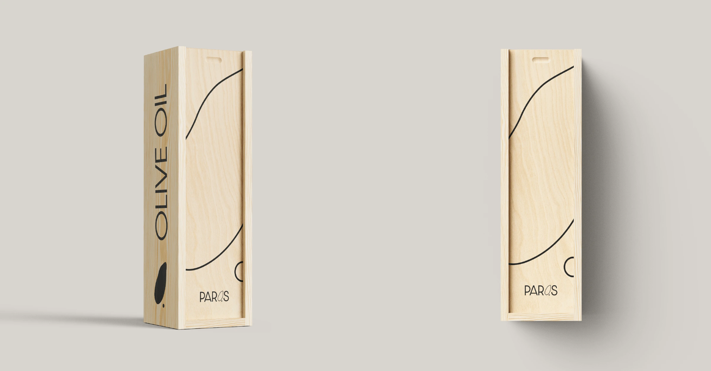
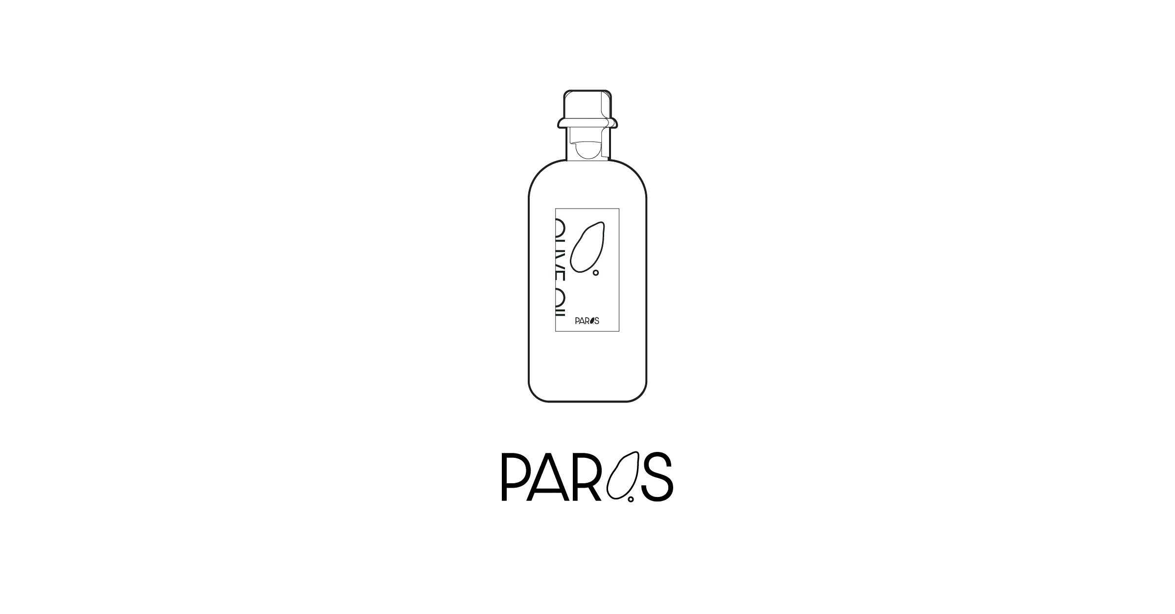
Paros is a Greek olive oil brand that makes super high quality, luxurious olive oil. Only the best olives are used to do so, making it an extremely exclusive product. The branding and packaging had to reflect this.
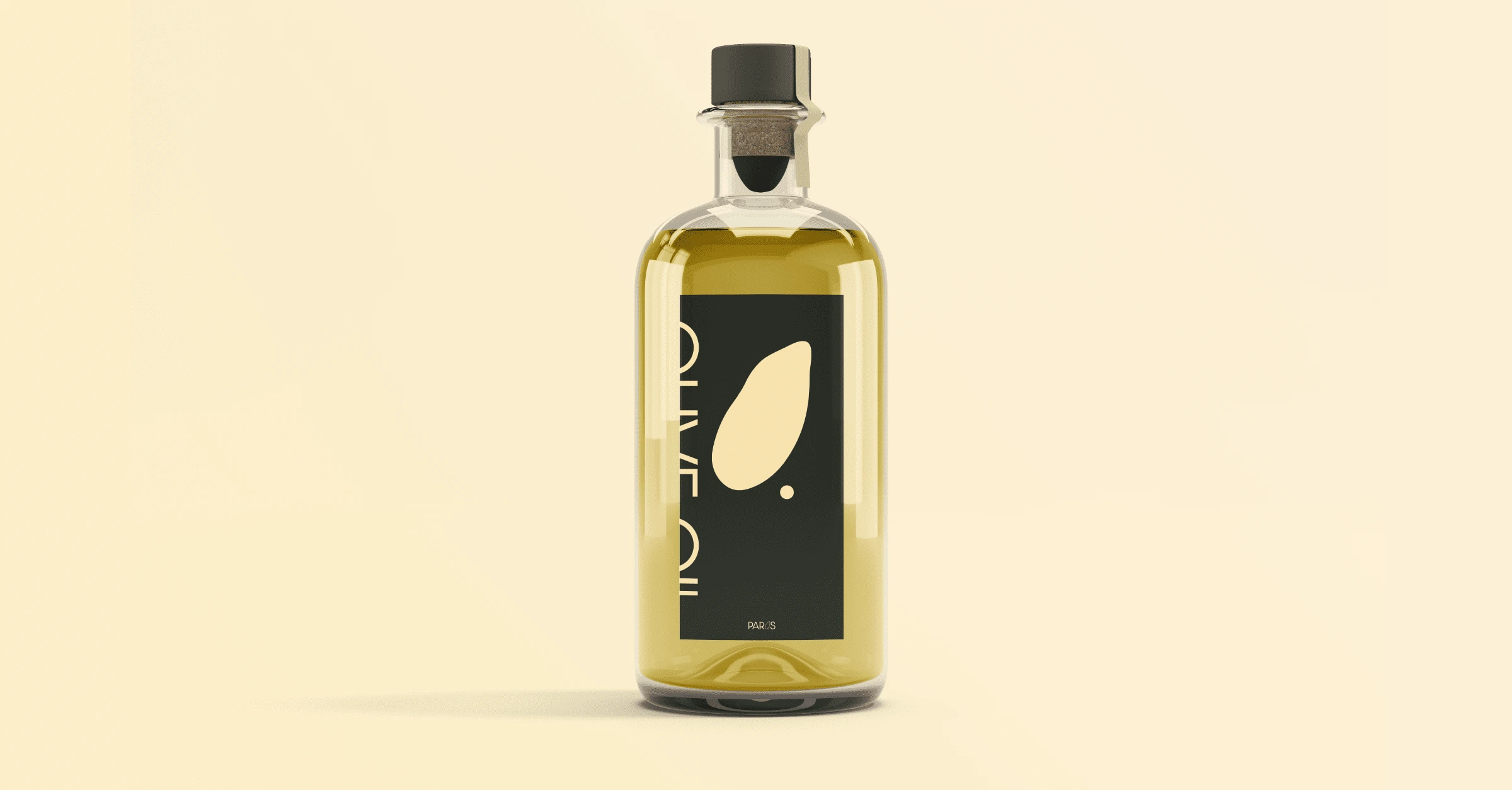
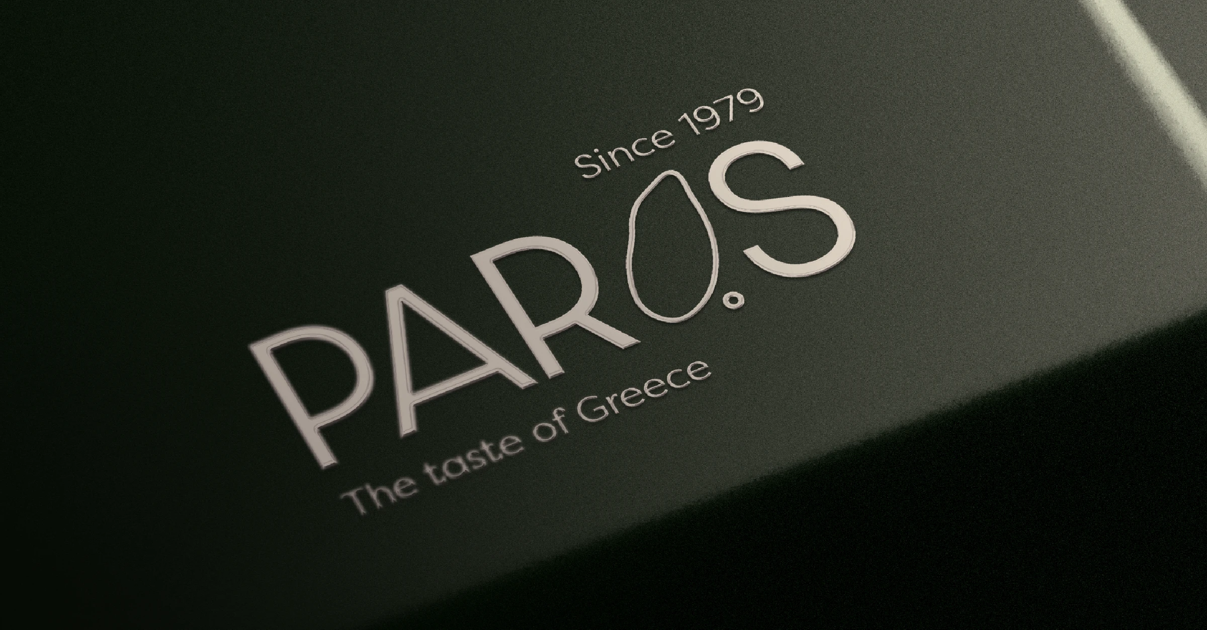
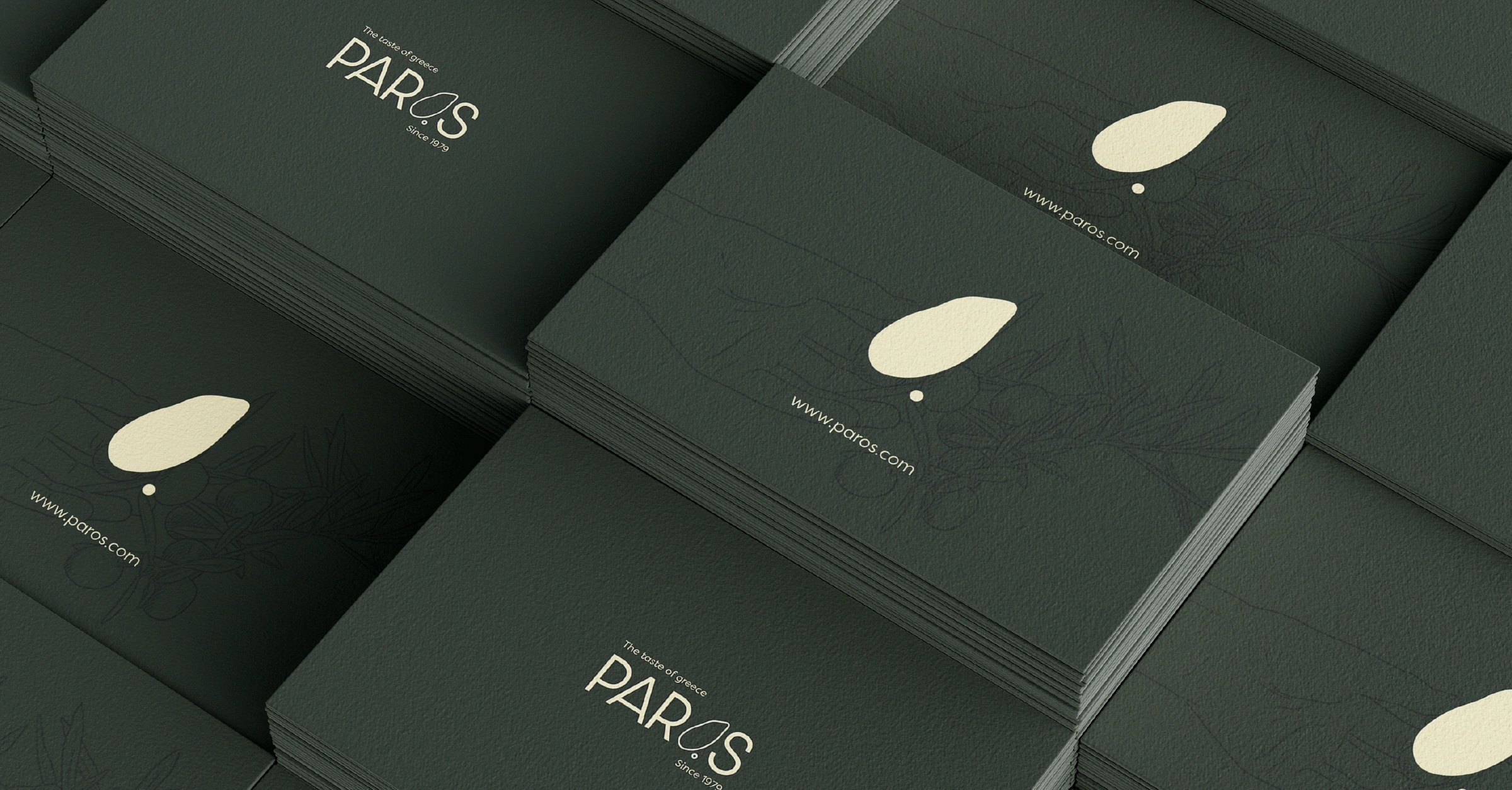
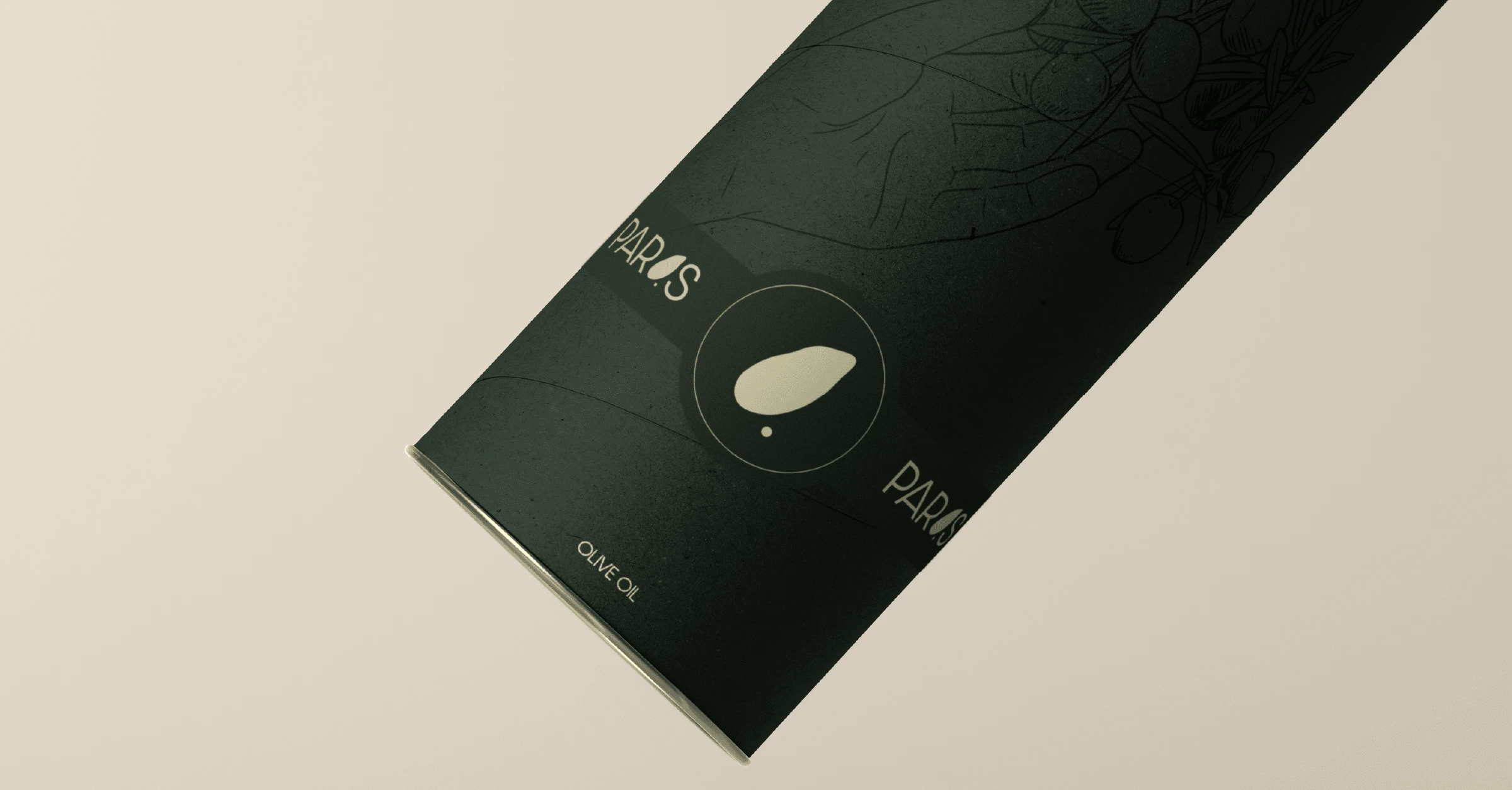
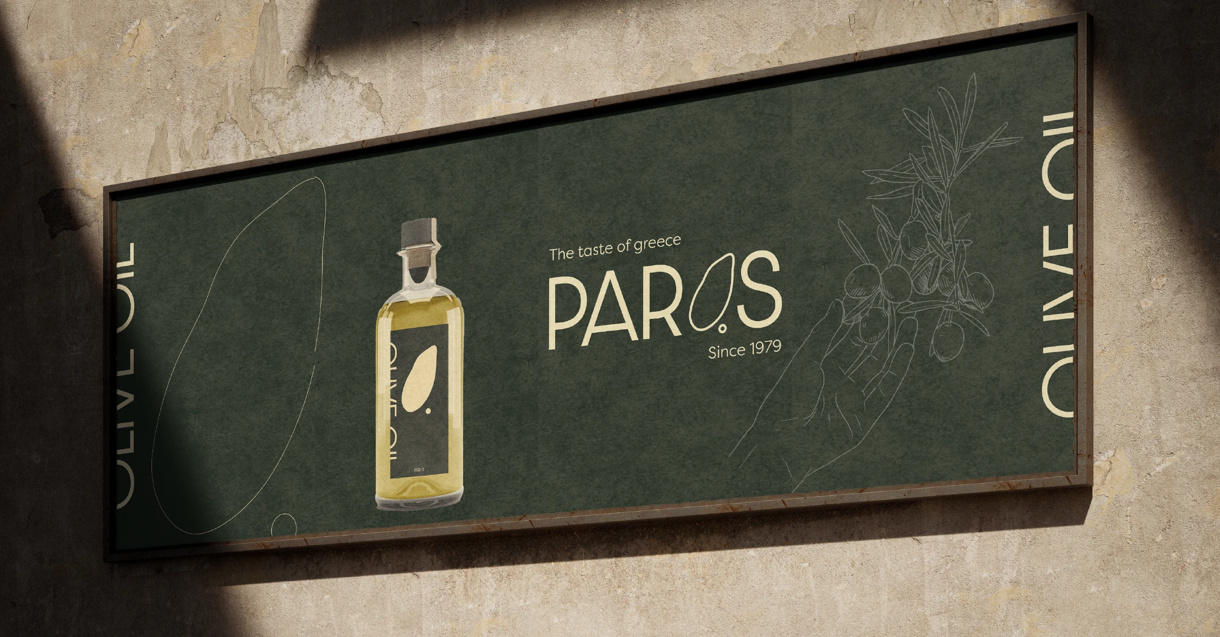
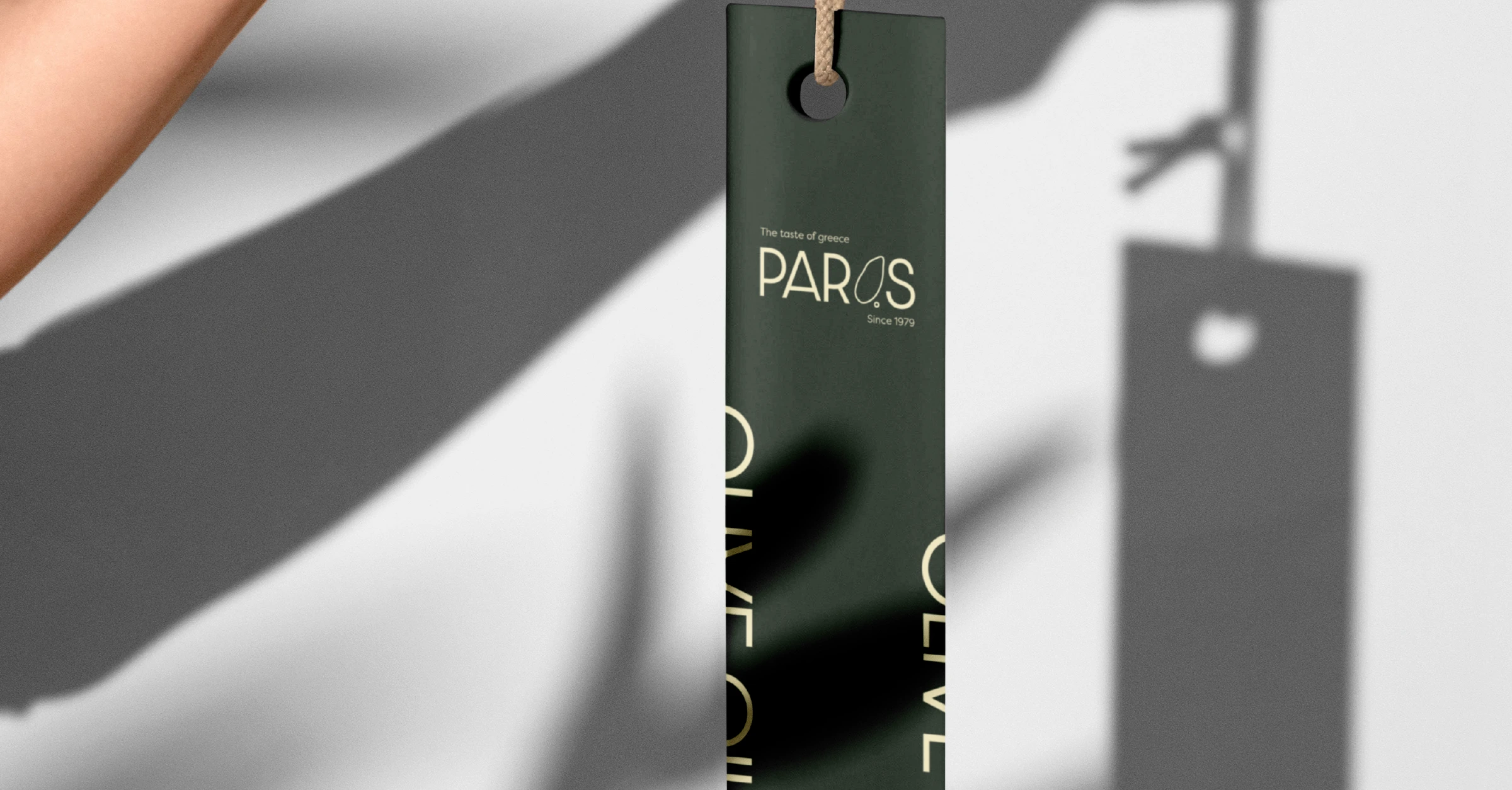
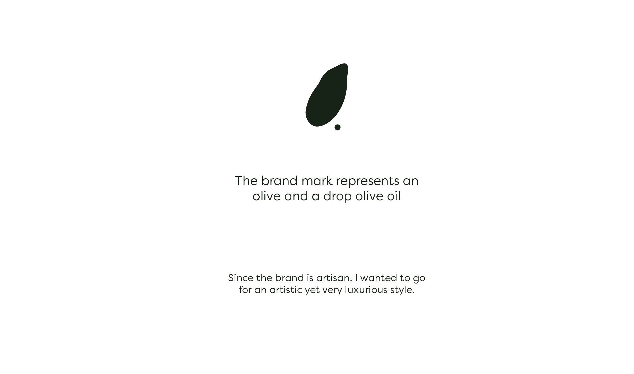
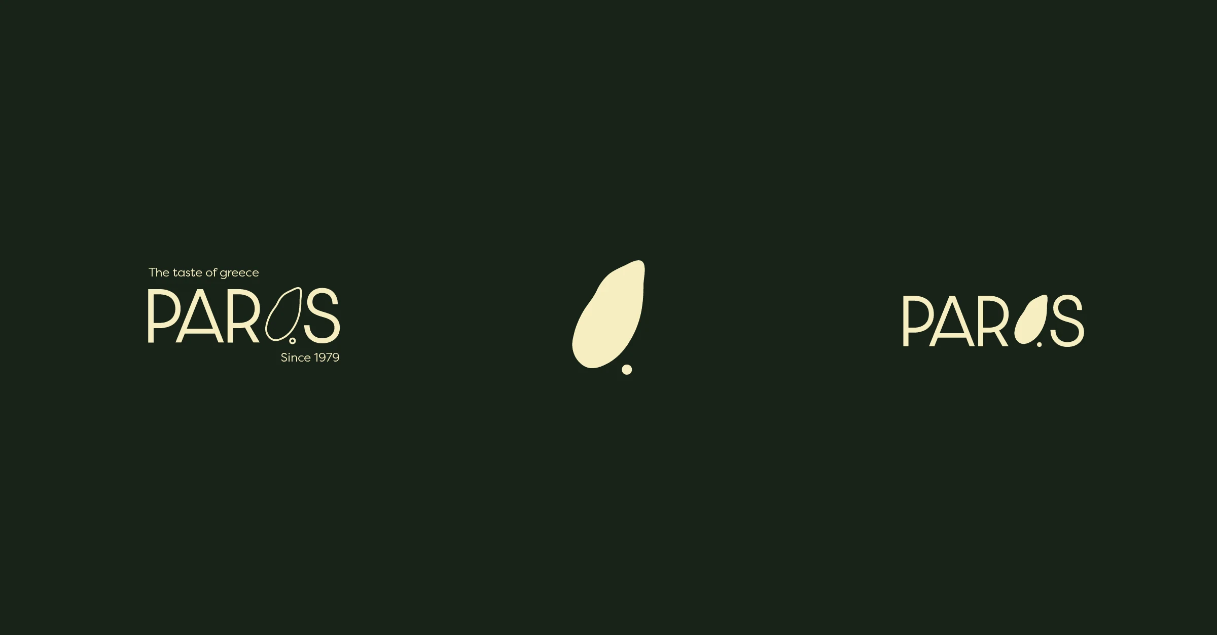
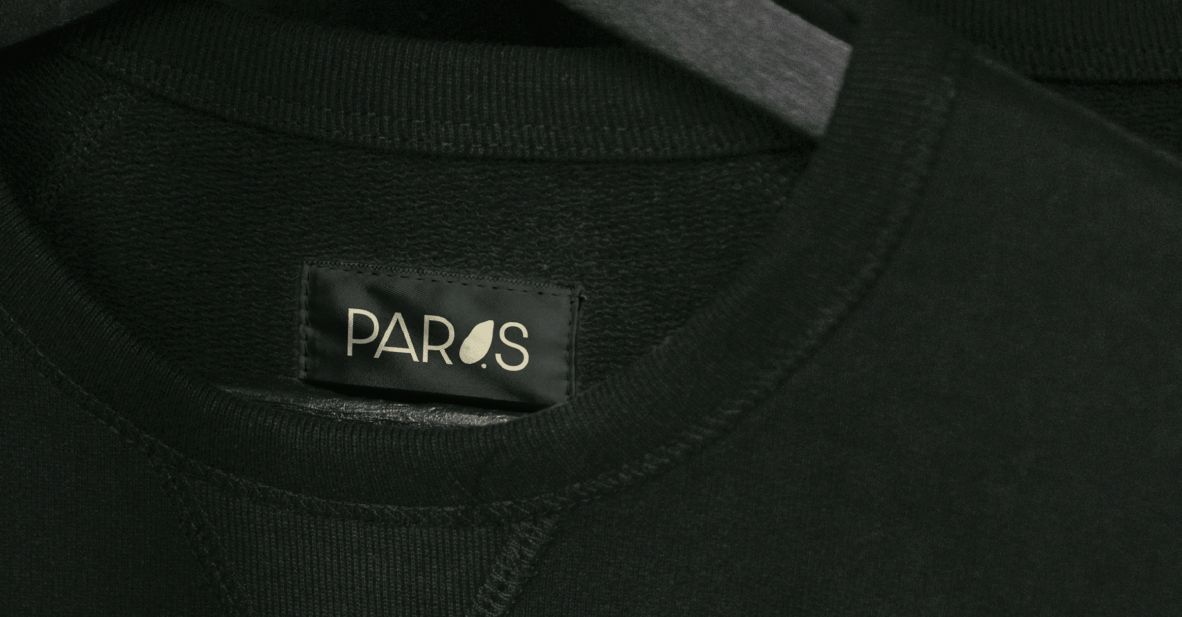
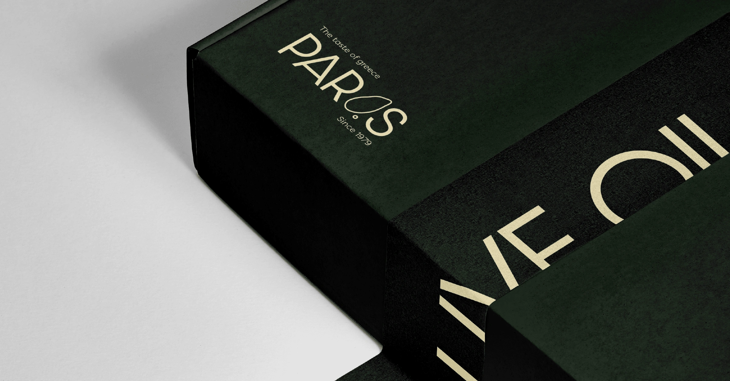
The art direction is more leaning towards artistic, artisan. For this reason, I used a rather playful font for the word mark, where I replaced the 'O' with the brand mark. The brand mark is an abstract mark of an olive with a drop of olive oil next to it. It is very versatile and can be used in all marketing material.
For the extra luxurious feeling, I used a very deep green paired with a cream colour.
Like this project
Posted May 31, 2023
Branding for a super exclusive, luxurious olive oil brand. This brand can only call for minimalism and deep colours.
