Hued | Healthtech Identity + Web Design
Lindsey Morgan
Updating The Brand Identity
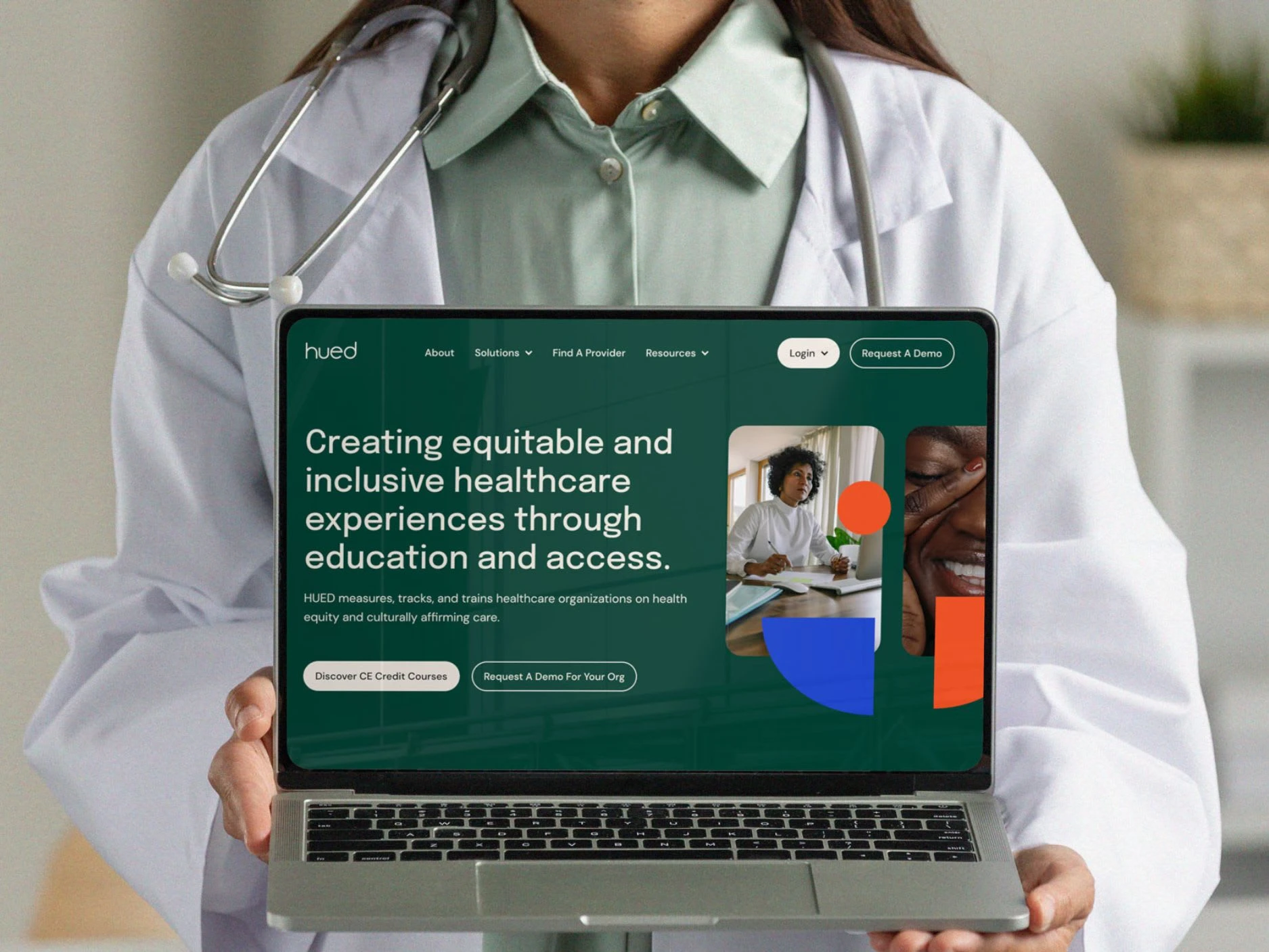
We began with refreshing the brand identity (working with an existing wordmark) and incorporating modern design elements with the goal of increasing the capacity of HUED’s digital footprint — enabling the identity to be carried throughout both the marketing website and backend product.
I began with three concepts to share internally, and together — we selected two that I strengthened into brand direction presentations for the HUED team. Each included a concept, color palette, typography, imagery styles, design elements, and an example of how these could all come together for the web.
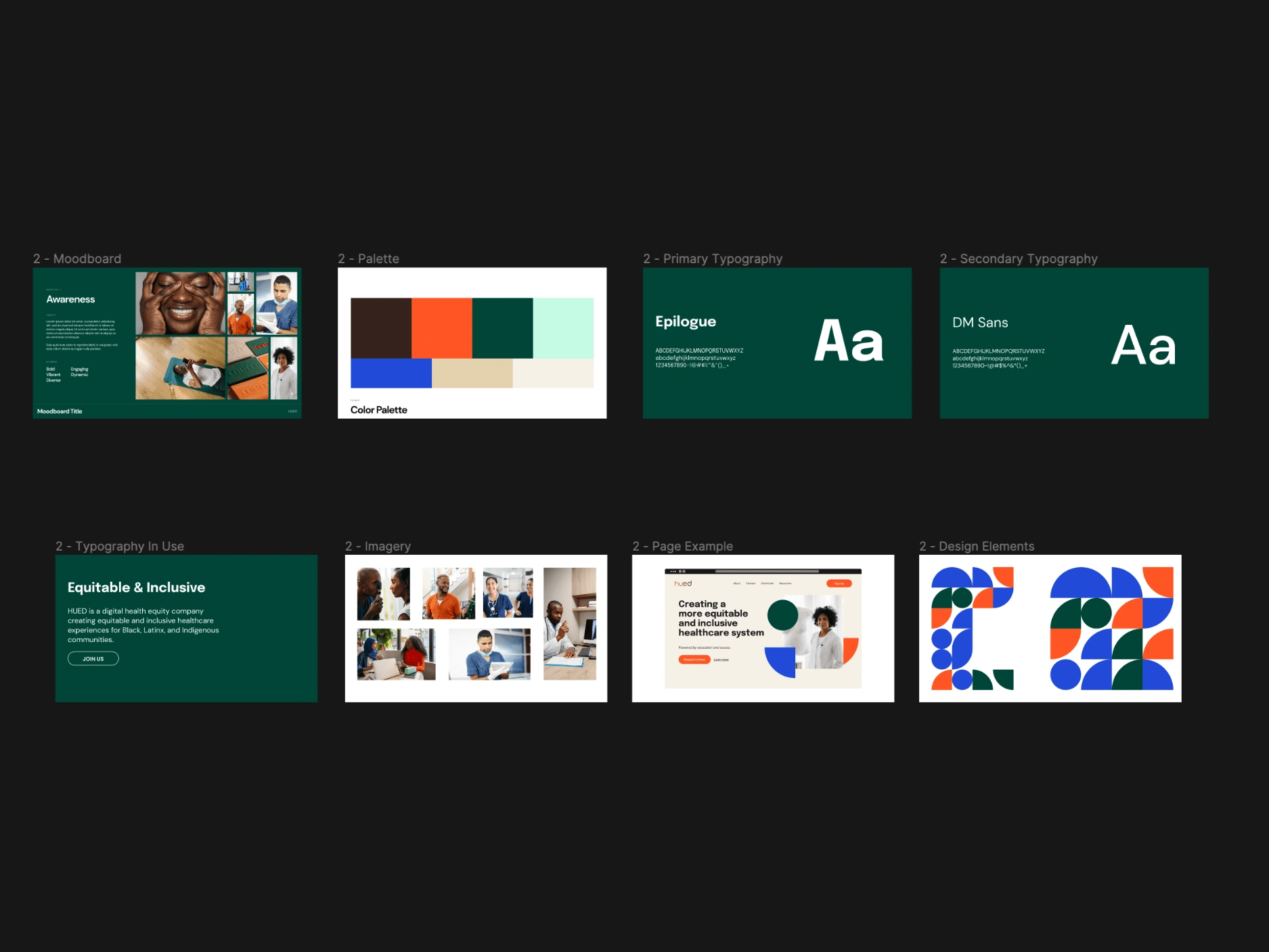
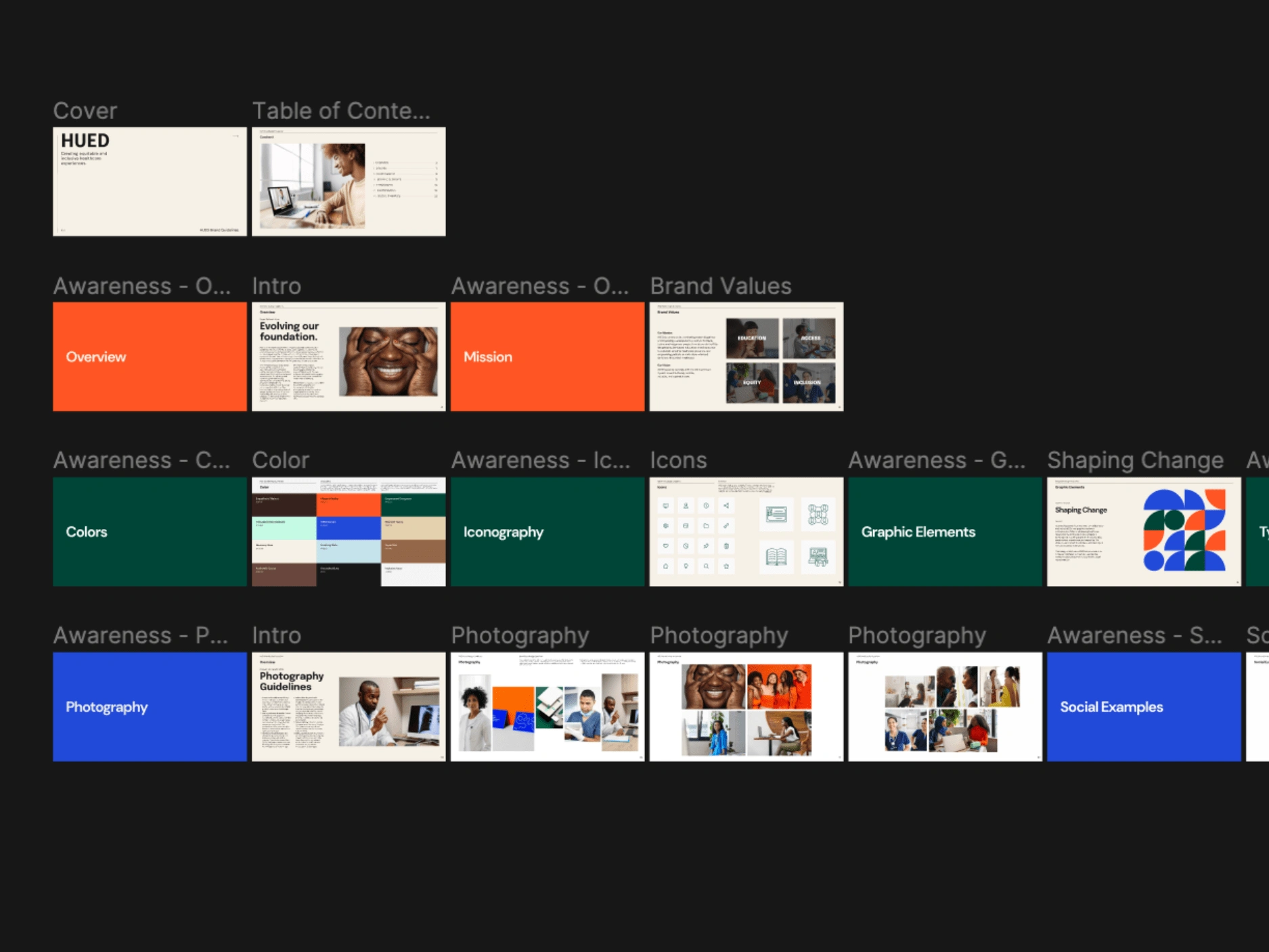
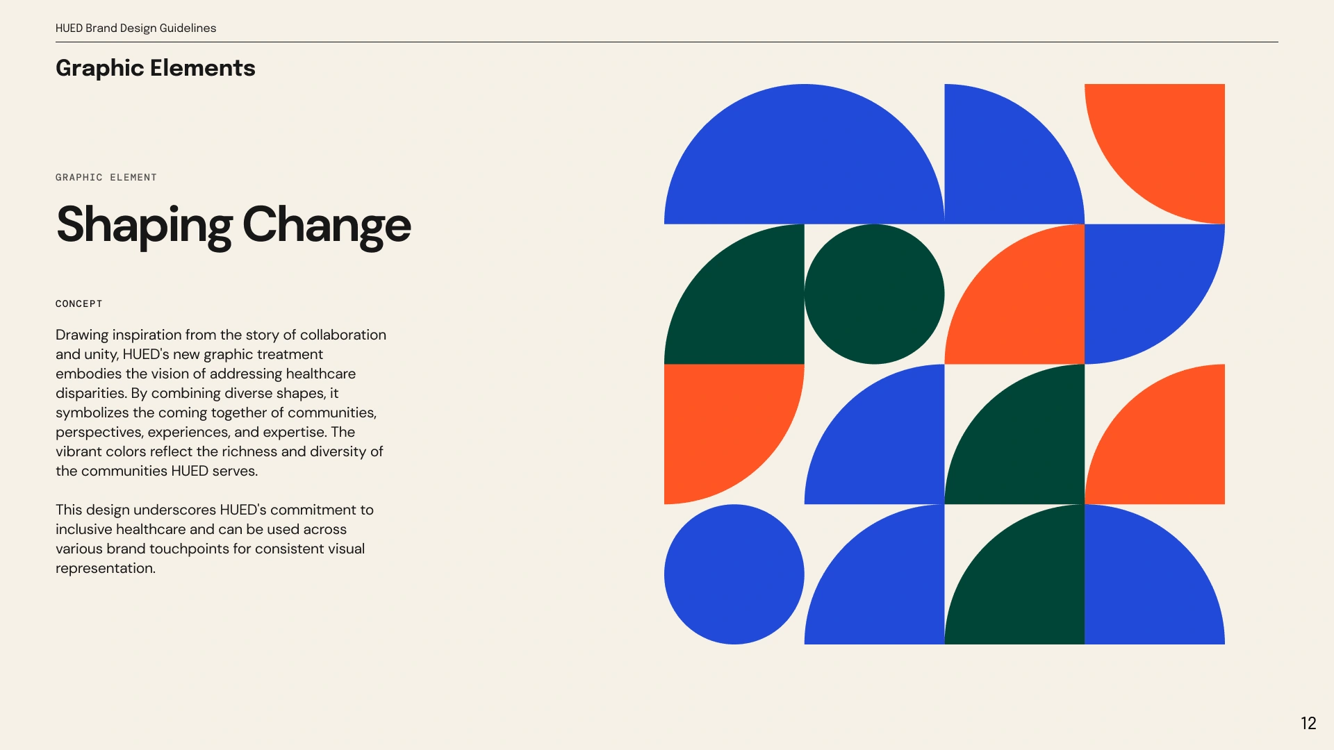
After presenting to stakeholders and pushing for a bold new direction, the team agreed it’s just what the brand needed — and I worked with a junior designer to build out a fully updated brand guidelines document in Figma.
Covering The User Journey
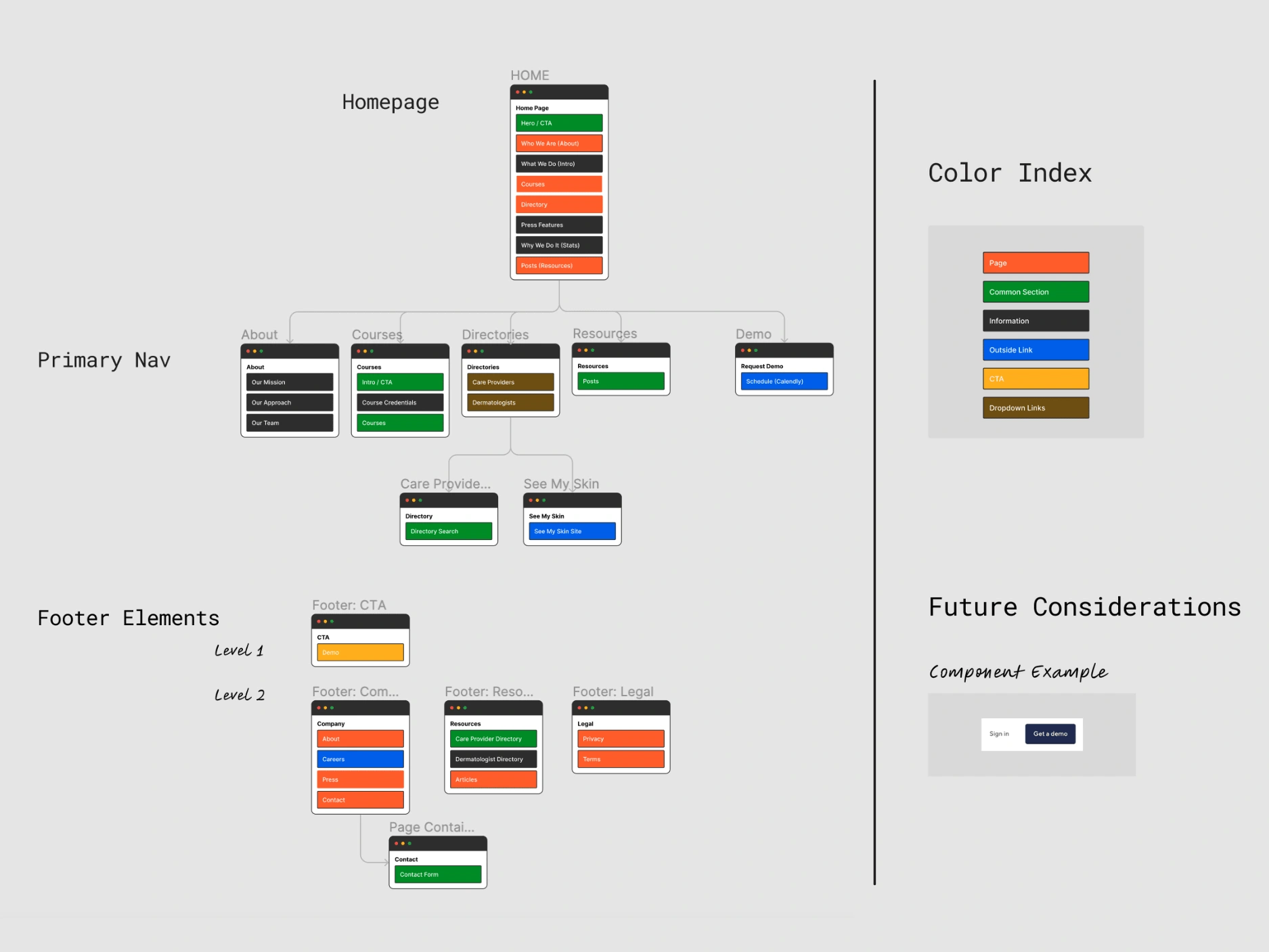
Our first task was to complete improved architecture by synthesizing learnings, mapping out the user journey, and delivering site specifications and recommended site map.
Two of the largest pain points were:
- non-qualified leads requesting a demo
- general confusion about what HUED does and how.
We worked closely with HUED’s founding team to understand the user types the site needed to serve — and honing in on who was currently being left out. The three primary user groups were: BIPOC users looking for healthcare providers in the free directory, individual practitioners looking to take courses, and enterprises and healthcare organizations interested in purchasing courses for their entire staff.
The current challenge surrounded the balance between currently being most known as a free resource, but also communicating the key product offering. From a long-term business perspective, we identified which user type best suits overall product revenue goals, in order to begin prioritizing them and their journey in the overall site structure.
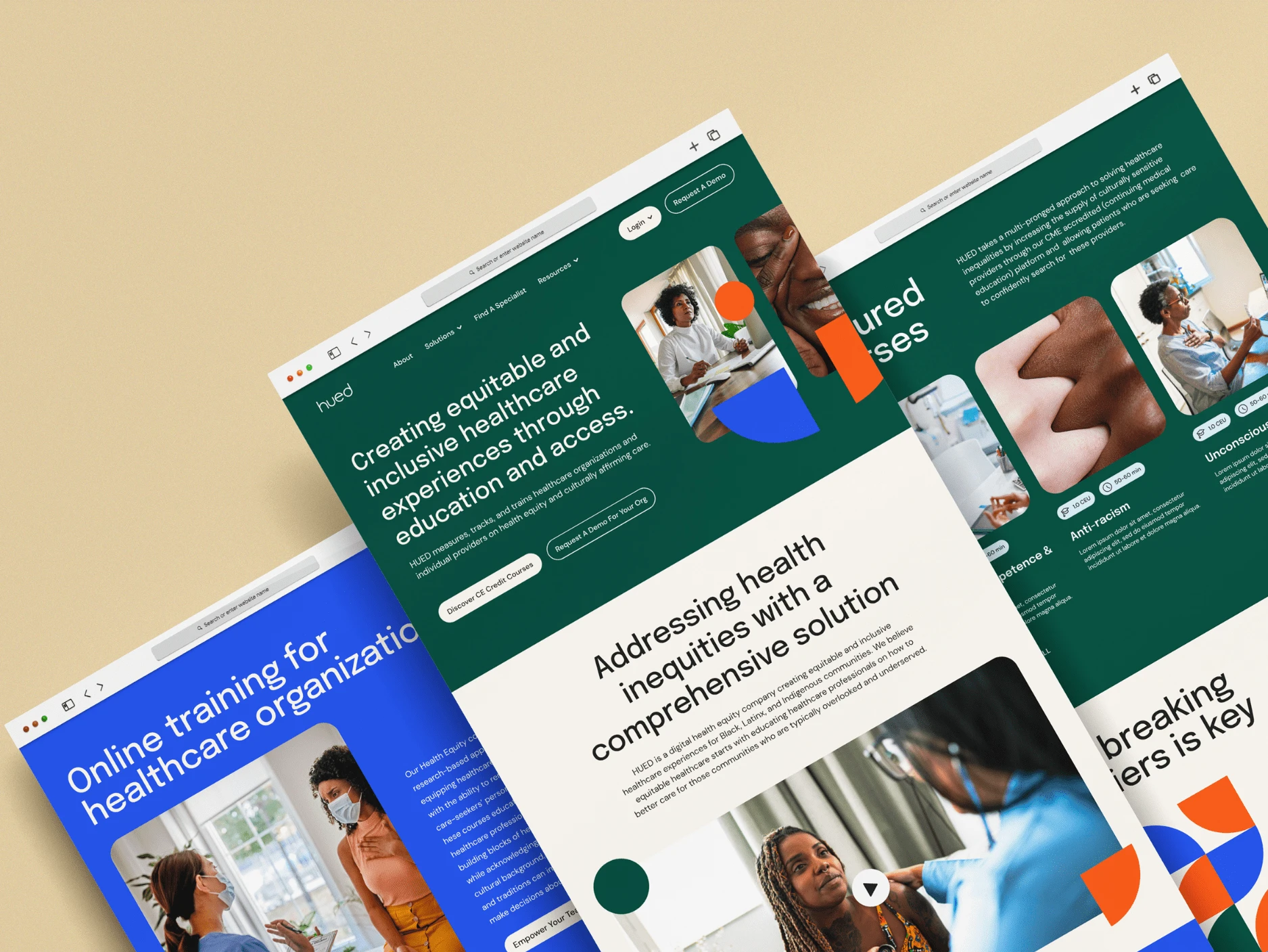
Reimagining The Web Experience
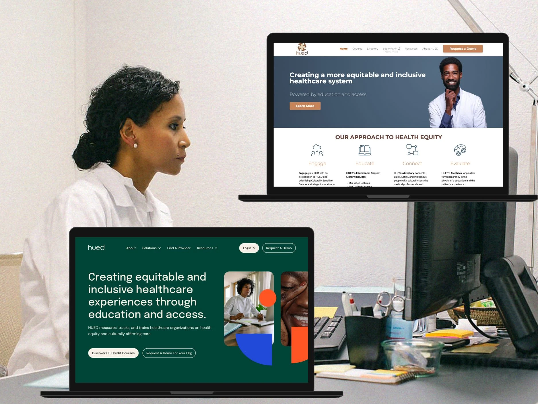
The final task included a complete overhaul of the web experience — which was built screen by screen in Figma. This allowed for easy cross-functional collaboration between design, stakeholders, and development throughout the project.
The first priority was to ensure that the site as a whole is optimized for conversions and lead capture, which we accomplished by revisiting the site map and user types, noting any additional insights we’d learned about HUED in brand and product strategy stages since the first iteration.
Notable Solutions
“Request A Demo” can be off-putting to people who are used to easy sign-ups and transparent pricing structures — so we made sure that non-enterprise customers had a simpler journey path to explore and purchase courses for individuals. This included the addition of Course Detail pages instead of a single overview page.
We added a “Solutions” dropdown to the menu, which in the future can be its own compound landing page, but for now (due to project scope) is used as a tool to help each user group navigate to the appropriate part of the website to complete their journey.
Via the right navigation, we clarified the experience for users who would need the option to log in to either the directory as a practitioner in order to update their profiles or into their available courses. They were previously only able to do so via sub-domains and email links.
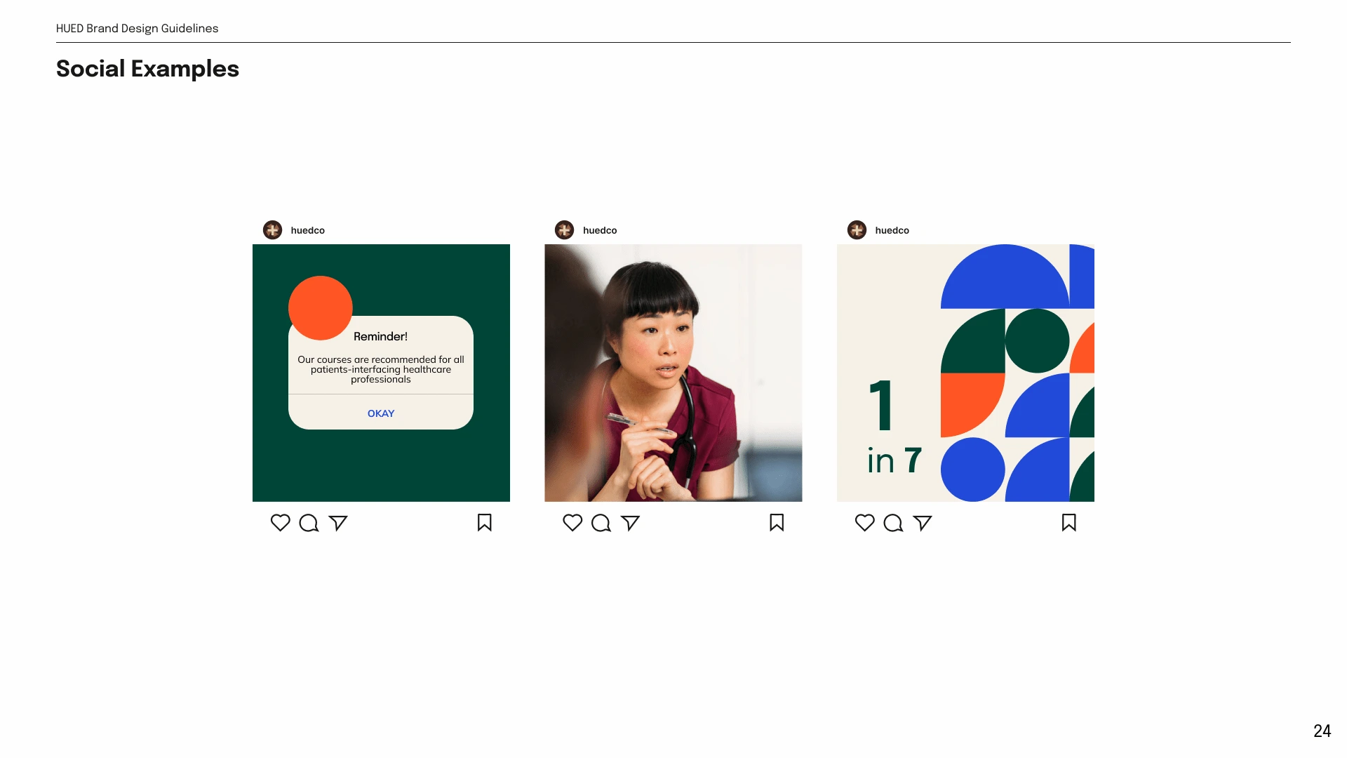
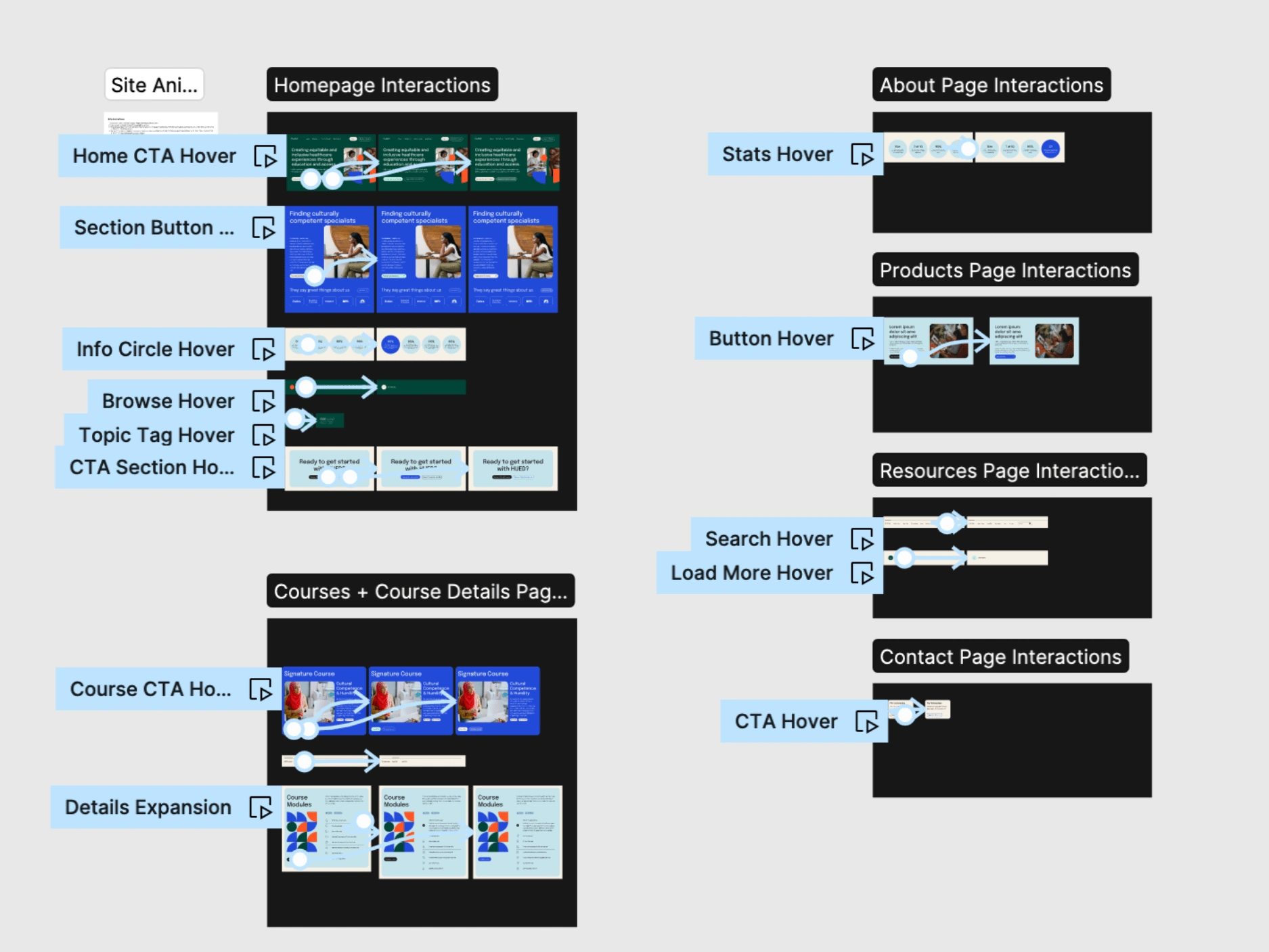
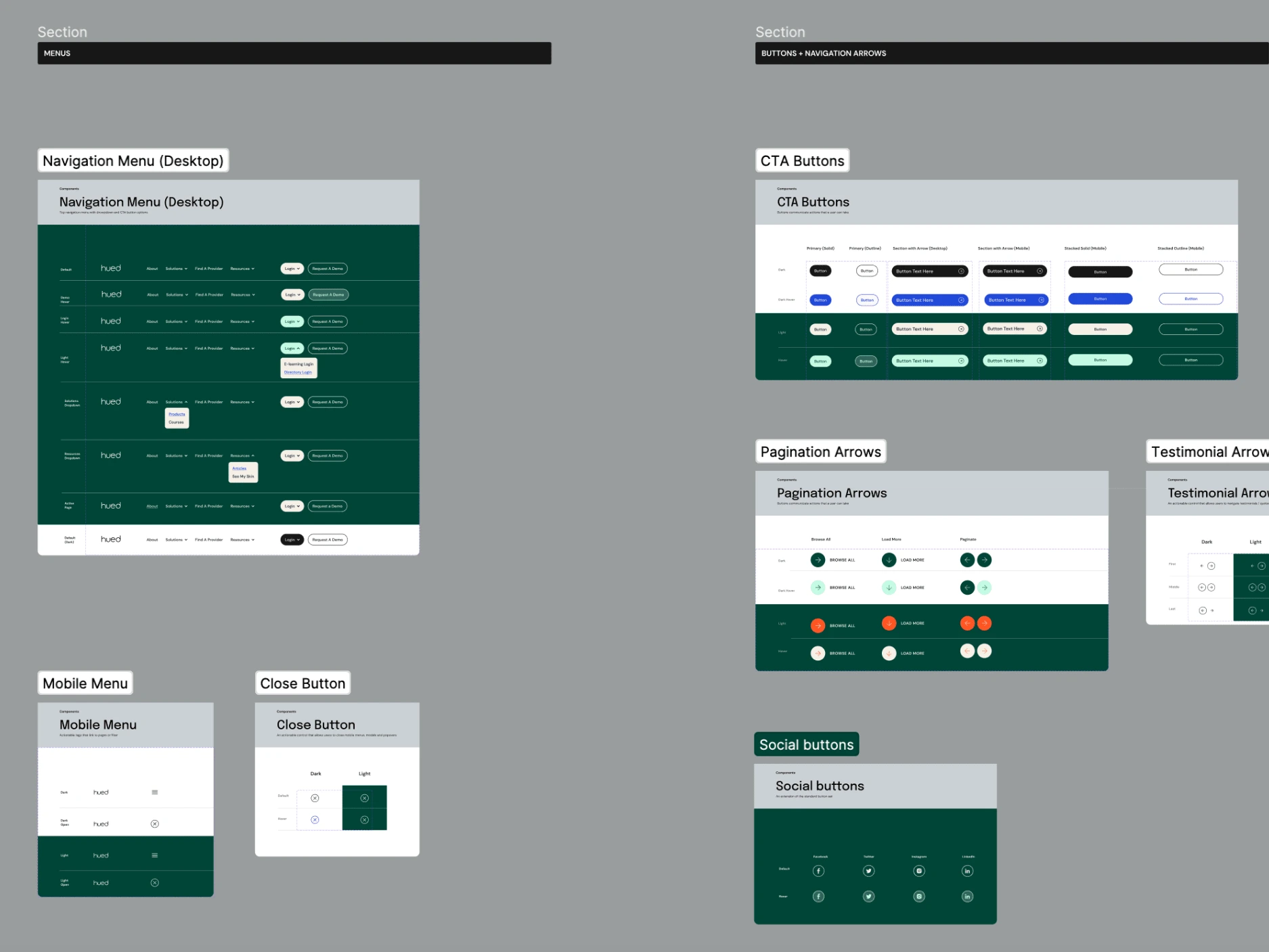
Of course, our next priority was to fully integrate the updated visual identity. In order to complement the new modern style — I created prototypes in Figma to act as notes on desired interactions and animations. I also paired this with a web design system set with all of the colors, elements, and states used in the design.
Like this project
Posted Aug 30, 2023
I worked as Lead Designer and was responsible for both a brand identity overhaul, strategic UX, and site design for Hued, a healthcare education platform.