Lacuna | Edtech Brand Identity + UX/UI Design

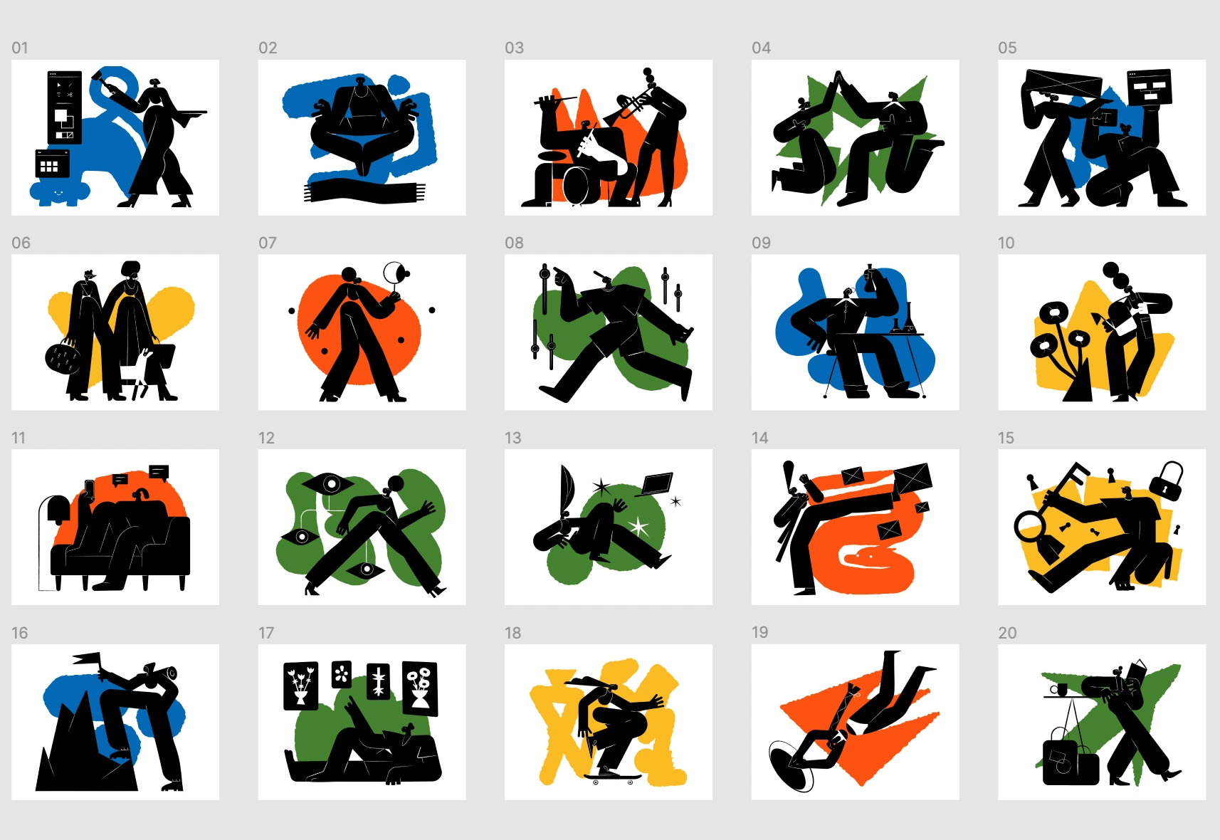
For Lacuna, I created an art-based brand identity that stands out from what’s becoming stereotypical in the UX and tech industry. Leaning towards education and learning, I focused on muted primary colors that bring the brand to life, while still feeling more serious than elementary school. I paired black and white photography, for learners to see themselves represented, with blackout illustrations that can be used for courses and marketing materials.
User Personas
The product strategy phase of Lacuna focused on conducting extensive research to understand the needs, aspirations, and barriers faced by aspiring UX designers of color. Through interviews, surveys, and observations, a series of empathetic user personas were crafted, providing deep insights into their educational backgrounds, career goals, and the obstacles they encounter. This research served as the foundation for the subsequent phases of the project.

Brand Identity
A distinctive and art-based visual identity was developed to break free from the stereotypes often found in the UX and tech industry. The objective was to create a brand that stood out while maintaining a sense of sophistication and relevance to education and learning.
To achieve this, the brand identity focused on utilizing a palette of muted primary colors. These colors were carefully selected to bring vibrancy and energy to the brand while avoiding an overly playful or elementary school aesthetic. The result is a visual identity that strikes a balance between being engaging and professional, capturing the essence of Lacuna's mission.
Furthermore, the brand identity incorporated a mix of black and white photography to ensure learners see themselves represented. This approach adds a layer of inclusivity and authenticity, enabling aspiring UX designers of color to connect with the brand on a personal level. Complementing the photography, blackout illustrations were created to be used across various courses and marketing materials, adding visual interest and enhancing the overall brand experience.


MVP
Finally, the MVP product design phase brought the vision of Lacuna to life through the creation of a Minimum Viable Product. Guided by the user personas and the product strategy, the UX/UI design team meticulously crafted a seamless and user-friendly learning platform. The MVP product design seamlessly integrates curated content, interactive learning modules, mentorship opportunities, and a supportive community to foster growth and professional development for aspiring UX designers of color.


Like this project
Posted Jan 26, 2023
Full brand design and strategy for an asynchronous online learning platform with a focus on post-bootcamp UX designers from underrepresented backgrounds.
Likes
0
Views
33


