Coral Health | Product (App) Design

BUILDING A DESIGN SYSTEM
Within my first few weeks with Coral, I recognized the need for a comprehensive digital design system that could streamline the user experience and speed up feature development. To achieve this, I conducted a thorough audit of existing screen designs and utilized the atomic design methodology to build out the system atom by atom.
My primary focus was to improve the existing UI while minimizing design debt, which I achieved by making subtle yet effective changes such as color corrections, consistent typography, and refined spacing rules. By developing a cohesive design library in Figma and creating a Style Guide in Zeplin, I successfully implemented the design system and bridged the gap for development.
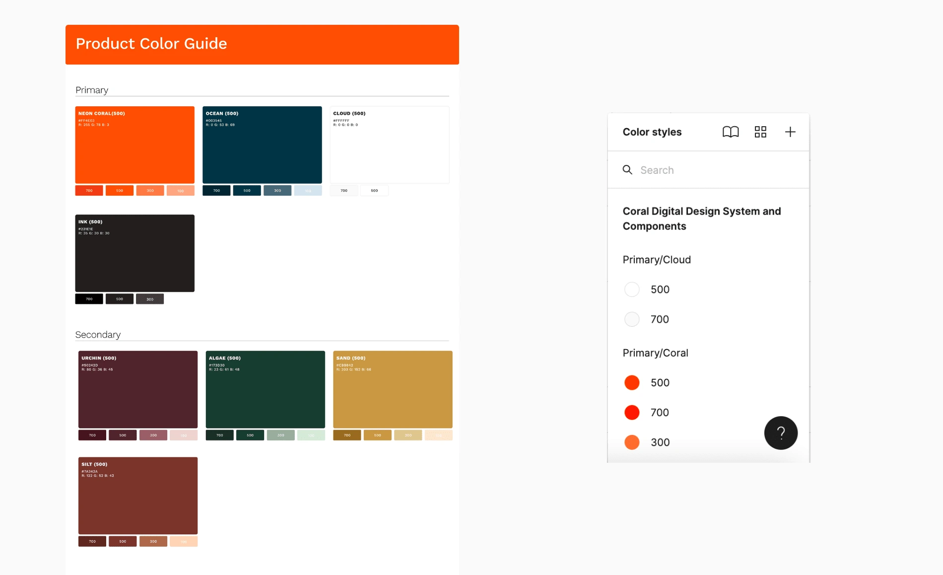
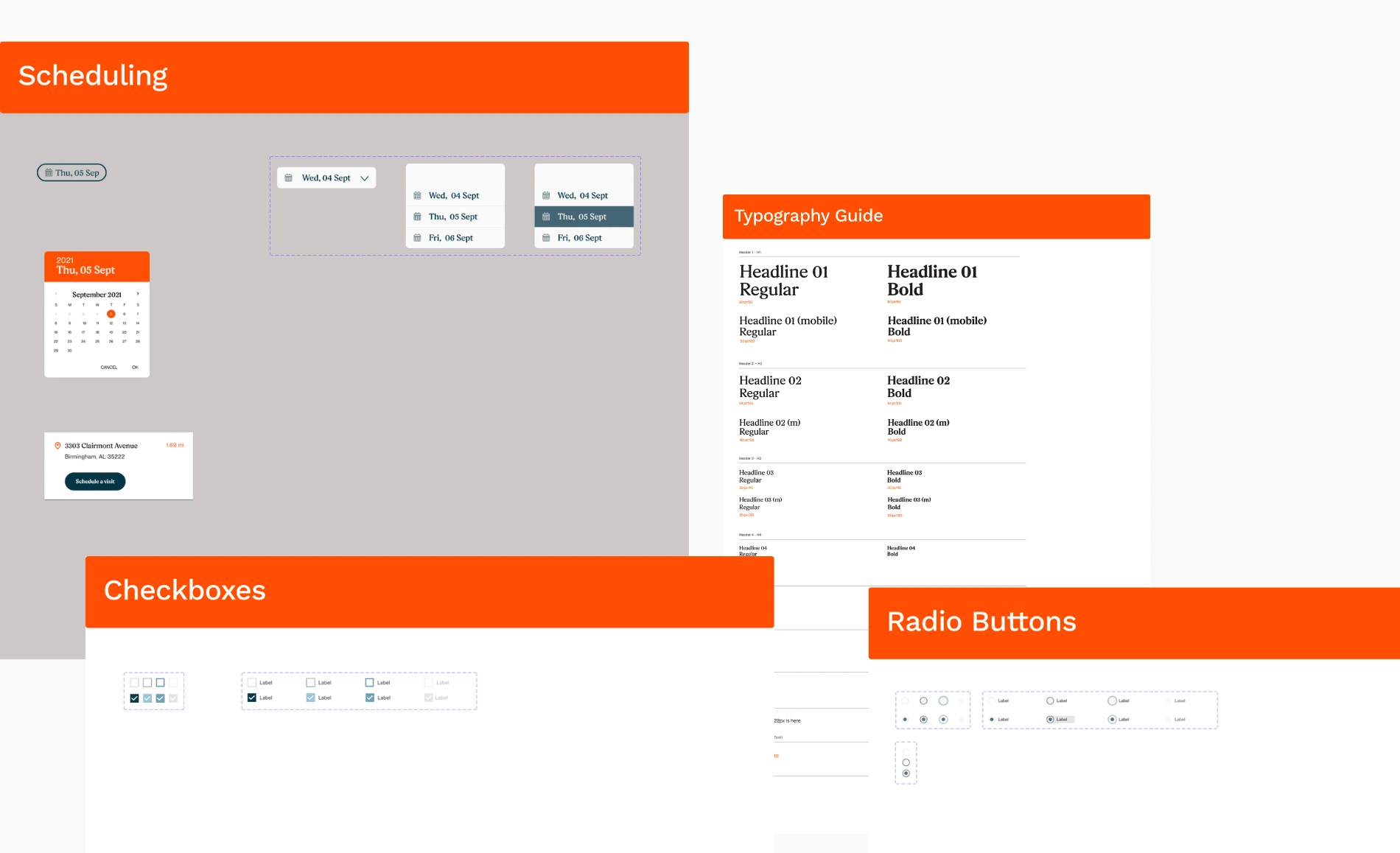
I then applied and linked settings from the system to all existing screens, exporting and organizing them in Zeplin for easy access. Finally, I built comprehensive documentation in Confluence to ensure proper usage and governance of the design system. Thanks to this effort, the Coral Health digital product was able to achieve greater efficiency, and consistency through additional feature builds and a growing library of assets.
PLEASING STAKEHOLDERS + CONTINUING CARE
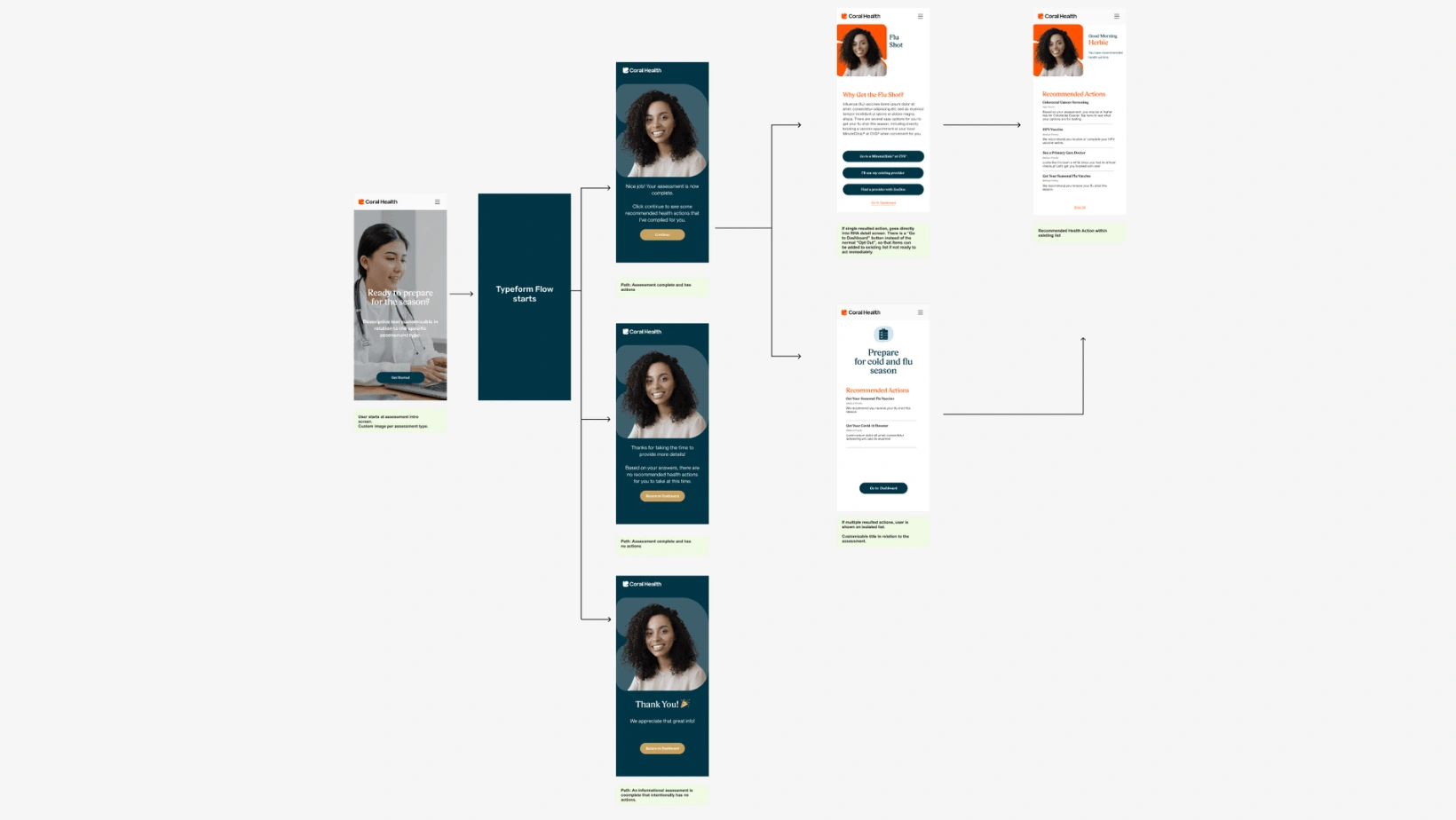
Coral Health's pricing model is based on "active" members, making engagement a critical component of our overall platform design. However, we recognized that it was easy for members to become "inactive" after completing the initial onboarding assessment and recommended healthcare actions. To combat this issue, we developed the idea of "mini assessments" as a way to notify members of additional relevant healthcare actions, particularly those that are season-based, such as the flu shot.
We designed a flow that could be initiated from email, SMS, or notification alerts — and I worked with engineering to ensure that this feature was seamlessly integrated into the platform design. By periodically prompting users with these mini-assessments, we were able to re-engage them with the Coral Health platform and encourage ongoing participation.
EXECUTING A CVS INTEGRATION
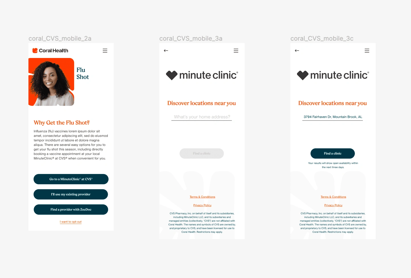
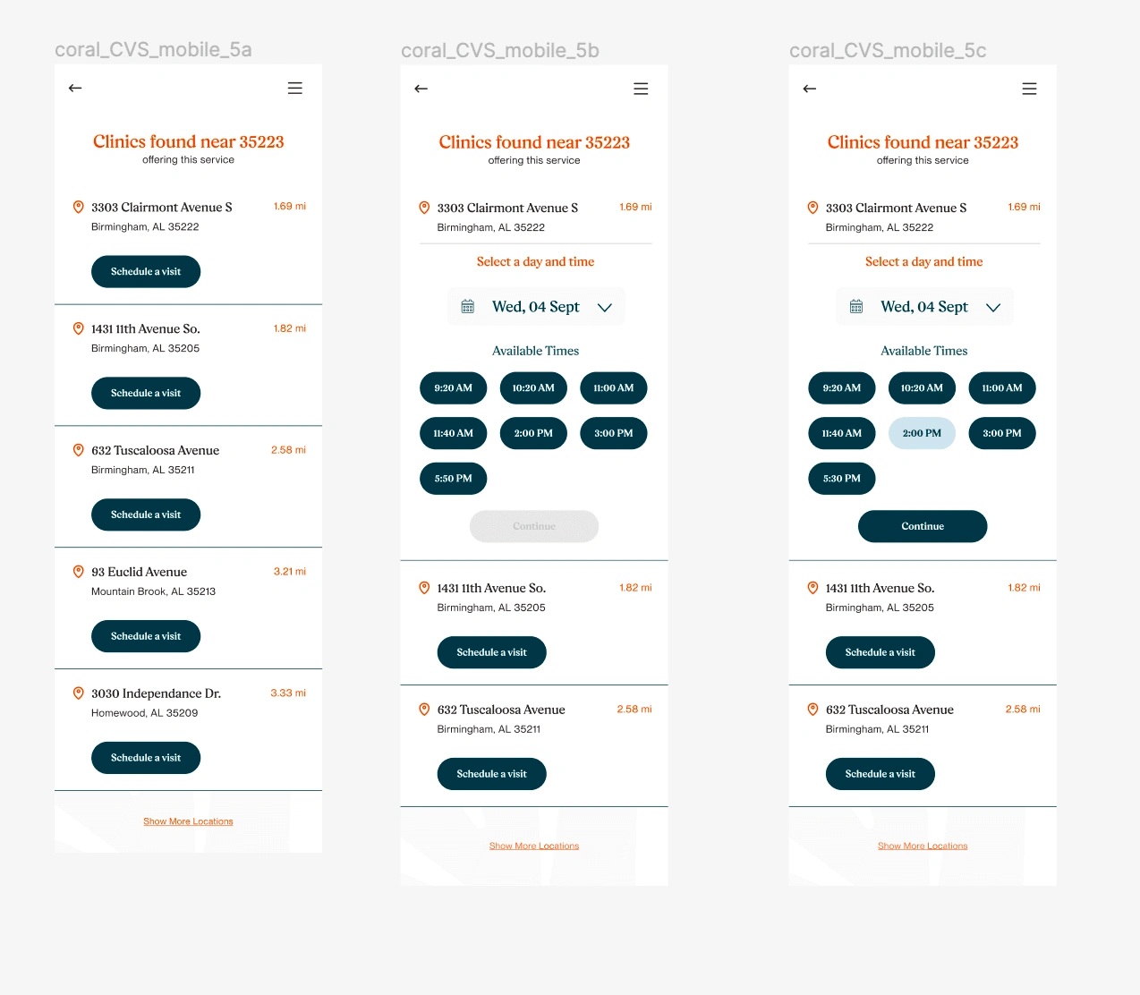
At Coral Health, we believe that convenience is key to driving action and helping our members achieve their health goals. To make this a reality, we partnered with CVS and integrated their clinics booking feature directly into our platform. This allowed our users to easily book appointments based on our recommended health actions, without ever having to leave the Coral app.
To make this integration possible, I conducted extensive research to understand the existing booking process at CVS clinics and identified areas for improvement. Using this research, I designed a user flow that guides users through the process of booking an appointment seamlessly within the Coral app.
With a tight deadline, I quickly moved from concept to high-fidelity screens, skipping wireframing and iterating on designs with team feedback. Fortunately, our pre-existing design system greatly aided in this process. I worked closely with a software engineer throughout the entire project, from the proof of concept stage through to QA testing and final completion.

Like this project
Posted Jan 26, 2023
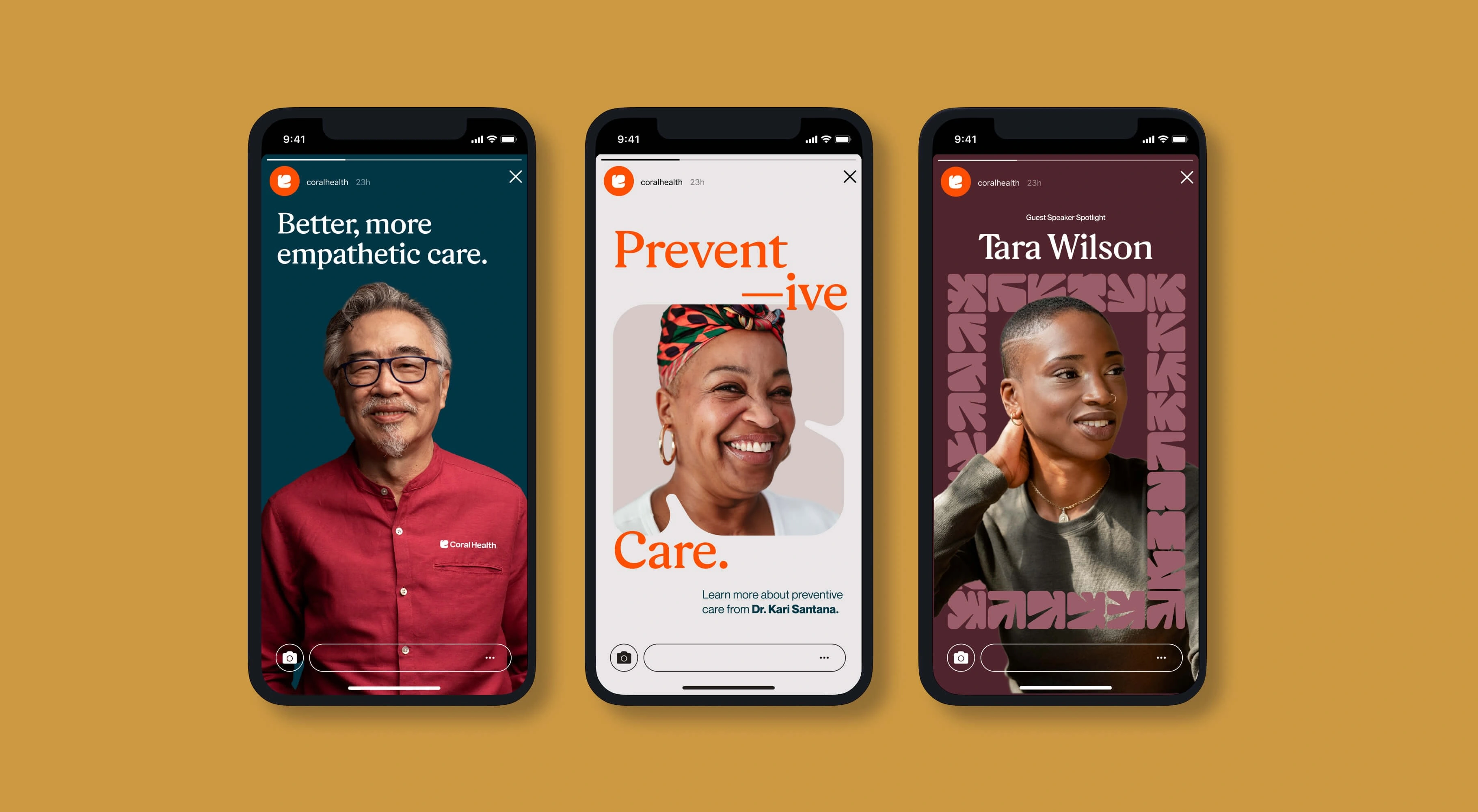
Product design and continued brand development for Coral Health, a B2B web-based application designed to provide culturally sensitive healthcare to employees.
Likes
1
Views
52


