Branding for a Berlin-based premium ice cream factory
Project
EisQueen, established since 2015 with a strong presence on the German market, decided to broaden its brand's offerings. To ensure consistent alignment with its values, they sought a comprehensive style guide. They approached me for assistance in a light rebranding and the design of new packaging.
Client
EisQueen is a premium, artisanal ice cream brand based in Berlin. Their mission is to bring the luxurious experience of an ice cream boutique to your home, by making their products available in fine foods markets.
Workshops
It started with workshops and brainstorming to define EisQueen's essence and aspirations. We set goals, devised strategies, and explored design's role in achieving them. This process provided valuable insights into potential branding directions.
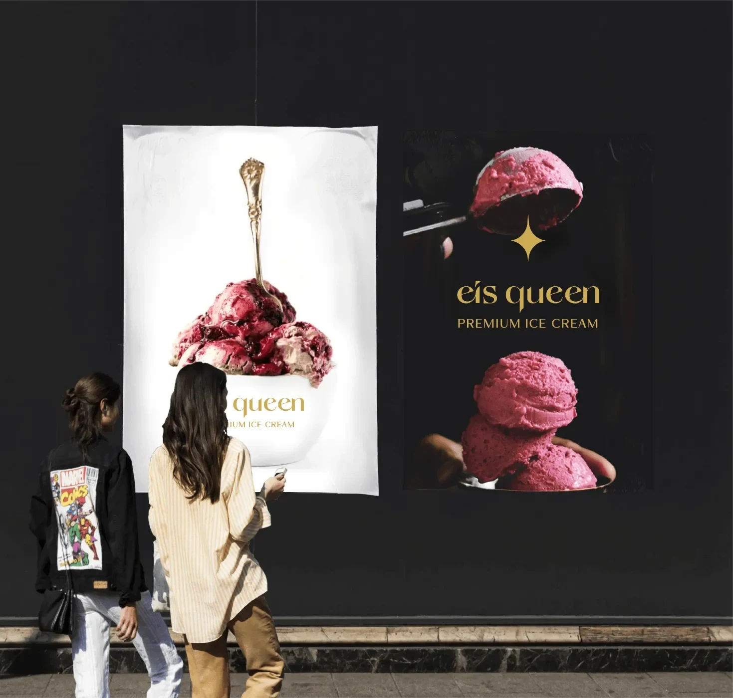
Luxurious
Prioritizing EisQueen's luxury, they pride themselves on fresh, high-quality ingredients and product excellence.
Artisan
The second core value in EisQuenn’s production chain is their commitment to traditional methods and the use of unprocessed ingredients.

Colours
I select muted, harmonious colors that uphold EisQueen's commitment to quality. The primary scheme, a timeless blend of black and white, provides a classic backdrop for a varied palette. Secondary colors include deep blue for reliability and trust, complemented by gold for a regal touch echoing a crown.

Fonts
I opted for the Queens, an elegant serif font with a hint of quirkiness for the EisQueen website. It is paired with the clean and stable Neue Haas Unica font to create a harmonious design.

Packaging Design
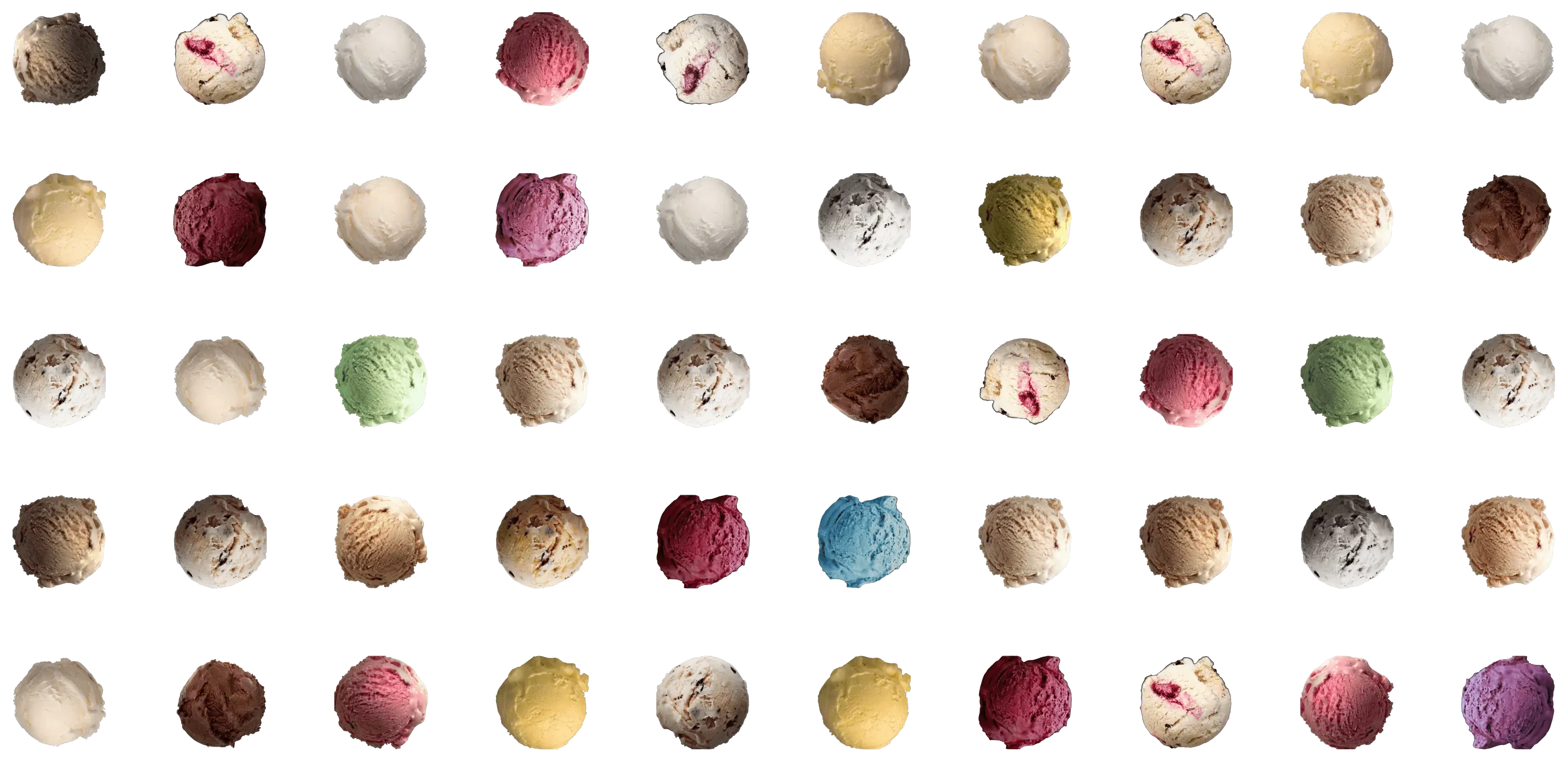
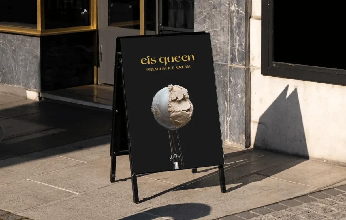
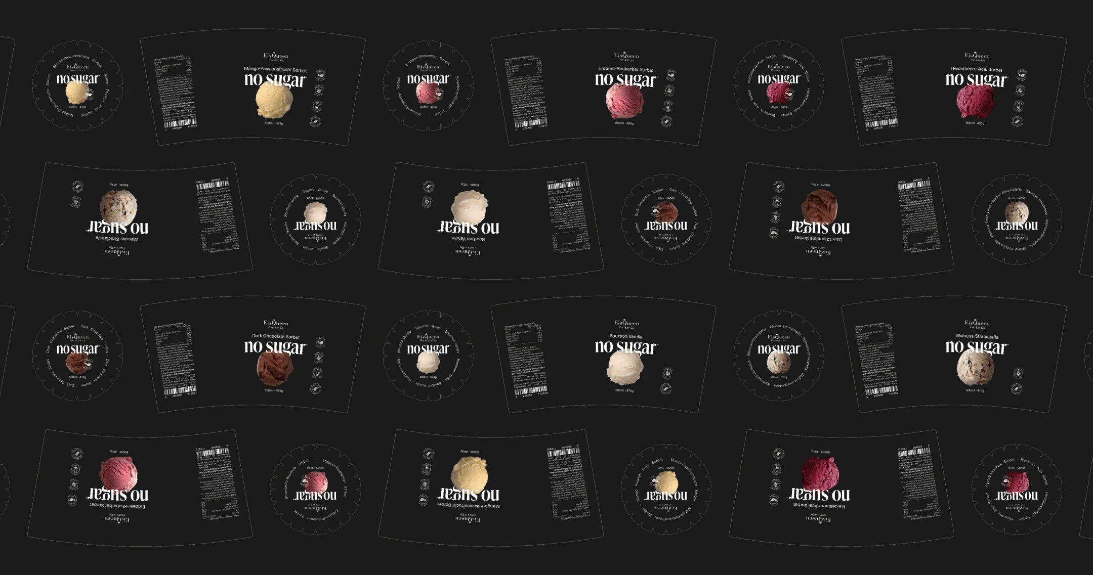
After exploring various concepts, I crafted EisQueen's ideal packaging. The refined black shade struck an elegant balance, complementing the simple yet luxurious appeal. Strategic ice scoop placement ensured clear flavor distinction.
Key Results
Developing EisQueen’s Style Guide and collaborating with people who know their product in and out and have years of customer interaction was a truly valuable experience.
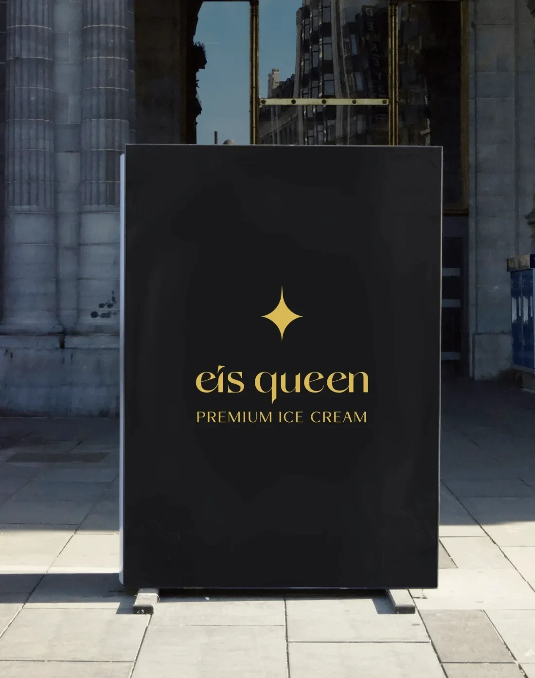
It was also very rewarding for me to witness how design impacts brand perception in physical world, especially when the product proudly sits on store shelves.
Case study on my website:
Like this project
Posted Dec 12, 2024
EisQueen sought a comprehensive style guide to align with their values. They approached me for light rebranding and new packaging design.

