Logotype (and Brand) Redesign for AEK in Ecuador
Jose Vargas
The Way of the Sword is the Way of the Heart
An open space to develop as a human being
Scope of The Project
Brand Identity Re-design
Brand Manual
Request
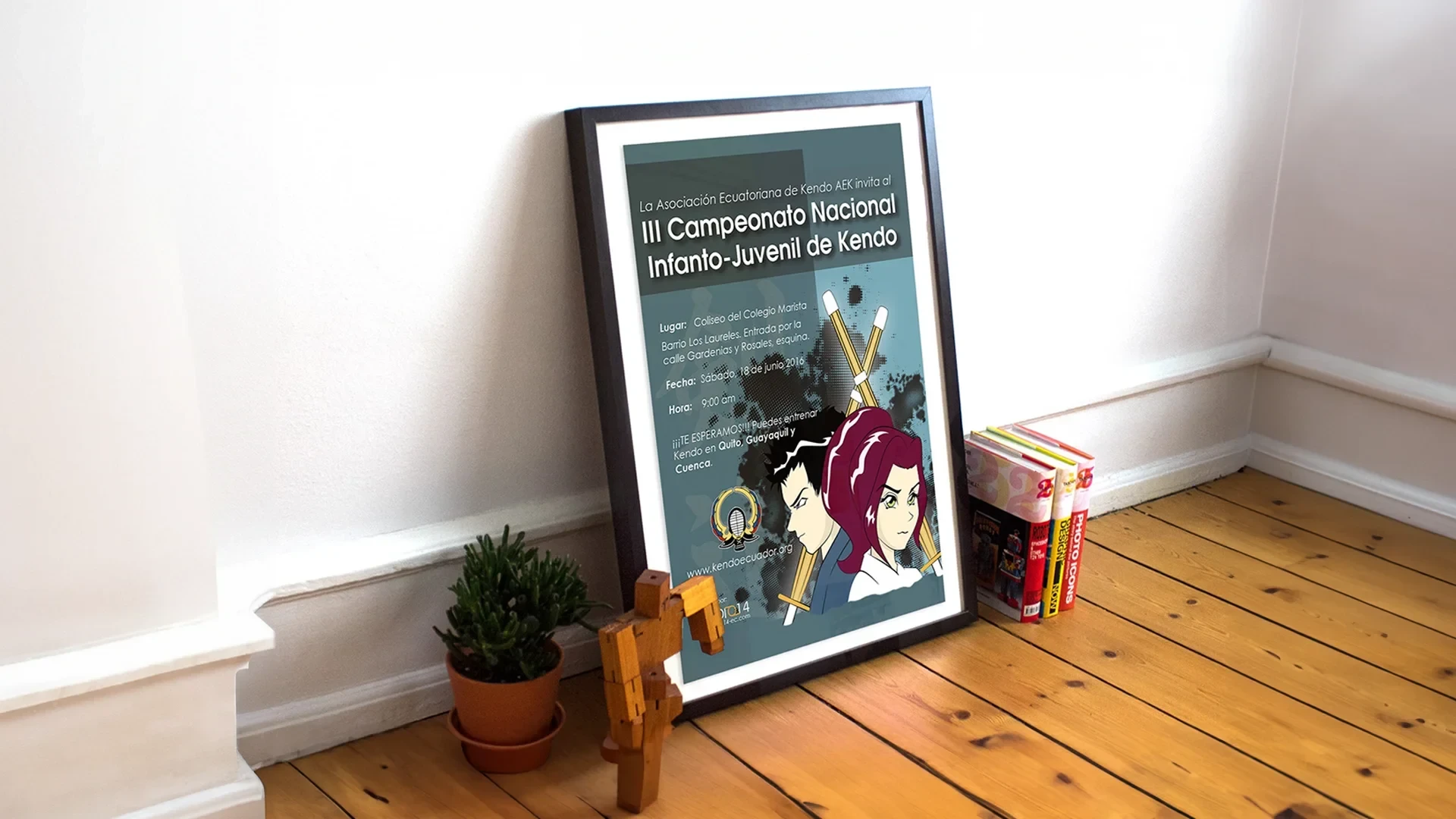
AEK (Ecuadorian Kendo Association) contacted me to redesign their logotype and their entire brand. AEK oversees all the Kendo (Japanese fencing) Dojos in Ecuador, as well as managing local tournaments, seminars, grading exams, towards the improvement and development of the martial art. The main request was to revamp the brand and create something that can be used in any type of media as well as differentiate themselves from other worldwide organizations.
Outcome
Since Kendo is a Japanese Martial art, I based my design approach on the Kamon (Japanese Family Crest) designs. My idea was to create a "family symbol" for the AEK as they act as a family for all the dojos in the country. Also, I took elements from the Ecuadorian flag and Kendo to combine them into something unique and different. My client was happy with the result, and they use their brand across all media and events they participate in, both locally and internationally.
Brand Change
The previous brand design didn't have any element to differentiate from other similar logotypes. It was clear in terms of typography, but it didn't show any element related to Kendo other than the Japanese characters (kanji) for the name of the martial art, and the place where everything started.
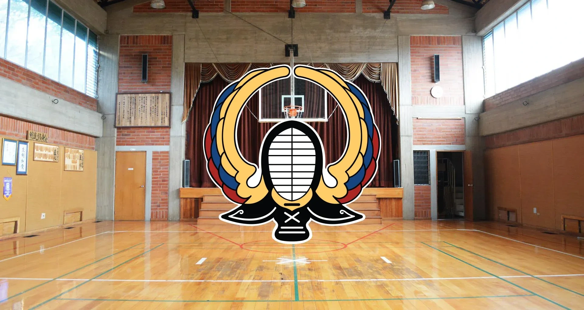
Based on the Kamon designs, I combined the Condor (national Ecuadorian symbol) with the mask of the Kendo armor, to create a symbol that represents both Ecuador and Kendo in a unique way.
Old Brand
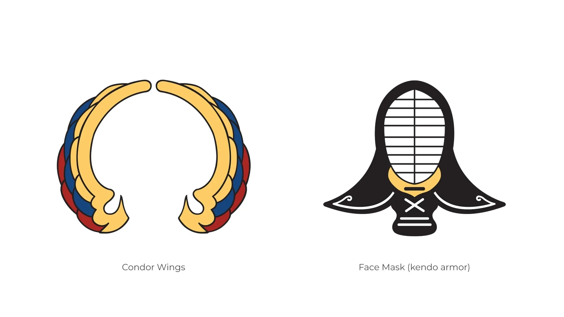
Combination of Elements
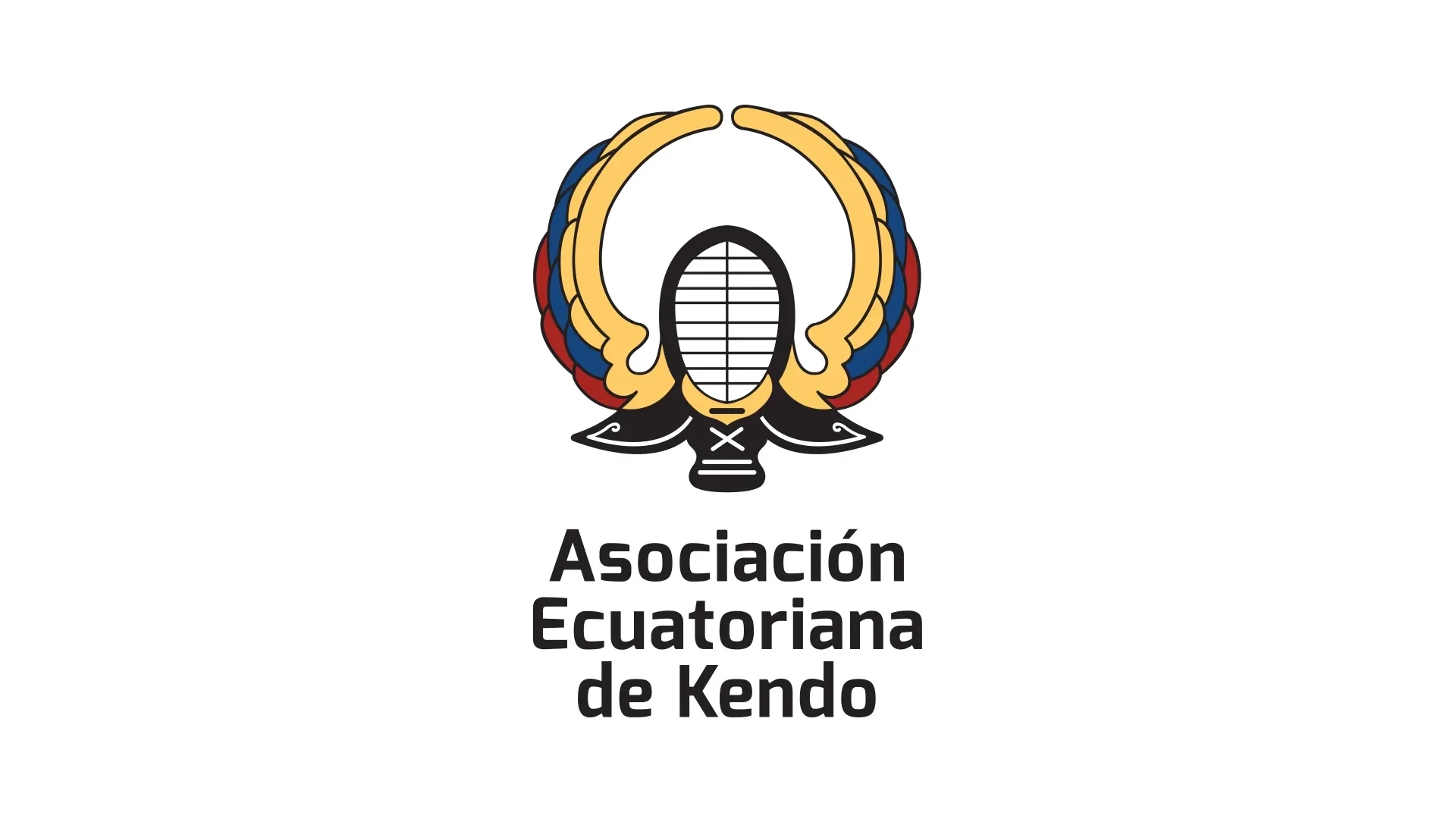
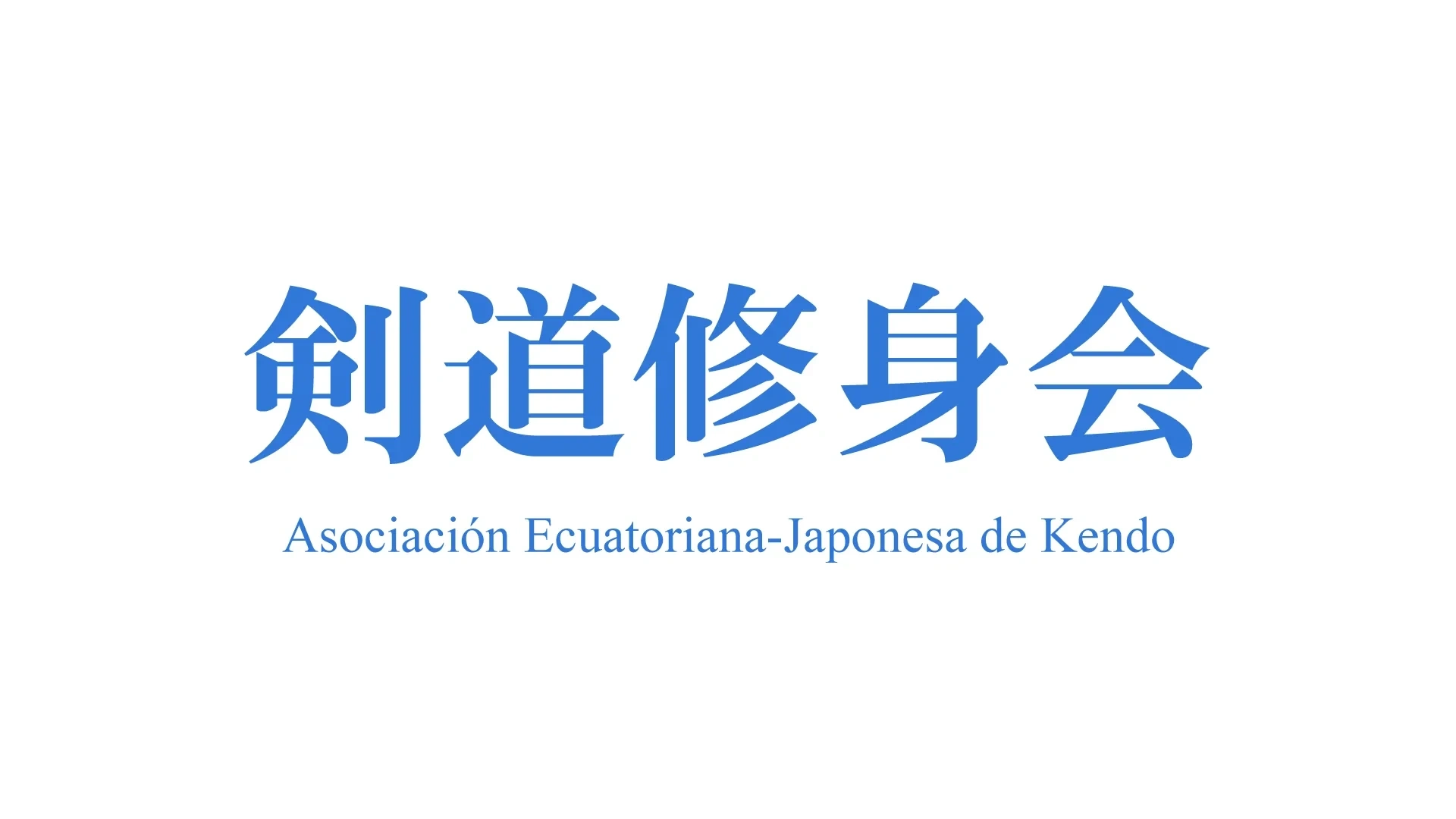
New Brand Redesign (Ecuadorian Kendo Association)
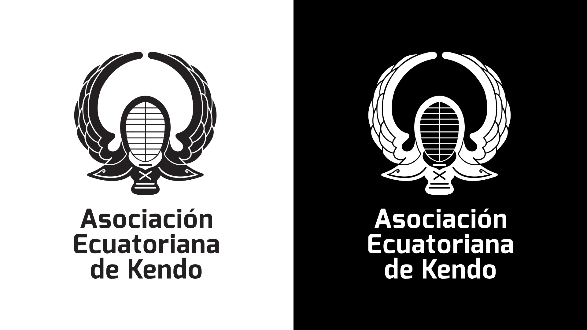
Black & White Versions
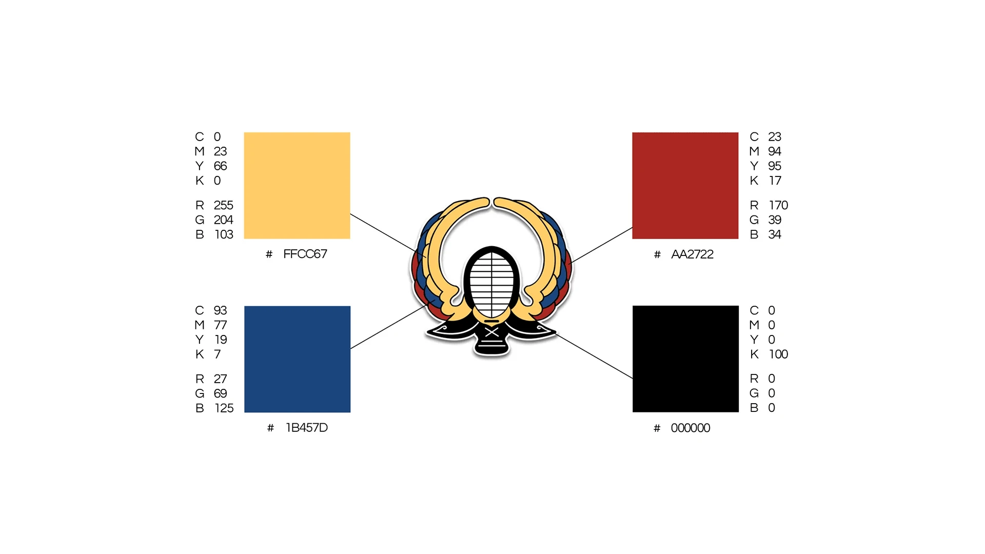
Colors for the Brand
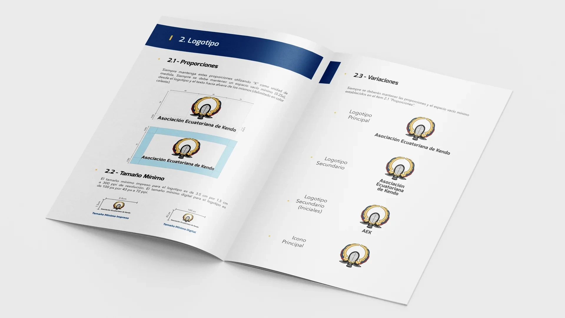
Brand Manual
Along with all the deliverables I designed a Brand Manual to help AEK to use their new brand in the best way possible across all the media they need it to be present. This manual included definitions on size usage, typography, examples of good and bad use, and more. Something to be referenced for future usage by AEK.
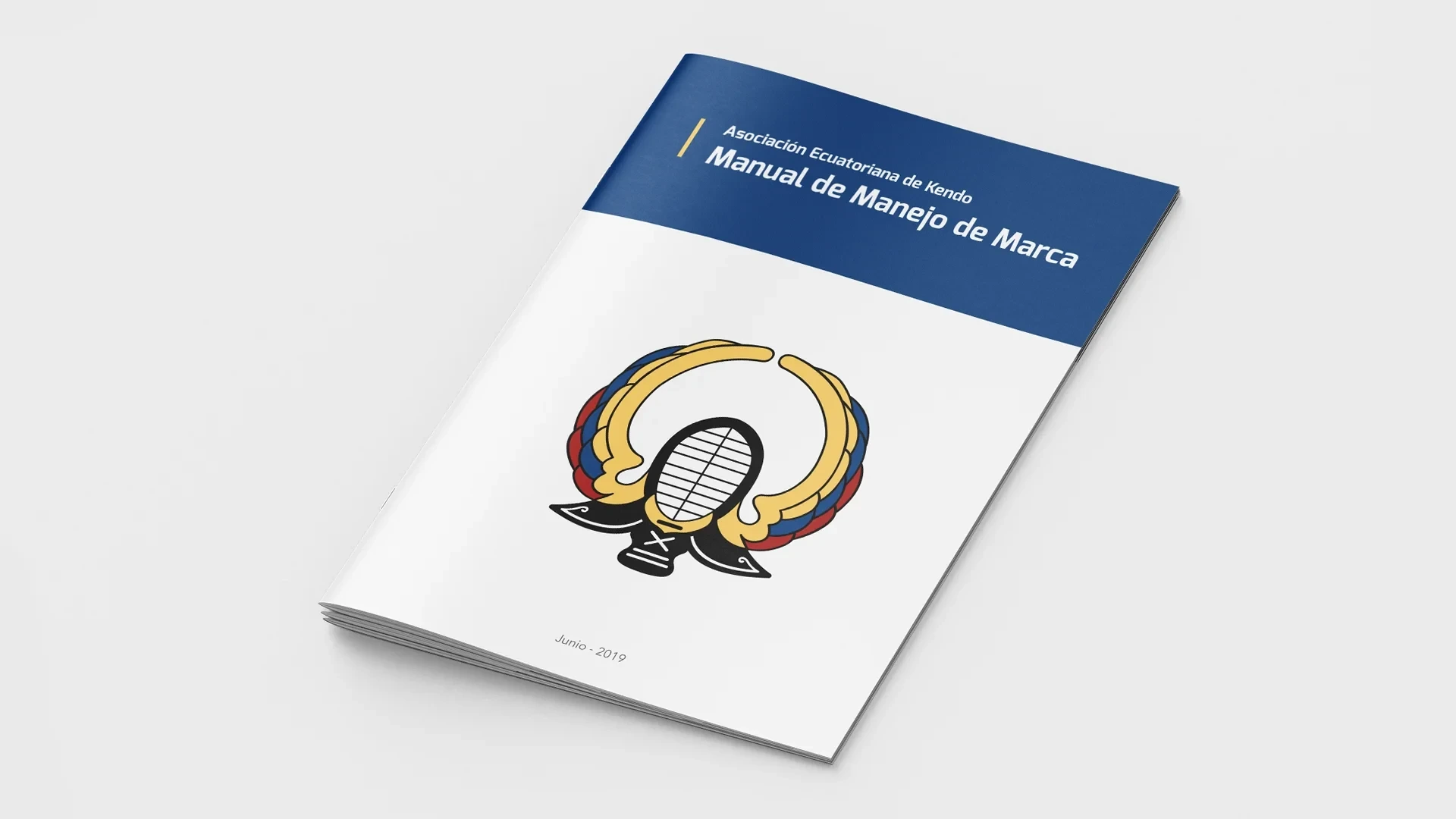
Brand Manual: Front Cover
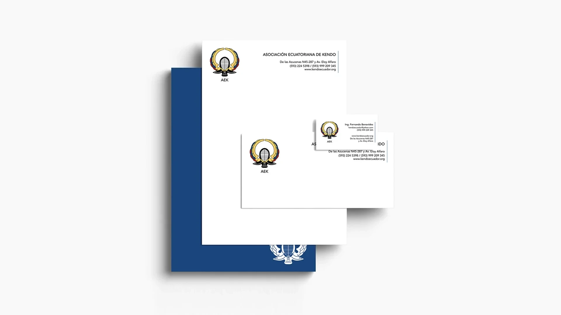
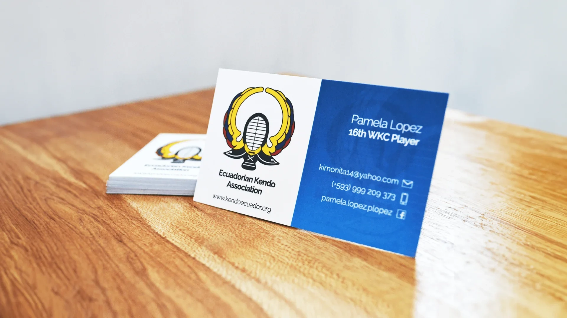
Brand Usage
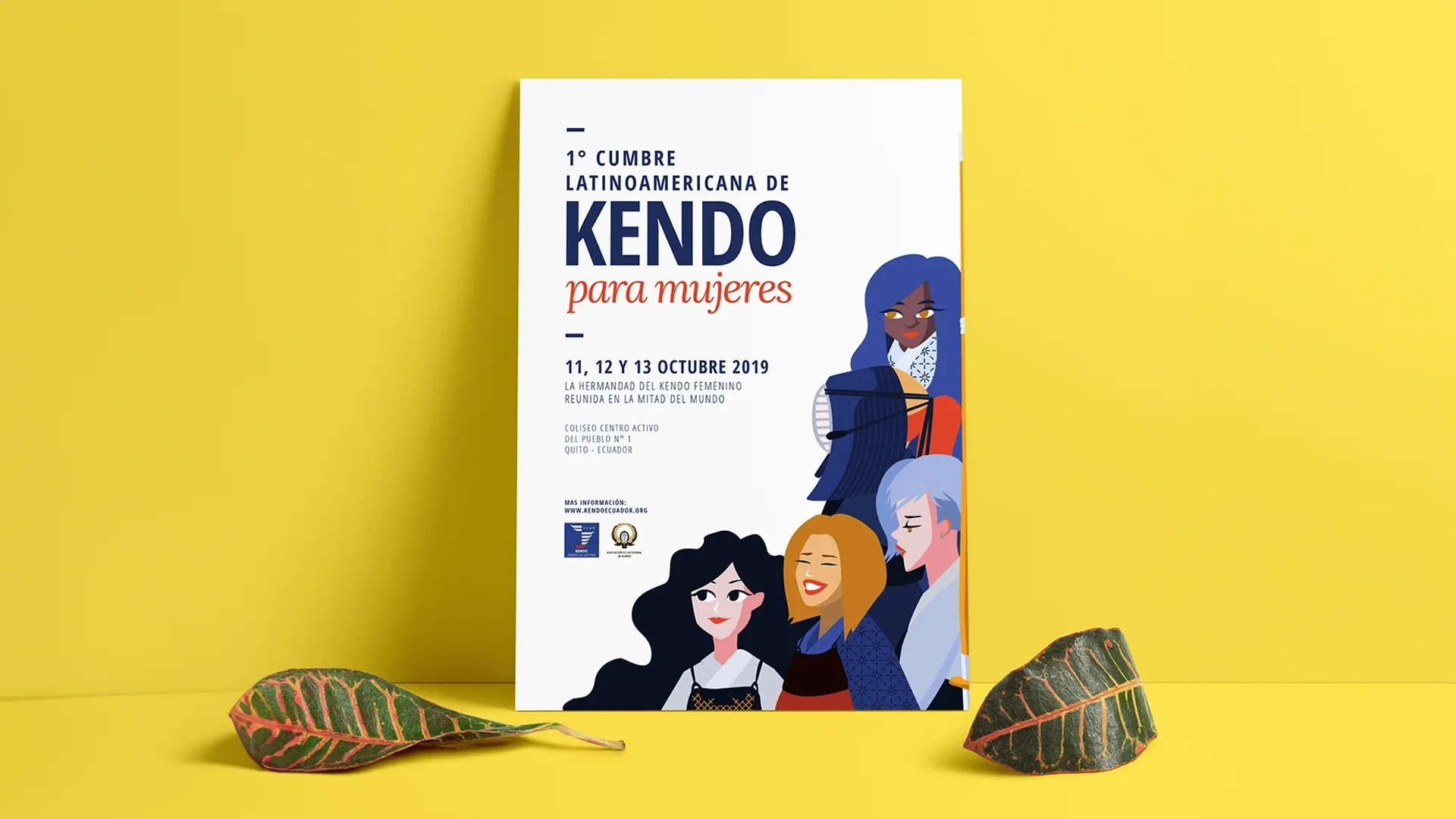
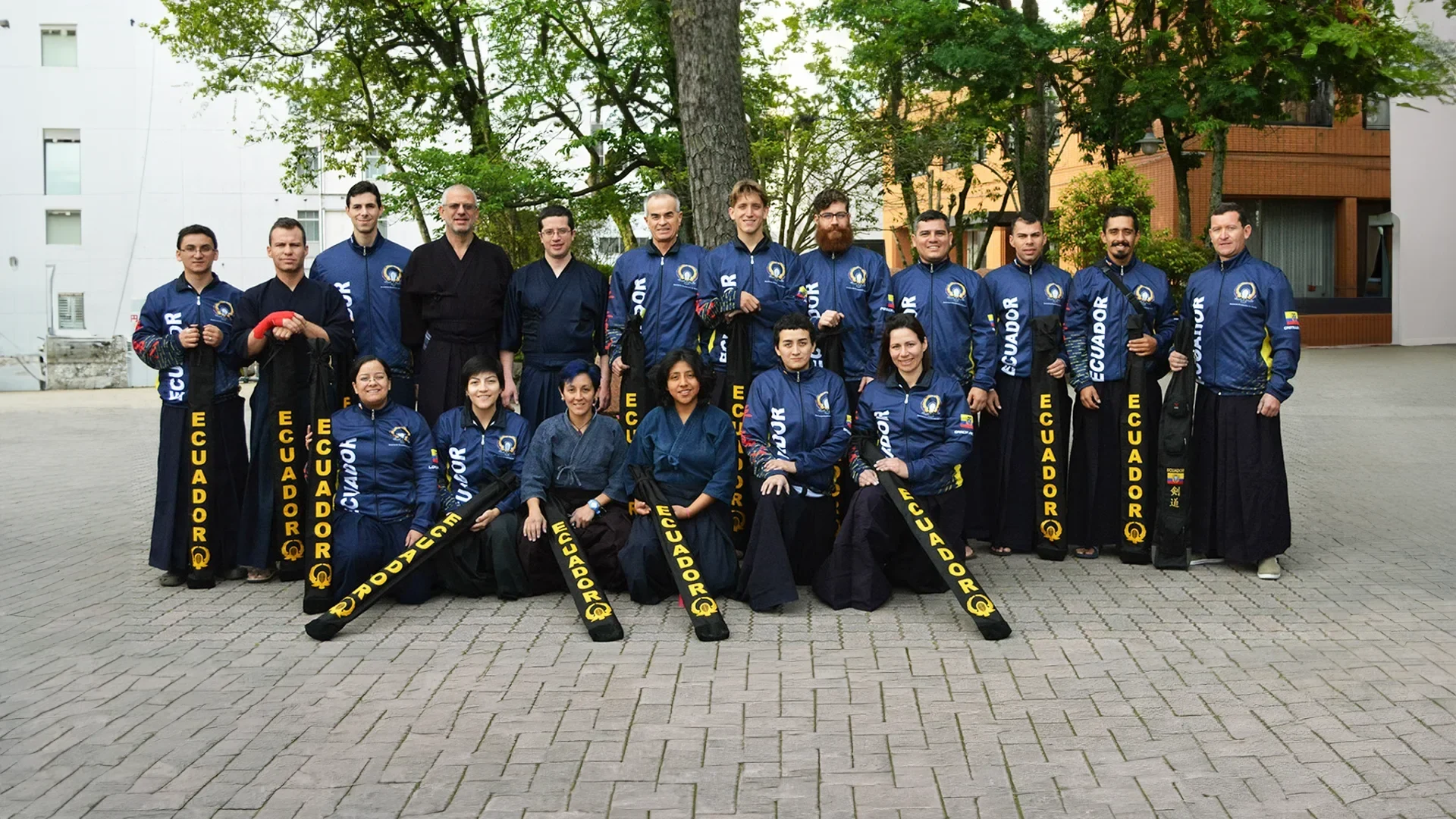
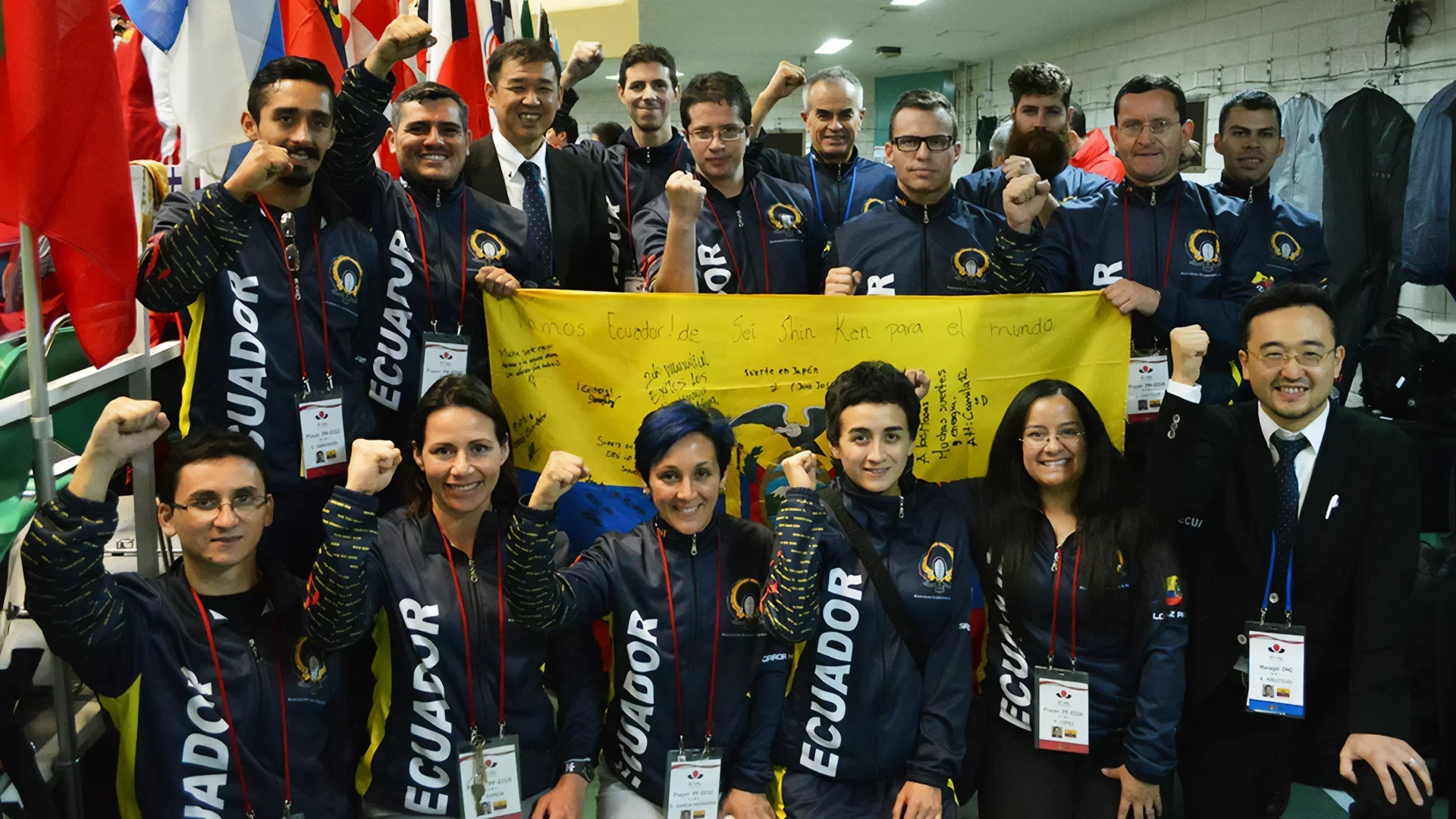
This new brand was used by AEK in a variety of events, tournaments, and seminars locally and around the world. The adaptability of the brand makes it easy to use, identify and remember no matter where the client uses it.
Like this project
Posted Sep 28, 2023
I redesigned a brand for a national sports organization in Ecuador, looking to create an everlasting brand image to help kendo grow nationwide.
Likes
0
Views
25