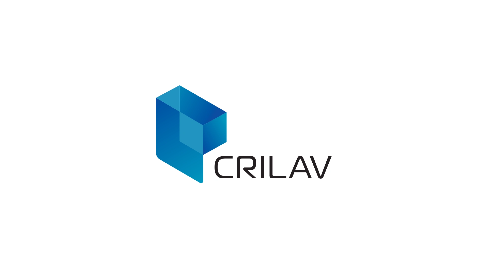
Logotype Design for CRILAV Consortium

Logotype Design
CRILAV Consortium is a software and technology development company based in Quito, Ecuador. They approached me to create a new logotype that represents their business. They wanted a logo that is easy to use across multiple digital as well as printed media.
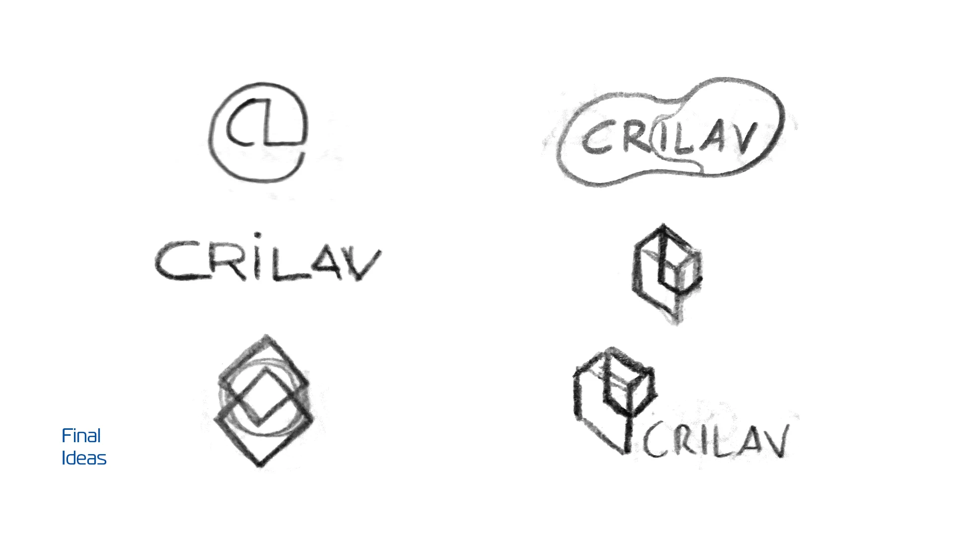
My approach for this logotype was to use the two main letters from both companies that are part of the consortium, "C" and "L". I tried a couple of ideas until I produced a form that I believe represents technology, simplicity, as well as dimension while being modern. I am happy to say that the client loved the result, and they are proudly using it in all the systems and tech they are creating.




Like this project
Posted Jul 24, 2024
Logotype design for CRILAV Consortium, a software and technology development company in Ecuador.

