Built with Ideogram
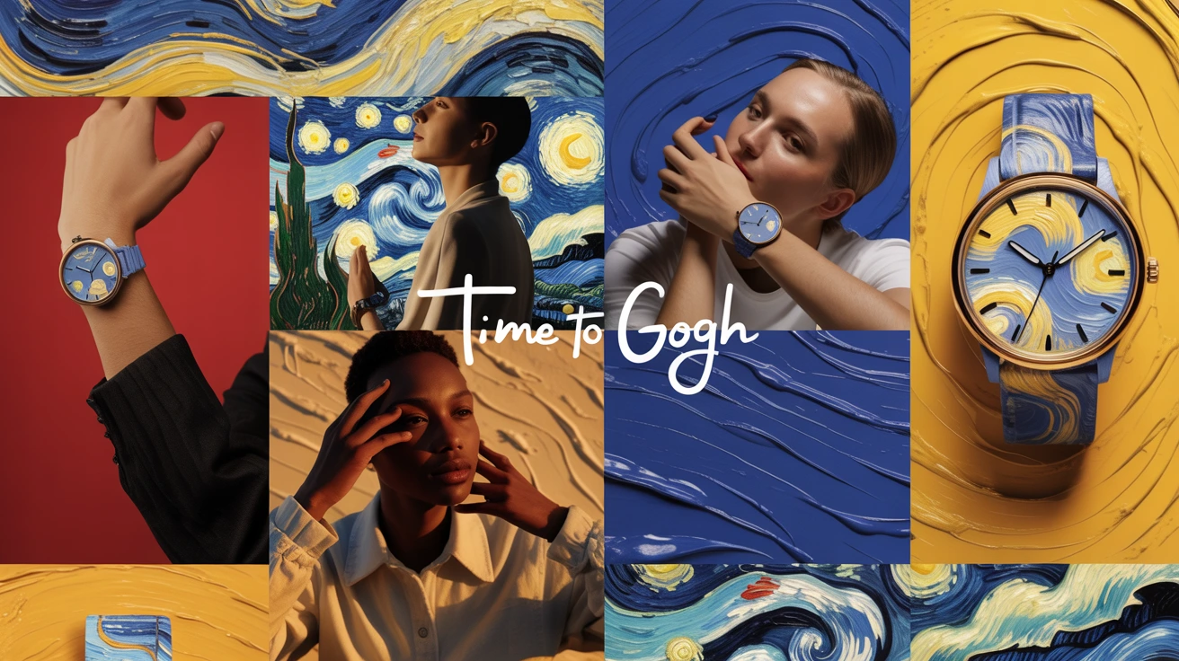
Time to Gogh Brand Identity Development
Chhavi Malik
The Idea
What if a watch didn’t just measure time but reminded you to move with it?
Time to Gogh began as a thought experiment:
how would a luxury brand look if it treated time like art; fluid, emotional, and never still?
The name holds the paradox:
to go and to Gogh; the urgency and the artistry.
Because to live beautifully is to leave with love.
moodboarding via Ideogram
The Brand Philosophy
We don’t keep time. We keep moving.
“Time to Gogh” isn’t just another watch brand about control or precision.
Instead it is about having the permission; the art of knowing when to move on,
when to begin, when to let something go.
The brand celebrates that human rhythm.
Each second, a brushstroke; each moment, a mark.
concept by Ideogram
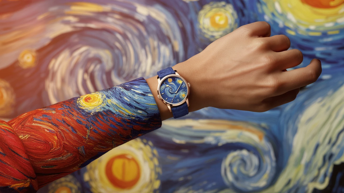
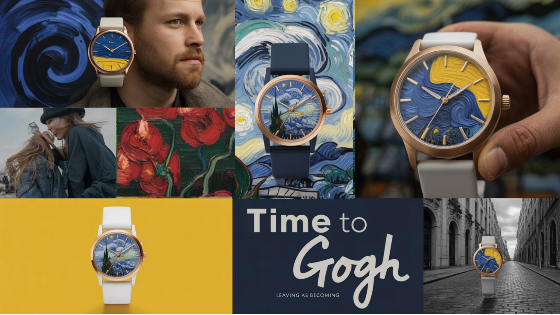
Visual Language
Van Gogh’s colors weren’t calm. They pulsed with feeling.
The brand borrows that language of motion within stillness to translate emotion into visual texture.
Cobalt Blue for introspection
Golden Yellow for courage
Mustard for grounding
Emerald Green for growth
Red for release
Every watch carries that palette
not as a mere decoration, but as dialogue.
Color as emotion. Time as movement.
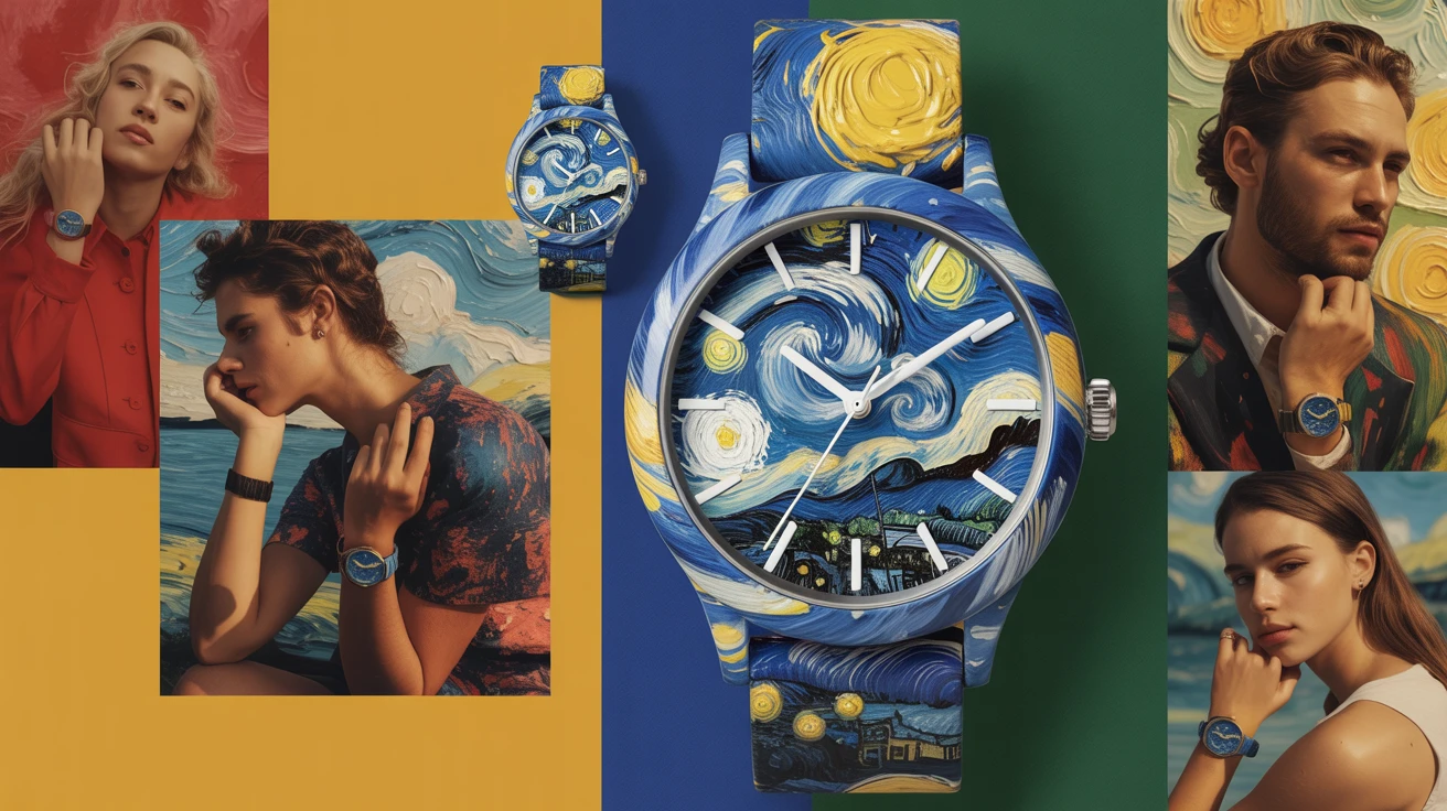
product concept via Ideogram
The Product
Each Time to Gogh watch face is a miniature canvas; a homage to the chaos inside clarity.
The swirling paint becomes time itself:
the brushstroke of a second hand,
the swirl of a decision made,
the texture of being alive.
“Wear the present like art.”
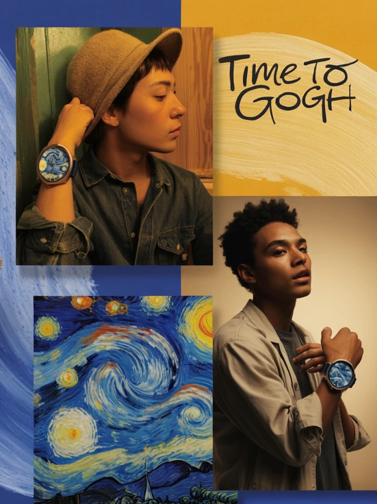
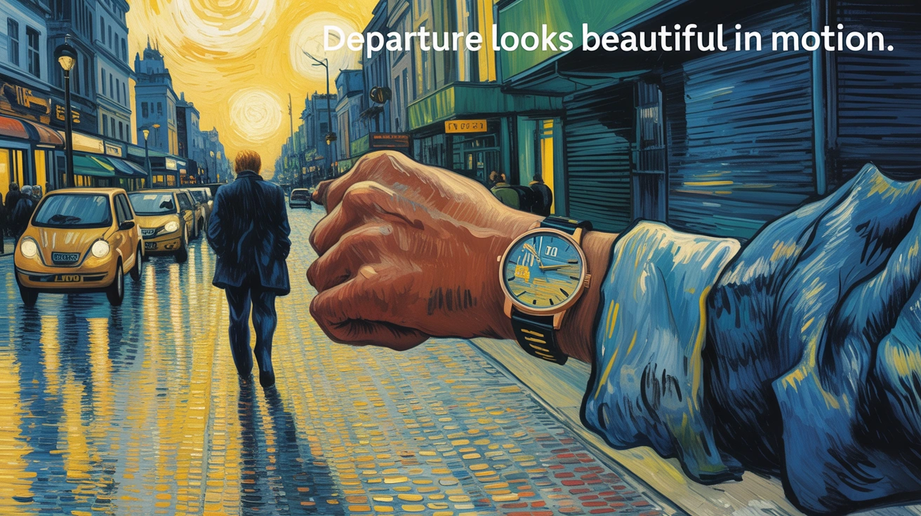
Brand Campaign
Concept: Leaving as Becoming.
Every ad explores motion as identity and how moving forward is not escape, but evolution. The idea is to remain in a constant state of departure, while always arriving.
Taglines:
The moment won’t wait.
Departure looks beautiful in motion.
Every tick is an invitation.
Time doesn’t stay it sings.
Each line is a sentence fragment from a story you can feel but not finish.
Because art like time; refuses to stop.
Campaign concept via Ideogram
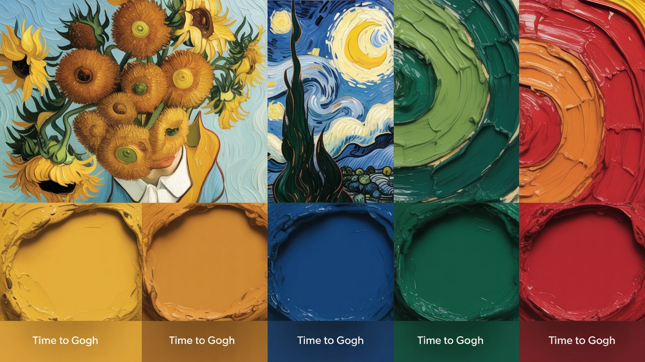
Brand Campaign
Concept: Color Stories (Palette Series)
Each color became a mood capsule; a campaign within the brand.
Star Fields — deep blue, for reflection.
Grain Waves — mustard, for resilience.
Soft Flames — red, for release.
Quiet Leaves — green, for renewal.
Bright Nods — yellow, for joy.
Each tone paired with its own short phrase:
“Time to Gogh — again, again, again.”
The Brand Voice
Minimal words, maximal feeling.
Every line written like it could hang in a museum.
The tone blends creative sensitivity with strategic restraint; a writer’s heart in a strategist’s rhythm.
Voice pillars:
Poetic, but grounded.
Philosophical, but clear.
Emotional, but measured.
The Strategy
The project’s goal was to build an identity that looked painterly but thought philosophically.
A system where visuals feel handcrafted and human, and the copy mirrors that.
Each phrase acts as both brand line and invitation.
“Time to Gogh” isn’t a slogan.
It’s a reminder that beauty is a moment you must move through to see.
Like this project
Posted Oct 18, 2025
Created a brand identity for 'Time to Gogh', a luxury watch brand emphasizing time as art using Ideogram.
Likes
6
Views
37