Brand identity – MIB Profisport
Štěpán Kráčmar
Introduction
Brand Rebirth
When the MIB Profisport team reached out to me, they asked for something seemingly simple — new Instagram templates. But a good designer doesn’t start by opening the graphic tool. A good designer starts with questions.
Why do they even want new templates? How does Instagram connect to their business? And most importantly — what do they want their communication to achieve?
After roughly an hour of conversation, the picture started to get clearer. It wasn’t about a visual facelift. It was about a brand transformation — about making MIB Profisport look as professional as they actually are.
Brand & Audience Analysis
An Agency for True Stars
I did a deep analyses of the company — we created core values, brand personality and market positioning, as well as user persona and competition evaluation. And we have found the core problem:
The MIB Profisport brand didn’t reflect its own professionalism.
It looked like a small local agency, even though in reality it offered world-class experience and a top-tier approach.
Players didn’t feel properly represented.
Clubs didn’t perceive MIB as an equal partner.
Key values — trust, expertise, growth — were getting lost in translation.
Redesign Goal:
To build a modern brand that visually and verbally embodies professionalism, trust, and the energy of sport.
Core Problem: Missing Identity
MIB had almost no distinct visual style.
On Instagram, they relied mostly on reposts from clubs, and the only original logo on their website suffered from fundamental issues: poor contrast, low readability, zero adaptability, and no narrative behind it.
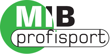
Old logo
Logo design process
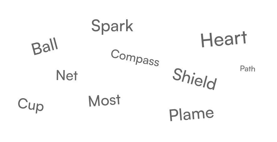
There's a specific process when I create a logo. It's got three parts:
15 words that could represent the brand — these became the foundation for the symbolic direction of the logo.
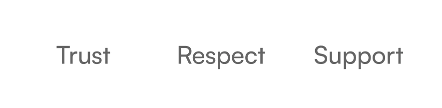
10 emotions and values, from which the client selected the three key ones.
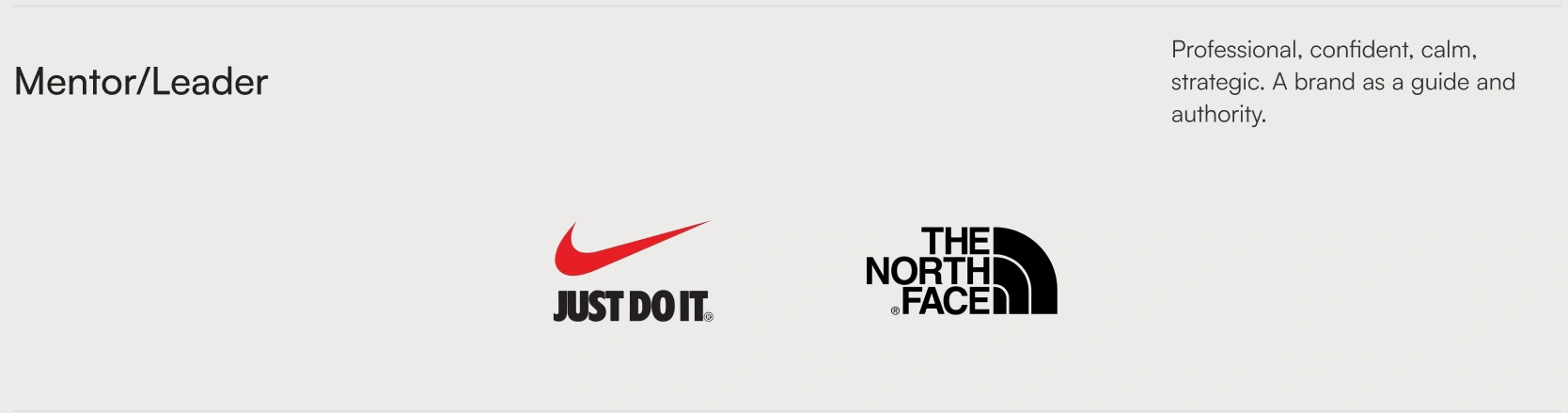
Three possible brand profiles, illustrated with real-world examples.
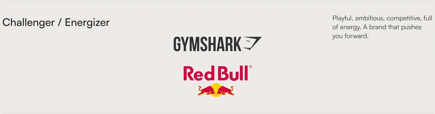
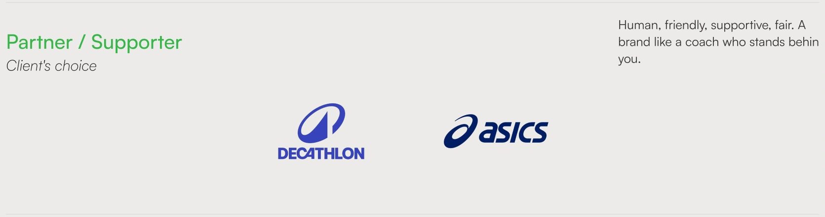
This gives us a better understanding for the path forward.
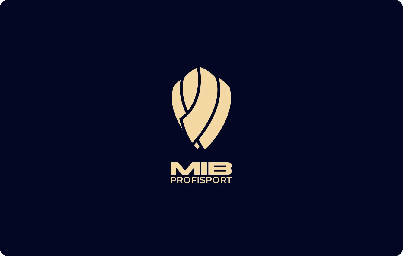
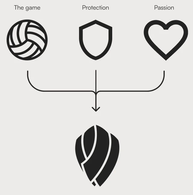
Logo
I connected three words from the word list
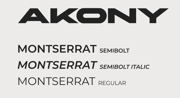
Typography
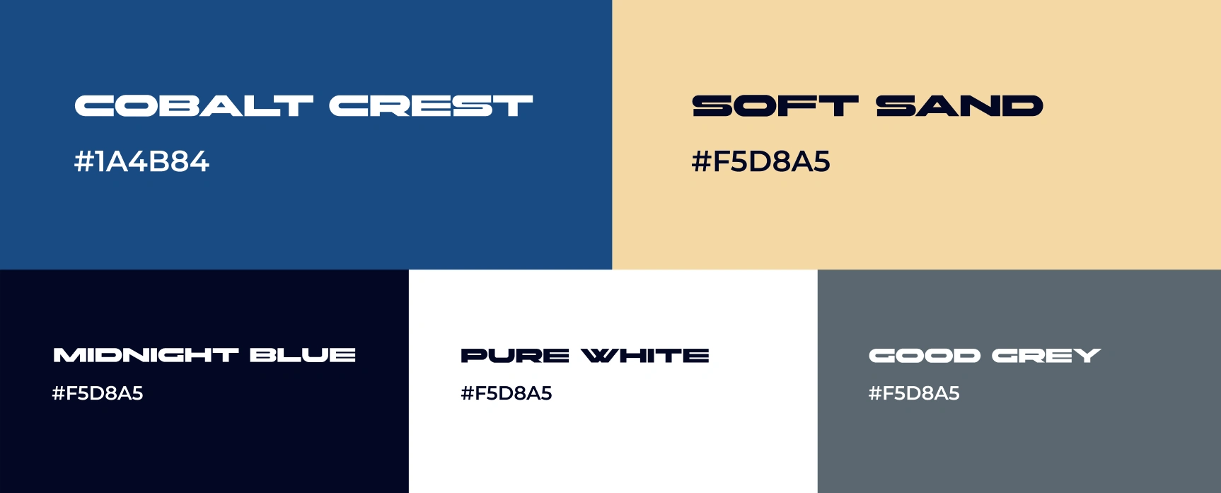
Palette
The colors were based on the emotions and values we defined with the client at the beginning of the process.
Uses
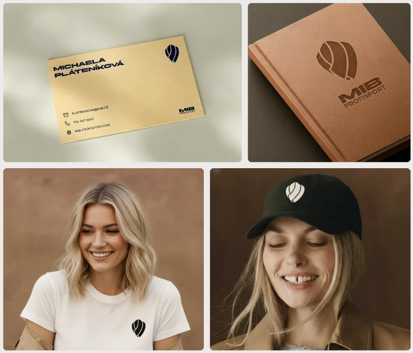
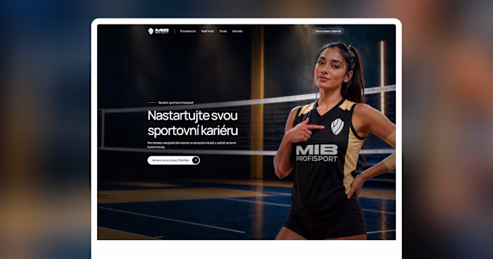
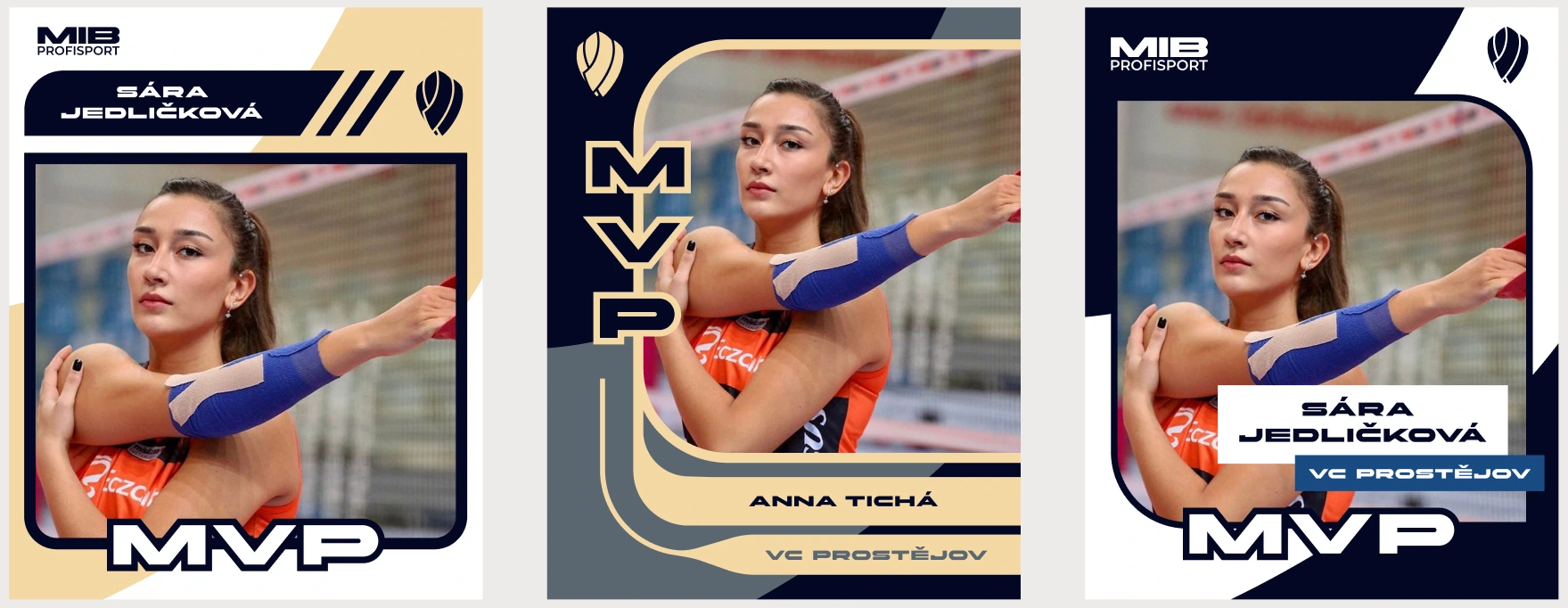
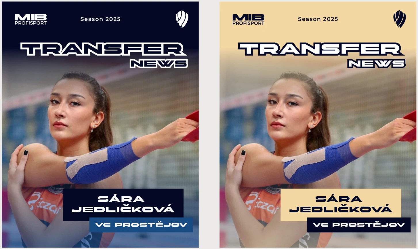
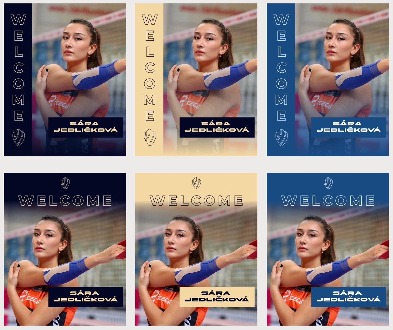
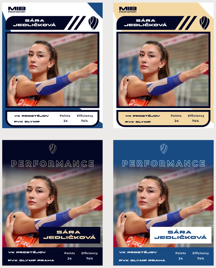
Social media templates
It was time to move on to creating Instagram templates.
Since one of the key goals of the brand transformation was to make players under MIB Profisport feel like stars, I took inspiration from player cards for the MVP template. The rest of the templates were designed with a minimalist and functional approach.
MVP
Transfer
Welcome
Performance
Like this project
Posted Jan 12, 2026
Branding for volleyball agency MIB Profisport