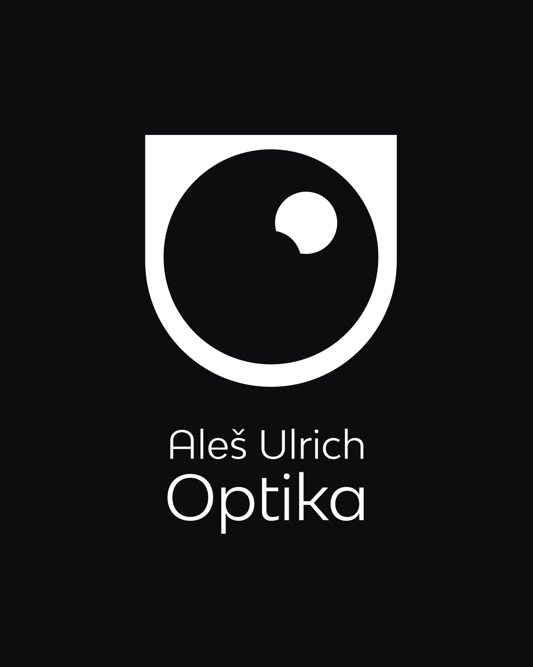
Logo Design for an optician shop
Štěpán Kráčmar
We look every day.
But we rarely truly see.
The logo for Aleš Ulrich Optika, an optician shop, was built on the idea that vision is not just a technical service, but a relationship with the world.
A glance. A connection. Trust.
Client
Optika Aleš Ulrich is an independent optician focused on precision, care, and long-term relationships with clients.
The challenge
The main problem wasn’t visibility — it was distinction.
In a market full of generic optical stores, the brand lacked a clear visual identity that would communicate trust, professionalism, and human approach at the same time.
Target audience
Clients who value quality over trends.
People looking for expert care, calm atmosphere, and a place they can return to for years — not just a quick purchase.

The approach
The logo was not designed for the client, but with the client.
We began with a collaborative workshop:
15–20 key nouns defining the brand’s core (vision, clarity, care, trust, precision…)
→ shaping the visual language
10 emotions and values
→ defining the color palette and contrast
Design process
The logo development included:
over 50 initial sketches,
exploration of symbolism, balance, and reduction,
selection and refinement of the single concept that best captured the brand’s essence.
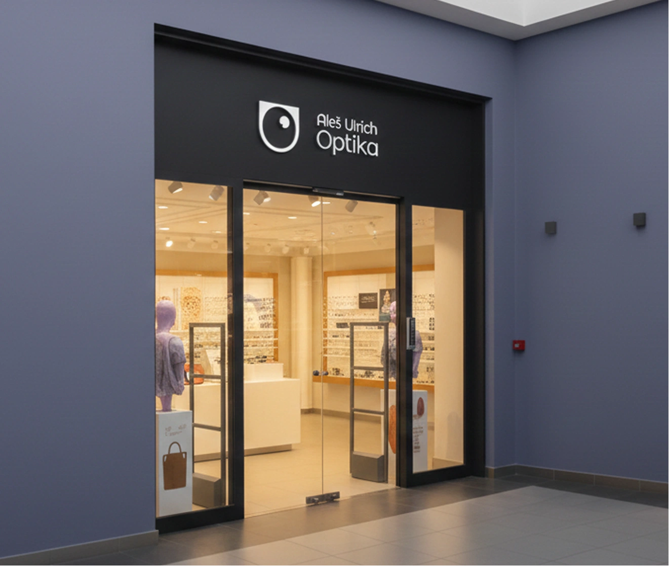
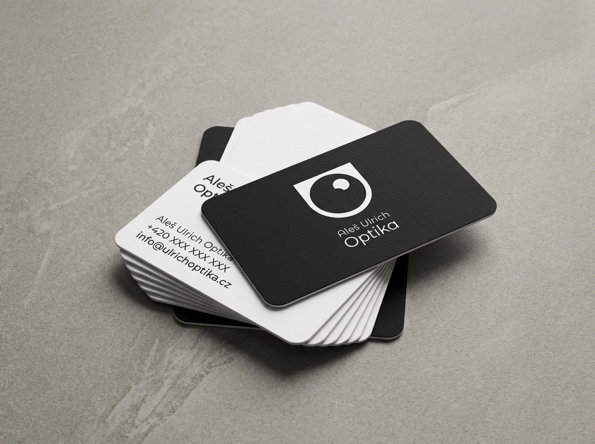
The final mark is a reduced eye symbol — precise, calm, and timeless — designed to work across storefronts, print, and digital touchpoints.
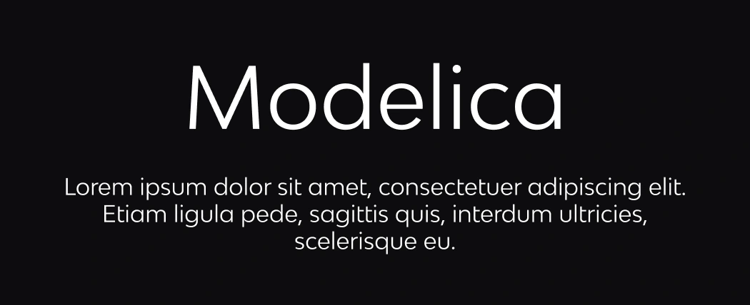
Typography
Just as vision should be clear and sharp, the typography is direct and uncompromising.
Modelica was chosen as both the primary and secondary typeface.
Its geometric structure, high legibility, and neutral character support the brand without drawing attention to itself.
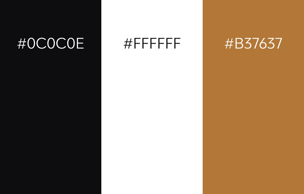
Color palette
The color palette is built on clarity and contrast.
Black and white form the foundation of the identity —
representing precision, legibility, and professional confidence.
They ensure the brand remains timeless, clear, and highly functional across all applications.
The brown tone is used only as an accent.
It adds warmth and a human touch without disrupting the overall calm and minimal character of the brand.
Color here doesn’t decorate.
It supports focus.
Result
A visual identity that feels professional yet human,
distinct yet quiet,
and built to last.
Like this project
Posted Jan 13, 2026
The logo for Aleš Ulrich Optika, an optician shop, was built on the idea that vision is not just a technical service, but a relationship with the world.
Likes
0
Views
1