Redesigning Pay4Me's Landing Page for High-Stakes Peace of Mind
George Philip
Redesigning Pay4Me's Landing Page for High-Stakes Peace of Mind
🧠 Problem
Pay4Me is a fintech platform that helps African students and immigrants pay tuition, visa, and application fees internationally. The product works, the service is reliable, but the homepage doesn’t reflect that. Users landed on the site, stayed for a few seconds, then left.
After some research, I found that the problem here was trust. The headline promised “Cross-border Payments for International Students”, but nobody was clicking anything.
Why? Because the homepage, or rather the hero section, was solving the wrong problem.
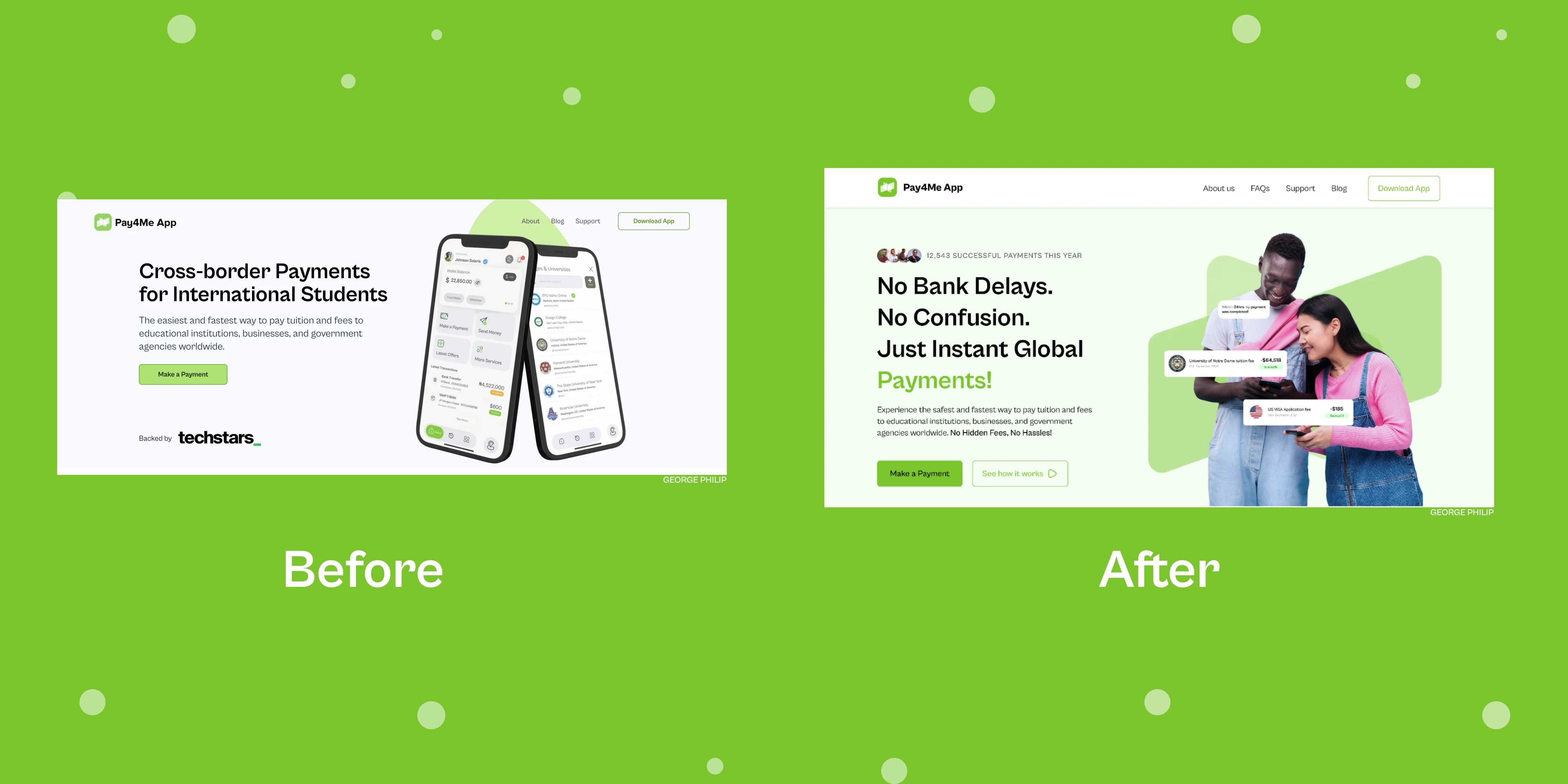
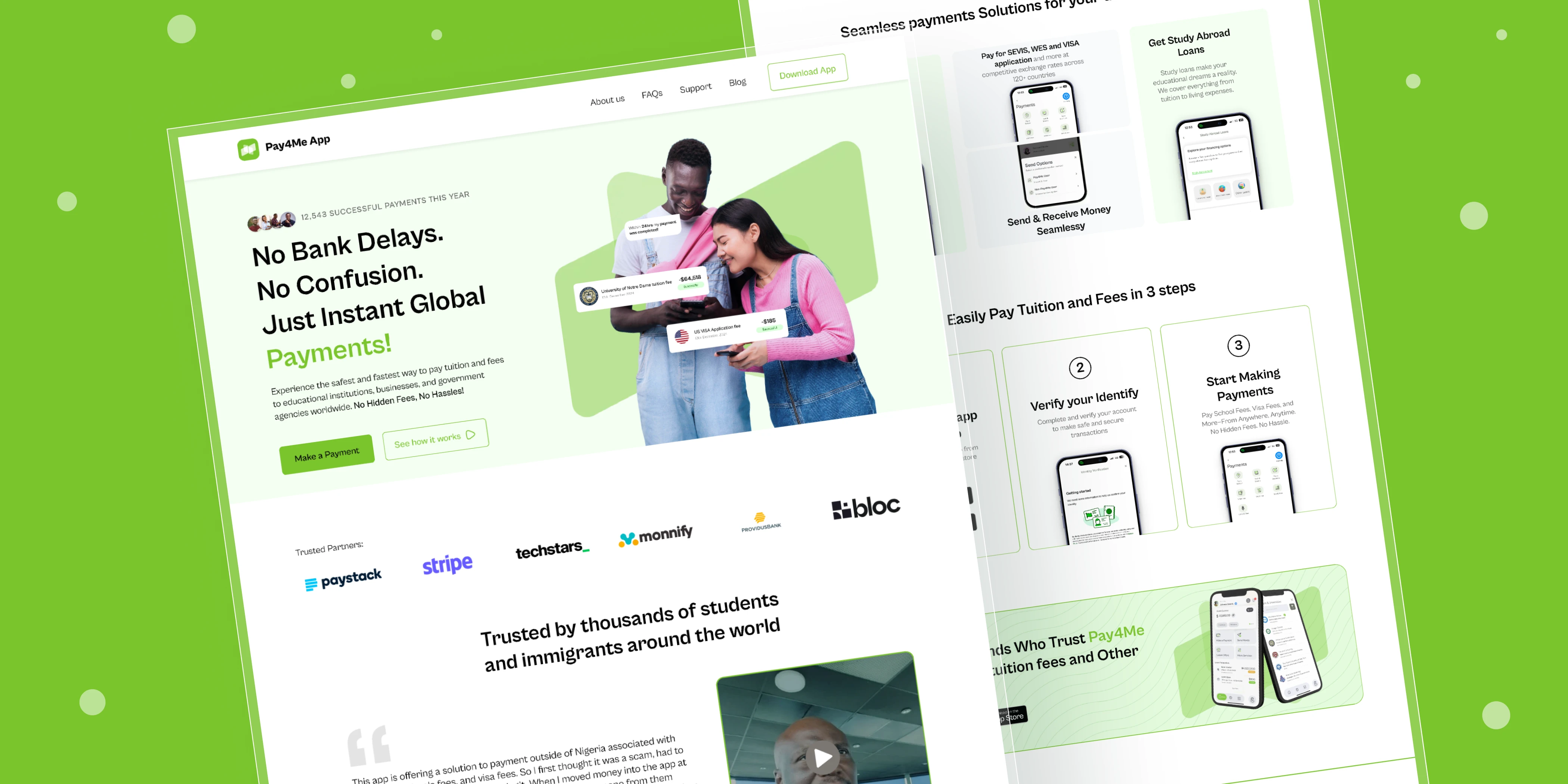
redesign of pay4me app homepage
🔍 Insight
When someone’s about to send $10,000+ across borders, “cross-border” isn’t exactly what they care about. They want to know:
“Can I trust this platform with my money?”
What I Discovered
While most designers would’ve optimized flows or cleaned up the UI, I started by reading what people were saying in Telegram groups, App store reviews, Reddit threads, and student forums. What I saw was telling:
“Has anyone actually used this app with real money?”
“My cousin lost $3,000 on a scam platform.”
“I’m scared of clicking ‘send’... What if it disappears?”
Nobody was asking about features or rates. They were asking if this was safe.
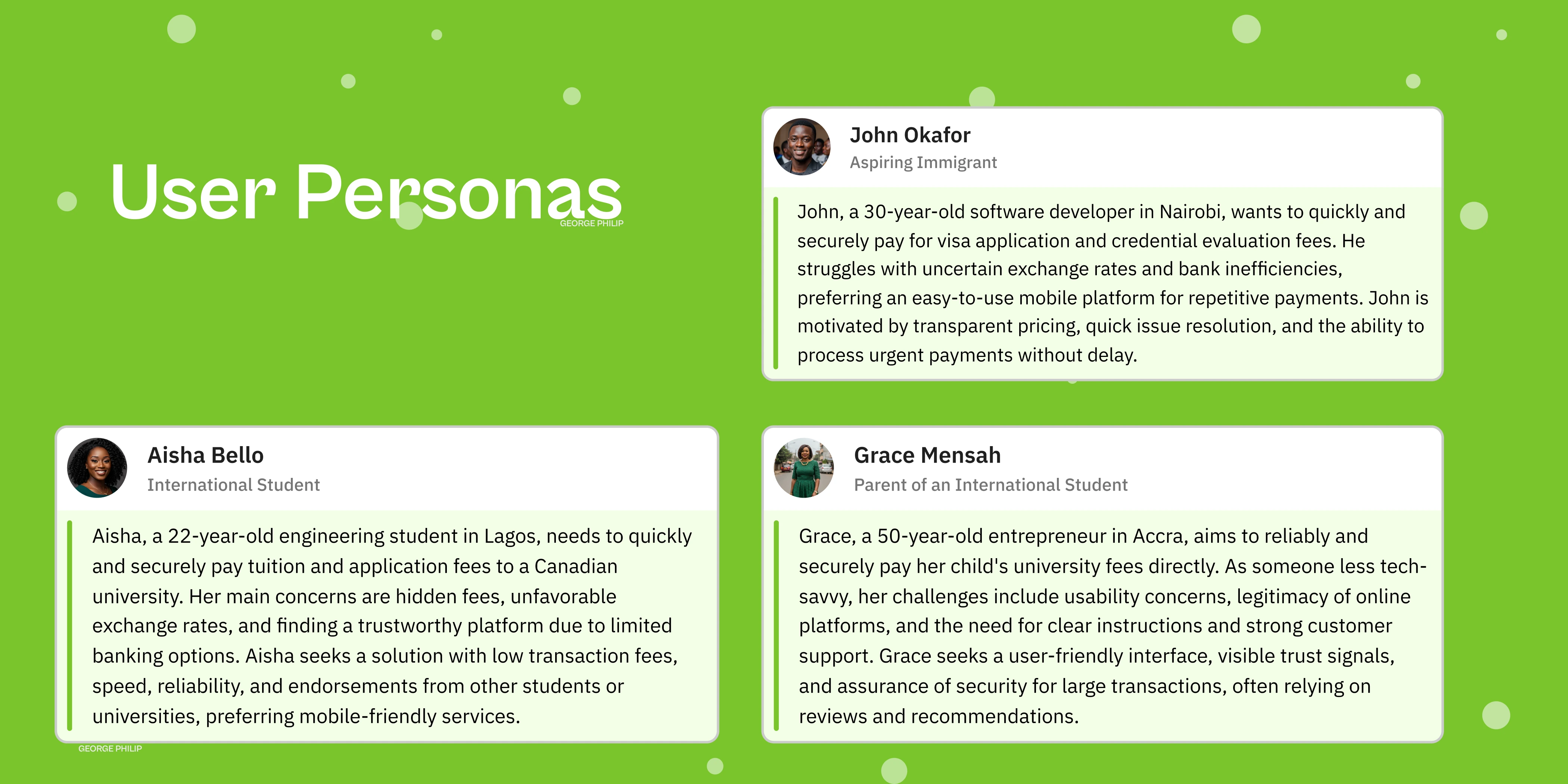
user personas
That insight reframed everything.
🎯 Solution
I redesigned the homepage to focus on trust first, not speed or “cross-border”.
✅ New Copy
Old:
Cross-border Payments for International Students
The easiest and fastest way to pay tuition and fees…
New:
No Bank Delays. No Confusion.
Just Instant Global Payments!
This copy is more human, more specific, and directly addresses what users are actually worried about.
🔄 Dual CTAs
Instead of one generic button, I added two:
“Make a Payment” for action-first users
“See How It Works” for skeptical users who need clarity first
🧍🏽♂️ Visual Representation That Converts
I replaced the app's mockup interface with diverse student faces - a Black male student and an Asian, the kind of people actually using the product. This immediately made the experience feel more personal and relatable. This wasn’t about diversity optics. It was about making users see themselves in the product.
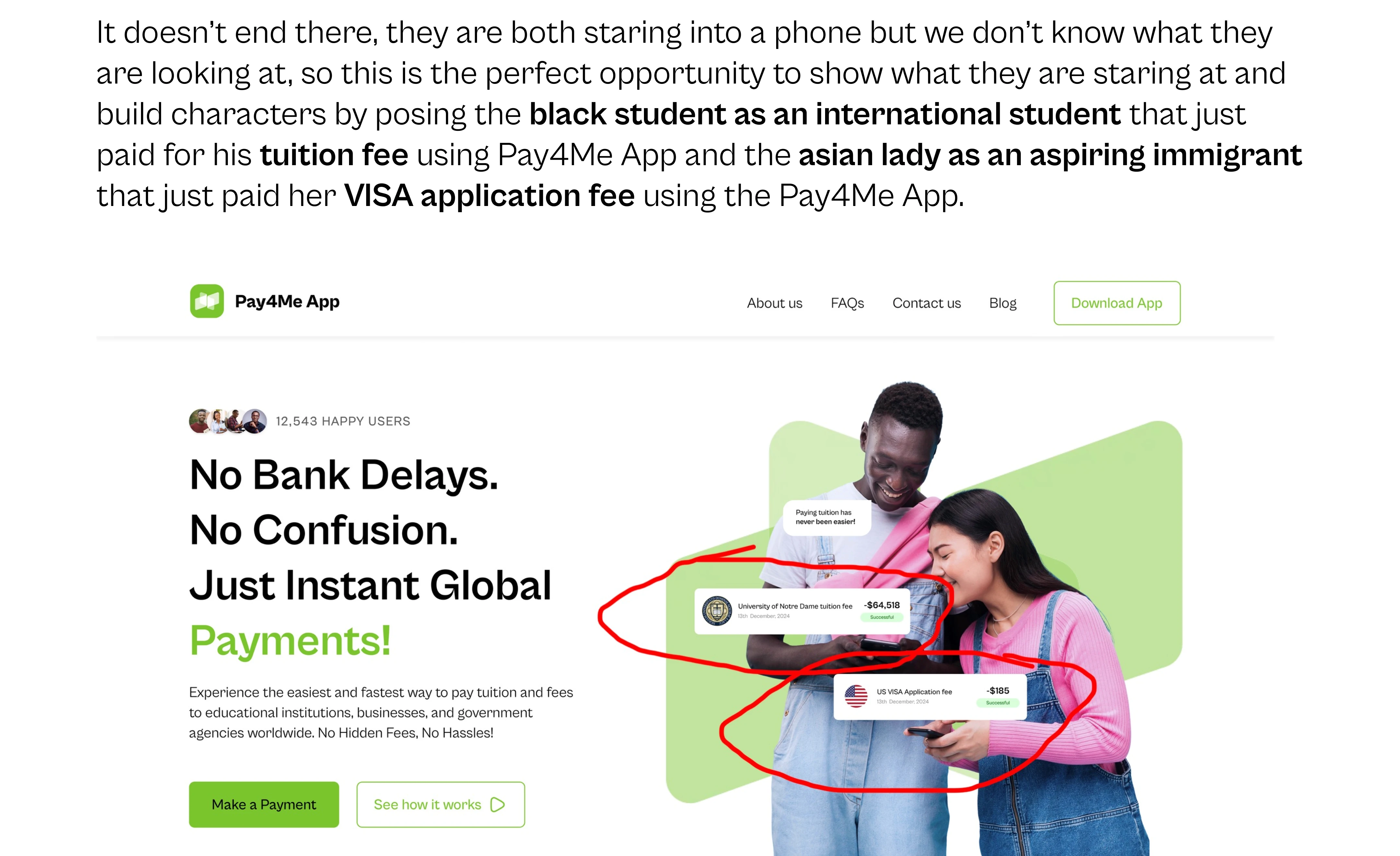
strategically placed elements to explain what they are srating at
🔐 Trust Signals
I added:
A real usage stat: “12,543 successful payments this year”
ScamAdviser verification badge
Visible security guarantees
Raw user testimonials placed right below the hero section
Expected Outcomes
Since the redesign was built on research and conversion-focused UX principles. Here’s what we expect:
+40–60% homepage-to-app conversion lift
Lower bounce rate by 30–50%
Users spending more time on the page (goal: 60+ seconds)
Fewer support tickets asking, “Is this legit?”
✏️ My Role
UX/UI Design · Strategy · Copywriting
I led the entire homepage redesign, from user research to Figma mockups to brand copy.
🛠 Tools
Figma, Google Analytics, App Store Reviews, Reddit
💬 What This Project Says About My Work
I don’t just make things look good. I design for what people feel when they hit your site. In this case, I solved a trust problem nobody was addressing. And I did it with clarity, empathy, and real user insight.
Why I’m the Designer You Need
I don’t just build interfaces; I solve problems for people who feel stuck. This project pushed me to dig deeper, fight harder, and design smarter. I turned user stress into trust, backed by data and grit. Whether it’s a fintech app or your next big challenge, I bring empathy, strategy, and results that make users and businesses win. I’m not here to blend in; I’m here to change the game. GET IN TOUCH!!
Like this project
Posted Jul 18, 2025
Redesigned a fintech homepage to fix a trust problem. Focused on safety and clear copy to help students pay tuition confidently.