Photography Business Portal Redesign

OTumininu Paseda


Picture This: Photography Business Update
Software: Figma | Year: 2025
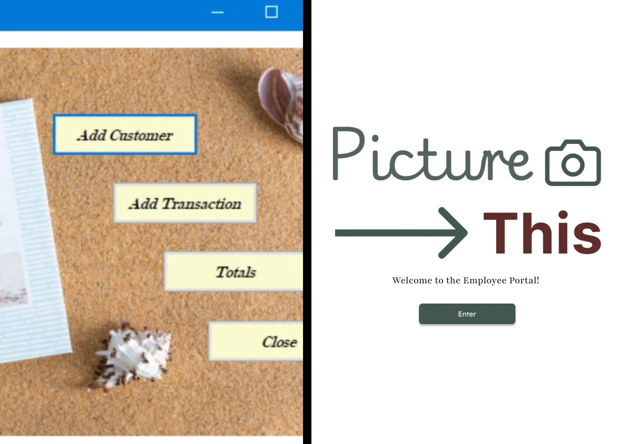
In the fall of 2018, when I was still in college, I created a photography website for a course in Visual Basic. In 2025, I revisited that project.
Project overview
In my university Visual Basic Course (Fall 2018), I was tasked with developing a data management system for a small photography business. Though the focus of the project was programming, I put more effort into the UI and visual design. I created five colorful pages that navigated users through the assigned tasks. Though I am still proud of my work, I thought it could use a visual update.
Problem Statement
Employees of the photography company, Picture This, have been recording client and transactional information in their database for years. As the company grows, their database struggles to keep up with demands. It’s slow, clunky, and, at times, difficult to maneuver. The increase in clients makes it difficult for representatives to quickly record and find clients and transactions. They are in need of an updated system.
Key Changes/Scope
The original project had more tasks and a larger focus on data management. This minor redesign will act as a proof of concept with a focus on three screens. The title screen, the Add Client screen, and the Transactions screen. As the UX designer, I will use Framer to create a website that is more efficient, more effective, and more visually appealing.
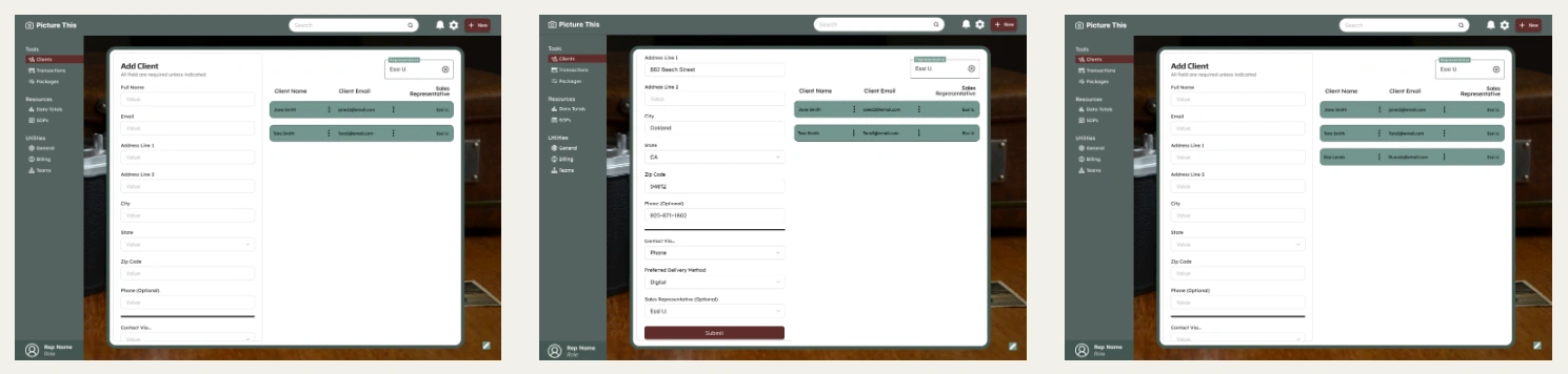
Below are the original screenshots of the screens that I will redesigned:
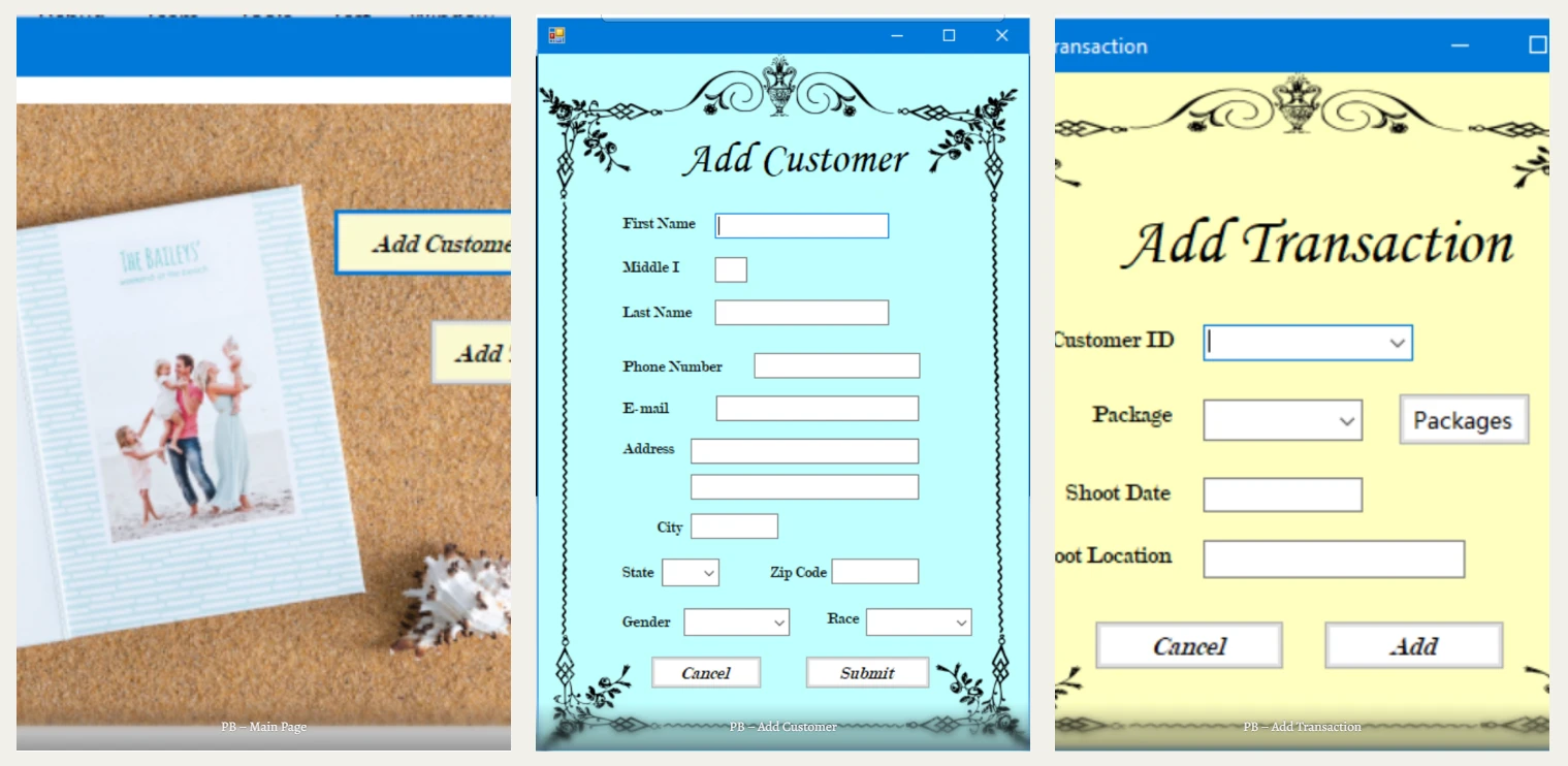
Main Page; Add Customer; Ass Transaction
Mock-ups
As this is a redesign, I started off with visual designs that I could build off of. Yet, the final mock-ups came out very different from my project from six years ago.
Title Page
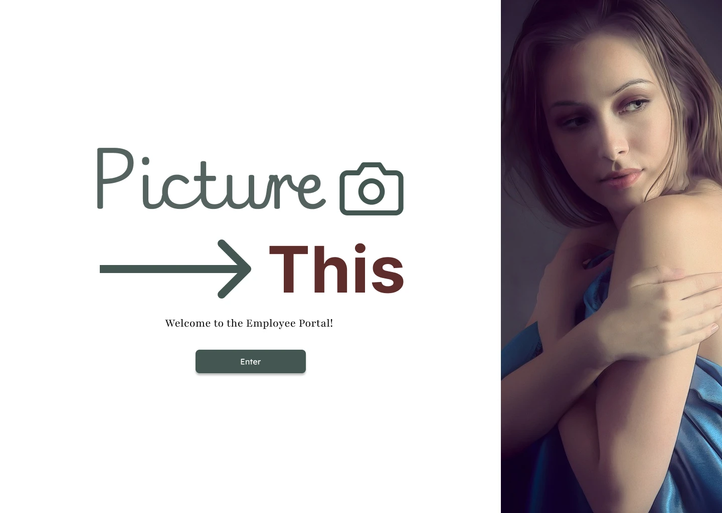
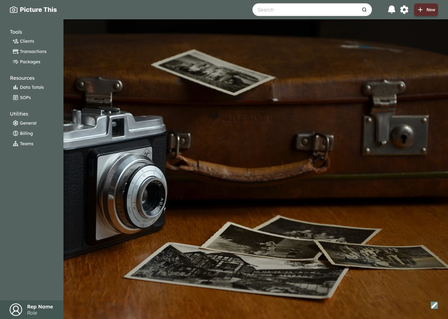
To make it clear from the beginning that this is a portal, I made sure to clarify that users were being welcomed into the employee portal. On the main page, I took the time to show off the branding of the portal: deep greens with a burgundy accent. The placeholder logo is the camera icon, so I also spotlighted that. The most eye-catching visual on the page is the slideshow that cycles through pictures every few seconds. This slideshow would be filled with the business’s work samples.
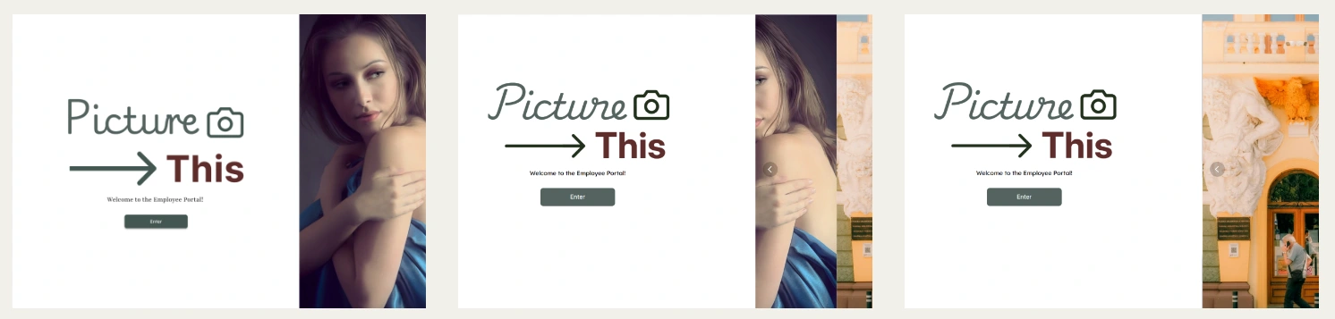
It’s a simple first page, but it tells the user two things:
This is an employee-facing portal.
This is a photography company that’s proud of its work.
Client
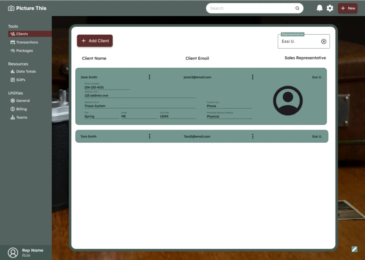
The client page has two goals: add clients and view clients. The first thing users will see will be the list of all clients. Users can filter the list by sales representative and expand each client bar with a click. When expanded, the user will be able to see all the data entered at the creation of the client record.
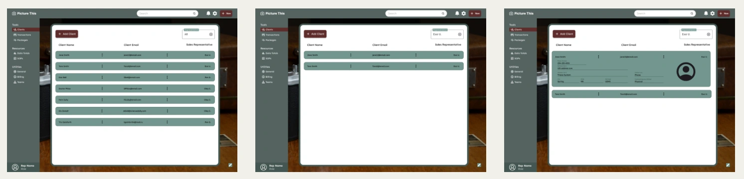
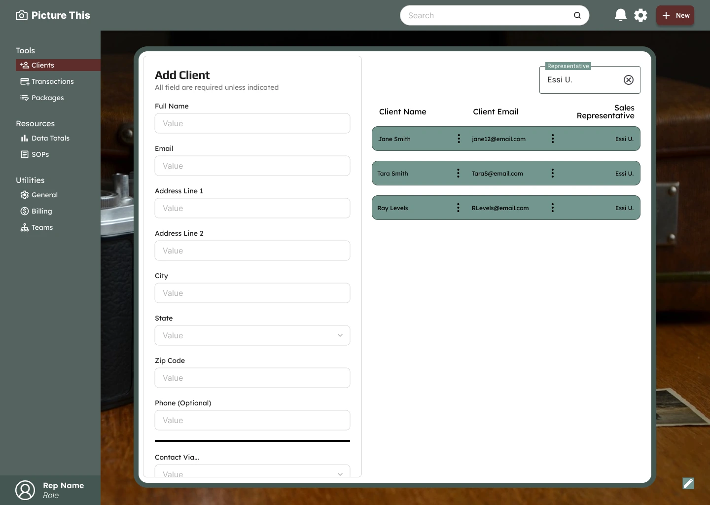
When the user clicks on the burgundy “Add Client” button, the list slides to the side to share the screen with a client creation form. When filled out, the submit button will add the client to the list. To maintain the viewport, the form scrolls vertically, independent of the page itself.
Transactions
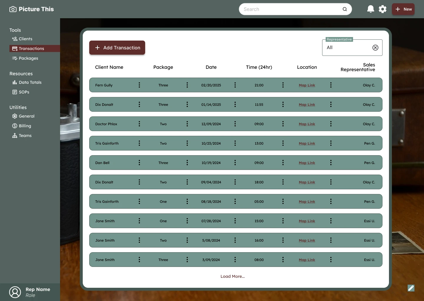
The Transaction page has two goals: add and view transactions. The first thing users see will be the list of transactions. The user will be able to see all the data entered at the creation of the transaction record. They will be able to filter by sales representative. Instead of a location, the location field shows a map link that will take the user to directions on any map software of their choice.
This eliminates the need for the representative to copy and paste the information into another app. Photographers and drivers can also benefit from the quick transition to a map app.
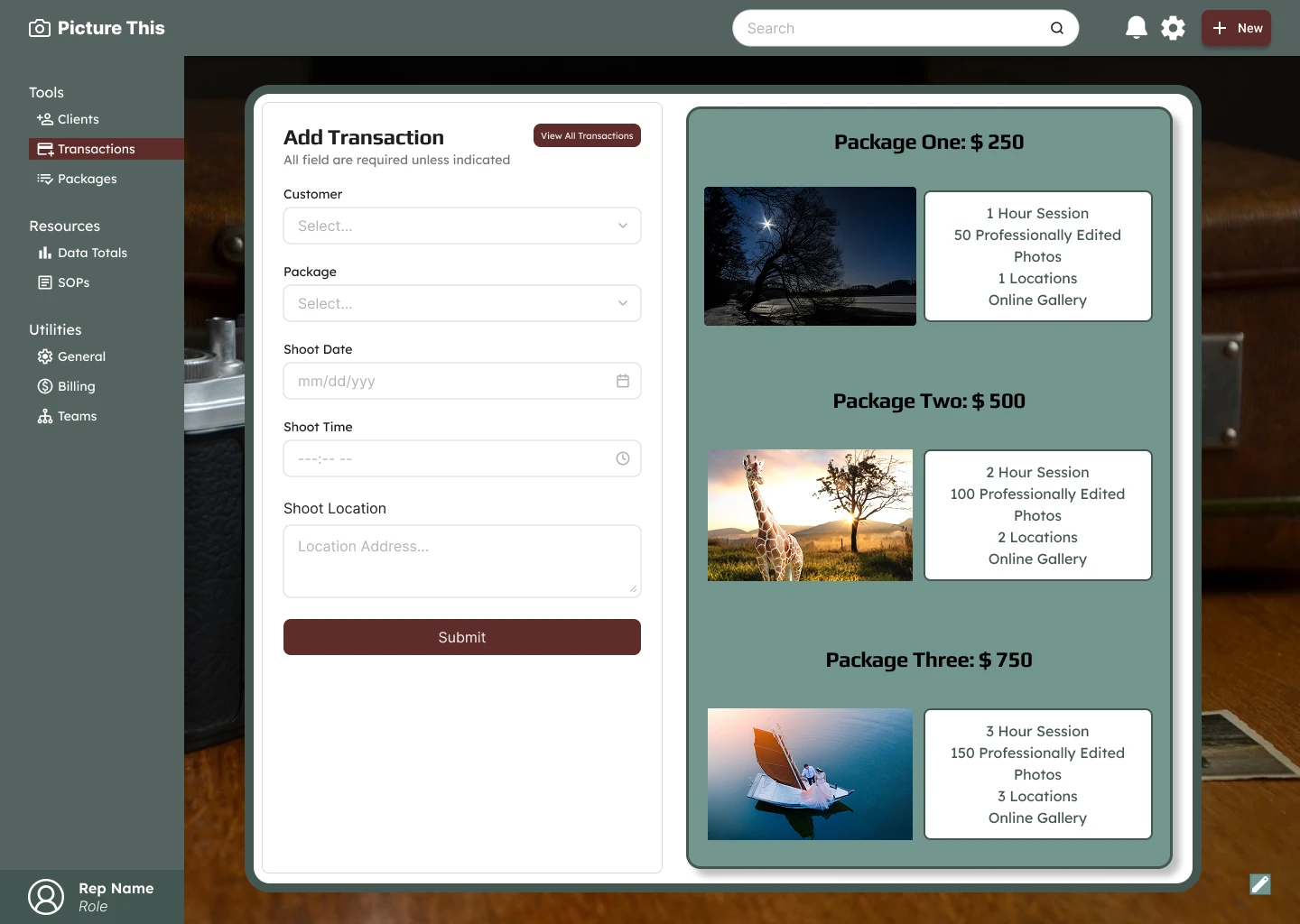
When the user clicks on the burgundy “Add Transaction” button, the page changes to one that is split between a creation form and a view of all available packages and prices the business offers. When filled out, the submit button will add the transaction to the list. At the top of the form is a button that will take users back to the transaction list page.
Extras
For the background of the site, I chose a photography-related image that I liked. In the bottom right corner, there is an edit button that would allow all employees to change the background to what they choose. This is a company that prioritizes art; the employees should be allowed to feed into their creativity.
Key Takeaways
Beyond the significant visual transformation, this new design allows for rapid data entry and recording. The design has bold visual elements that differentiate it from the prevailing minimalist design trends. Finally, this is an internal portal, so it is important that primary users can curate their experience—even if that means making a bolder design statement than typically seen in public-facing applications.
Like this project
Posted Aug 27, 2026
Redesigned the internal portal for Picture This to improve UI/UX and efficiency.
Likes
0
Views
2
Timeline
Nov 24, 2025 - Nov 30, 2025