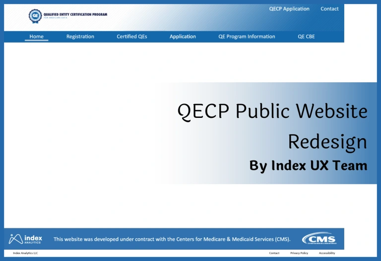
QECP Website Redesign for CMS

OTumininu Paseda

QECP Redesign
Date: 2023 | Tool: Adobe XD | Client: CMS
Background:
“The CMS Qualified Entity Certification Program (also known as the Medicare Data Sharing for Performance Measurement Program) enables organizations to receive Medicare Parts A and B claims data and Part D prescription drug event data for use in evaluating provider performance.”
The UX team at Index Analytics was tasked with updating the website to be more professional and current in order to create a more meaningful and relevant experience for users.
In total, we updated 12 pages. I have attached three of the pages below to give an idea of the changes that were made across the entire website:
Registration Page
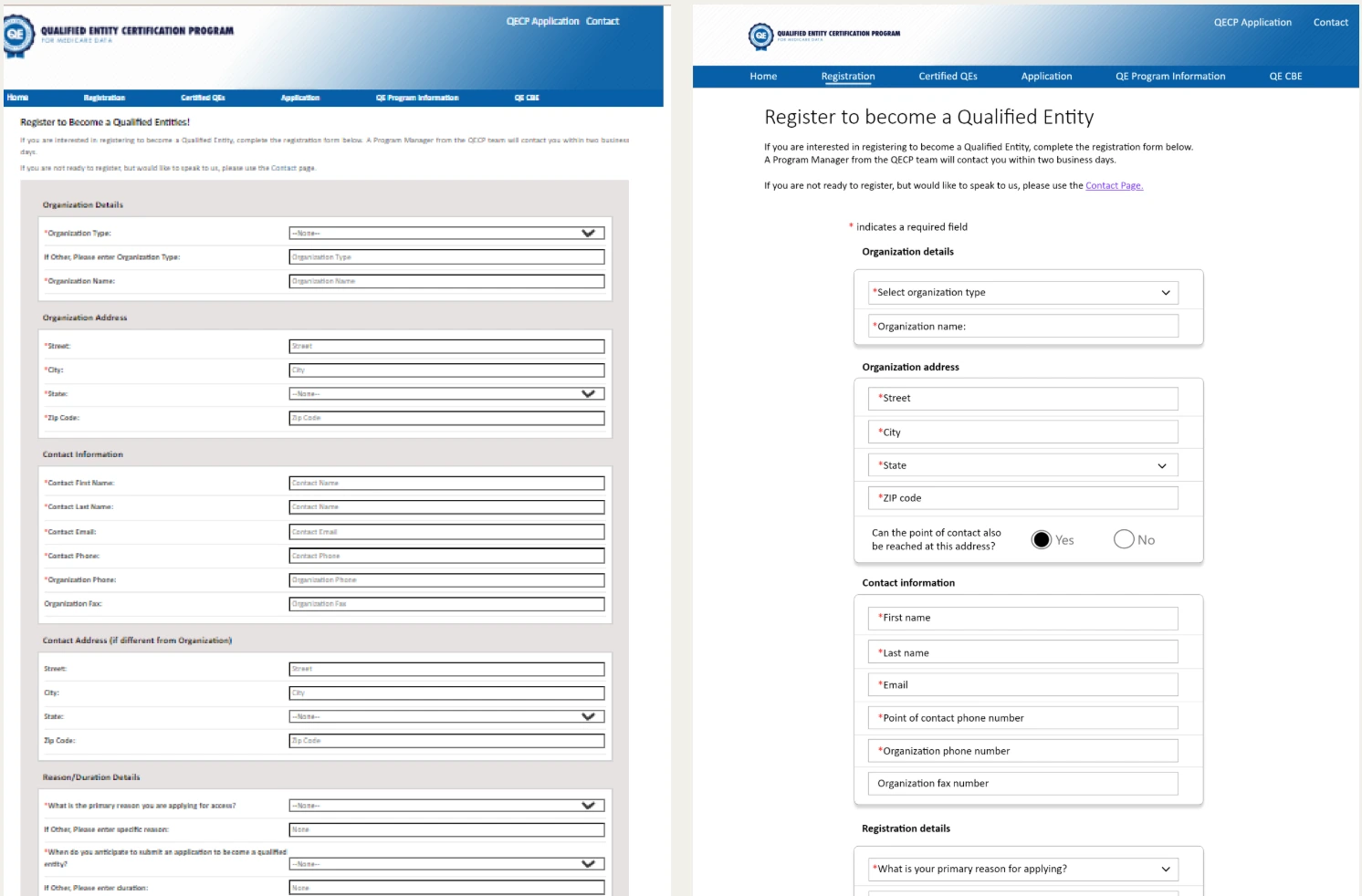
Left: Original Design ; Right: Redesign
On the left is the original registration page. The first thing that stood out was the gray box that surrounded the input boxes. For the redesign, that gray box was removed. Other problems include the input labels being so far from the input boxes and the categorical divisions not being prominent. For the redesign, the labels were removed, leaving only the in-box labels. The categories were more clearly defined and grouped. The reCAPTCHA box was centered, and the Submit box was made larger and reshaped to be recognizable as a button.
Overall, the redesign is easier on the eyes. It makes use of users’ instinct to group context by making clearer groupings. We also made use of users’ ability to recognize shapes and associate them with function. The page is simpler and less cluttered. Rounded shapes also make this page more pleasant to interact with.
Data availability and Cost Page
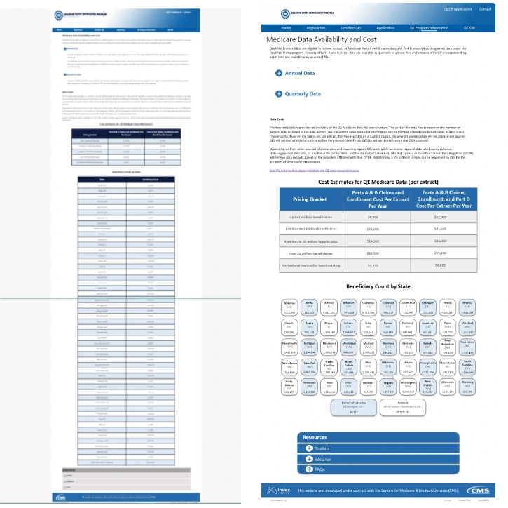
Notice the green line on the original image. That is roughly where the redesign stops. The primary goal for this page was to decrease the amount of scrolling needed to get through the page. To do this, the long table had to be changed into something that was less impactful on the length of the page. The table was completely redesigned to be more visually appealing while still passing along information. The new design eliminates the need to read horizontally as the information is grouped vertically. The tables that remained were changed to match the brand color. Importantly, the amount of scrolling has decreased immensely.
Standard and Alternative Measures Page
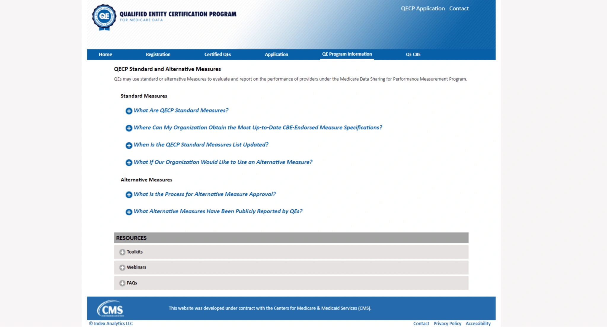
Original
Many of the pages did not have images that needed to change and were mostly text. For those pages, the focus was on making the text easier to read. This included increasing the size of the font and standardizing the typography.
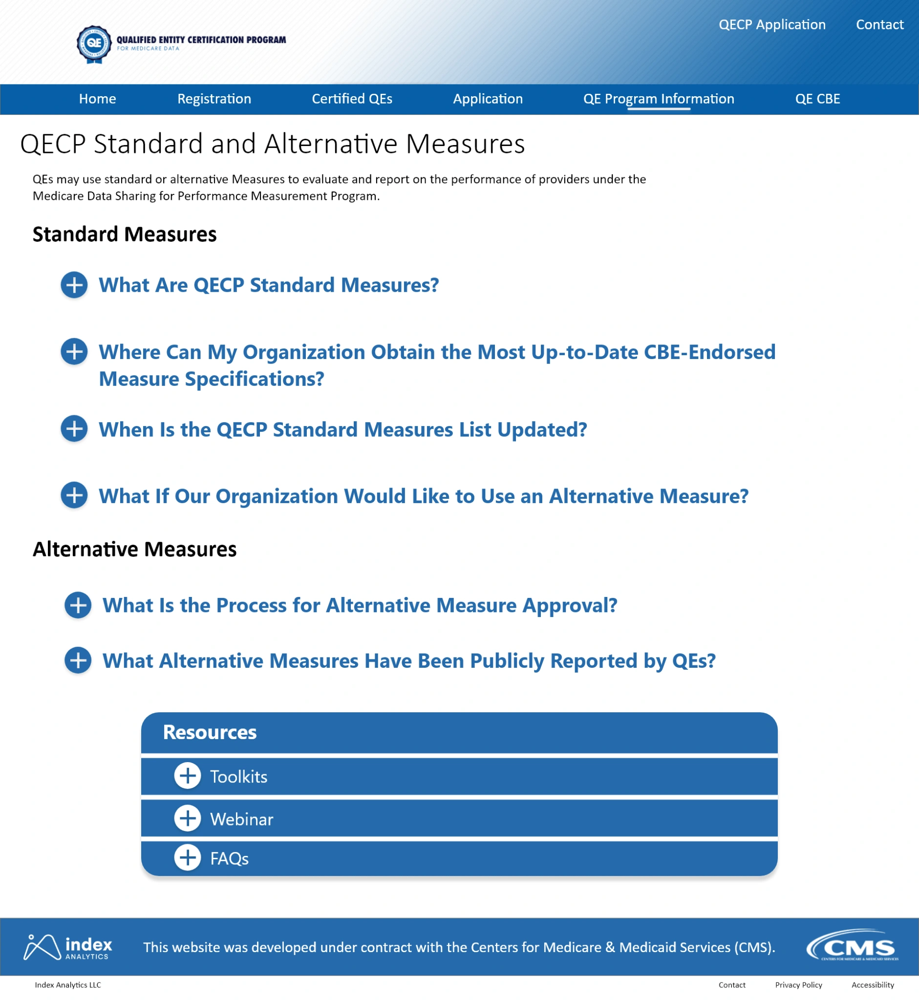
Redesign
Resources Table
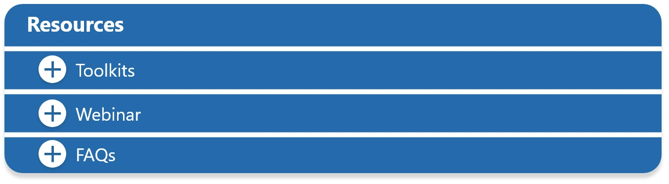
Roughly 8 of the 12 pages had these “resources” table at the bottom of the page. The color and design were unappealing and difficult to read. The gray plus icons on the lighter backgrounds do not meet WCAG color contrast guidelines.

Original
The new design meets WCAG color contrast guidelines and matches the branding colors.
Redesign
Final Comments
In addition to the changes above, drop shadows were also added to buttons and cards throughout the website to make certain things pop for the users. The gray sidebars were removed, and the background color was changed to just white.
Overall, the new design meets 508, matches the brand style, and is more aesthetically attractive. It requires less from users and improves readability and comprehension throughout the site.
Like this project
Posted Aug 28, 2026
Redesign of QECP website with improved UI/UX, enhancing user experience and meeting accessibility standards.
Likes
0
Views
3
Timeline
Jan 1, 2023 - Dec 1, 2023