La Condesa | Branding & Packaging Design

MELD


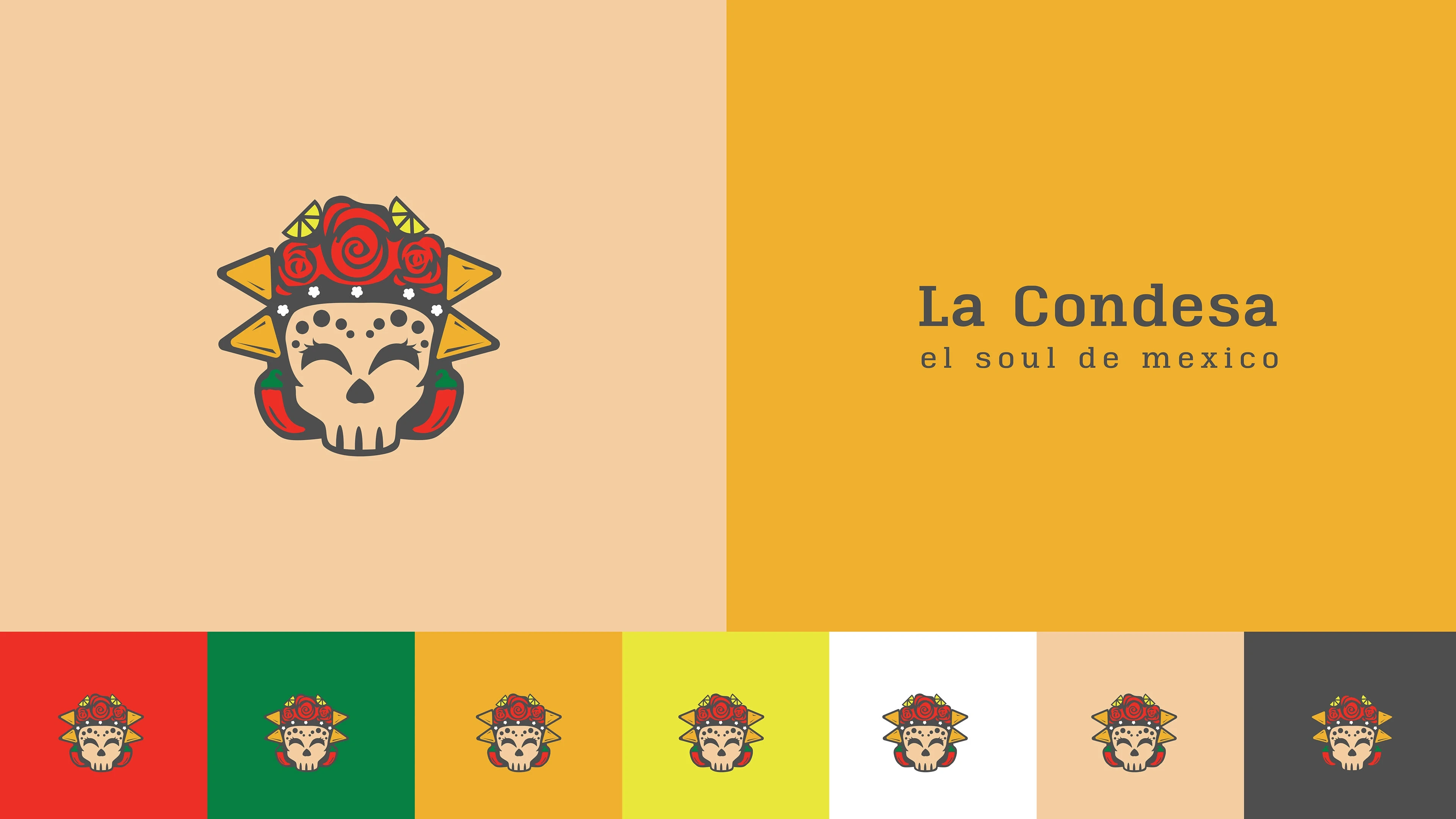
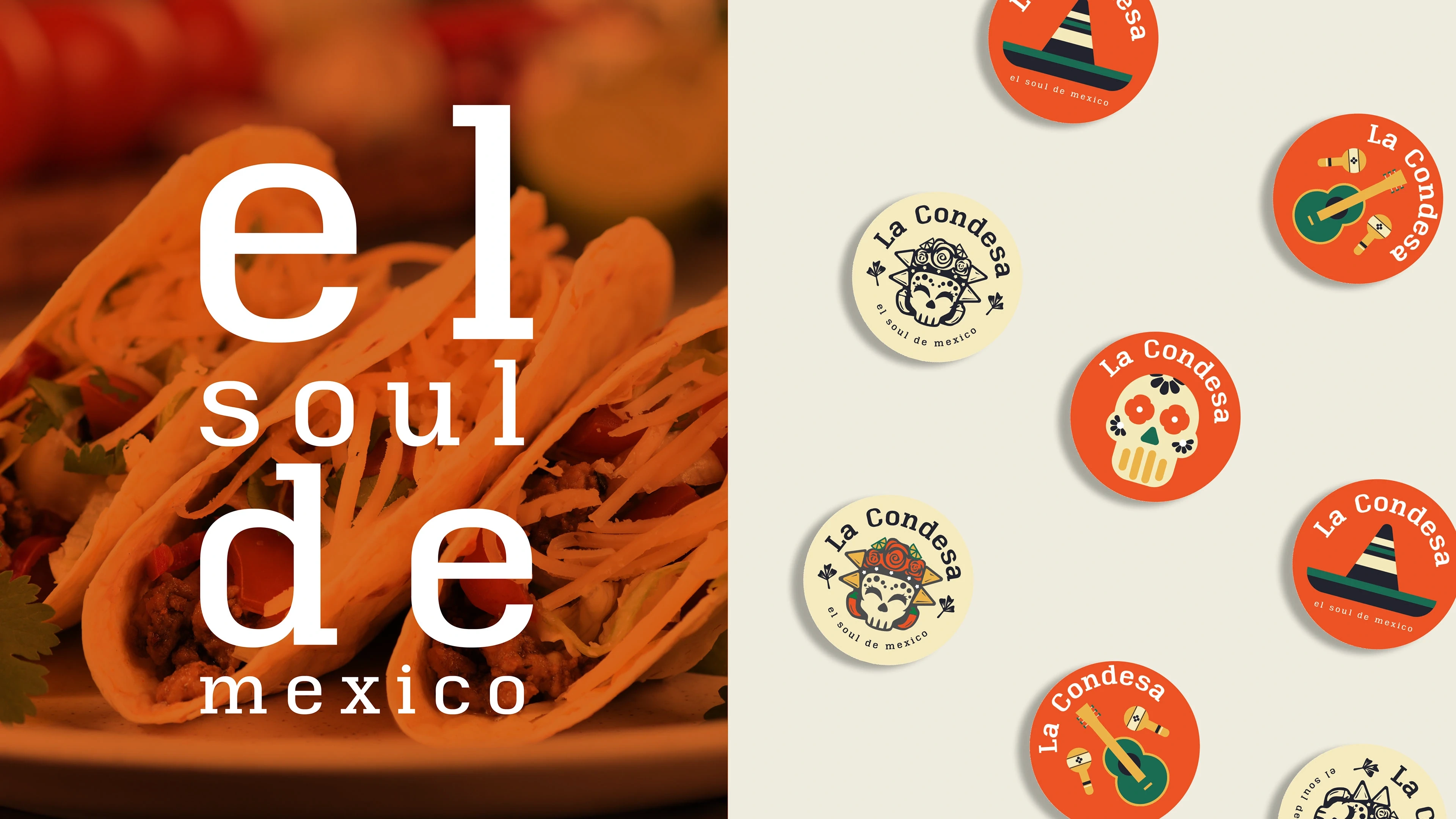
At the heart of La Condesa’s identity is a logo inspired by iconic imagery from the celebrated movie
‘Coco,’ interwoven with symbols that capture the soul of Mexico.
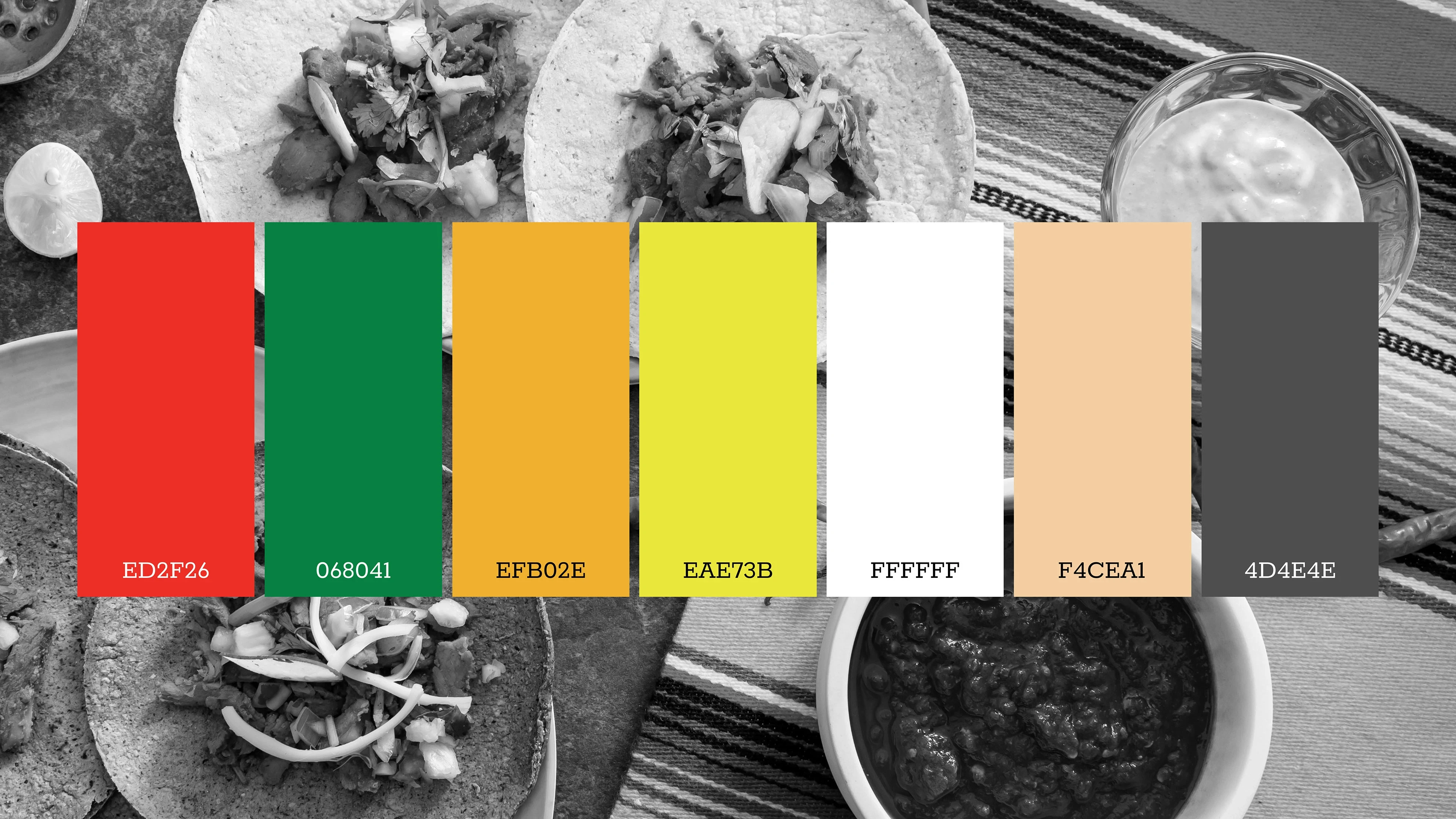
The color paletteis thoughtfully chosen to evoke the energy of fiestas and the depth of tradition, infusing life into every touchpoint.
Bold headlines invite festivity, while refined body text enhances readability for menus and branding alike.
From signage to digital, your effort was to make every element sings with Mexican identity.
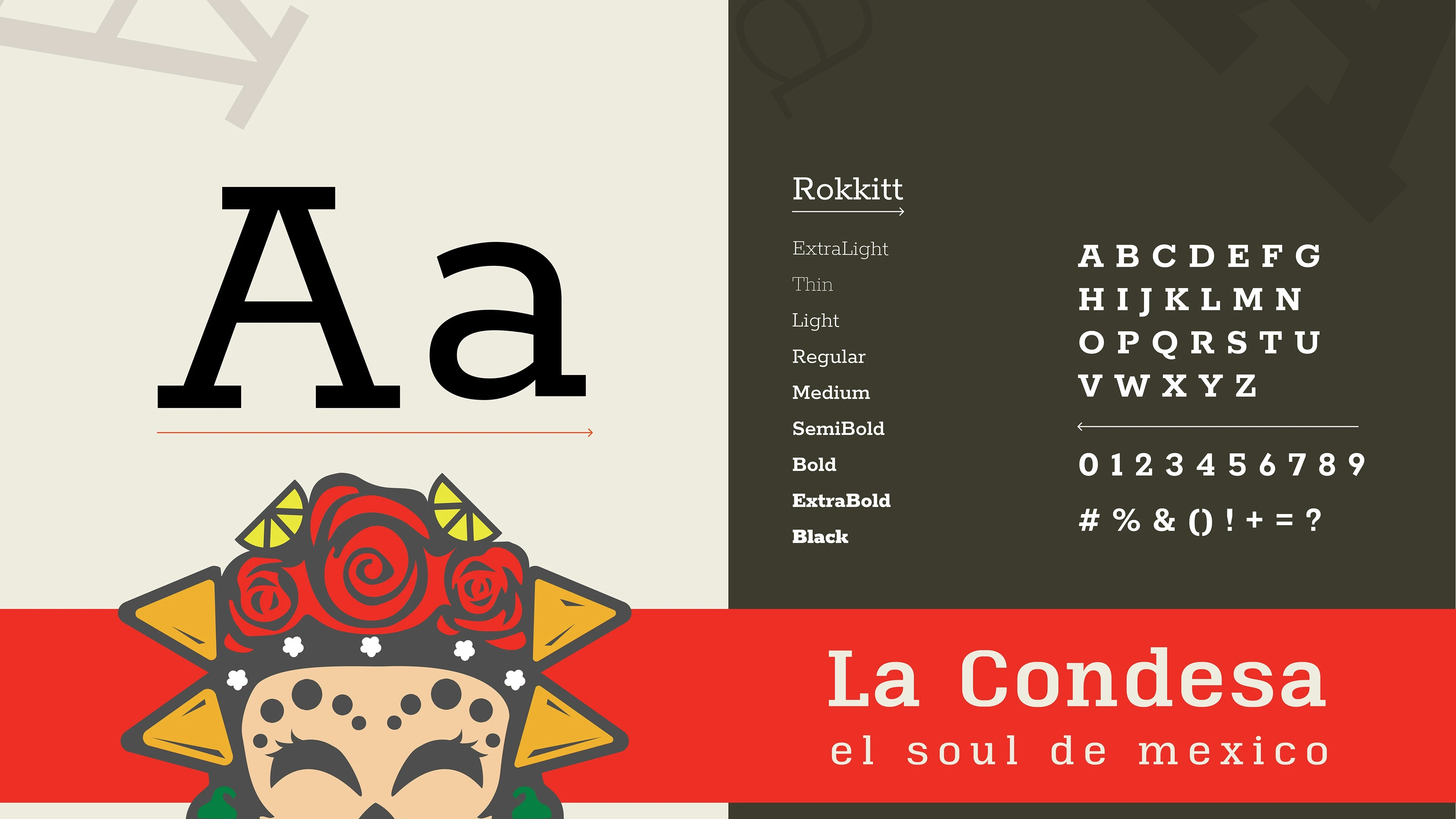
La Condesa’s typography showcases the Rokkitt family, its handcrafted feel and versatile weights mirroring the
handcrafted quality and diversity of the cuisine.
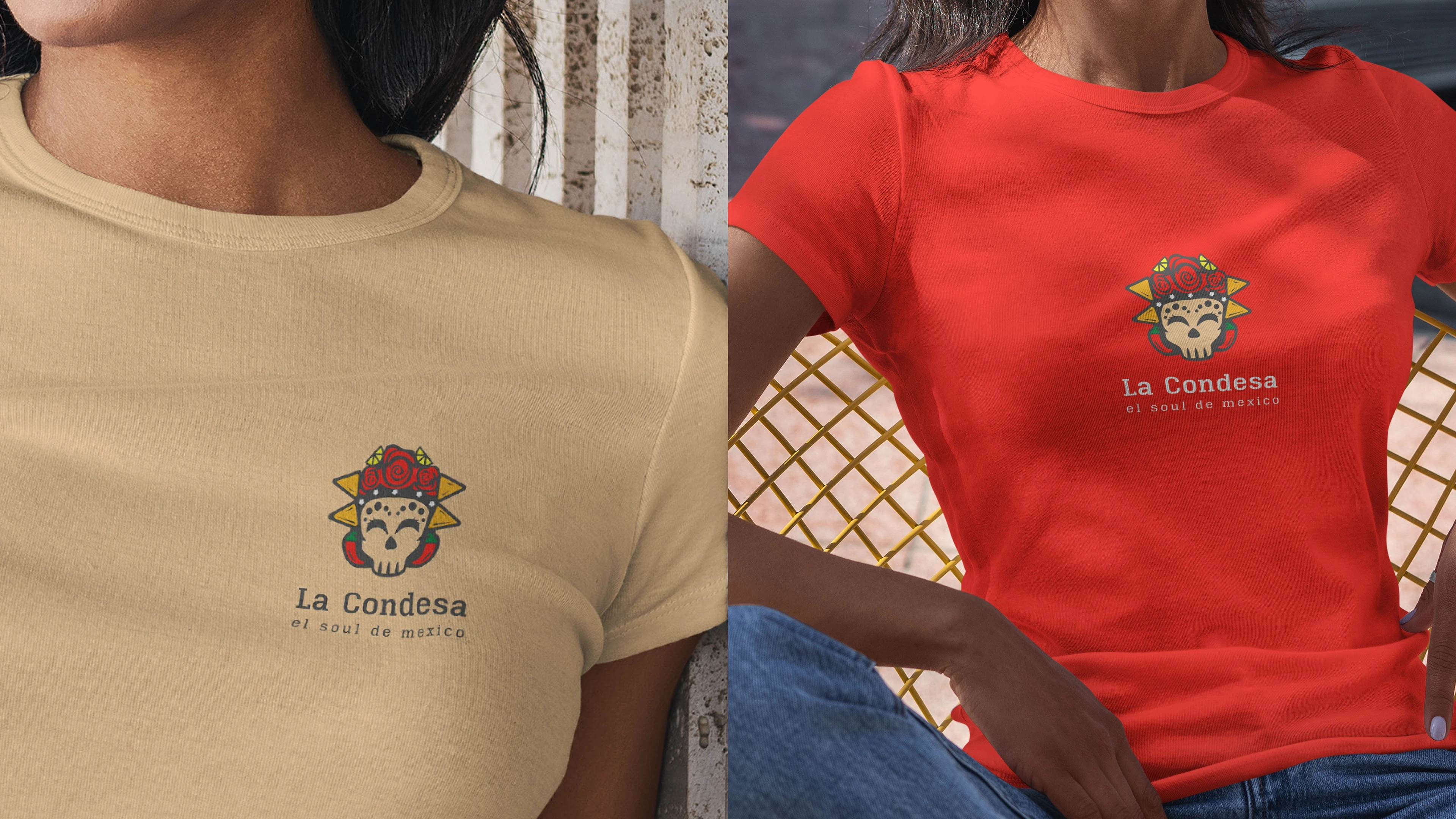
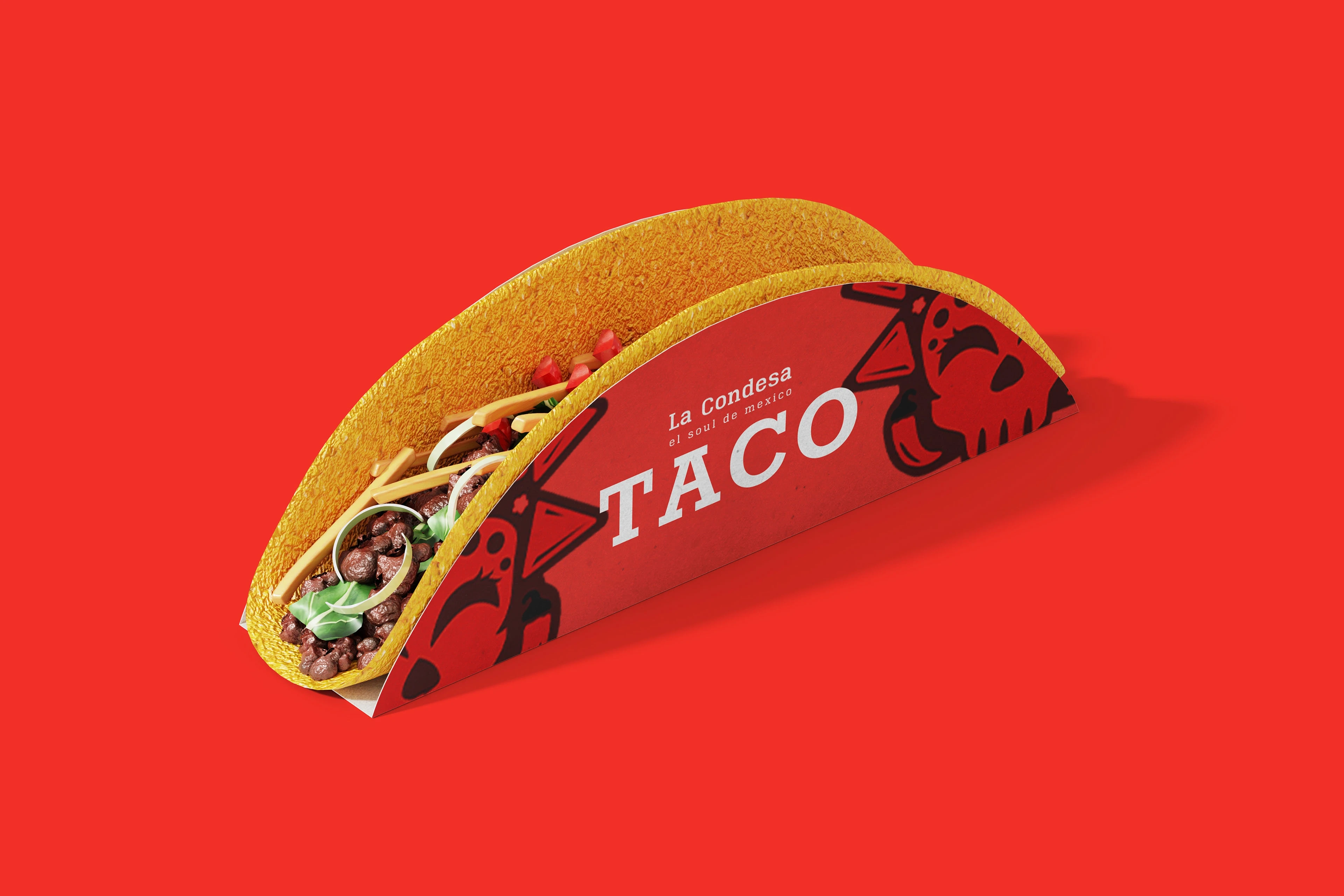
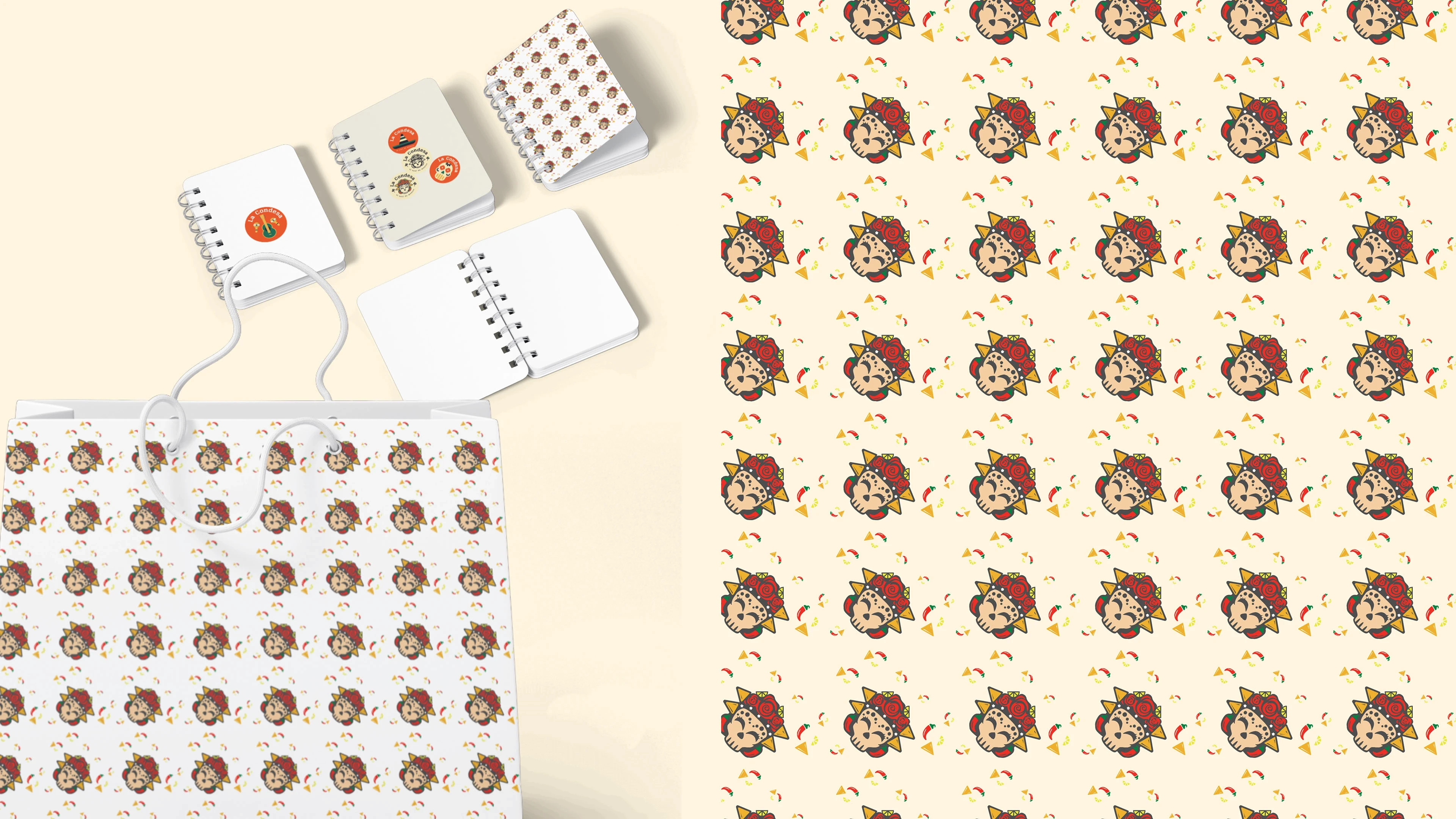
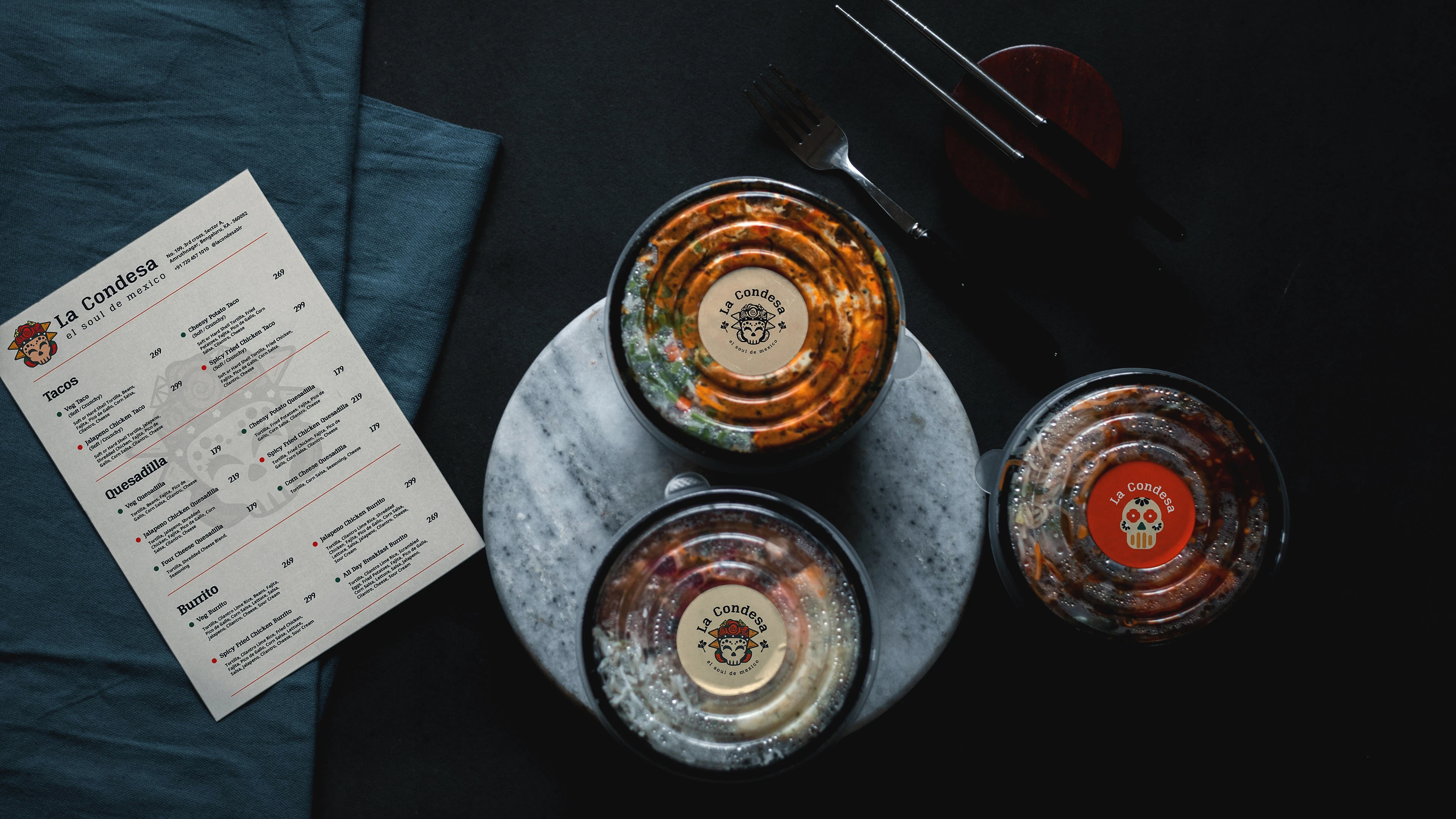
The logo and colours unify menus, merchandise, and promotional pieces.
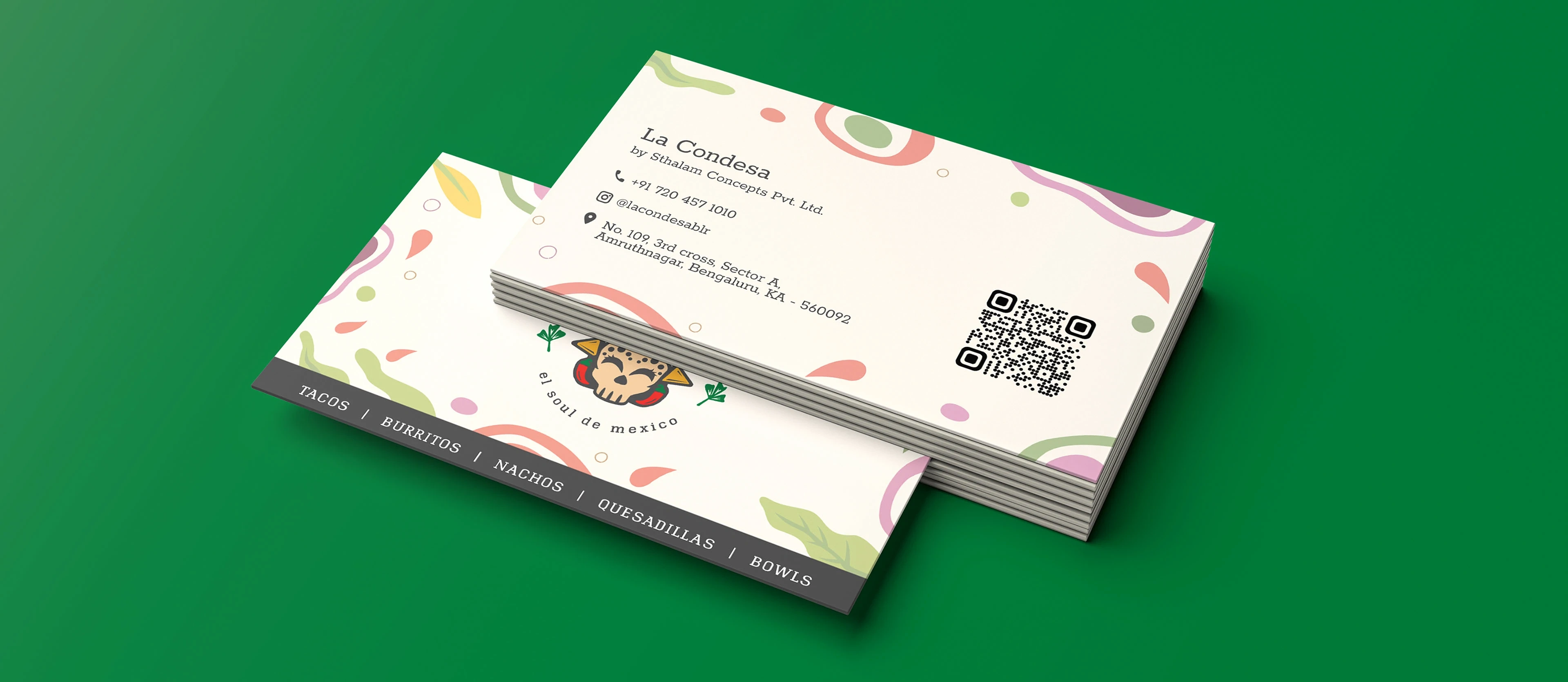
Business cards that spark a festive mood!
La Condesa’s Bangalore venue is a beacon of celebration; our menus spotlight Tacos, Burritos, Nachos, Quesadillas, and Bowls,
all made from authentic recipes.
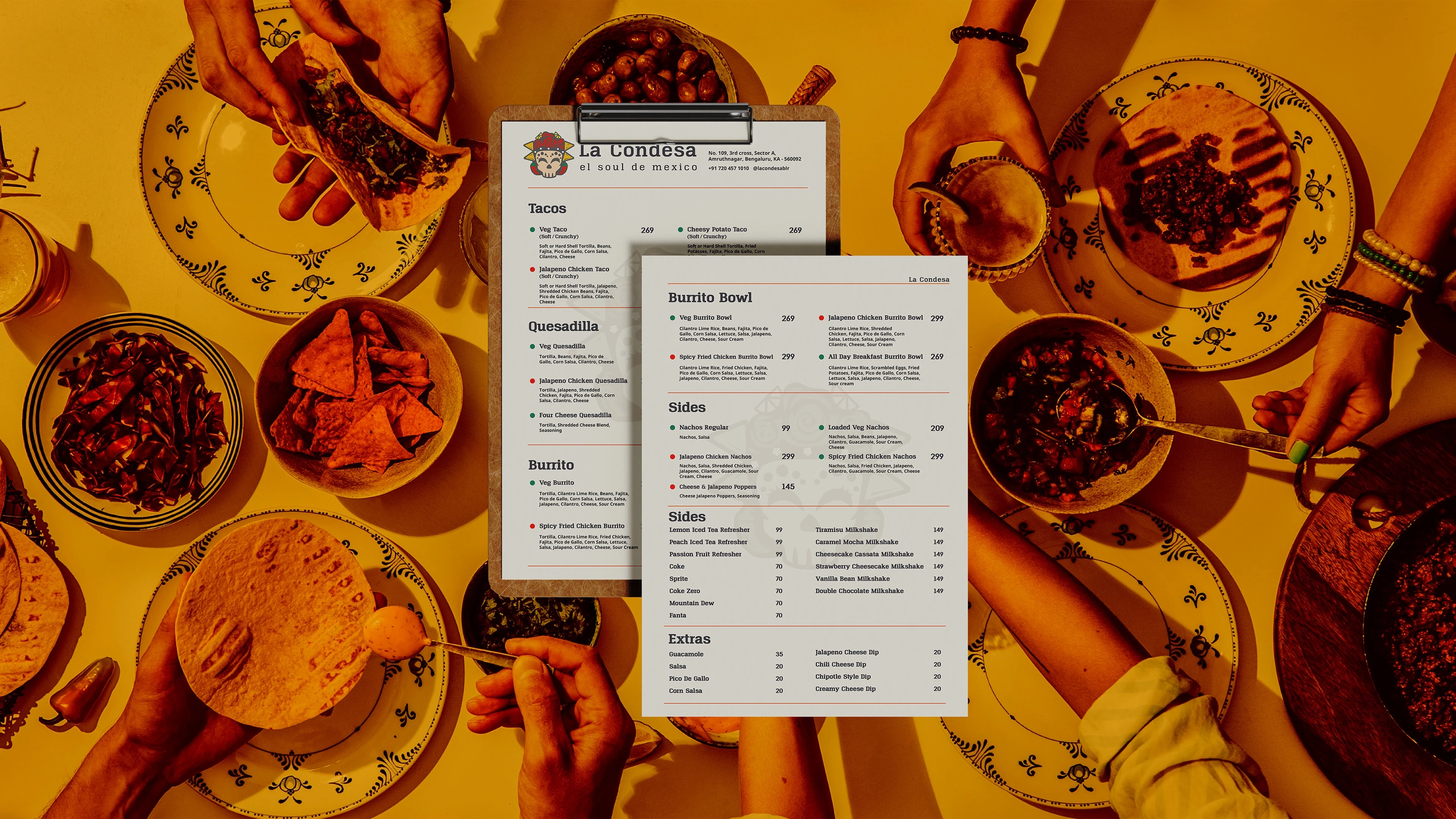
Each classic dish—Tacos, Burritos, Quesadillas, Nachos, Bowls—is lovingly spotlighted. Slogans like ‘el soul de Mexico’ and playful graphics reinforce La Condesa’s promise: genuine Mexican cuisine brought to life with soul, quality, and festive warmth.
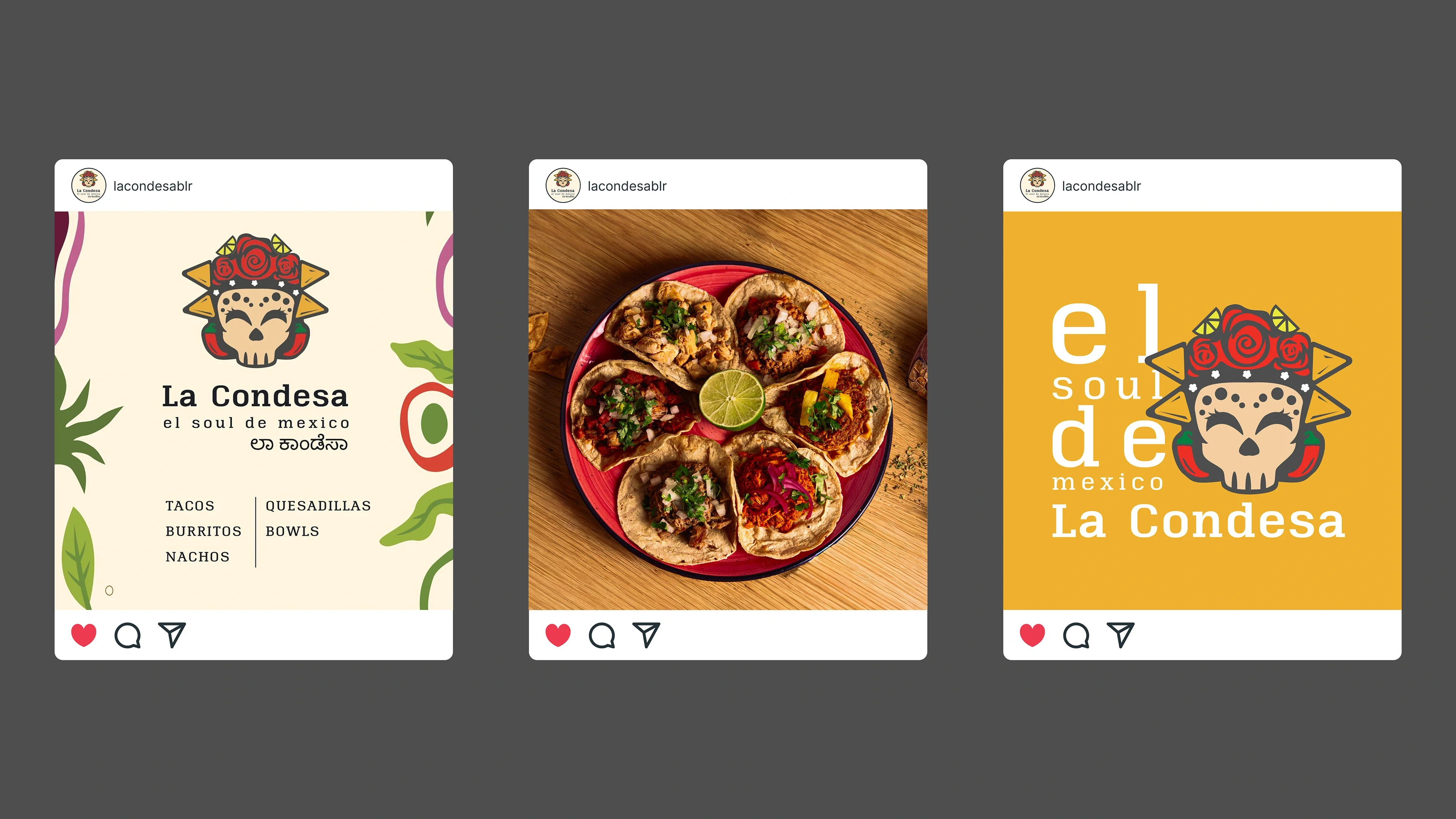
Campaign visuals continue the story online, connecting the Bangalore audience with Mexican heritage—
La Condesa becomes more than a meal. It’s an invitation to experience the heart of Mexico.
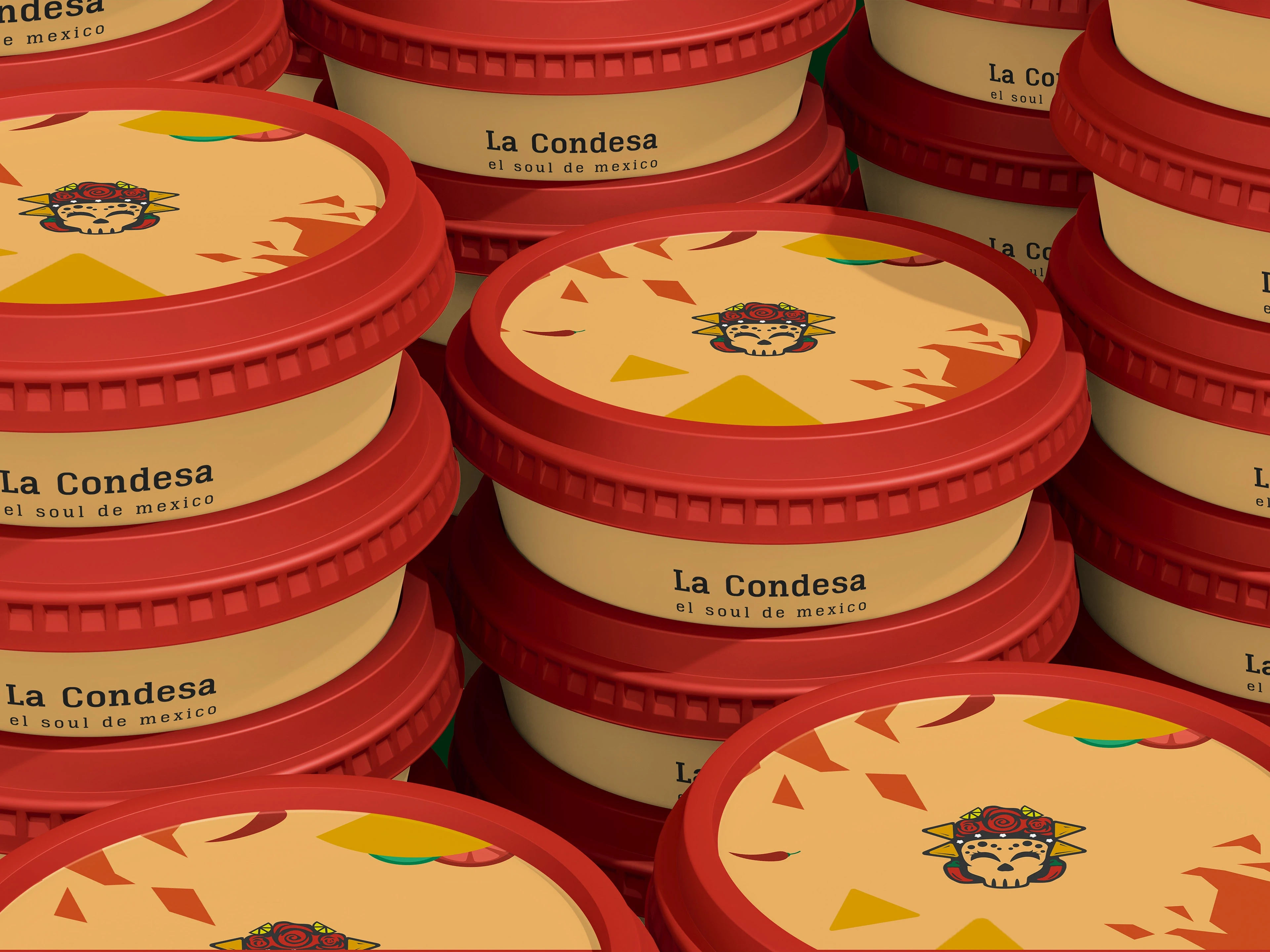
The consistent illustrative pattern brings the packaging alive to match the same intensity as the flavour from the menu.
Together they give La Condesa a consistent identity and colour.
The consistent illustrative pattern brings the packaging alive to match the same intensity as the flavour from the menu.
Together they give La Condesa a consistent identity and colour.
Like this project
Posted Nov 27, 2025
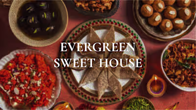
A gourmet destination for all things Mexican: brought alive with colorful, joyous branding that is rooted as an embodiment of Mexican food.
Likes
0
Views
4
Timeline
Oct 1, 2024 - Nov 1, 2024