MAXXD Fitness and Nutrition App UI Design
Alex Pluda
Verified
MAXXD
A fitness and nutrition app that combines custom training with calorie tracking.
Role: Product & UI design, interaction model, visual identity.
Platform: iOS.
Year: 2025.
The approach
I designed MAXXD to change shape depending on what you're doing. Dense when you're planning, quiet when you're performing. Tap-based when you're still, swipe-based when you're moving. Every screen was checked against the same question: what does the user actually need right now, and what can go away?
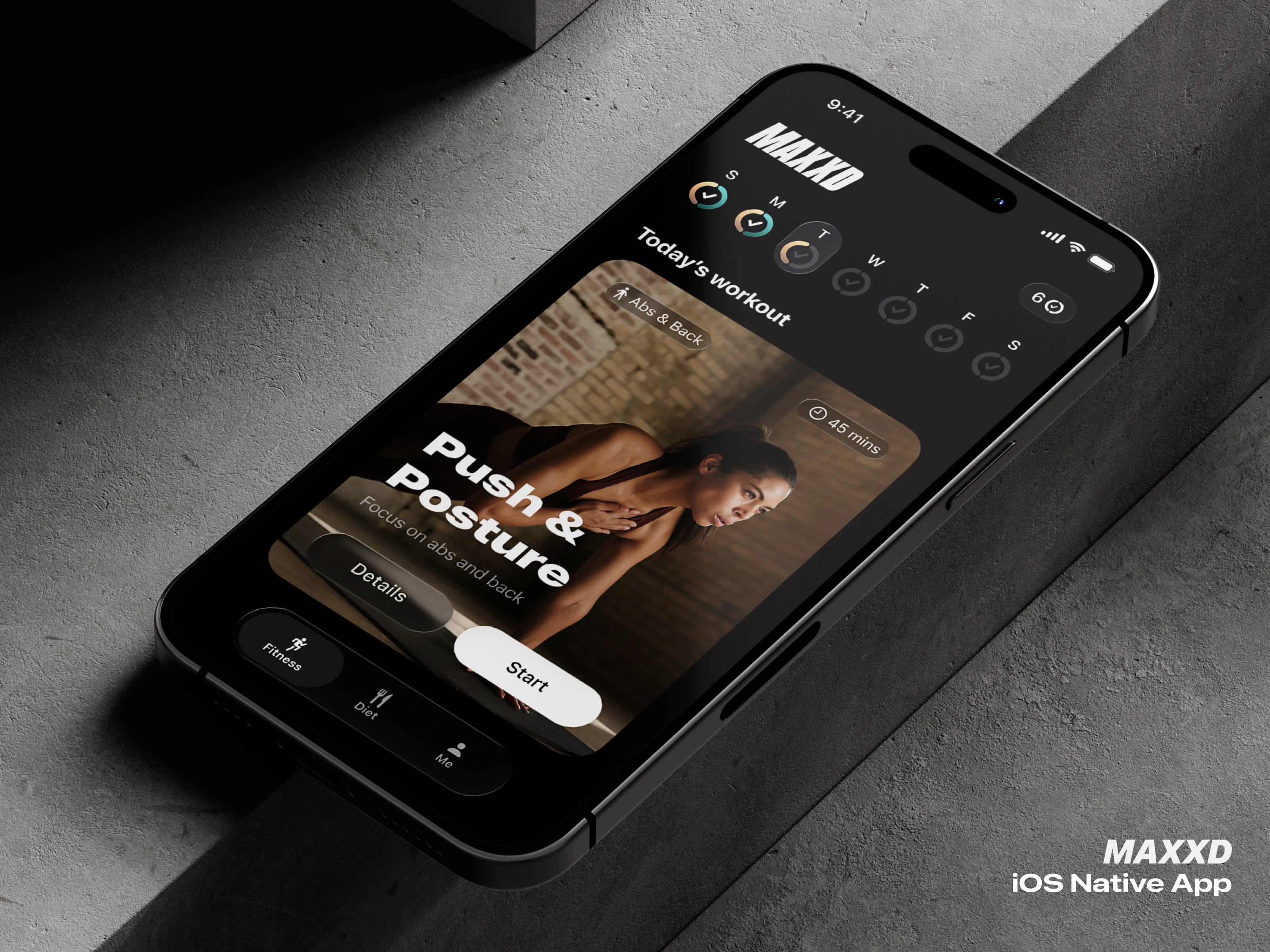
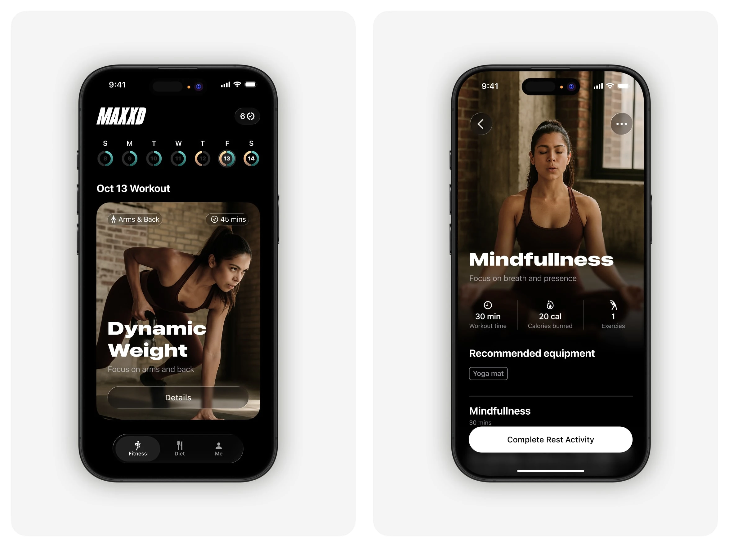
Dashboard
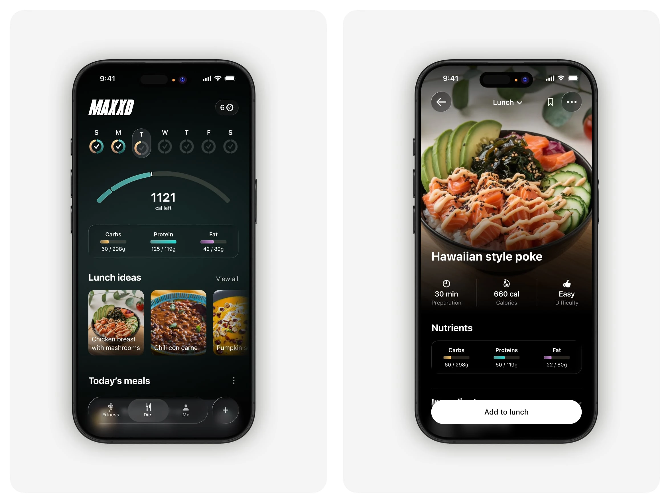
The dashboard is where the full picture lives. Week at a glance, next workout as a card, calories and macros at the top. Diet and fitness have their own tabs, but I kept the weekly streak header shared across both, so you always see the full state of your week no matter which side you're on.
The streak ring is one of the components I spent the most time on. It had to show three states in one glyph: workout done, diet done, or both. I designed it to scale from the weekly header down to the monthly grid without losing legibility, so you learn it once and read it everywhere.
Training
When you start a workout, the interface flips. Video takes over the screen, type gets big, controls shrink. Only what you need for the current exercise is visible.
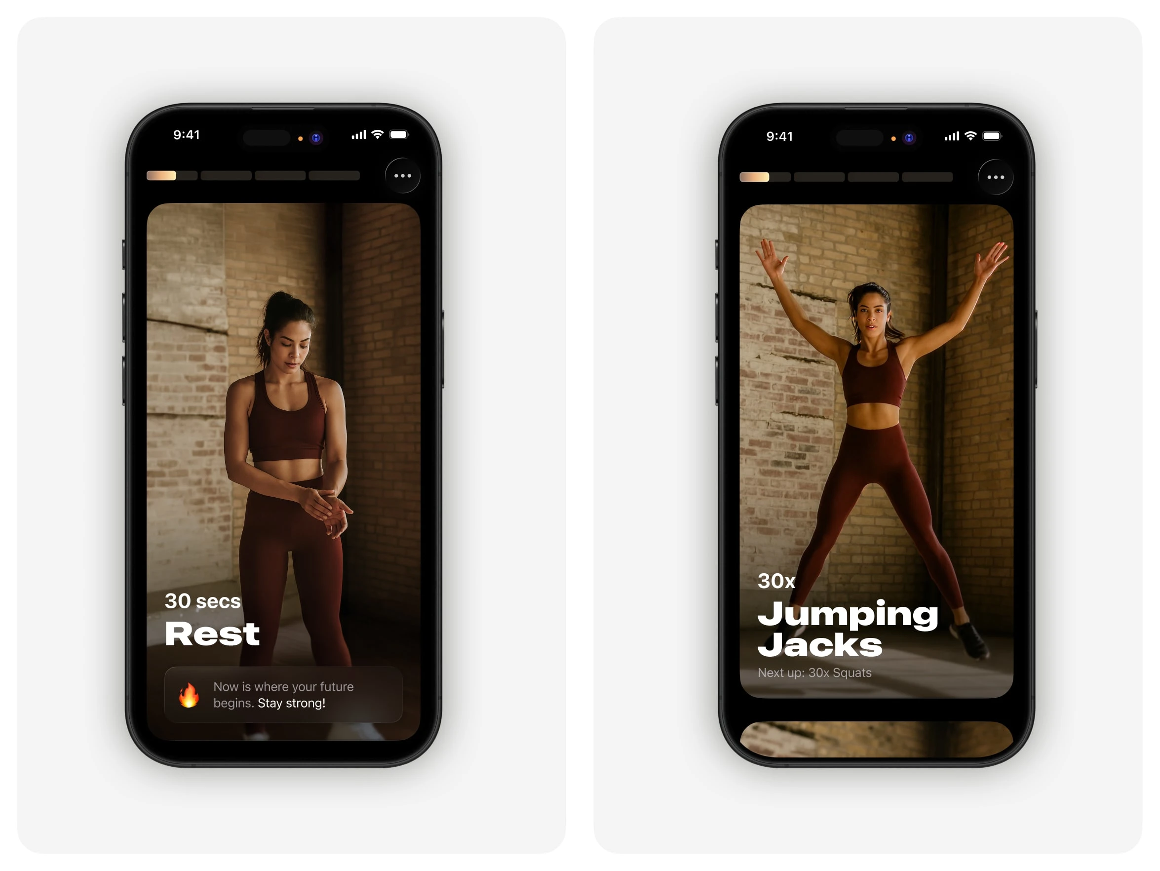
I moved most of the interaction from taps to swipes. Sweaty fingers and small targets don't mix. Exercise cards stack vertically like a TikTok reel, so the next one is already loaded when you finish. If something isn't working, an injury, missing equipment, a movement you can't stand, you swipe the card away Tinder-style and the replacement takes its place.
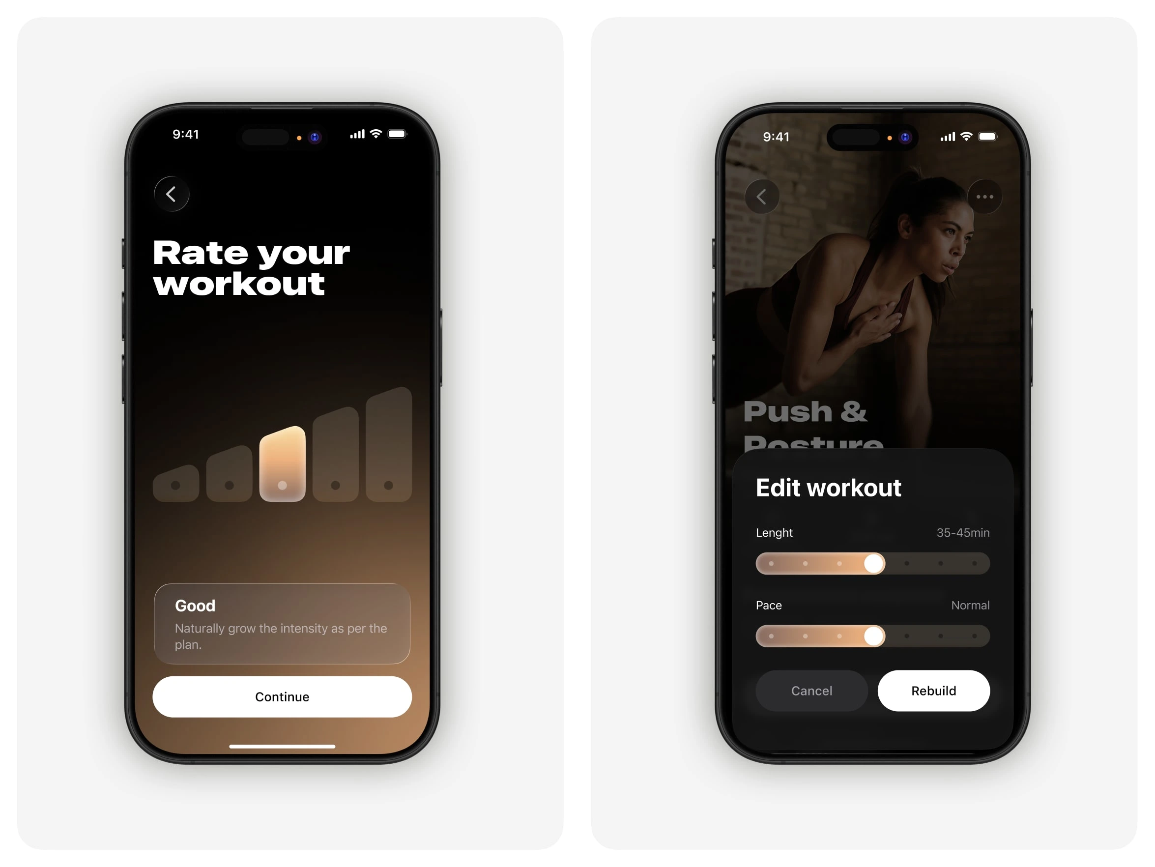
At the end, one screen: rate the workout on a five-step scale. One tap and you're done. For people who want more control, the edit sheet exposes pace and length as two sliders and a Rebuild button, so the deeper settings are there without cluttering the main flow.
Two palettes
Fitness is gold. Diet is warm teal. I designed them to each do their own thing on their own screens, but to combine cleanly where the two worlds meet.
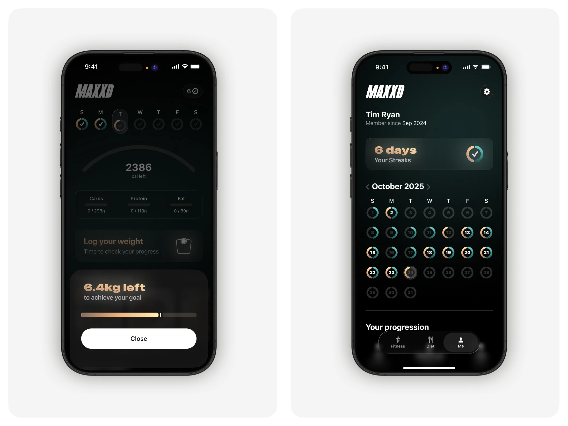
In the streak rings, each day is split between the two: orange for the diet half, teal for the workout half. A full day shows both. You can scan a month and see immediately where you skipped workouts or went over on food, without reading any numbers.
Food logging
Most calorie trackers make you pick one input: camera, barcode, text, or voice. They all fall short in different ways. The camera guesses wrong, voice mishears, typing is slow. I designed MAXXD's logger so you can combine them in the same entry.
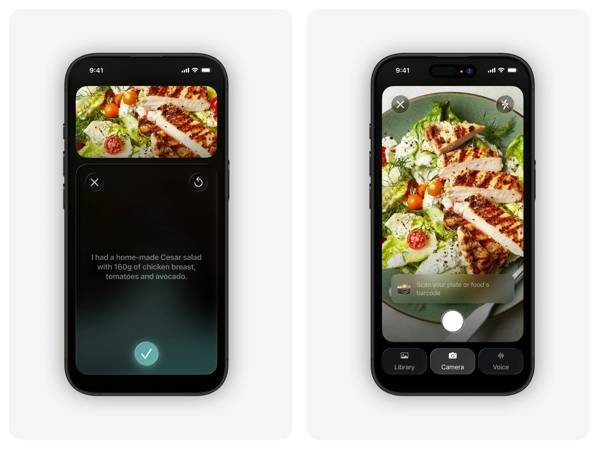
Snap the plate, add a voice note for grams or how it was cooked, type a correction if something's off. Each input covers what the others miss. A single tap is still enough if that's all you want, but the flexibility is there when you need it.
Wrap-up
The design goal for MAXXD was to match the interface to what the user is actually doing. Full control when you're planning, almost nothing in the way when you're training, flexible input when you're logging food. The palette and type hold it all together.
Like this project
What the client had to say
Alex is the best designer I've worked with over my 20-year career. He's a great thought partner, cares deeply about his craft and helped me level-up. I honestly cannot wait to collaborate with him on my next project- he's my first call.
Tim Ryan, Wave State
Nov 12, 2025, Client
Posted Apr 20, 2026
Designed the UI and interaction model for the fitness app MAXXD, enhancing user experience through adaptive design.
Likes
3
Views
28
Timeline
Oct 4, 2025 - Nov 12, 2025
Clients
Wave State