Biological test Results app
Petra jakljevic
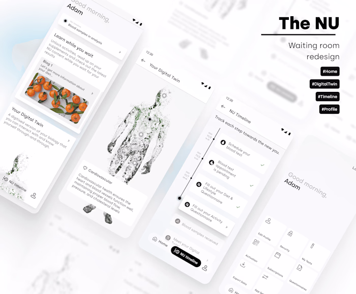
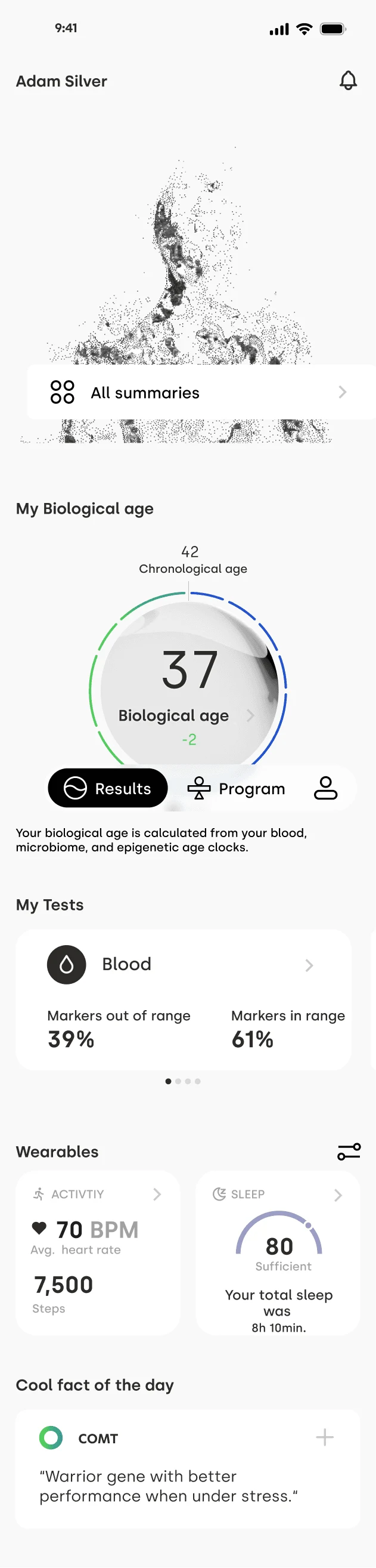
Biological test Results app
The redesign of the Companion app aimed to streamline data presentation, enhance the overall user experience, and align seamlessly with the business vision.
The solution was to facilitate user understanding of their data and ensure easy navigation throughout the complex application. This was achieved through research, design, and collaboration with cross-functional teams.
Date: 2022 - 2024
Client: The NU
URL: www.thenu.com
*Due to a signed NDA, I'm unable to showcase specific details of my work in my portfolio.
Process timeline
01 Discover
Analyze the existing user flow
Competitor research
Messaging and tone
Usability testing
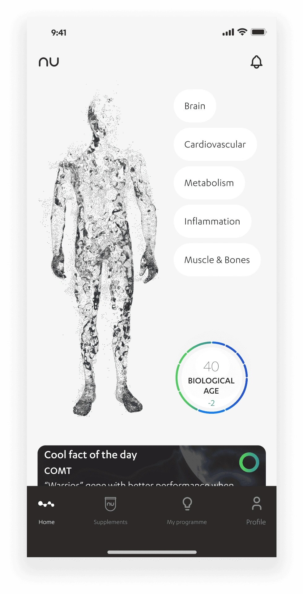
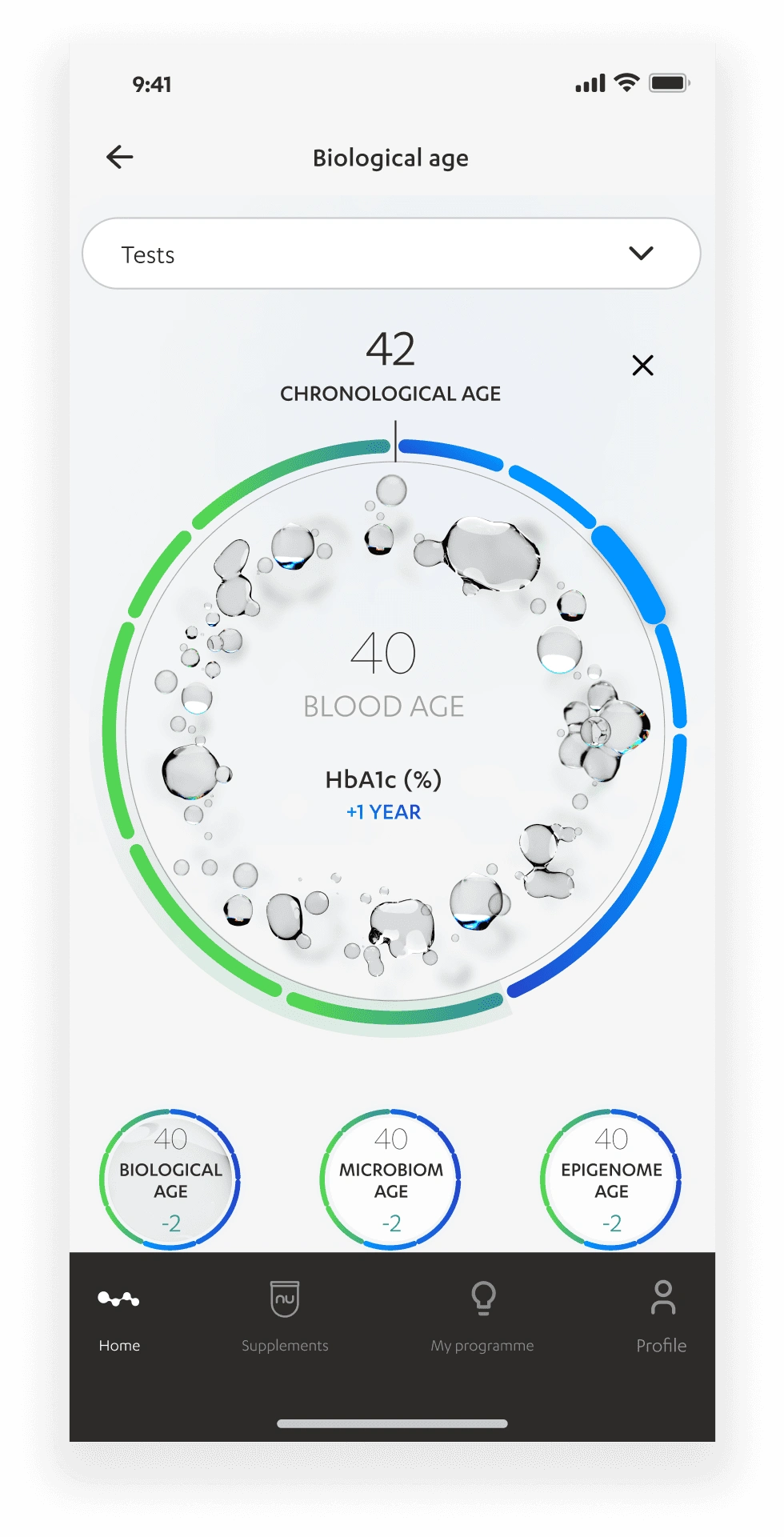
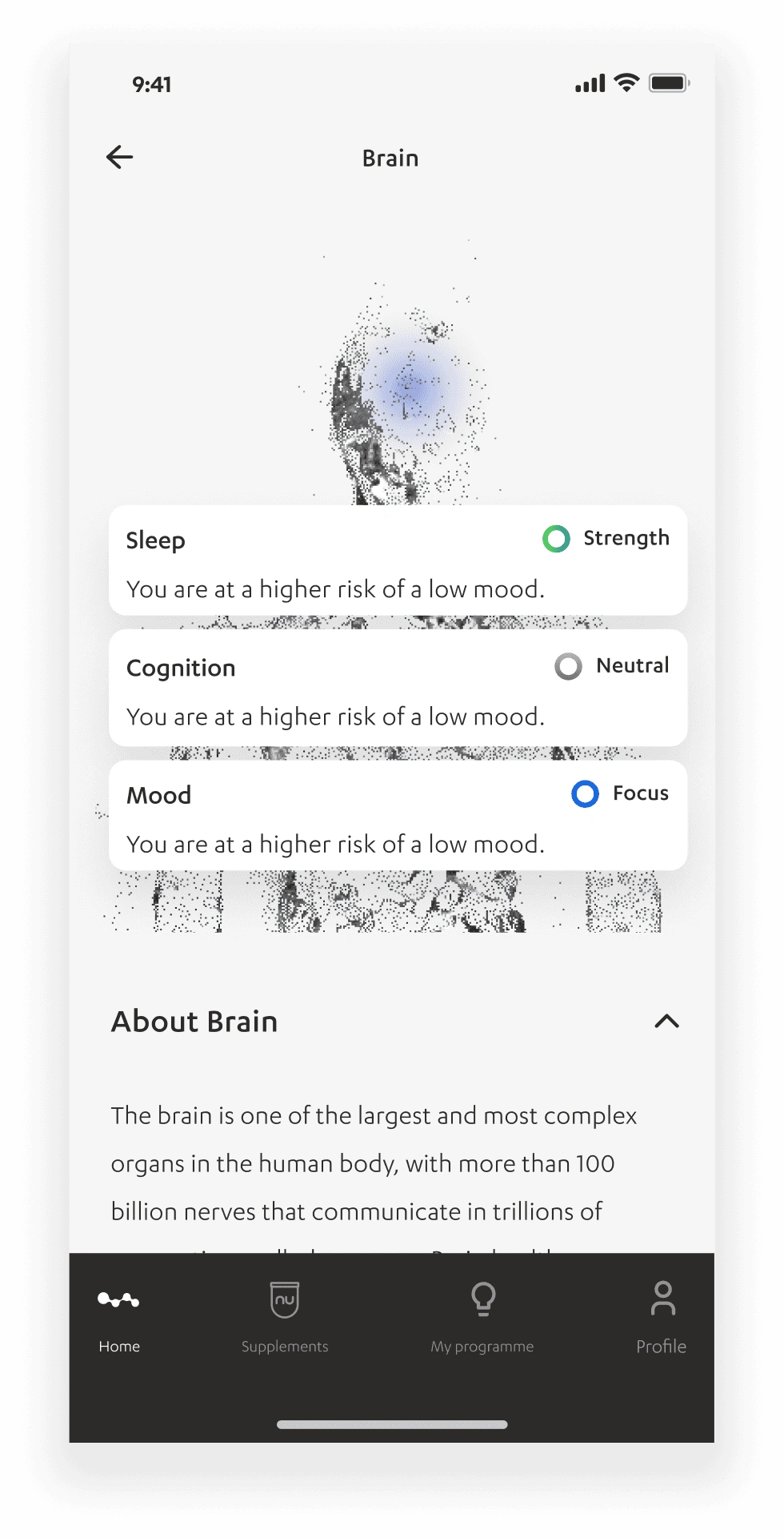
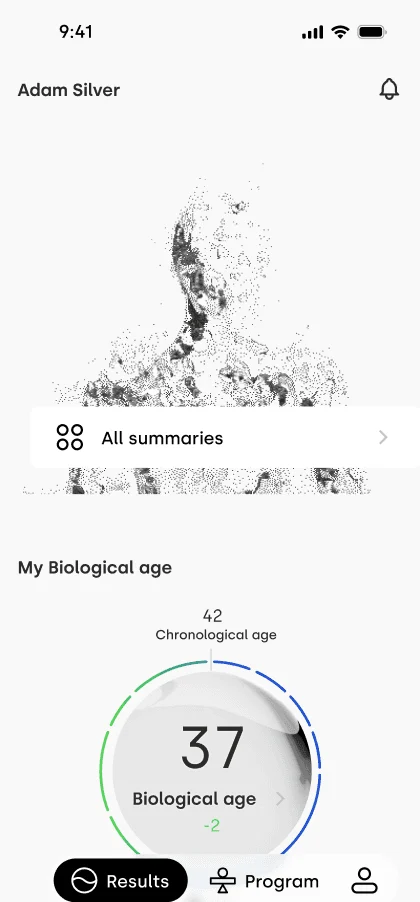
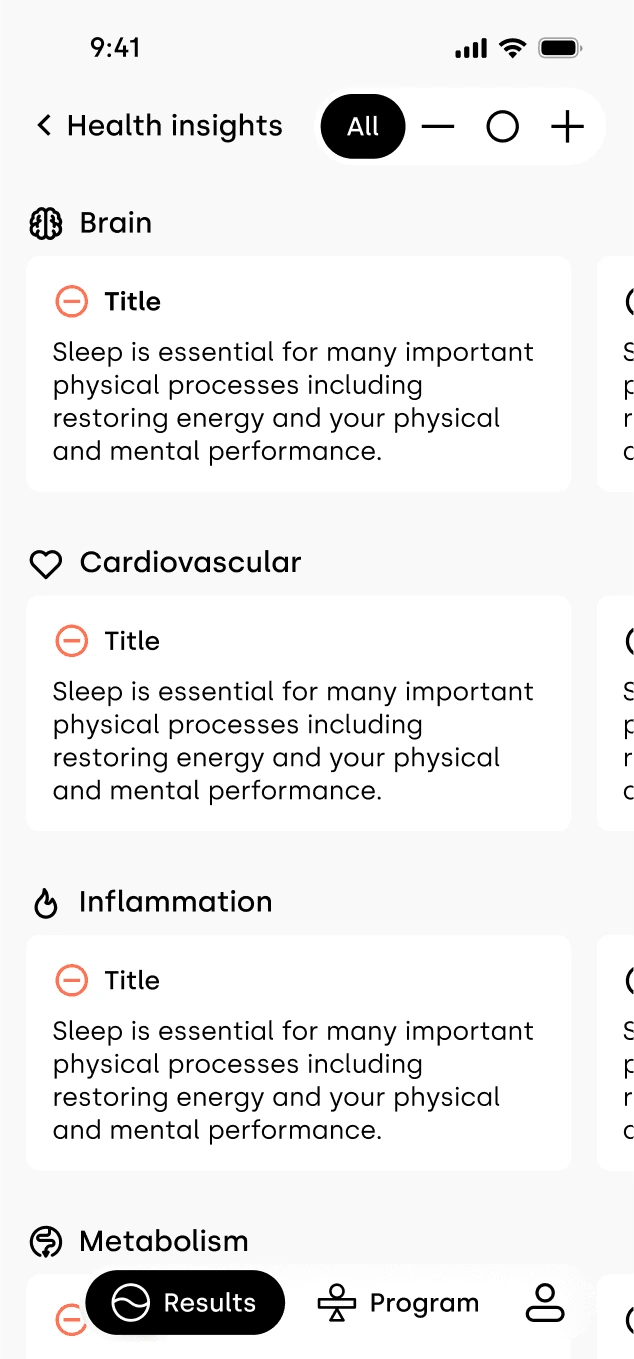
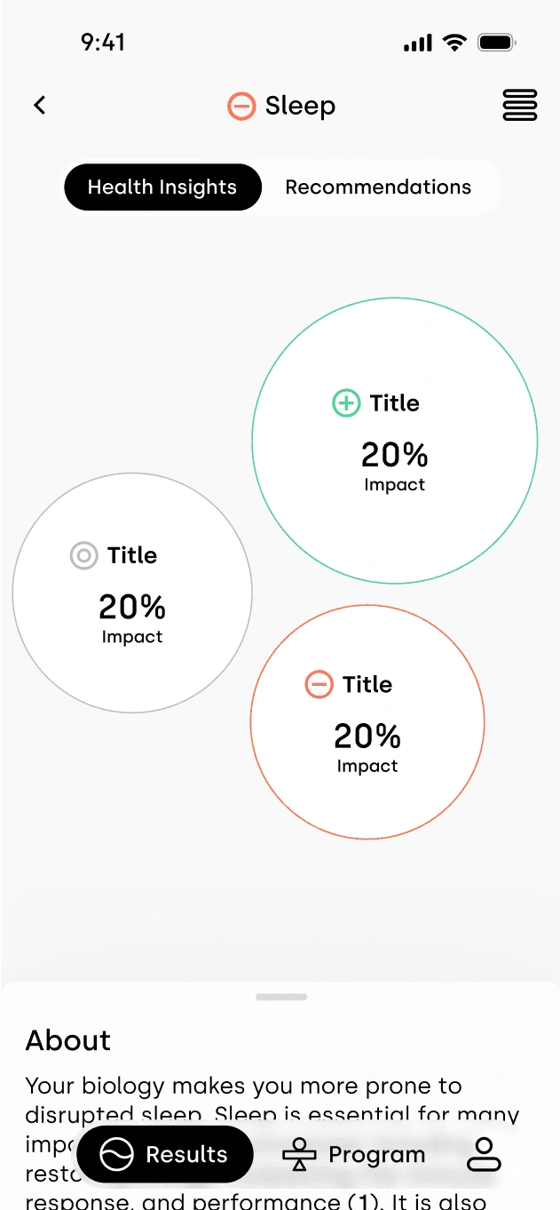
How to showcase complex biological data for users without healthcare or science backgrounds?
02 DEFINE
Focus
Problem statement(s)
Project objective
Success metrics
Problem statement:
#1 Nina is facing challenges in understanding her results due to her results being too complex and comprehensive.#2 David finds it challenging to stay engaged with the app after reviewing his results, as there's no compelling reason for him to return.
03 DEVELOP
Brainstorm on what are the possible solutions to the biggest pain points our users experience with wireframing.
Ideate and iterate
Design principles:
#1 ...prioritize simplicity in design to cater to users without healthcare or science backgrounds. Ensure that data presentation is clear, straightforward, and easily understandable
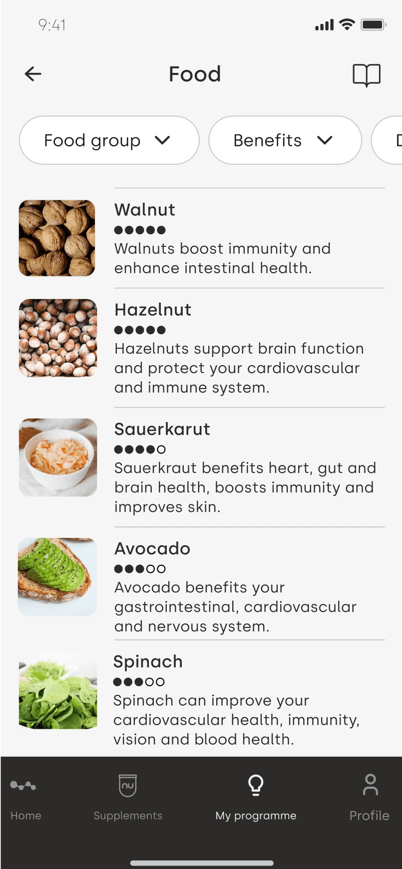
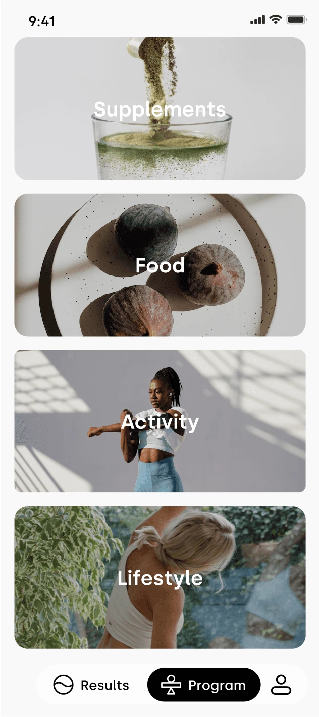
#2 ...have features that add value to the user experience, encouraging regular engagement and retesting
04 Post MVP iterations and uplift
Test
Improve
deliver
The design journey persists beyond the last version. The app followed a complete reconstruction, with occasional A/B testing to evaluate performance and explore potential improvements.
05 Before & after
MVP designs
Post MVP designs
Like this project
Posted Oct 24, 2024
Welcome to my portfolio! Take a journey through my work and gain insight into the projects I've been fortunate to contribute to thus far.
Likes
0
Views
7