Design of Social Emotional Learning portal for parents
Steffenie Jones
As the inaugural UX/UI designer at Vidaly, I led and managed the research and design initiative to create a portal that connects parents with their children's progress in Vidaly’s Social Emotional Learning game.
To be truly beneficial, the concepts Learners are practicing in the game need to be reinforced in their current daily relationships.
To strengthen these connections, we focused on developing a Guardian portal where parents and guardians could follow along with their Learners progress.
We started this process by interviewing parents to better understand their needs when it came to supporting their children. After using a tagging system to synthesize and code the raw data from transcribed interviews, we gathered the following main points of insight that helped us better understand parent's needs.
Interviews with parents helped us better understand the environments in which they were having conversations with their children about social emotional learning. We wanted to better understand these specific moments in time in order to create a platform that would fit seamlessly into their routines and provide a clear value.
We found 3 main insights from these conversations with parents:
Parents wanted to feel empowered to, and capable of, having conversations about wellbeing with their children.
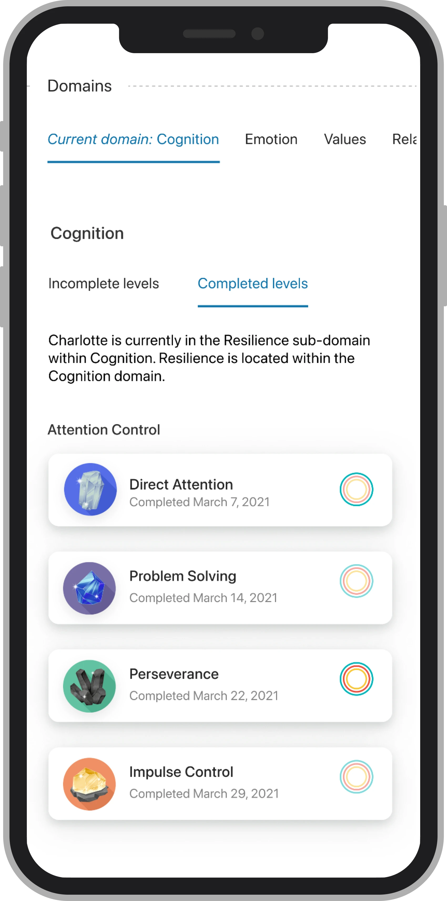
Having clear benchmarks and progress markers helped parents know that their child was on a beneficial trajectory.
There was a specific moment that parents were having these conversations, such as in the car after school. This led us to a mobile first design to be support parents when they needed it most.
To help turn these insights into actionable design decisions, I created a brief persona that we could all refer to throughout the process. This allowed us to have a shared understanding of who we were designing for.
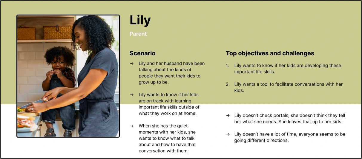
The insights from interviews helped form our persona, Lily, who is a mom of three who also works full time.
Lily doesn't have a lot of time to check portals, and has to check a few for each of her kids, so being updated quickly is valuable. Lily wants to be able to apply what she sees from the portals into conversations with her kids and in conversations with her husband.
Because Lily is short on time and is juggling many other responsibilities, we focused on creating components that would help Lily get the most information out of the portal at a glance.
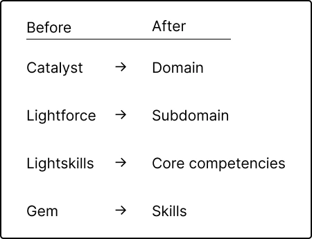
During interviews parents shared discomfort in not being well versed enough in wellbeing concepts to talk with their kids. They wanted to have these conversations, they just didn’t feel that they had the ability to. With this insight, it became clear that creating a shared language in the platform would help empower parents to have these conversations with their kids instead of being disengaged or intimidated.
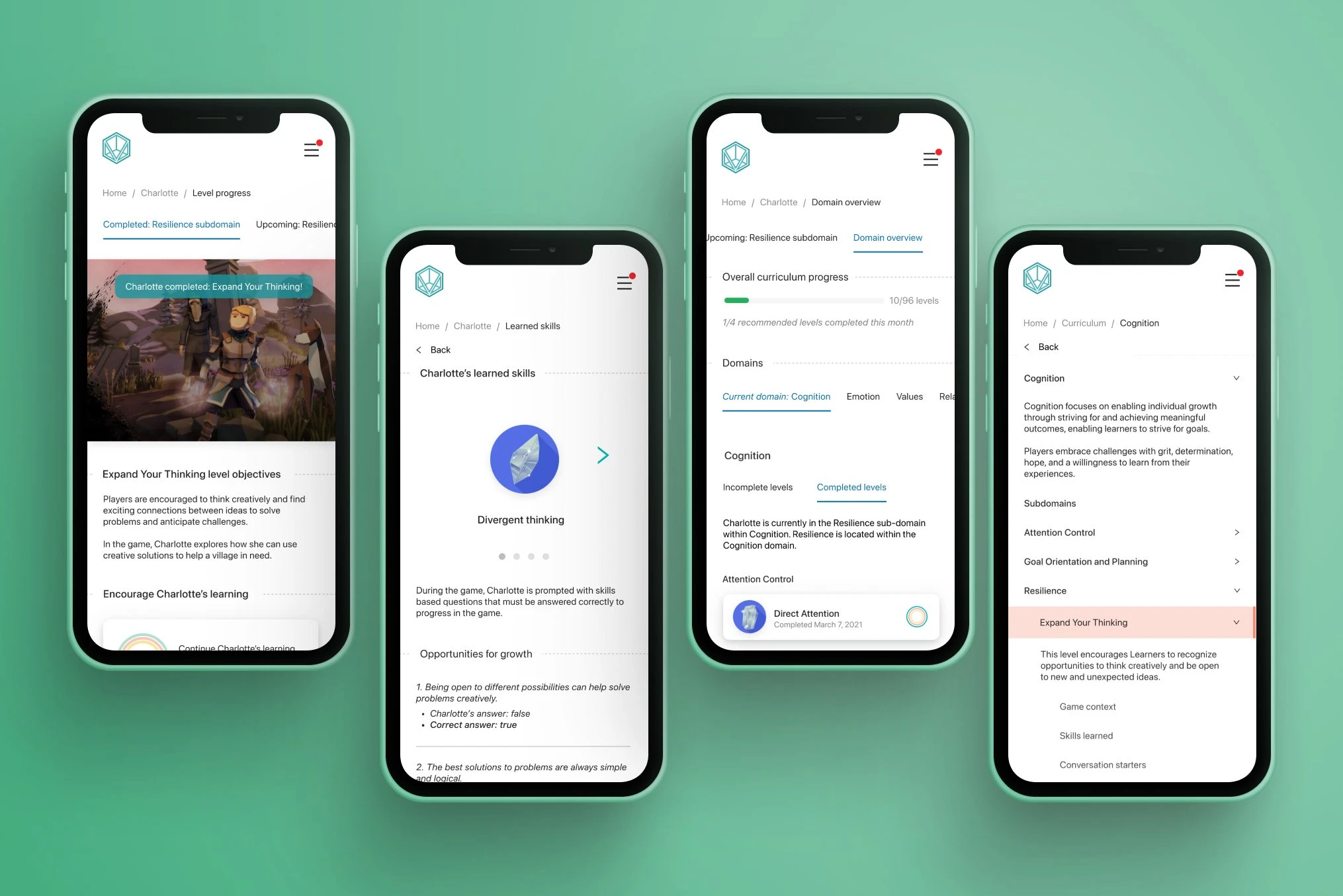
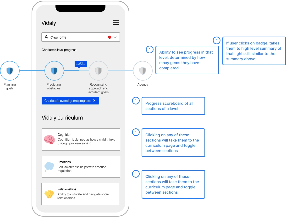
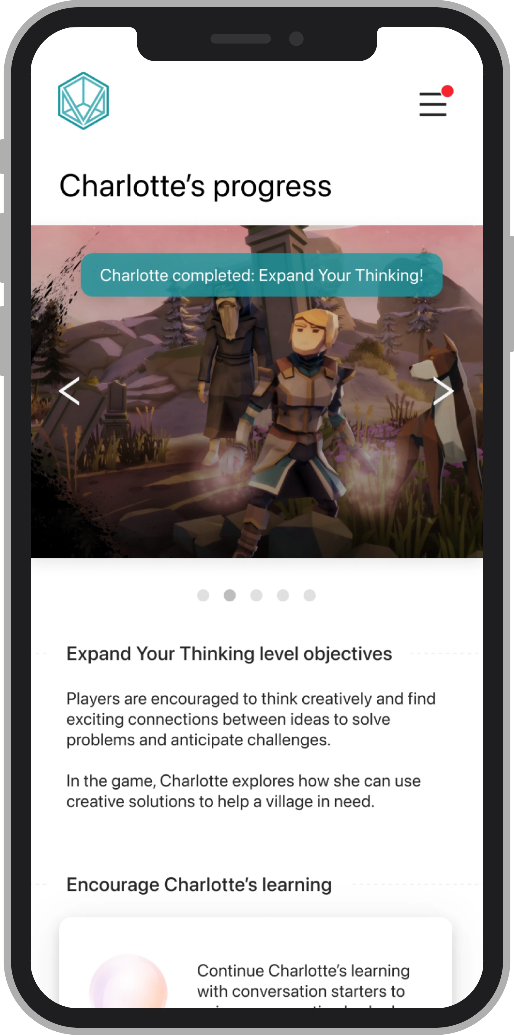
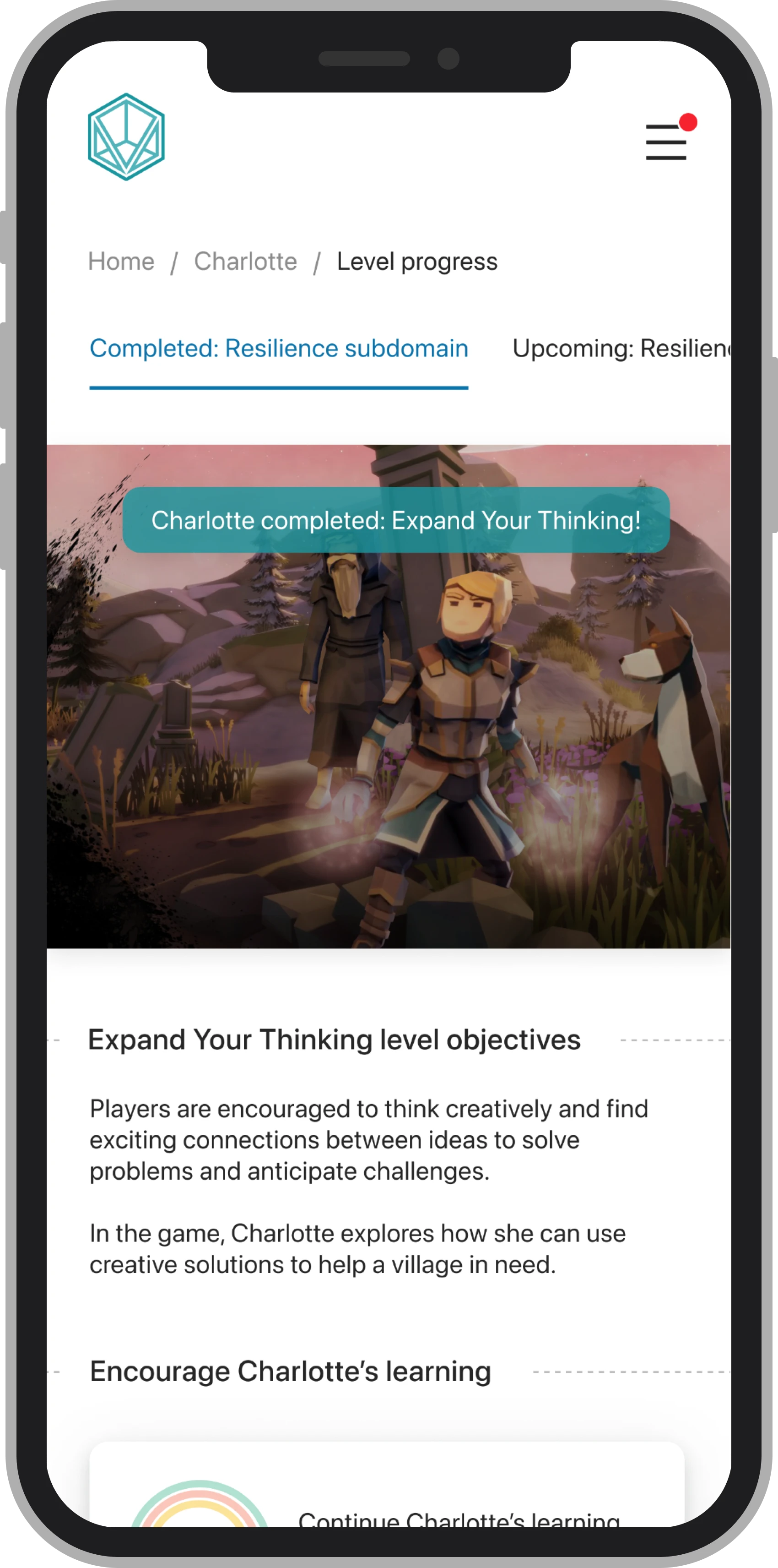
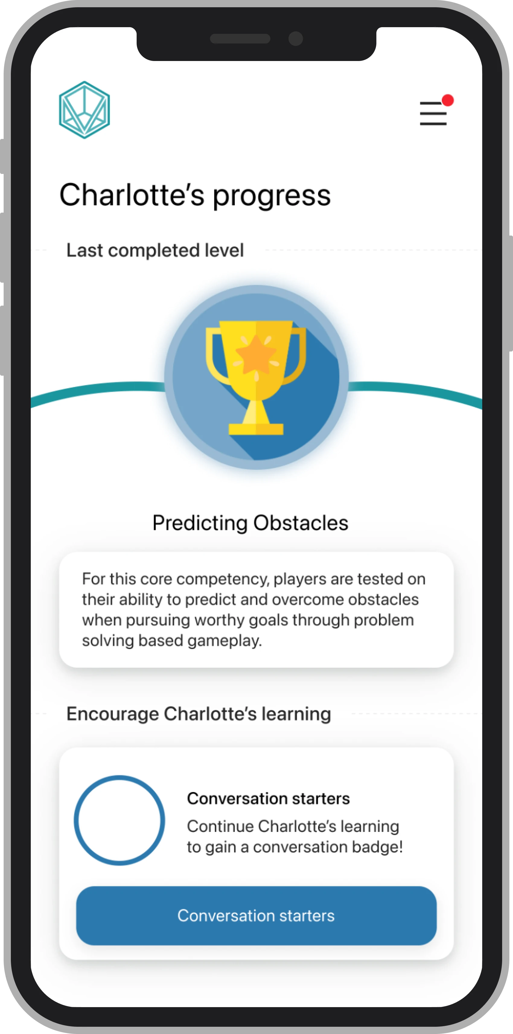
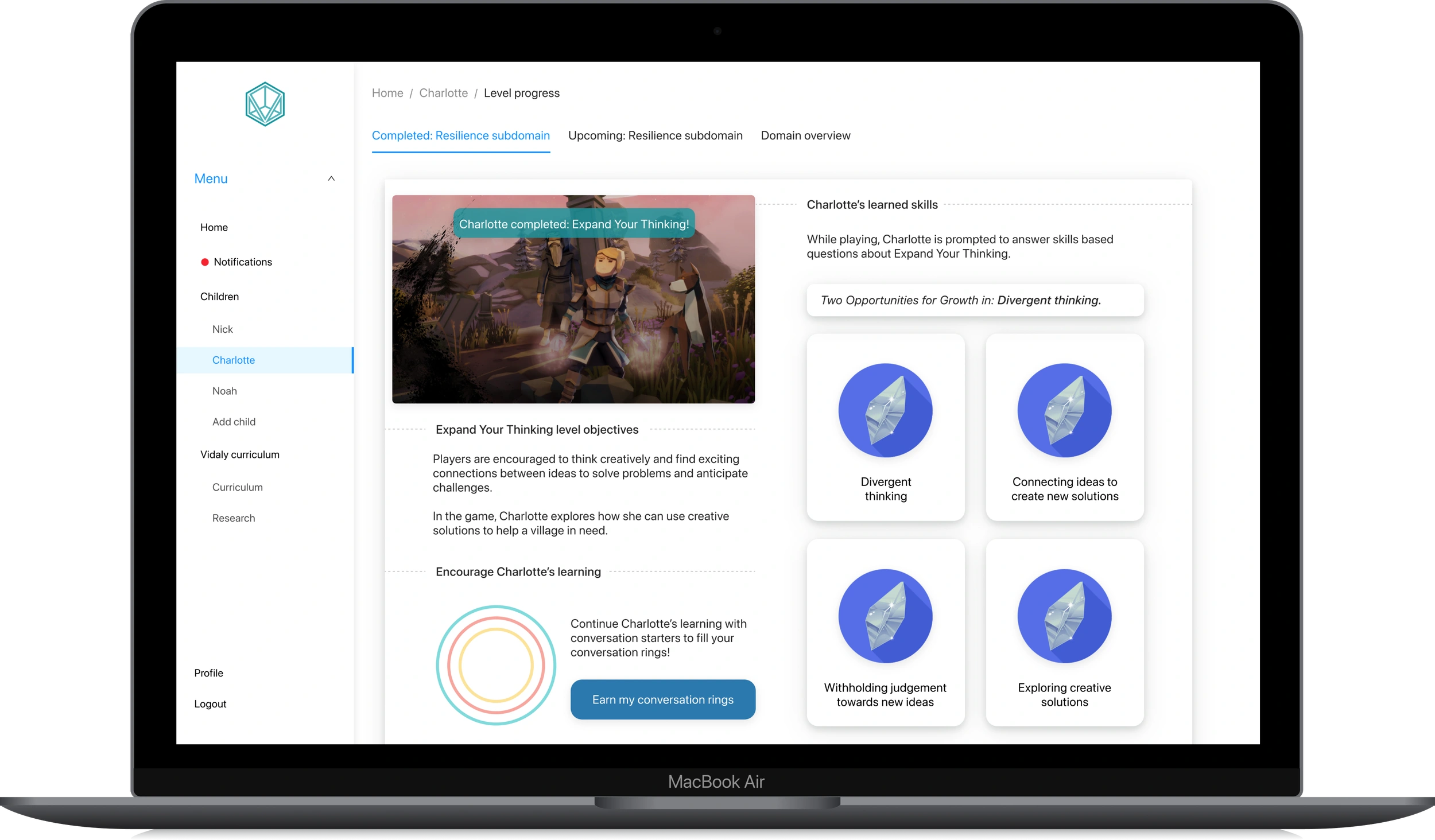
The initial wireframes focused on designs that helped accomplish the user goal, "Lily wants to know what Charlotte learned in the last level and start a conversation with her about it," which we defined in our user flow. Wireframes included:
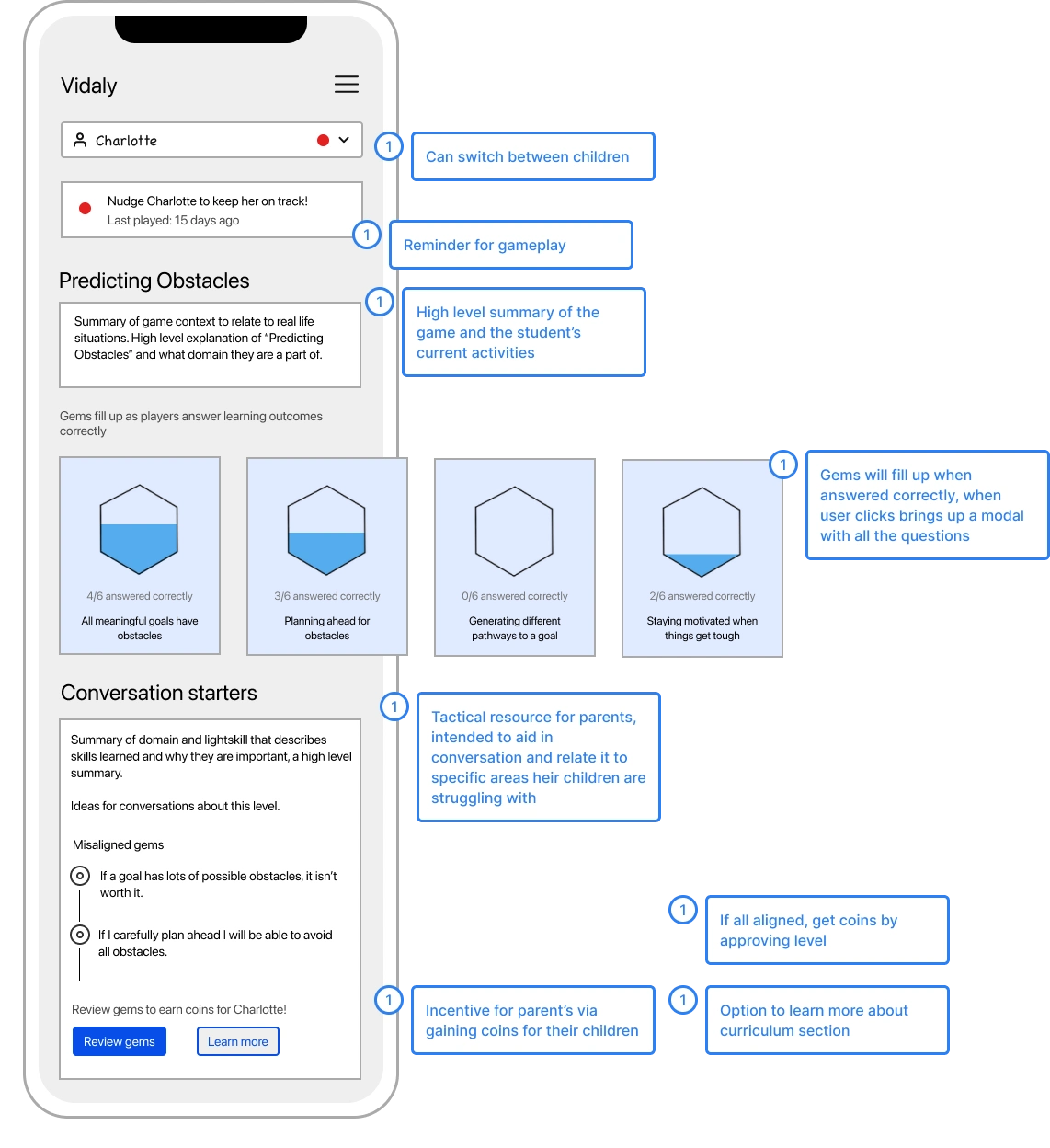
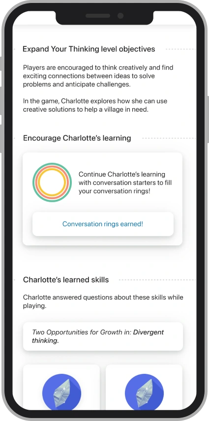
Summary of last completed level.
"Gem questions" which are questions that Learners are asked in the game.
Conversation starters to help parents connect lessons to real world situations.
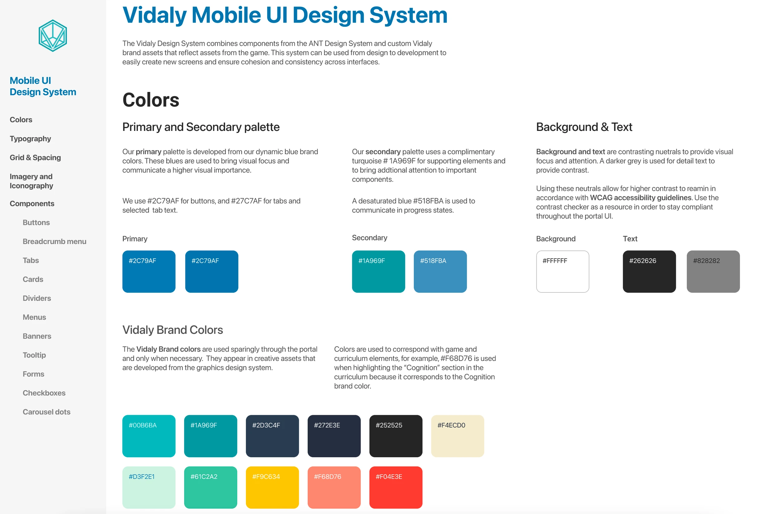
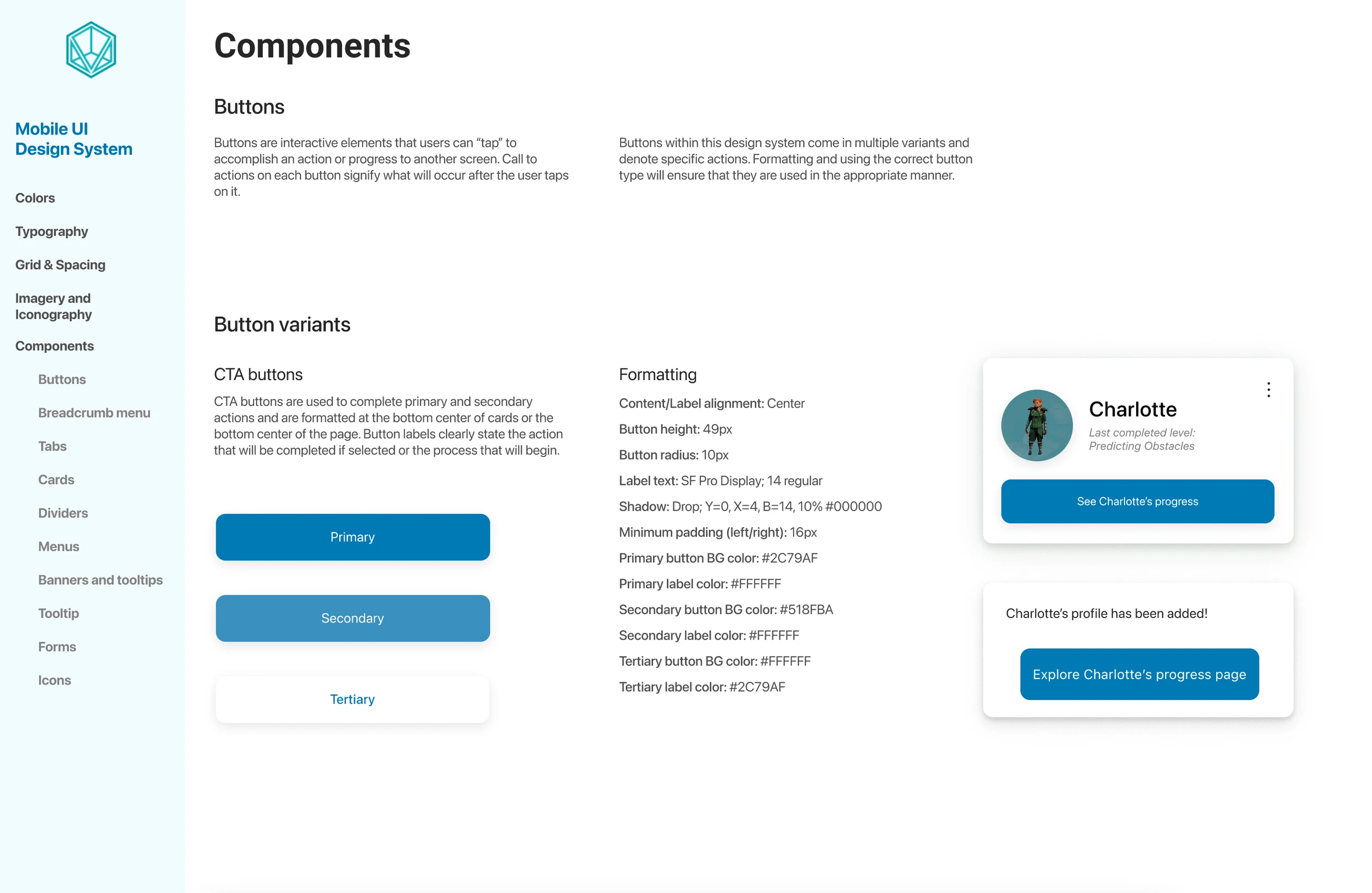
For the visual identity of this portal, it was important to combine branded design elements created by our Creative Director and components from the ANT design system using Apple iOS guidelines to improve the process for our engineer when it came time for development.
Using the ANT design system proved helpful in the beginning, but I decided to customize elements to communicate a sense of warmth that was in line with the Vidaly brand identity. This design system layout is inspired by my talented designer friend, Robel!
During development and in writing portal content, I noticed we did not have a cohesive voice and tone as a company. It was important that we developed a consistent brand voice and tone to increase our users sense of trust in Vidaly.
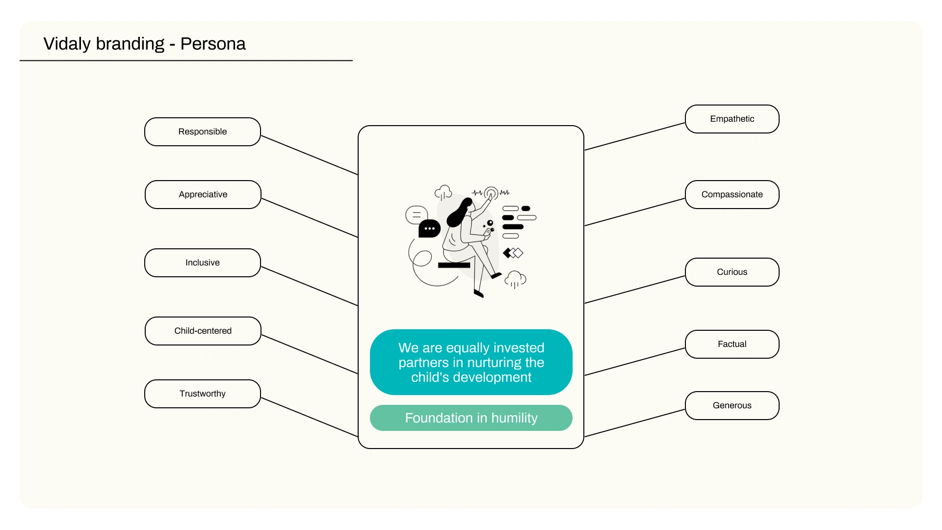
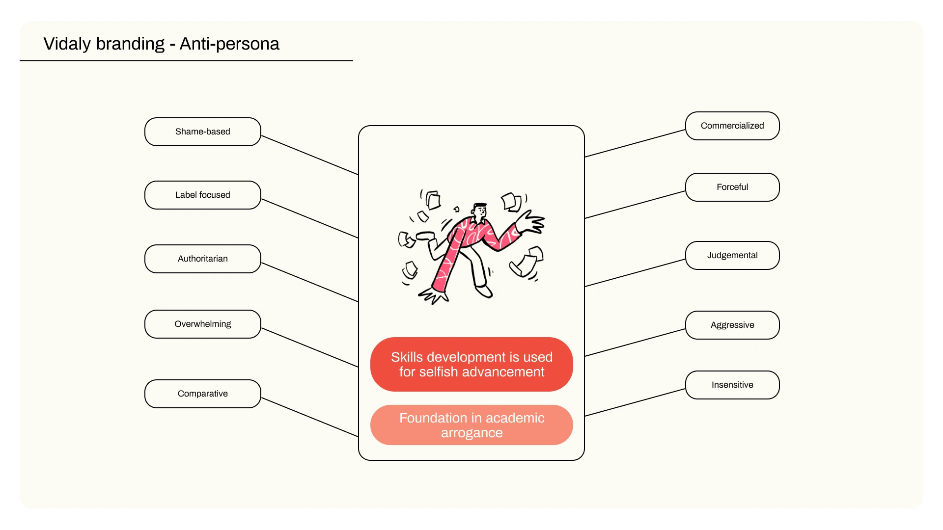
I led the team through a fun collaborative branding exercise in FigJam where we defined tone and voice by defining our audience, what values were important to us in communicating information, and the lasting impact we wanted to have on our users. Something that was particularly helpful was creating a Vidaly persona and anti-persona to be clear about how we wanted to come across as a company.
We defined the following principles based on the FigJam exercise we completed together:
Approachability, Knowledgable, Humility, Warmth, Curiosity, Generosity, and Fun!
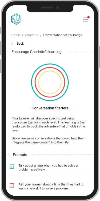
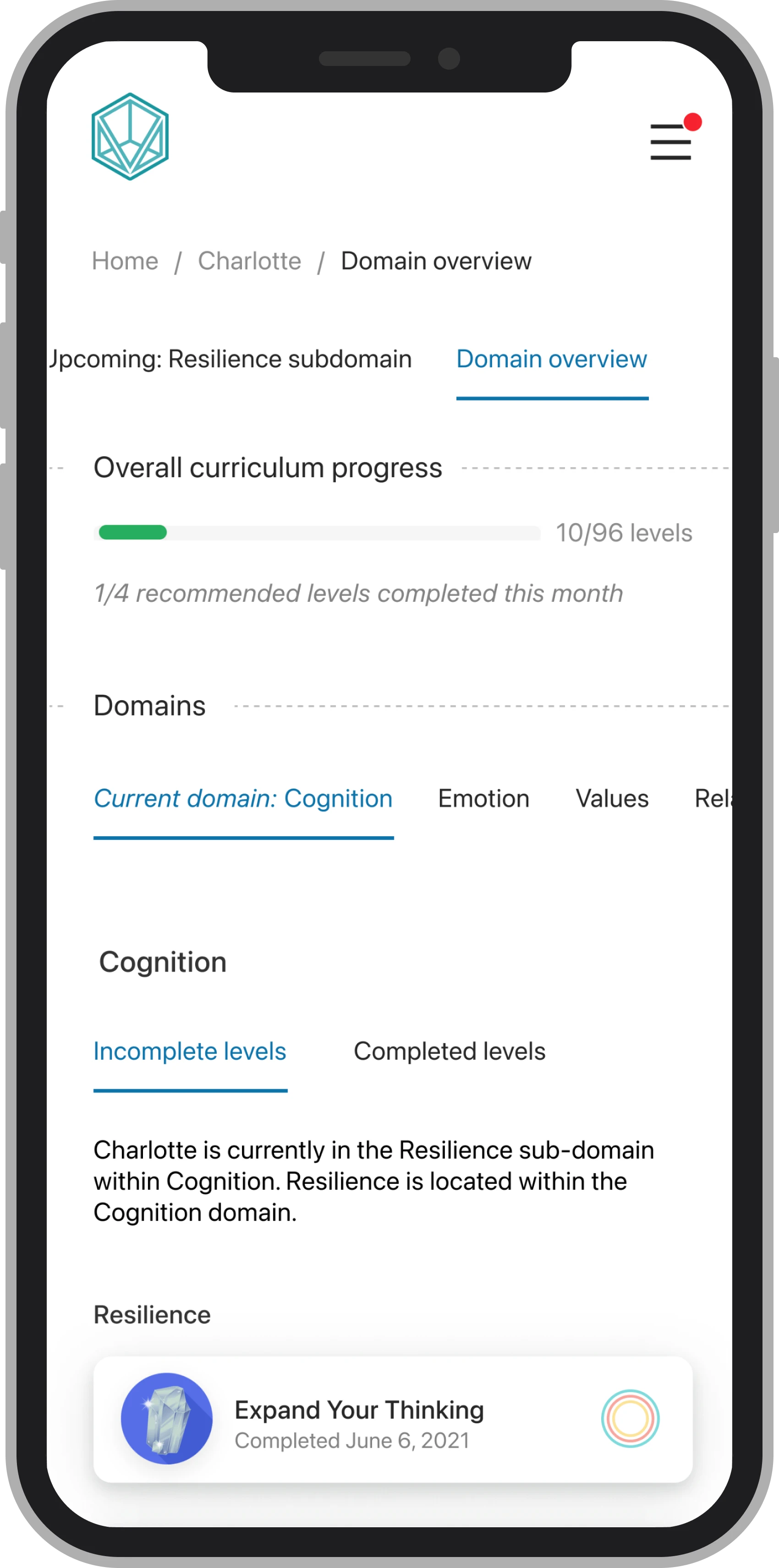
Clear markers of progress were helpful for guardians, and they often wanted specific clarity between what levels had been completed and what conversation rings had been earned.
We gamified the conversation starters to provide a sense of accomplishment to parents and opportunities for connection through conversation.
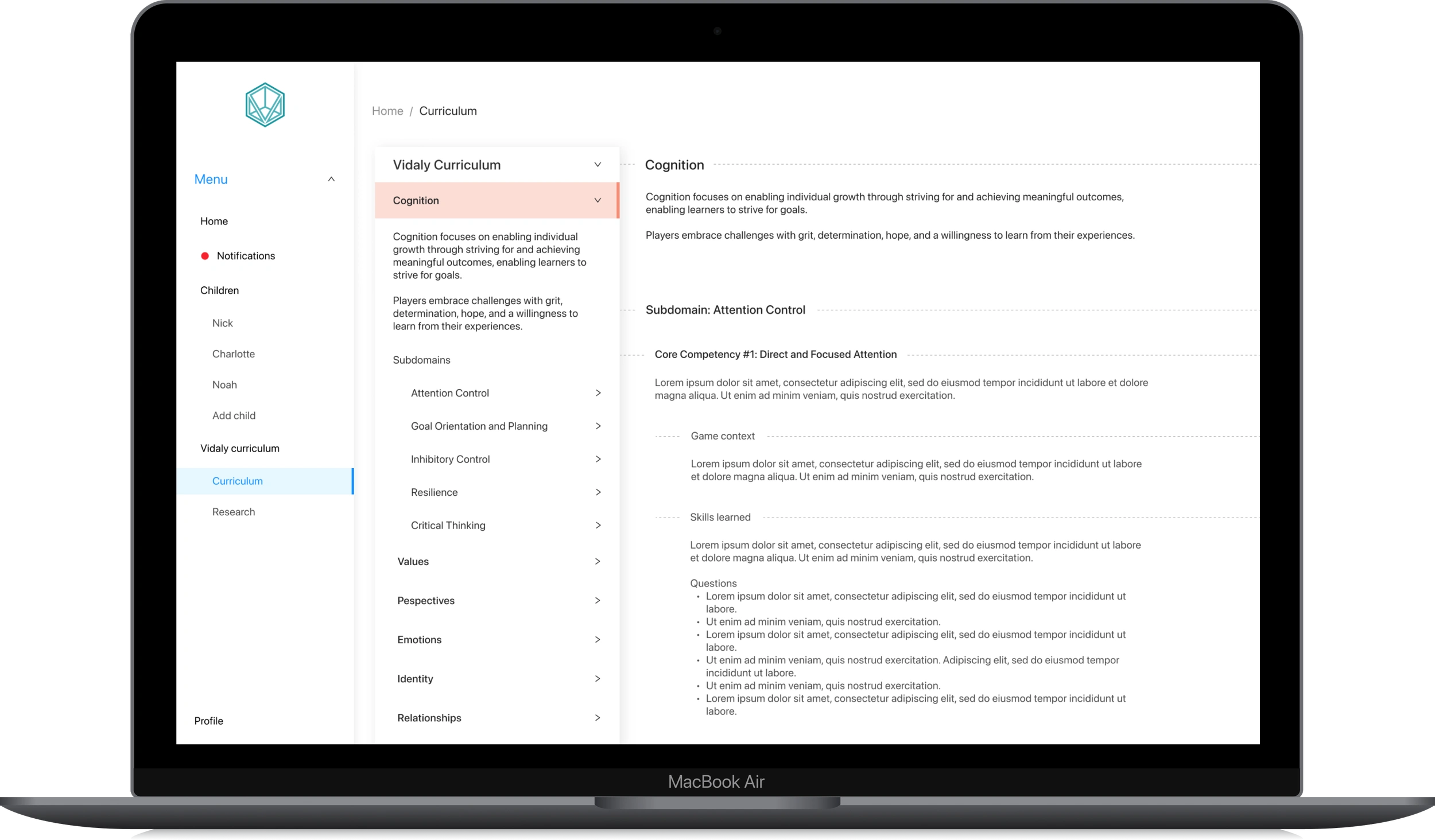
Structuring and organizing the curriculum was the most challenging part of the portal because of the density of information. To make it easier to follow along, the curriculum was not connected to their Learner's progress and instead was a reference that could be accessed at any time.
We used the same mobile design system in order to scale to desktop. The increased visual space was helpful for some elements such as the curriculum, where I used an interaction pattern similar to Wikipedia to organize the large amount of information.
As the inaugural UX/UI designer at Vidaly, I led and managed the research and design initiative to create a portal that connected parents with their children's progress in Vidaly’s Social Emotional Learning game.
Process
Allowing parents to directly interact with a prototype allowed us to observe their behaviors in real time. We used unmoderated and moderated testing methods of the portal prototype to reach saturation in insights.
During one of these usability tests, when the mom I was testing with started exploring her son's progress in the portal, he excitedly jumped into the camera view and started talking about his thought process for how he answered each question in the game. After walking through some of these together, they returned to the homepage and launched into a candid conversation based on the prompts in the portal.
This was a really special interaction to be a part of and see as a researcher because I was able to see the real possibility of connection that the game and portal could provide to a Learner and Guardian. I felt very lucky to be able to observe in real time the way in which their relationship was deepened by having the portal as a resource.
Through testing, we were able to address four major usability themes:
Reducing cognitive load.
Clear markers of differentiation.
Opportunities to connect.
Curriculum navigation.
We found that users viewed the multiple text boxes and icons on the dashboard screen as clickable, which led them to feel overwhelmed.
Below is a progression of the dashboard screen that increased user control and freedom by decreasing extraneous clickable elements and adding navigation tabs at the top.
In the original scope of this project, administration and teachers were included as part of the user groups that we interviewed with for a B2B portal. In that research, reporting options and data visualization were more relevant to their specific needs. As Vidaly scales to schools, they hope to create a similar portal for teachers and administration.
After completing design of the mobile and desktop platforms, files were officially handed off to the team. Unfortunately, this start-up did not end up getting the funding they needed to launch their product. It’s bittersweet to be able to be a part of a team’s growth and to experience the uncertainty of launching a startup. I feel so lucky to have been able to work with such a talented and passionate team throughout this!
Like this project
Posted Feb 6, 2024
I led and managed the research and design initiative to create a portal that connected parents with their children's progress in the accompanying game.
Likes
0
Views
14