Encouraging ethical consumption and communicating impact
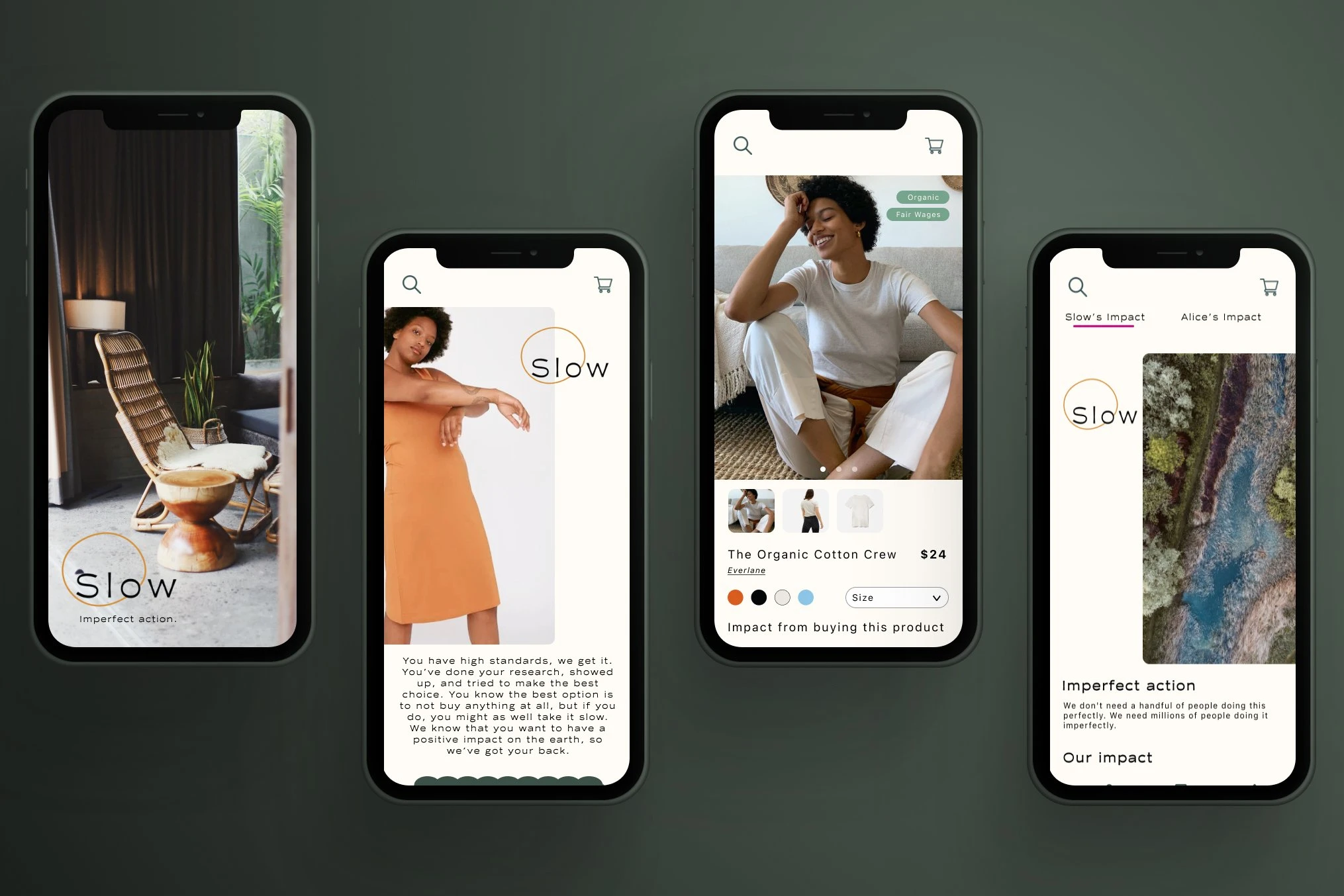
For this project, I wanted to understand how people made sustainable decisions when purchasing new products, and what a resource might look like to make that process easy and convenient.
Through this concept, I learned how to match needs to a tangible solution, and how important it was to keep users involved during development and base decisions on research.
The thought behind Slow was simple, the intention to slow down when it comes to consumption. At the rate we are going now, we are harming the environment in devastating ways that will have irreparable impact in the future.
There are a myriad of reasons why shopping sustainably is not accessible to a majority of people, but for those who want to try, they are often overwhelmed by the amount of responsibility is put on them to find that sustainable solution.
Exploration
The challenge
I started this project by understanding how people were currently shopping, and what their motivations were when making sustainable choices.
In one-on-one interviews, I asked people how they made how they decided to buy new things and what kind of challenges they experienced if trying to buy from sustainable brands.
"I want to make sustainable choices but it usually requires a lot of research, and at the end of the day I don't know if I've really made much of an impact."
"Sometimes I really can't afford to buy something sustainable, and I almost feel like there is a sense of shame around that. I don't like when people shame you for not being able to always be sustainable."
"I think my choices mainly depend on the kind of marketing that companies do. I'm much more likely to buy from a company that has great marketing and I feel like they've invested in being a sustainable company. It's hard to know if they actually follow through, but at least they stand out and I remember them when wanting to buy something later on."
Based on the interviews, there were four main feelings that people experiences that made it challenging to feel empowered to live a sustainable lifestyle.
Trust: people didn't trust that companies were adhering to standards that they had set, and were instead using sustainability as a marketing tactic, also known as greenwashing.
Shame: people were often shamed because the choice they made was unsustainable or not "sustainable enough". This shame discouraged them from choosing sustainable items.
Ease: people had to invest a lot of time into making researched decisions. These choices were also more expensive and hard to find, which led them to choose based on convenience.
Impact: people wanted to know that their choices were making an impact and what they were doing was making a difference. Usually there was no feedback to create positive reinforcement for their choices.
These feelings from participants meant it would be important to create an accessible resource that encouraged a sense of accomplishment when making sustainable choices.
How might we integrate an accessible guide into their current behaviors? How might we empower people through validating the impact of their choices?

What would set Slow apart would be the ability to shop all sustainable brands and be prompted during the checkout process with "swaps" of more sustainable options. These "swaps" were usually chosen based on a sustainability criteria that the user set and what they were looking for.

Creating the Slow brand was an exercise in pushing the envelope while still remaining recognizable. As a user said:
"Sometimes I wish that "sustainable" brands would do something more outside the norm of nature-y green tones and neutral tones. It's not that exciting and they all look the same honestly, it'd be nice if these brands would take more creative risks."
I played with this balance in the brand design by keeping a muted and natural palette, but added in bright neon alert colors that would set it apart from other sustainable company branding.
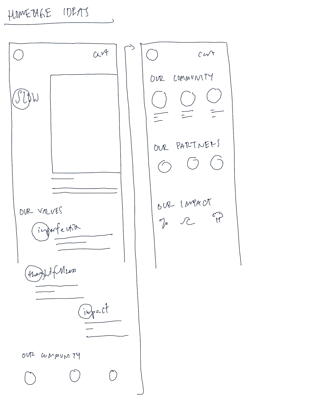
Before taking on hi-fidelity screens to test with users, I went through multiple drafts of hand drawn screens. With my peers that I tested this with, I found that while I wanted to focus on the story and intention of Slow, most people had a job to be done and wanted to have the items they were looking for accessible from the start.
Personalizing the experience
When researching solutions that may exist already, I found that they created really great criteria and ratings, but no way to purchase from sustainable companies directly or a way to measure impact.
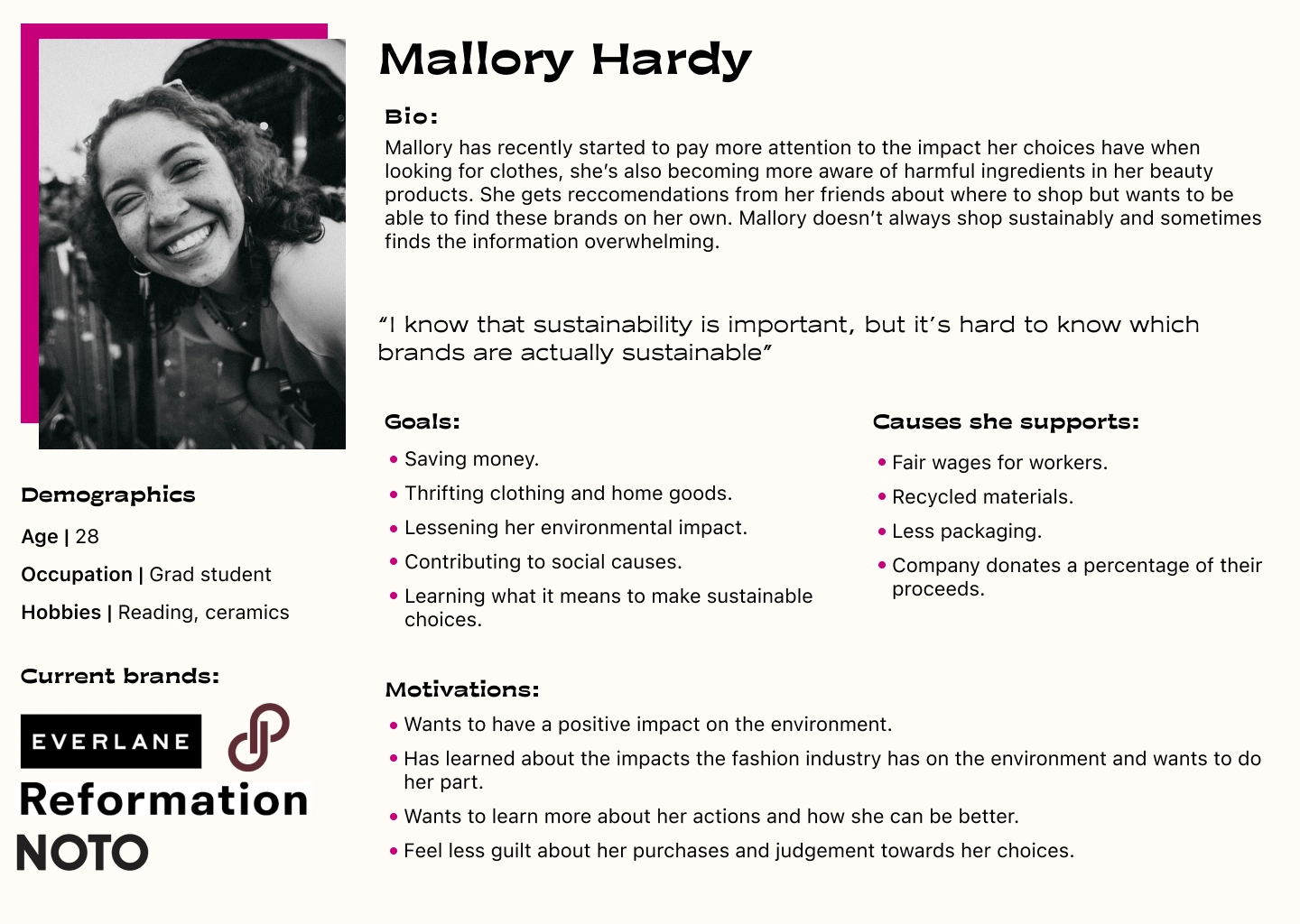
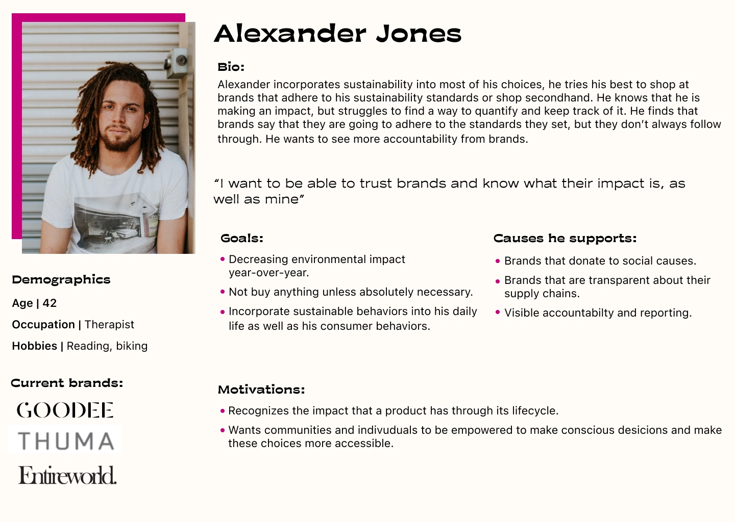
To make sure decisions were in alignment with our users, I created personas of potential users based on conversations I had with the interviewees.
Consumption is inevitable living in this day and age. We are constantly marketed new and exciting items in order to keep up with trends that promise us fulfillment. While following these trends is something that I enjoy, the impact of this consumption led me to design a compromise.
Timeline
Tools
Figma, Zoom, Flowmapp
Client
Personal project
Scope
Quantitative and Qualitative research, Branding
Overview
Process
Design with intention

Mapping out ideas
Testing with users
Drawing people in
The key flow
Social impact
Additional user needs
Desktop versions
Moments of delight to look forward to
After initial designs, I moved on to testing with users to validate flows and gather insights.
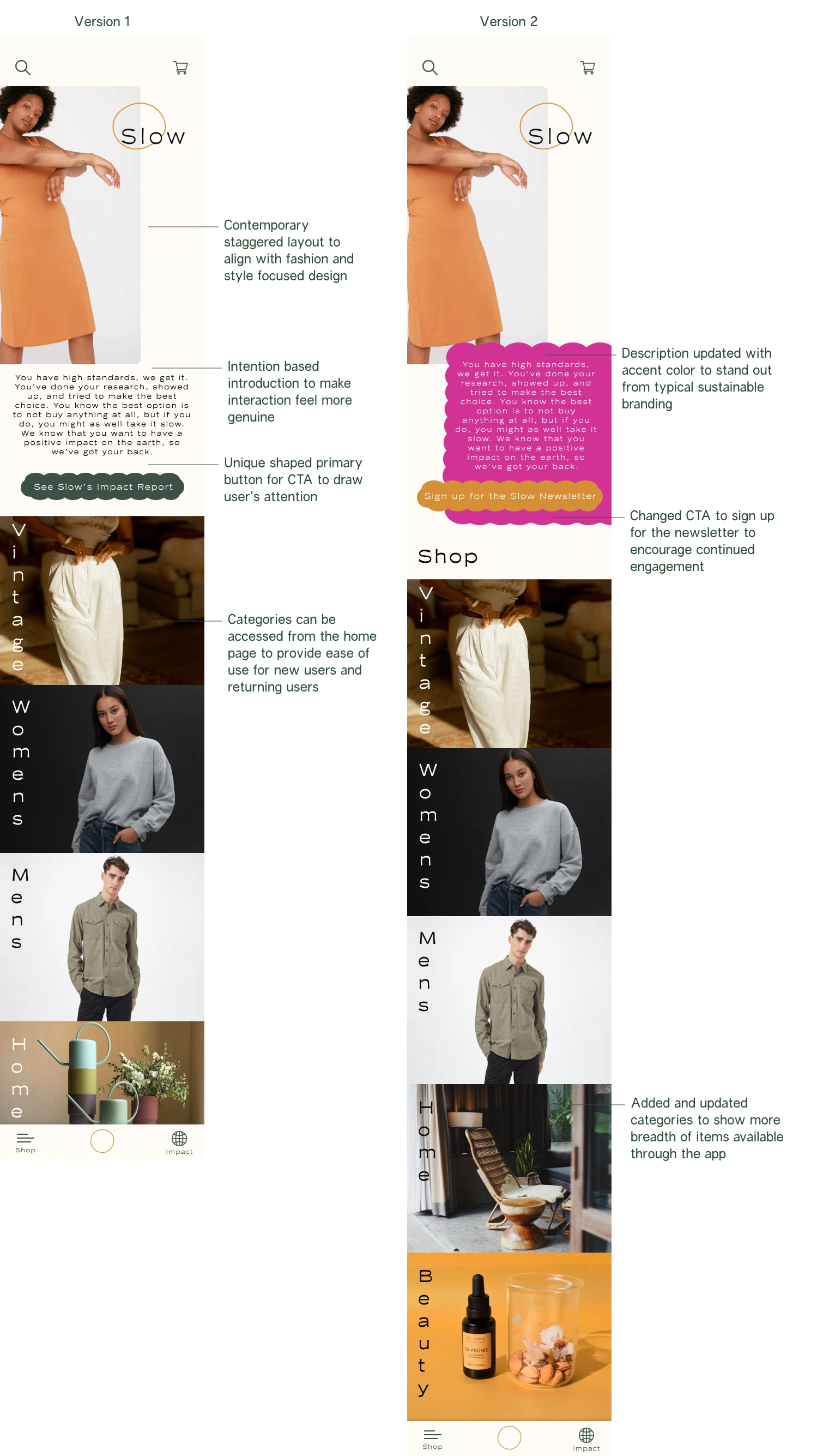
Based on the primary feelings from research (Trust, Ease, Shame, and Impact), it was important for the first screen that users interacted with to communicate a sense of warmth.
In testing, I found that I needed to make shopping the first action to be done when opening the app and allowing users to search for their items since this was the main user's objective.
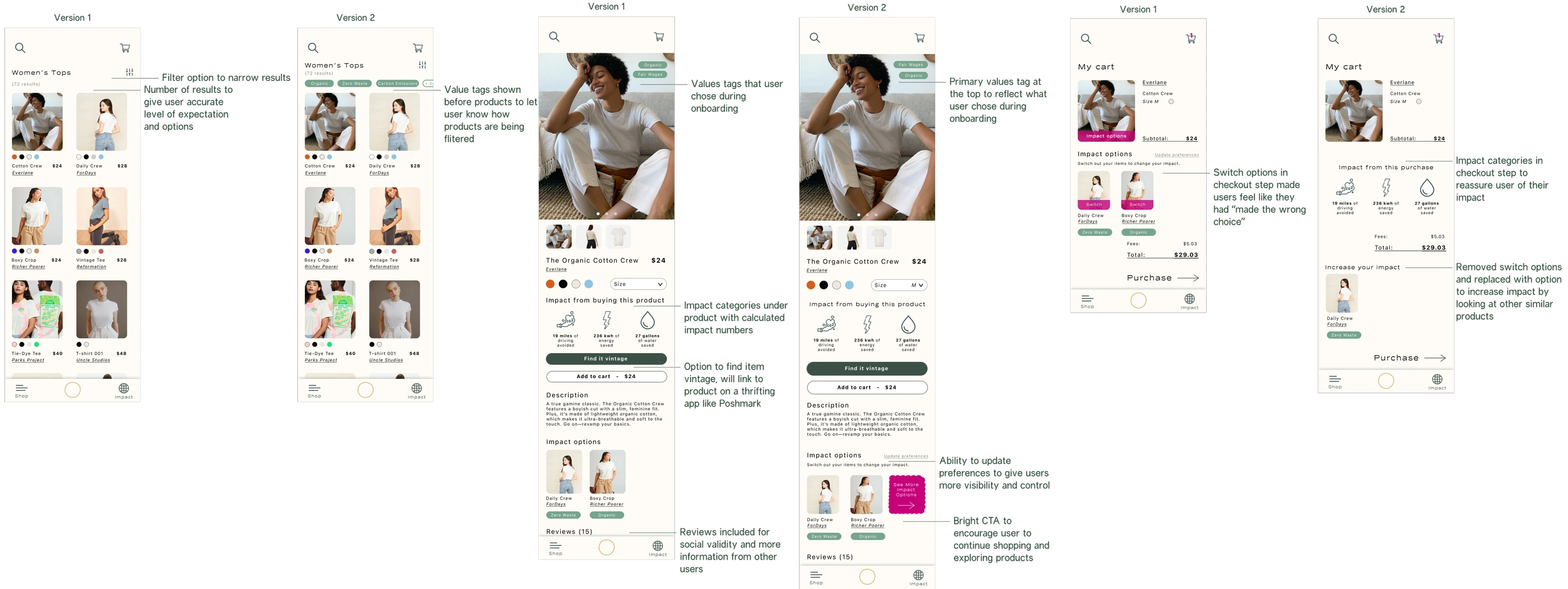
Because this was a consumer app, the purchasing flow was the key experience to gain insights from when testing. What I found from this round of testing, was that people felt empowered by adding to their impact report, but felt a sense of doubt when seeing the impact options in check out because they felt like they had made the wrong choice.
Only 25% of users tried the impact options whereas 100% of users called out the "add to impact report" CTA and wanted to know what it would do.
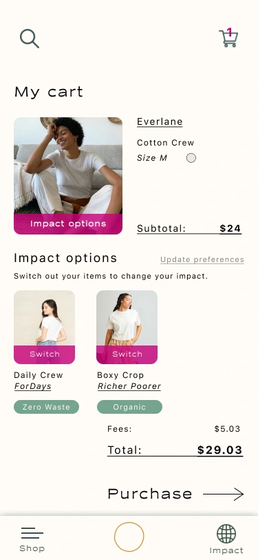
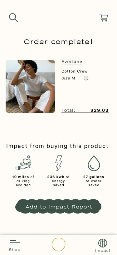
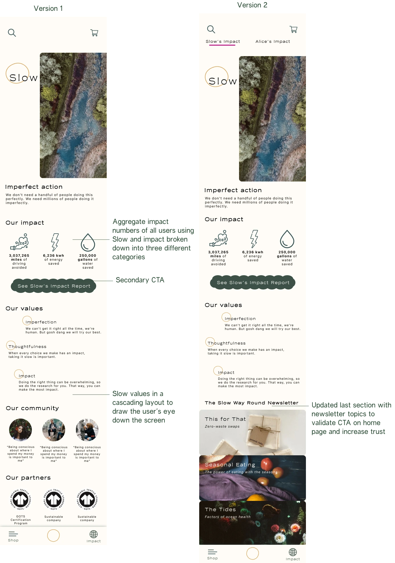
Making values tags more consistent throughout the process helped reinforce the steps they had taken during onboarding and made the experience feel more personal, like the app was tailored to the impact they wanted to make.
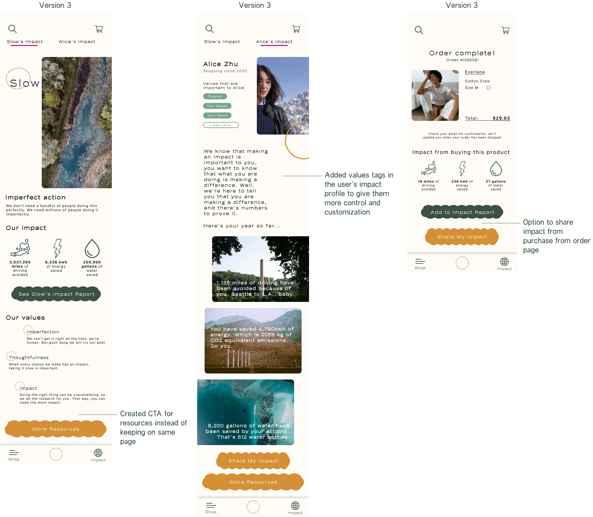
Seeing these values and impact numbers throughout the app reinforced a tangibility in the actions they were taking. Having something tangible to share helps make an action feel more concrete.
From interviews, I knew that users were more likely to be encouraged to make sustainable choices if they were being held accountable by their peers.
I wanted to make this an empowering experience instead of a shameful one. Using the impact numbers from each item, this would compile a report at the end of the year that users could share.
Outcomes
While the initial prototype made it easier to purchase sustainable items directly and track personal impact, I did not accomplish the user need of wanting to donate specific funds. In updated iterations, I would want to explore ways that consumers could support their favorite brands by adding options in the checkout to donate to their causes.
Scaling this to a desktop version and possibly adding a Google plug-in would help increase ease of access to sustainable options. Having something integrated would make it even easier for someone to naturally pick a more sustainable choice without having to do heaps of research.
Like this project
Posted Feb 6, 2024
Designed a mobile-first app that provided ethical alternatives while shopping. Shopping in the app would create impact reports based on user-chosen values.
Likes
0
Views
19

