Editorial e-commerce web design
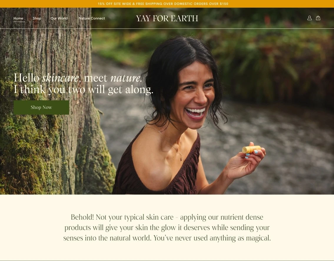
The Yay for Earth team reached out to me to support them in designing their Shopify storefront where they sell all-natural, organic, and regenerative ingredient focused lotion line. They have a loyal customer base due to their unwavering standards for quality and environmental ethic. The previous Yay for Earth website had allowed the team to sell their products and felt familiar to most of their customers, but did not allow them to mature in their branding and the partnerships that they wanted to pursue. The team had a clear idea of the look and feel they wanted to accomplish, but were struggling with making it a reality.
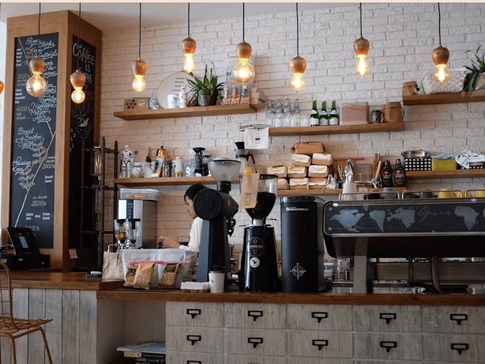
I worked closely with the team to completely redesign the website to reflect their vision. We spent countless hours finding inspiration through Pinterest, analyzing other beauty sites, testing colors, and trying sooooo many fonts. Since the business was local to Boulder, I had the privilege of designing side by side the owner at various coffee shops around town for hours on end. I was able to describe decisions in real time, provide suggestions, and improve the confidence that the team had in making their own design decisions. I think it is a fine balance to provide design guidance while also allowing the client space to communicate their vision.
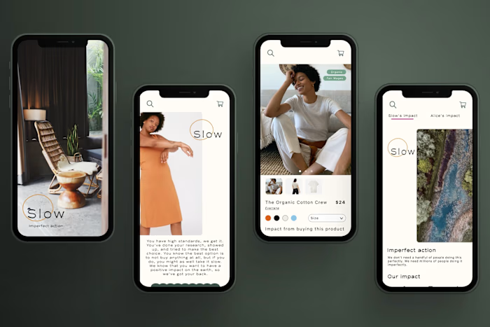
In the process, we were able to create a multi-page site with clear user flows and interactions. The editorial aesthetic reflected their values of approachability, simplicity, and calmness. As a business and a brand, they feel proud to share their website with others and are excited for the opportunities it can open for them now that they have a website that reflects the amount of care and intention into their products. I’m so proud of the team for having taken this step and can’t wait to see the ways in which they grow!
The brief
Why Yay for Earth?
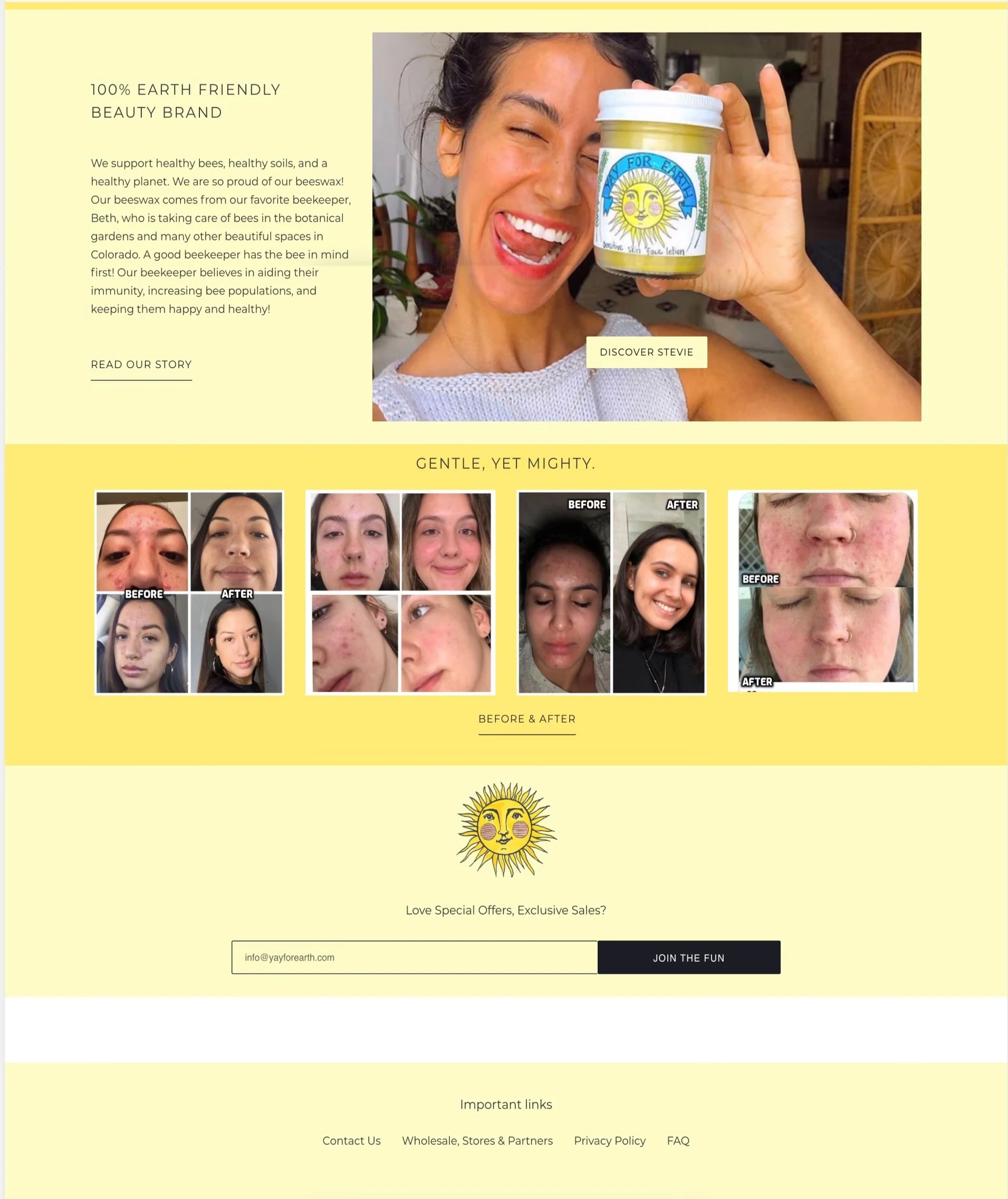
I worked closely with the team to redesign each page in their site and create a cohesive visual story. They wanted flexibility to be able to change elements based on seasonal campaigns, which meant they needed a framework that would evolve with them. We created a visual identity and brand that was earthy, simple, and accessible.
Working for Yay for Earth was a very special project for me because I have been able to see my friend put her heart and soul into this company firsthand. Every purchase made from the site and wholesale accounts directly impacts her ability to keep her family employed. Updating their website meant that they could raise their hand for more opportunities and start to take on more conservation efforts. It was very important to me to help the team make their creative vision a reality and help boost their confidence. Each font and color that we nailed was a full celebration between us all and it felt so incredible to launch a website we were all proud of! If I had to name my favorite project, this would be it.
Process
This project write up is currently in progress, check back later to get an in-depth account of my design process!
Outcomes
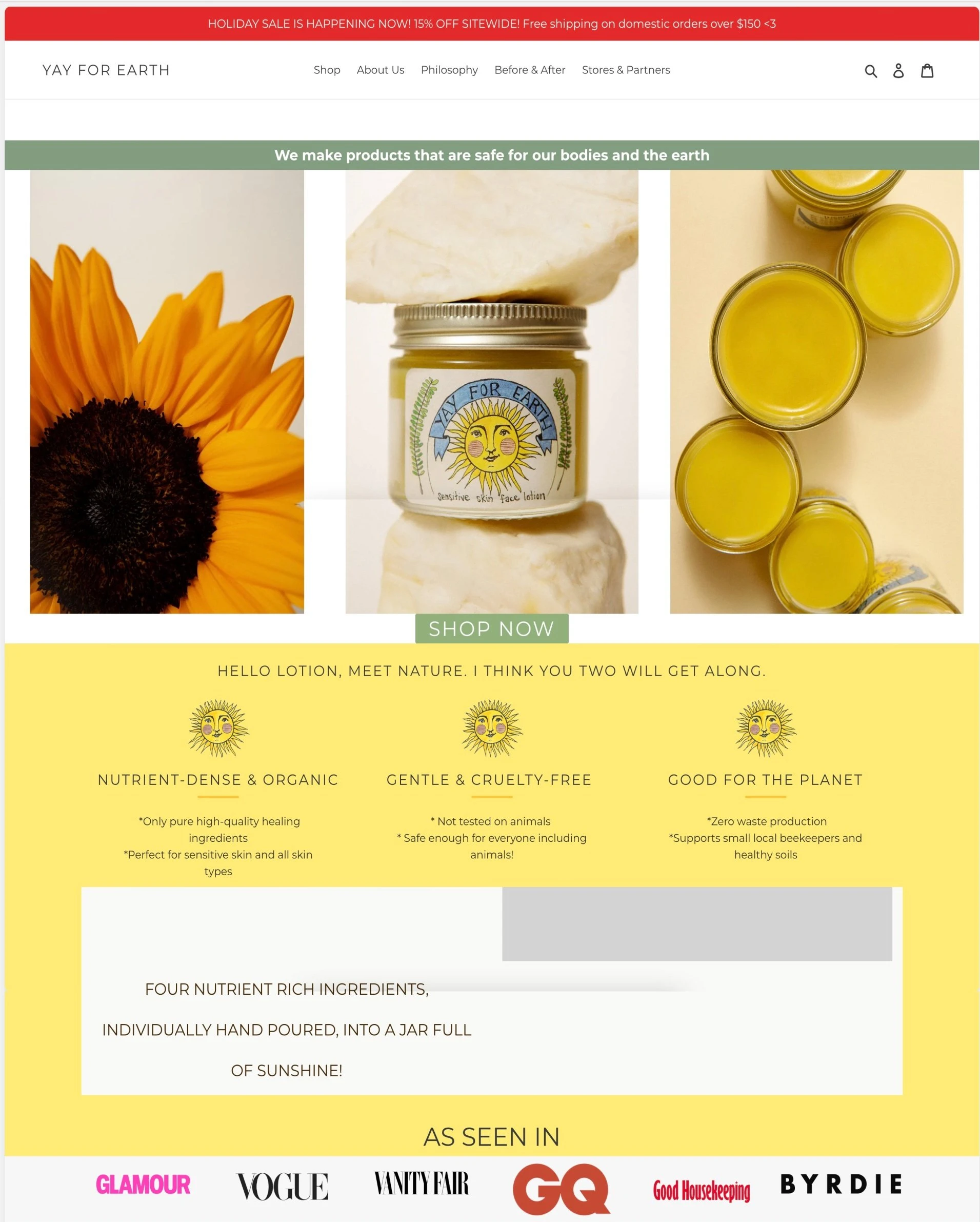
The finished product
After
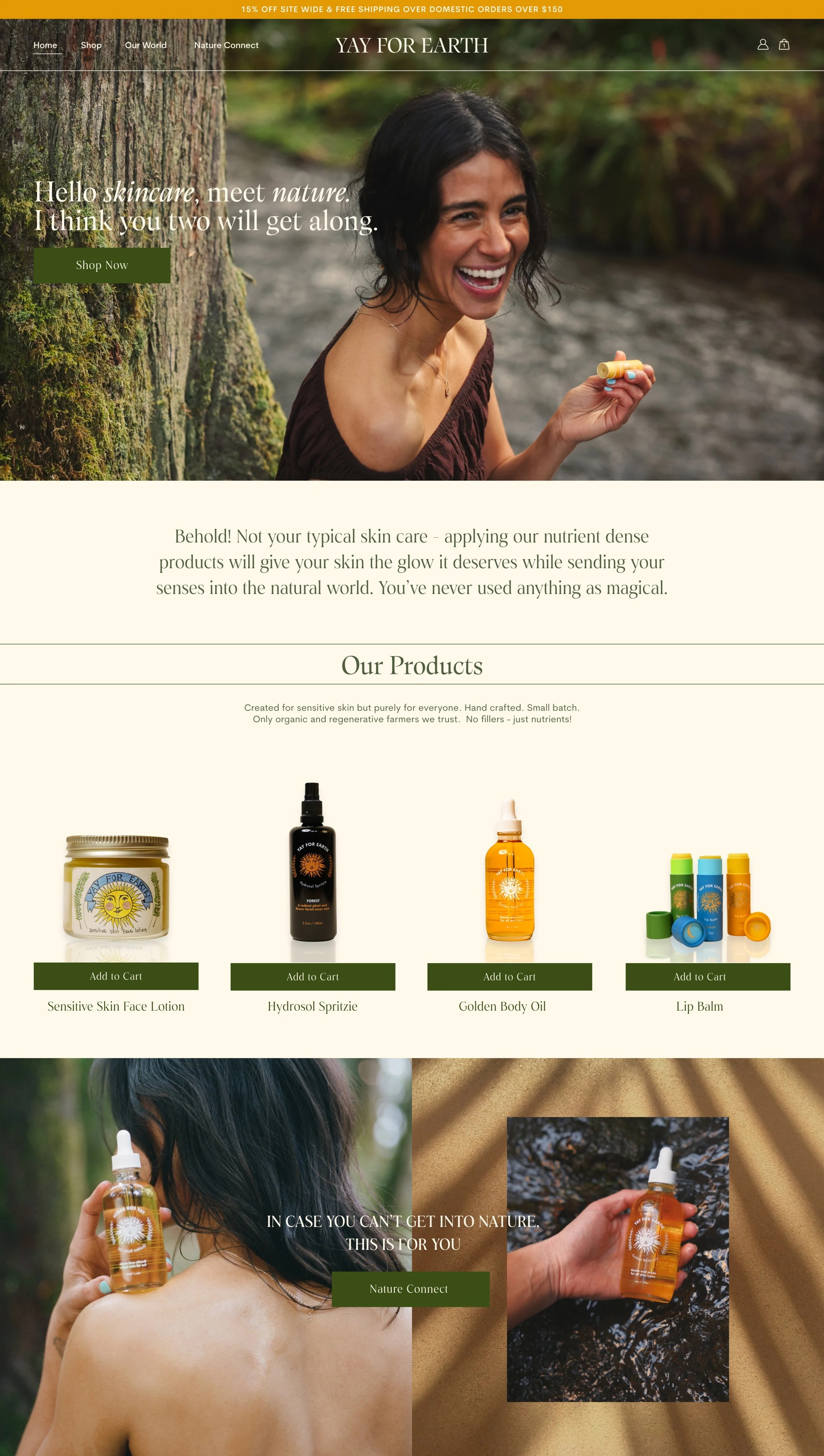
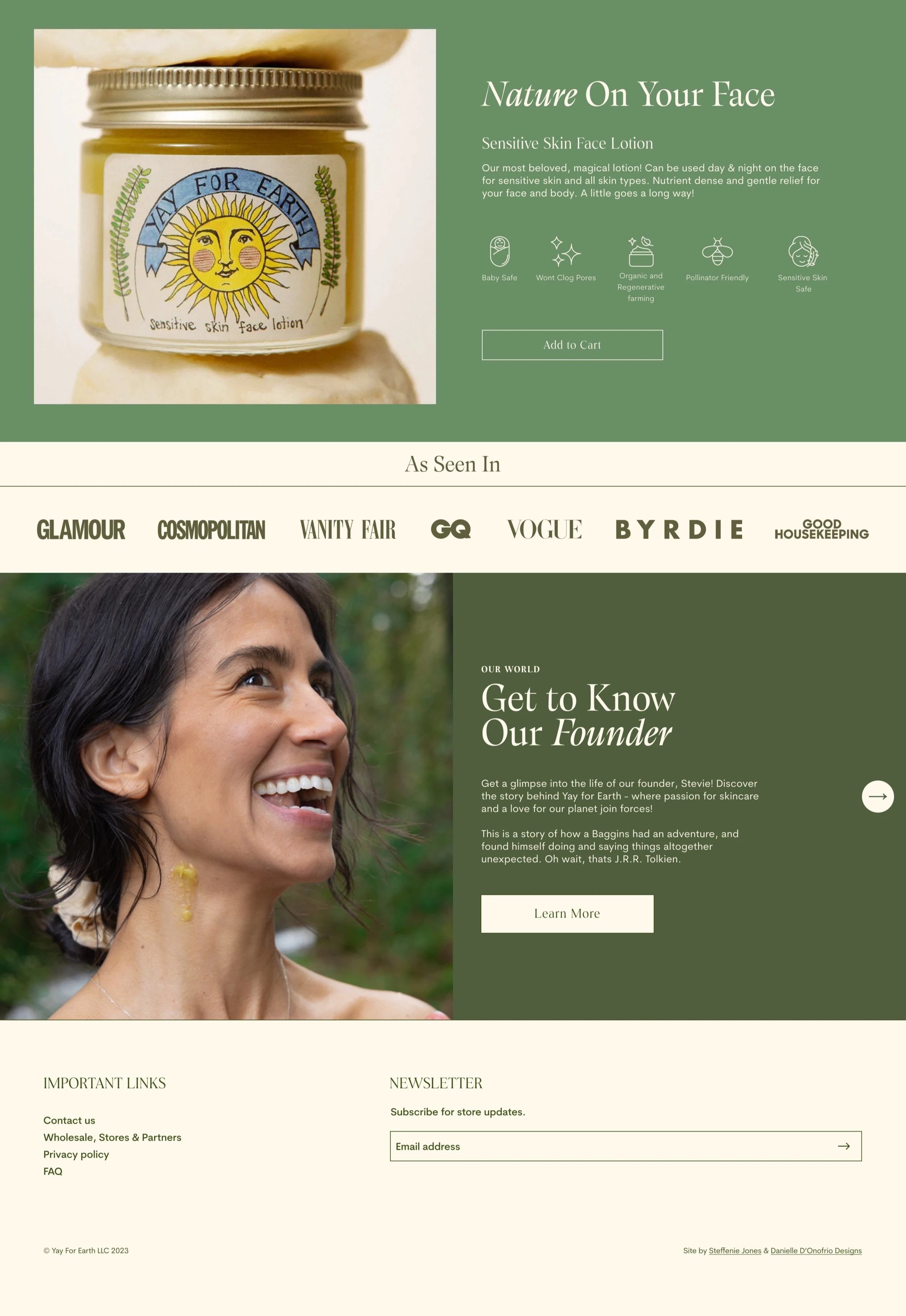
You can see the launched website here:
Yay for Earth has grown and matured as a company in the 5 years since they began in the founder’s small NYC apartment. They wanted a website that reflected their growth and would open up more opportunities for partnerships.
Yay for Earth wanted an editorial website with simplicity in mind. I worked with another designer for handoff and development of the website, which was launched November 2023.
Timeline
Tools
Figma
Like this project
Posted Feb 6, 2024
Redesigned website with a focus on editorial design style and branding. Created a functional framework to grow with the client as their business matures.
Likes
2
Views
30
