Kartini's Celebration
The Brief
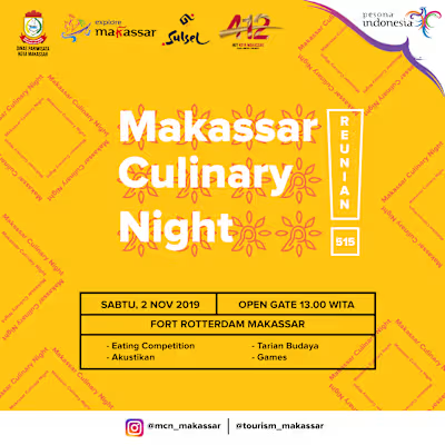
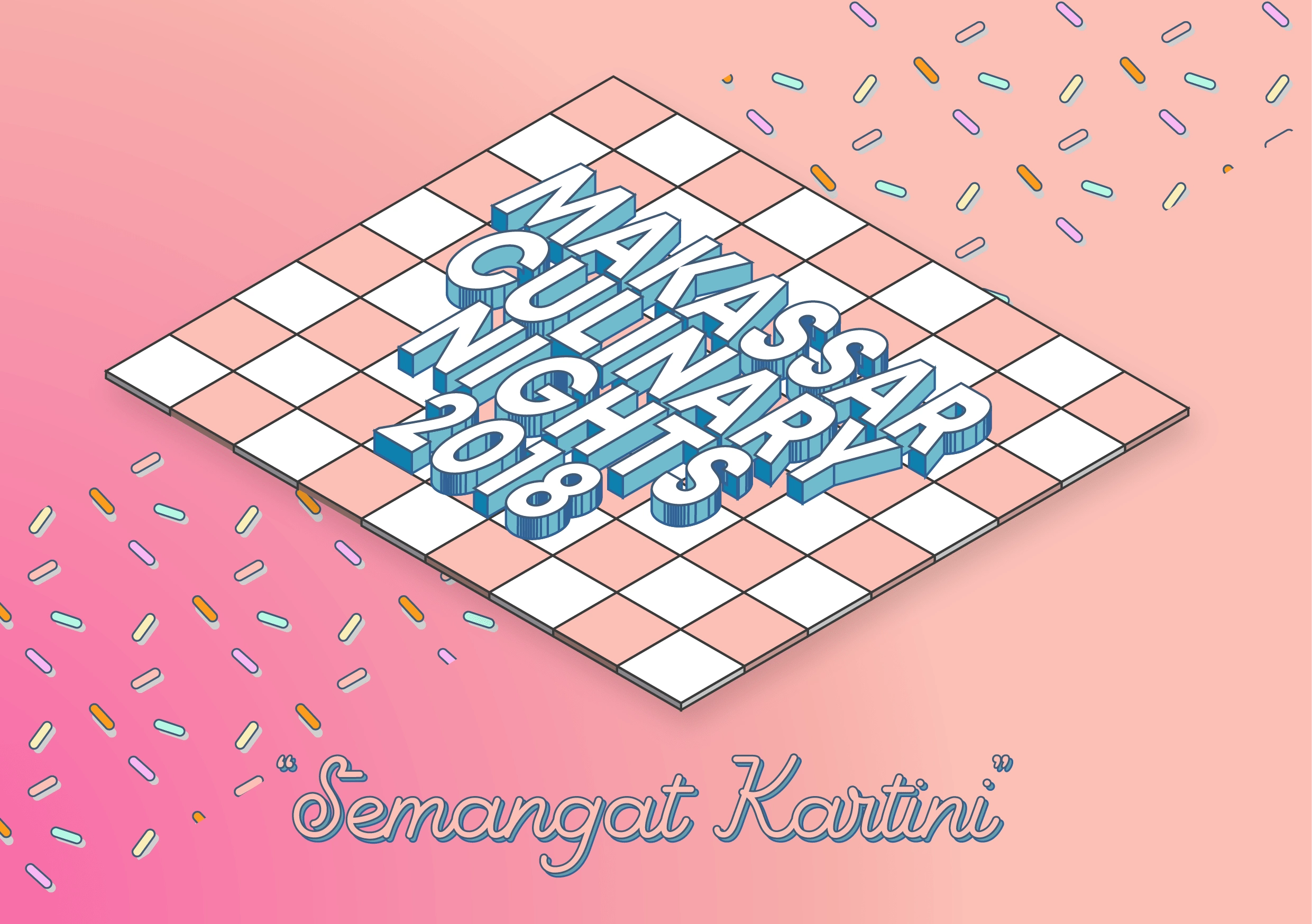
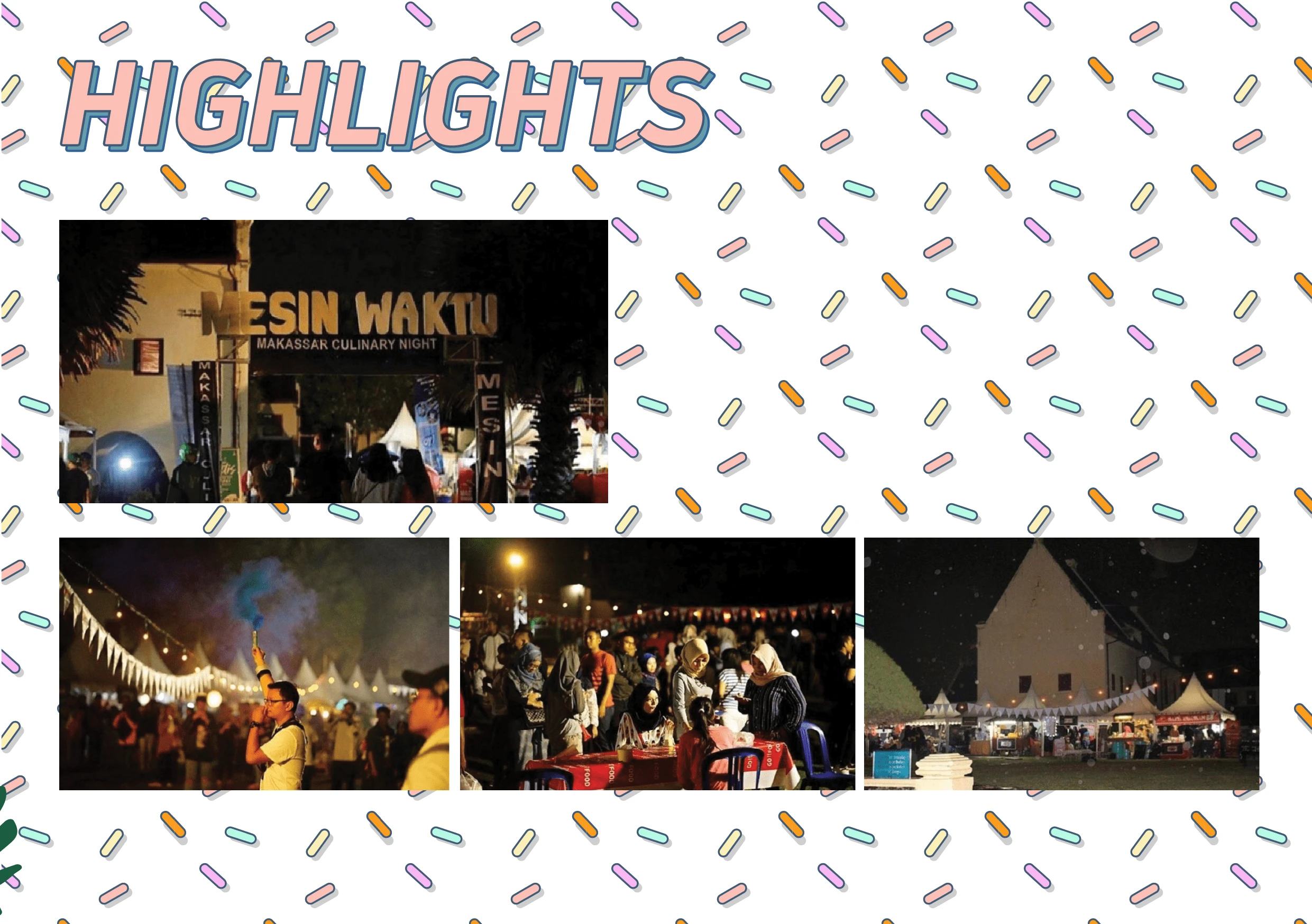
The Makassar Culinary Night is an annual festival in my hometown that aims to celebrate a single night filled with an abundance of culinary delights. The event is themed around Kartini, a renowned Indonesian heroine who fought for women's equality. By incorporating this theme, the design aims to pay homage to Kartini's legacy while also highlighting the rich culinary heritage of Makassar. The design's use of vibrant colors and bold typography effectively captures the essence of the festival, making it a visually striking and engaging visual identity that honors the spirit of Kartini and the culinary traditions of Makassar.
Design Process
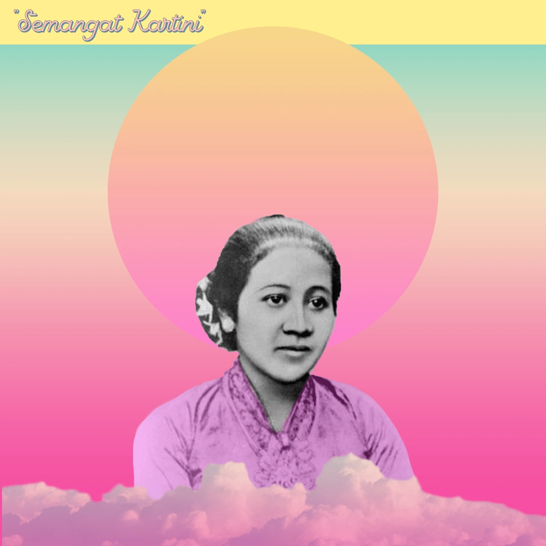
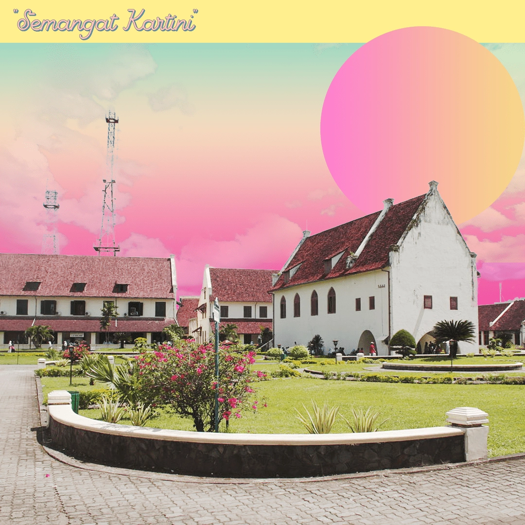
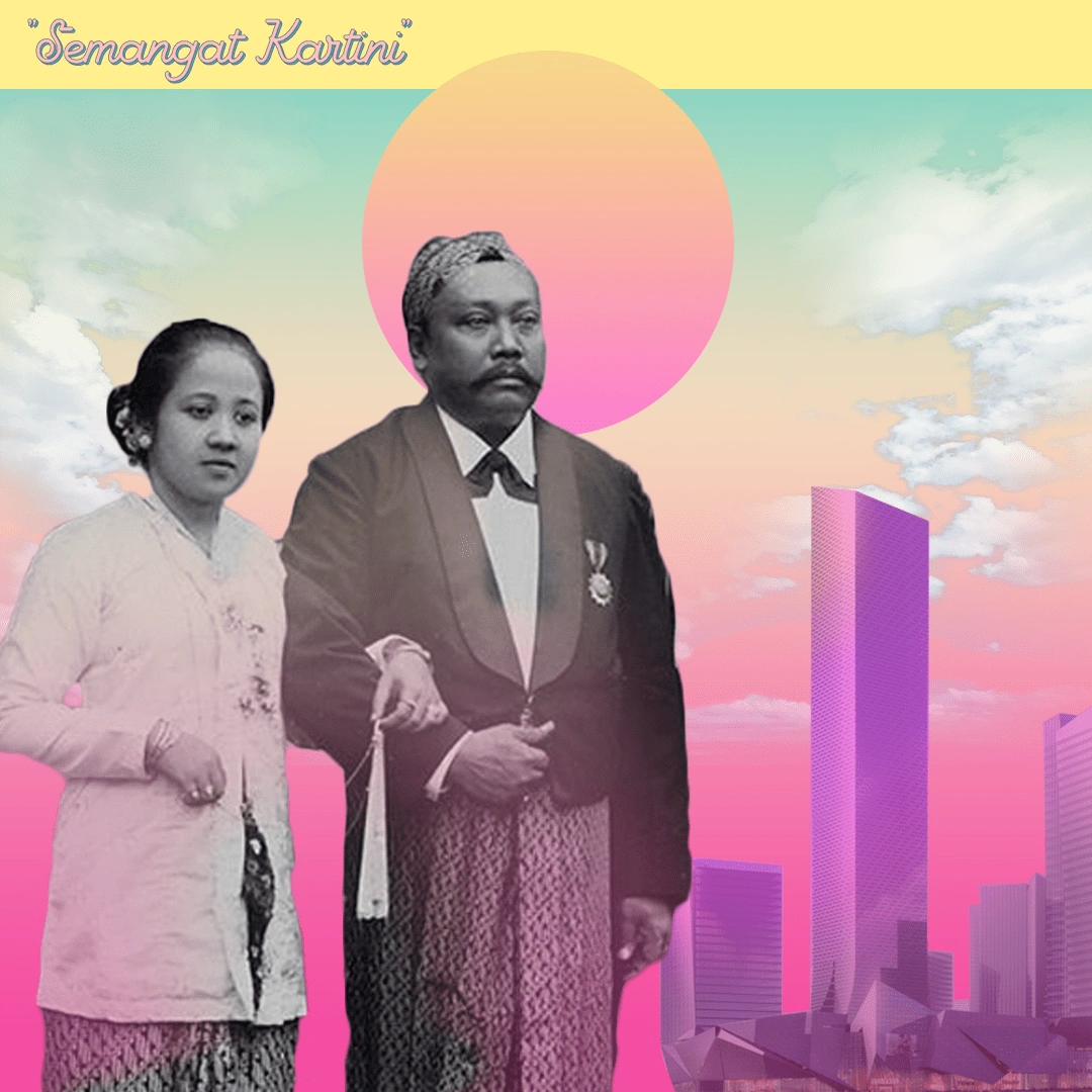
As the graphic designer, my role was to create a series of images that effectively capture the festive atmosphere of the celebration themed around Kartini. The color palette, featuring pink as the primary hue, was carefully selected to represent the celebratory theme of Kartini, complemented by bright colors such as yellow to enhance the playful and whimsical feel, and blue as a contrasting color to add depth and visual interest. Additionally, the design incorporates celebratory elements through the use of shapes such as checkerboard, sprinkles, and organic forms, which add a sense of joy and festivity to the overall design. The deliberate blend of colors and shapes results in a visually striking and engaging visual identity that effectively communicates the essence of the celebration.

Results
To commemorate the Kartini movement, which serves as the theme of this culinary festival, I aimed to create a visually striking and festive design that balances playfulness with a touch of femininity. Through the strategic use of objects and a carefully curated color palette, I was able to craft an image that not only captures the essence of the Kartini movement but also effectively communicates the celebratory atmosphere of the festival. The design's harmonious blend of colors and shapes results in a visually appealing and engaging visual identity that effectively conveys the theme of the event.
Like this project
Posted May 14, 2024
The Makassar Culinary Night festival celebrates culinary delights while honoring Kartini, a pioneering Indonesian heroine. I designed a vibrant visual identity.


