Built with Framer
Feelistic: 8-Page Framer Site & Brand Refresh

Min Maung
Verified


Feelistic: 8-Page Framer Site & Brand Refresh
Feelistic is a Hong Kong consultancy, operating as a practice of AI Central Services Limited, that helps financial institutions turn undocumented operational logic into auditable, AI-ready decision engines. Its buyers are senior banking and compliance leaders: technical, sceptical, and short on time.
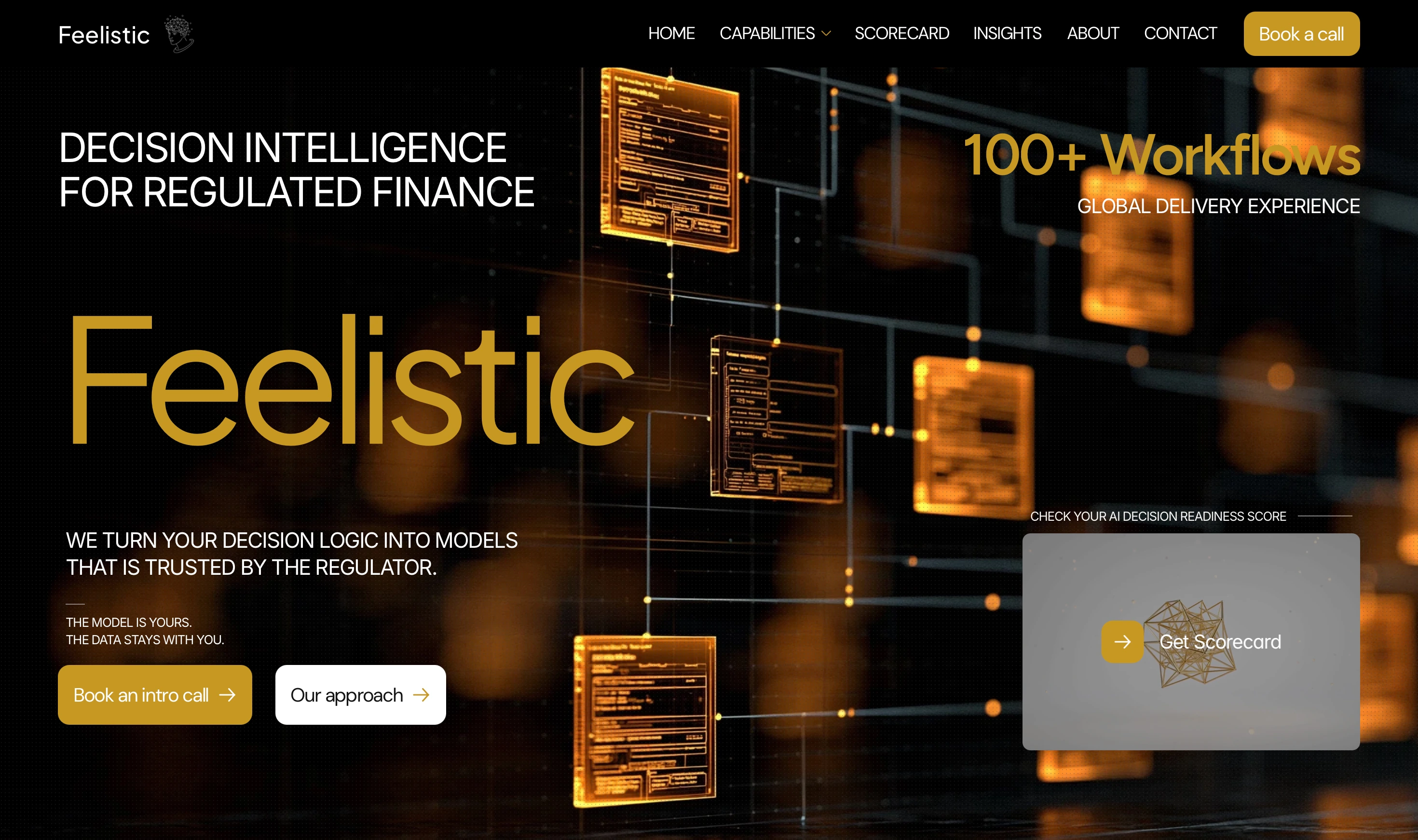
Hero
Background
I built the original AI Central Services site in an earlier phase. When the company rebranded to Feelistic and sharpened its offer, they came back to take the site further: a new brand, a clearer single offer, and a structure that could grow with the business.
The challenge
The material is dense by nature: decision models, regulatory frameworks, audit trails. The risk was a site that was accurate but exhausting. The goal was the opposite: keep every bit of depth, but make the path through it obvious, so a senior buyer understands what Feelistic does and how to start within the first few scrolls.
My role
Design and Framer development end to end: brand refresh, page architecture, navigation, new page builds, CMS, custom code, and legal pages.
What I delivered
Full brand refresh: new palette and type system applied consistently across every page through design tokens.
8-page site: Home, Our Services, The Approach, Modeling Examples, Scorecard, Insights, About, and Contact, plus legal pages.
A new Approach page built around one clear offer and one clear next step.
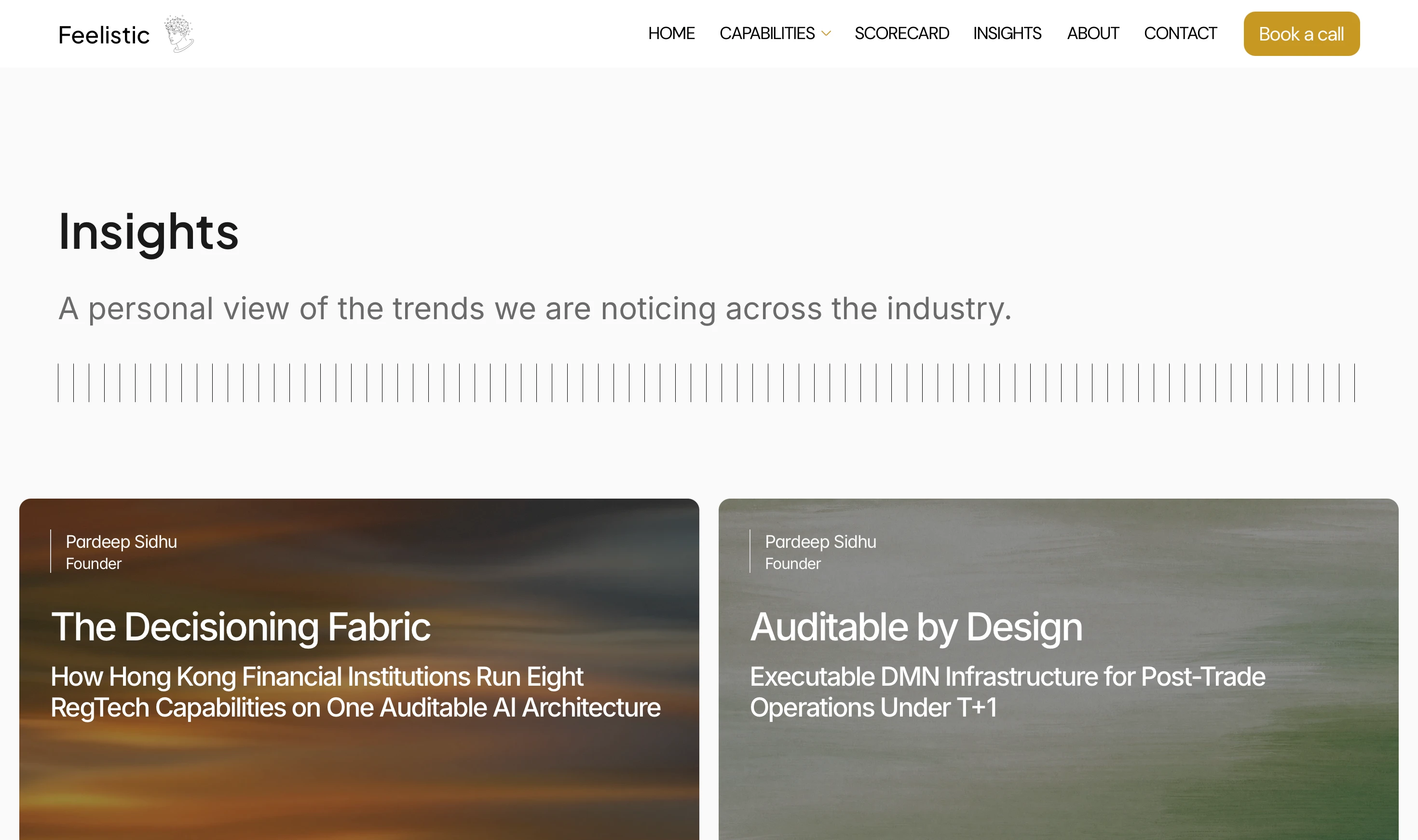
A CMS-driven Insights section with long-form article templates the team publishes to without touching the design.
Structured data (JSON-LD) on articles for search and answer-engine visibility.
Restructured navigation with a grouped Capabilities dropdown to keep a dense site easy to move through.
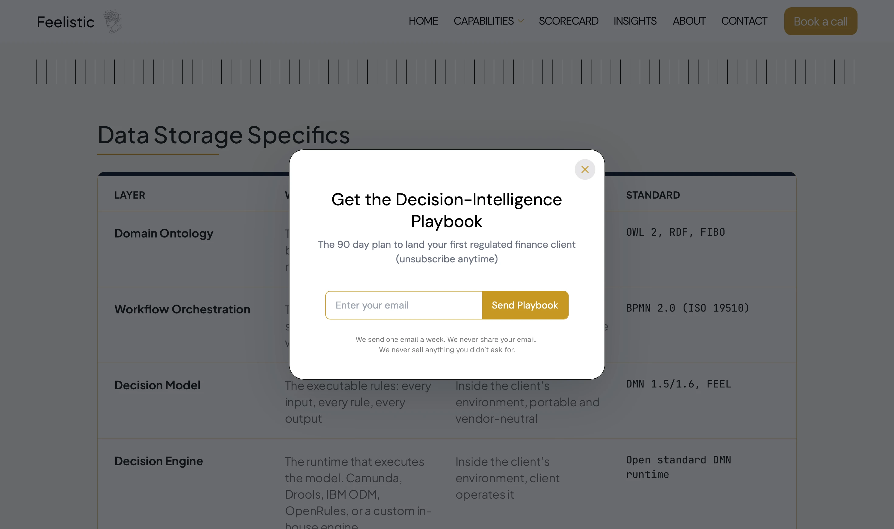
Custom-coded lead capture with scroll and exit triggers and a cooldown, plus a sticky call to action.
Responsive refinement across mobile, tablet, and desktop.
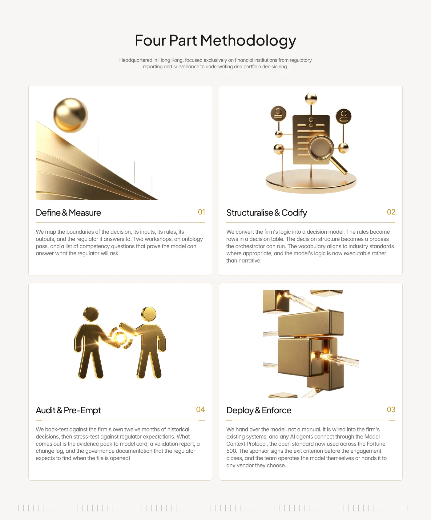
Key decisions
One offer, one next step. The Approach page replaced a menu of services with a single entry point: a free scoping call leading to a fixed-scope diagnostic. Everything else on the site points here.
Process as a journey, not fine print. I broke the diagnostic into three numbered steps (entry point, first meeting, post meeting), with the terms of the engagement laid out underneath, so a buyer reads it as a clear path rather than a contract.
Answering the first objection early. Regulated buyers ask “where does our data live?” before anything else. The technology stack is laid out so that answer is visible at a glance, before they have to ask.
Navigation that scales. With ten pages and more content coming, the nav groups Services, Approach and Examples under one Capabilities dropdown, keeping the top level short.

Content that compounds. Instead of a static brochure, the Insights section gives the team a publishing system for technical articles, each with structured data so search and AI engines can read and cite it.
Lead capture that respects senior buyers. The playbook popup only appears on high-intent pages, triggers at scroll depth or exit intent, and stays quiet for days once seen, so it never reads as pushy.
The result
A cohesive, expanded site that carries Feelistic’s refreshed brand and dense subject matter in one clear structure, built to read as precisely as the work the company sells, and set up to keep growing through its Insights content.
Like this project
What the client had to say
Excellent


Pardeep Sidhu, AI Central Services
Oct 2, 2026, Client
Posted Sep 30, 2026
Brand refresh and 8-page Framer site for a Hong Kong finance consultancy, with a CMS Insights section, structured data, and custom lead capture.
Likes
1
Views
19
Timeline
Oct 2, 2026 - Oct 2, 2026
Clients
AI Central Services