Built with Framer
clauseback: Framer Landing Page for Invoice Review

Min Maung
Verified


clauseback: Framer Landing Page for Invoice Review
clauseback helps multifamily operators check every vendor invoice against the contract that governs it. When a charge doesn’t match, it surfaces the overcharge with the exact clause, page, and dollar amount behind it.
The challenge
clauseback was early. There was no finished product UI to screenshot, and the audience, property operators and AP teams, are skeptical buyers who need to trust a finding before they act on it.
The site had to do three things at once:
Make a technical workflow (contract terms vs invoice lines) understandable in seconds
Feel credible enough for a finance-minded buyer
Show the product’s value without a product to show
My role
Design, copy, and build. I wrote the page narrative from scratch, designed the visual system and product visuals, and built the full site in Framer over about two weeks, from brief to handover.
Building the product before the product existed
Instead of placeholder screenshots, I designed interface-style visuals that show exactly what clauseback does. Contract and invoice stacks feed into a comparison engine, matching lines clear, and the one breach resolves into an overcharge receipt with the recoverable total.
The second sequence shows where clauseback sits in a real workflow. Invoices pass through AP approval as normal, while clauseback checks the layer underneath: the contract itself. Clean lines continue to payment, breaches branch off into a verified finding.
A short animation showing how clauseback moves from contract terms to invoice review findings.
Narrative and structure
The page moves the way a skeptical buyer thinks: here’s the problem you can’t see, here’s how it gets caught, here’s what gets checked, here’s proof it works.
Problem: overcharges that don’t look like overcharges
How it works: onboard, reconcile, recover
What clauseback checks: five specific checks, each tied to the contract
Proof: real vendor responses
Questions: the objections a buyer actually raises, including pricing
Proof, in the vendors’ own words
The strongest evidence wasn’t a stat, it was vendors admitting the error. I designed a scrolling section of ten real vendor emails, redacted like legal exhibits: names, accounts, and amounts blacked out, the vendors’ words left intact. The center card comes into focus as the loop moves, and it pauses on hover so a reader can stop and read.
A motion piece featuring emails vendors wrote back.
Designed to be maintained
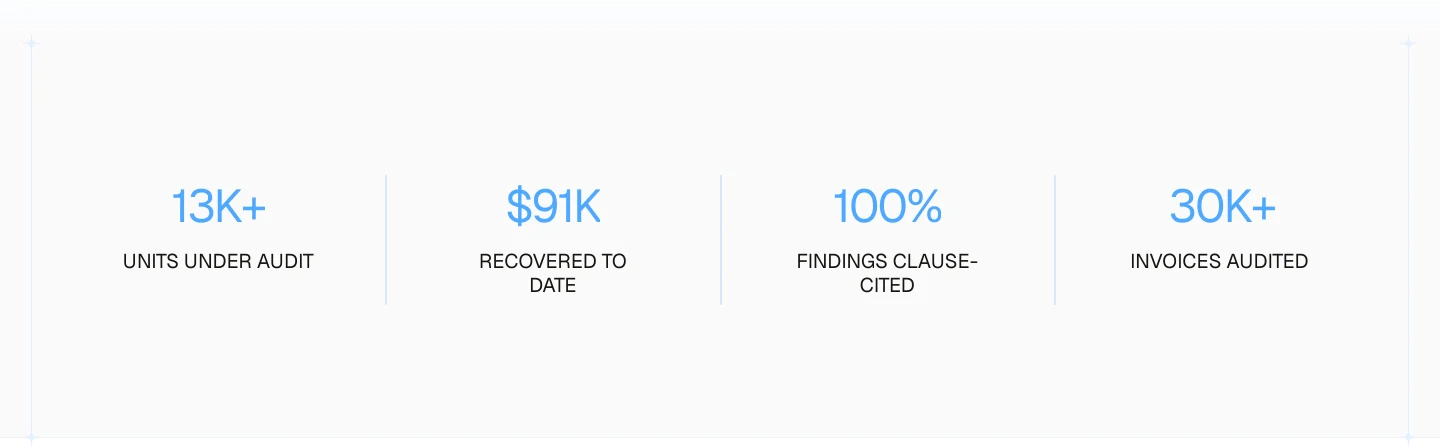
The headline stats run off a CMS collection with count-up animation, so the client can update recovered totals and audit counts himself as the numbers grow, without touching the design.
Refining the tone
Through two revision rounds, the client and his partner wanted the voice to feel more measured, closer to how their buyers talk. We softened the headlines, tightened the copy, and simplified sections down to what earned its place. The result reads less like a pitch and more like a credible tool.
Responsive
Every section was adapted for mobile, including the flow diagram and the email loop, rather than just scaled down.
Client feedback
“Min turned a rough brief into a clean, credible site and made the handoff painless. Fast, responsive, easy to work with, and the finished product needed no cleanup. He also left it set up so I can update the content myself. Highly recommend.
Jake Lindahl, Founder of clauseback
Outcome
clauseback launched with a site that explains a technical product clearly and earns trust before the full product experience exists.
Like this project
Posted Aug 7, 2026
Framer landing page and custom product visuals for an early-stage platform that helps multifamily teams review vendor invoices against contract terms.
Likes
0
Views
9
Timeline
Jul 20, 2026 - Aug 2, 2026
Clients
clauseback