Retail Operations Dashboard for 247 Points of Sale

Min Maung

Context
Thar Ki Co operates 247 points of sale across Thailand and Myanmar, spanning owned stores, consignment partners, and online channels.
The initial request was a “churn dashboard redesign,” but the real users were head-office operations staff monitoring sales performance. I redesigned onboarding, the overview dashboard, and sidebar labels in a 4-week sprint.
The Problem
The existing product landed new users on six empty panels, each saying "No data yet." Setup was buried among eight competing options. The whole thing was built on customer-success conventions, but the users needed retail operations language.
One screen was doing two jobs. I split them: onboarding became a three-step flow with a clear end, and the overview became a dashboard built for people who already know their business.
Onboarding
The existing product didn't have an onboarding flow. Setup prompts were layered on top of an empty dashboard. I broke it into three steps: Connect (named integrations with a visible time estimate), Import (live progress with specific counts like "24 stores detected"), and Configure (letting users shape what they track from day one).
The language was written for someone learning the tool from scratch, not just current staff. The team plans to expand beyond head office, so the onboarding teaches the product without assuming familiarity.
Simple 3 steps onboarding
The Overview
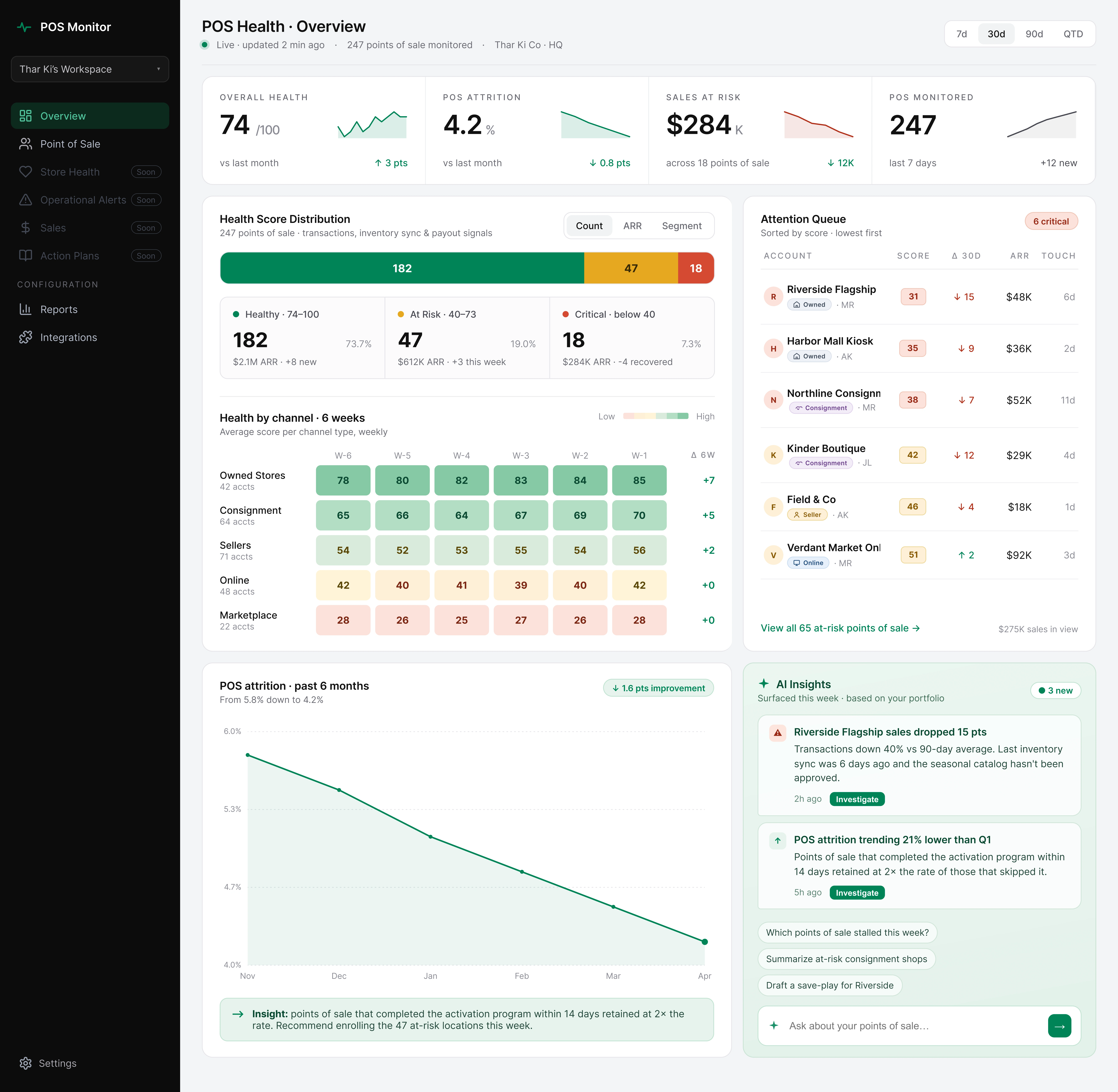
The overview answers one question the team asks every morning: where does my attention go today?
Overview dashboard
Four metrics at the top mirror the old labels so existing users keep their muscle memory while the language shifts to retail.

Top 4 metrics
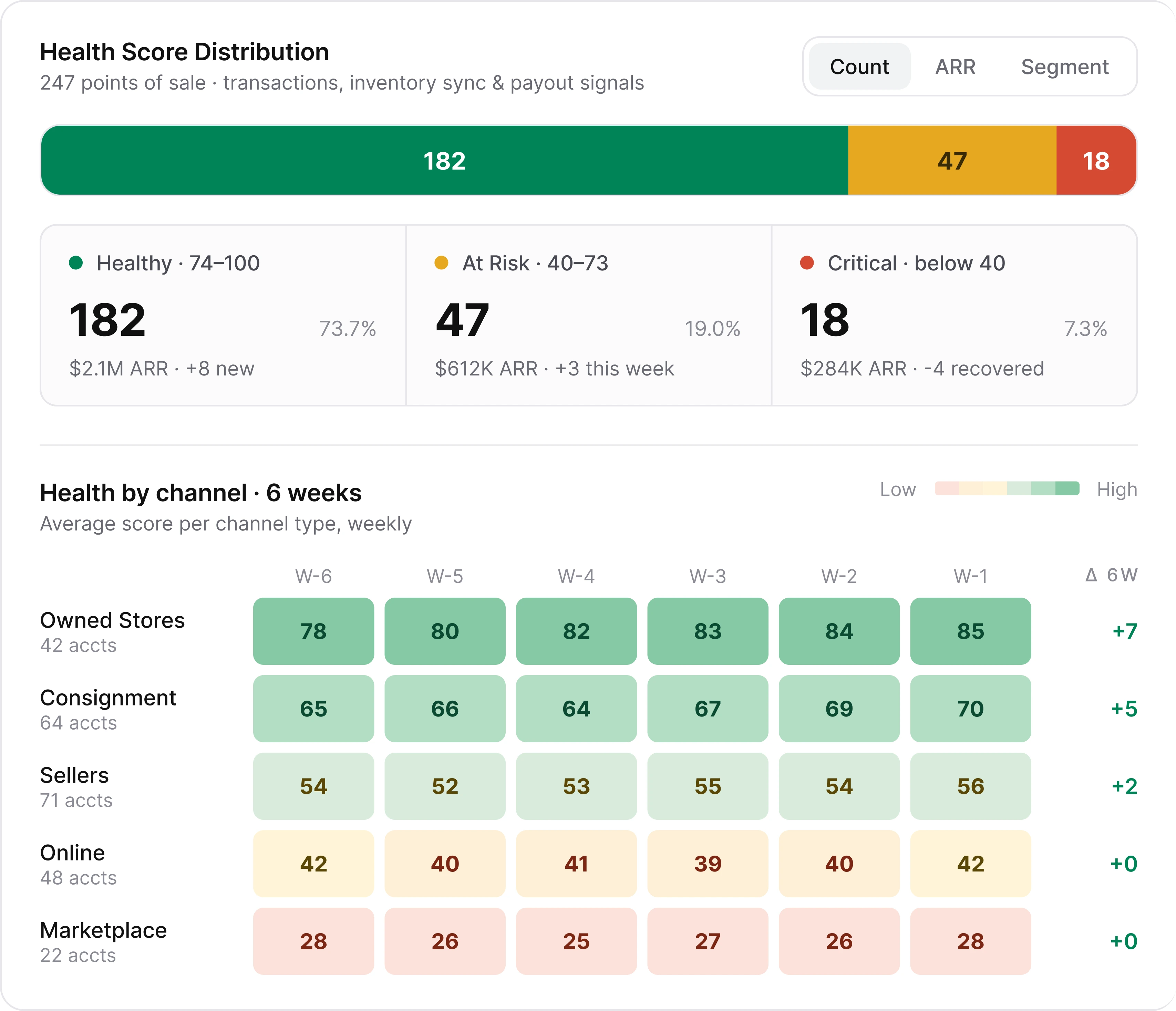
A channel heatmap compares performance across 5 channel types over 6 weeks, making directional trends visible at a glance. A 6-week delta column confirms whether each channel is improving or declining.
Cohort chart
An Attention Queue sorts stores by lowest score first, so triage happens in the time it takes to scan five rows. Each row names the store, channel type, score, 30-day delta, and ARR.
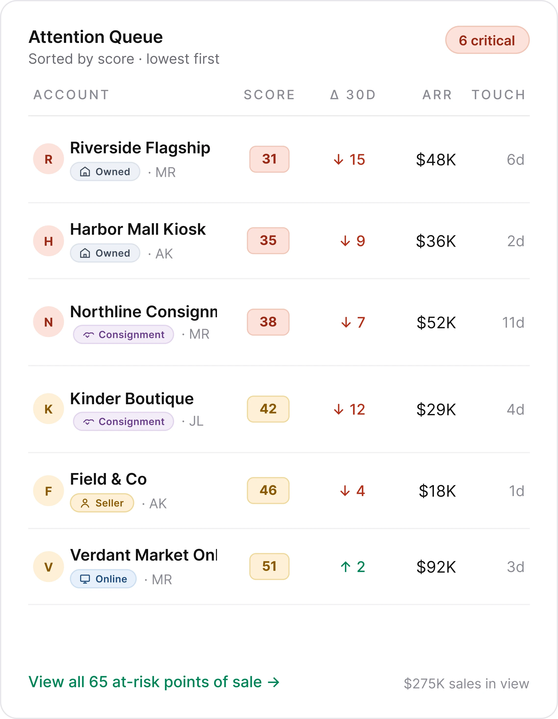
Attention Queue
The attrition card surfaces POS attrition trends so the team can spot closures and underperformers before they compound.
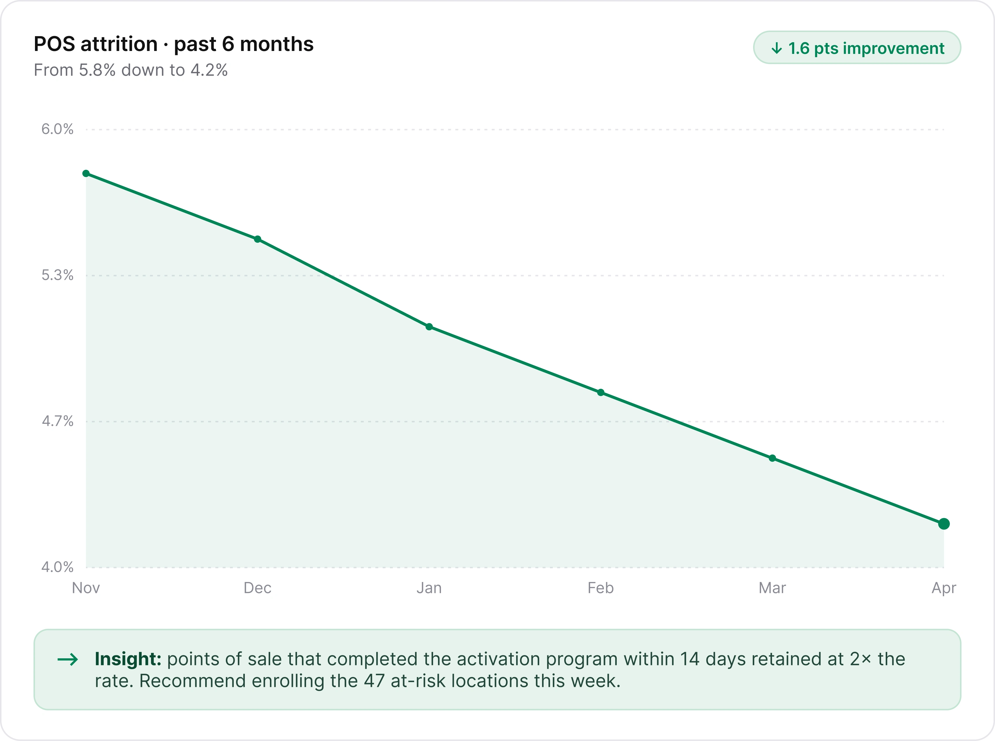
Attrition card
I proposed a structured AI Insights panel instead of the blank chat the client wanted: surfaced insights with specific stores and numbers, starter prompts for common questions, and free-text input for anything else. A blank chat asks users to know what to ask. This shows them what's worth asking first.
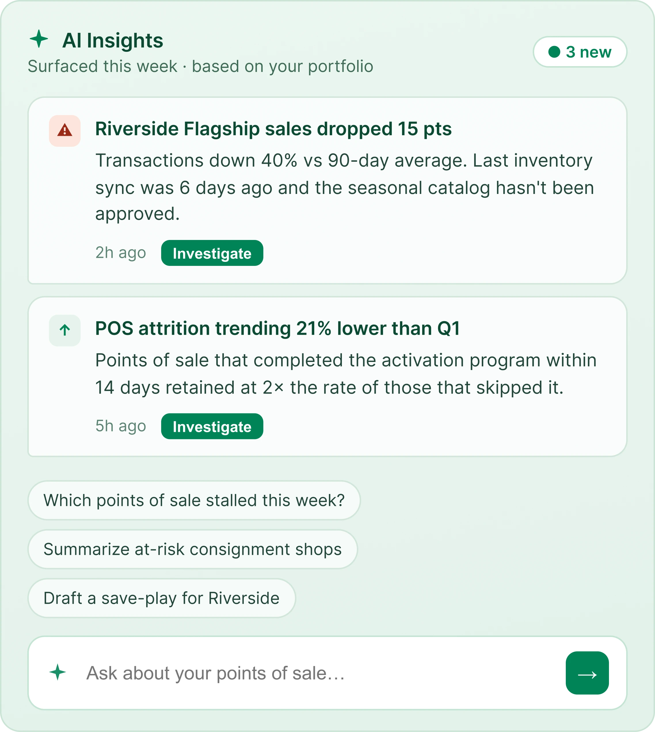
AI Insights
Impact
Client-reported results in the first three months:
Setup completion: 45% to 70%
Time to first data view: 12 min to 4 min
Support tickets: down 35%
Daily usage: 35% to 55%
Like this project
Posted Jun 25, 2026
Onboarding and dashboard redesign for an internal retail performance tool used across 247 points of sale in Thailand and Myanmar.
Likes
0
Views
13