Built with Framer
SignalBoard: SaaS Analytics Landing Page

Min Maung


SignalBoard: SaaS Analytics Landing Page
A Framer landing page for SignalBoard, an analytics dashboard that puts revenue, churn, acquisition and customer health into one view. The page is built for SaaS leaders and growth teams who are tired of switching between tools to understand how the business is doing.
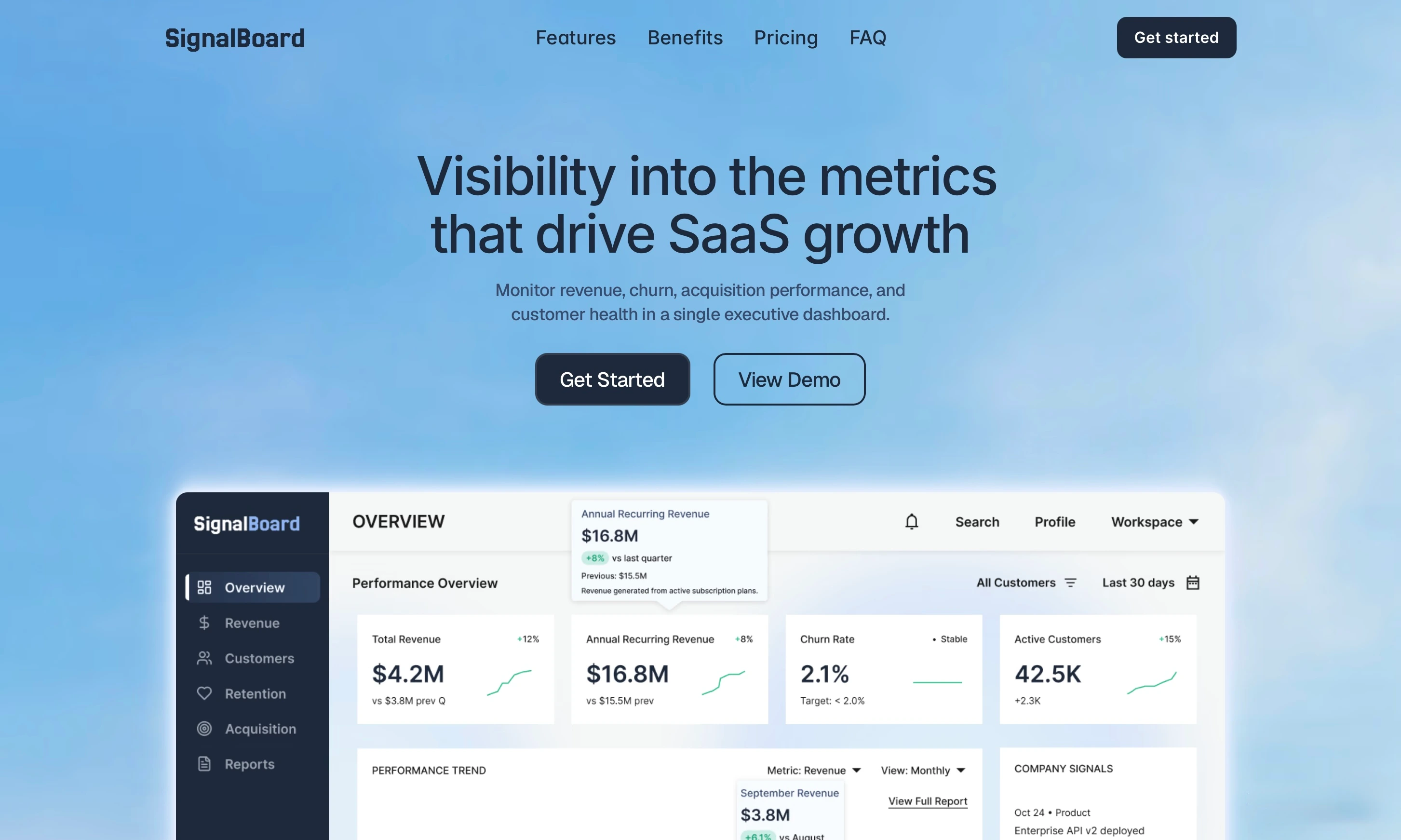
Hero
The challenge
Analytics products are hard to sell on a landing page. Every competitor promises “all your data in one place,” and visitors have seen a hundred dashboard screenshots. The page had to show why this dashboard matters within seconds, answer the questions that stop people from signing up, and move them to a plan.
My role
Design and Framer development of the full responsive landing page: structure, copy direction, visual system and conversion flow.
The approach
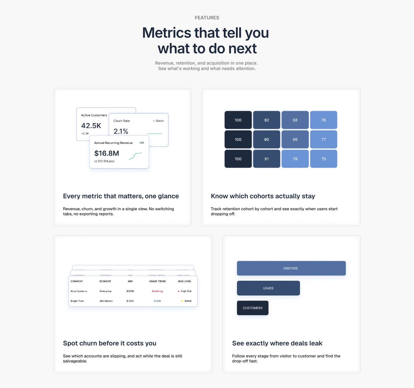
Lead with outcomes, not features. Each feature card opens with a problem the visitor already feels: “Spot churn before it costs you,” “See exactly where deals leak,” “Know which cohorts actually stay.” The dashboard view sits under the claim as proof, so the visitor reads the benefit first and sees the evidence second.
Lower the perceived effort early. A three-step “How it works” section (connect your tools, track key metrics, act on insights) comes right after the features, answering “how hard is this to set up?” before it becomes a reason to leave.

Speak to each buyer. The lifecycle section breaks the product into acquisition, customer growth, churn and revenue, so a marketing lead, a CS lead and a founder can each find the part that matters to them. Testimonials follow the same split, with quotes from marketing, customer success and growth roles.
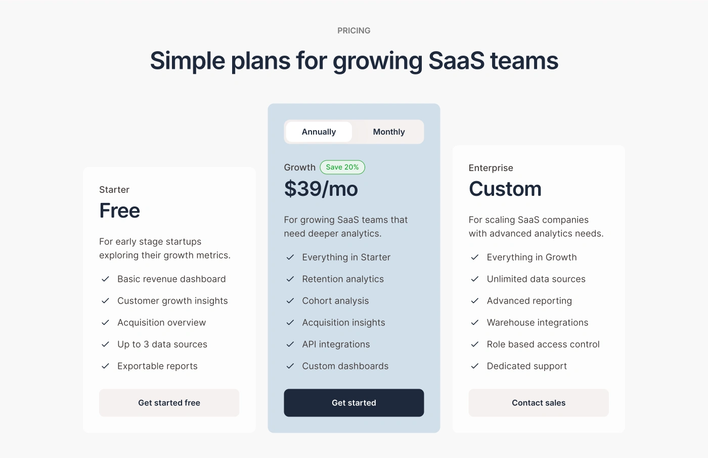
Remove friction at the decision point. Pricing has a free Starter tier for low-risk entry, a highlighted Growth plan with an annual/monthly toggle, and an Enterprise tier routed to sales. The FAQ then handles the common blockers: data accuracy, integrations, setup time and security.
Page flow
Hero with a clear value line, a full dashboard preview, and two CTAs
Problem-led feature cards with product views
How it works in three steps
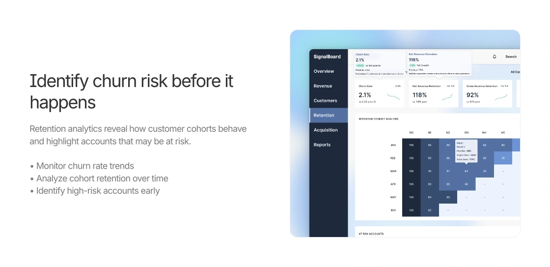
Deep dives by role and lifecycle stage
Social proof: usage stats and role-specific testimonials
Pricing with a free entry tier
FAQ covering objections
Closing CTA with a self-serve and a sales path
What I delivered
Conversion-focused page structure, from first impression to plan selection
Benefit-first copy direction for every section
Clean, light visual system built around real dashboard UI
Interactive pricing with a billing toggle
Fully responsive Framer build across desktop, tablet and mobile
Outcome
A live, responsive landing page that turns a data-heavy product into a clear story: here’s the problem, here’s how the dashboard solves it, here’s the plan that fits you.
Like this project
Posted May 30, 2026
A Framer landing page for SignalBoard, an analytics dashboard that puts revenue, churn, acquisition and customer health into one view.
Likes
0
Views
26