Logo & Brand Guideline

Zaky K


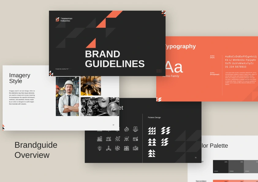
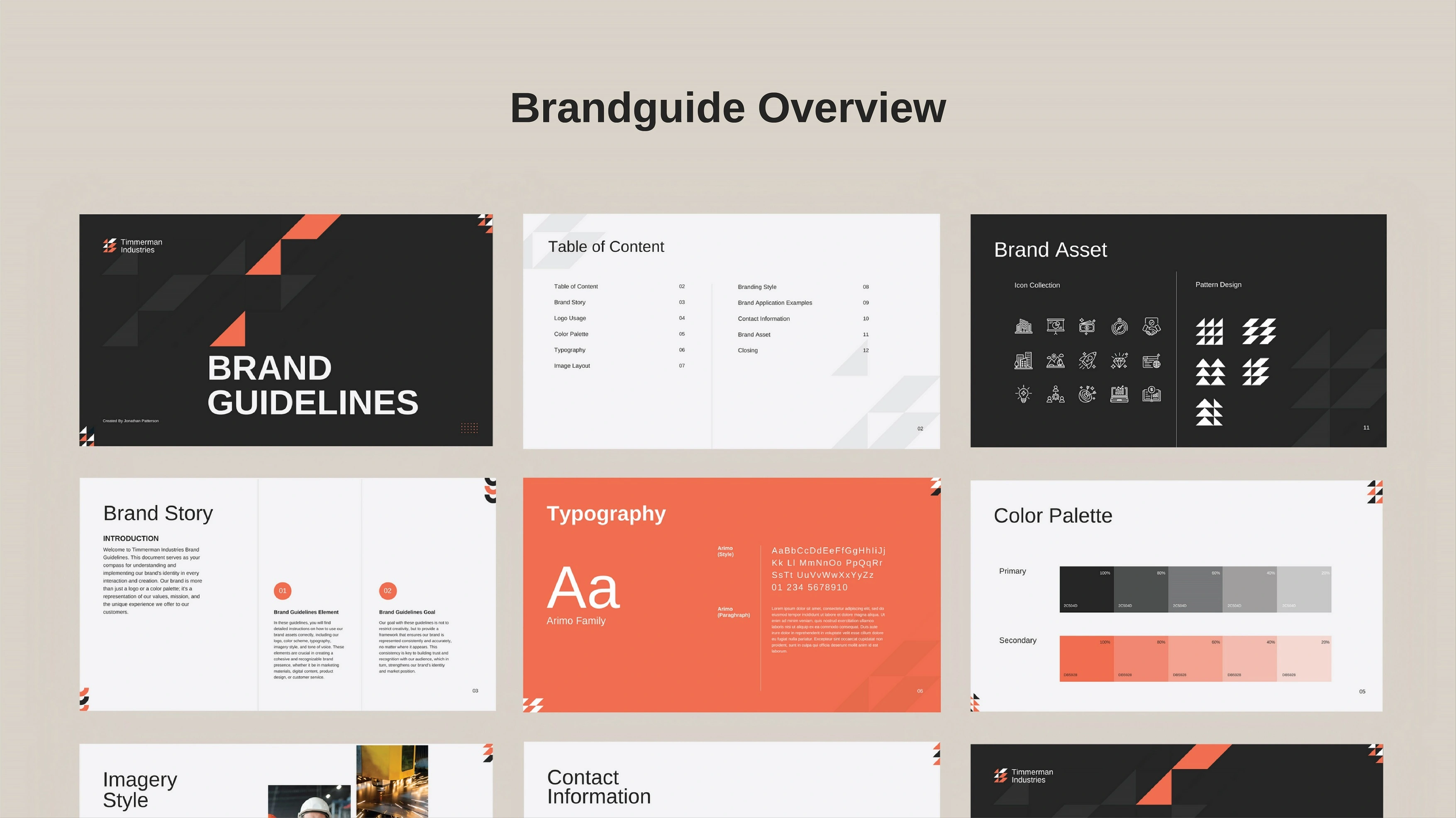
Tinnerman Industries Modern Brand Idenitity & Guidelines Present
Brand Usage Overview
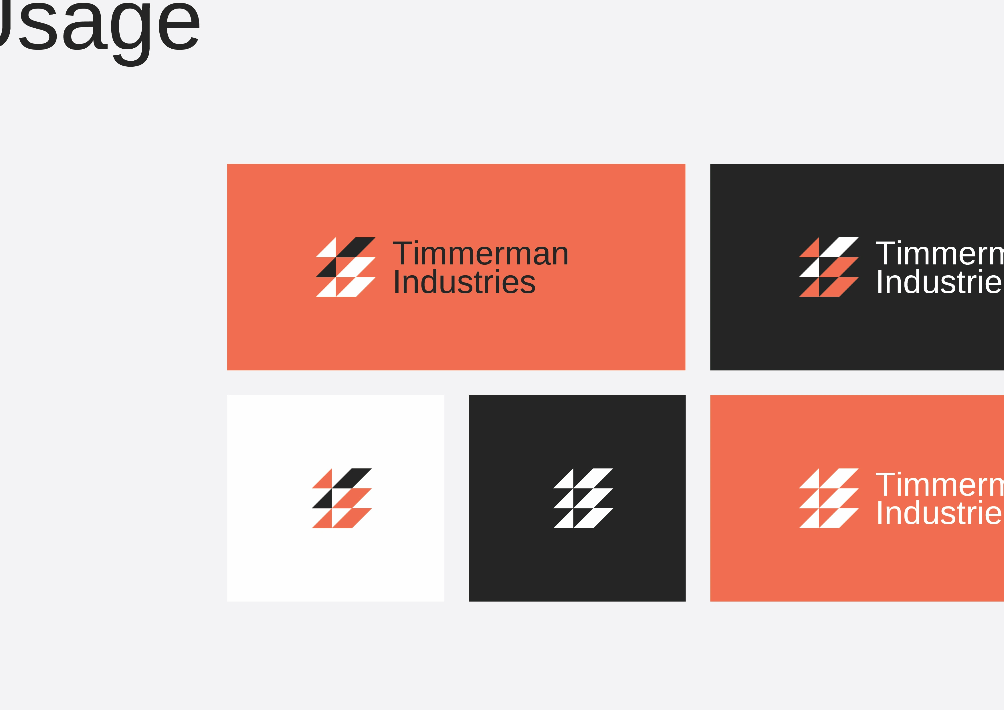
The visual showcases the flexible identity system of Timmerman Industries, highlighting how the logo adapts across multiple color environments. The mark features a sharp, geometric symbol composed of interlocking triangular shapes in orange, black, and white—creating a sense of motion, precision, and industrial strength. Paired with a clean sans-serif logotype, the brand feels modern, structured, and highly functional.
The layout demonstrates the logo’s versatility across different background colors: a vibrant orange field, a deep charcoal tone, and a clean white canvas. Each variation maintains strong contrast and readability, showing that the identity holds its integrity whether displayed in full color or simplified monochrome. This system reinforces the brand’s consistency, ensuring the mark remains recognizable in digital, print, and environmental applications.



If you enjoy my work, feel free to hit the Appreciation button below.
More Details Information:
You’re also welcome to leave a comment — your feedback helps me grow. Thank you!
Like this project