Building Materials Catalogue Search Experience
Marco Simioni
Background:
A software company specializing in energy simulation and LCA calculation for buildings, needed to redesign their building component catalogue. The existing catalogue was functional but lacked user-friendliness and efficient navigation features. (for reference see at the bottom of the page)
Challenge:
The main challenge was to create a comprehensive and intuitive interface that would allow users to:
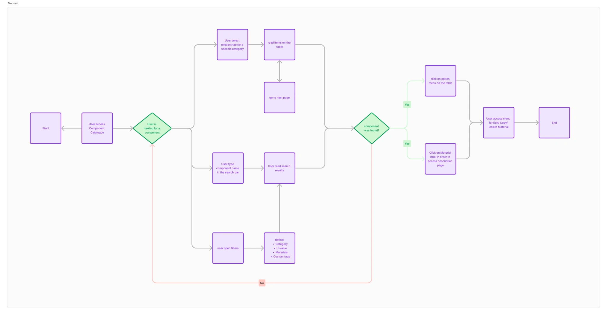
Easily browse and search for components
View detailed information about each component
Edit components as needed
Compare different materials based on performance metrics
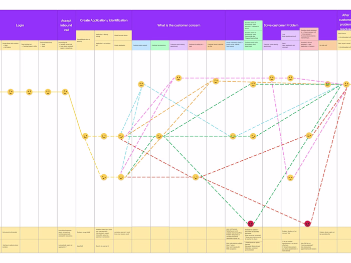
Task flow analysis
Solution:
The redesign focused on several key areas:
1
Improved Catalogue Overview
2
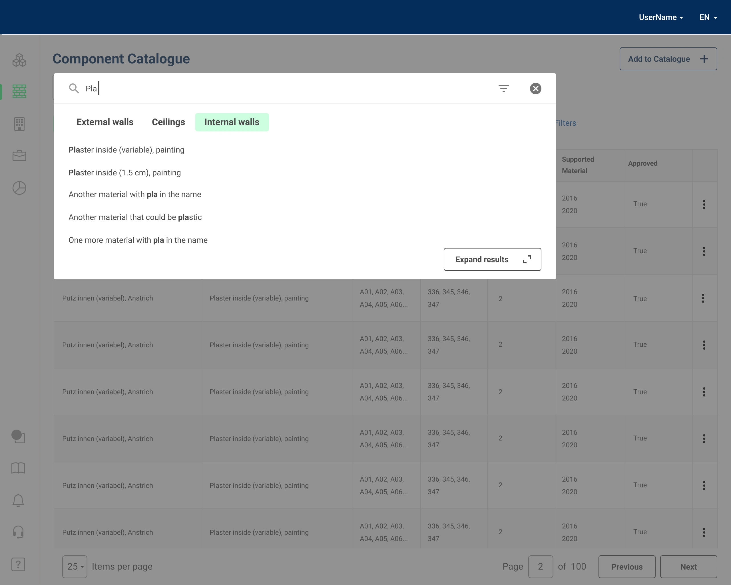
Enhanced Search Functionality
Integrated Elasticsearch for high-speed, full-text search capabilities
Implemented an overlay search interface to reduce cognitive load
Added category-based search results with highlighted keywords.
3
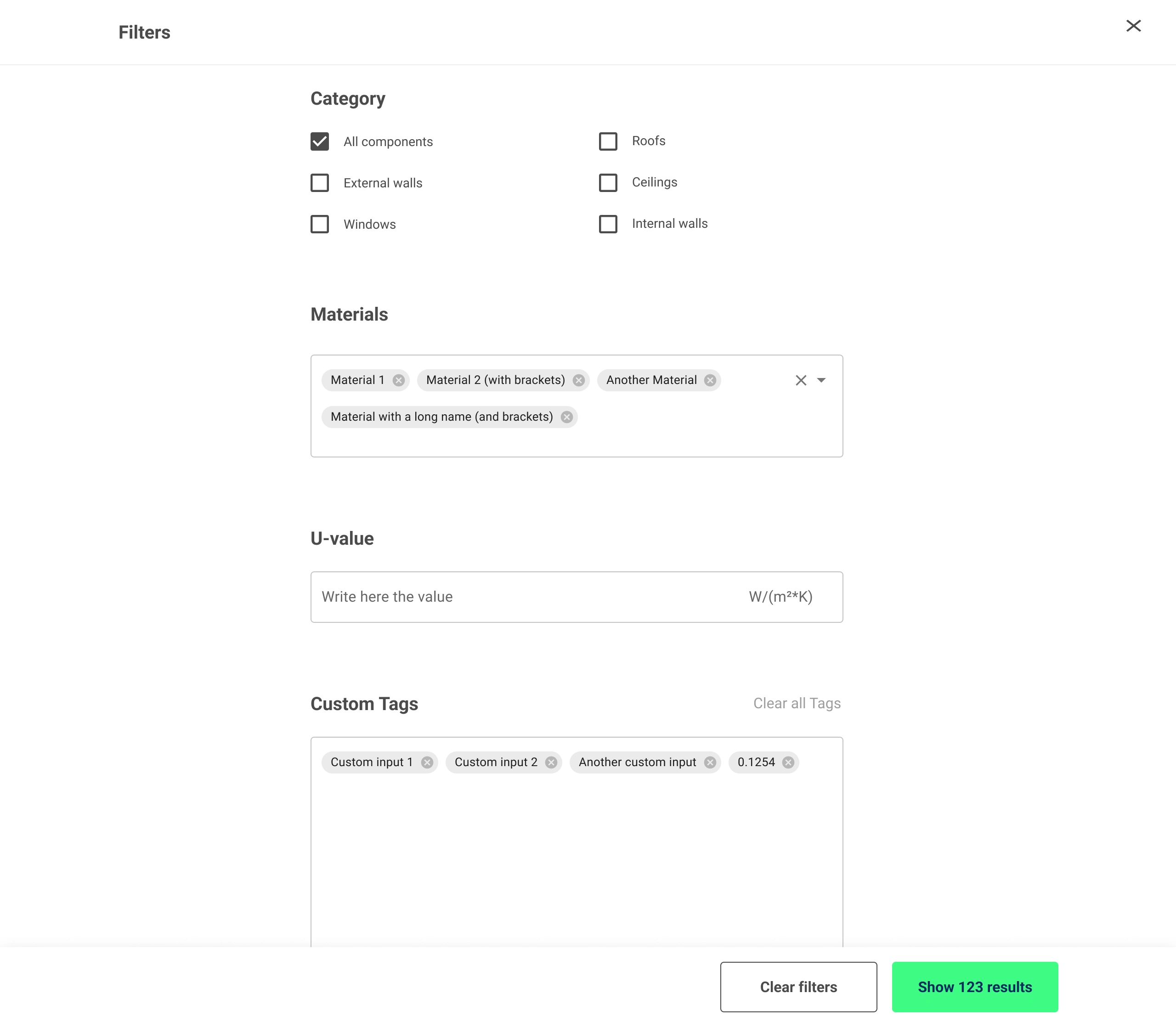
Comprehensive Filtering System
Designed a full-screen modal for filters to avoid overwhelming users
Included multi-select autocomplete fields for material filtering
4
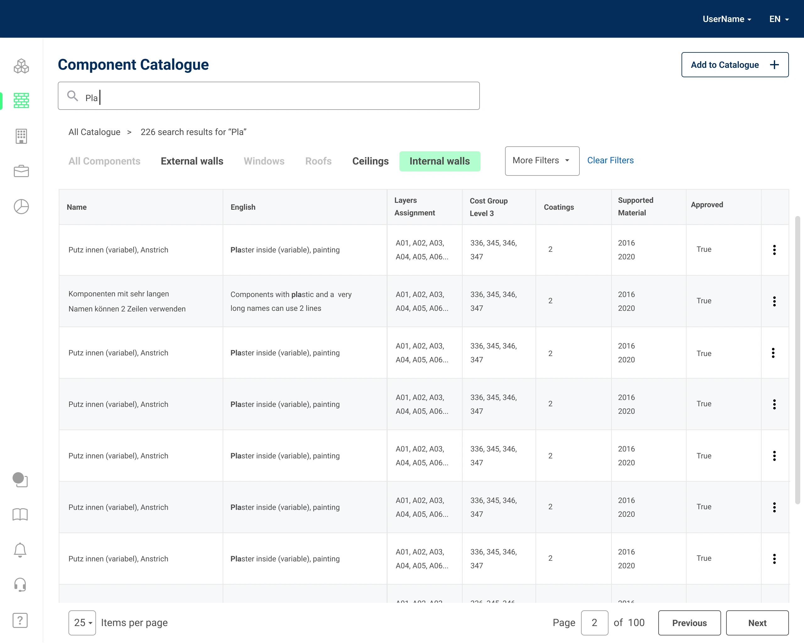
Clear Search Results
Results are displayed per categories similarly to the Catalogue overview tabs and the word or words typed by the user are highlighted.
This approach facilitates the findability of the information and offer consistency with the main overview
5
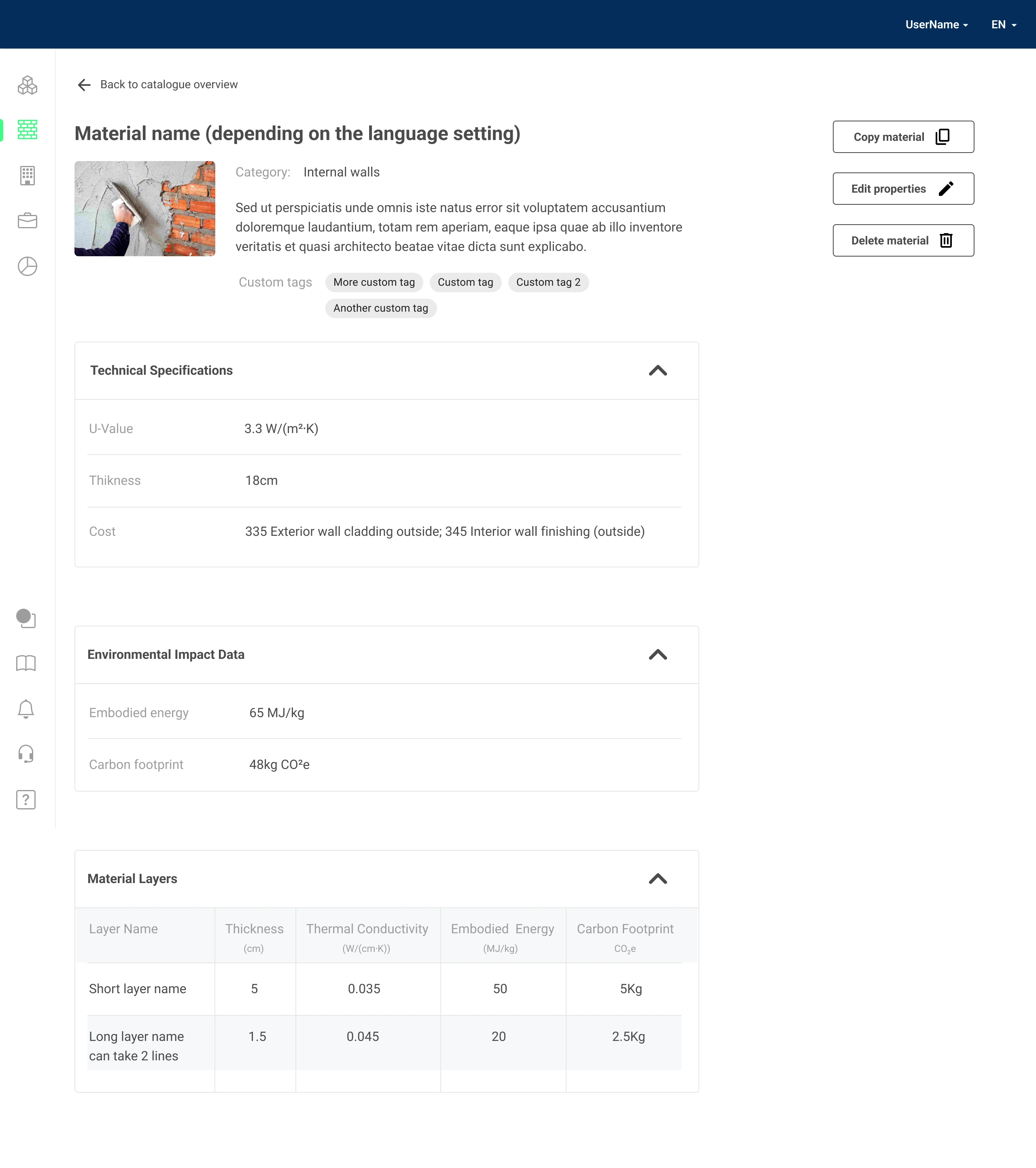
Detailed Component View
Created a layout that prioritizes key information (name, category, description)
Implemented modular components for technical specifications, environmental impact data, and material layers
Added white space for potential future features or related information
Results:
The redesigned catalogue significantly improved user experience by:
Reducing the time needed to find specific components
Providing clearer and more accessible information about each component
Offering more powerful search and filter capabilities
Creating a consistent and scalable design language across the platform
Reference:
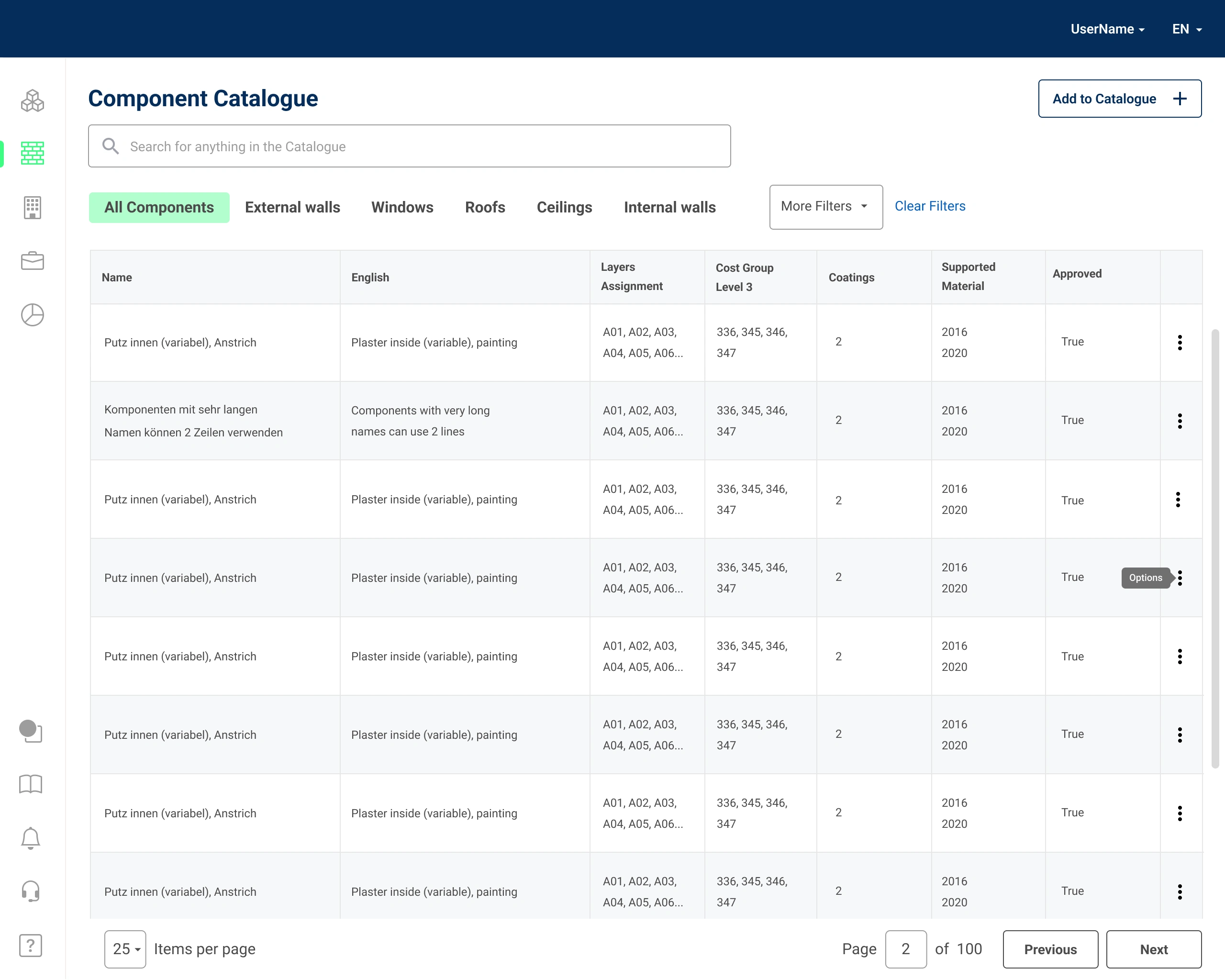
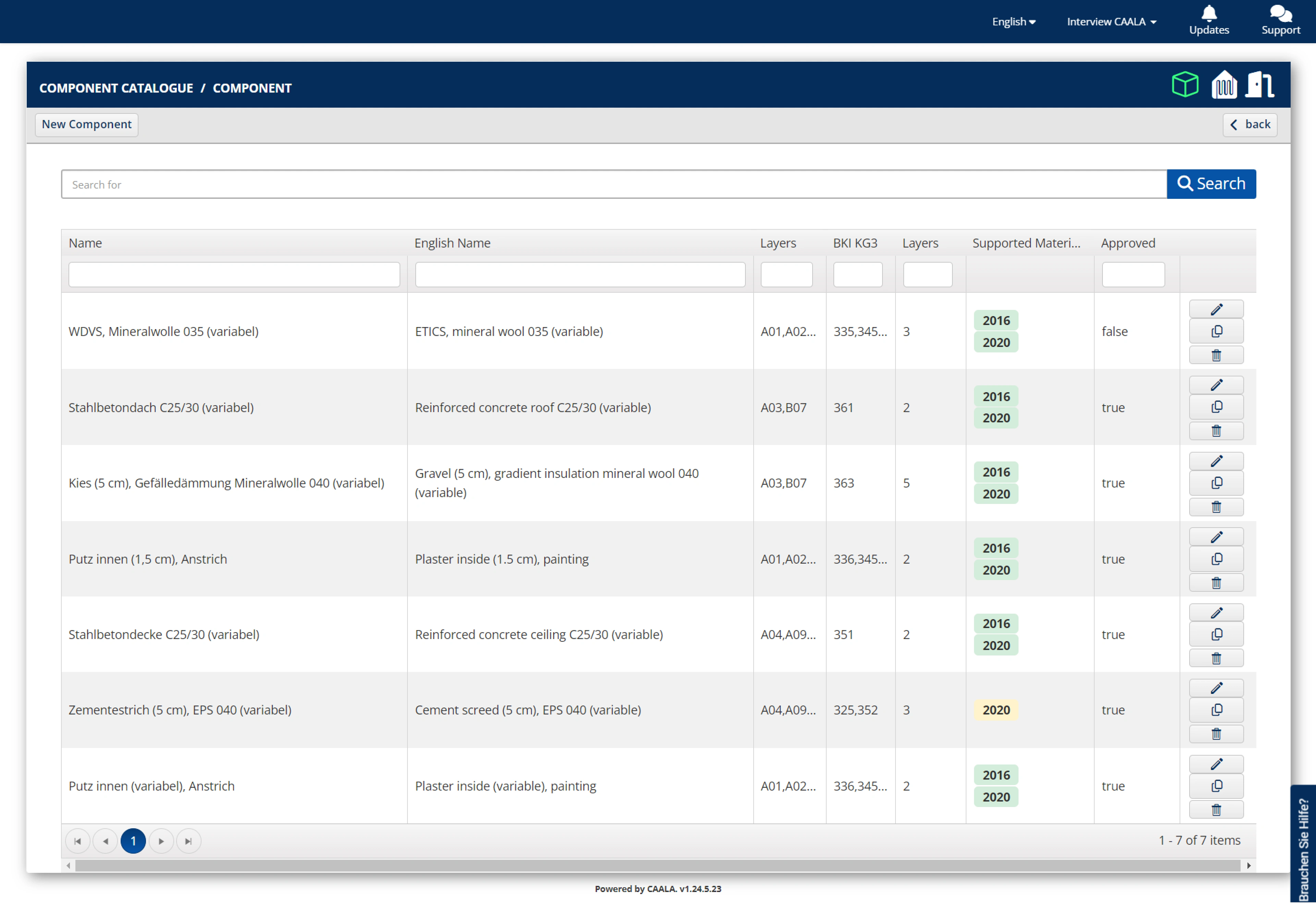
Here is the original version of catalogue overview page. The initial UI Audit highlighted some issues
Information Density: The table is very dense with information, making it difficult to scan and read. There is a lot of text in each cell, and the columns are not very wide.
Color Contrast: The text color in the table is quite light, and the background color is white. This can make it difficult to read the text, especially for people with visual impairments.
Language: The interface appears to be in German. If the target audience is international, it would be beneficial to include an option to switch the language to English.
Search bar: The search bar is placed directly above the table data, and may not be immediately noticeable to users.
Pagination: The pagination information is displayed at the bottom of the table ("1-7 of 7 items").
Like this project
Posted Nov 13, 2024
The redesigned catalogue significantly improved user experience by: Reducing the time needed to find specific components Providing clearer and more accessible
Likes
0
Views
5