Cup & Cake - Bakery Branding

Hasan Khan


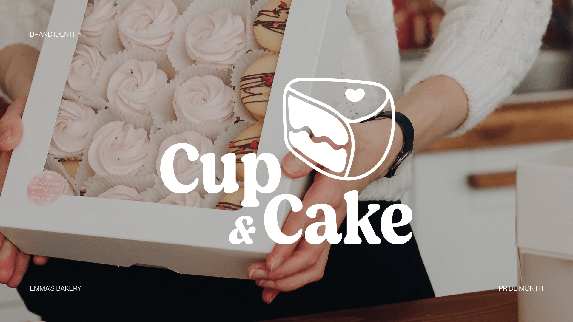
Cup & Cake
Emma, a passionate baker with a love for cupcakes and cakes, envisioned creating something beyond delicious desserts. She aimed to spread joy and acceptance through her baked creations. Thus, "Cup & Cake" was born—a place where people can savor sweet treats while celebrating the message of love and diversity.
Let me show you the branding I made for her.
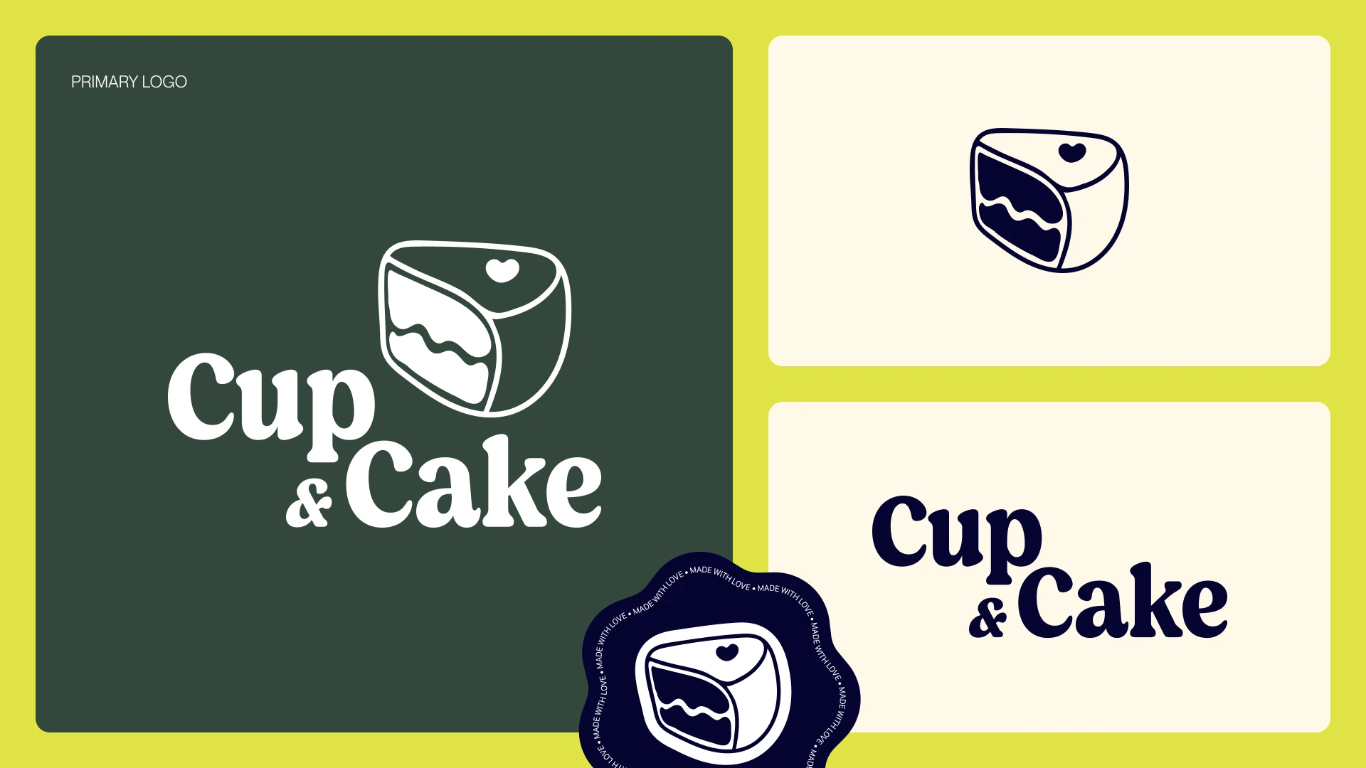
Logo
I wanted the logo to feel kind, welcoming, and a little bit sweet. So, I went with a gently rounded serif font and a cute little pastry icon. I think they work together to create a warm and inviting vibe.
The main logo has the word "Cake" tucked in right under the word "Cup," with a cute little pastry emblem right above it.
I also created a couple of variations: one that's just the pastry icon, and another that's just the text.
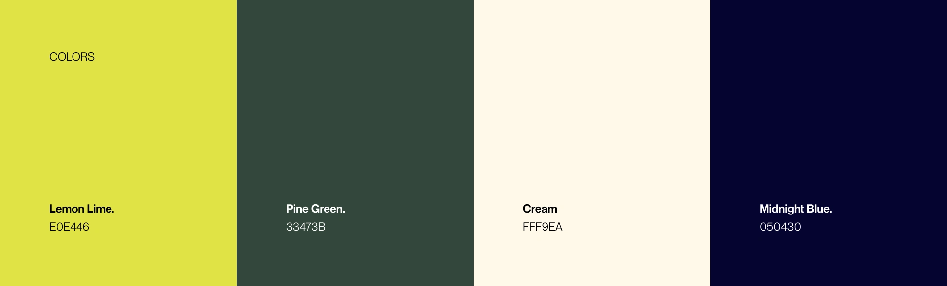
Colors
I selected Lemon Lime (#E0E446) as the primary color and Pine Green (#33473B) as the secondary color. These colors symbolize the anarchist and harmonious attributes of nature, aligning with the brand's focus on acceptance, love, and community.
To maintain a clean and efficient visual identity, I opted for a minimal color palette that is comprehensive enough for practical use without extending the project's timeline unnecessarily.
For neutral tones, I chose Cream (#FFF9EA) and Midnight Blue (#050430) for text and background, respectively.
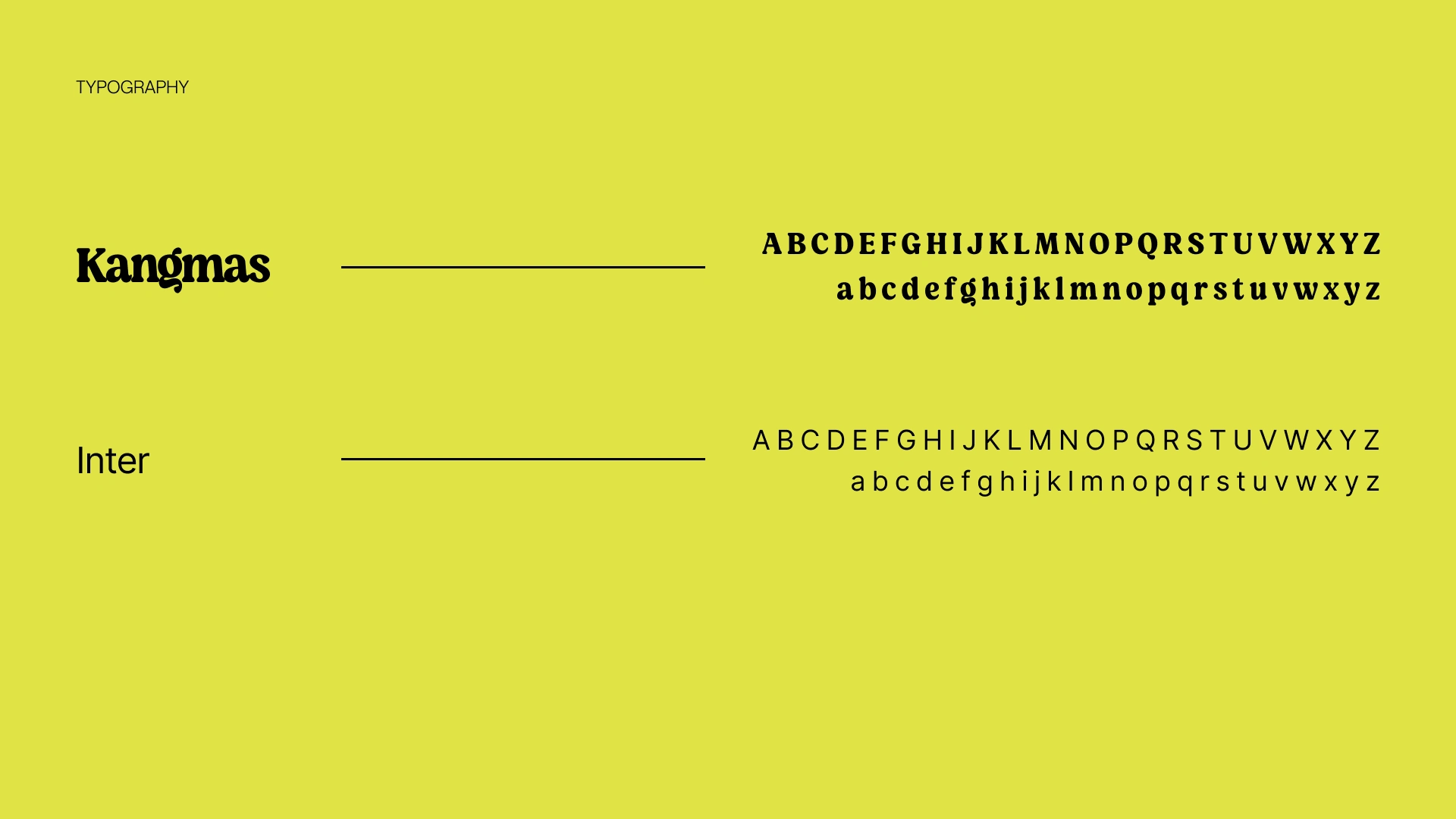
Typography
For the display font, I chose Kangmas for its clean lines and the sense of security, comfort, and community it conveys. This was a carefully considered decision, made after a thorough review of several font options.
Inter was chosen as the body font because of its versatility and the way it complements Kangmas. While Highway Gothic was a close contender, Inter ultimately felt like a better fit, striking the perfect balance.
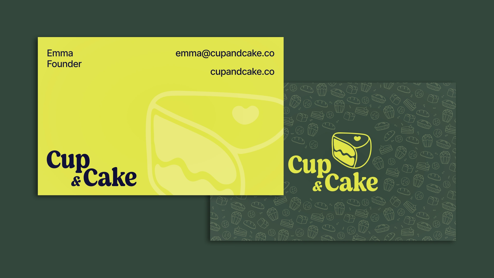
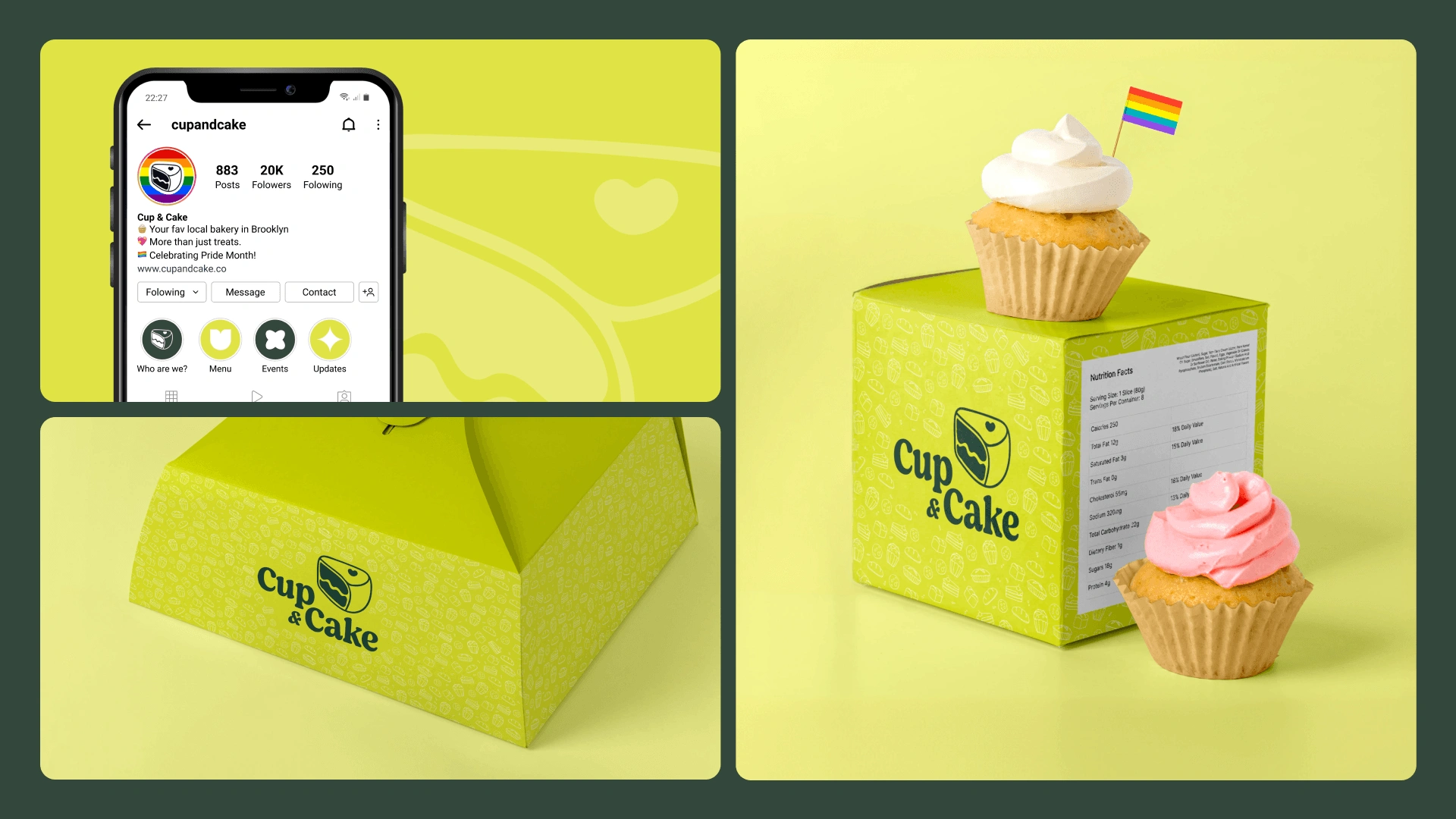
Brand Collateral
The "Cup & Cake" brand collateral is designed to radiate joy, warmth, and a sense of community.
The business cards are vibrant and cheerful, showcasing the Cup & Cake logo prominently.
A playful pattern of pastry icons fills the background, adding a touch of whimsy and reinforcing the brand's identity. This pattern is carried across various materials, creating a consistent and recognizable visual language for the brand
Like this project
Posted Aug 12, 2024
This project showcases a vibrant brand identity for “Cup & Cake”, a bakery spreading joy and community.


Mingle - Brand Identity Design
Meraki :: Behance