Meraki :: Behance

Hasan Khan


![Meraki / [Me-rah-kee] — INTROUDCTION & BRIEFING](https://media.contra.com/image/upload/fl_progressive/q_auto:best/s1otuvciutabhi3vvjsh.webp)
Meraki / [Me-rah-kee] — INTROUDCTION & BRIEFING
Depression can trap people in a destructive cycle. While the solution seems clear – seek support and build healthy habits – many struggle to take the first step.
Seeking help and committing to self-care are essential for confronting depression. However, feelings of hopelessness, overwhelm, and lack of support can feel insurmountable.
People with depression often need more than just the knowledge of what to do. They need a caring community and a system that guides them forward. Things like maintaining a sleep schedule or consistent hydration may seem impossible without external support.
Meraki provides that crucial support. Our platform offers community, guided steps, and personal tools to break the cycle of depression. We understand that healing isn't just about knowing what to do – it's about having the support to actually do it.
With Meraki, users gently integrate healthy habits like journaling, meditation, and outdoor time. Small, supportive communities reduce isolation. Personalized scheduling and reminders ensure self-care becomes a priority.
Meraki helps people take back their lives from depression. By addressing the unique challenges of support and habit-building, we pave the way for lasting mental well-being.
Meraki's Logo
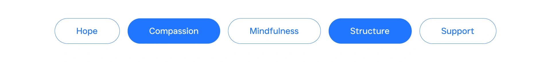
My goal for the Meraki logo was to instantly connect with our mission – supporting people on their mental health journeys. To do that, I used visual symbols that reflect our core values: compassion, structure, hope, support, and mindfulness.
After researching other mental health brands, I landed on a design that merges a beehive and a bubble vase. Beehives represent growth and support within a structured community. The vase symbolizes a space for nurturing potential.
I deliberately chose a northwest orientation for the logo. This reflects a partnership approach to healing. Meraki guides users, but this orientation reminds them of their own power to move forward. The northwest is associated with progress and finding your light – a message of empowerment.
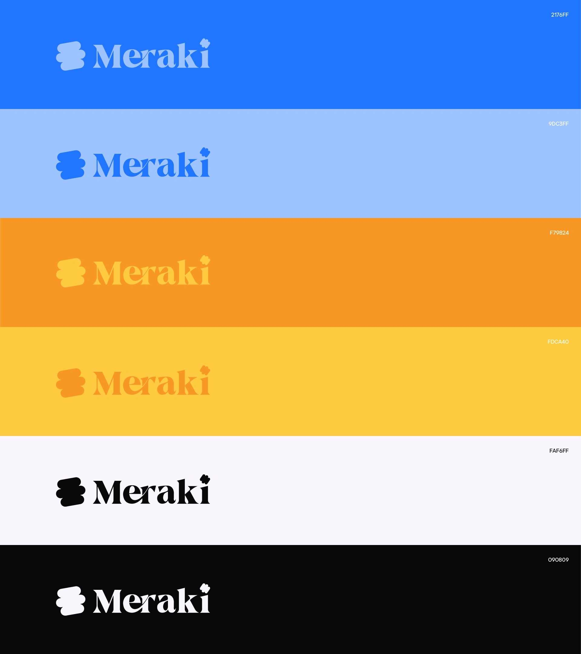
Colors
To create a sense of calm and trust, I chose blue as Meraki's core color (#2176FF and #9DC3FF). These blues evoke the open sky, offering peace and the potential for growth.
For warmth and positive energy, I included vibrant orange tones (#F79824 and #FDCA40). This represents a nurturing community where users find support and optimism for their journey.
A soft, off-white background (#FAF6FF) creates a gentle, welcoming space. Deep black (#090809) grounds the palette. It's used for text and key elements, ensuring readability and a touch of sophistication.
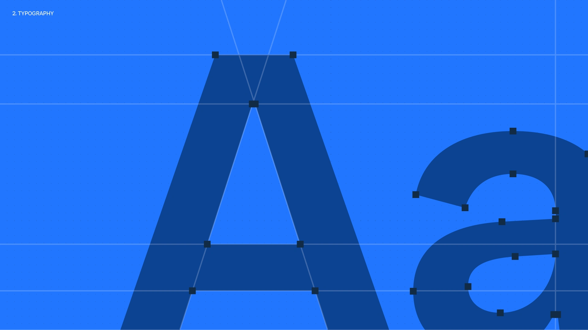
Meraki's Typography
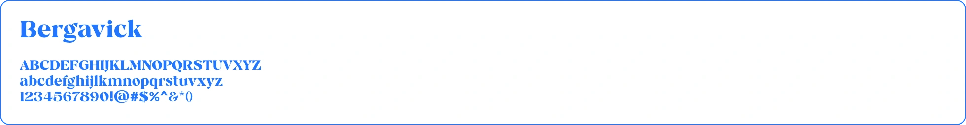
I chose Bergavick for its friendly warmth and clear readability. Its serifs add a traditional touch, building trust for users seeking mental health support. Bergavick also has a slight diagonal angle, which adds subtle personality.
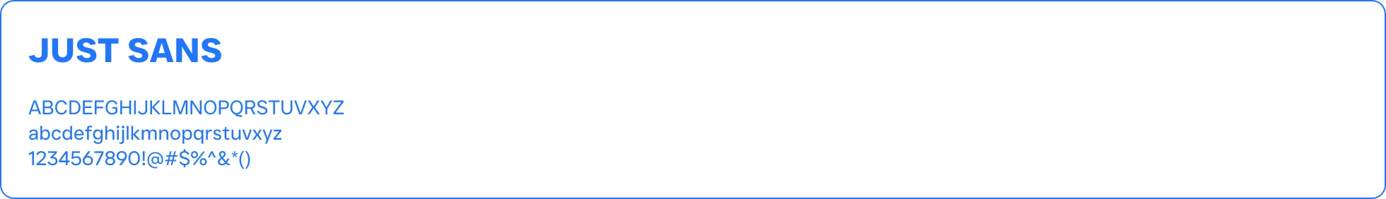
For body text, I went with JUST Sans, a minimalist sans-serif font. It's incredibly easy to read, which is crucial for an app focused on mental health. This clean look reinforces Meraki's focus on distraction-free self-care.
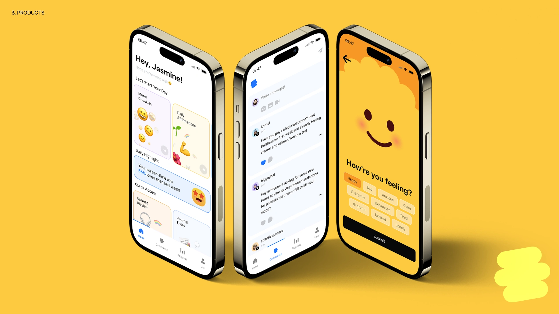
Meraki's Product Line
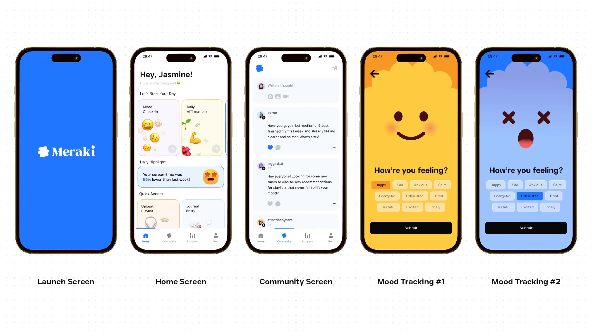
Mental health apps can be overwhelming. That's why I designed Meraki's app with a focus on simplicity and calm. User-centered design methods (like heuristic evaluation, gamification, and A/B testing) guided every decision to ensure a welcoming experience.
The app uses a deep blue palette to create a peaceful atmosphere. The interface is minimalist to help users focus on mood tracking and meditations.
Meraki also features a safe, moderated community space. Users get the support they need by sharing experiences and building connections.
The mood tracker is both intuitive and visually appealing. Users can quickly log their feelings using expressive illustrations. An optional journaling feature encourages deeper reflection. Data visualizations will help users spot emotional patterns.
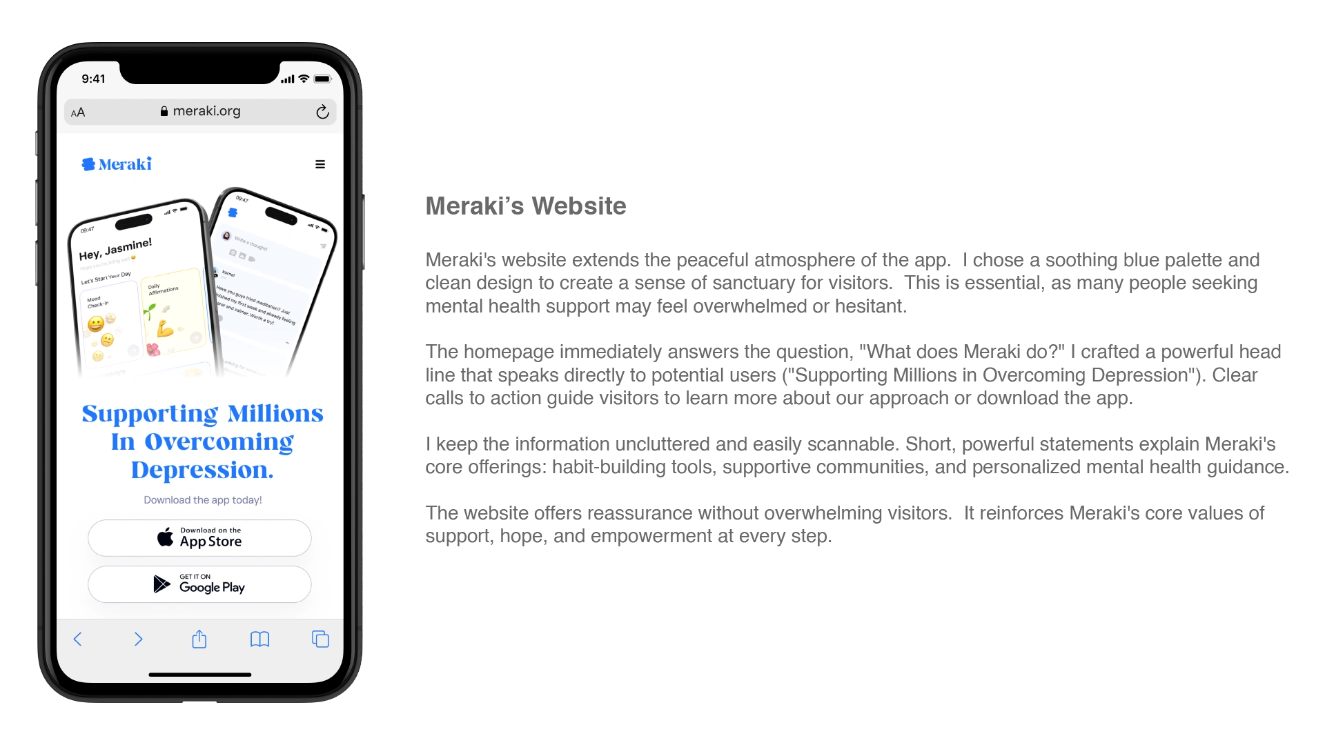
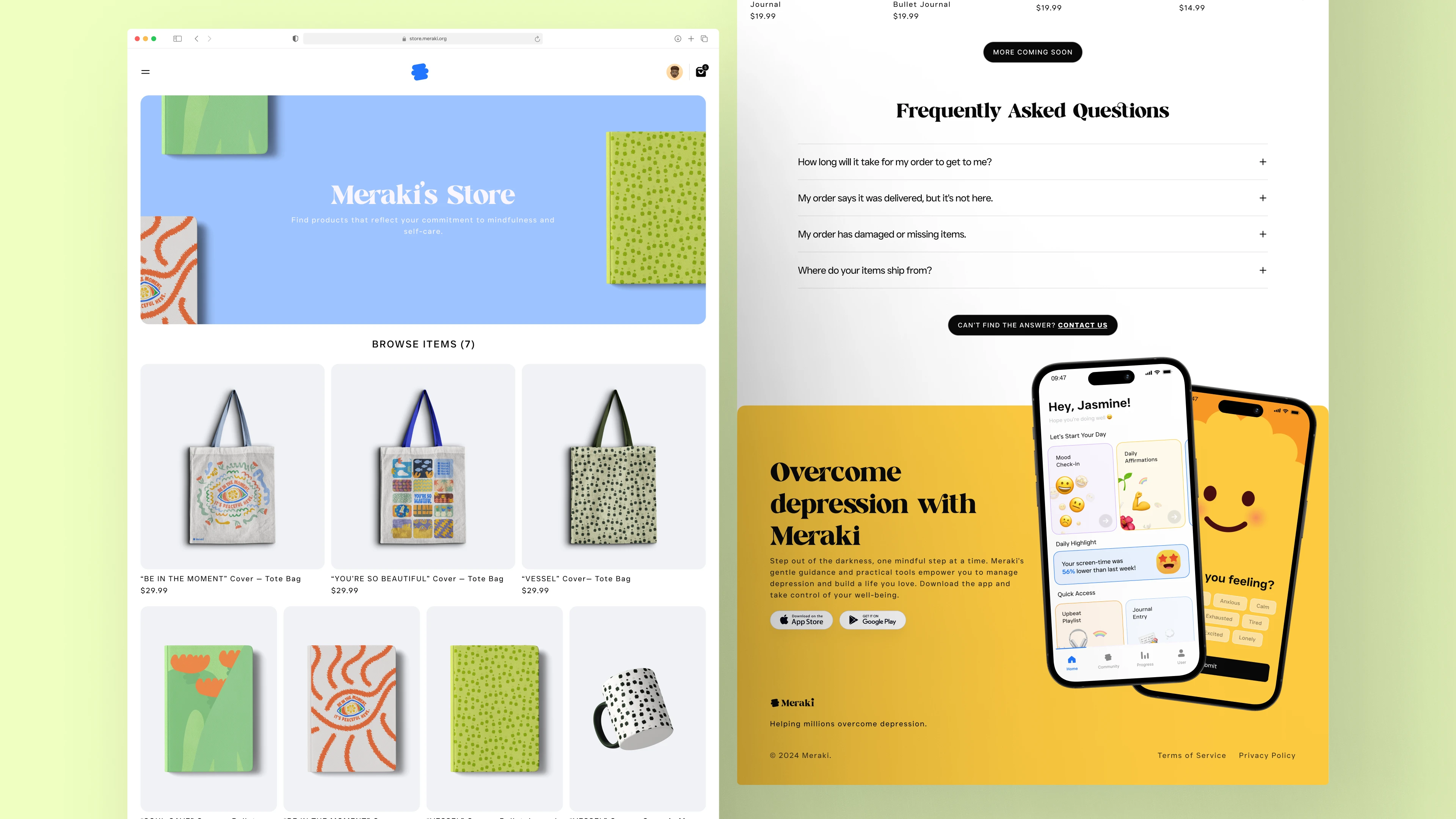
Meraki's e-commerce homepage offers a calming introduction to our mission. A minimal header and simple navigation bar keep the focus on the products themselves. Our curated collection of seven items, designed to support mental wellbeing, is showcased in a visually appealing grid.
To ensure user confidence, we include a prominent FAQ section. Here, we address common concerns like shipping times, order issues, and where items ship from. This approach reduces friction and demonstrates our commitment to customer support.
The footer reinforces our core message: "Overcome Depression with Meraki." This powerful CTA seamlessly directs users to the app download page, connecting the e-commerce experience with our core mental health tools.
Like this project
Posted Aug 12, 2024
Developing a visual identity for a mental health platform that supports individuals with depression.


Cup & Cake - Bakery Branding
Mingle - Brand Identity Design