Notelify - AI Note Taker Dashboard
Cansaas Agency
Overview
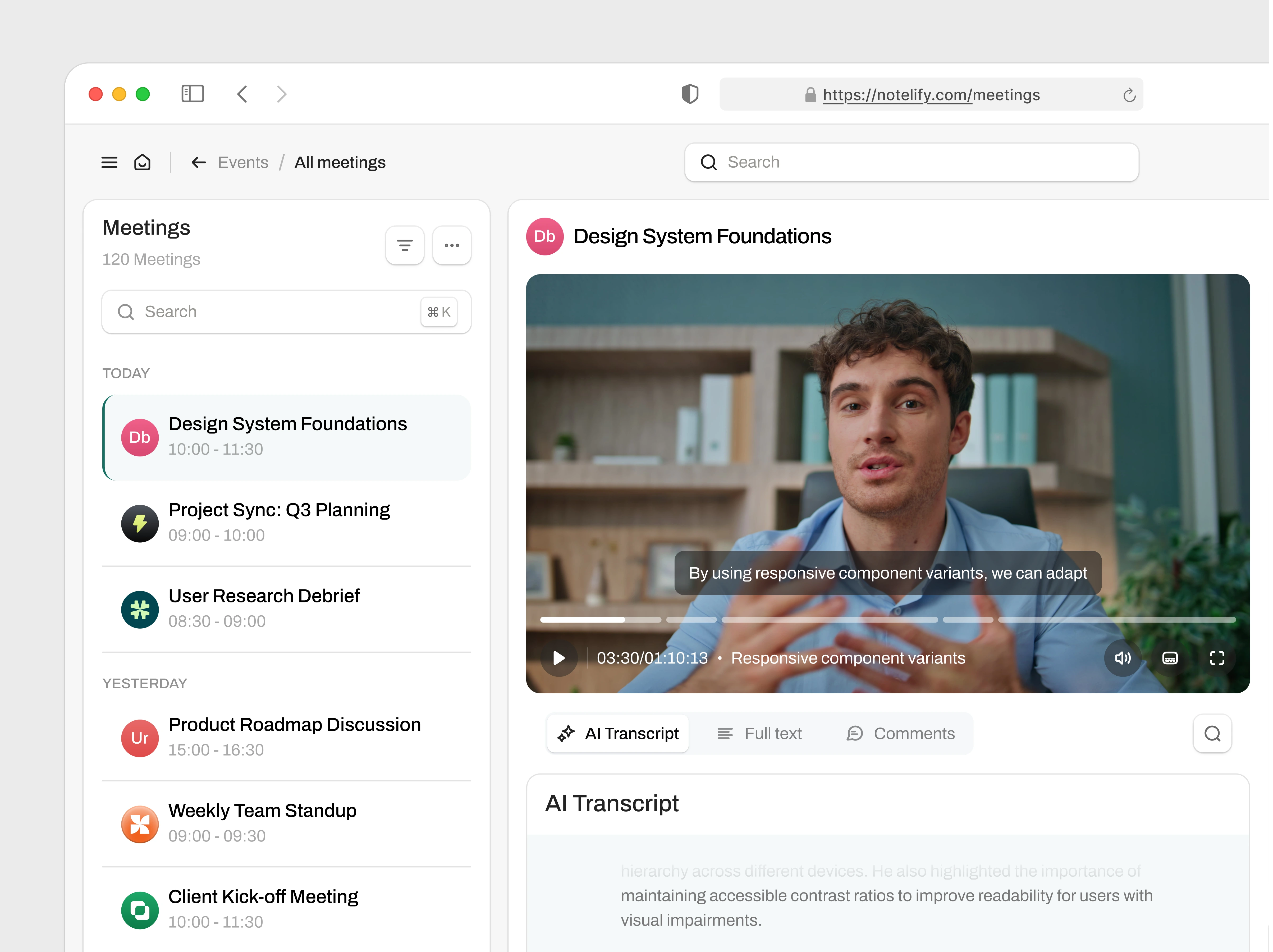
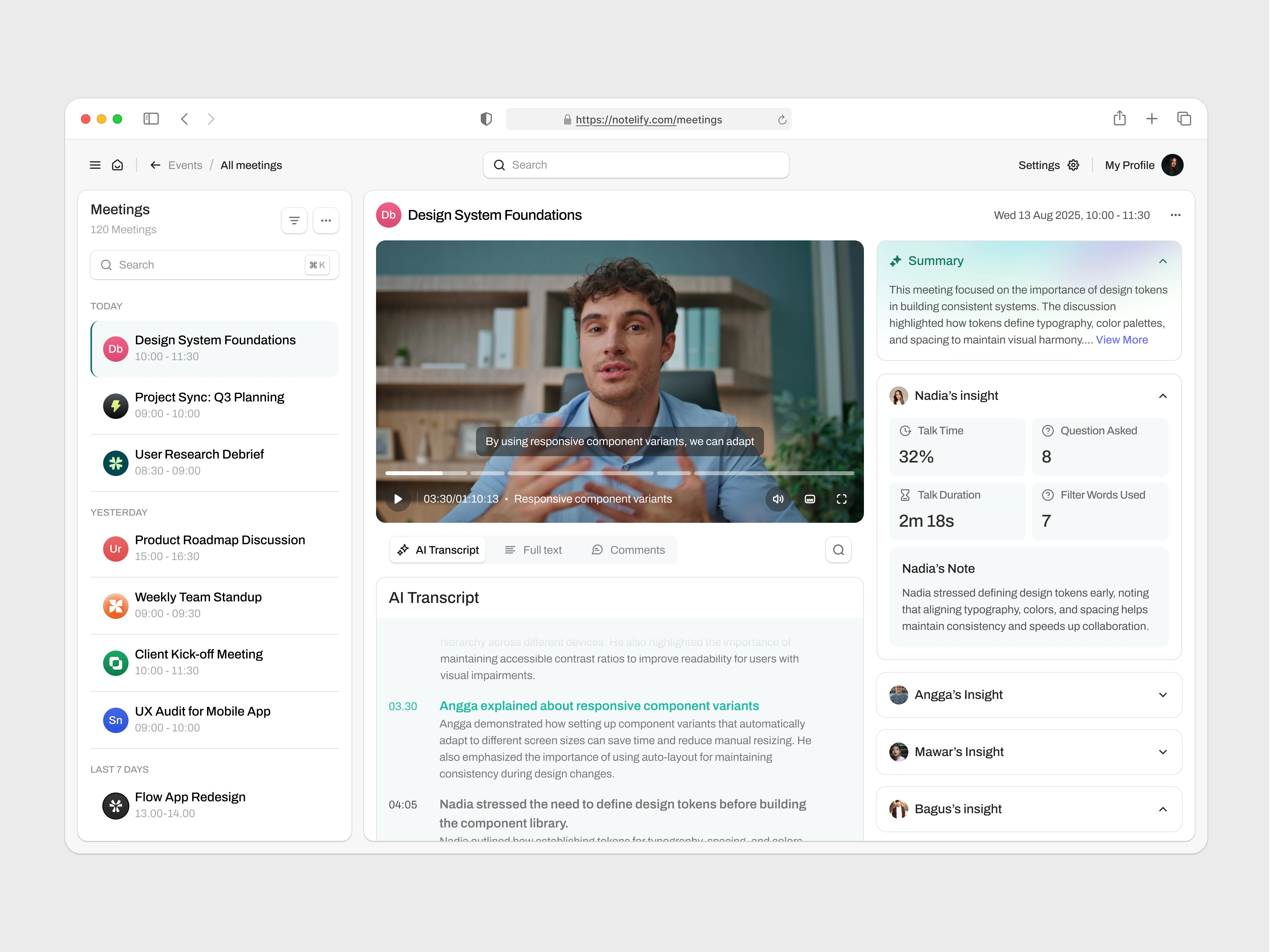
This AI Note Taker dashboard was designed to make meetings more productive by combining live transcripts, AI-generated summaries, and participant insights into a clean, structured interface. The goal was to simplify complex meeting data while ensuring users could easily access key details without feeling overwhelmed. The design balances clarity with functionality, delivering a tool that helps teams stay aligned and focus on outcomes rather than raw information.
The Problem
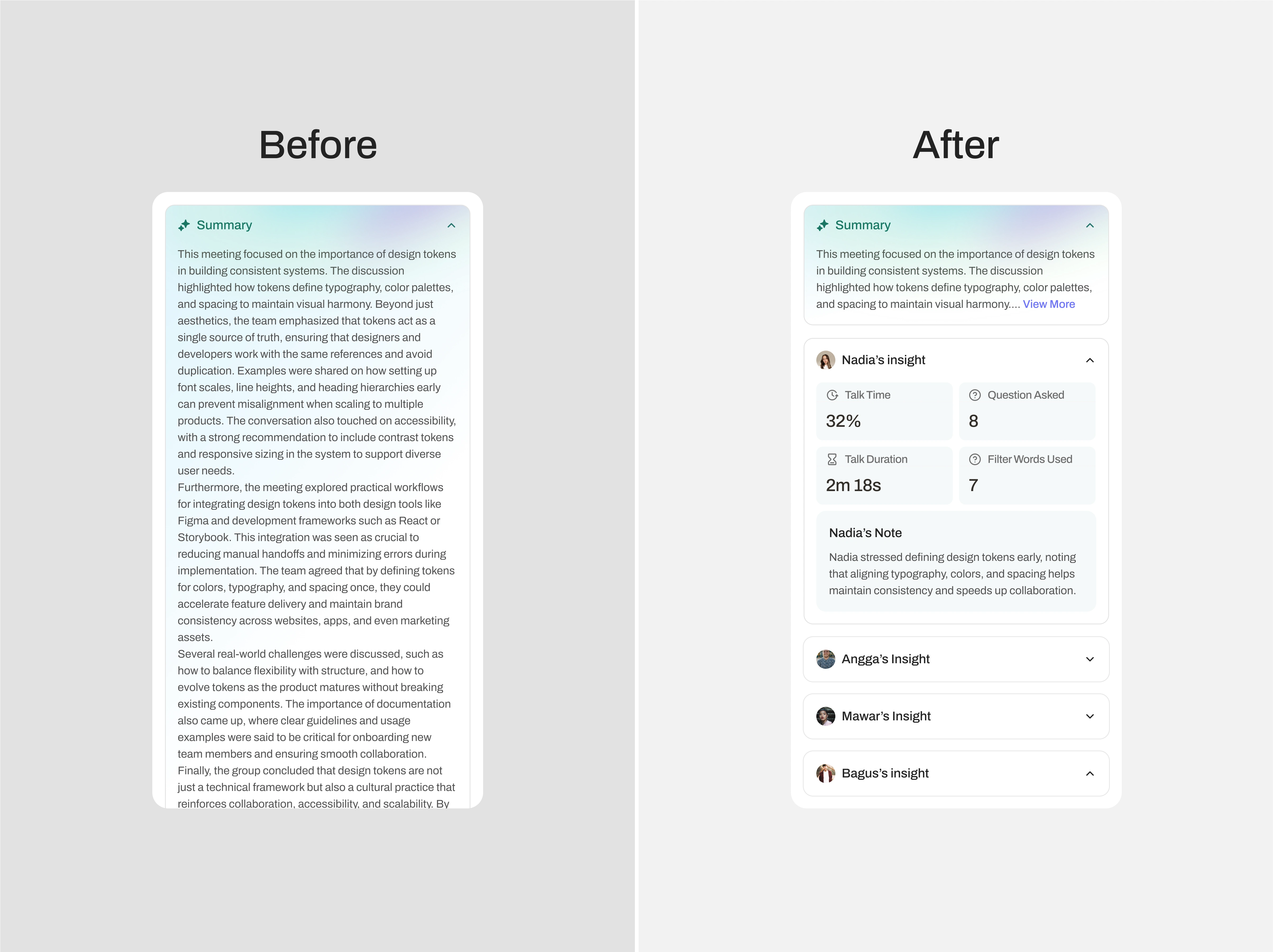
Meeting tools often fall into one of two traps: they either present too much information at once, creating clutter and fatigue, or they oversimplify, leaving users searching for critical details. In early versions, the summary panel showed long blocks of text with no way to control readability. This lack of hierarchy and interaction risked reducing usability, as users could quickly lose focus and miss important context.
The Solution
The redesigned dashboard applies the Progressive Disclosure principle (NNGroup), ensuring information is shown gradually to prevent cognitive overload. Key improvements include:
Concise Summaries with Control – Instead of lengthy text, summaries now display a scannable overview with a “View More” button, giving users the choice to expand only when needed.
AI-Driven Insights – Talk time, participation metrics, and keyword highlights are clearly visualized, helping users grasp engagement patterns at a glance.
Transcript Navigation – Time-stamped highlights allow quick review of key discussion points without scrolling through full transcripts.
Participant Insights – Individual notes and metrics for each attendee provide context, making it easy to revisit contributions and follow up effectively.
Like this project
Posted Aug 20, 2025
Its intuitive design ensures clarity, focus, and efficiency helping teams save time, stay aligned, and never miss a detail. 🎯✨
Likes
4
Views
18