RIOVIVA Brand Identity and Packaging Design

Hossain Mobarak


RIOVIVA — Sparkling Botanical Soda Brand Identity & Packaging System
RIOVIVA is a vibrant sparkling botanical soda brand built around freshness, flavor, plant-powered ingredients, and the energy of outdoor living.
The project was created to reimagine functional beverages as something that feels joyful, expressive, natural, and visually memorable. Rather than leaning into the clinical language often used by wellness drinks, RIOVIVA combines bold typography, botanical illustration, playful animal characters, warm color palettes, and lifestyle-driven art direction to create a brand that feels both healthy and full of personality.
At the center of the identity is one simple idea:
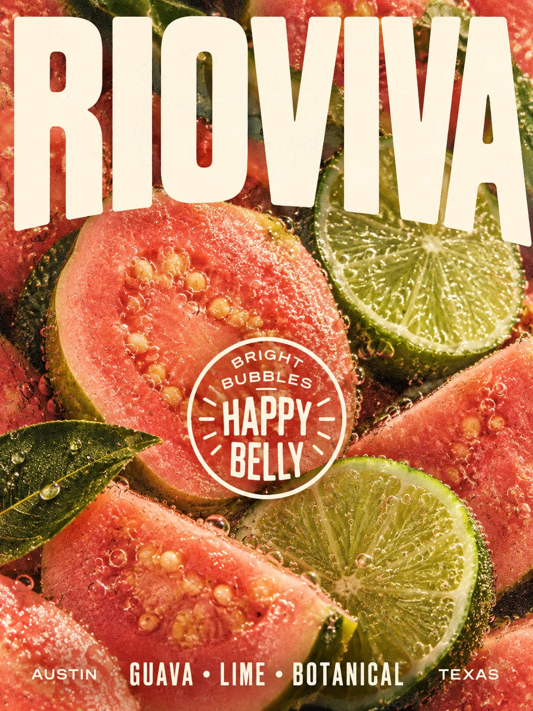
Bright bubbles. Happy belly.
RIOVIVA is positioned as more than a sparkling drink. It represents a refreshing everyday ritual—something made for warm afternoons, outdoor gatherings, road trips, beach days, and moments where good flavor and good energy naturally come together.
My Role
For this project, I worked as the Brand Identity Designer, Packaging Designer, Illustrator, Art Director, Campaign Designer, and Visual Designer.
My role included developing the overall brand concept, visual identity, logo direction, packaging architecture, flavor color system, illustration language, secondary packaging, campaign graphics, lifestyle imagery, and the broader visual world surrounding the product.
My main goal was to create a beverage brand that could feel natural without looking generic, functional without becoming clinical, and playful without losing premium shelf appeal.
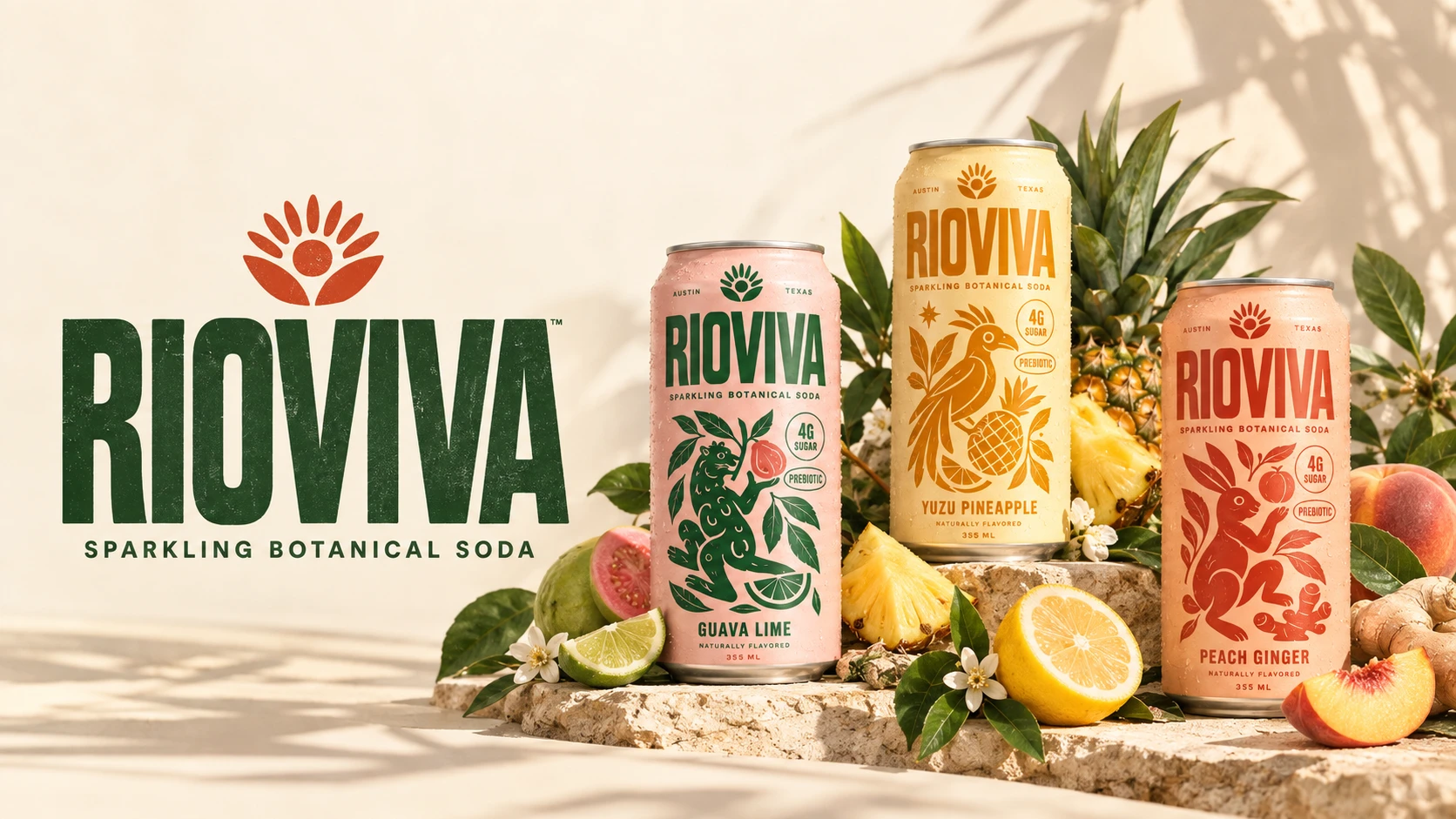
Every visual decision—from the oversized typography to the character illustrations and photography—was designed to help RIOVIVA feel immediately recognizable.
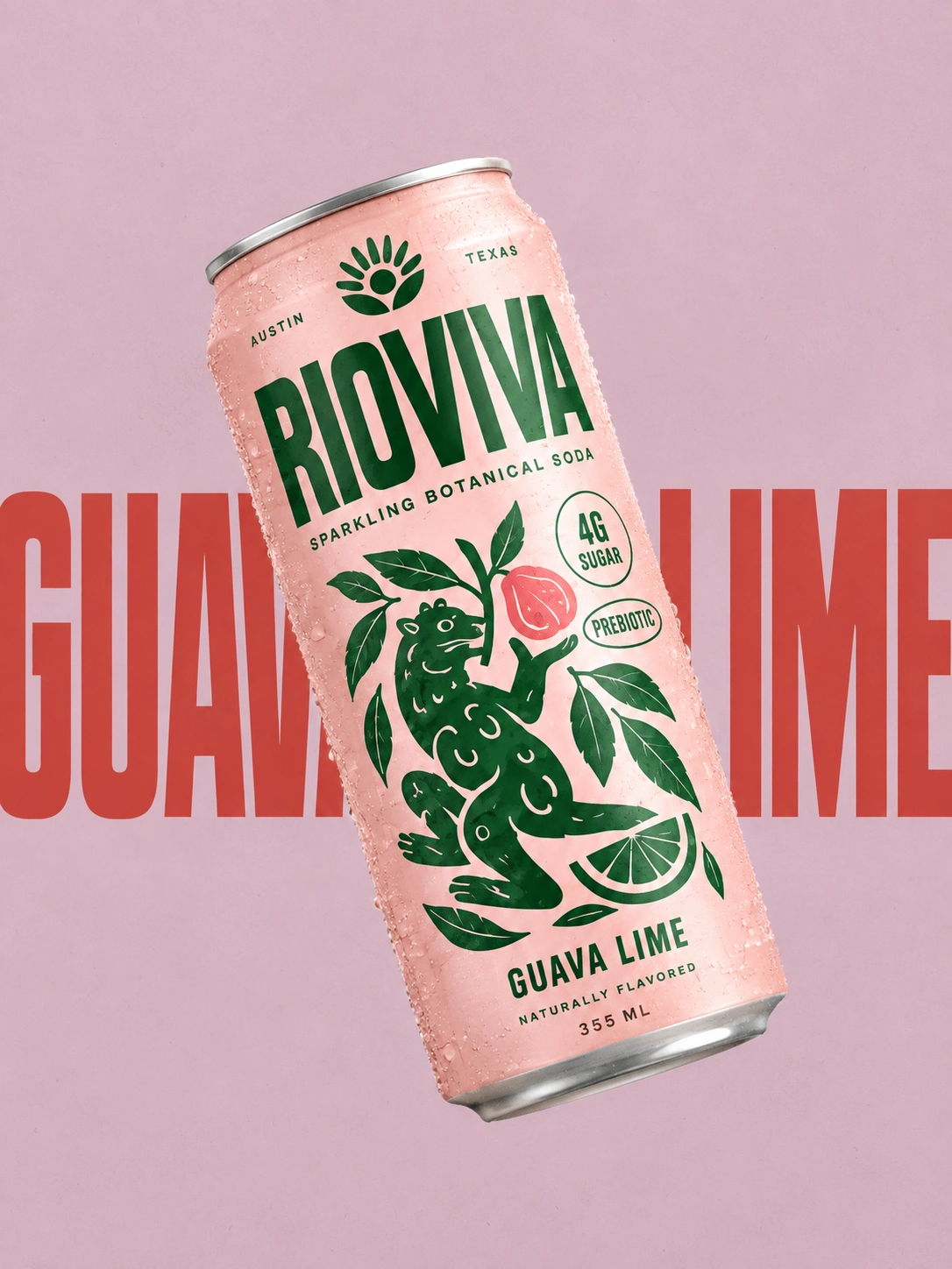
The name RIOVIVA suggests movement, vitality, nature, and life.
That feeling became the foundation of the visual identity.
I wanted the brand to capture the sensation of something fresh and alive: sparkling water poured over fruit, sunlight hitting citrus, condensation running down a cold can, and the relaxed energy of being outdoors.
Packaging Design
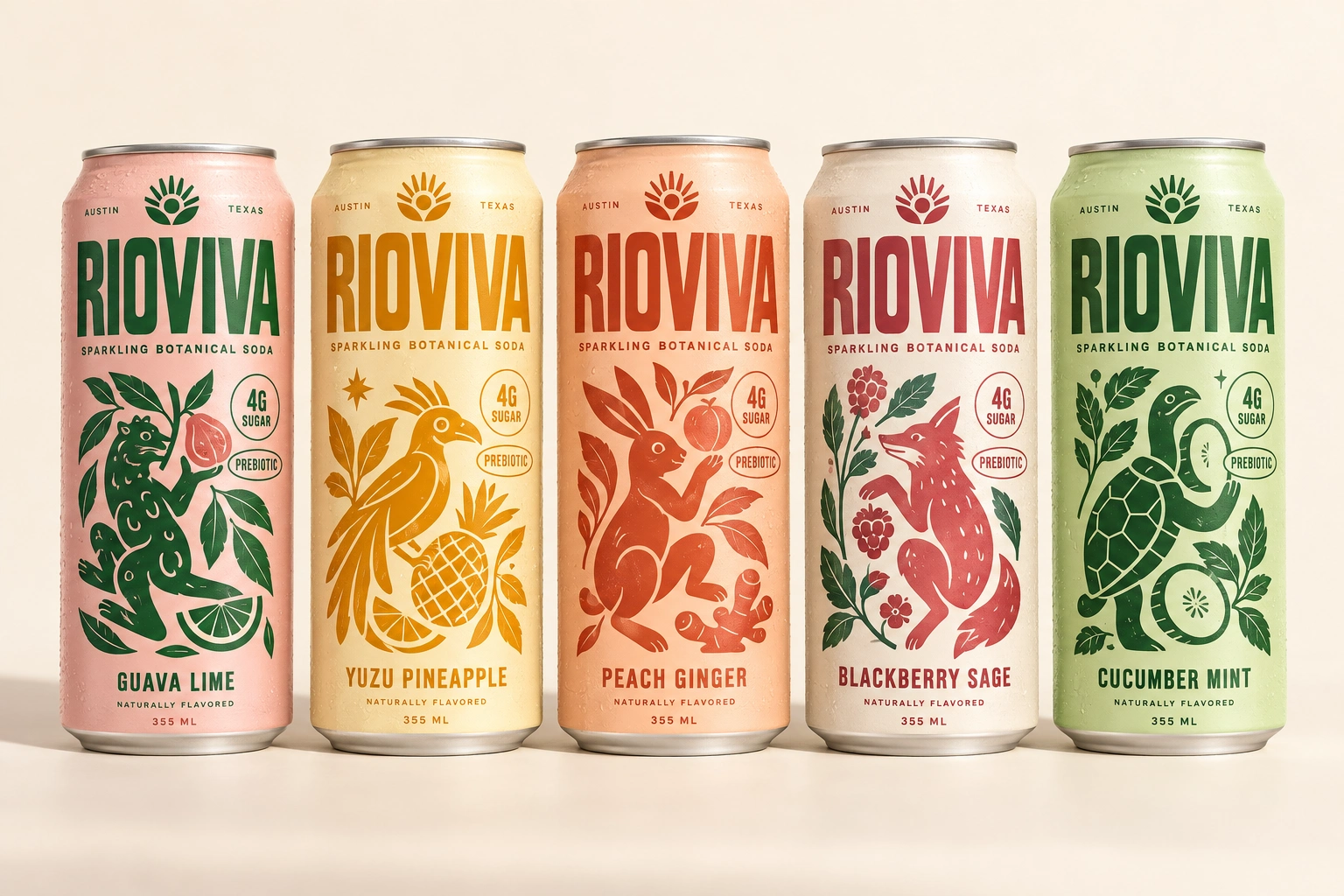
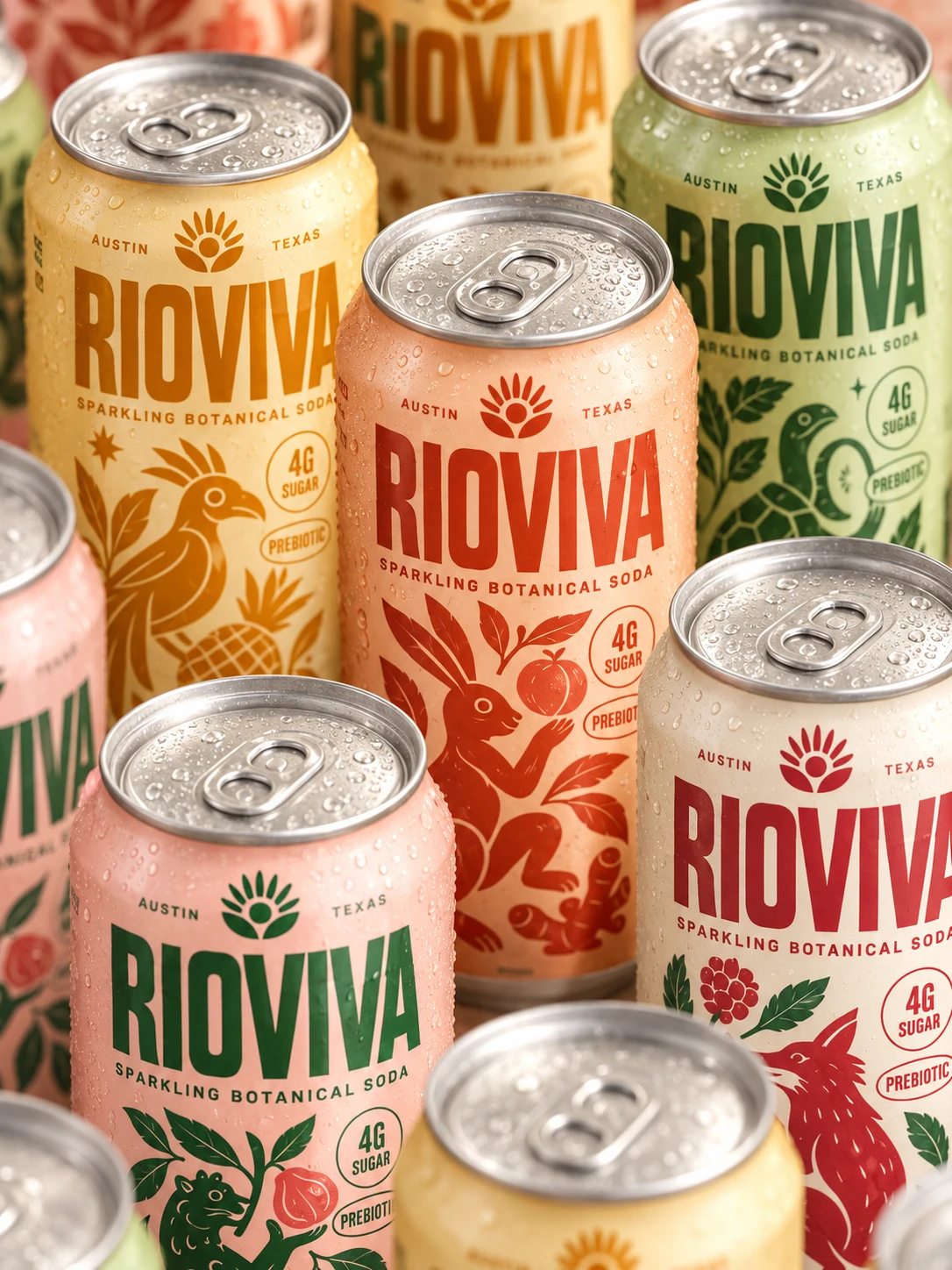
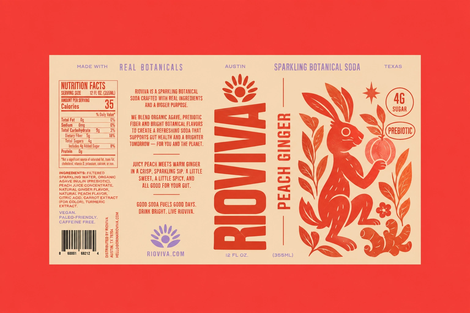
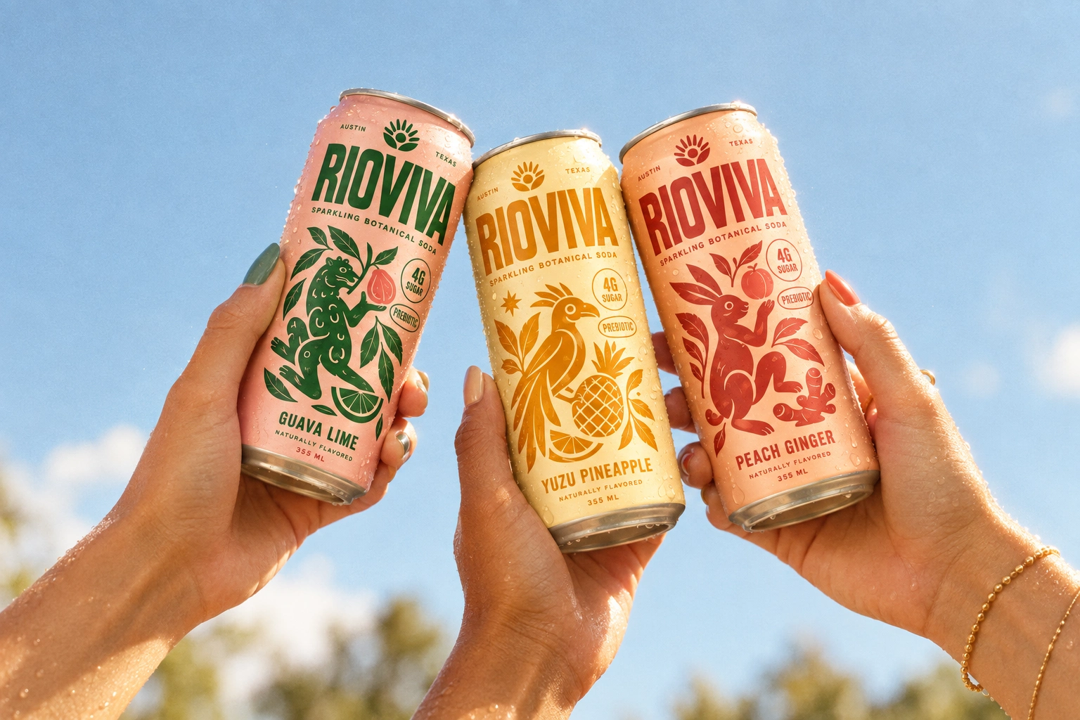
The individual cans were designed as the hero of the brand.
Each flavor follows the same information hierarchy while receiving its own distinct personality through color, ingredients, and illustration.
The range includes:
Guava Lime — soft pink with deep botanical green
Yuzu Pineapple — warm yellow with golden orange
Peach Ginger — peach with rich terracotta
Blackberry Sage — warm cream with berry red and green
Cucumber Mint — fresh green with dark botanical tones
This color-coding system makes the flavors easy to distinguish while keeping the collection visually unified.
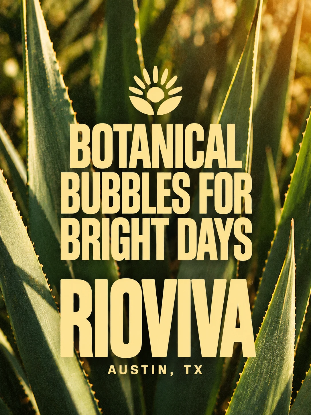
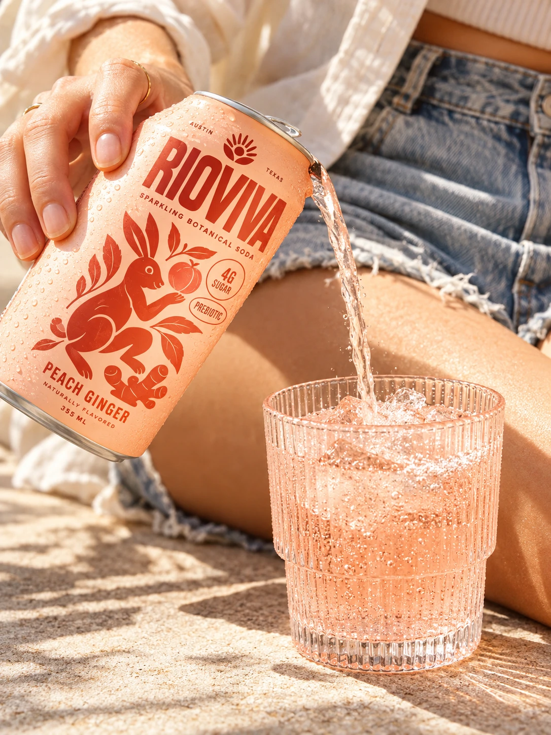
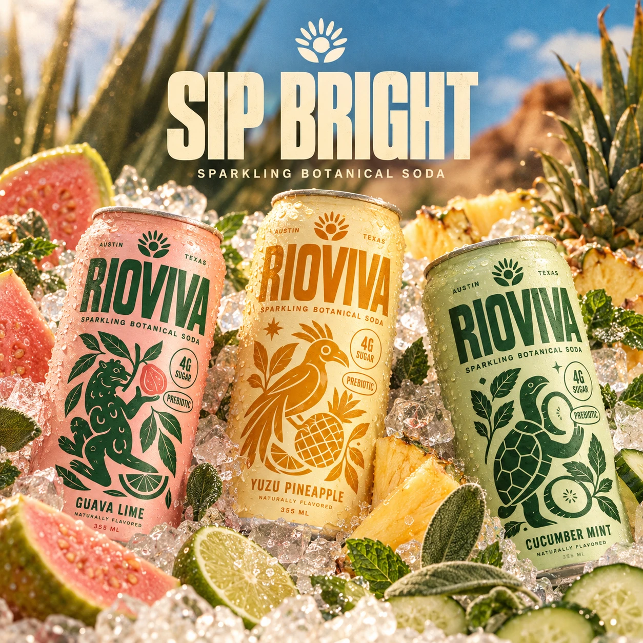
Illustration became one of the most distinctive parts of the RIOVIVA identity.
Each flavor is represented through its own animal character and surrounding botanical ingredients.
The illustrations are bold, simplified, slightly vintage, and intentionally imperfect. This gives the brand a handcrafted quality while allowing it to stand apart from ultra-minimal beverage packaging.
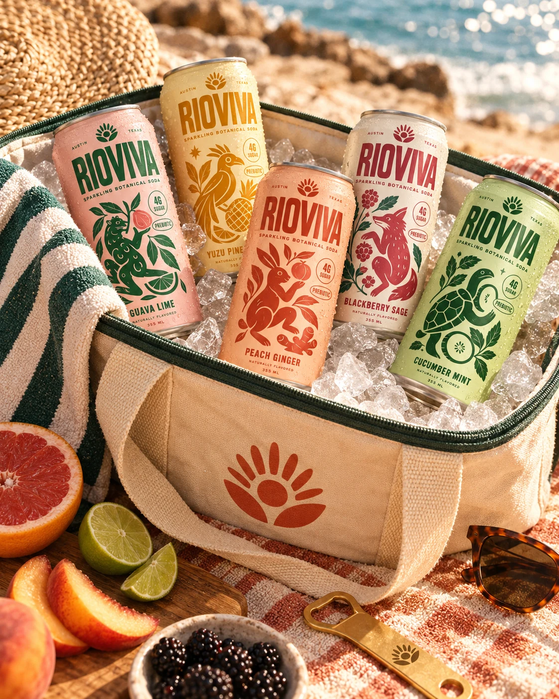
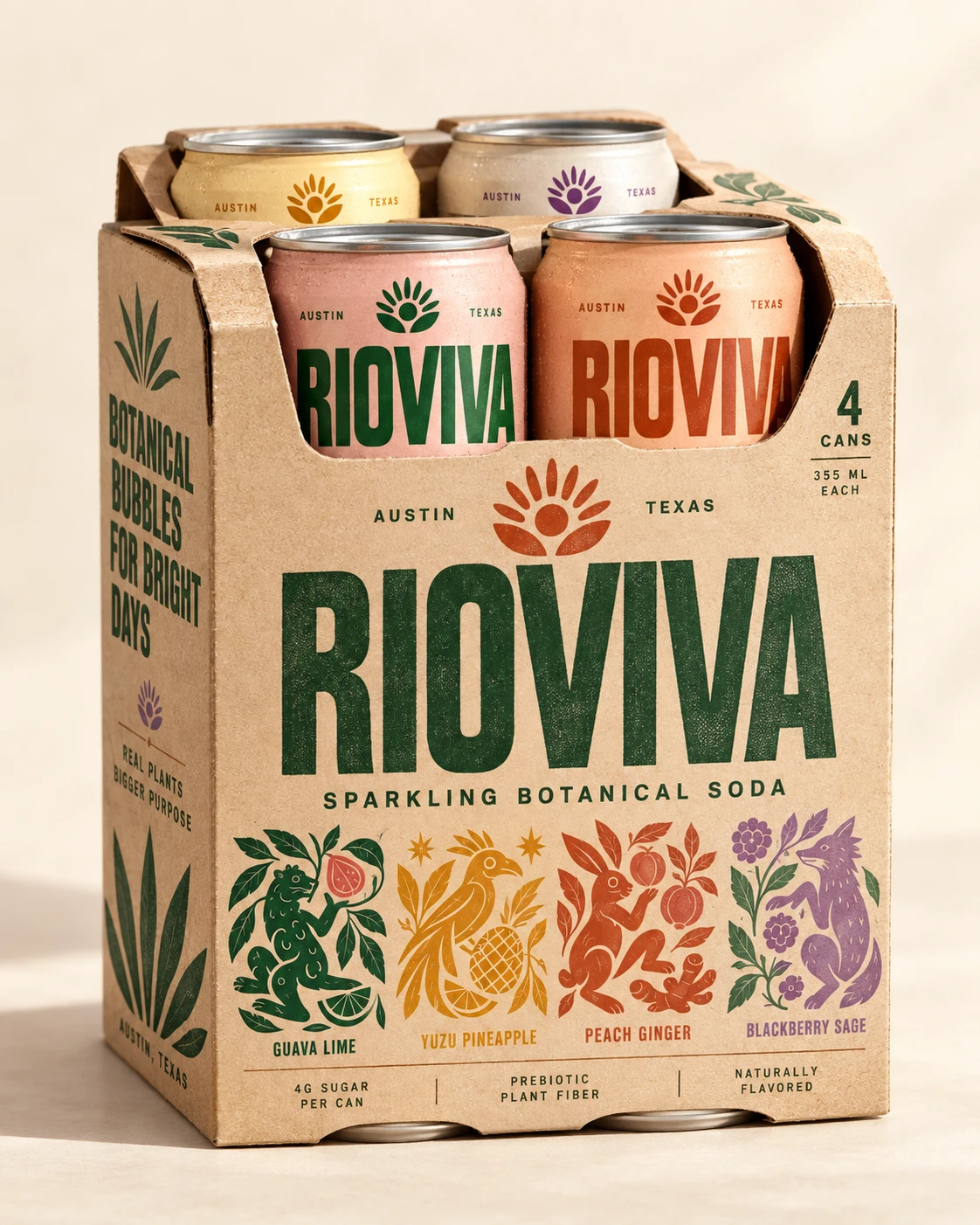
The multipack packaging extends the visual identity beyond the individual cans.
I designed the carrier using a more natural kraft-paper appearance to introduce contrast against the colorful primary packaging.
The brown paper texture helps communicate the botanical positioning, while the large green RIOVIVA wordmark maintains strong visibility.
A lineup of flavor illustrations appears across the front, transforming the pack into a miniature overview of the brand world.
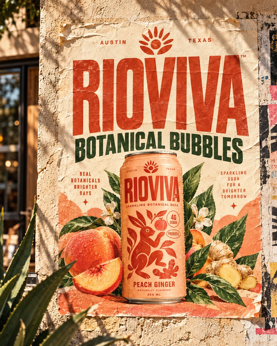
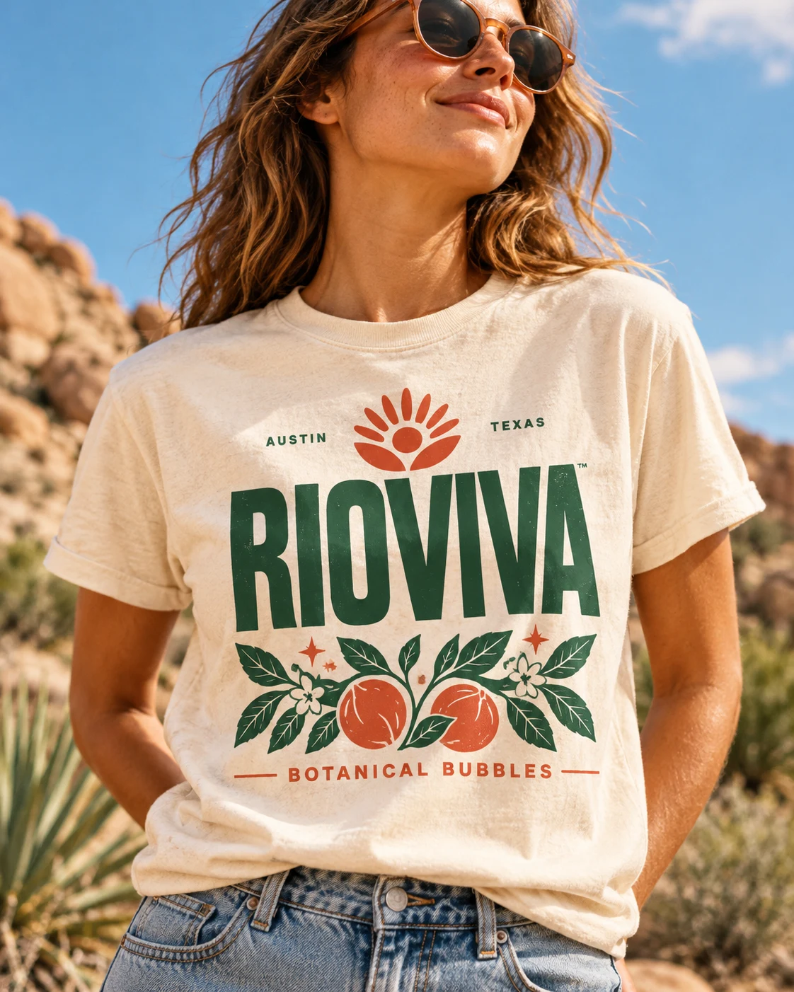
The final result is a colorful and character-driven beverage brand designed to communicate not only what the product contains, but how it should make people feel: refreshed, energized, and ready for brighter days.
RIOVIVA — Bright Bubbles. Happy Belly.
My Role:
Brand Identity Designer · Packaging Designer · Illustrator · Art Director · Campaign Designer · Visual Designer
Like this project
Posted Oct 4, 2026
Developed brand identity and packaging for RIOVIVA, a botanical soda brand. The project was created to reimagine functional beverages as something feels joyful.