Cypress Rally Club Brand Identity Design

Hossain Mobarak


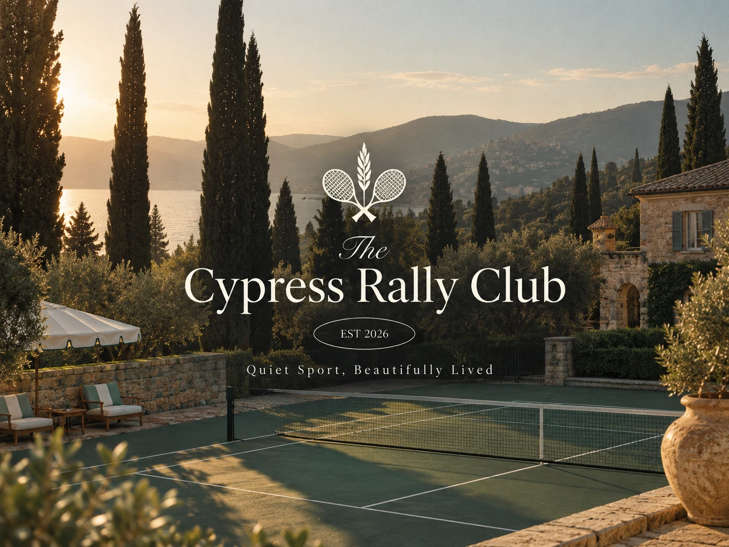
Cypress Rally Club — Tennis Club Brand Identity & Lifestyle Branding
A refined, heritage-inspired brand identity created for The Cypress Rally Club, a premium tennis and lifestyle club where quiet sport meets beautifully lived leisure.
The creative direction combines the timeless elegance of European tennis culture with the warmth of a Mediterranean-inspired setting. The result is a sophisticated identity built around sport, nature, leisure, community, and understated luxury.
Rather than creating a typical energetic sports identity, I explored a more editorial and lifestyle-driven direction—one that positions tennis as part of a broader way of living.
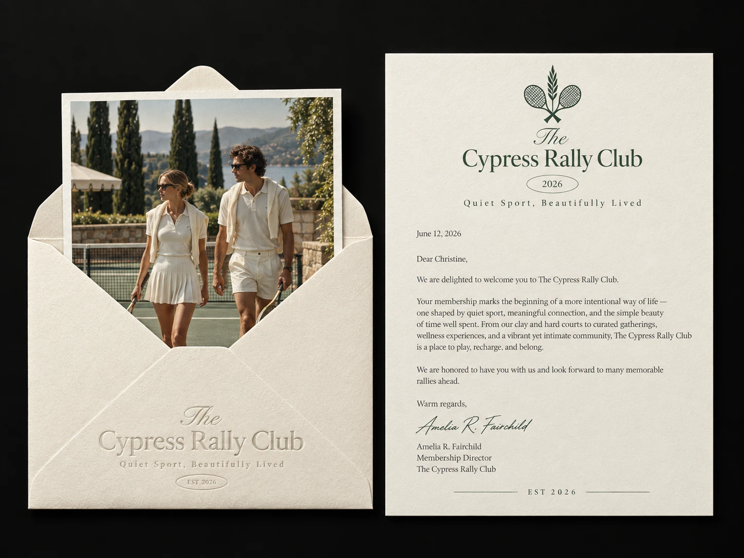
The core idea behind Cypress Rally Club is:
“Where Leisure Meets the Baseline.”
The brand treats tennis as more than a competitive sport. It becomes part of a slower, more refined lifestyle—morning matches, beautiful surroundings, social gatherings, and time spent outdoors.
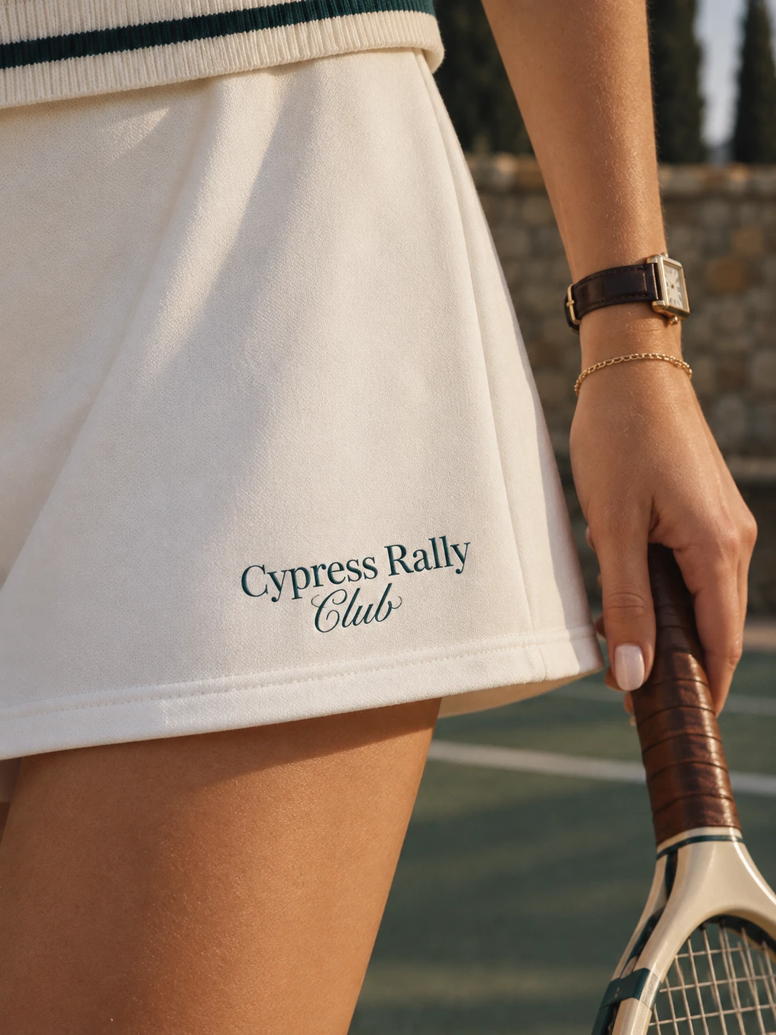
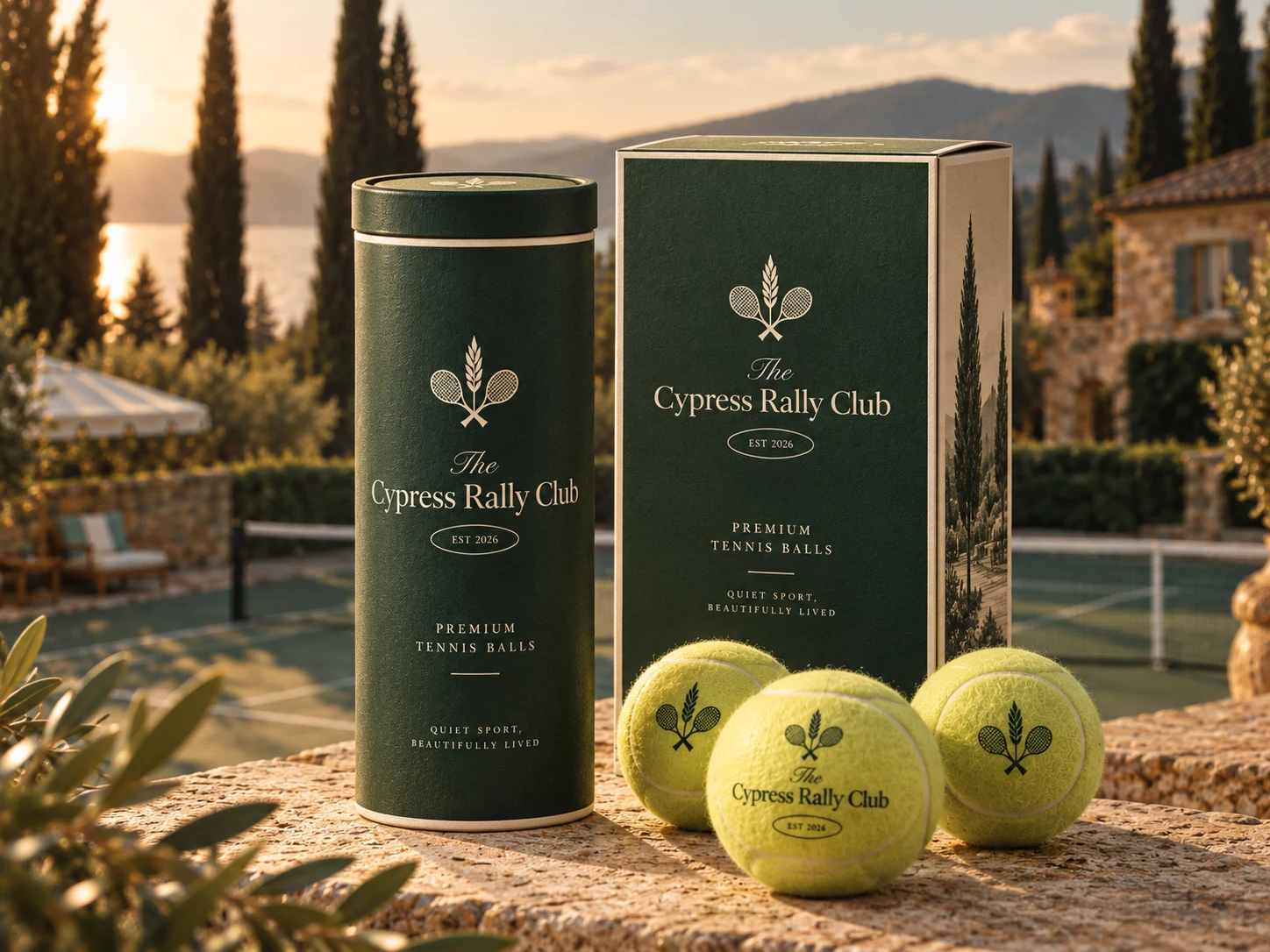
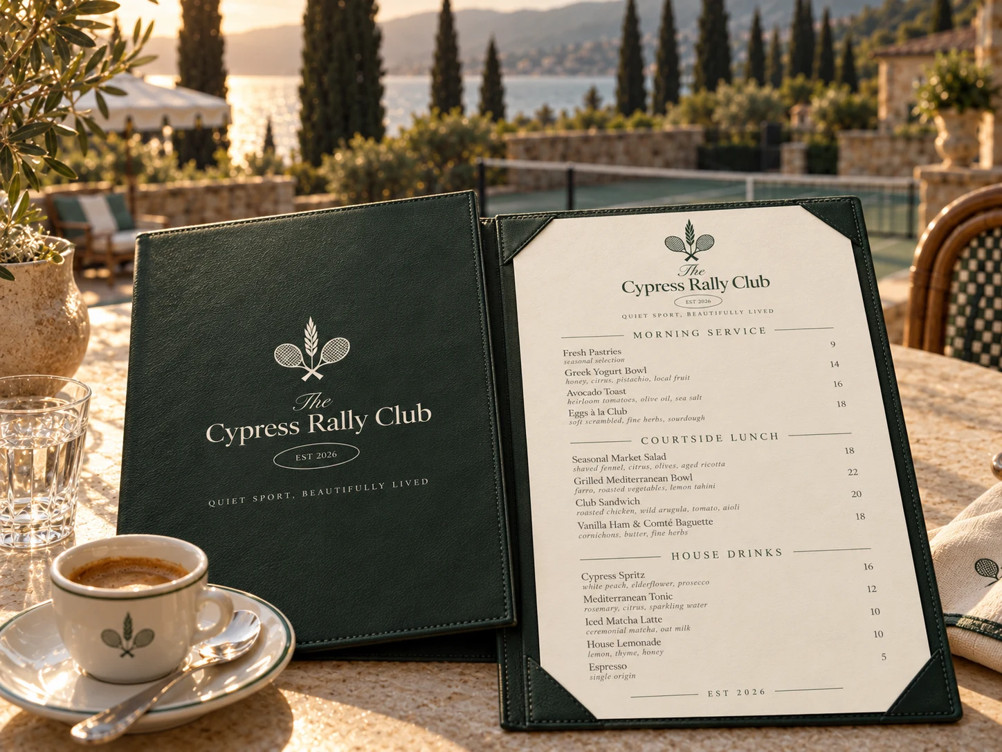
The Cypress Rally Club identity combines a refined wordmark with a distinctive emblem featuring tennis rackets, botanical elements, and a subtle star detail.
The crossed rackets establish the connection to tennis, while the botanical element brings the surrounding landscape into the identity.
The result is a club mark that feels sporting without being overly aggressive and premium without becoming overly formal.
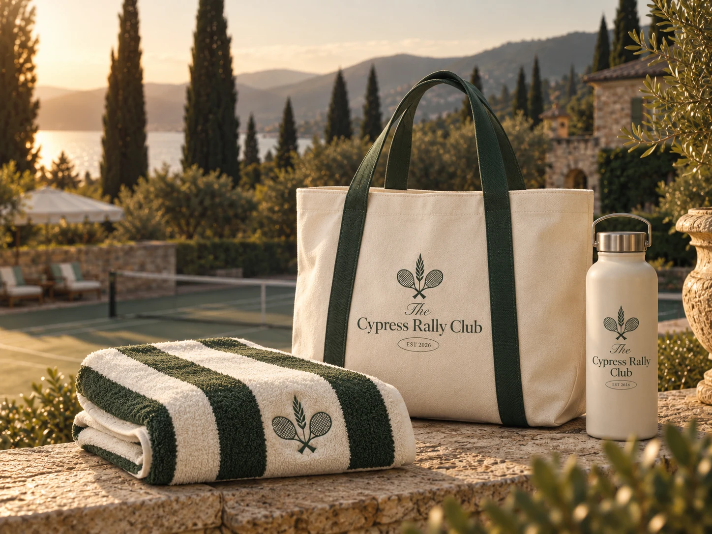
The emblem can work independently across:
Club signage · Apparel · Tennis equipment · Merchandise · Stationery · Digital applications · Event materials
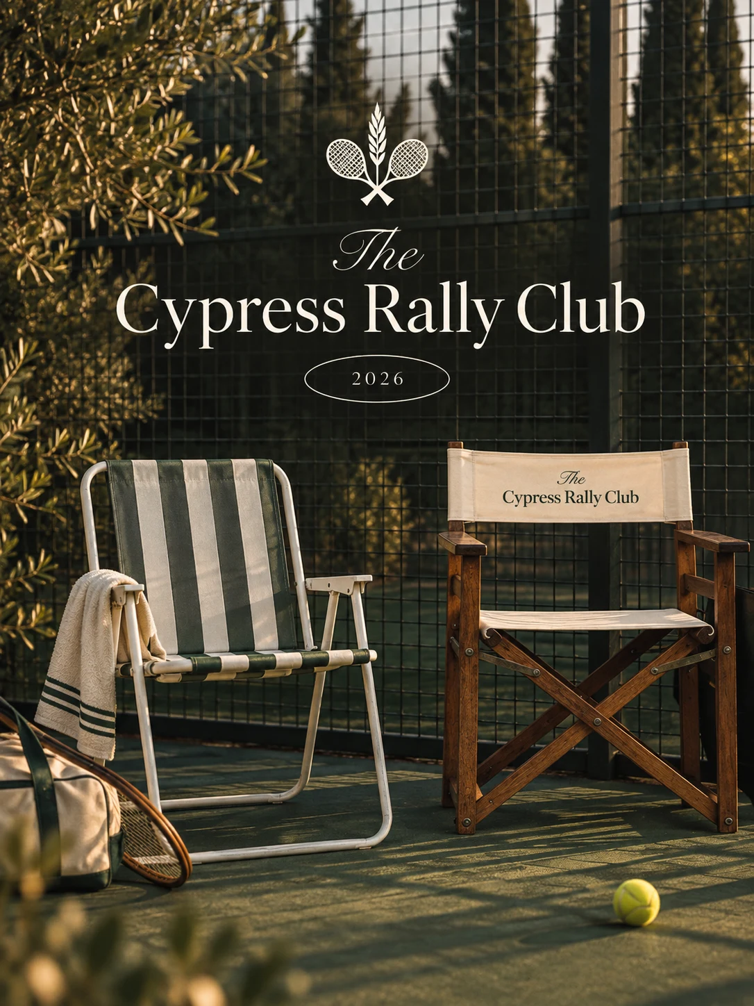
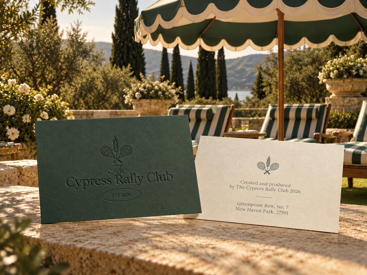
The identity is built around a sophisticated combination of deep cypress green, warm ivory, natural stone, and sunlit landscape imagery.
The dark green creates a strong connection to the tennis court and surrounding vegetation, while the warm neutral tones introduce a sense of Mediterranean elegance.
This creates a visual atmosphere that feels:
The typography combines elegant serif lettering with restrained supporting type to create an editorial, heritage-inspired feeling.
Large serif headlines provide the identity with a sense of tradition and sophistication, while smaller spaced typography adds structure and modernity.
This contrast allows the brand to communicate both:
Classic Club Heritage + Contemporary Lifestyle
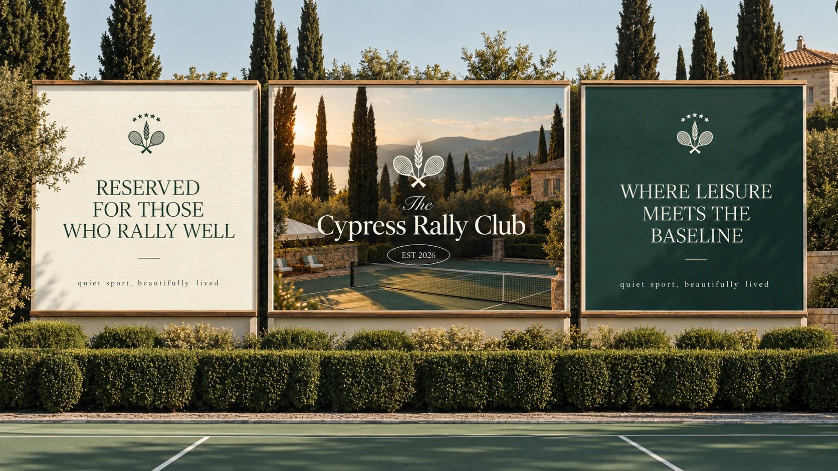
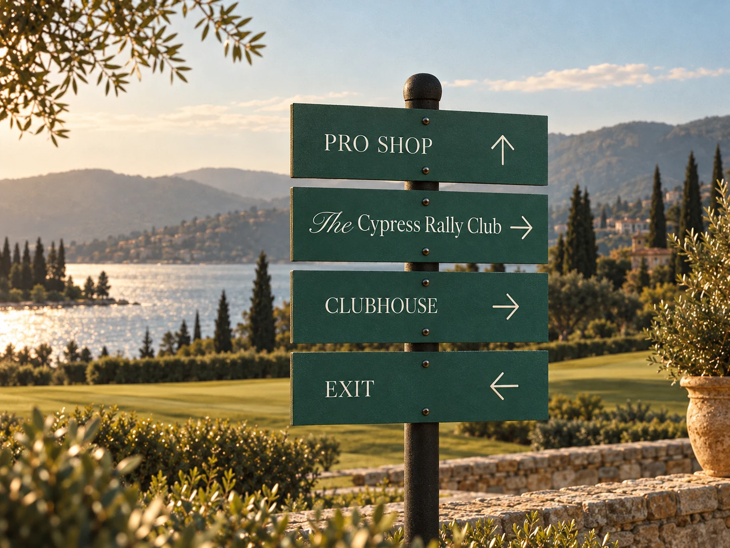
The identity was translated into a series of large-format outdoor signs designed to live naturally within the club environment.
The signage uses photography, typography, brand messaging, and generous whitespace to create a premium visual presence without overwhelming the surrounding landscape.
The campaign messaging includes:
“Reserved for Those Who Rally Well”
and
“Where Leisure Meets the Baseline.”
These statements give the club a distinctive voice—confident, elegant, and slightly playful.
The goal was to create a distinctive premium tennis club identity that could extend beyond the court into a complete lifestyle brand.
Cypress Rally Club was designed to communicate a particular feeling:
Quiet sport. Beautiful surroundings. A well-lived life.
A brand where tennis is the activity, but the lifestyle is the experience.
Like this project
Posted Oct 2, 2026
Created a premium brand identity for Cypress Rally Club blending tennis and lifestyle aesthetics. A brand where tennis is the activity is the experience.