Website redesign | Manufacturing and construction company Pegas
The project's outcomes demonstrate improved user experience and increased customer engagement through enhanced visual design and user-friendly navigation.
Pegas is a manufacturing and construction company founded in 2003. It has its own factory in Vyazma. The production facility is equipped with modern equipment from European brands (LEDINEK, HUNDEGGER). The company employs a team of professionals in design and construction.
It is important to maintain the color palette in the project, as the entire project's identity is based on it. Business cards, the construction team's uniforms, and packaging for construction materials are associated with the green color and logo, so it is important to maintain this connection on all corporate identity mediums.
THE PROBLEM STATEMENT
01. Responsive web design
The old version of the site did not adapt to mobile devices, that led to the loss of a large number of users. It is necessary to make the site user-friendly for all devices and meet the needs of all users.
02. Structure of the website
It is necessary to improve the navigation on the site and provide scenarios for users who want to build a house with the help of a company and who want to order materials for construction.
03. Request for an order
Create convenient forms so that the client can send an order request from any page of the site.
04. Presentation of projects
The user needs to see all the details of the project in order to decide on an expensive purchase.
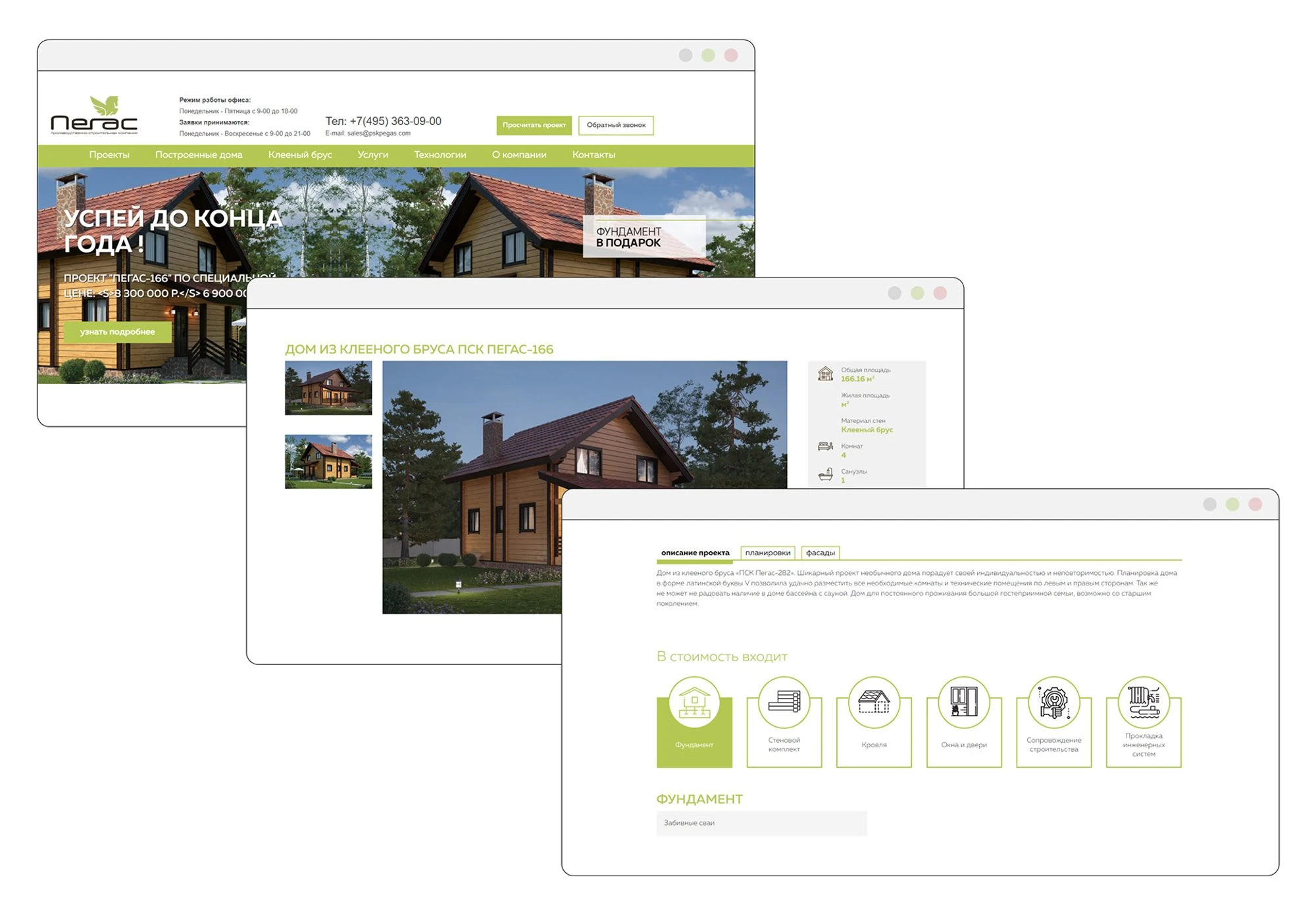
Old version website
STAGES OF PROJECT DEVELOPMENT
After discussing the task and project goals with the client, I created a work plan and divided each stage into sequential steps. All stages were approved, which made the process clear and transparent, allowing us to align the completed work with the main objective of the project.
Research
I analyzed the current state of the website, its content, identified its strengths and weaknesses. I studied competitors and developed a development strategy.
Analysis of the current site
Competitive Audit
Interview
Define
At this stage, I have identified the main issues of users based on the conducted research.
User Journey Map
Gap Map
Ideate
I structured the information and created the main user scenarios.
User Stories
User Flow
Information Architecture
Design
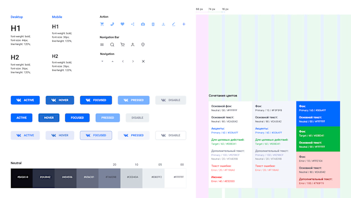
I selected a visual language for the project, worked on wireframes and mockups, and created Design System.
Wireframes
Visual design
Design System (UI kit)
RESEARCH
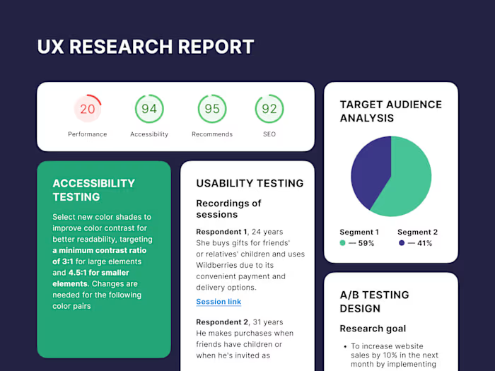
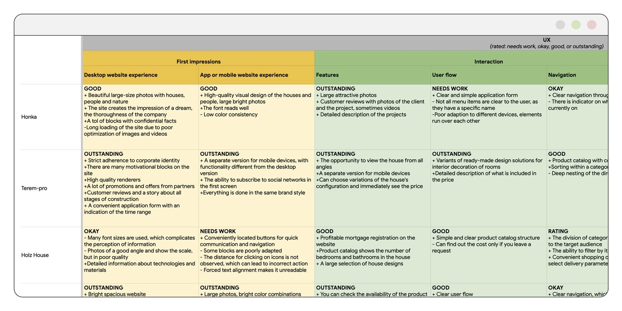
During the initial stage of project development, I conducted research on both direct and indirect competitors of the website. To accomplish this, I created a table that examined and compared various parameters, such as first impressions, key features, user flow, navigation, brand positioning, tone, and content quality. A small portion of the work is presented in the image below.
Additionally, a research conducted by the marketing department helped to formulate a list of requirements and recommendations for interface design and optimization for marketing purposes.
Competitor research
Interview and identification of the target audience
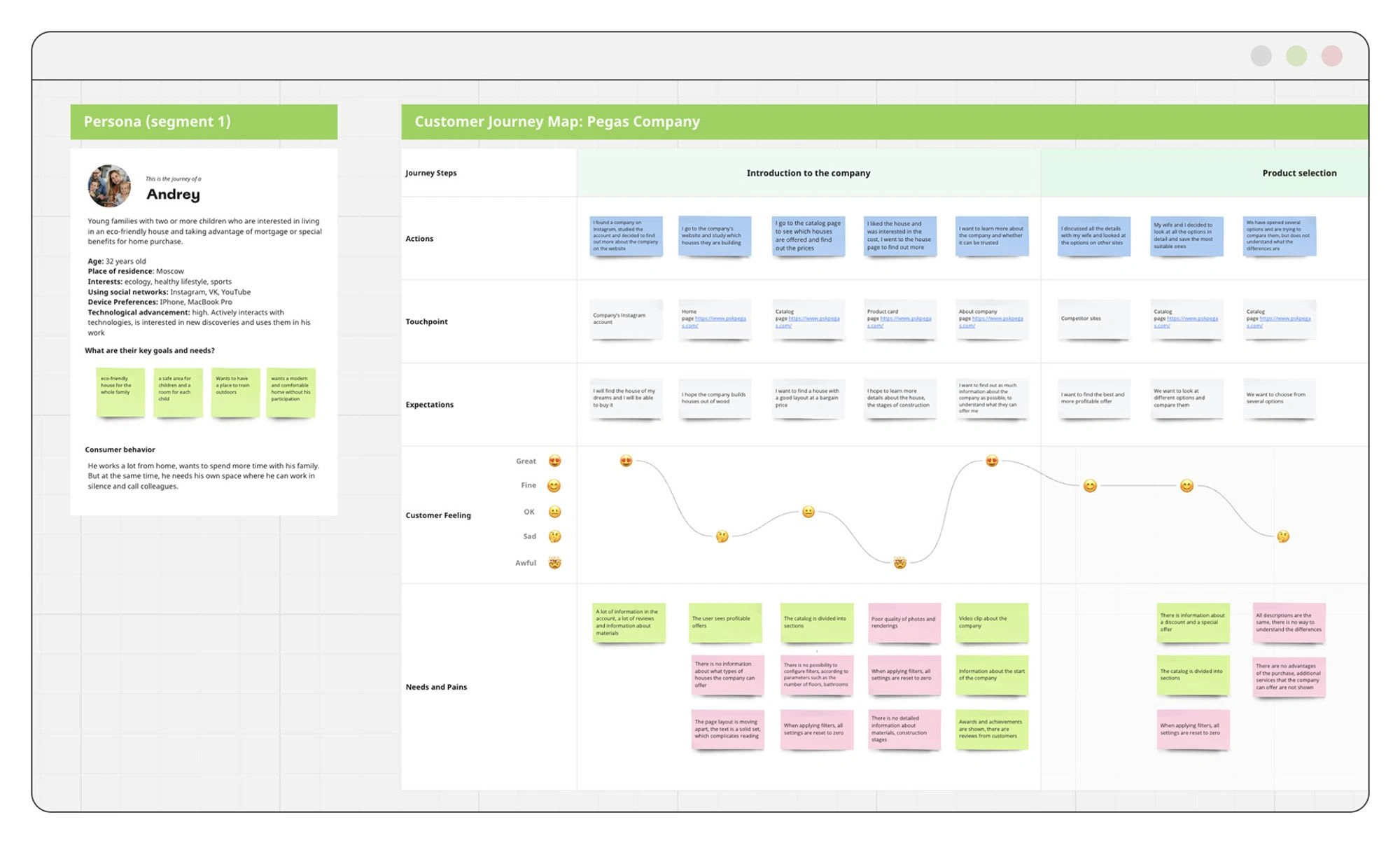
Through research and data analysis, four target audience segments were identified. The first segment consists of young families with two or more children who are interested in living in an eco-friendly house and taking advantage of mortgage or special benefits for home purchase. Safety and modern technologies are important to them.
The second segment includes retirees who want to create a cozy, wooden house reminiscent of their childhood, where they can enjoy time with their grandchildren. Reliability and memorable experiences are important to them.
The third segment comprises men aged 25-45 who want to build a house by themselves but require drawings of various levels of detail and assistance in material selection. Professionalism of the company is important to them.
The fourth segment consists of construction teams in need of high-quality and affordable materials for their work. Material quality, ease of purchase, and timely delivery are important to them.
DEFINE
User Journey Map
Based on the obtained data, four User Journey Maps were developed, which identified pain points, followed by the creation of a gap map. This process helped formulate questions for the ideation stage.
User Journey Map
IDEATE
At this stage, I created the Information Architecture of the project and generated ideas for the project interface based on the information gathered during the work. After discussing the ideas with the team, new concepts were introduced, and we sorted out ideas that were not feasible for implementation.
The most important aspect was working with the team and discussing ideas with each specialist. This helped not only to come up with new ideas but also to gain different perspectives on the project.
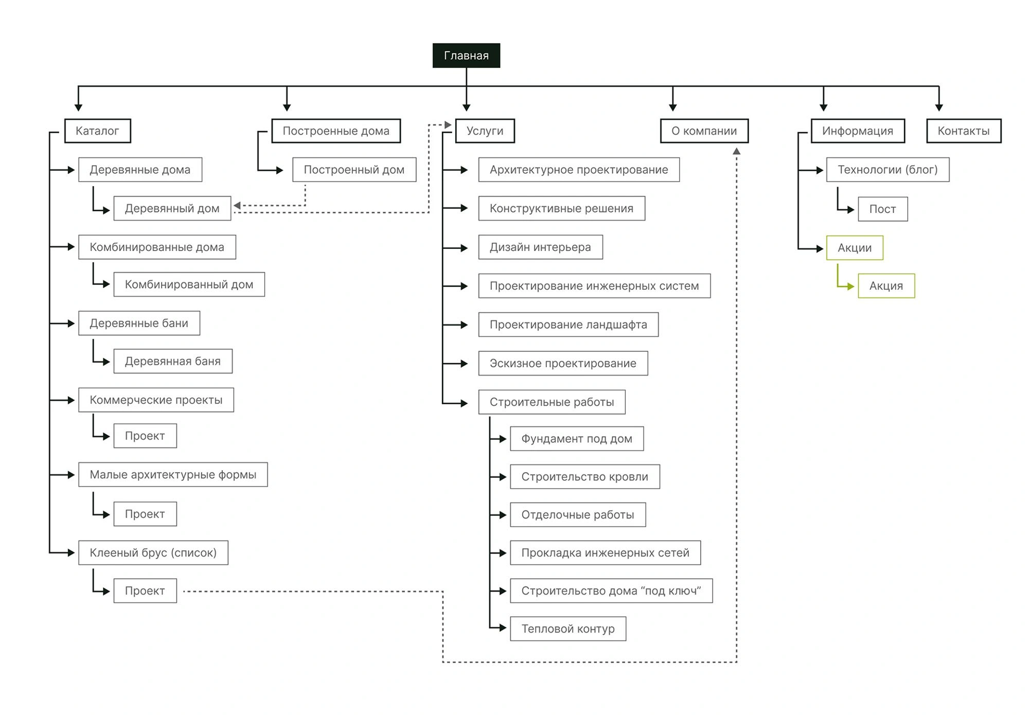
The top-level information architecture
DESIGN
Wireframes
Creating wireframes allowed for quickly aligning the project's main structure, determining the user flow, and considering all states. The process optimization helped validate key ideas, make adjustments, and generate new solutions. Hypotheses were also tested through prototype testing.
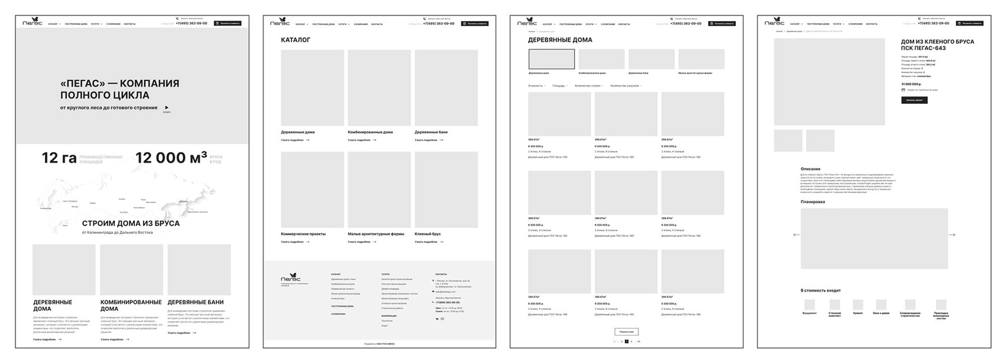
Wireframes
Concept
After the wireframes were approved, the work on finding the main style began. Approximately 10 design variations and color combinations were explored. Eventually, two directions were selected, and after further refinement and discussions, one option was chosen.
Once the main style was defined, I started assembling the UI kit and working on the application's pages. According to metrics data, it was found that the majority of inquiries and page views occurred on the desktop version of the website. Therefore, the work began with developing the desktop version of the site.
The process was divided into stages, allowing for accelerated implementation and the ability to evaluate the results at each step of the work.
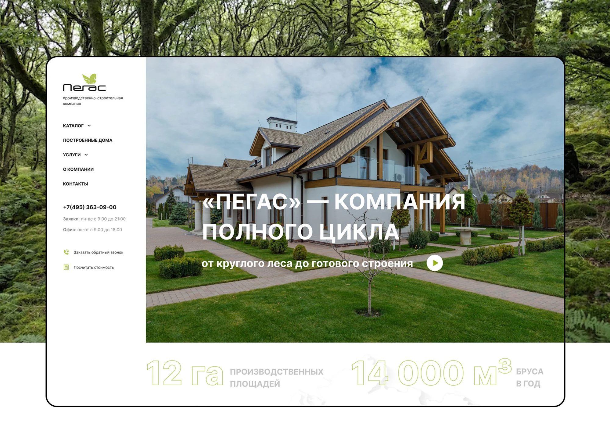
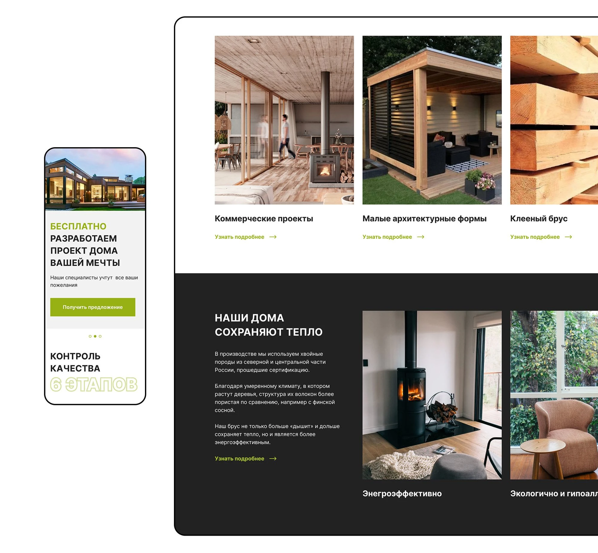
In this project, it was crucial to maintain a connection with the logo and existing brand identity while creating a modern, airy, and eco-friendly website. Therefore, green became the accent color for buttons, icons, and typography. It blends perfectly with the photographs of cottages and the ecological concept.
Additionally, a dark gray shade was used as a secondary color to emphasize the green and add a sense of formality.
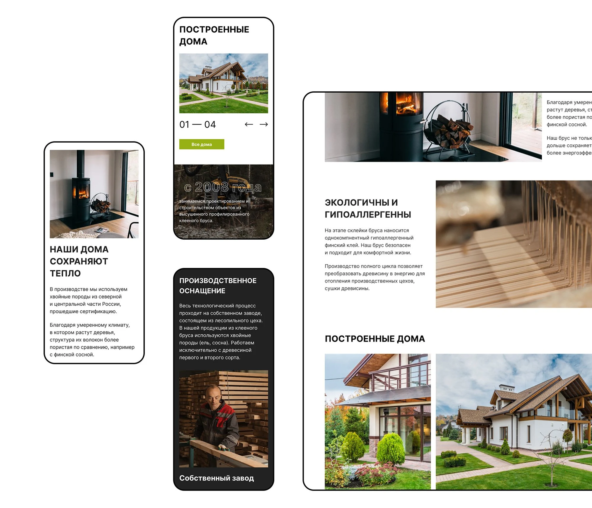
Mobile
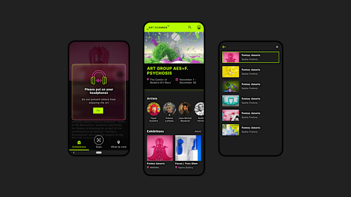
Despite the fact that users submit inquiries from the desktop version, their first interaction with the company occurs primarily through mobile devices. Special attention was given to the mobile version, making it lighter in weight without compromising on information.
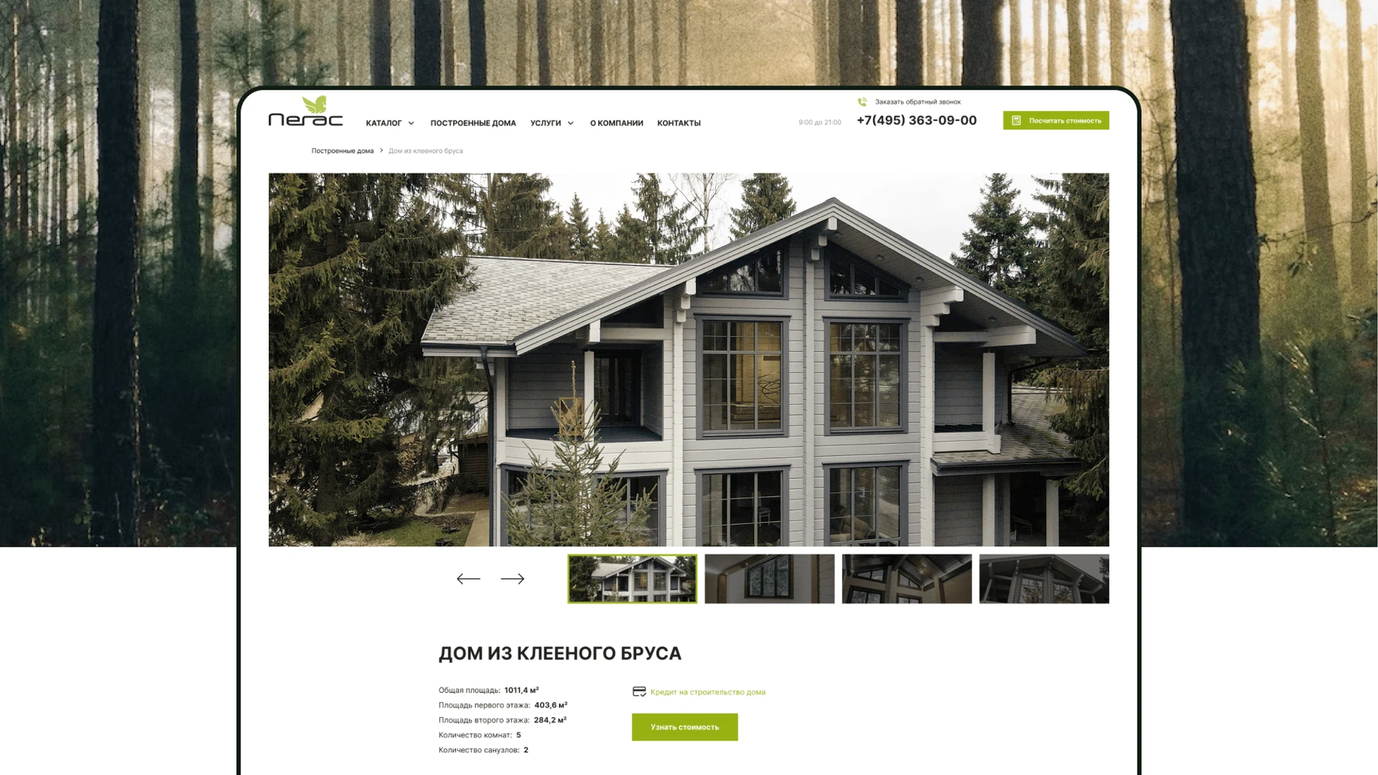
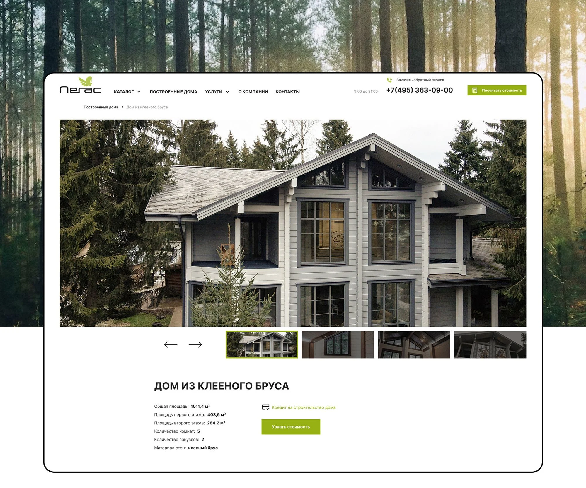
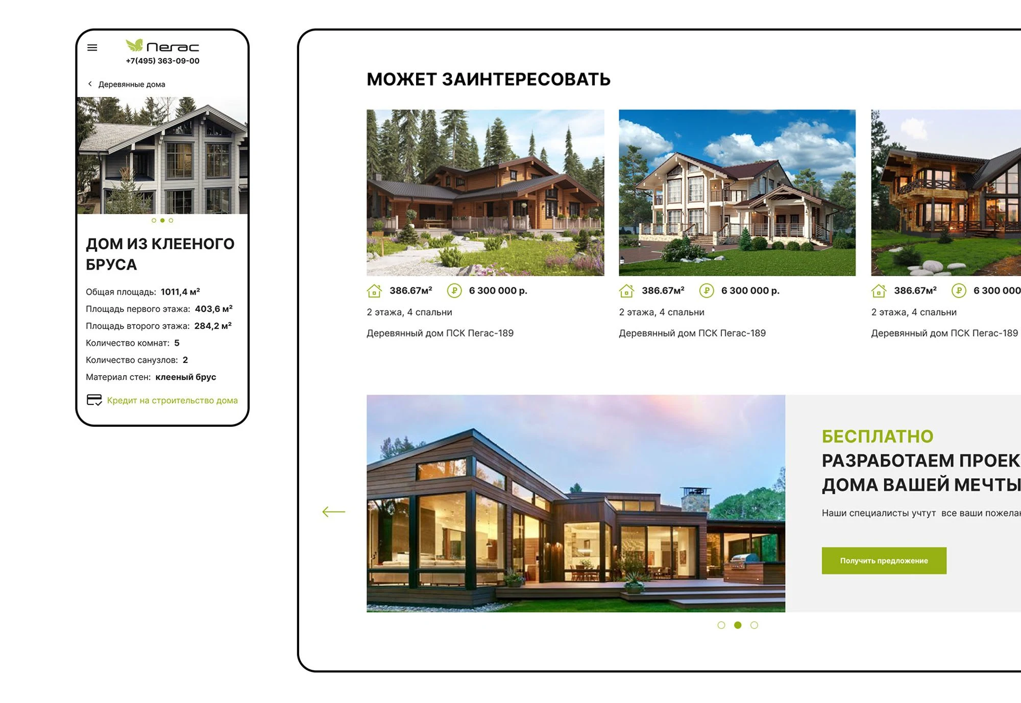
Product card
For the user, it is important to examine the house in intricate detail. I provided the client with a list of recommendations regarding content preparation and material quality. Following that, a professional photoshoot was conducted, and a company video was created. Product cards were designed to include sections for key promotions and offers, as well as a recommendations block to facilitate user search. This helped increase the depth of engagement and boost the number of inquiries from the website.
Catalog
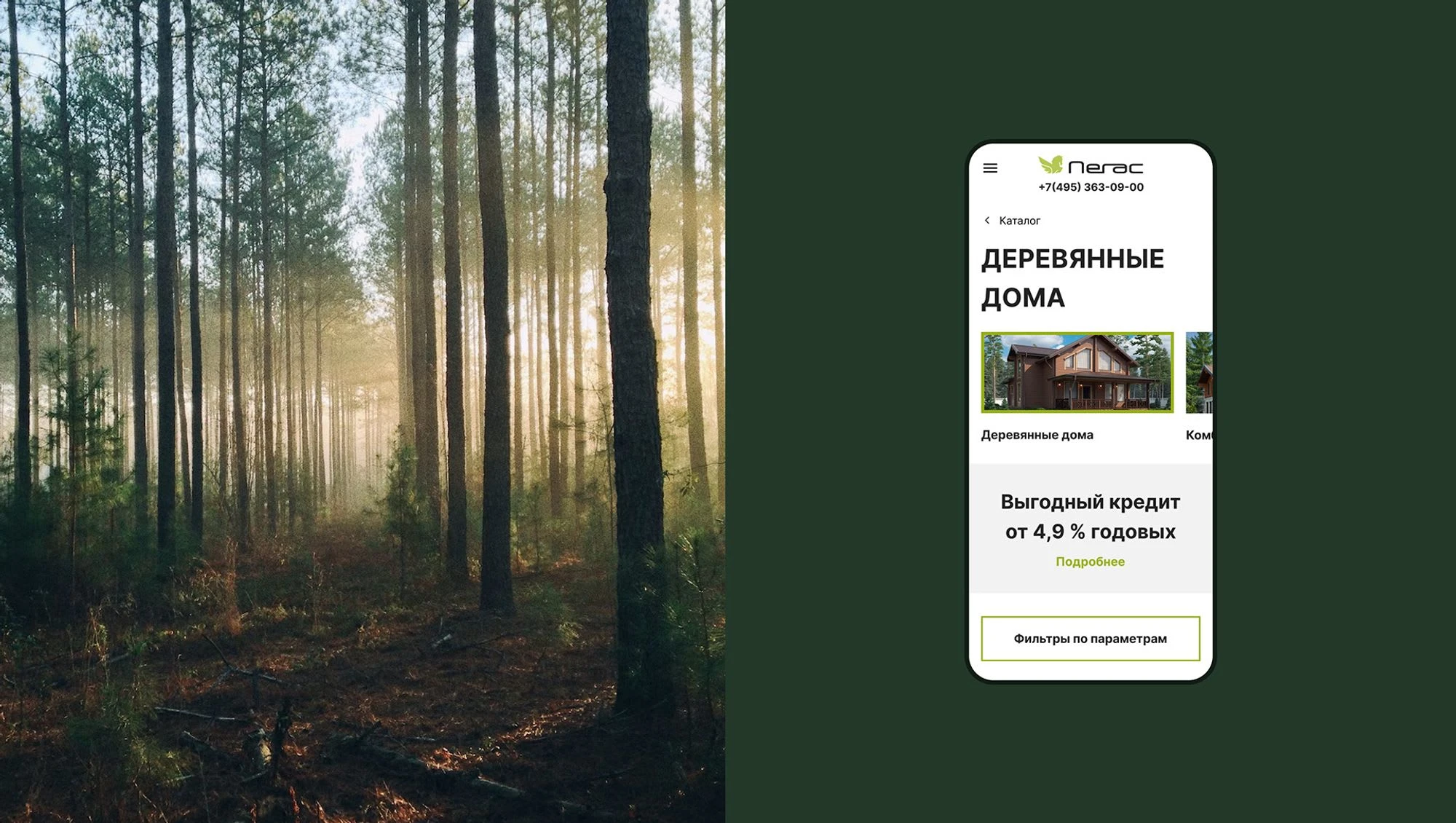
Photographs and renders are a crucial part of the interface, which is why references were prepared to guide the content creation. The photographs are large and eye-catching, showcasing all the details of the wooden houses. Users need to examine all the details to make an informed decision about the project.
For easy navigation on the catalog page, users can quickly switch between categories.
Material sale
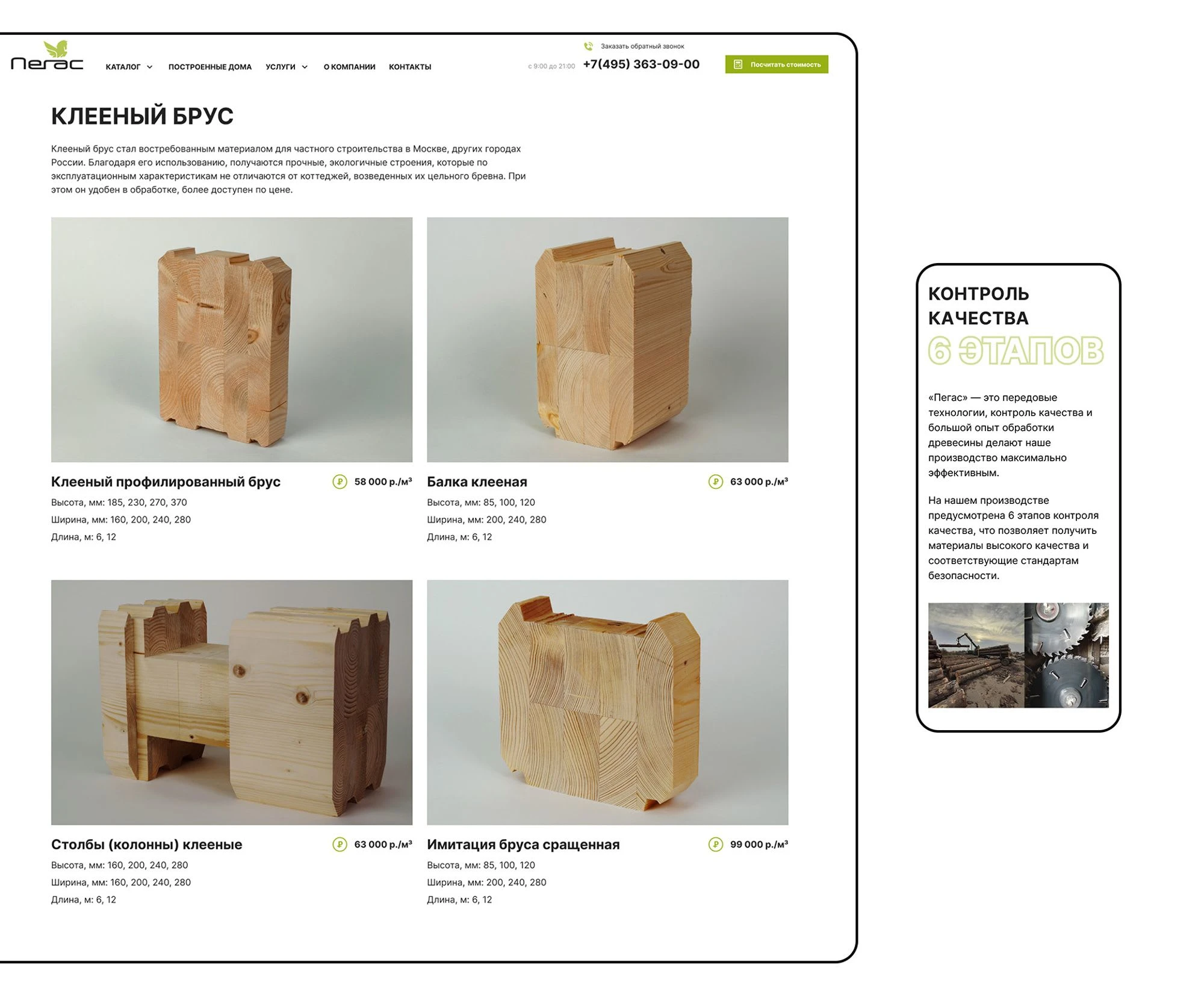
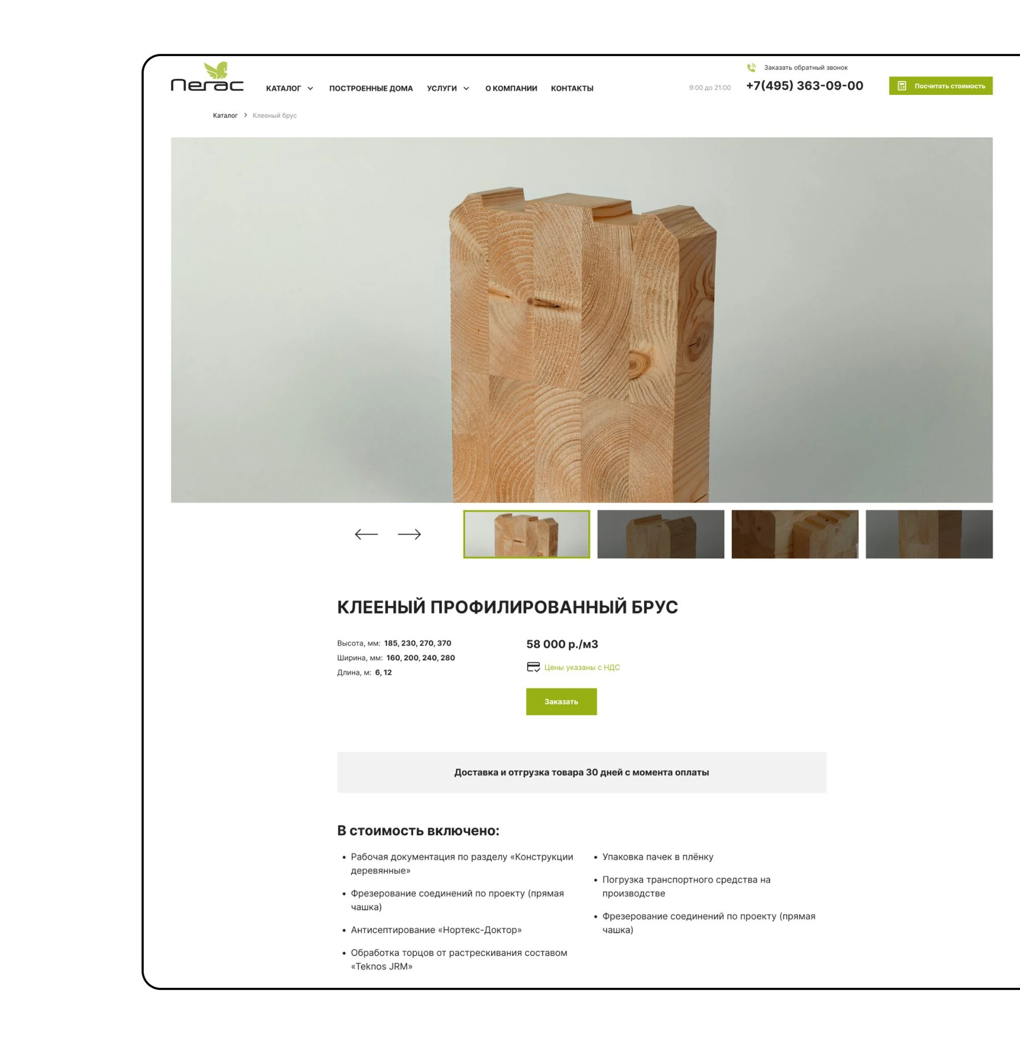
The website includes two different scenarios: ordering a house project development and ordering glued timber for construction. It was necessary to design and make the product cards consistent for different types of products.
This simplifies user interaction with the interface and reduces the workload for the content manager.
RESULTS
150+
layouts developed at the design stage
I have analyzed the states and various usage scenarios of the website. Interactive prototypes were created, and forms for submitting requests were developed for each type of user.
8.2%
the number of orders on the site increased by
After launching the updated website, the number of rejections decreased to 12.7% and a positive trend for the development of the website has formed.
2.5
months of intensive work on the project
The work was completed within tight deadlines and a limited budget. Within 2.5 months, research was conducted, prototypes were developed, and page designs were created.
Like this project
Posted Jan 7, 2024
After the launch of our updated website, we observed an impressive 8.2% increase in the number of orders.
Likes
0
Views
12
