UI kit for Abodity
In this project, I organized the components and established a systematic approach, which enabled the developers to implement the project promptly.
In the company, some website pages had already been designed, and some ideas were implemented on the current site. However, the front-end development team faced difficulties in working with the designer's mockups due to the lack of grids, text styling, color schemes, and inconsistent icon sizes.
I conducted two productive meetings to understand the requirements from the development team and stakeholders. Following that, I devised a plan for implementing a design system and prepared a document outlining the key sections of the UI kit.
THE PROBLEM STATEMENT
01. Absence of grid and unified module
The layouts used a 12-column grid system for both desktop and mobile versions. However, the elements of the layout were not aligned to the grid, and there was no unified module to which the entire system could be attached.
02. Many different elements for a single goal
There was no consistent rule for using elements on the website and in the layouts, and new icons, buttons, and inputs were often added to create new pages.
03. Challenges with content population
The website content was filled with various types of information, so it was necessary to consider different content variations without compromising the overall system's consistency.
04. Banner adaptivity and unclear cards
The stakeholder wanted the mobile banner to occupy minimal space, but previous solutions made the text unreadable, rendering the banner useless.
Based on the research results, it was found that users didn't understand the purpose of the website. Therefore, within the UI kits, it was decided to refine the cards for subsequent testing.
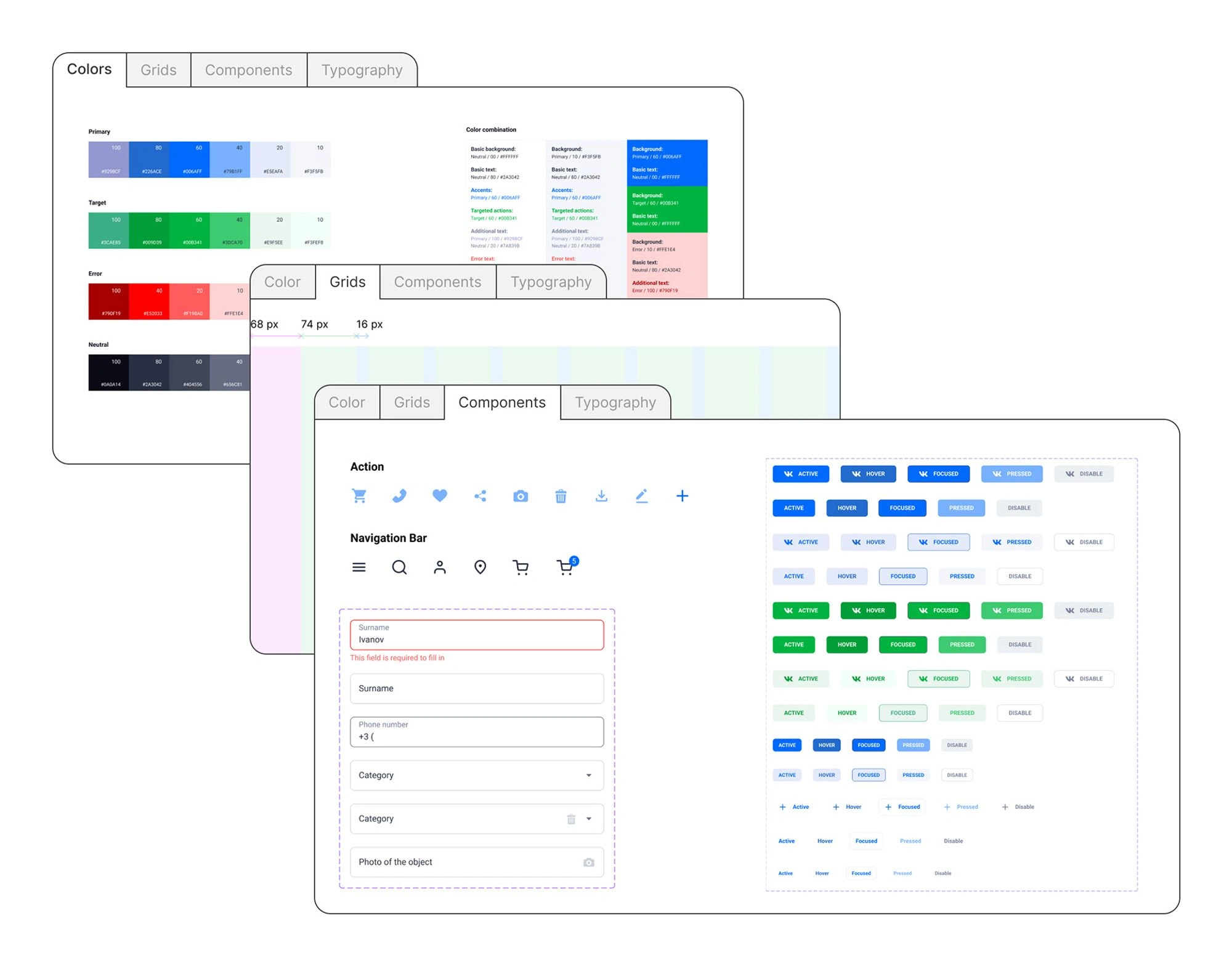
Part of the IU kit
RULES FOR MAINTAINING THE UI KIT
At the first stage, the rules for maintaining and documenting the UI kit were defined. It illustrates how to create new components and correctly determine the hierarchy and naming of system elements. It also covers the key aspects of using this system.
MODULE AND GRID
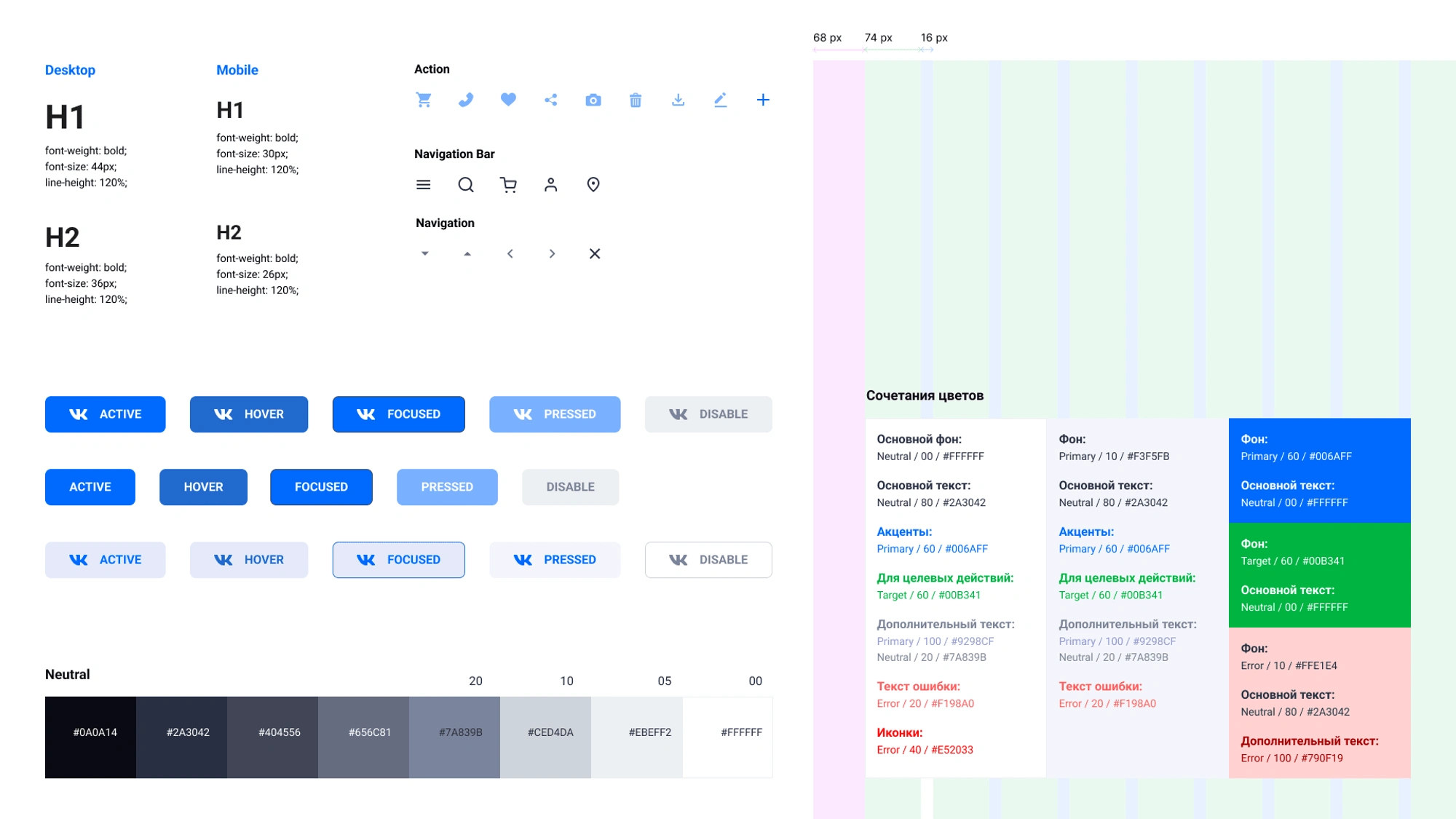
A 4px module was taken as the foundation, and the entire system adhered to it. Based on this module, spacers were implemented, which aid in assembling blocks according to a specific logic and maintaining consistency.
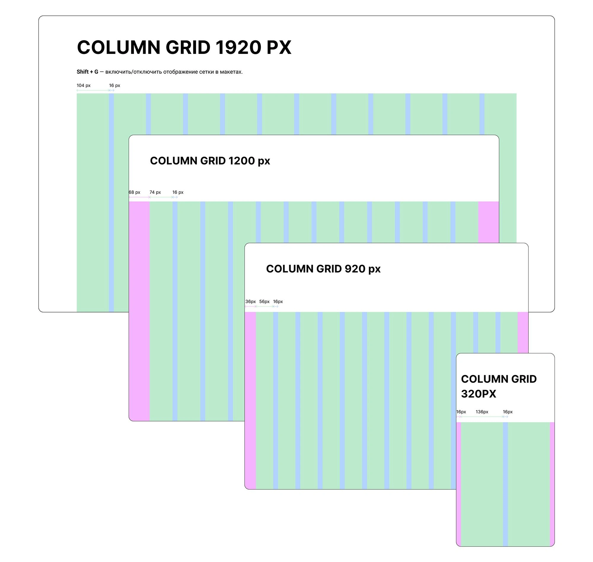
The grid was designed for the main breakpoints: 1920 px, 1200 px, 920 px, and 320 px. These screen resolutions were determined together with the developers and documented in the brief. At a resolution of 1920 px, the grid had a maximum width of 1424 px, while for smaller resolutions, the focus was on margins and gutters, and the column width was calculated automatically.
TYPOGRAPHY
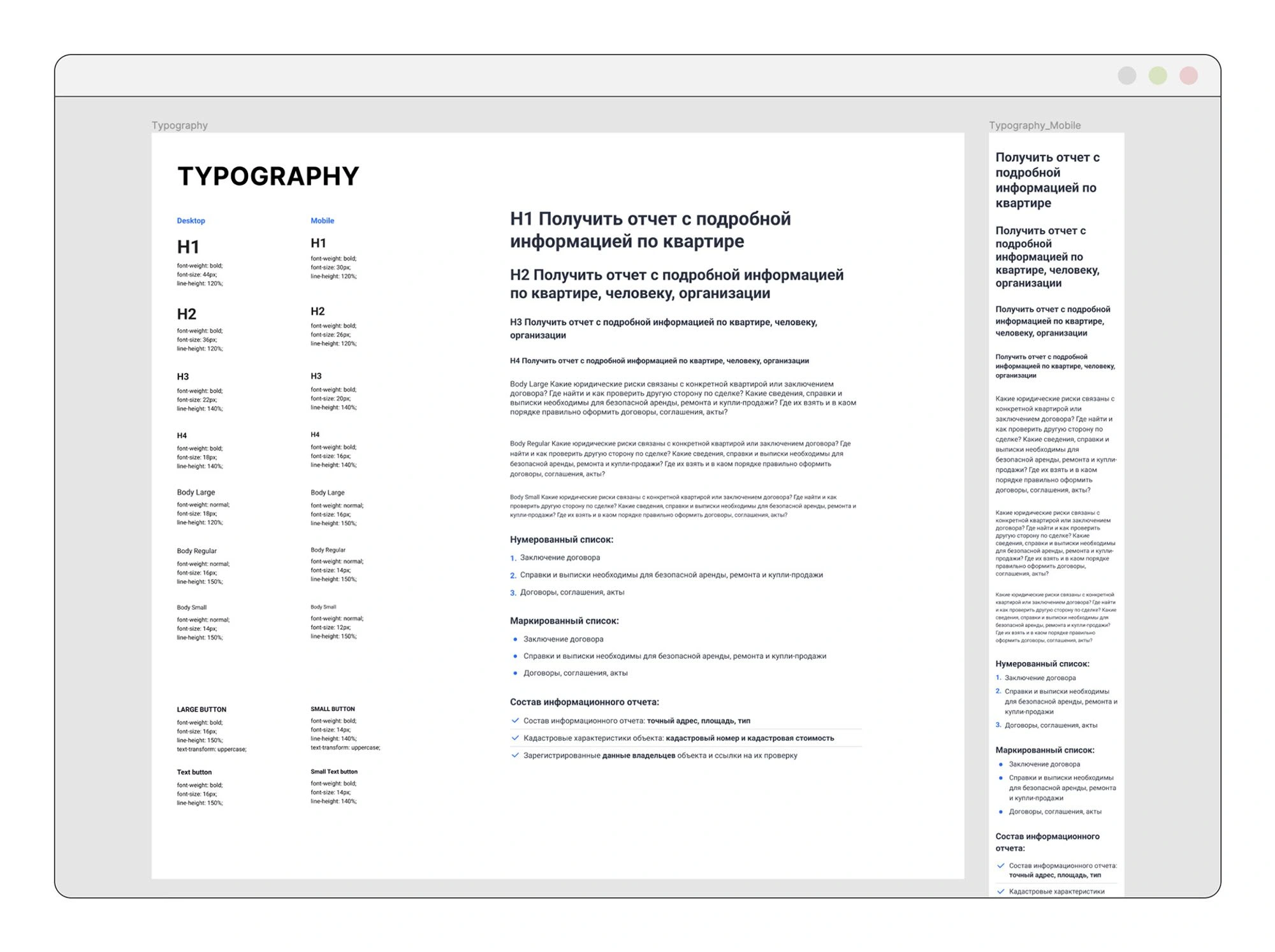
During the development of font style hierarchy, an analysis of the current website and layouts was conducted. Subsequently, a list of necessary levels was compiled, and unnecessary styles were simplified to ensure consistency and ease of use within the system and its implementation in the project.
The styles are divided into two categories for desktop and mobile versions. In response to the developers' requirements, an example of using text styles in header and text blocks was developed. Additionally, three types of lists were created separately.
COLORS
I divided the color palette into four categories. In the "Primary" category, I gathered the main shades of the brand's style. The "Target" category contains colors used to create additional accents for promotions and useful information. The "Error" category is responsible for indicating errors. In the "Neutral" category, I included shades ranging from dark gray to white for texts, backgrounds, and additional elements.
To ensure easy usage of the color system, I provided an example of color combinations for backgrounds and texts. Together with the front-end developers, we refined this section.
BUTTONS, INPUTS
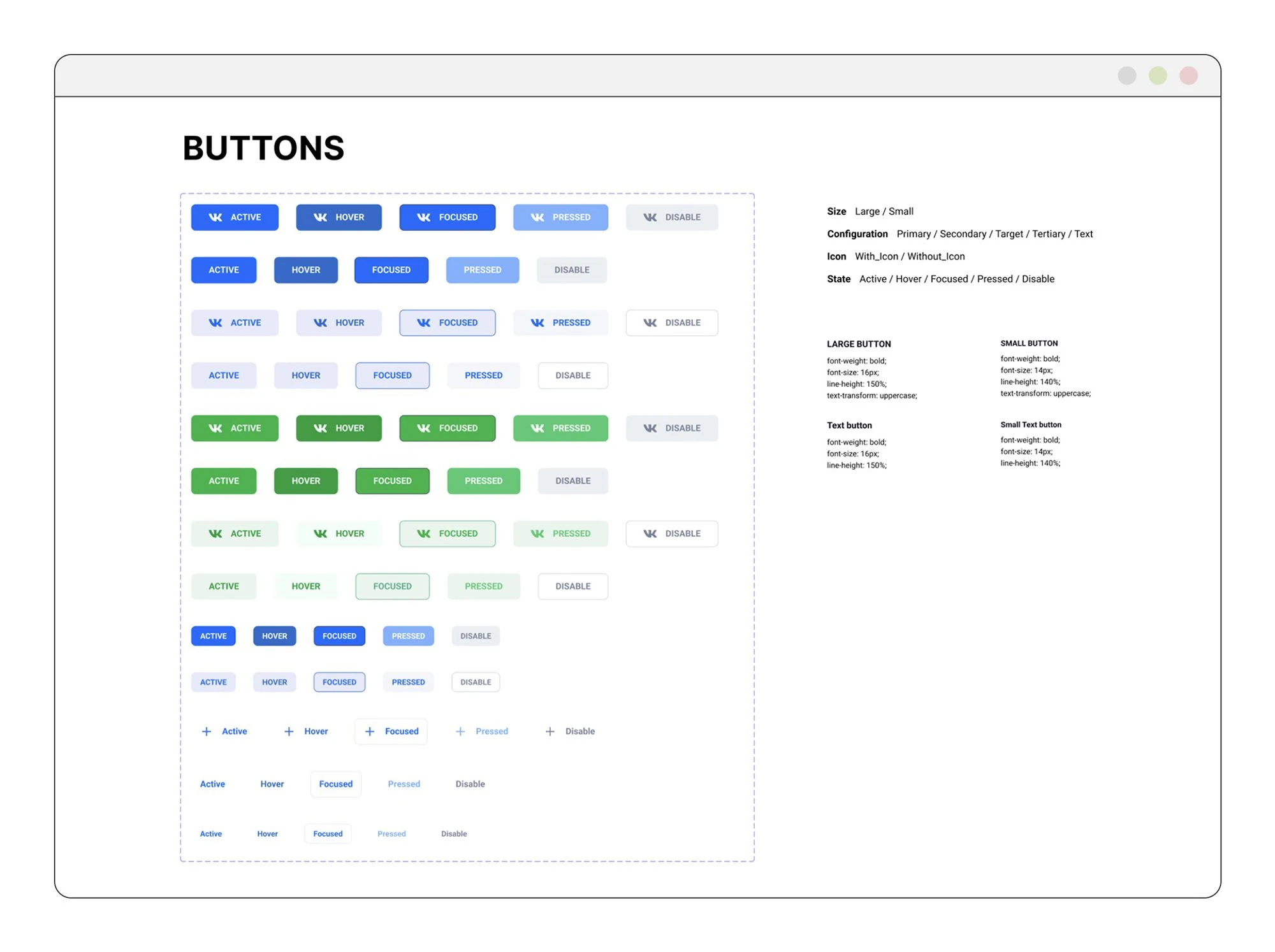
On the website, there were numerous variations of buttons and inputs. I conducted an analysis of the website and unified everything to a consistent style. I determined the most suitable button variations to be used. To ensure usability, I additionally described the structure of icon states.
With the team's collaboration, we identified the purposes for using inputs and selected the most appropriate implementation approach.
ICONS
Icons from the entire website were collected, categorized, and redrawn in a unified style. Unused icons were removed. This section is designed to be updated with new icons as they become available.
MAIN WEBSITE BANNER
Two banner options were considered, one from the existing website and the other proposed by the designer. However, neither of these options included the capability to upload images, as the focus was primarily on illustrations. However, the website mainly involved uploading images and adding a headline with descriptions. To enhance user interaction with this section, I suggested adding a call-to-action button to both banner options.
In the new banner version, users can choose a template and upload various types of information. Additionally, a section called 'What Can You Do with Abodity' was added below the slider, providing explanations of the main functions and services offered by the platform.

CARDS
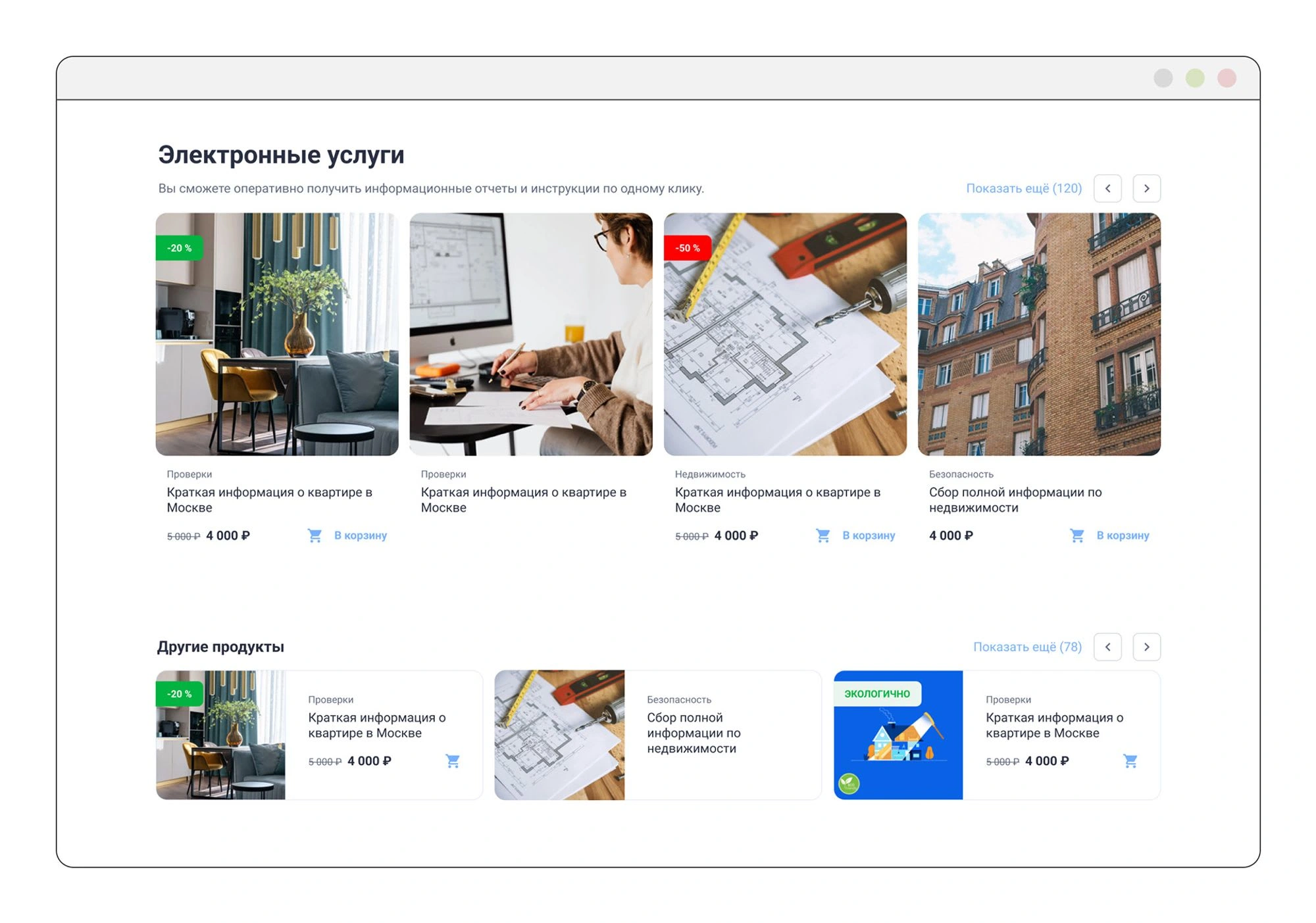
The main problem with the cards was that users didn't understand the services, and the information was poorly readable. Managing discounts was also challenging. To address this, I created a more streamlined card design by eliminating the background and adding a border to image cards on a white background.
I replaced the triangular discount indicator with a rectangular one that adjusts to the text size, allowing for various labels, even with longer words. This change aligned with the project's business objectives.
Users had difficulty determining the category to find the desired service. To address this, I added category labels to the cards. This way, users could identify in which category to expect the service and similar ones.

The cards were adapted to various sizes to address the task of structuring information. The main services were highlighted with larger-sized cards, while additional services were placed in horizontally-oriented cards.
Like this project
Posted Jan 7, 2024
In this project, I organized the components and established a systematic approach, which enabled the developers to implement the project promptly.
Likes
0
Views
3

