UX Research for the Children's Toy Store
I conducted research based on metrics and the client's request.
The client approached us with a request to conduct a series of studies. Yandex.Metrica was recently connected to the website, and based on the collected data, it was decided to conduct usability testing, as well as identify problem areas through mobile version testing and accessibility testing.
In the near future, the client plans to implement a landing page with promotions and wants to know how the introduction of a new banner with discounts will affect the site's metrics. In order to measure these metrics, it was decided to conduct A/B testing, and I conducted calculations to assess the feasibility of conducting the test.
PROJECT OVERVIEW
Company description
Murzilka is a company that sells children's toys. It has a brick-and-mortar store and an online store. The website offers products for boys and girls. There is a choice of over 850 brands of children's toy and children's goods manufacturers.
Project link: https://murzilka.kz/
Constraints
The website uses a custom-built content management system (CMS), which can make it difficult or restrictive to implement new features. It is necessary to consult with the project developers before prioritizing the implementation of new features.
Business goals
Increase website order conversion rate from 0.07% to 2% in the next quarter by improving the user interface for users;
Increase website sales by 10% in the next month by implementing a landing page with discounts on the homepage.
Research Objectives
Formulate hypotheses about user problems based on data from Yandex.Metrica;
Use usability testing to evaluate the usability and clarity of the interface during product selection and purchase, and to test hypotheses;
Test the effectiveness of the landing page with discounts using A/B testing;
Test the mobile version of the website to identify problems with the website's adaptation;
Conduct an accessibility test.
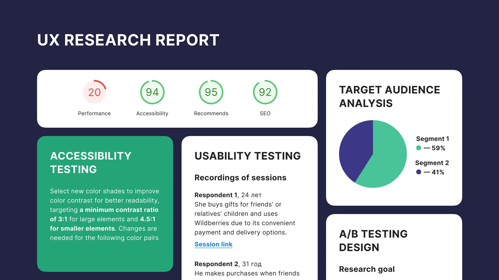
TARGET AUDIENCE ANALYSIS
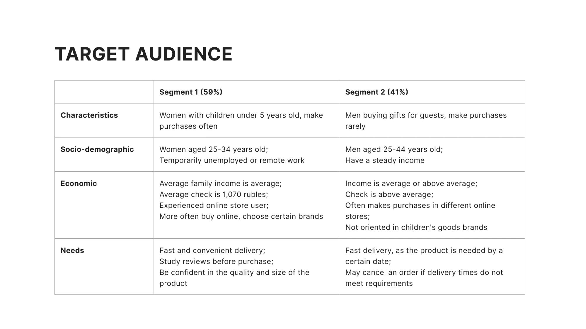
Data for the formation of target audience segments was taken from open sources and studies conducted by DataInsights in 2014 and 2021, as well as from metrics provided by the project client.
It is recommended to supplement the description of target audience segments as data accumulates and after interviews and surveys are conducted.
Conclusions
Delivery times are important for both segments, so it is important to provide detailed delivery information in the product card;
Representatives of both segments often shop online, so it is important to adhere to common and predictable patterns for product selection and purchase. After identifying problems and improving the current interface, it is worth conducting a competitive analysis to identify new hypotheses and implement new features;
Segment 1 is demanding on product details and characteristics, so detailed information should be provided in the product card. At the next stages of the study, it is worth conducting an online survey to determine the most important criteria for product selection;
Segment 1 carefully studies reviews. It is recommended to consider the possibility of adding a review feature to the website to increase trust and motivation to purchase.
BUILDING PRODUCT HYPOTHESES
Based on the assumed purchase funnel for children's toys on the website, hypotheses were formulated and then tested through usability testing.
USABILITY TESTING
Usability testing was chosen to validate these hypotheses since it is essential to determine how the user reasons and identifies constraints at each step of the assumed product selection and ordering funnel.
Based on the conversion funnel, I've constructed a User Flow, upon which the usability testing scenario will be built.
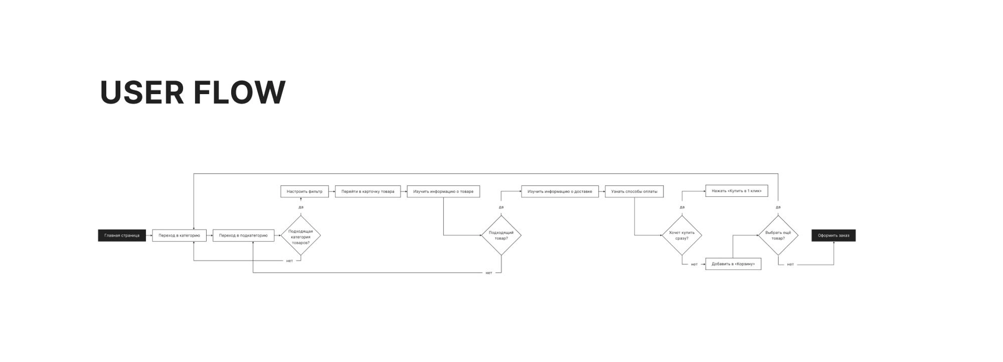
The research scenario can be viewed via the link to Google docs. Usability testing was conducted with 4 respondents from 2 segments of the target audience.
Results
The user doesn't expect that clicking on the 'All Products' menu item will open a menu with all categories.
3 out of 4 respondents tried to find the desired category within the first three menu items, ignoring the remaining sections.2 out of 4 respondents did not expect that the 'More' menu item would display the remaining catalog categories.
The user expects to see information about the product's sizes for making a final decision.
All respondents, in one way or another, paid attention to the size of the toy; 2 out of 4 declined to purchase a toy they liked due to a lack of understanding of the product's dimensions.
The user expects to see the age category for the toy.
3 out of 4 respondents paid attention to the age category designation of the product, which was indicated on the packaging or in the description. If this parameter was not specified, they would close the product card.
When clicking on a discount banner, the user expects to be directed to the 'Sales' section.
3 out of 4 users expected that clicking on the Sale banner would take them to the promotion details and did not understand which page they landed on. 1 out of 4 users couldn't find discounts on the website.3 out of 4 respondents initially tried to locate the section with promotions.
The user finds it difficult to locate the desired brand in the expanded brand filter.
All 4 respondents were unable to find the desired brand in the filter. One respondent experienced issues where products were not displayed when applying filters.
The user does not understand which data fields are mandatory to fill in.
All respondents filled in the fields selectively; 2 out of 4 respondents preferred to provide only one type of contact information (either phone or email).
The user expects the 'Personal Account' entry to be located next to the 'Cart’.
Only 1 out of 4 respondents attempted to access the personal account through the top bar.
Conclusions
Navigation issue
All respondents experienced difficulties in finding the desired section. The website navigation is not intuitive. Card sorting should be conducted to determine how users group products and in which sections they expect to find the desired category.
Product card information
When choosing a product, respondents relied on the item's size and the age category of the toy. Additionally, 2 out of 4 respondents wanted to see the scale of the toy relative to a familiar object, the product's package content, and additional features. It is recommended to further investigate what the target audience relies on when choosing a product through a survey.
Promotions on the website
Respondents do not notice promotional offers and do not understand how to use them. It is recommended to implement promotional offers at various stages of the funnel: on the homepage, in the menu section, product catalog, and product card.
Catalog filter
Respondents had a need for additional filters: two respondents in the soft toys section wanted to customize filters by the type of animal and the child's gender. There were difficulties in finding the brand, and the applied filters displayed an empty page.
Order information input
A survey should be conducted to further check which fields the target audience is willing to fill in. It is recommended to highlight mandatory fields on the website to avoid misleading users.
Accessing the "Personal account"
Users are accustomed to the "Personal Account" being located next to the "Cart," so duplicating information in the website header can be removed.
A/B TESTING DESIGN
Research goal
To increase website sales by 10% in the next month by implementing a discount landing page on the homepage.
Hypothesis
If specific advertising banners with promotional offers are created, the number of purchases on the website will increase.
KPI
Increase the conversion rate of order placements on the website.
Preparation before conducting the test
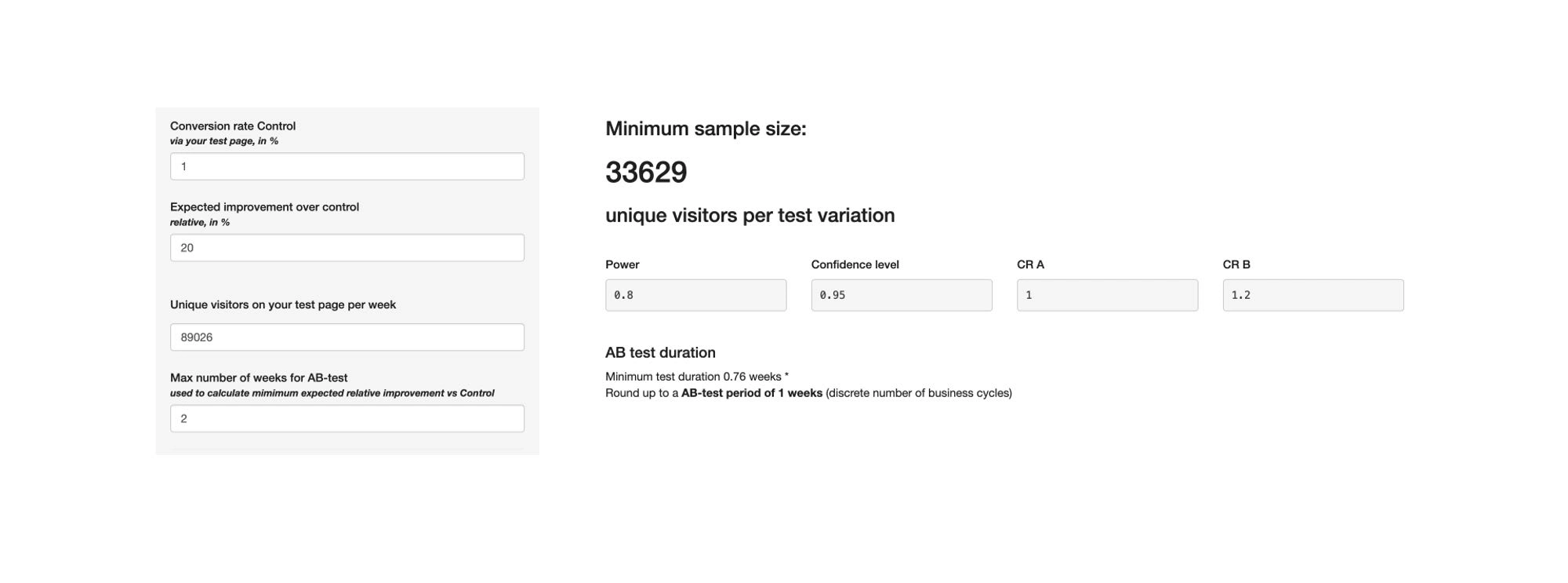
Currently, the percentage of purchases relative to website visitors is very low, less than 1%. Therefore, it is recommended to first increase this metric to 1% by improving usability based on confirmed usability testing hypotheses and making changes to the website's accessibility. Then, to conduct A/B testing, it will require no more than 2 weeks, which will expedite the experiment and allow for testing more hypotheses.
The conversion rate has been set as a baseline at 1%, and it is assumed that it can be increased by at least 20%. Based on the provided data from analytics, the number of visitors per week is 89,026 users.
Considering this data, the test can be conducted within 1 week. The minimum number of users for each variant is 33,629.
It is necessary to prepare an advertising banner leading to the sales landing page.
MOBILE VERSION TESTING
Methods of mobile website testing
Manual testing
Conducted an analysis of the website based on design heuristics;Checked links, visual content, the quality of prepared materials, and navigational links.
Optimization check
Testing tool used: Google mobile friendly;Automated testing of the website's mobile-friendliness.
Website loading speed test
Testing tool used: Google developers;Automated testing of the website's performance, special features, recommendations, and search engine optimization.
Recommendations
Optimize image loading
Change icon format from PNG to SVG. Requires the collaboration of a designer and frontend developer;
Discuss the possibility of switching to WebP image format with developers. Clarify potential challenges during the transition and its impact on product uploads from 1C;
Discuss with developers the replacement of image loading algorithms on the site and how to reduce the network load on users.
Fixing technical issues
Add a label under the logo indicating that it is a children's store;
Investigate why banner clicks do not work on the first attempt. Requires developer involvement;
Correct the display of drop-down lists. Requires frontend developer work.
Code Optimization. Discuss with developers how to improve code in the following areas:
Unused JavaScript code;
Long chains of critical requests;
Time for processing, compiling, and executing JS scripts;
Font optimization on the site.
Server Performance Improvement
Discuss with backend developers options to enhance server performance, reduce response times, and increase page loading speed.
Usability
Make it possible to copy the promo code or navigate to the product catalog when clicking on a banner. Requires discussion with developers;
Clarify why not all products can have their quantities increased and fix it if it's a bug. If there are specific rules for certain products, discuss options for displaying such products;
Discuss with developers the possibility of improving the search bar's functionality. Use metrics to determine how often users use this feature to prioritize and assess the feasibility of the task;
Add a navigation panel at the bottom or top of the screen. Requires consultation with a designer.
ACCESSIBILITY TESTING
Testing tool used: Webaim
Conclusions
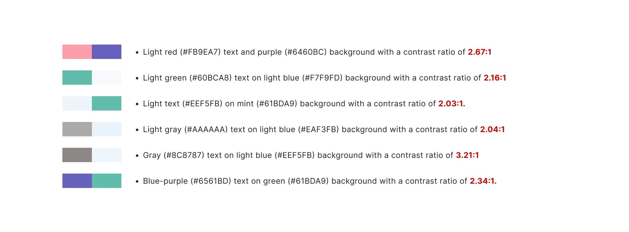
Contrast issues
Testing has revealed issues with color contrast combinations, which complicates interaction for users with limited vision capabilities or those in specific circumstances, such as using the website in bright sunlight.
This factor makes the website's usage process more challenging and can lead to purchase abandonment on the site.
Screen Reader Limitations
During accessibility testing, issues were identified that could affect the correctness of interaction with the interface using screen reader programs.
The absence of the <label> tag, an <h1> heading, and the lack of assigned headings for some elements can result in incorrect reading of the website's information, potentially leading users astray. Additionally, duplicating alternative text for different elements indicates that the site contains repetitive information, making it difficult for users to select the correct product.
Recommendations
For the Design Team
Select new color shades to improve color contrast for better readability, targeting a minimum contrast ratio of 3:1 for large elements4.5:1 for smaller elements. Changes are needed for the following color pairs:
For the Development Team
Add <label> tags for the search bar, email subscription form, and price filter in the product catalog;
Include an <h1> header on the homepage;
Assign heading levels to the "Brand" filter in the product catalog and "Convenient Payment" in the product card;
Provide alternative text and remove duplicates, ensuring consistency across all site pages.
Requires further discussion
In the footer, consider either merging "Wholesale Discounts," "Partner Registration," and "Wholesaler's Cabinet" into one item or creating unique pages for each section.
RESEARCH CONCLUSIONS
Hypothesis
Based on the provided metrics and analysis of target audience segments, hypotheses were formulated and tested using usability testing. These hypotheses aimed to uncover the user-friendliness of the website.
The client plans to implement a landing page with promotions and wants to assess its impact on sales. Therefore, based on this data, it was decided to conduct A/B testing. Usability testing confirmed the hypothesis regarding the introduction of a more prominent format for promotions.
Low conversion rates for orders were also observed on the mobile version, leading to mobile version testing.
To identify accessibility issues, testing was conducted using a service, which revealed problems related to color contrasts.
Recommendations
I would recommend breaking the work into stages. First and foremost, we can discuss implementing changes in the mobile version and optimizing website performance. This will help improve conversion rates on mobile devices, while designers work on ideas to enhance the site's structure and refine confirmed hypotheses.
Replacing color pairs on the website can be a time-consuming and challenging task, especially if there is no design system in place, and design tokens are not used in the markup yet. I recommend that the designer create a UI kit, followed by the integration of design tokens into the markup. This will allow for more flexible color changes on the website and avoid future complications.
To refine the catalog filters and product card, conducting online surveys based on the user requests identified during usability testing is recommended. After conducting the survey, prioritize the information and implement new filters in the catalog and additional description fields in the product card.
Like this project
Posted Jan 7, 2024
I conducted thorough research, considering metrics and client requirements. This approach aims to enhance user experience and boost the number of orders.
Likes
0
Views
4

