Innovative UX/UI Redesign for E-commerce Platform
Bernd B
About the project
Brucki is a Leobersdorf-based online bike shop that specializes in the sale and maintenance of KTM bikes. In collaboration with a Vienna-based digital agency, a fundamentally revamped online shop was created, strengthening the Brucki brand and positioning it as an expert in KTM bikes.
In addition to a new, clearer UI, the design focus was also on a more structured and user-friendly page layout that specifically addresses the search needs of buyers, thereby improving the discoverability of products and content
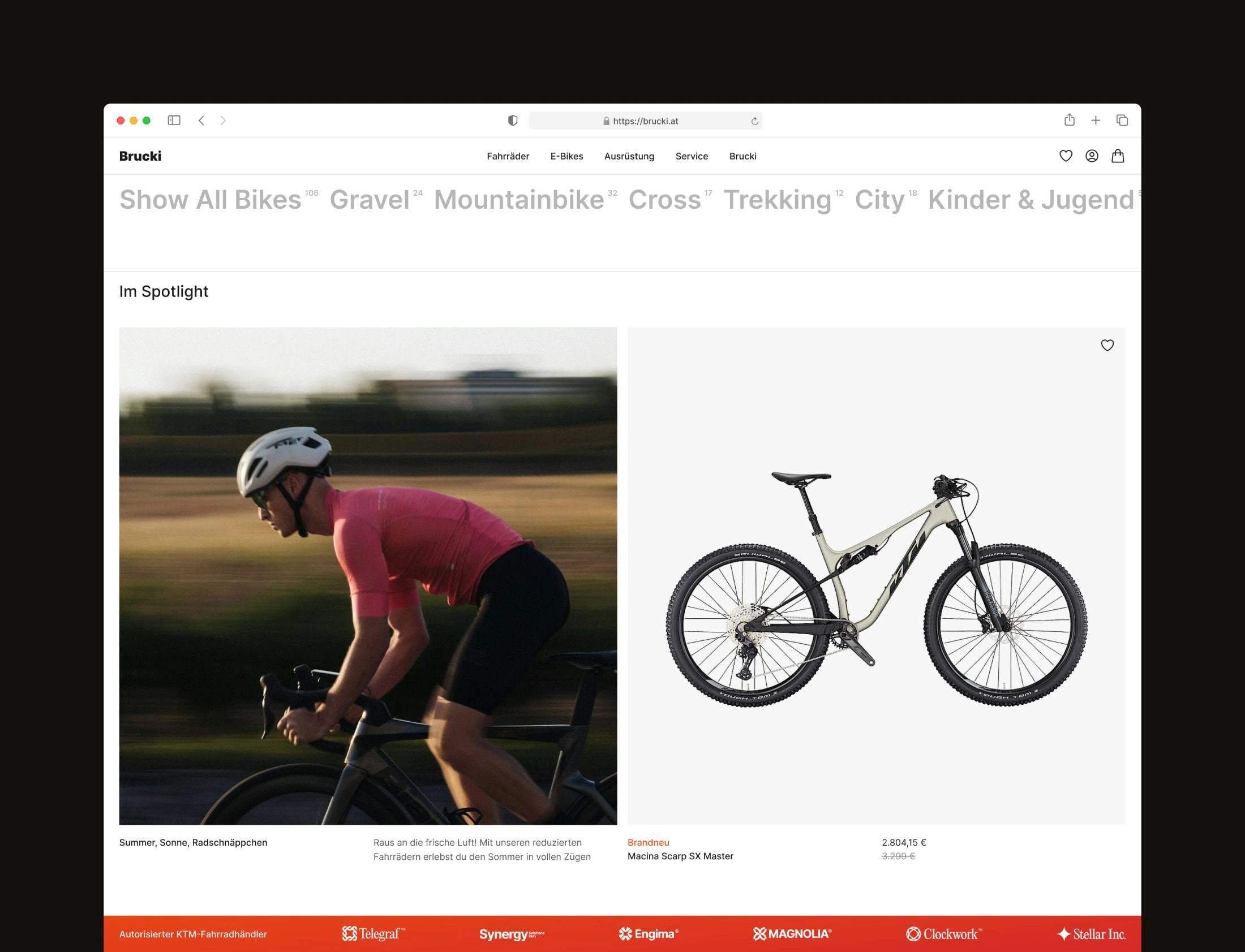
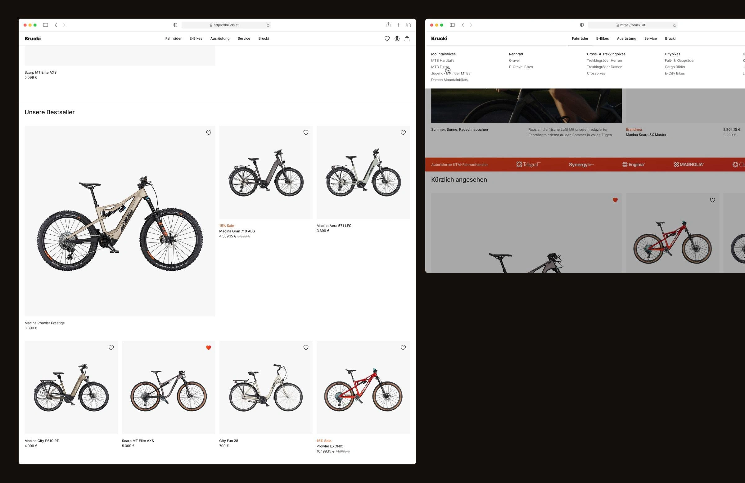
Simplified Structure: Streamlining Product Discovery
The new homepage is clean, consciously utilizing white space and focusing on what is essential for a bicycle online shop—the products. Teaser elements and loud UI are avoided; instead, the emphasis is placed on a solid page structure that suggests recently viewed products, bestsellers, and articles on maintenance, purchasing, and repairing the bikes.
Shallow on Top – Deep on Demand: A User-Centric Design Approach
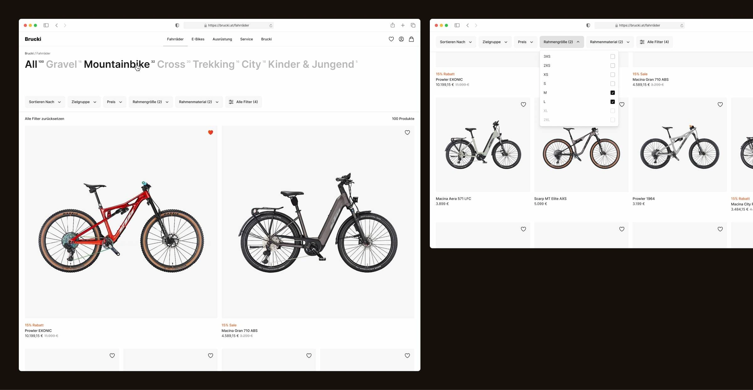
The new product overview page, in contrast to the old online shop, follows the "shallow on top – deep on demand" principle. Products are not divided into separate category pages but are initially displayed collectively, allowing users to later refine their preferences by selecting category filters. This approach not only speeds up navigation and searching for bikes but also enables browsing for those who prefer not to limit their search initially.
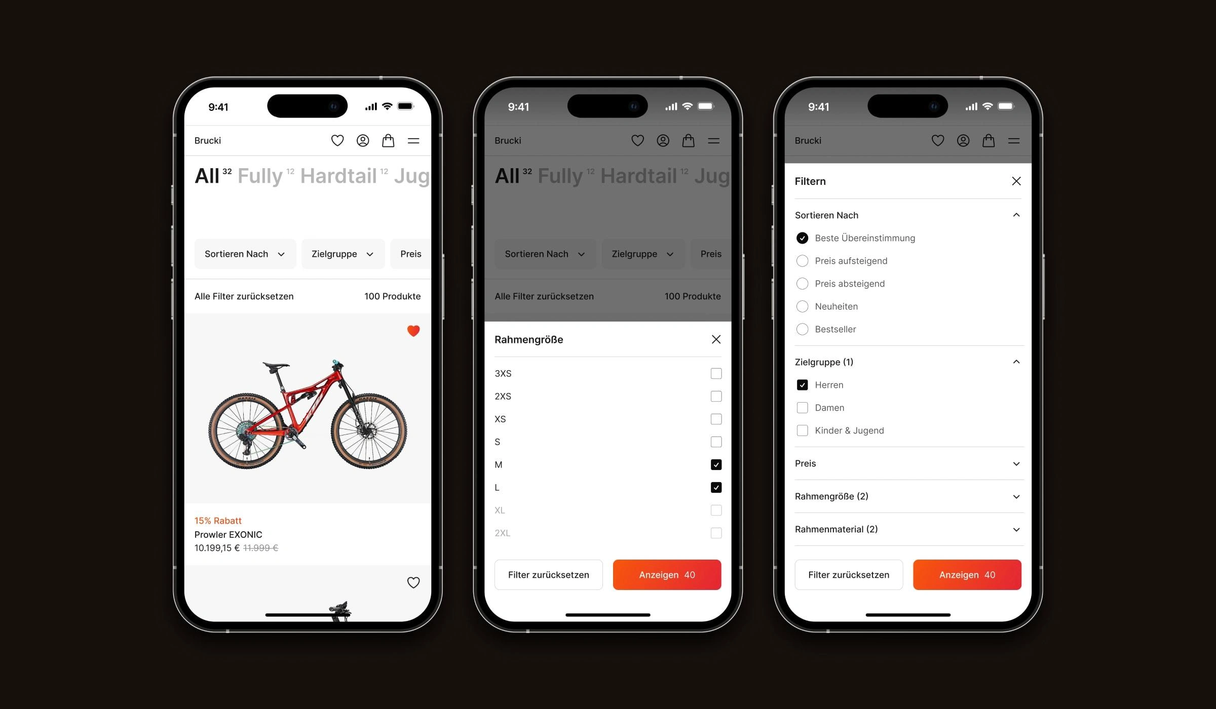
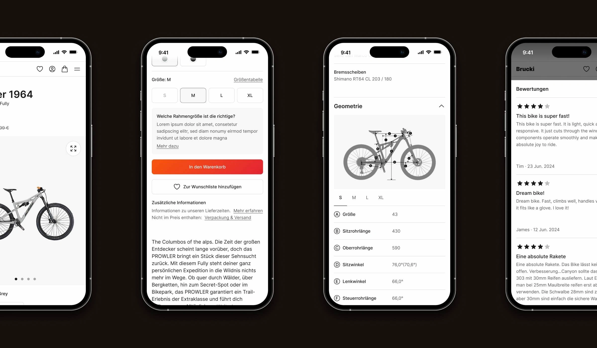
The division of filters into categories and subsequent selective filters such as gender, price, frame size, etc., is particularly effective in the mobile view. By consciously focusing on categories, users can quickly narrow down the overview and then refine it further as needed.
Maximizing Usability: Reduced Design for Better Engagement
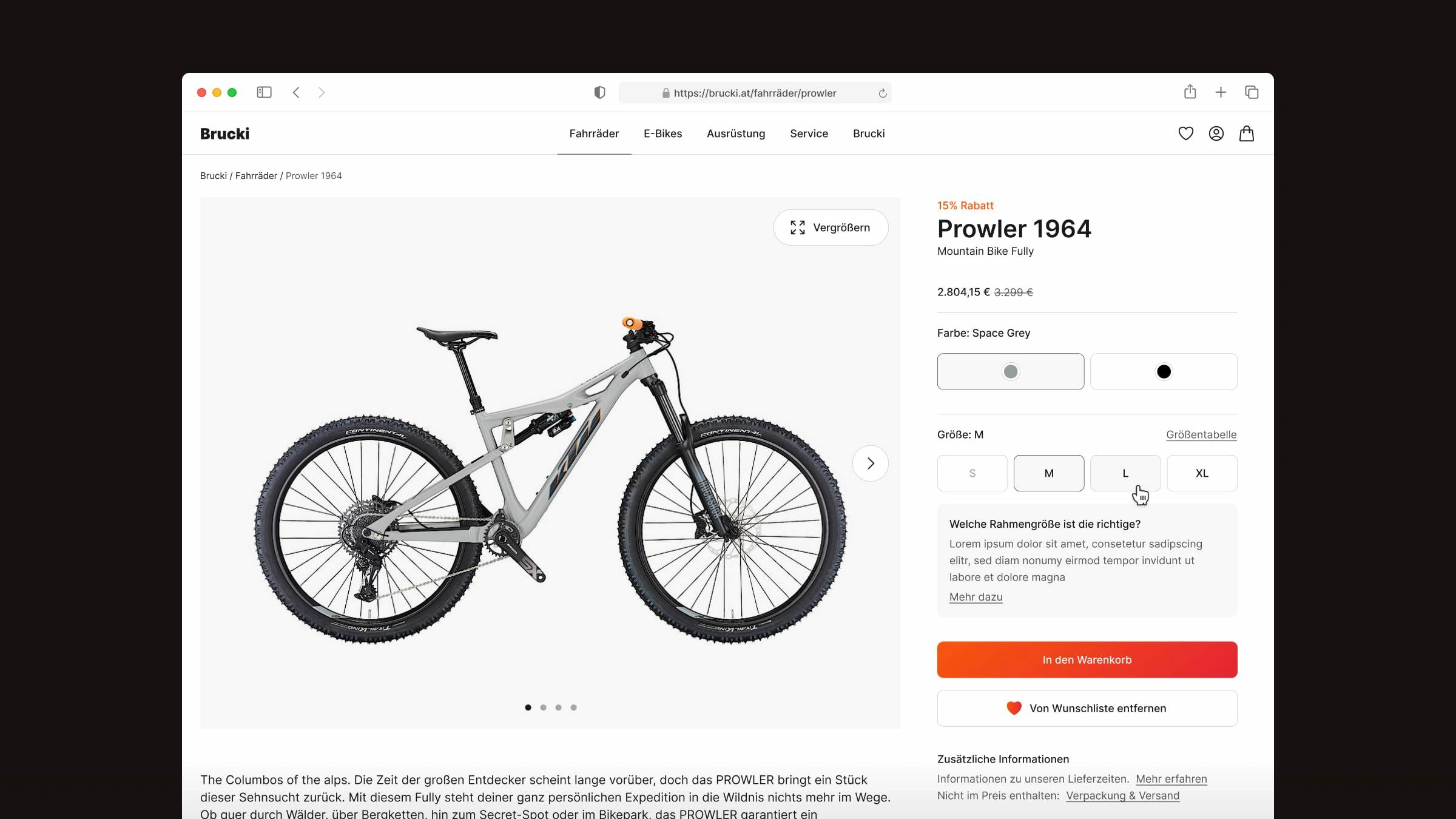
Especially on the product detail pages of the shop, the focus on a reduced yet consistent design system proves effective: despite numerous interaction and content elements, the page overall appears structured and tidy, using color accents where clearer interaction is necessary.
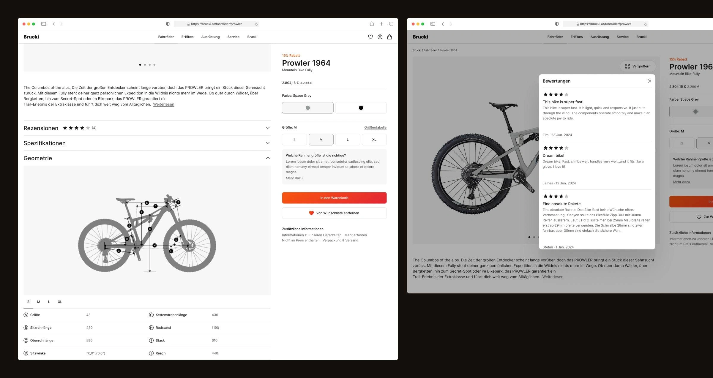
In line with typical online shop design patterns, the CTA and product detail area remain static and always visible, while the other detailed information is scrollable. Overall, the layout and content structure have been significantly revamped compared to the original shop design, with a focus on better structuring and readability of the content.
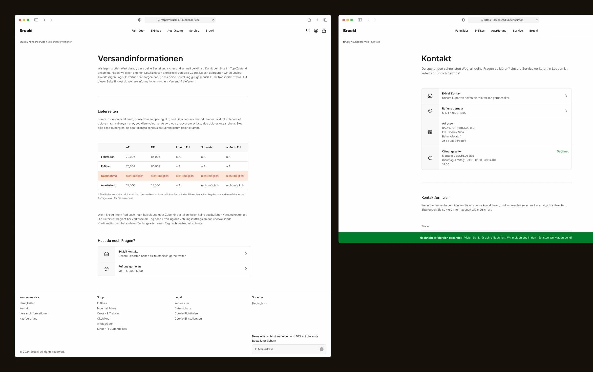
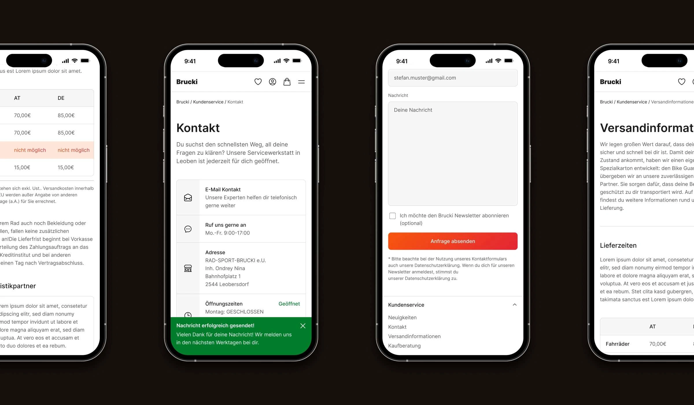
Empowering the Client: Easy Creation of Cohesive Detail Pages
In addition to the main and product pages of the online shop, templates for current and future content pages have been created. Unlike the other pages, there is a deliberate focus on a simpler layout here to ensure that both customers and their employees can easily create visually cohesive detail pages. Notably, there is a visual differentiation between content and interaction elements. This not only makes CTAs more recognizable, but it also allows for easier design implementation of their content compared to a purely text-based layout.
Like this project
Posted Oct 10, 2024
In collaboration with Brucki, an Austrian bike online shop, a well-structured site and clear UI were developed, enhancing overall UX and strengthening the brand