Navigating the future of sustainable water systems
Bernd B
Project abstract
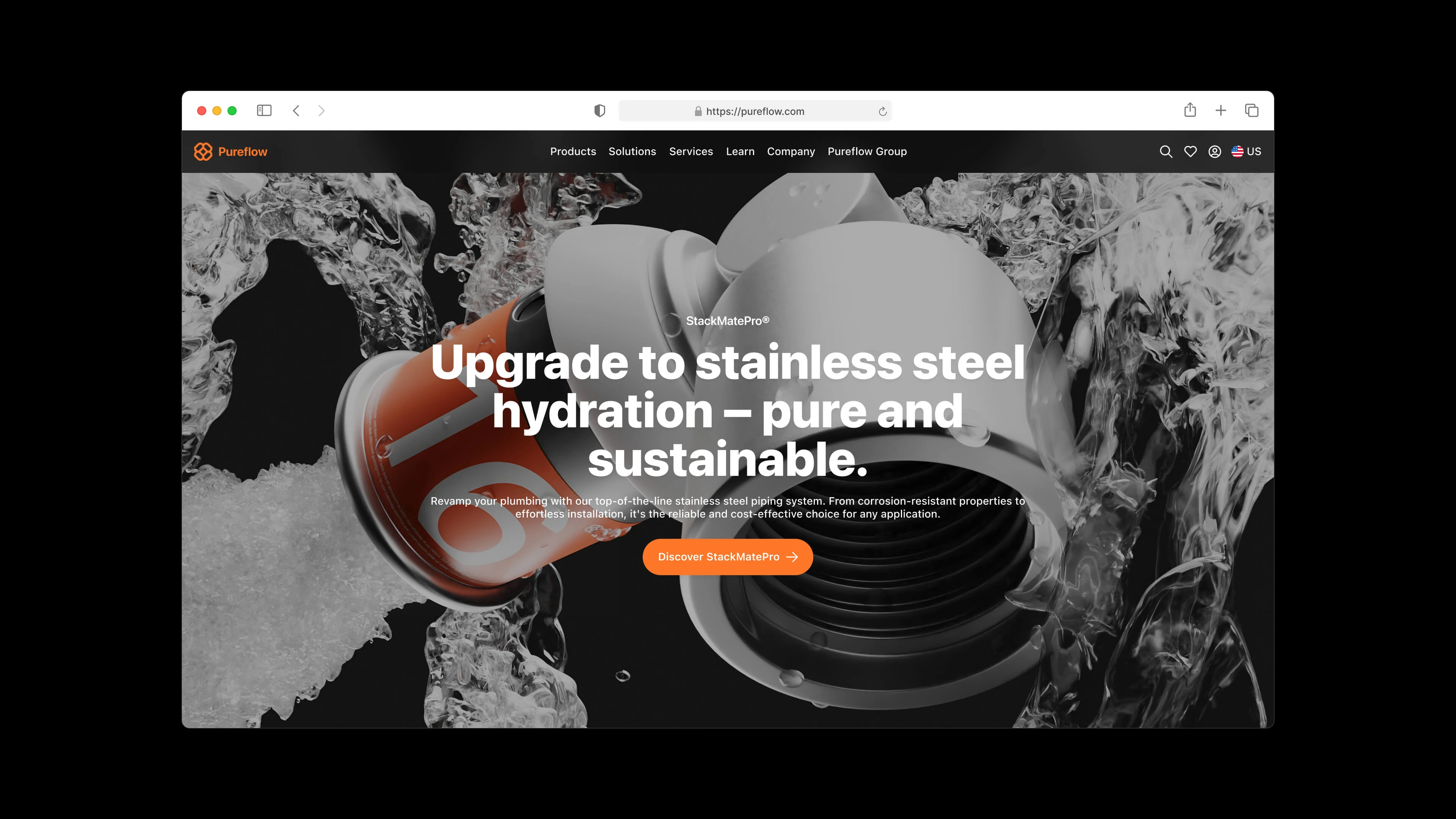
The client approached me with the request to redesign the existing navigation structure. Due to the growing product range and increasing content, navigation had become increasingly complex and difficult to use. As a global market leader, Pureflow (name changed for data protection reasons) needed a thorough overhaul of its information architecture and overall design.
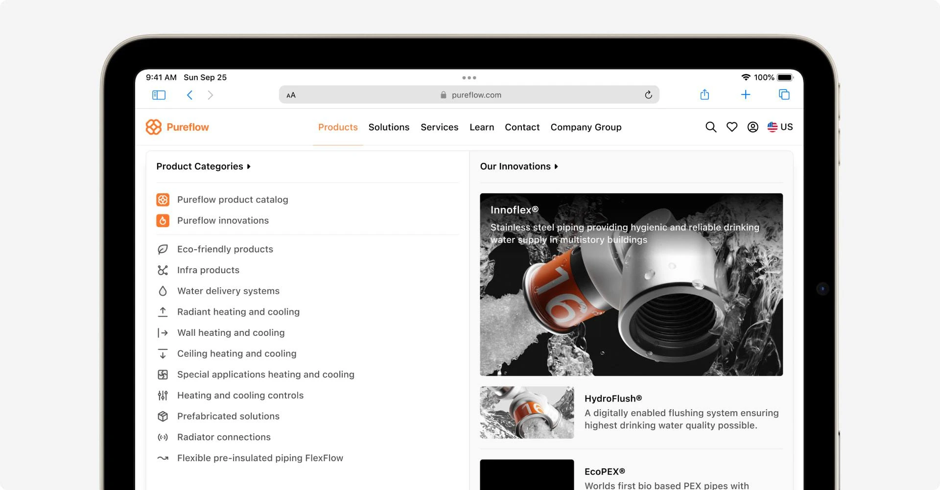
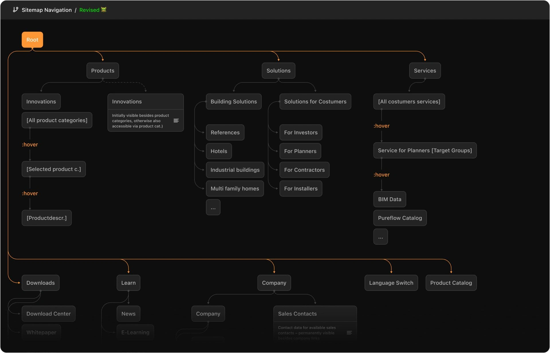
Compared to the original navigation design, the new design offers a significantly clearer structure. To find a solution that meets both functional and aesthetic requirements, I carefully considered the needs of the client and the end users
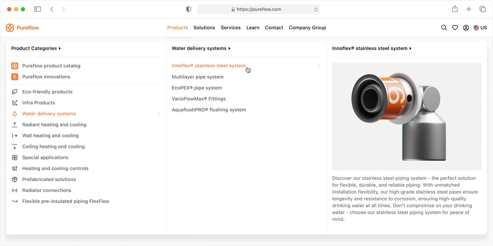
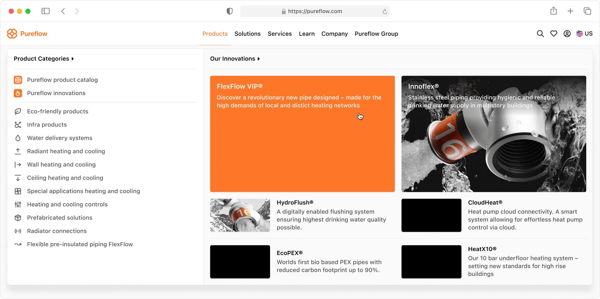
To improve user guidance, contextual hints were integrated into the last column: The information column adapts according to the previously selected product, helping users better evaluate and assess the products. Ultimately, this can reduce click paths and enhance the overall user experience (UX)
Flexible Navigation: Adapting to Varying Information Levels
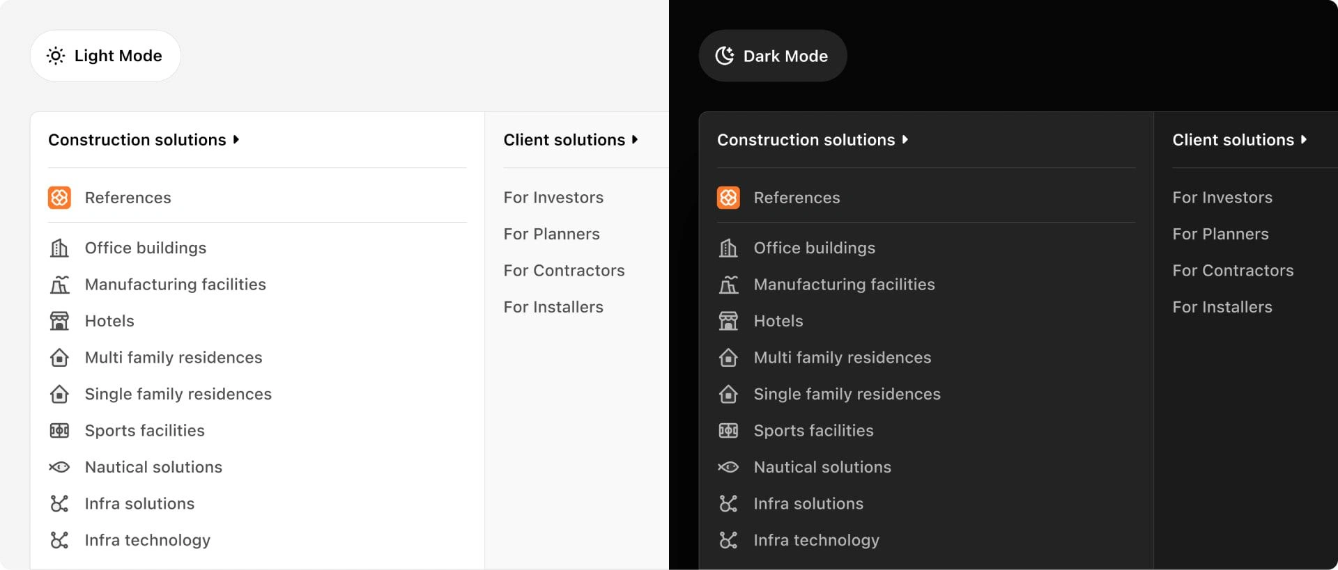
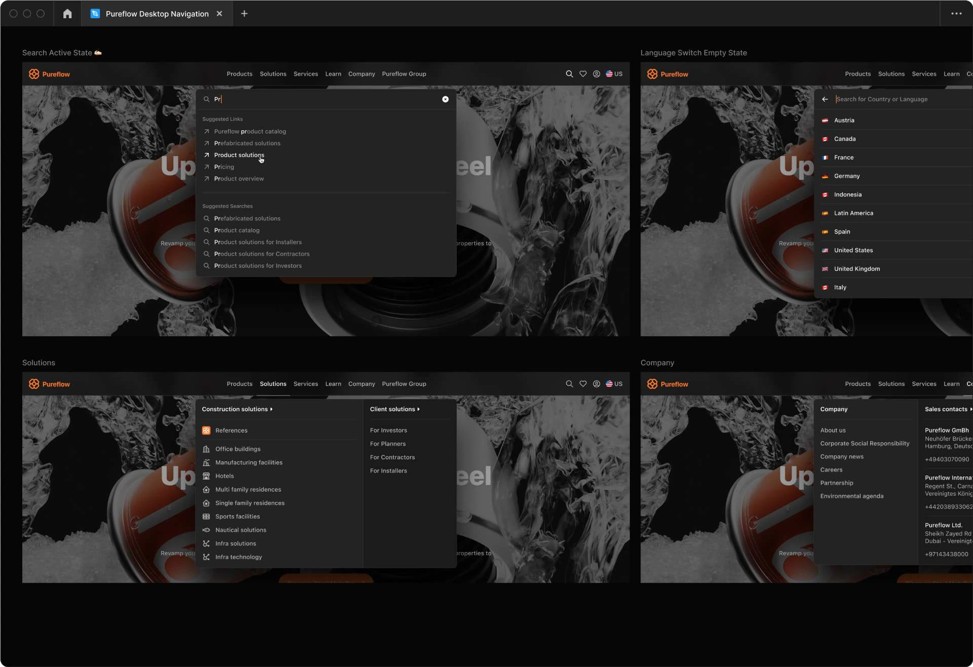
What is probably most striking about the new navigation design is its flexibility to adapt to different levels of information. By using a card design, the content always appears appropriate, whether it is a simple popup with five items, an extensive mega menu, or a search bar.
Responsive Design
As will be shown later, the original mobile navigation had insufficient usability, leading to numerous negative reviews regarding overall accessibility and navigation structure. Since a significant portion of Pureflow's user base consists of mobile users, I focused on addressing this challenge early in the design process. Through repeated iterations that incorporated feedback from both the client and the users, the final design offers a clear structure and enables the display of various content formats, regardless of screen size.
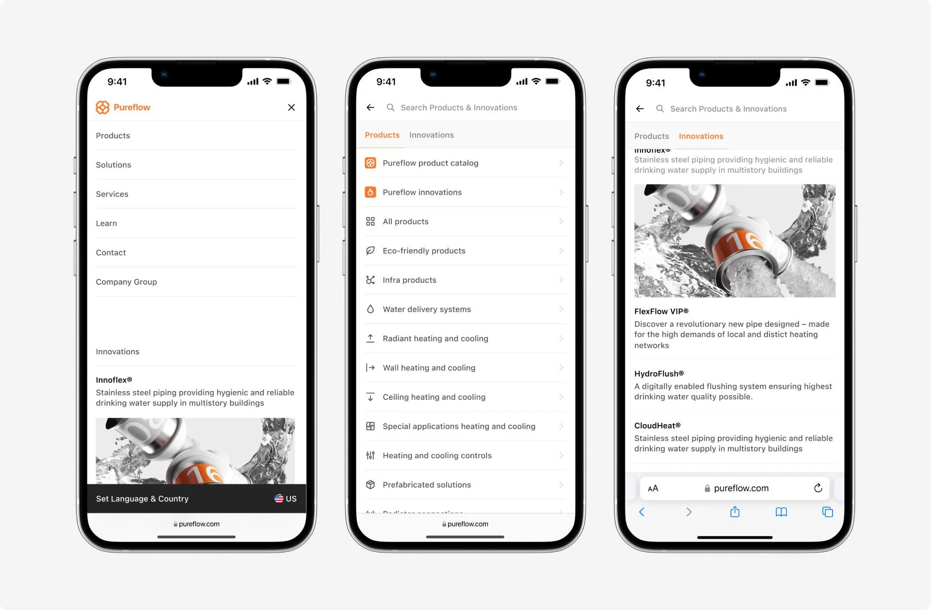
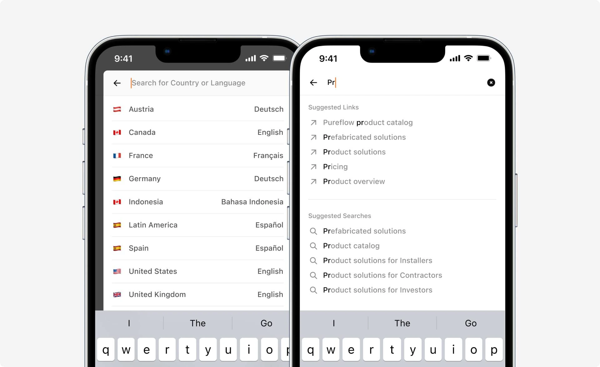
Thanks to its modular design, the search function works equally well on mobile devices and desktops. This consistency across all screen sizes ensures that users can seamlessly utilize the search function, regardless of the device they are using.
Research & UX
Before the actual design process, I first gained a clear understanding of the challenges the client was facing. As shown in the diagram below, the overall rating appears satisfactory. However, the results are less satisfactory regarding the ratings from Norway and Sweden. The reason for this will be explained further on.
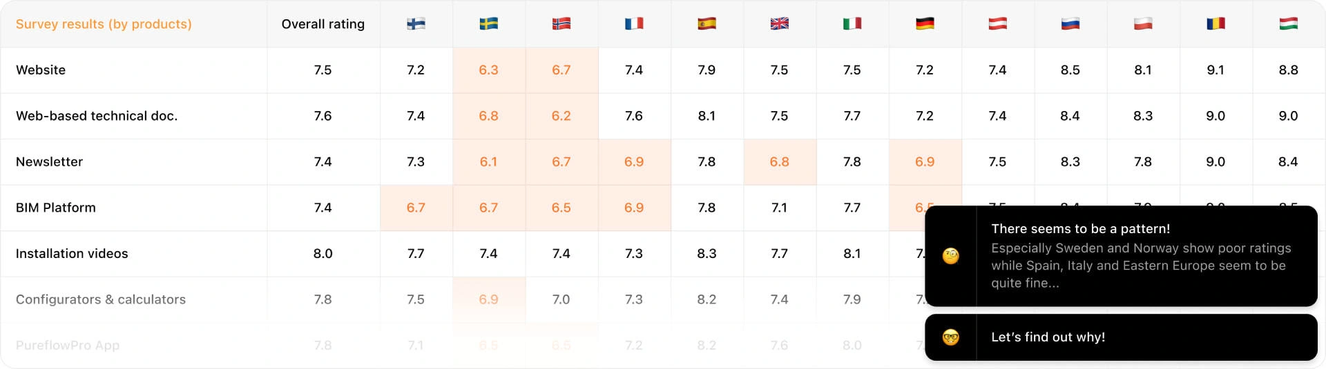
Additional research revealed that the frequent negative ratings in Nordic countries were due to the similarly high number of mobile users. Some content was unavailable on mobile devices, and the navigation and search functions were inadequate and did not meet current standards.
Why Relying 100% on Market Research Should Be Reevaluated
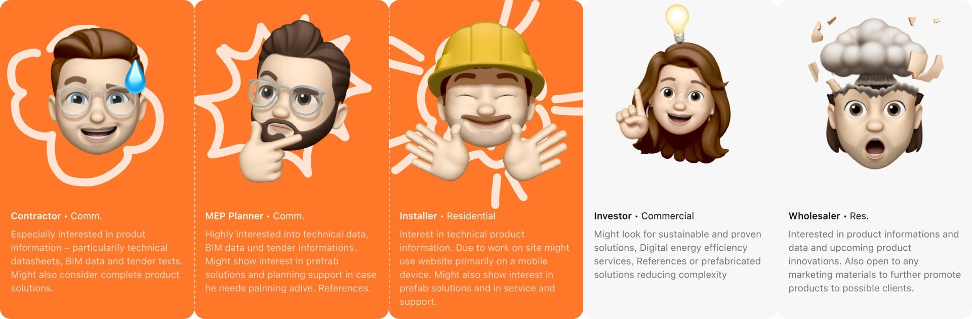
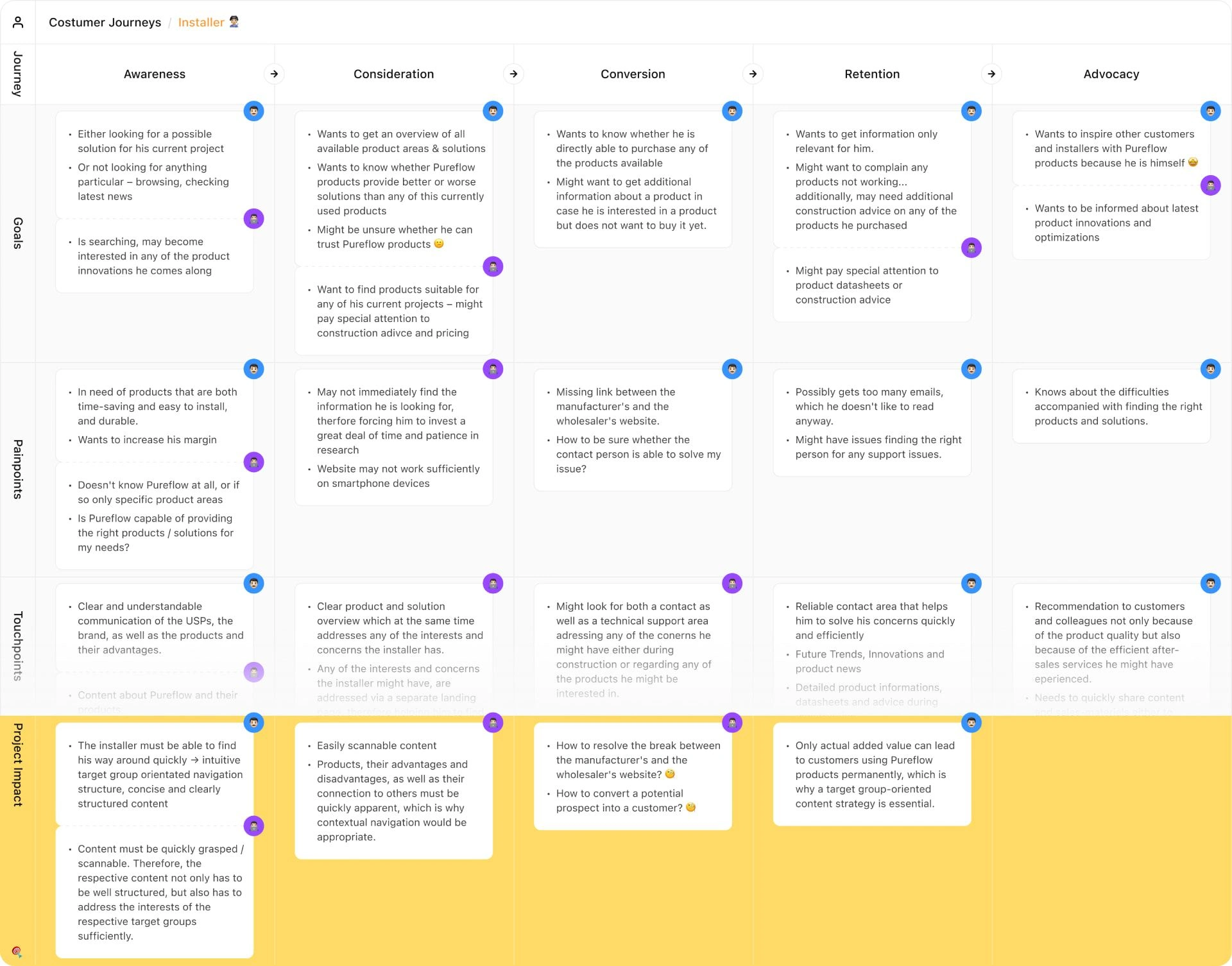
The user journeys created in a workshop aimed to establish a common understanding of how potential new customers can become enthusiastic advocates. Special emphasis was placed on identifying the goals and motivations of the target groups at each stage of the journey. In preparation for the workshop, the client defined five target groups: the first three groups are involved in commercial construction projects, while the remaining groups specifically target private individuals. Subsequent user interviews revealed that the initially identified desires and motivations of the target groups only partially aligned with their actual needs.
Target group sharpening
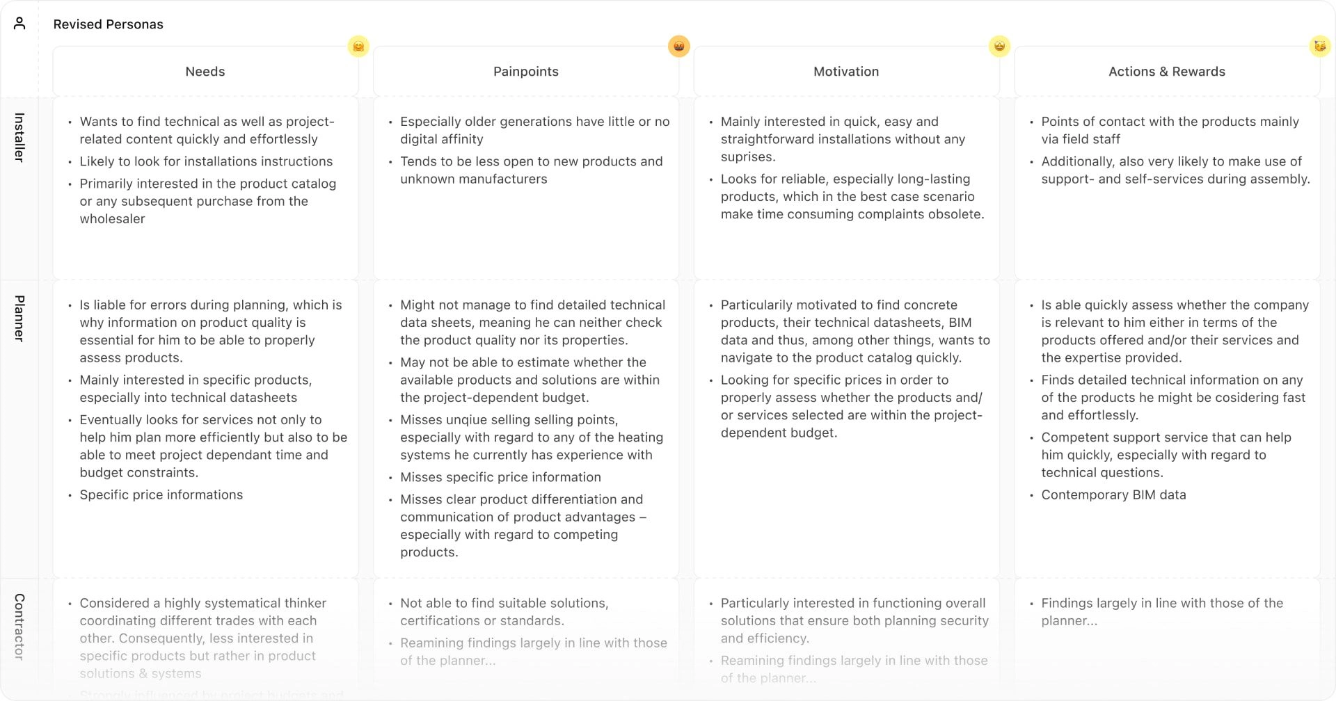
Despite the involvement of the customer service team in the workshops, it became clear that the assumed motivations, goals, and pain points of the target groups were somewhat inaccurate. Accordingly, the initially predominantly theoretical target groups were interviewed in their working environment a few weeks after the workshop. This allowed for the target groups to be further specified and subsequent design decisions to be made based on actual customer needs and pain points.
Evidence based information architecture
Through a two-day workshop and several user interviews, the subsequent information architecture was built upon the desires and pain points of the users. Both the information architecture concept and the resulting design were not only visually and structurally a clear improvement over the previous state but also met the content requirements of the end users.
Like this project
Posted Oct 10, 2024
Pureflow sought myexpertise to redesign its navigation structure due to increasing product offerings and content complexity, requiring a thorough ux approach.
Likes
0
Views
5