The Red Baron: Where Web Design Embraces Humor and Passion
Bernd B
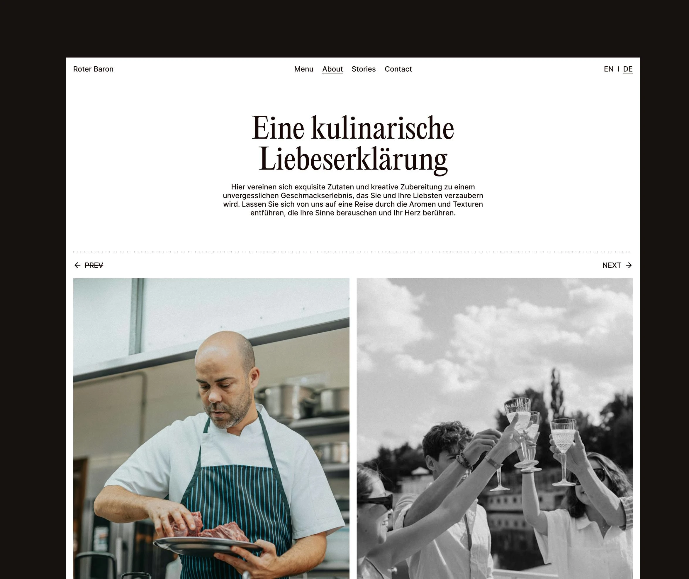
About Roter Baron
What could be more beautiful than design perfectly capturing the character and story of a Michelin-star restaurant? The Red Baron, a self-initiated project, fulfills this expectation. In an unconventional yet authentic way, good design, unique illustrations, and heartfelt texts work together to communicate the spirit of a restaurant that has made hospitality and high-quality cuisine its standard.
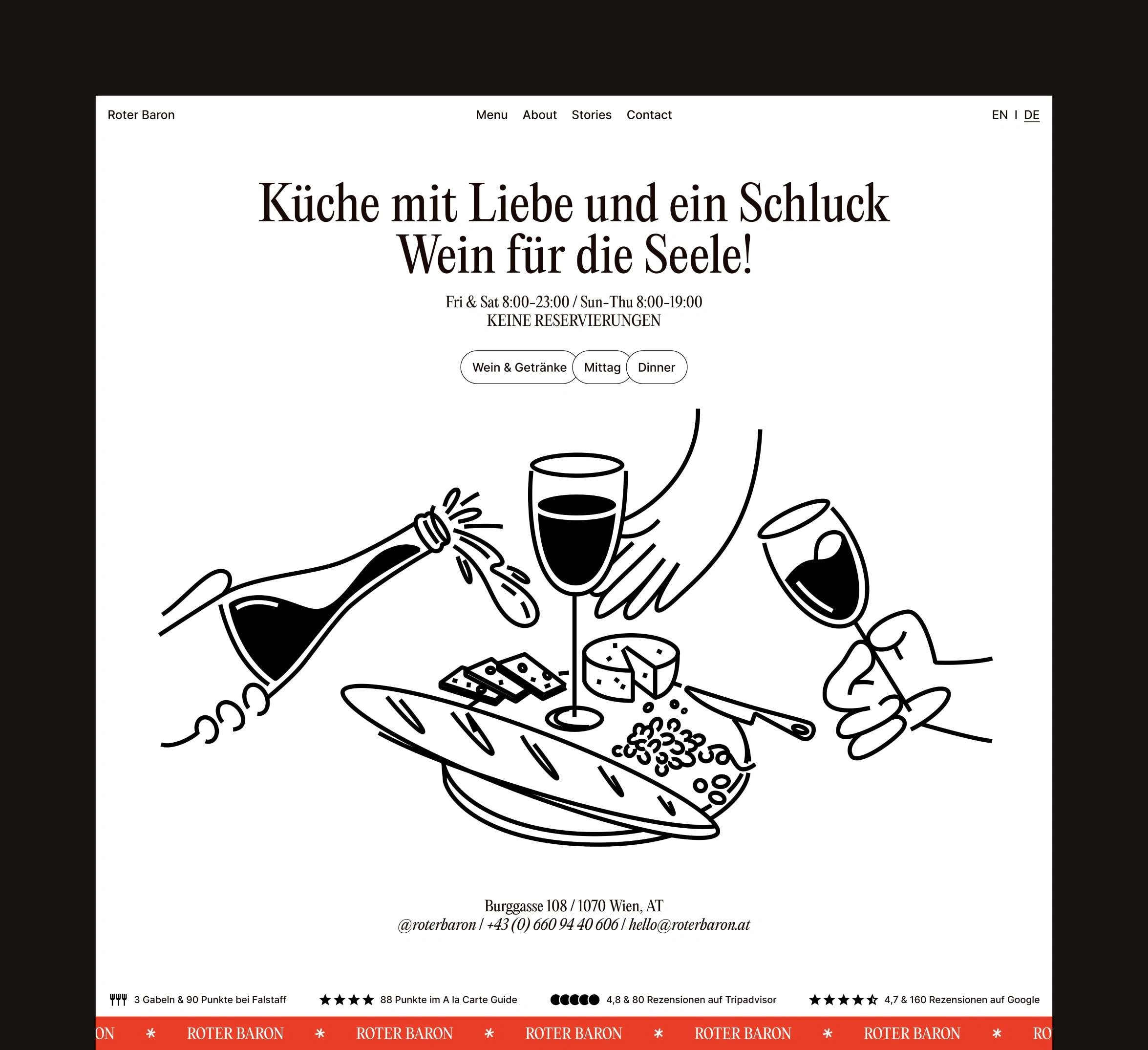
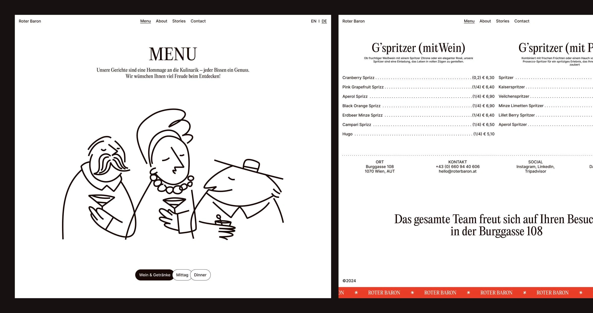
The menu continues the striking typography and choice of illustrations consistently. An unconventional yet functional layout is enlivened by warm illustrations and typographic accents, giving the overall appearance a humorous and heartfelt character
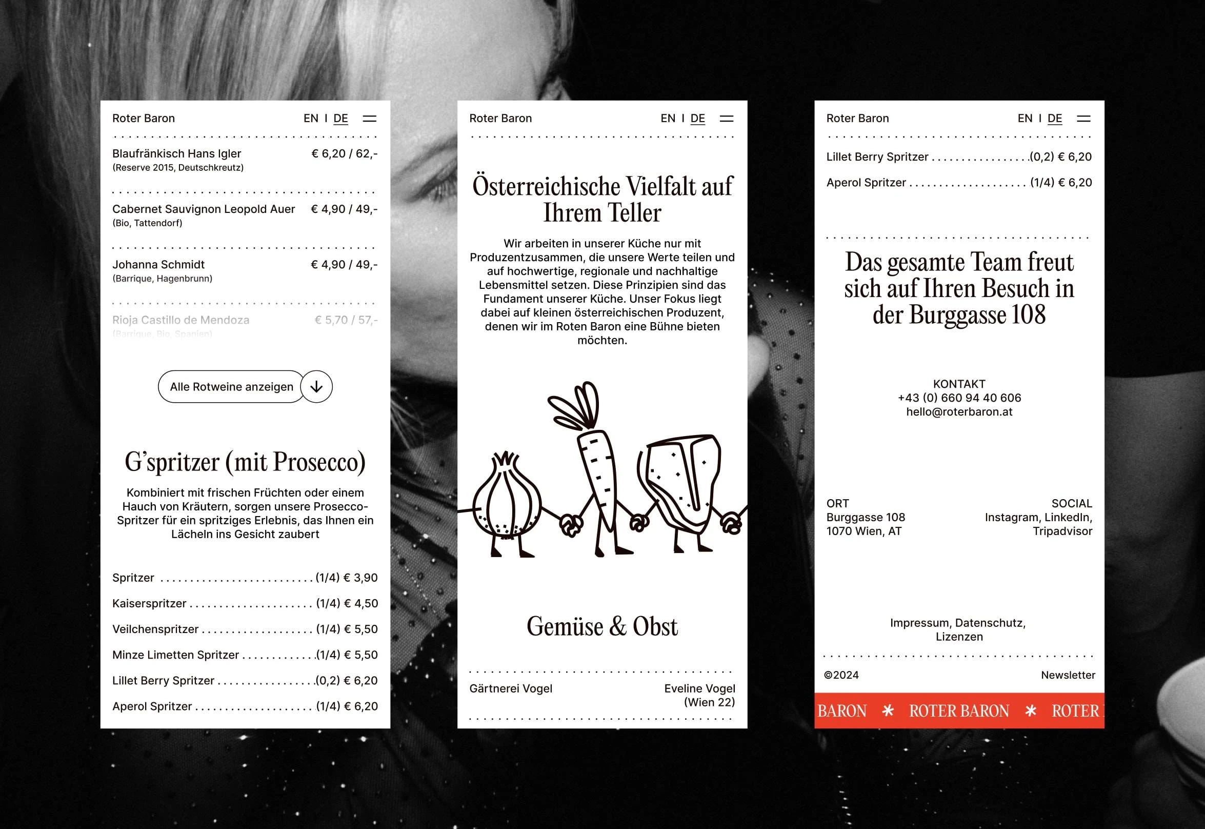
Mobile-First Design
Especially with the mobile-first approach, the design of the mobile version is on par with the desktop view—in fact, it excels. The design appears relaxed and easily comprehensible, even in limited space. The contrast between the content is achieved solely through the choice of typography and the use of white space, ensuring that all text is WCAG compliant and thus highly readable.
Showcasing Personality: More Than Just Information
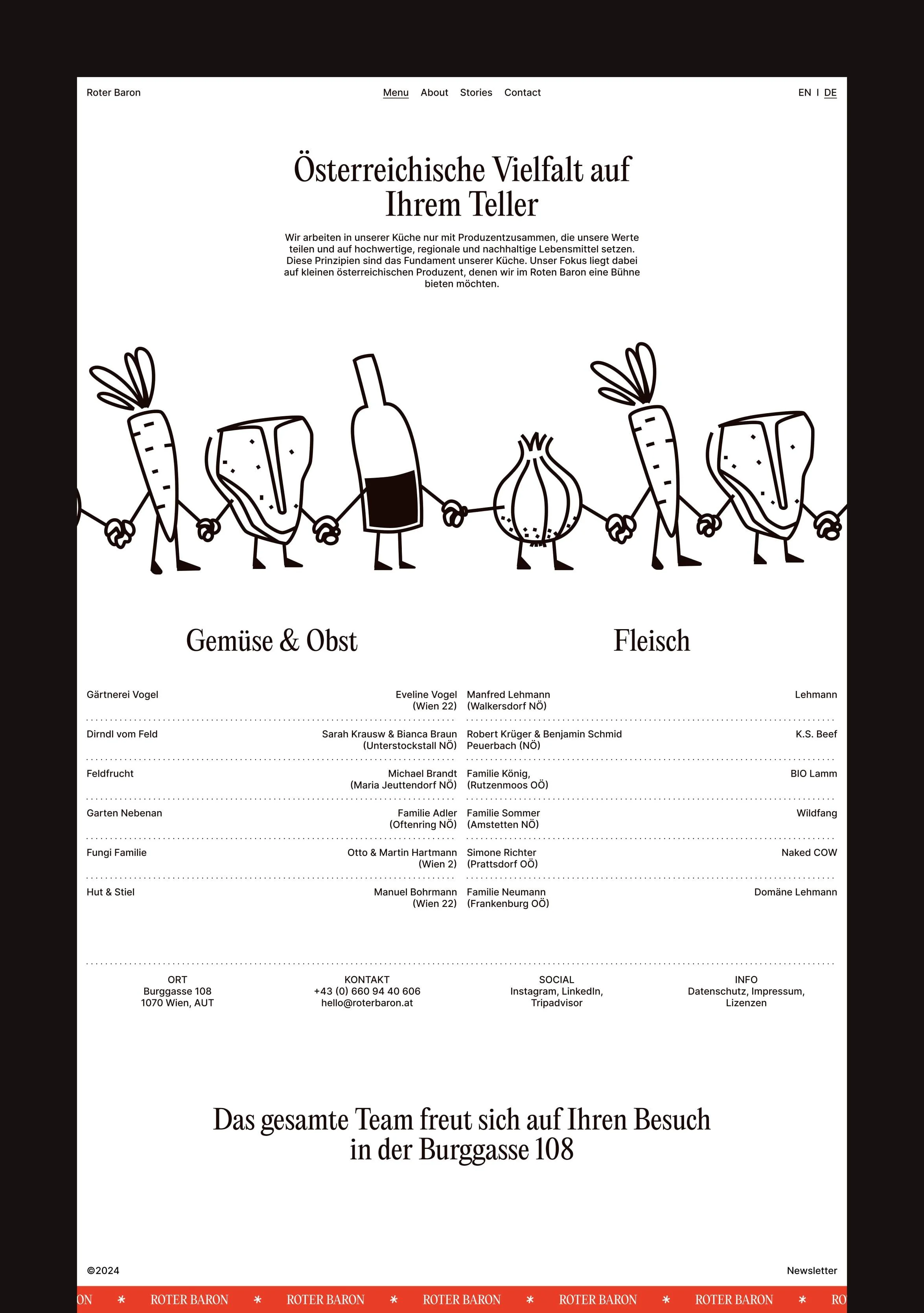
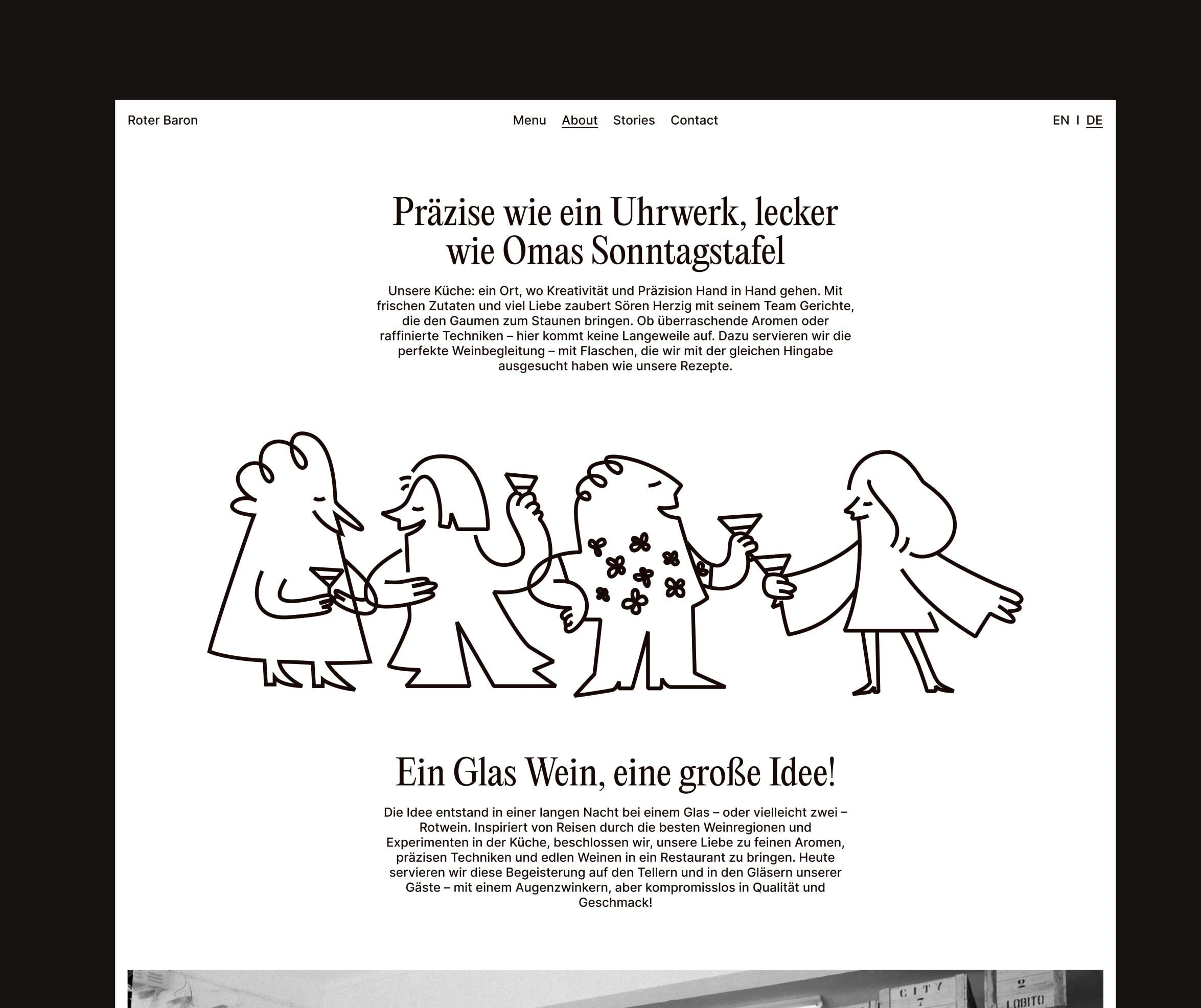
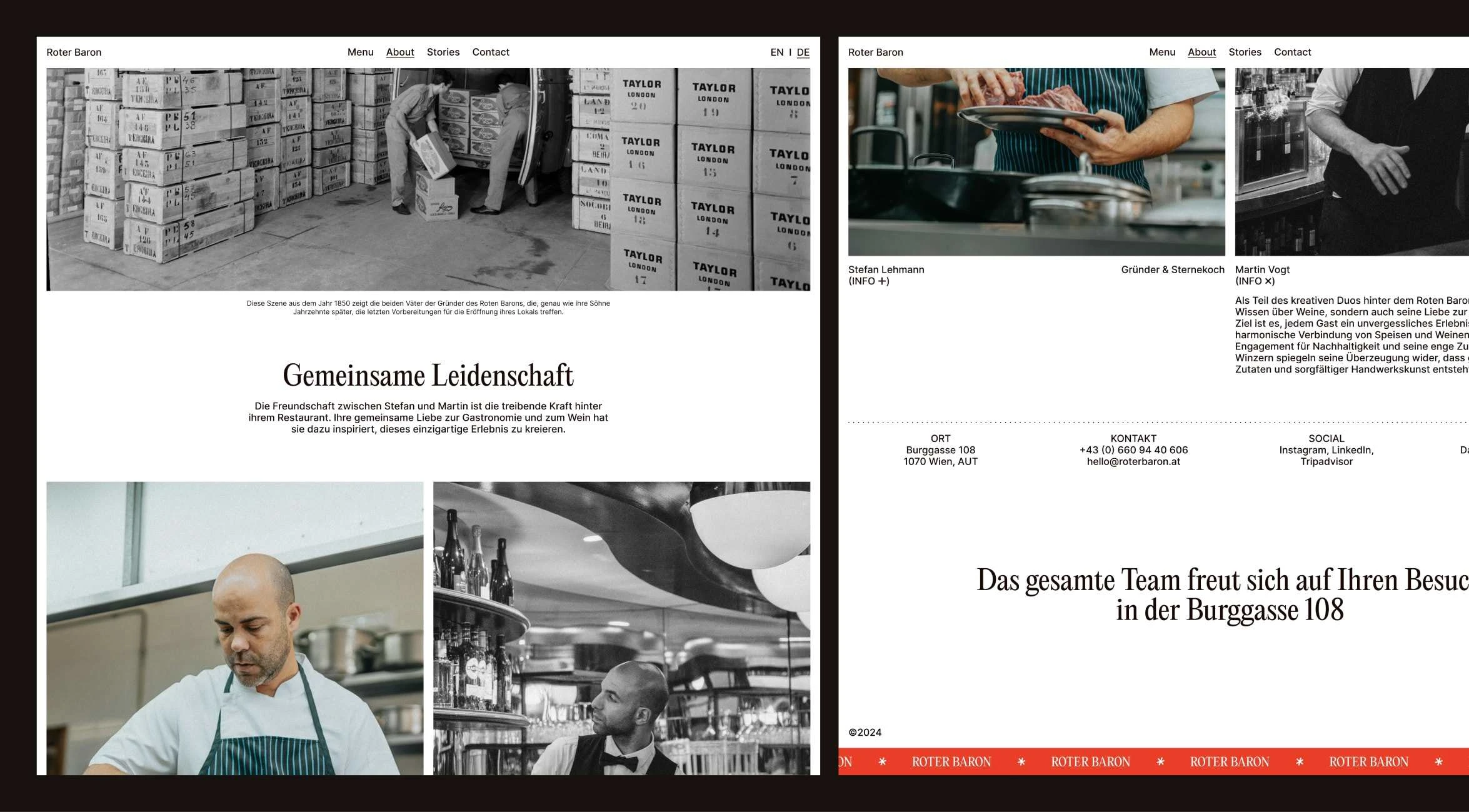
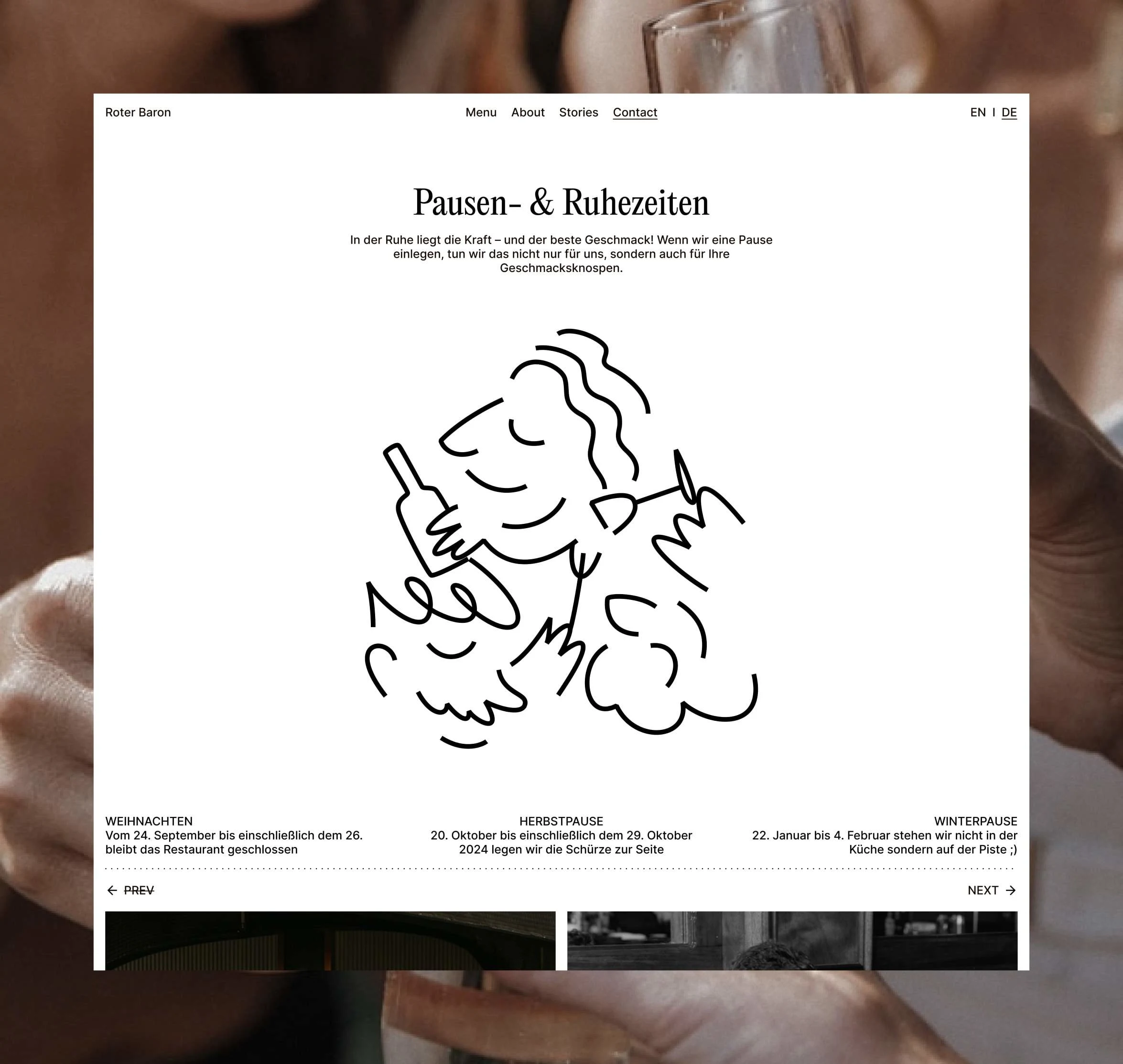
The Red Baron aims not only to inform throughout the entire page but also to showcase personality and passion for the subject. This focus is evident across the site, especially on the About page. Warm texts, combined with approachable imagery, capture the spirit of a restaurant that operates with warmth, passion, and professionalism in every aspect of its work.
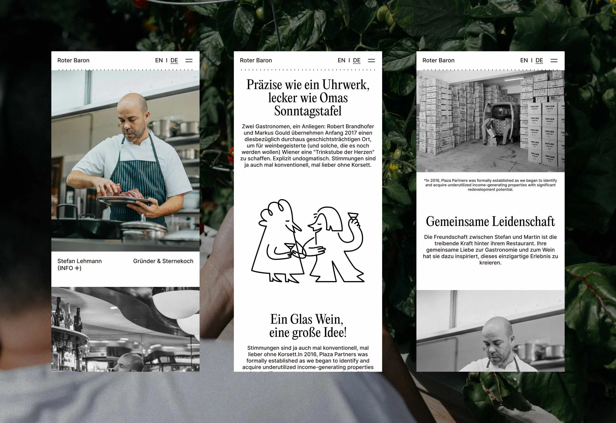
The About page tells an authentic story shaped by personal experiences, friendship, love for the profession, and creativity. The narrative and design are approachable, inviting guests to share in it for an evening.
Balancing Authenticity and economic interests
Despite all its authenticity, the site also pursues economic interests. Good stories build trust and a sense of belonging; they help us understand the world a little better or consciously escape from it. Above all, they need a strong conclusion—rather than a conventional footer, this involves a call to action (CTA) that warmly invites interested visitors to actively participate in an inspiring story.
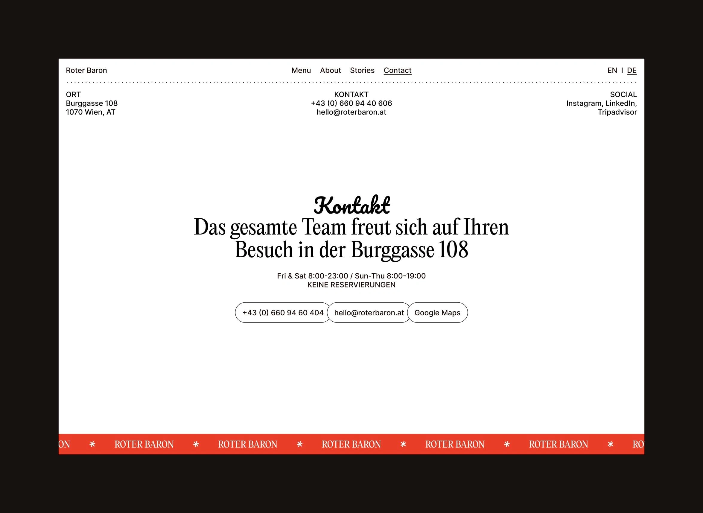
The contact page is undoubtedly one of the most important pages—accordingly, it is designed with warmth through creative typography and layout choices.
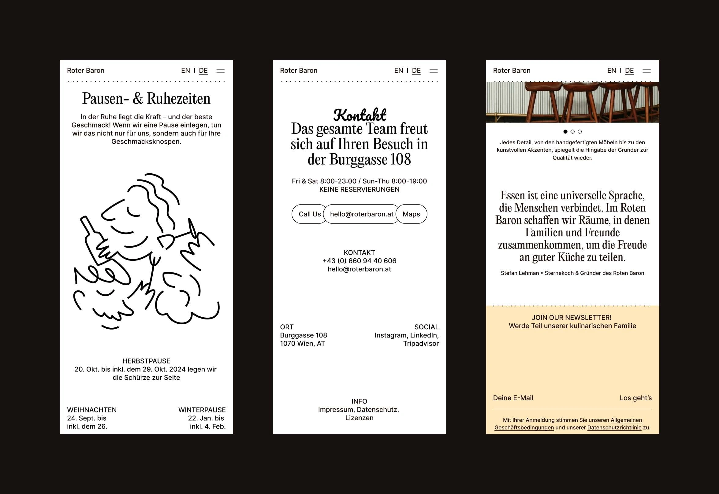
Despite its primarily informative nature, the contact page, like the other pages, remains interesting. An unconventional layout that still adheres to strict design rules appears relaxed and somewhat carefree, yet is visually cohesive in a curious way.

Like this project
Posted Oct 10, 2024
The Red Baron beautifully captures a Michelin-star restaurant's essence through unique design, illustrations, and heartfelt texts, showcasing its hospitality.