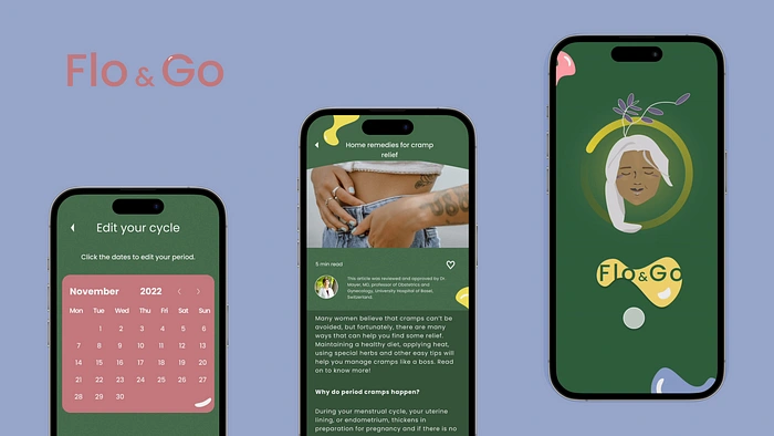
Period tracking app Flo&Go
Ironhack project 4: Wellness app
Dear UX enthousiasts, welcome to my 4th case study project in the Ironhack bootcamp.
Overview
Challenge
This time the brief was a little different. We were tasked to create a wellness app from scratch to present on the Daily health conference day. On this make believe conference day it was up to us to wow and convince the stakeholders to develop and integrate our app into their arsenal of health applications available to their members.
Problem: The Daily health conference has seen a significant drop in memberships and want to offer more value to their members and keep their image up to date. They organised a MPV competition among designers to rethink how people can adopt and commit to a health-improving routine.
The app
can address any aspect of personal wellbeing
should track the user’s progress and encourage them to implement a healthier lifestyle
Users must retain control over their private data (GDR Compliance)
The UI must exude a fresh and modern feel, and should be aligned with the Daily Health Conference’s values.
The prototype should include
User profile and goals
The main user flow presenting the app’s main feature(s)
Must-Have
Users need to be able to set up their profile to include important information relevant to their goals
Users need to be able to set goals and track their progress
Users need to be able to edit, share or delete their personal data
Users need to be informed about the usage of their personal data (This is an opportunity to practice UX writing)
Users need to receive feedback from the system (empty states, errors…)
Nice to Have
Educational component: find a way for users to stay informed throughout the process and understand how a health routine can benefit their well-being
A “Privacy” page should be included in the design, but there is no need to create it or its content.
To conclude this project we’re presenting our MVP through a 10 minute presentation on the Daily Health conference in front of the stakeholders and boardmembers.
Chosen topic: Menstrual tracking app
Duration: 10 days
Team: Claudia Rewinkel and
Deliverables: App including all facets of UX design process, Research, Market analysis, Subject research, Affinity Diagram, Empathy map insights, User persona and UJM, Ideation results, low, mid and hi fidelity wireframes, User flows, Concept and desirability testing results, moodboard, Style tile and style guide, Hi fi interactive prototype, key insights and next steps, and final presentation slides on UX and UI process.
Role: UX UI designer (sidenote: I might have spent an excessive amount of time on the UI as it was incredibly fun to create the illustrations from scratch and style our app, can’t wait to take you through the process!)
Menstrual tracking to empower the modern woman
For our topic it became clear that me and my teammate were passionate about giving women a tool to not only track their menstrual cycles, but to also empower them with knowledge on the effects their hormones have on their body allowing them to work with their cycle. Through desk research our research we found that over 90 percent of women struggle with pms symptoms but often end up gaslighting themselves not taking their symptoms seriously and wonder whether they are the only ones experiencing these feelings.
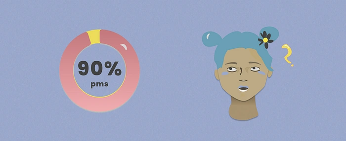
Through our research we wanted to validate our hypothesis that women would feel more in control and confident if they could both track their cycles and gain an understanding on what their body goes through and that breaking the stigma surrounding periods is important to make space to nurture the body without judgements.
What is already out there?
There are already a myriad of period tracking apps on the market, we believed that there was still room to add value and resources to our prospective users. We went ahead conducting both a competitive and feature analysis to understand our position in the market a bit better and to get an understanding of areas of improvement through updating our knowledge to what is already tried and true.

Competitive and Feature analysis
After our thorough analyses we concluded that some apps were already providing a vast amount of resources but that the community aspect deserves more attention.
Surveys
We created our surveys to understand the relationship women have with their periods better and to find out how people feel about sharing their personal data online. If you’re curious to see our 10 question survey take a look here!
Summary
We comprised a survey of 10 questions and got a total of 75 responses, and found out our most of our users were women between 26–35 (57,3 %)
Below are two of our keyfindings:
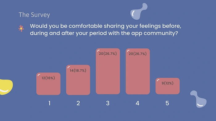
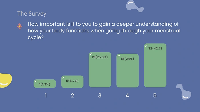
These findings revealed to us that women find it important to understand their bodies better and are willing to share with community if it is available.
User interviews
With the context of our quantitative data in mind, we created a user interview guide focussing on the needs of our prospective users. Particularly what the relationship is between women and their periods, what they feel they need from tracking apps and how they would feel supported during their cycle. We concluded that women feel there is still a lot of stigma surrounding periods and would love to have ways to access resources and community to feel less isolated and to understand their bodies better.
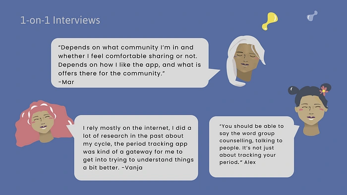
From here we clustered our findings into an affinity diagram and dotvoted on what the main themes were to then fill out an empathy map that would help us in creating our user persona.
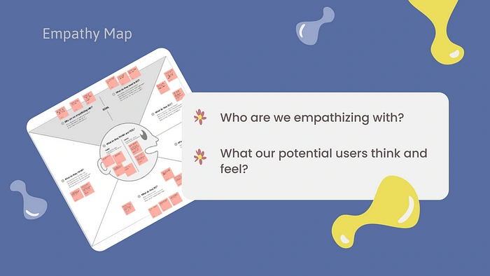
Defining our problem
User persona
Let me introduce you to our vivacious and bubbly Meg! A loyal member of the Daily health conference apps and in tune with her body for the most part as she likes to stay fit through exercise, meditation and nutrition.
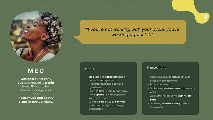
Let me walk you through a day in the life of Meg through our User Journey map:
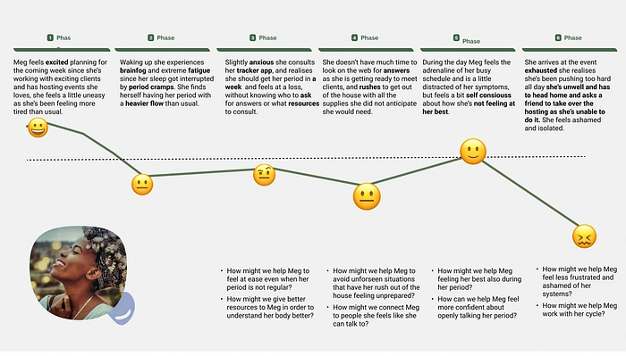
Meg experiences quite the emotional rollercoaster and plummets from being excited to plan for her events to feeling defeated and ashamed cancelling her event due to period symptoms that stress her out.
Meg’s frustrations highlighted the following how might we’s:
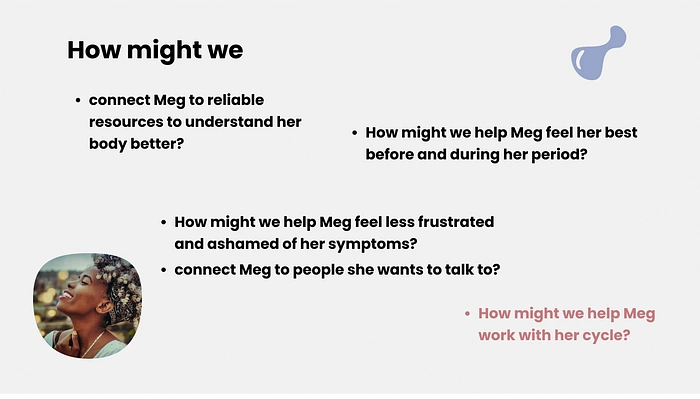
Problem statement
Our ‘how might we’ questions shaped our problem statement as follows:
Women with active menstrual cycles need to find a way to understand their bodies better during their cycles because a lack of helpful resources and communities exacerbates their symptoms and confidence.
Ideation
On to the ideation! Where we came up with a lot of ideas and general concepts through crazy 8s while also bearing in mind the must haves ,should haves and nice to haves the Daily Health Conference provided us with.
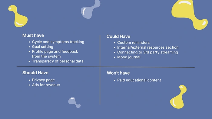
As we already had our list of must haves we knew to focus on these specifically:
Users need to be able to set up their profile to include important information relevant to their goals
Users need to be able to set goals and track their progress
Users need to be able to edit, share or delete their personal data
Users need to be informed about the usage of their personal data (This is an opportunity to practice UX writing)
Users need to recive feedback from the system (empty states, errors…)
MVP Statement
After compiling all the essential features we created the following MVP statement:
Our period tracker app aims to help users efficiently track their menstrual cycle every month.
Women can create their profiles, set goals, add symptoms, check daily insights and share their thoughts and feelings with the app community. They can participate in live sessions within community to build on their resilience and confidence, or chat with other women. They can also consult medical advice and a myriad of reliable resources to understand their body better and plan accordingly.
By ensuring that these features are available, users will be able to see cycle trends and symptoms patterns, while feeling assured their personal data is safe and confidential. The users will feel their best while on their period and be more confident navigating their menstrual cycle.
Sitemap
At this stage of the process both Amadeja and me were extremely excited about our concept but soon felt overwhelmed with the scope of what we wanted to accomplish. This made us turn to making a sitemap before we did anything else. Our sitemap allowed us to have a visual overview of what we wanted to incorporate in our app and conveyed the general idea for the information architecture as well.
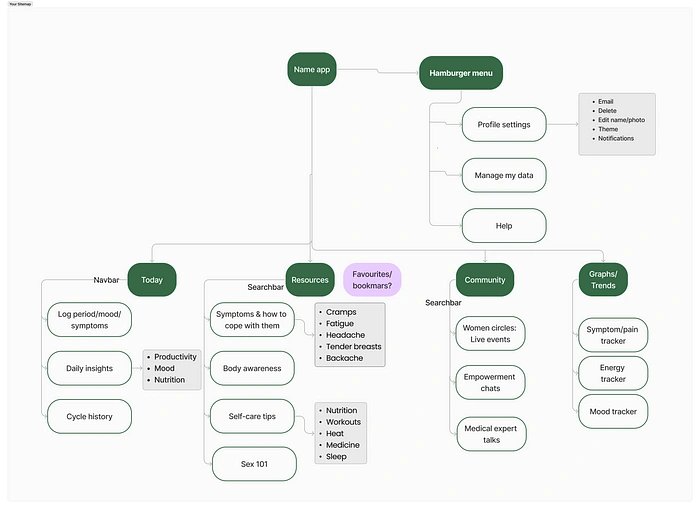
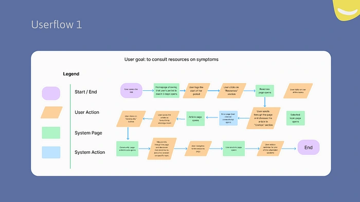
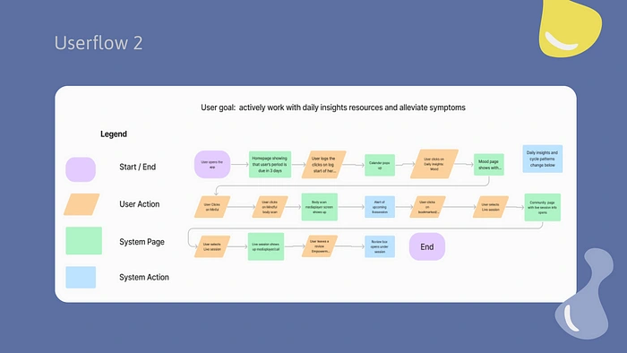
Using our sitemap we created our two User Flows. The first one portraying the most efficient way to use the app when users find themselves in a stressful period of time and the latter one accommodating users who have plenty of time to browse and consult resources and perhaps partake in activities.
Design
Lofi Wireframes
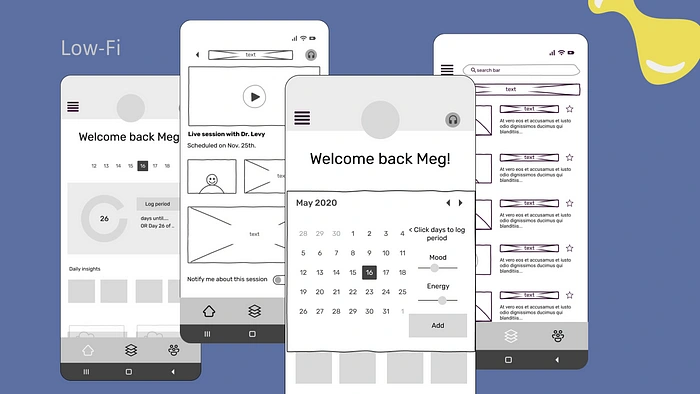
This is where our concept started to come to life! After a concept testing we discovered:
People were confused about the headphones icon that showed users that they could integrate third party streaming apps. Having that visible while on mediaplayer screens made it confusing as to whether it hinted at the mediaplayer audio or something else;
The organisation of topics could be better;
The navigation bar icons were a little unclear;
People wanted a separate screen for logging more in depth symptoms and notes.
Mid-fi wireframes
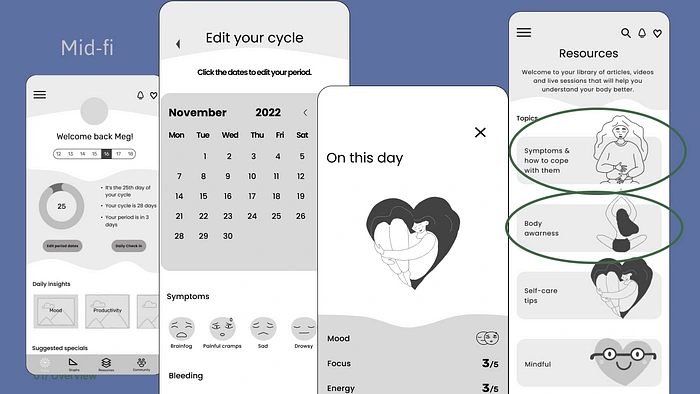
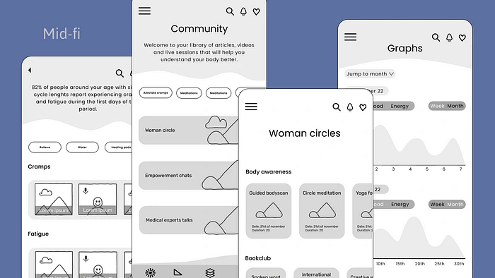
In our midfi wireframes we iterated on the icons in the navbar adding text for clarity. We removed the headphone icon to prevent confusion, created a seperate page for symptom logging and organised our topics differently in the Resources section.
Branding
Now before we jumped into HI FI’s we spent a good chunk of time preparing our design system and style guide.
Visual competative analysis
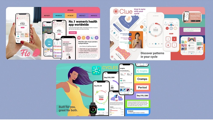
We started off doing a visual competative analysis and realised most period tracker app have an overall feminine character and realised we wanted to pay attention to our colour scheme to make our app more inclusive to people who identify as non-binary or trans. We find it important that everyone who has an active menstrual cycle feels seen, no matter what gender they identify with. This led to us having ideas to have a more gender neutral colour scheme.
Moodboard and Brand attributes
We then set of to define our period tracker app Flo&Go visually. We did this by making a visual moodboard using brand attributes. Through desirability testing we were able to validate our attributes and finish our moodboard.
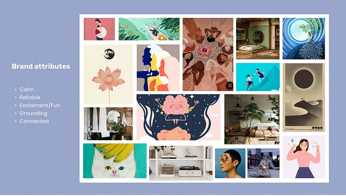
We went ahead and created our style tile, and meanwhile had lots of fun designing our avatars and illustrations!
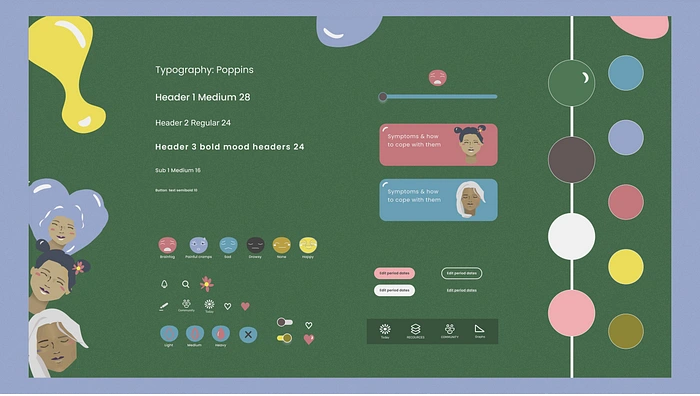
We were able to streamline our main elements like
Typography
Category cards
Icons for in app use and navbar icons
Colour pallete
Illustrations
Buttons
To work efficiently we invested time in making components to ensure coherency, flexibility and speed in our designing process.
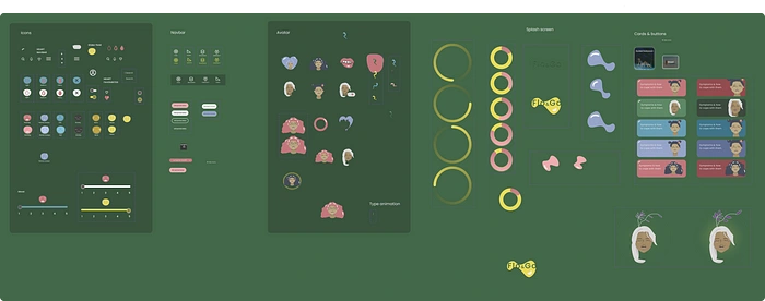
Check out our video of our High fidelity prototype here:
Our video on
Like this project
Posted Sep 6, 2023
This time the brief was a little different. We were tasked to create a wellness app from scratch to present on the Daily health conference day. On this make be…
Likes
0
Views
23

