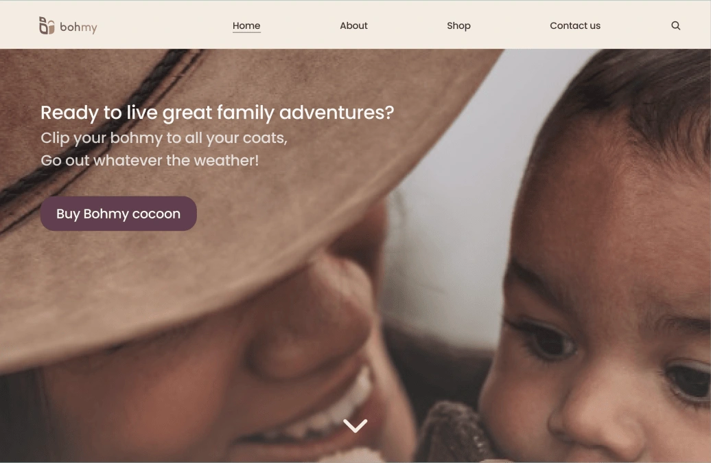
Bohmy: Ecommerce, Improving UX on mobile and web

Overview
Deliverables
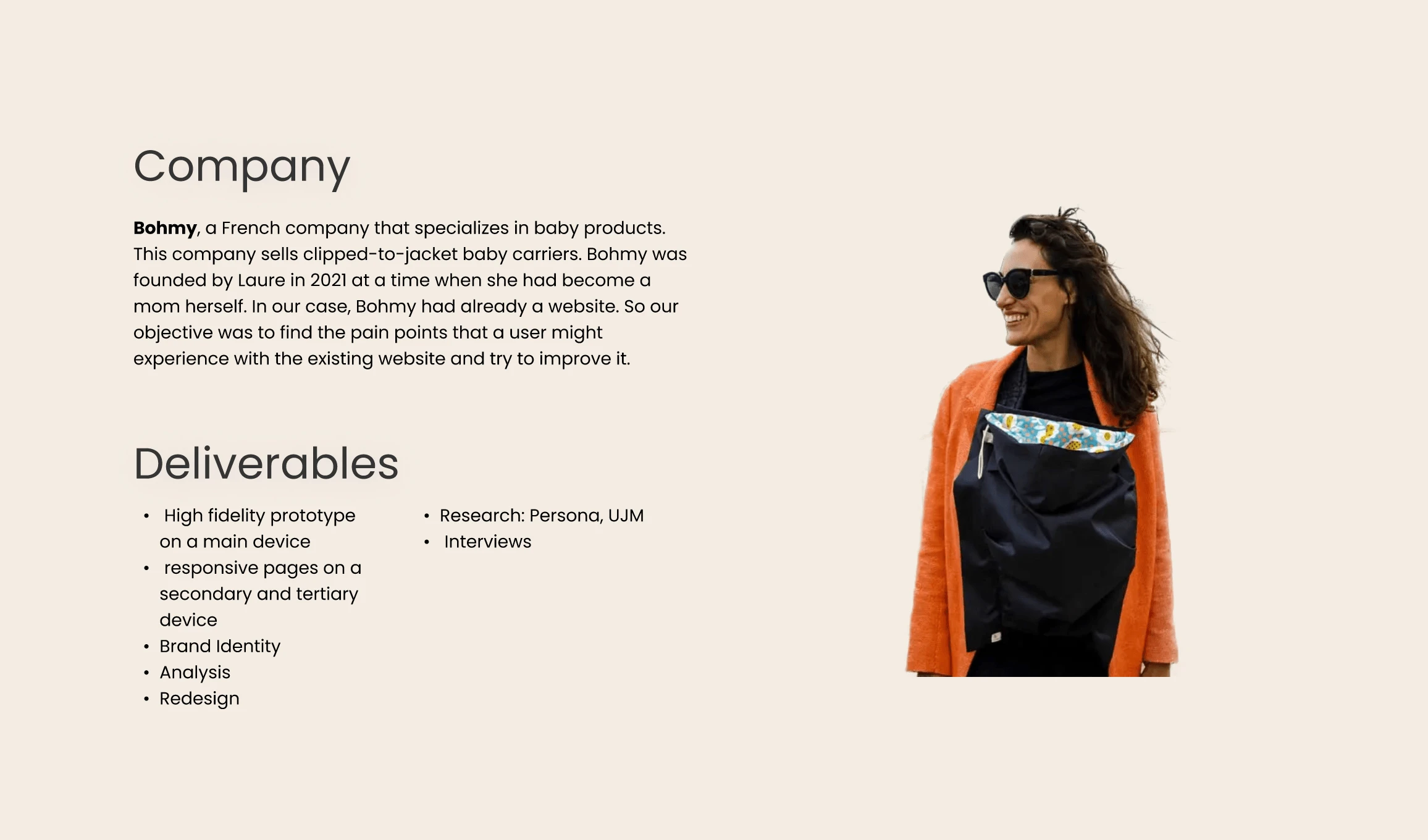
Completing this project involved creating a high fidelity prototype on a main device and responive pages on a secondary and tertiary device. Our main focus was redesigning a webpage. And making mobile and tablet responsive pages.
Roles: UX UI designer, researcher,
Methods & Materials: User research: quantitative and qualitative research, Swot analysis, Affinity mapping, Moscow Method, Moodboard, Wireframes, Low fidelity prototyping, High Fidelity prototyping, Figma, Figjam, Zoom.
Throughout this whole process we adhered to the designprocess
Empathize
Secondary research & Stakeholder interview
Through out amazing fellow peers at Ironhack we got a lead for a potential company to contact. We were able to schedule an interview with Laure, stakeholder of a Frenchbased company called Bohmy, specialising in baby clip on carriers. Before we jumped into this zoomcall we made sure to do some secondary research on Bohmy and get familiar with Bohmy’s products and online presence. Upon our new insights we were able to craft an interview guide that we were able to send ahead to Laure. If you’re curious to what we asked Laure, you can find our interview questions here
Follow the data
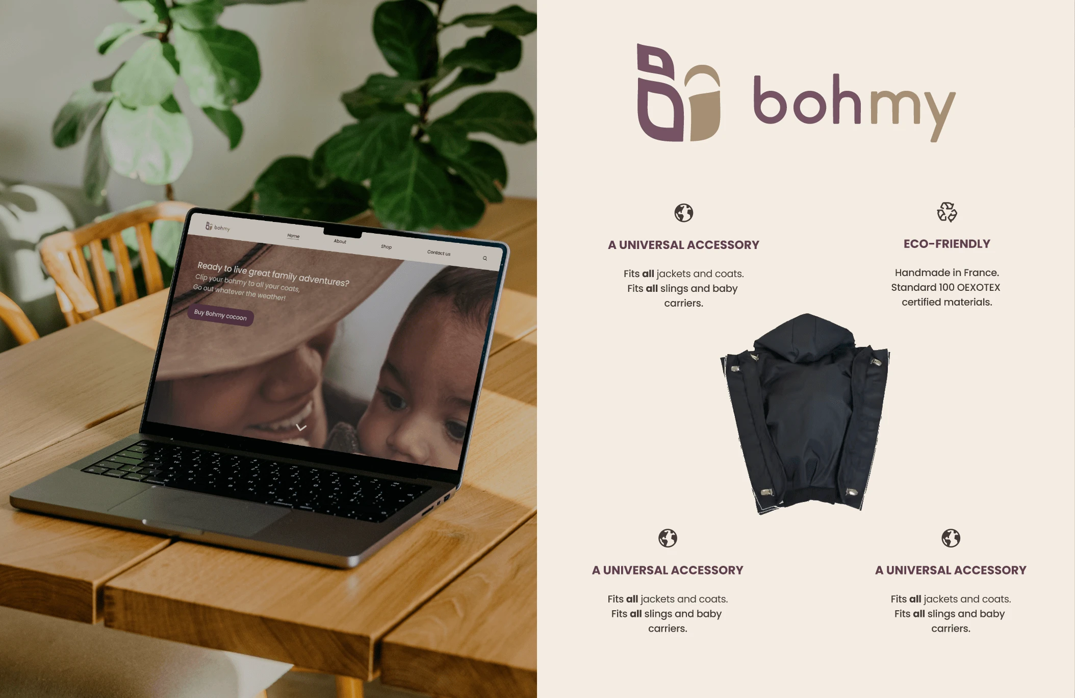
More detailed information on the product, Laure illuminated us on how the company got founded. After Laure became a mum she realised she neither wanted to give up her active lifestyle nor her love for fashion. She thought of a product that is durable and aligns with her values of sustainability and durability. To ensure parents can be active whatever the weather, and in their preferred outfit, these baby carriers are of timeless designs and are attachable without damaging clothing and rain and weatherproof.
Laure conducted her own market analysis, since her product is so niche there are not many competitors aside from 2 indirect competitors.
It was important to Laure that her designs are fashionable and of quality. Her main target audience are upmarket metropolitan fashion conscious parents in colder climates.
Laure wishes to expand her business to outside of Europe trying to appeal to the international market.
The main problems with her website, was that the website was incredibly slow. Laure was looking for a way to solve this and to possibly find ways to appeal to her target audience better.
Surprisingly enough most of her sales were through the mobile app with 88% of the sales. Because of this insight we decided to follow our data and make the mobile app format our priority instead of the desktop website. We also learned that most purchases were bought as a gift.
User Interviews
With the data above we were able to design new interview guides for users interacting with the Bohmy webshop with the task to purchase an item. Soon enough we had gained a thorough understanding of people’s experience interacting with the site. We extracted themes from our data through Affinity mapping and learned that people struggled mostly with confusing layout as people weren’t able to determine it was a webshop at first glance. Another theme slow loading of content, and issues with inconsistencies of language throughout the site and having long scrollable content and confusing information architecture making it hard for people to find what they’re looking for; in most cases company values or how to shop for items.
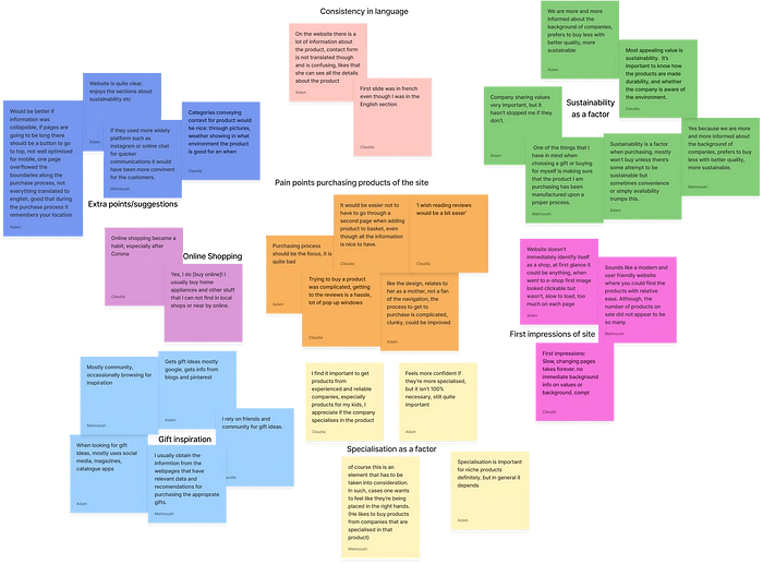
From the Affinity diagram we extracted the following themes and key focus points for our redesign:
Language inconsistencies
First impression of the site
Ease of purchase
Focus on company values: sustainability
SWOT
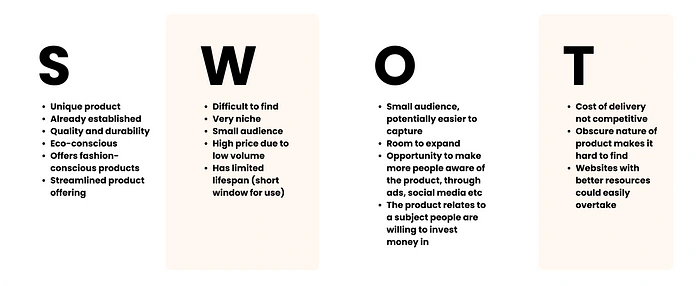
Our next step was to conduct a competitor analysis, though since we knew there were only two indirect competitors since Bohmy specialises in such a niche product. It made more sense to make a SWOT analysis of the current situation.
Define
Meet Marianne
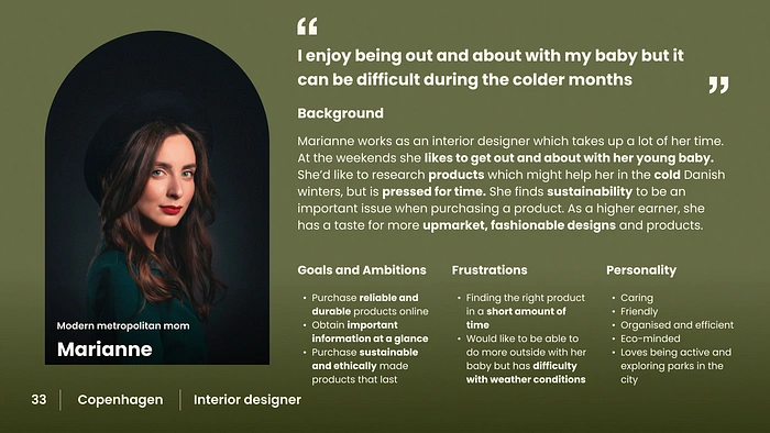
After gathering our data after our user interviews, we were able to identify our targeted users through our user persona Marianne. Don’t be shy, it’s time to get aquainted:’).
For a deeper understanding of Marianne’s daily struggles and wishes we synthesised a User Journey Map. Let’s follow Marianne through a normal day.
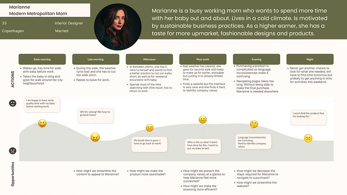
Our User Journey Map presented us with how might we’s that informed our next step, namely the making of:
THE PROBLEM STATEMENT
Working parents interested in upmarket fashion need to find a way to browse and purchase the right niche products for their baby because they lose time with complicated navigations and their attention is often required elsewhere.
Cue the Ideation:
Ideation
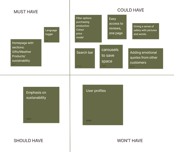
Crazy 8s and Moscow Method
We had a quick round of crazy 8s to get the creative juices flowing and made used the Moscow Method to prioritize features and get a clear picture on what to focus on.
Sitemap & Userflow
We then analyzed the current information architecture of the website and decided to make a sitemap to help us get an overview of the information presented on the website and how the user accesses all the information that is available.
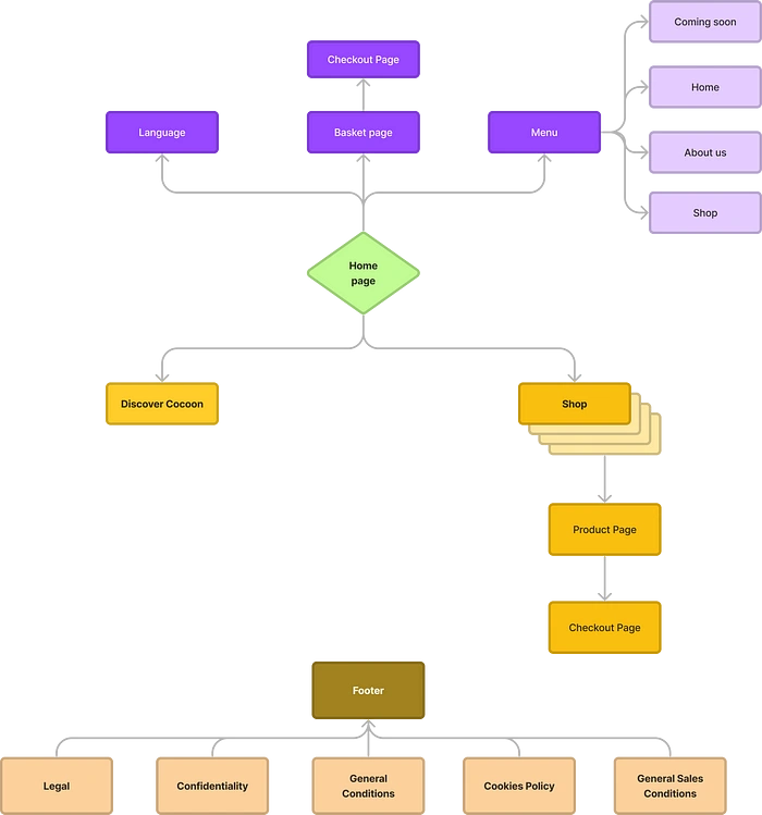
Through our sitemap we were able to design a User flow with the goal of purhasing a specific item in mind. This userflow served as the blueprint for our concept testing and creating our low fidelity wireframes.
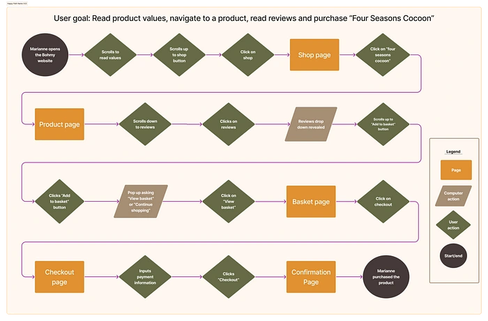
Userflow
Low fidelity
Our low fidelity wireframes served as a more comprehensive ideation of how our we felt the content would best be displayed. We wireframed the screens necessary to perform the userflow.
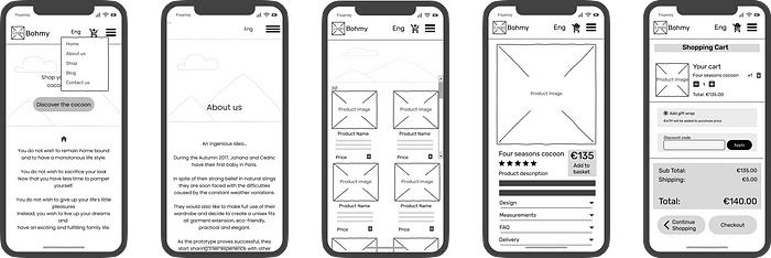
Low Fidelity wireframes
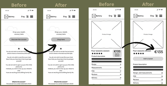
We prototyped our Low fidelity wireframes and went ahead to conduct concept testing which led to the following iterations:
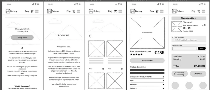
We then were able to iterate on the low fidelity by making our mid fidelity include these refinements.
Our usability testing validated our designs. Good news to get ready for our high fidelity!
UI preparations
Brand attributes, Moodboard and Style tile
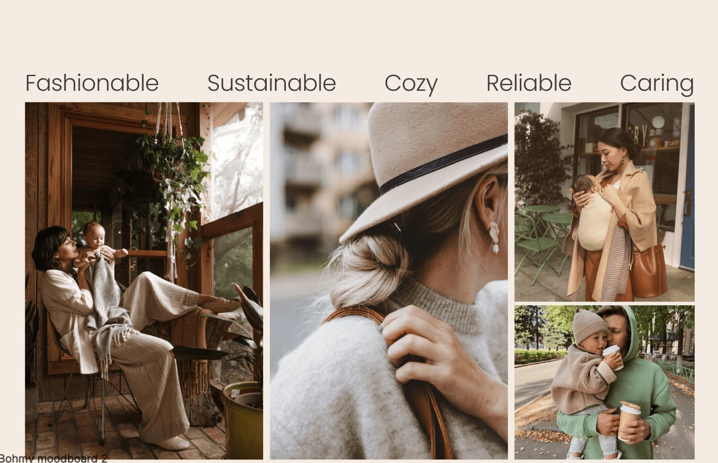
Before jumping straight into including colours and styles, we had a systematic approach by firstly coming up with brand attributes that sum up the essence of Bohmy that led us to making a moodboard
Fashionable
Sustainable
Reliable
Cosy
Caring
After a desirebility testing where people commented on our moodboard we learned that we were able to successfuly translate our brand attributes through our moodboard which paved the way to extracting colours and creating our style tile.
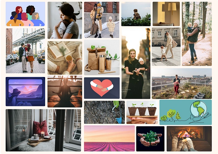
Moodboard
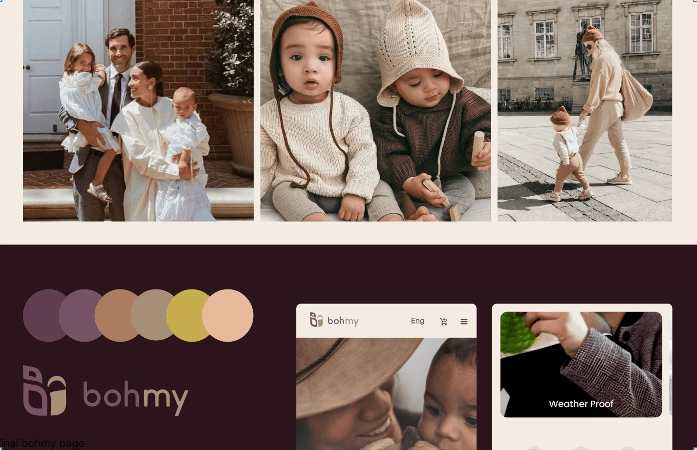
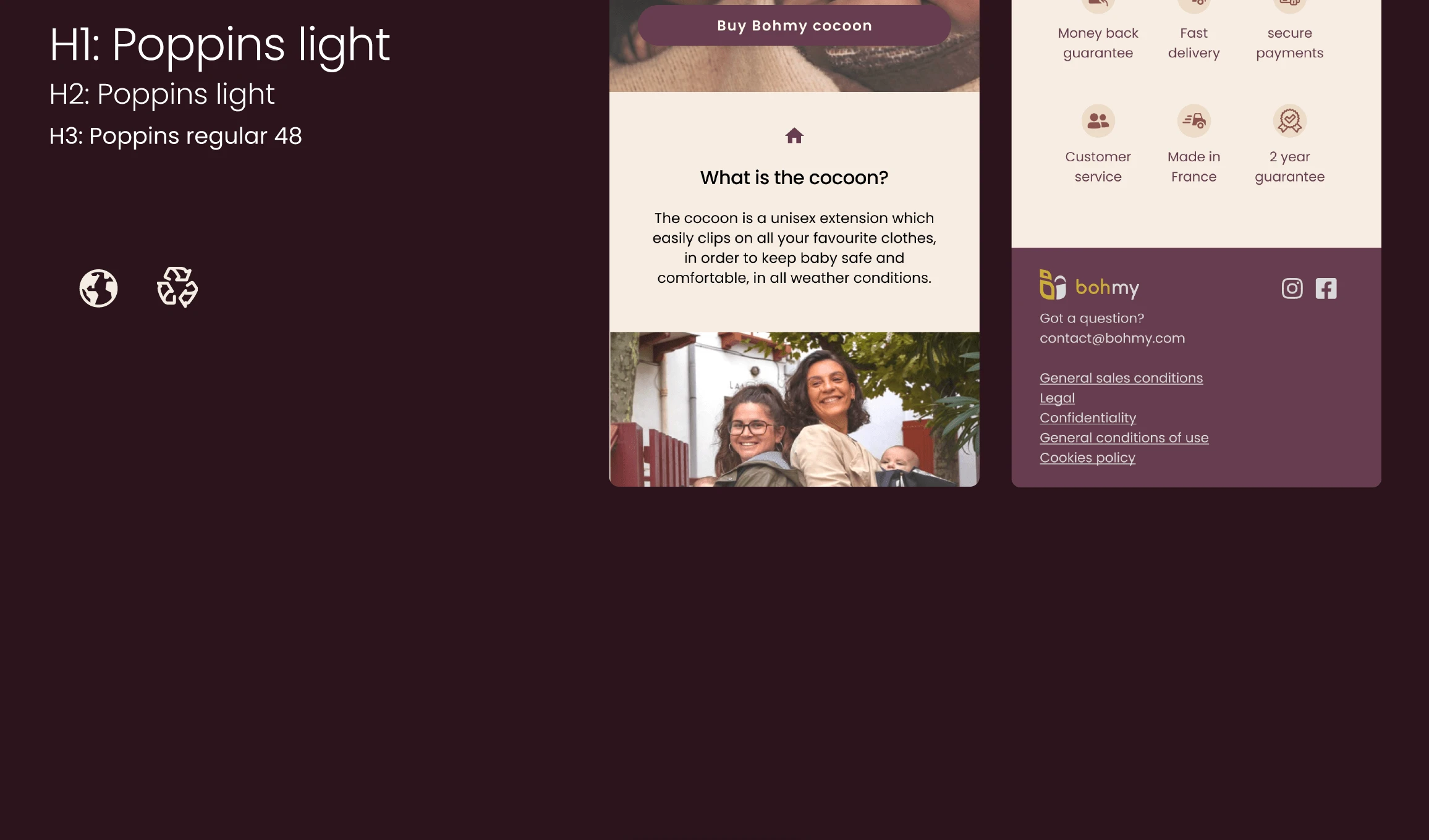
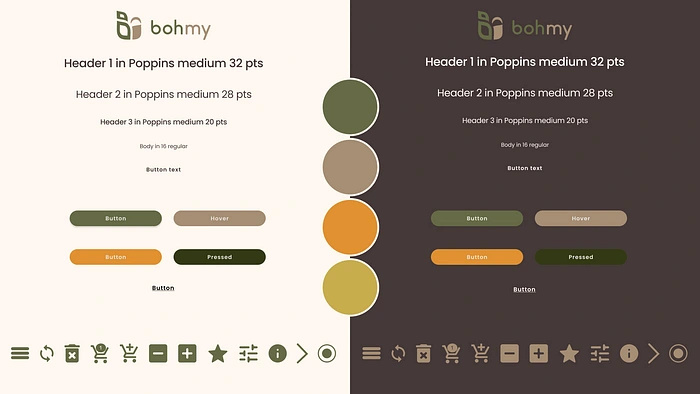
We extracted the following colours from our Moodboard as we wanted to go for a calm, cozy and reliable aesthetic. Also we wanted to evoke the connotation to sustainablity with our shade of green, and add a little playfulness with our orange accent colour. We chose Poppins for our font as it welcoming and friendly.
Style
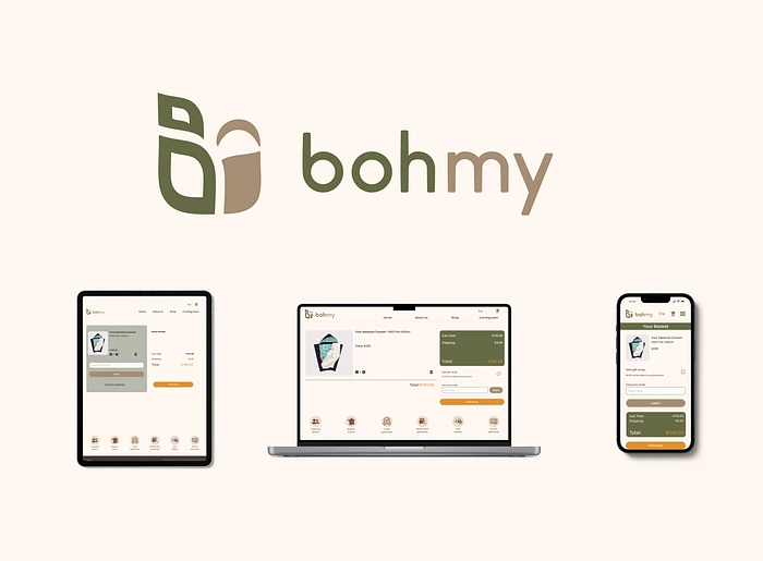
From the style tile we were able to manage our UI and design elements in a consistent fashion. Try out our prototype here:
Conclusion
I had such an amazing time with my team, and feel lucky to have learned so much in the past week.
It was especially an incredible project as we were able to work for an actual company and build a connection with our stakeholder Laure.
It was an amazing and challenging project as we followed through the entire UX design process from start to finish and learned so incredibly much in a matter of 7 days. Presenting the entire project in 8 minutes proved to be tricky since last time we needed only present the UX part, this time we had to consolidate our process and carve out sufficient time to highlight our UI part.
It was incredible to learn so much about the UI part of the process, from figma labs and micro interactions to creating beautiful designs validated through methods like desirability testing.
I feel confident to face the following challenge! Though at times the amount of new information can seem daunting, the endresults astound me and make me all the more excited to see what we can accomplish if we keep on learning and applying ourselves.
Thank you so much for reading!
See you for the next project:)
Like this project
Posted Sep 6, 2023
Dear UX enthousiasts, I’m back! This time with a juicy new case study on my second project of my Ironhack bootcamp experience. Me and my incredible team Adam Q…
Likes
0
Views
9
