UX Design of Cloud Infrastructure Monitoring Dashboard
delbueno™ Studio
Designing a complex monitoring Dashboard: The process
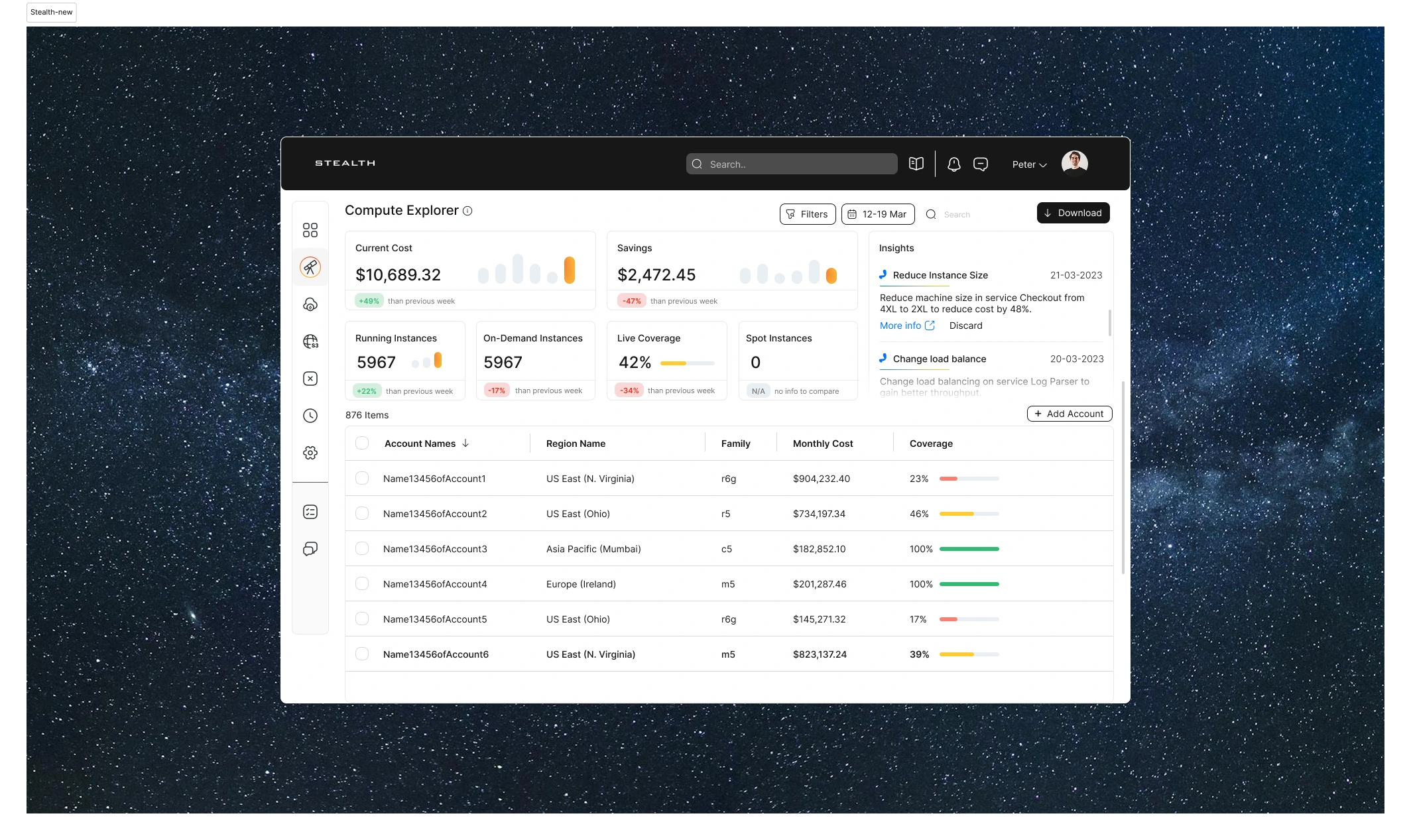
This cloud infrastructure dashboard is crafted for IT and DevOps teams managing complex environments. It delivers clarity, responsiveness, and precision to help both engineering and finance teams monitor usage, control costs, and access real-time insights through a single, intuitive interface.
The Mission
Our goal was to design a clean and scalable dashboard that supports fast decision-making, encourages cross-team collaboration, and simplifies access to essential operational and financial data.
Our Approach
We began by identifying the most frequent user actions. These included tracking infrastructure usage, analyzing system performance, monitoring expenses, and aligning engineering output with business goals.
To support this, we designed a modular layout that adapts to different user needs. The interface features high-contrast visuals for legibility, smart data grouping, and quick-access filters for deep dives. Navigation is intuitive, and every component is optimized to reduce cognitive load.
We focused on strong UX principles: clear typography, purposeful layout spacing, and real-time visualizations. Interactive charts, KPI cards, and contextual filters make insights easily accessible for DevOps, FinOps, and infrastructure teams alike.
The Result
A modern and highly functional cloud dashboard that improves visibility, speeds up workflows, and supports strategic decisions. It feels seamless to use, even in data-heavy environments. The thoughtful use of motion and micro-interactions enhances usability and keeps users engaged.
Have a UX/UI project in mind?
Let’s connect. With over ten years of experience, we’ve partnered with leading companies across cloud infrastructure, SaaS, fintech, and cybersecurity. We specialize in designing dashboards that transform complex systems into clear, usable products.
Like this project
Posted Feb 8, 2026
Designed a responsive cloud infrastructure dashboard for IT and DevOps teams.
Likes
1
Views
11