Woodland Stove Centre - Brand Identity
Alex Benn

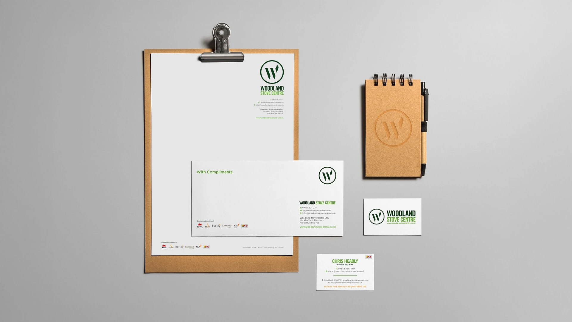
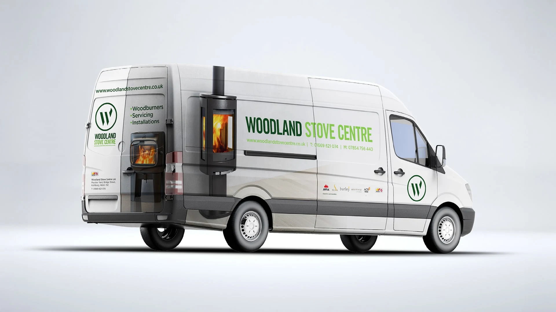
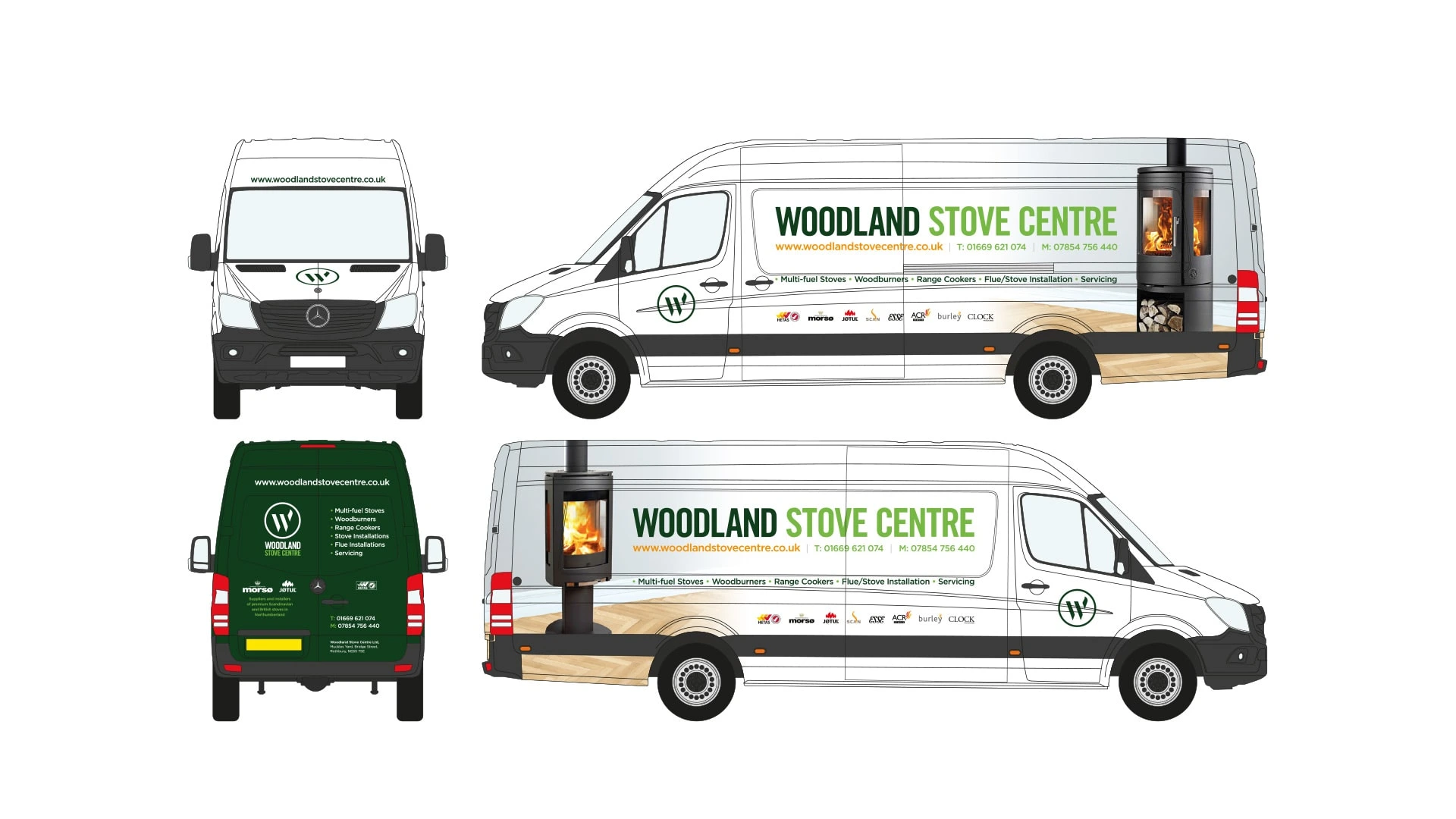
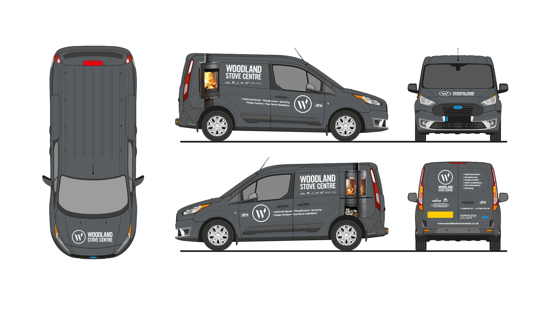
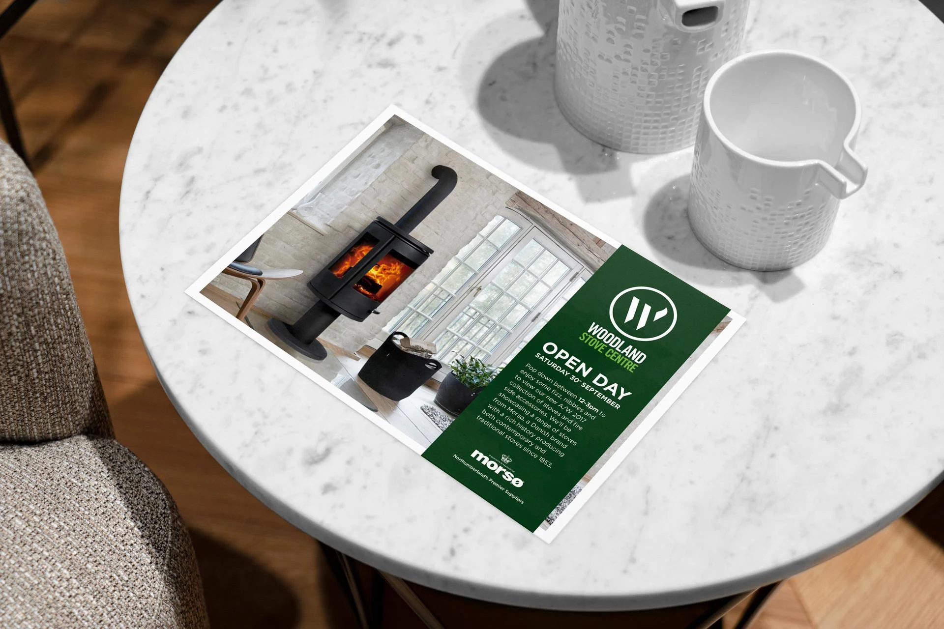
Woodland Stove Centre - Brand identity
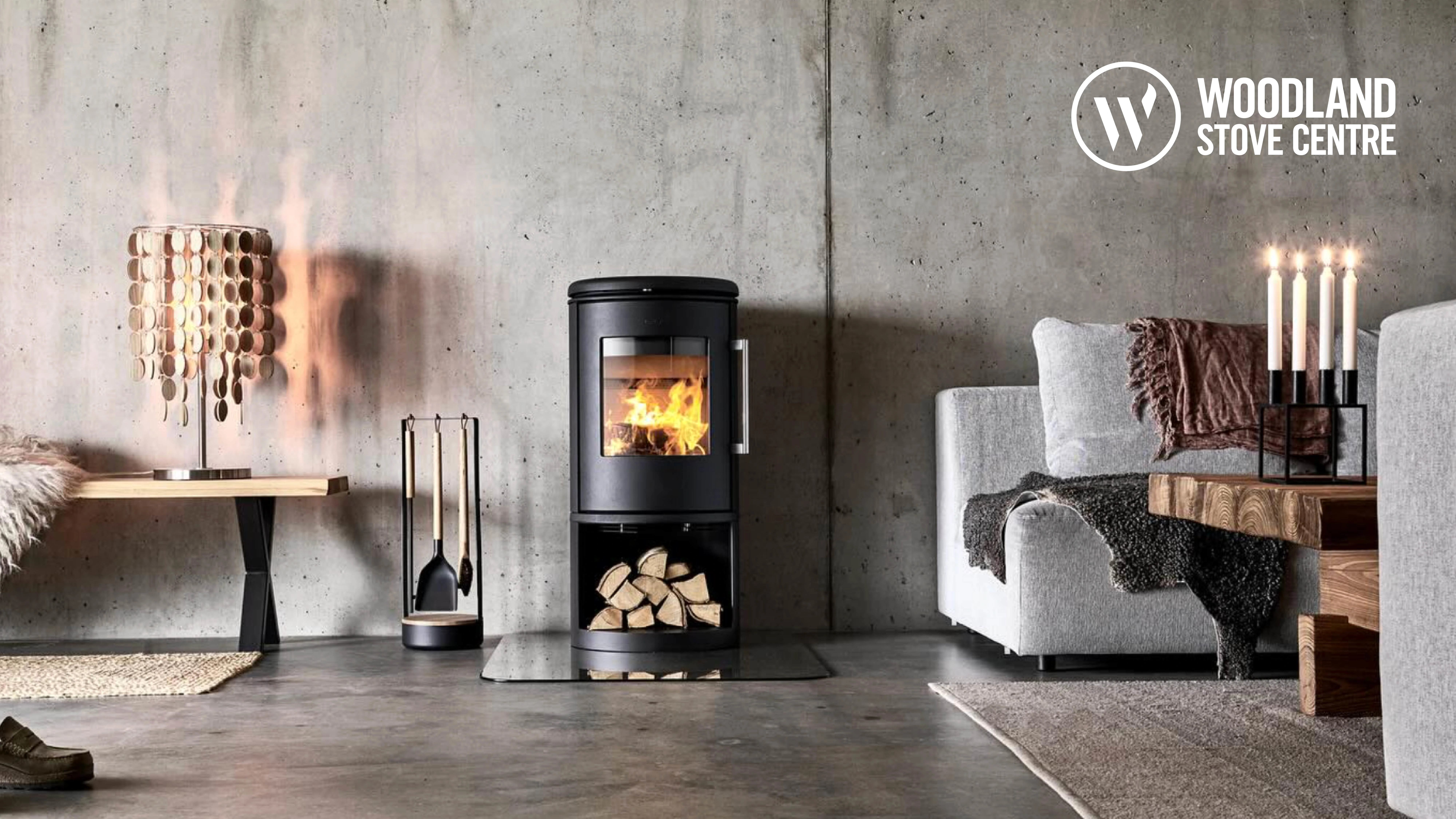
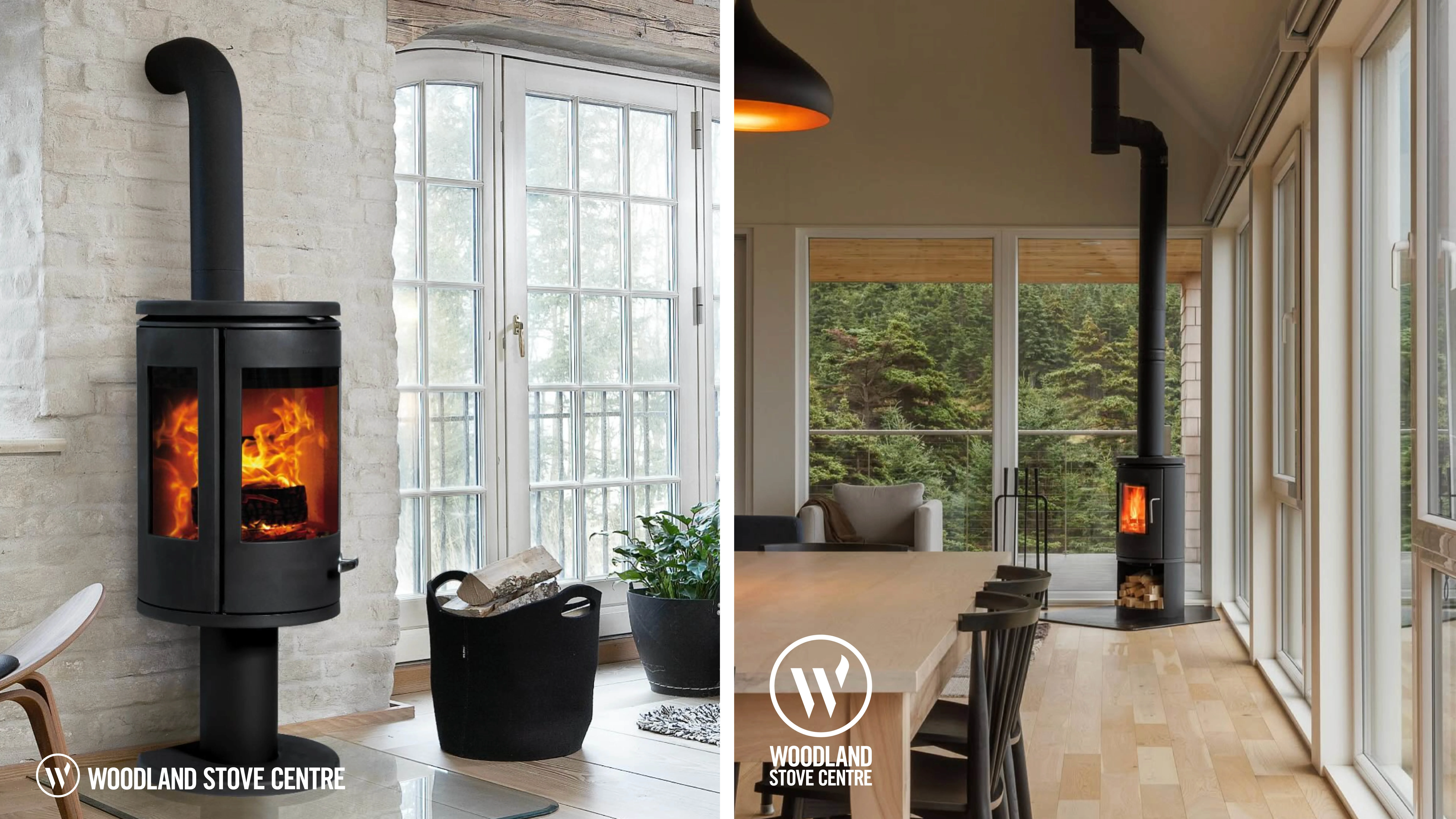
Rebranding this Northumberland based wood burning and multi-fuel stove installer. The aim was to maintain the brand equity they already had while upping the professionalism and prestige of the company as they looked to install higher end stoves from more renowned brands.
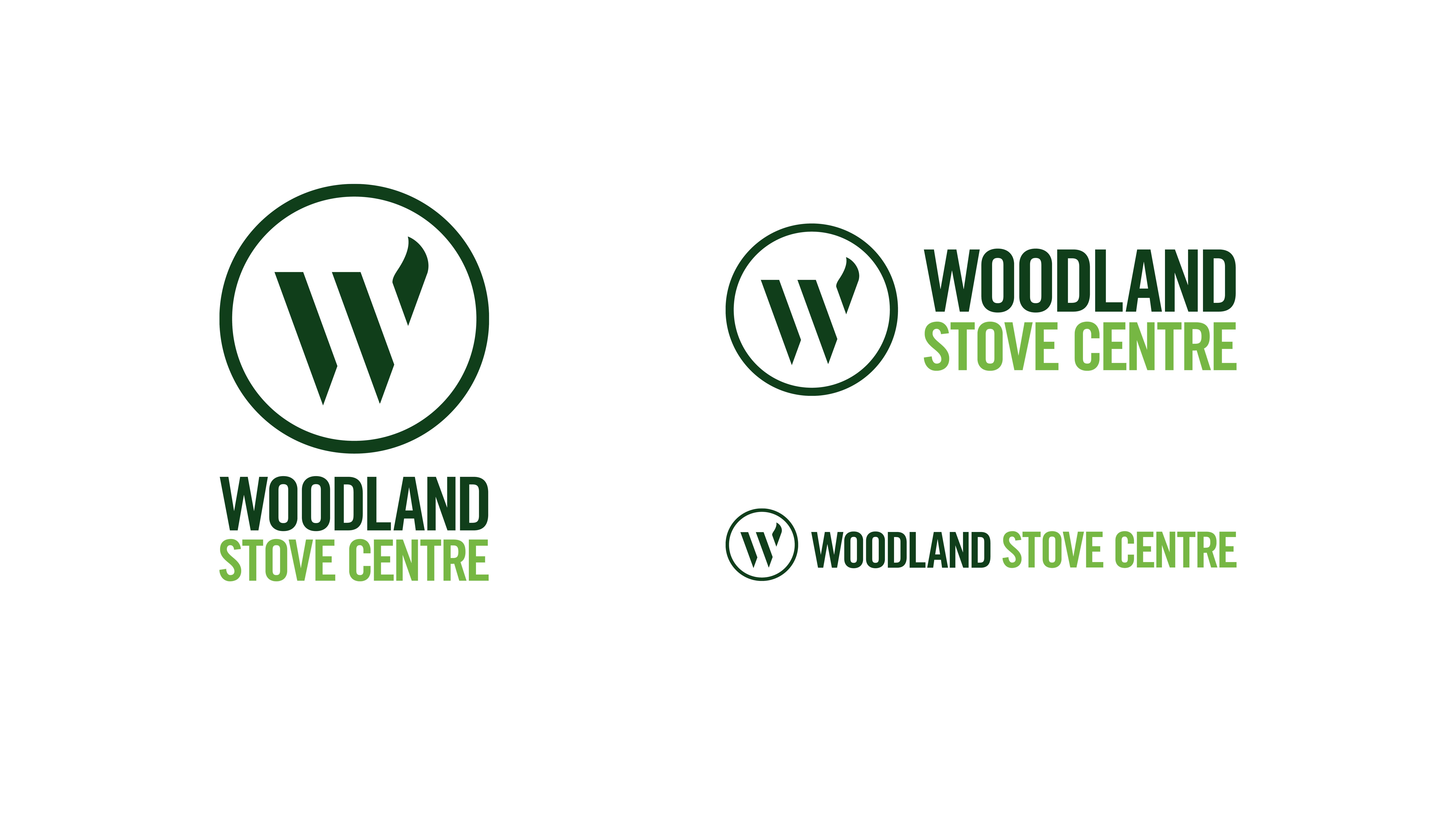
A new “W” brand mark was created which features a flame flicking off of the top right hand corner, referencing the transformation wood goes through in the stove. The simple circle shape forms a carrying device and adds solidarity to the mark. The typography as been updated and refined utilising the confidence and strength of 'Trade Gothic', while the dual greens echo the woodlands of Northumberland.
Like this project
Posted Dec 10, 2025
Rebrand this wood burning and multi-fuel stove supplier and installer based out of Northumberland.