Drift app Landing Page Design

Bilal Haider


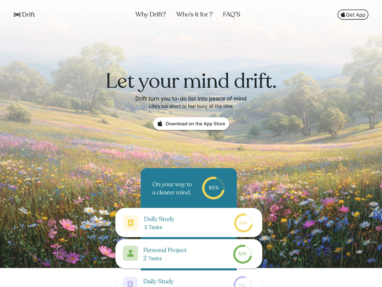
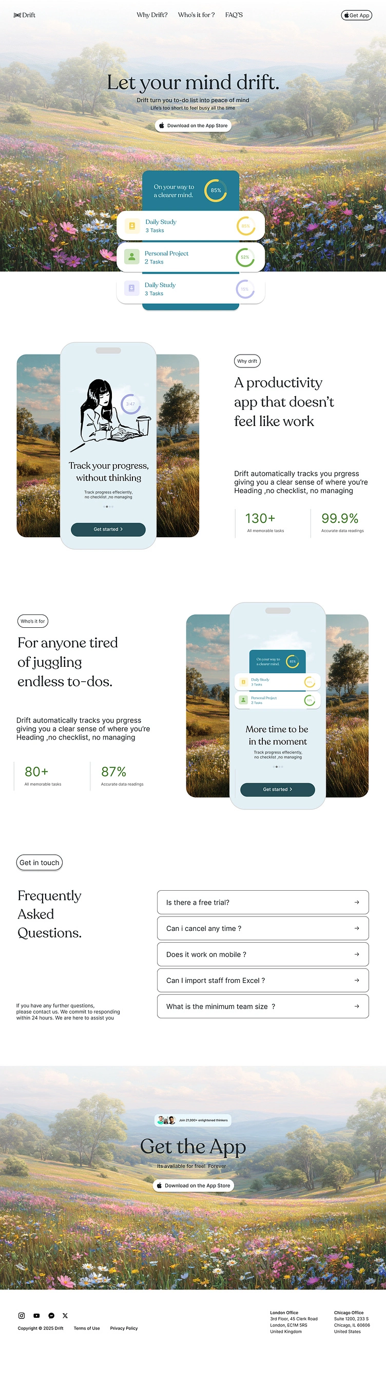
Designed the landing page for Drift — a productivity app that tracks your progress without the noise of endless checklists.
The brief was simple but the tension was real: how do you sell "peace of mind" for a to-do app without the page itself feeling like another task list?
The answer was atmosphere over structure. A soft, painterly meadow as the visual anchor across every section — hero, app showcase, closing CTA — so the page itself feels calm before a single word is read. Progress rings and task cards float on top of that softness instead of fighting it, which is really the whole pitch of the product: clarity without clutter.
A few things I focused on: → Letting whitespace and a warm serif headline do the emotional work instead of stock "hustle" visuals → Repeating the floating card/progress-ring motif from hero to app showcase to closing section, so the interface feels consistent even as the layout shifts → Keeping the FAQ and footer quiet and functional — the page earns the right to be minimal because everything above it already made the case
Full case study up soon. Would love to hear which section you'd push further.
#UIDesign #LandingPage #ProductDesign #BrandIdentity #WebDesign
Like this project