Powerhouse Pilates: Webflow Membership Website

Victor Adebayo


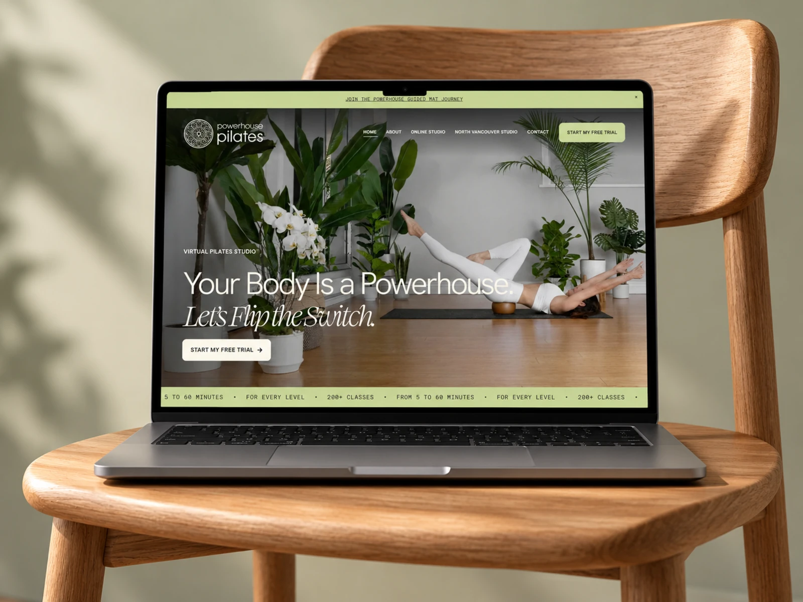
Powerhouse Pilates — Virtual Pilates & Fitness Website
Web Design · UX/UI Design · Webflow Development · Membership Experience
Project Type: Fitness / Pilates / Online Membership
Primary Objective: Position the brand as a premium Pilates experience, make class discovery easier, build instructor credibility, and convert visitors into free-trial members
Platform: Webflow
Role: Web Designer & Webflow Developer
Deliverables: UX/UI Design · Responsive Website Design · Webflow Development · Membership Landing Pages · Class Library Structure · Studio Experience · Pricing Pages · Lead Generation · Custom Interactions · SEO & Performance Optimization
1. Project Overview
Powerhouse Pilates is a Pilates and movement brand offering both an online studio and personalized in-person training in North Vancouver.
The virtual experience gives members access to an extensive library of Pilates classes covering different fitness levels, class lengths, equipment, and training styles, while the physical studio offers private and semi-private sessions with founder Jody Brouwers.
The goal of this project was to create a Webflow website that made the brand feel energetic, personal, premium, and easy to join.
Rather than designing the website like a traditional fitness membership platform, I wanted the experience to feel like Jody was speaking directly to the visitor.
The journey was structured around:
Feel Inspired → Understand the Method → Explore Classes → Build Trust → Compare Membership → Start Free Trial
2. The Challenge
Powerhouse Pilates serves two very different types of clients.
Some visitors want the flexibility of training at home.
Others want a more personalized, equipment-based Pilates experience in the physical studio.
The website therefore needed to support:
Virtual Pilates members
Complete beginners
Experienced Pilates clients
Reformer users
People training without equipment
Clients looking for strength
Clients managing pain or mobility concerns
Private studio clients
People considering recurring membership
The challenge was creating one cohesive brand experience without making these different pathways confusing.
The website also needed to communicate a large amount of content:
On-demand classes
Reformer workouts
Beginner classes
High-intensity sessions
Signature training styles
Membership pricing
Monthly challenges
Training programs
Instructor credibility
Private studio training
Testimonials
FAQs
Free trial
The main UX challenge was turning all of that into a simple message:
Whatever your starting point, there is a clear way to begin.
3. Design Strategy
I built the experience around four priorities:
Motivation → Discovery → Trust → Membership
Lead With Transformation
The homepage opens with the idea that the visitor’s body is already powerful — it simply needs the right training.
Instead of leading with a list of features, the experience focuses first on what Pilates can help someone achieve:
More strength
Better mobility
Greater confidence
Improved core stability
More consistent movement
Less discomfort
This gives the membership an emotional purpose before introducing the technical details.
Make the Instructor Part of the Product
For a training platform, the instructor is one of the biggest reasons someone joins.
I gave Jody strong visibility throughout the experience instead of hiding her story on an About page.
Her background, certifications, teaching style, and personality become part of the decision-making journey.
This helps visitors feel like they understand who they will actually be training with.
Make the Class Library Feel Flexible
The class experience needed to communicate that members are not locked into one type of workout.
Visitors can find sessions based on:
Available time
Experience level
Equipment
Training goal
Energy level
Preferred Pilates style
This makes the membership feel easier to fit into real life.
Reduce Commitment With a Free Trial
Rather than asking someone to purchase immediately, the main conversion pathway is a free trial.
This gives new visitors time to explore the platform, experience Jody’s teaching style, and decide whether the membership works for them.
The journey becomes:
Discover → Try → Build Confidence → Subscribe
4. UX/UI Design
Hero Section
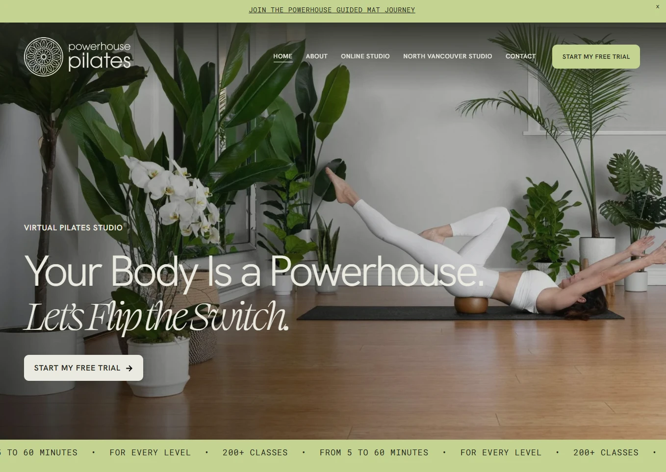
The hero was designed around a strong motivational message:
Your Body Is a Powerhouse. Let’s Flip the Switch.
The supporting content introduces the virtual Pilates experience while the primary CTA immediately gives visitors a clear action:
Start My Free Trial
This keeps the opening section focused and avoids distracting visitors with too many options.
Visual Direction
The brand needed to feel energetic without falling into the aggressive aesthetic used by many fitness websites.
I created a visual direction based around:
Strong lifestyle photography
Movement-focused imagery
Bold editorial typography
Natural studio environments
Generous spacing
Clear CTA contrast
Playful supporting copy
Clean content cards
The final experience feels motivational while still being approachable.
Typography System
The typography reflects the brand’s confident personality.
I created a clear hierarchy for:
Hero statements
Class categories
Membership benefits
Instructor messaging
Pricing
Testimonials
Training programs
CTA sections
FAQs
Large typography gives important messages energy, while supporting copy remains easy to read.
This is especially useful across longer sales pages where visitors may be scanning instead of reading every word.
Membership Experience
The membership is presented around what users actually receive rather than simply showing a subscription price.
Benefits include access to:
A large on-demand Pilates library
Classical and contemporary Pilates
Mat workouts
Reformer workouts
Stability ball sessions
Prop-based workouts
Equipment-free options
Beginner through advanced sessions
Regular new classes
Programs and challenges
This makes the value easier to understand before users reach pricing.
Signature Class Categories
One of the strongest parts of the UX is the way the class library is broken into recognizable training styles.
Core Pilates™
Focused on strengthening the body’s “powerhouse” through complete core training rather than repetitive crunch-based workouts.
Strong Pilates™
Introduces resistance work through tools such as weights, resistance bands, and the Fitness Circle.
Flow Pilates™
Combines Pilates with movement influences such as yoga, dance, mobility work, and restorative techniques.
The library also supports categories such as reformer, classical Pilates, beginner classes, and higher-intensity sessions.
Instead of presenting hundreds of videos as one overwhelming grid, these categories give members clearer entry points.
Class Discovery
The online studio needed to work for someone who knows exactly what they want and someone who has no idea where to start.
I structured the class experience around filters and guided pathways.
Members can look for classes based on factors such as:
Duration
Level
Equipment
Training style
Specific program
Goal
The platform also includes structured programs and monthly challenges for members who prefer more guidance.
This creates a stronger experience than simply giving users access to a large video library and expecting them to figure everything out themselves.
Beginner Experience
A major UX priority was making Pilates feel accessible.
The website directly communicates that beginners are welcome and provides beginner-focused classes and training pathways.
This helps remove one of the biggest barriers in fitness:
“Am I experienced enough to start?”
By answering that question early, the platform feels more inclusive.
Pricing Experience
The membership pricing needed to feel simple.
Rather than introducing several confusing tiers, the website presents two primary subscription options:
Monthly Membership
and
Annual Membership
The annual plan receives additional visual emphasis as the stronger-value option.
This keeps the choice straightforward:
Do I want flexibility or the best long-term value?
Both pathways lead back to the free-trial experience before the full commitment begins.
Instructor Positioning
The Meet Jody section is an important trust moment.
Jody’s story includes leaving a career in finance, discovering Pilates while traveling in Australia, becoming a certified STOTT PILATES® instructor, and later opening her North Vancouver studio.
Her additional NeuroKinetic Therapy® certification strengthens the positioning around movement quality, injury recovery, and pain-aware training.
Instead of presenting these qualifications as a simple credentials list, I integrated them into a personal story.
This makes the expertise easier to connect with.
Testimonials
The website uses client stories to reinforce the outcomes discussed throughout the page.
Testimonials focus on experiences such as:
Increased strength
Reduced pain
Improved confidence
Better movement
Long-term consistency
Positive instructor support
This gives visitors proof that the program works for real people with different goals.
Physical Studio Experience
The North Vancouver studio needed its own journey because private training is a very different service from the online membership.
The studio page focuses on:
Private classes
Semi-private classes
Personalized programming
60-minute sessions
Reformer training
Cadillac
Stability Chair
Ladder Barrel
Training props
Because the in-person studio currently operates with limited availability, the website uses a waitlist journey while also providing the virtual membership as an immediate alternative.
This creates a smart conversion path:
Studio Full → Join Waitlist → Start Online Now
Rather than losing the lead entirely.
Studio Equipment Presentation
Pilates equipment can be unfamiliar to new visitors.
Instead of simply listing equipment names, the website explains what each piece helps with.
For example:
Reformer
Strength, stability, and flexibility.
Cadillac
Core control, mobility, and movement variety.
Stability Chair
Balance, stability, and lower-body strength.
Ladder Barrel
Core strength, spinal mobility, and balance.
This makes the equipment feel useful rather than intimidating.
FAQ Experience
The online studio includes practical FAQs covering:
How to join
Beginner suitability
Equipment requirements
Membership access
Cancellation
Free trial
Class length
Mobile access
Smart TV access
Search and filtering
Challenges and programs
Customer support
I treated this as an important conversion tool rather than simply a support page.
The FAQ removes objections immediately before someone joins.
Responsive Experience
Mobile usability was especially important because online fitness content is often discovered and consumed from phones and tablets.
I optimized:
Navigation
Free-trial CTAs
Class cards
Pricing
Video layouts
Instructor content
Testimonials
FAQ sections
Studio content
Membership pages
Login pathways
The online studio itself is also designed to work across phones and tablets, with users able to access classes from different devices.
5. Website Architecture
The architecture was designed around both membership conversion and existing-member access.
Homepage
The homepage handles the main sales journey:
Hero → Membership Benefits → Class Categories → Library → Testimonials → Pricing → Instructor → Final Free-Trial CTA

About
Provides deeper context around the Powerhouse philosophy, Jody’s story, qualifications, and the outcomes Pilates can support.
Online Studio
Acts as the main training environment for members.
Users can search, filter, follow training plans, access challenges, and explore the class library.
Reformer Classes
Provides a dedicated pathway for members interested specifically in Reformer training.
Beginner Classes
Creates a low-pressure entry point for people starting Pilates for the first time.
High-Intensity Classes
Supports users who want more demanding Pilates sessions.
Physical Studio
Provides information about private and semi-private training in North Vancouver.
Because studio availability is limited, the primary action is to join the waitlist.
Monthly Membership
Creates a dedicated checkout pathway for members choosing a flexible monthly subscription.
Annual Membership
Provides a dedicated pathway for users choosing the longer-term membership option.
Login / Member Access
Returning members can move directly into the video library without navigating through the full marketing journey.
6. Webflow Development
Once the UX structure and visual system were established, I translated the marketing experience into a responsive Webflow build.
The focus was creating a front-end experience that felt highly customized while still supporting membership, video content, and ongoing updates.
Key development work included:
Responsive Webflow development
Reusable marketing sections
Membership landing pages
Class-category templates
Responsive navigation
Member login pathways
Pricing components
Free-trial CTAs
Studio waitlist forms
Testimonial components
FAQ interactions
Video embeds
Responsive media layouts
Custom hover states
Scroll interactions
Clean class architecture
Responsive typography
Optimized imagery
Semantic heading structure
SEO-conscious page architecture
Accessibility-conscious UI states
Performance optimization
Cross-browser testing
Cross-device testing
The structure was designed so new programs, class categories, promotions, and membership campaigns could be introduced without redesigning the entire site.
7. Design & Development Process
Research → UX Structure → Wireframes → UI Design → Design System → Webflow Development → Membership Integration → Responsive Optimization → Testing → Launch
Research
I started by understanding the two sides of the Powerhouse brand:
Virtual membership
and
private studio training.
I also reviewed the customer journey for beginners, experienced Pilates users, reformer clients, and people looking for pain-aware or strength-focused movement.
The main question was:
How do we make an online Pilates membership feel personal rather than like another video subscription?
UX Structure
I organized the experience around:
What will this help me achieve? → What classes can I take? → Will it work for my level? → Who is teaching me? → What does membership cost? → Can I try it first?
This became the foundation of the marketing site.
Wireframes
The wireframes focused on:
Hero messaging
Membership value
Class categories
Video library
Testimonials
Pricing
Instructor story
Studio pathway
Free-trial conversion
The goal was to make the value of the membership obvious before adding the full visual personality.
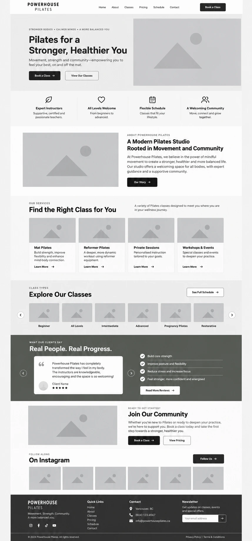
UI Design
The wireframes were transformed into a confident, energetic fitness interface.
The design combines bold messaging, real movement photography, clean layouts, and playful copy.
Instead of making the website feel overly serious, the interface reflects Jody’s more encouraging and personality-driven coaching style.
Design System
Reusable styles were created for:
Typography
Brand colors
Buttons
Class cards
Pricing cards
Testimonials
Instructor sections
Studio sections
Forms
FAQs
Navigation
CTA blocks
Responsive spacing
This keeps the marketing site consistent as new pages and campaigns are introduced.
Webflow Development
The approved interface was translated into modular Webflow components.
The marketing layer was kept flexible so content could evolve alongside the virtual studio.
Membership Integration
The website connects the marketing experience to membership registration, login, and the online training environment.
This keeps two responsibilities clear:
Webflow:
Brand, discovery, trust, and conversion.
Member experience:
Class access, search, programs, challenges, and ongoing training.
Responsive Optimization
Each important section was refined across desktop, tablet, and mobile.
Special attention was given to:
Class cards
Video imagery
Pricing
Membership CTAs
Instructor sections
Studio equipment
Long testimonials
Navigation
The goal was to keep the energetic visual identity intact regardless of screen size.
Testing
Before launch, I reviewed:
Navigation
Free-trial links
Subscription pathways
Login links
Video embeds
Class-category links
Studio waitlist
FAQs
Responsive layouts
Browser consistency
Launch
The final stage focused on usability, accessibility, performance, responsive behavior, SEO foundations, and making sure every high-intent visitor had a clear pathway toward the free trial.

8. Key Features
Custom Webflow fitness website
Virtual Pilates membership
Free-trial conversion journey
Extensive on-demand class library
Beginner-friendly positioning
Reformer class pathway
High-intensity Pilates content
Core Pilates™
Strong Pilates™
Flow Pilates™
Monthly and annual memberships
Monthly challenges
Guided training programs
Instructor-led brand experience
Private studio pathway
Studio waitlist
Equipment education
Client testimonials
FAQ and troubleshooting content
Member login access
Mobile-friendly training experience
Responsive Webflow components
Custom interactions
SEO-conscious structure
Accessibility considerations
Performance optimization
9. Final Result
The final Powerhouse Pilates website turns a large online class library and highly personal coaching brand into a clear, motivating, and conversion-focused digital experience.
Visitors immediately understand that Powerhouse is not simply another collection of workout videos.
The website introduces a recognizable instructor, a clear training philosophy, different class styles, flexible membership options, and a structured online environment designed for people at different fitness levels.
Class categories make the library feel easier to navigate, while the instructor story and client testimonials add the personal connection that can often be missing from online fitness platforms.
The free-trial journey also lowers the barrier to entry, allowing visitors to experience the teaching style before committing to a membership.
For local clients, the North Vancouver studio creates a premium private-training pathway, while the virtual membership ensures people can start immediately even when physical studio availability is limited.
The result is a modern, personality-driven Webflow website that combines fitness motivation, instructor credibility, class discovery, membership conversion, and responsive design, giving Powerhouse Pilates a digital experience that feels as personal and energetic as the training itself.
Like this project
Posted Oct 23, 2026
A Webflow membership website for Powerhouse Pilates, designed to make class discovery, instructor trust, pricing, and free-trial sign-up feel clear across virtual and in-studio training paths.
Likes
6
Views
8
Clients
Powerhouse Pilates