Mind Your Business Radio: Content-First Webflow Redesign

Victor Adebayo


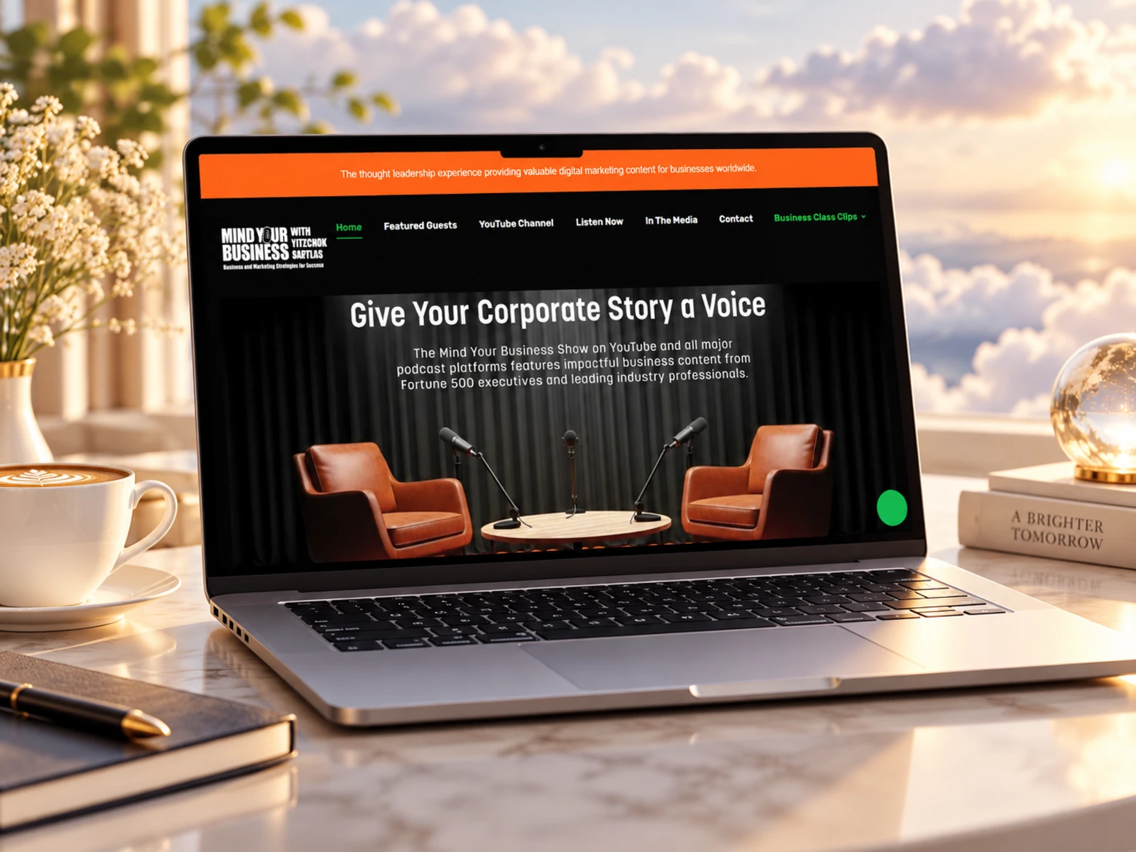
Mind Your Business Radio — Business Podcast & Media Website
Web Design · UX/UI Design · Webflow Development · Podcast CMS
Project Type: Media / Business Podcast / Thought Leadership
Primary Objective: Showcase expert conversations, make episode discovery easier, strengthen the show’s credibility, and generate guest and partnership opportunities
Platform: Webflow
Role: Web Designer & Webflow Developer
Deliverables: UX/UI Design · Responsive Website Design · Webflow Development · Podcast CMS · Episode Pages · Guest Presentation · Media Integration · Lead Generation · Blog CMS · SEO & Performance Optimization
1. Project Overview
Mind Your Business with Yitzchok Saftlas is a business-focused radio and podcast show built around conversations with entrepreneurs, executives, consultants, financial professionals, real estate leaders, and other industry experts.
The platform gives business leaders an opportunity to share their expertise while providing listeners with practical conversations around leadership, growth, marketing, finance, decision-making, and entrepreneurship.
The show is hosted by Yitzchok Saftlas, founder and president of Bottom Line Marketing Group, and is distributed through radio, podcast, video, and digital-media channels.
The goal of this project was to create a Webflow website that could bring all of those content formats into one clear digital experience.
Rather than designing the site like a traditional radio station, I focused on building a content-driven thought-leadership platform where visitors could:
Discover the Show → Explore Episodes → Learn About Guests → Build Trust → Listen or Watch → Become a Guest or Partner
2. The Challenge
Podcast and media websites often have one major problem:
there is a lot of content, but very little structure.
With hundreds of episodes, different industries, guest profiles, audio, video, articles, media coverage, testimonials, and partnership opportunities, the experience could easily become difficult to navigate.
Mind Your Business also serves more than one audience.
The website needs to work for:
Regular listeners
Business owners
Entrepreneurs
Executives
Potential guests
Sponsors and partners
People discovering an individual guest through search
Visitors looking for business education
Media and event partners
The website therefore needed to:
Communicate the show’s purpose immediately
Make recent episodes easy to discover
Handle a growing library of content
Give individual guests strong visibility
Establish credibility around the host and show
Integrate audio and video platforms
Surface recognizable past guests
Showcase guest feedback
Support partnership enquiries
Make long-form episode information easier to scan
Create a strong mobile listening experience
Support organic search through episodes and editorial content
The core challenge was turning a large media archive into an experience that felt current, organized, credible, and easy to explore.
3. Design Strategy
I structured the experience around four priorities:
Discover → Listen → Trust → Connect
Put the Content First
The episodes are the product.
Instead of making visitors move through a long company introduction before seeing the show, I brought recent conversations forward.
Episode titles, guest names, short descriptions, dates, and runtime information help visitors decide quickly whether a conversation is relevant to them.
Make Thought Leadership Feel Credible
The website needed to communicate that this is more than a casual interview podcast.
The experience reinforces credibility through:
Recognizable business guests
Host background
Guest testimonials
Radio and media distribution
Consistent episode publishing
Business-focused topics
Long-form conversations
This helps new visitors understand the authority behind the content before committing to an hour-long episode.
Create Two Conversion Journeys
There are two main forms of conversion.
Audience Conversion
Listen, watch, subscribe, or explore another episode.
Business Conversion
Become a guest, discuss a partnership, or connect with the show.
I kept these pathways distinct so promotional CTAs never interfere with the listening experience.
Build for a Growing Archive
A media website needs to become more useful as more content is published.
The Webflow CMS structure was therefore designed around reusable episode, guest, and editorial content rather than manually building each new page.
This creates a scalable foundation for an expanding show library.
4. UX/UI Design
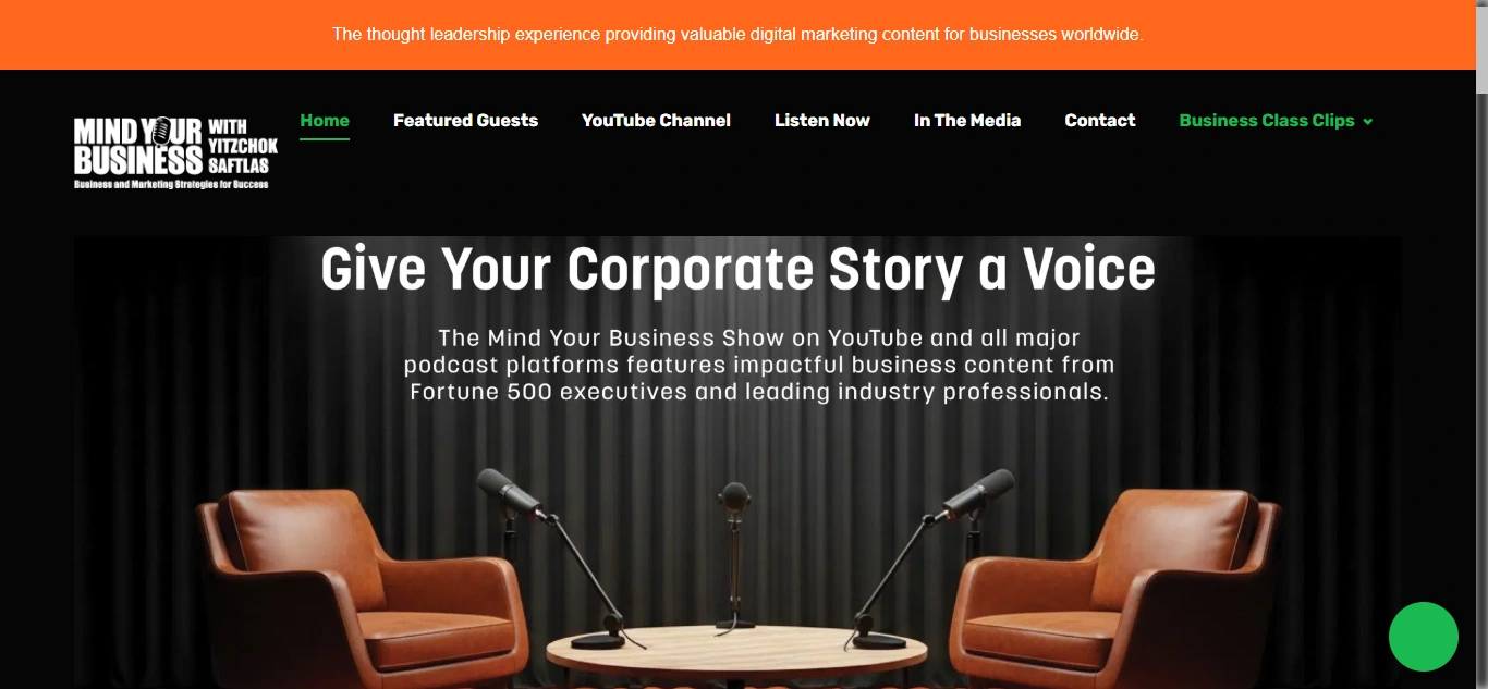
Hero Section
The hero needed to communicate exactly what the show offers.
The messaging positions Mind Your Business as a business podcast for experts, by experts, giving leaders a platform to share their experience and providing audiences with practical business conversations.
The primary experience then moves quickly into the content.
Rather than filling the top of the website with unnecessary marketing copy, the design encourages visitors to start exploring episodes.
Visual Direction
The visual system needed to feel professional enough for senior business guests while still feeling like a modern media platform.
I focused on:
Strong editorial typography
Professional guest imagery
Clear episode cards
Structured content spacing
High-contrast CTAs
Media-focused layouts
Restrained animation
Consistent content components
The design avoids looking overly corporate while maintaining the credibility expected from a business-focused program.
Typography System
Typography plays an important role because episode titles can be long and descriptive.
I created a hierarchy for:
Hero messaging
Episode numbers
Episode titles
Guest names
Dates
Runtime
Article headlines
Host information
Testimonials
Calls-to-action
The goal was to make even content-heavy sections easy to scan.
Episode Discovery
The homepage highlights recent episodes in a structured feed.
Each episode can communicate important information such as:
Episode number
Title
Guest
Publication date
Runtime
Description
Audio or media pathway
Recent discussions cover topics ranging from client growth and financial strategy to healthcare models, leadership, sales, banking, and company building.
Instead of forcing users to read every description, I designed the card hierarchy so titles and guests can be scanned quickly.
Episode Detail Experience
Individual episode pages provide enough context for visitors coming directly from Google, social media, or a guest’s network.
The structure can include:
Episode title
Episode number
Guest name and company
Publication date
Audio player
Video embed
Episode description
Key discussion topics
Guest information
Related episodes
Social sharing
Subscription CTA
This turns each episode into its own searchable content asset instead of treating it as a simple audio file.
Guest Presentation
Guests are central to the brand.
The website showcases experts across sectors including finance, banking, consulting, real estate, leadership, professional services, and entrepreneurship.
I gave guest names and imagery enough visual prominence so audiences can browse based on the person as well as the topic.
This also improves the value of appearing on the show for guests because their participation receives a stronger digital presentation.
Host Credibility
The host section introduces Yitzchok Saftlas and his background as a marketing executive, author, columnist, and radio host.
The website connects his professional experience with the quality of the conversations rather than making the biography feel disconnected from the show.
This section answers an important question for new visitors and potential guests:
Who is leading these conversations?
Guest Feedback
One of the strongest trust elements is feedback from past guests.
The live site includes comments from business leaders, authors, consultants, and executives describing both the quality of the interviews and the response they received after appearing on the program.
I treated these testimonials as more than decorative social proof.
They demonstrate two benefits simultaneously:
Audience benefit: thoughtful, well-led conversations.
Guest benefit: professional exposure and useful engagement.
Listen & Watch Experience
The show exists across multiple channels, including radio, podcast audio, YouTube, and other media platforms.
I structured the website as the central hub rather than trying to replace those distribution platforms.
Visitors can discover the content on the website and then choose how they want to consume it.
This keeps the site focused on discovery, credibility, and connection while external platforms handle streaming and subscription behavior.
Editorial / Blog Content
The blog extends conversations beyond the audio episodes.
Content includes business lessons, negotiation insights, leadership discussions, real estate conversations, and expanded material from previous interviews.
From a UX perspective, this creates another entry point for visitors who prefer reading.
From an SEO perspective, it gives important topics and guest conversations additional searchable content beyond podcast metadata.
Partnership Experience
The site also functions as a business-development tool.
Potential partners and guests can move from consuming the show into contacting the team about sharing their expertise or discussing partnership opportunities.
I kept this pathway separate from the main episode feed so it feels intentional rather than intrusive.
Responsive Experience
Mobile optimization was especially important because podcast discovery frequently happens on phones.
I focused on:
Simplified navigation
Readable episode titles
Touch-friendly episode cards
Responsive audio embeds
Video scaling
Clear guest information
Large listen/watch CTAs
Easy contact access
Responsive testimonials
Clean content stacking
The goal was to make it easy for someone to discover an episode and start listening without fighting the interface.
5. Website Architecture
The architecture was designed around content discovery while keeping business opportunities accessible.
Homepage
The homepage acts as the main media hub.
The journey includes:
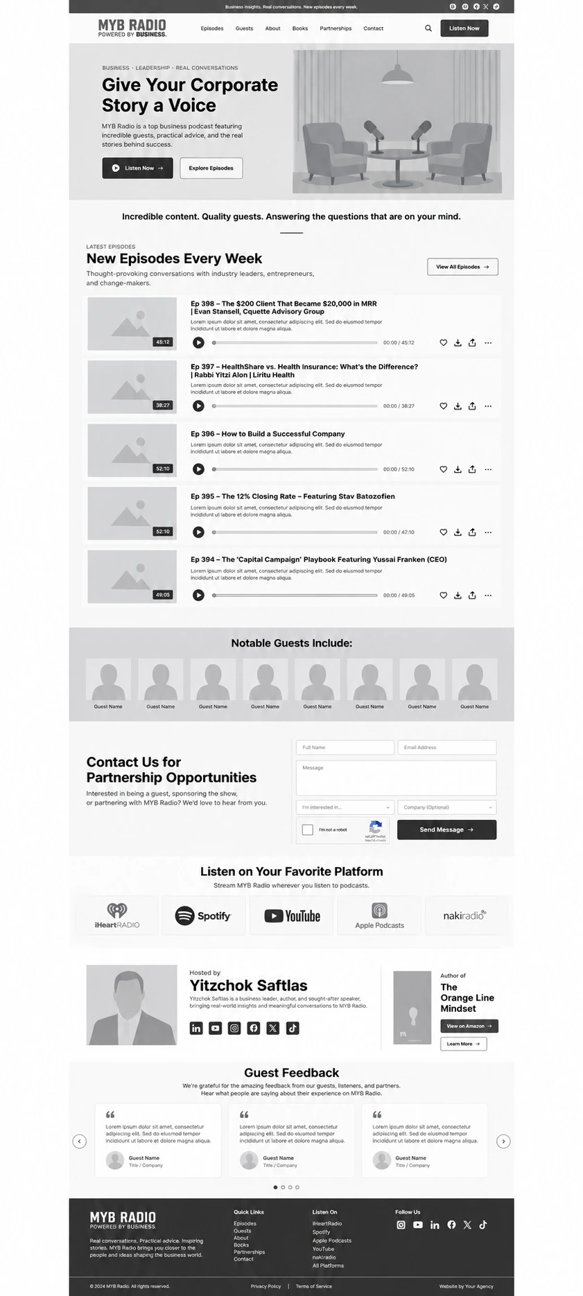
Show Positioning → Recent Episodes → Notable Guests → Distribution → Host → Guest Feedback → Partnership CTA
Episode Library
The episode archive provides a scalable way to browse past and current conversations.
Episodes can be sorted or organized around topics, dates, industries, or guests as the library grows.
Individual Episodes
Each episode receives a dedicated content experience for audio, descriptions, guest information, supporting content, and related episodes.
Featured Guests
Provides a more visual way to discover the business leaders and experts who have appeared on the show.
Visitors interested in a specific person can move directly into relevant conversations.
Listen Live
Connects visitors to the program’s live radio distribution, extending the website beyond on-demand podcast content.
YouTube / Video
Provides a route to the show’s video content for visitors who prefer watching the conversations.
Blog / In the Media
The editorial section extends the life of episode topics with written business content and interview-based articles.
About the Host
Provides deeper context around Yitzchok Saftlas, his background, professional work, and thought-leadership experience.
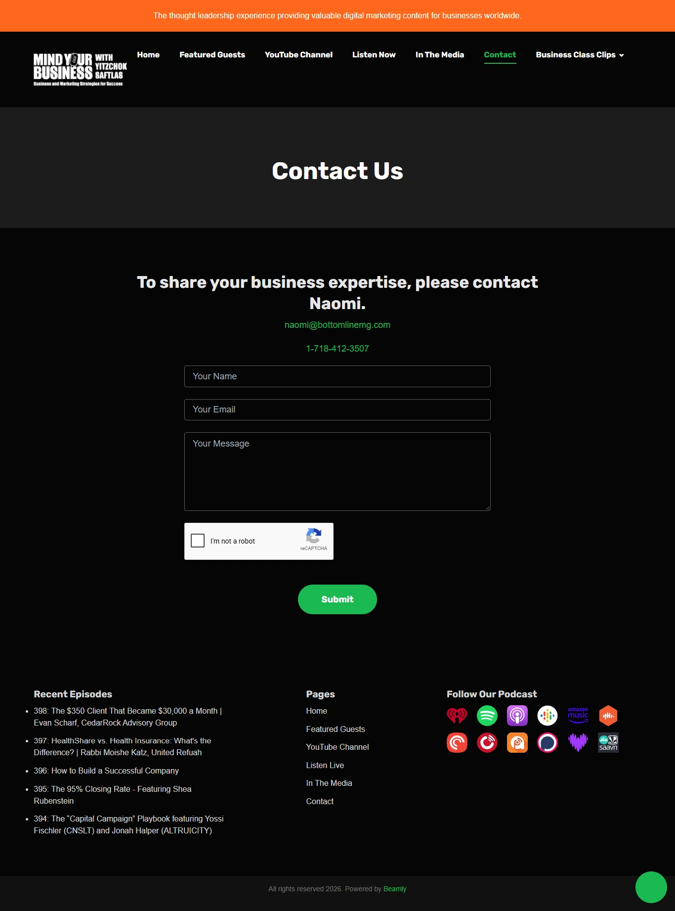
Contact / Partnerships
Creates the main conversion pathway for potential guests, experts, sponsors, and partners interested in working with the show.
6. Webflow Development
Once the UX structure and visual direction were established, I translated the project into a responsive Webflow build.
The development focused heavily on scalability because the website needs to support an ongoing stream of episodes and editorial content.
Key development areas included:
Responsive Webflow development
Webflow CMS
CMS-powered episode collection
Guest CMS structure
Blog CMS
Reusable episode cards
Episode detail templates
Audio player integration
Video embeds
External podcast-platform integration
YouTube integration
Radio/listen-live links
Testimonial components
Host-profile components
Related episode sections
Partnership contact forms
Responsive navigation
Search-friendly content structure
Custom hover states
Subtle scroll interactions
Responsive imagery
Clean class structure
Semantic heading hierarchy
SEO-friendly episode metadata
Open Graph setup
Accessibility-conscious interactions
Performance optimization
Cross-browser testing
Cross-device testing
The CMS structure makes it possible to publish a new episode without manually rebuilding the page layout each time.
7. Design & Development Process
Research → Content Strategy → UX Structure → Wireframes → UI Design → Design System → Webflow Development → CMS Setup → Responsive Optimization → Testing → Launch
Research
I started by understanding the show’s audiences, episode formats, media channels, host positioning, guest value proposition, and partnership goals.
The key question was:
How do we make hundreds of hours of business conversations feel easy to discover rather than overwhelming?
Content Strategy
I separated the content into three levels:
Current Content
Recent episodes and new conversations.
Credibility Content
Guests, host background, testimonials, and media presence.
Business Content
Guest opportunities, partnerships, and contact.
This prevents everything from competing for attention at once.
UX Structure
The user journey was built around a few simple questions:
What is this show? → Is there an episode relevant to me? → Who has appeared here? → Can I trust the content? → Where can I listen or watch? → How can I get involved?
This became the foundation of the navigation and homepage.
Wireframes
The wireframes focused on:
Hero positioning
Episode-card hierarchy
Episode feed
Guest presentation
Host credibility
Testimonials
Distribution links
Editorial content
Partnership CTAs
The goal was to solve content discovery first before introducing detailed visual styling.
UI Design
The wireframes were transformed into a clean editorial media experience.
Rather than relying on heavy decorative elements, I used typography, guest photography, spacing, and strong content hierarchy to create visual interest.
The interface supports the content rather than competing with it.
Design System
Reusable design rules were created for:
Typography
Buttons
Episode cards
Guest cards
Media embeds
Testimonial blocks
Blog cards
Host sections
Forms
Navigation
Tags
Metadata
Section spacing
Responsive behavior
This creates consistency across a large and continually growing content library.
Webflow Development
The approved UI was translated into modular Webflow components.
The build was structured so new episodes, guests, testimonials, and articles could be introduced without redesigning the website.
CMS Setup
The CMS architecture provides collections for content such as:
Episodes
Guests
Blog articles
Testimonials
Media features
Relationships between collections can support features such as:
Guest → All Episodes Featuring That Guest
or
Episode → Related Guest Information
This creates a more connected content experience as the archive grows.
Responsive Optimization
Every major content type was tested and refined across desktop, tablet, and mobile.
Special attention was given to:
Long episode titles
Media players
Guest imagery
Episode metadata
Testimonials
Navigation
Contact CTAs
This ensures the site remains comfortable to browse even with information-heavy content.
Testing
Before launch, I reviewed:
Navigation
Episode links
Audio playback
Video embeds
External media links
CMS templates
Blog articles
Forms
Testimonials
Mobile layouts
Browser compatibility
Content hierarchy
Launch
The final stage focused on page performance, media optimization, accessibility, SEO foundations, responsive consistency, and making sure new content could be published efficiently.
8. Key Features
Custom Webflow media website
Business podcast positioning
CMS-powered episode library
Individual episode pages
Episode numbering and metadata
Audio player integration
Video / YouTube integration
Listen-live pathway
Guest profiles
Notable guest showcase
Host biography
Guest testimonials
Podcast-platform links
Business blog
Written interview content
Related episode discovery
Partnership opportunities
Guest enquiry pathway
Contact forms
Reusable Webflow components
Responsive media embeds
Mobile-friendly episode discovery
SEO-focused episode structure
Open Graph optimization
Performance-conscious media loading
Cross-device responsive design
9. Final Result
The final Mind Your Business Radio website transforms a large collection of interviews, business insights, and media appearances into a clear, credible, and scalable thought-leadership platform.
Instead of making visitors search through an unstructured archive, the experience brings recent conversations forward, gives guests strong visibility, and makes episode information easy to scan.
The website also communicates the credibility behind the program through the host’s background, established guests, media distribution, and extensive guest feedback.

For listeners, the journey is simple:
discover a conversation → understand what it covers → listen or watch → explore more.
For business leaders, the website creates another journey:
discover the platform → evaluate its credibility → understand the guest experience → start a conversation about appearing on the show or partnering with it.
The Webflow CMS gives the project a scalable foundation for future episodes, guests, articles, testimonials, and media content without sacrificing design consistency.
The result is a professional, content-first Webflow website that turns Mind Your Business from a radio program into a complete digital media platform, giving business audiences an easier way to discover valuable conversations while creating a stronger platform for experts who want their ideas to be heard.
Like this project
Posted Oct 15, 2026
A content-first Webflow media platform for Mind Your Business Radio, built to make episodes, guests, and business insights easier to discover while supporting guest and partnership enquiries.
Likes
3
Views
2