Pure Flow Pilates Website Redesign

Victor Adebayo


Pure Flow Pilates — Fitness & Wellness Website
Web Design · UX/UI Design · Webflow Development · Booking Experience
Project Type: Pilates / Fitness / Wellness Studio
Primary Objective: Build trust, showcase classes and studio experience, simplify booking, and convert first-time visitors into members
Platform: Webflow
Role: Web Designer & Webflow Developer
Deliverables: UX/UI Design · Responsive Website Design · Webflow Development · Class & Service Pages · Pricing Experience · Schedule Integration · Booking Flow · CMS Blog · Custom Interactions · SEO & Performance Optimization
1. Project Overview
Pure Flow Pilates is a San Francisco-based Pilates and movement studio focused on helping people build strength, improve alignment, move with confidence, and feel better through mindful practice.
The studio offers a mix of classes, private appointments, courses, memberships, and an introductory offer designed to make it easier for new clients to experience the studio before making a larger commitment.
The goal of this project was to create a website that felt calm, welcoming, premium, and easy to use.
Rather than designing the experience like a typical fitness website filled with aggressive messaging, I wanted the interface to reflect the studio itself: intentional, supportive, and focused on progress rather than pressure.
The customer journey became:
Discover the Studio → Explore Services → Build Confidence → Check the Schedule → Choose a Plan → Book
2. The Challenge
Pilates studios need to communicate more than classes.
For a first-time visitor, there can be a lot of uncertainty:
Is Pilates suitable for beginners?
Which class should I choose?
What equipment do I need?
What should I wear?
How much does it cost?
Can I book online?
What is the studio atmosphere like?
Will I feel comfortable if I’m new?
Are private sessions available?
What happens if I need to cancel?
Pure Flow also offers multiple ways to engage with the studio, including classes, appointments, courses, memberships, and an introductory package.
The website therefore needed to:
Make the studio feel welcoming immediately
Explain services clearly
Reduce anxiety for beginners
Present pricing and introductory offers simply
Make scheduling and booking easy
Highlight the studio environment and amenities
Build trust through reviews
Communicate the sense of community
Support mobile booking
Keep the experience visually calm without becoming too minimal
The central challenge was balancing wellness-focused branding with a clear conversion journey.
3. Design Strategy
I structured the website around four priorities:
Welcome → Explore → Trust → Book
Make New Visitors Feel Comfortable
The opening experience focuses on accessibility rather than exclusivity.
Instead of making Pilates feel intimidating or only suited to experienced members, the messaging invites new visitors to explore the studio and find classes that match their body, schedule, and goals.
This was important because the first emotional barrier is often not price.
It is:
“Will I feel like I belong here?”
Use the Intro Offer as the Main Conversion Tool
The website promotes a new-client package of 3 classes for $90, giving first-time visitors a lower-friction way to experience the studio.
I treated this as a central conversion pathway rather than just another pricing option.
The offer appears at key moments throughout the website so visitors always have a simple next step when they are ready.
Let the Studio Experience Sell the Brand
Pilates is highly experiential.
People are choosing more than a workout—they are choosing instructors, atmosphere, convenience, facilities, and community.
The website therefore gives visual space to:
Studio imagery
Movement photography
Amenities
Community
Reviews
Class experience
Booking convenience
This creates a more complete picture of what becoming a client feels like.
Keep Booking Close to Every Decision
A visitor should never need to search for the schedule after becoming interested.
Book Now, intro-offer, pricing, and schedule pathways are positioned naturally throughout the experience.
This keeps the journey simple:
Interest → Confidence → Availability → Booking
4. UX/UI Design
Hero Section
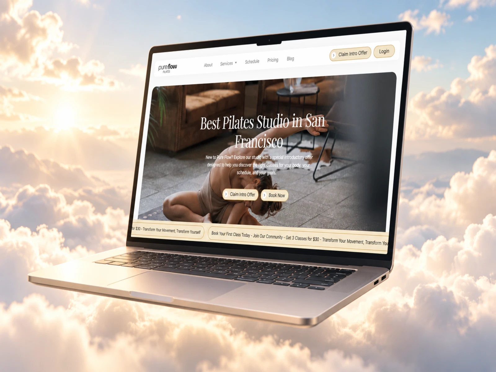
The hero establishes Pure Flow as a Pilates studio while immediately speaking to new visitors.
The messaging combines studio positioning with a clear invitation to explore the introductory offer or book directly.
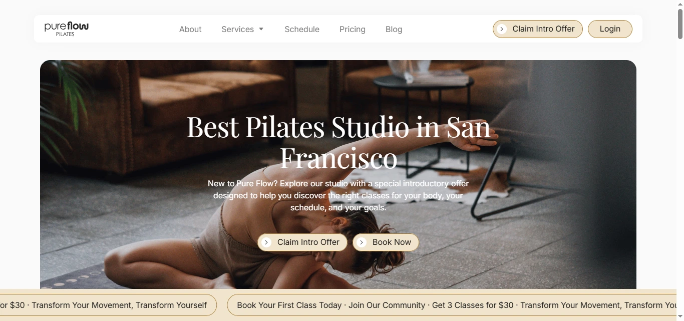
Rather than overloading the hero with details about every class, I focused on:
Where am I? → Is this for me? → What should I do next?
This makes the opening experience easier to understand.
Visual Direction
The interface was designed around the feeling of controlled movement.
I used a visual system based on:
Large lifestyle photography
Calm spacing
Soft section transitions
Clean typography
Refined cards
Generous whitespace
Clear CTA contrast
Subtle motion
The design avoids the heavy blacks, neon colors, and high-intensity visuals commonly associated with fitness websites.
Instead, it presents Pure Flow as a premium wellness space where movement feels intentional.
Typography System
The typography needed to balance personality and readability.
I created styles for:
Hero statements
Section headings
Class names
Service titles
Pricing
Reviews
FAQs
CTAs
Supporting copy
Larger headlines create an editorial feel while the body typography remains simple enough for class and pricing information to be scanned quickly.
Service Discovery
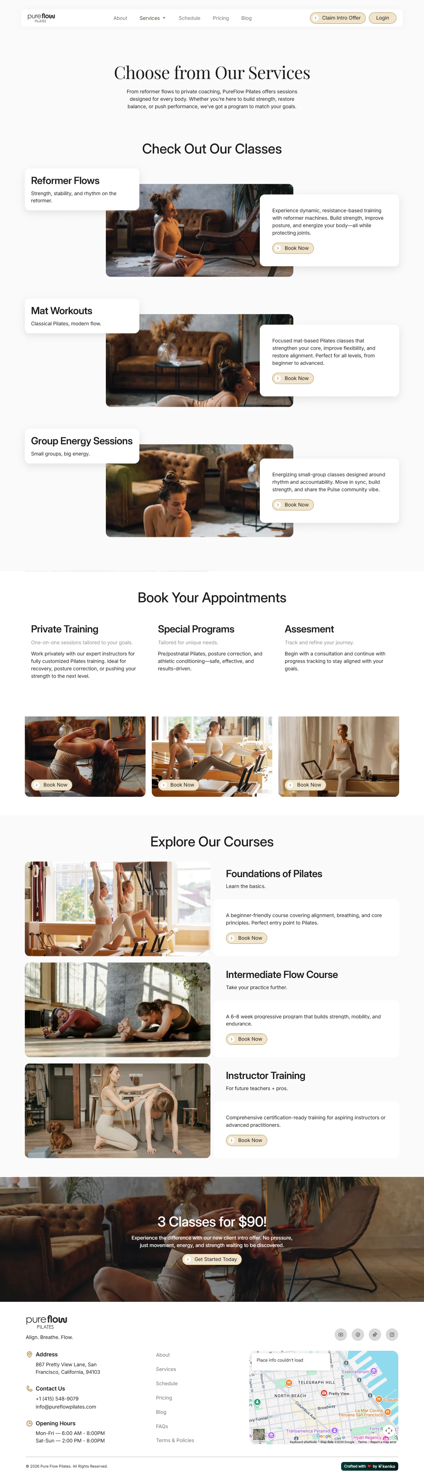
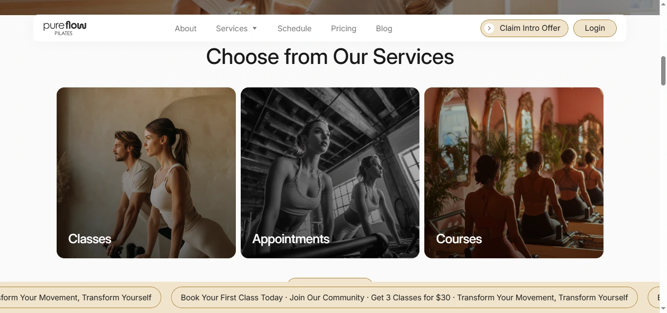
The website separates the main offering into three clear categories:
Classes
Appointments
Courses
This helps users choose based on how they prefer to engage with the studio.
A visitor interested in regular group practice can move toward classes, while someone looking for more individual support can explore appointments.
The structure keeps the homepage clean while still showing that Pure Flow offers more than one type of Pilates experience.
Intro Offer
The introductory package is given strong visual priority:
3 Classes for $90
Supporting copy reinforces that the experience is designed for people who want to explore the studio without pressure.
From a UX perspective, the offer works well because it sits between a one-time class and a larger membership decision.
It gives visitors enough time to experience:
Different instructors
Class formats
Studio environment
Community
Scheduling
before deciding whether Pure Flow is right for them.
Studio Amenities
One of the strongest design opportunities was showing that the experience extends beyond the class itself.
The studio highlights amenities including:
Showers
Lockers
Mats
Towels
Parking
Water station
Changing rooms
Mirrors
Therapy room
Spacious studio floor
Self check-in
Waiting lounge
Free Wi-Fi
Outdoor space
Air purification
Retail area
Instead of burying these details in a FAQ, I treated them as part of the studio value proposition.
This helps potential clients picture what arriving, training, changing, and leaving the studio will actually feel like.
Community Section
Pure Flow places a strong emphasis on being inclusive and supportive.
The live site describes the studio as a place for people of different bodies and experience levels to move, breathe, and grow stronger together.
I gave this messaging its own visual space because it answers an emotional question that class descriptions cannot:
What kind of people will I be surrounded by?
This helps make the brand feel more human.
Reviews & Social Proof
The site highlights more than 100 client reviews, including feedback around instructor support, beginner friendliness, strength, flexibility, and the welcoming studio atmosphere.
I used testimonials as a core part of the trust system.
They reinforce several important messages:
Beginners are welcome
Instructors are supportive
Classes can still challenge advanced clients
The environment feels comfortable
Members see improvements in strength and mobility
This makes the claims around community and quality feel more credible.
Schedule Experience
For a fitness studio, the schedule is one of the most important parts of the site.
Visitors need to quickly understand:
Which classes are available
When they take place
How they fit around work or personal routines
How to book
I kept schedule access visible from the main navigation and connected it directly to the booking journey.
This removes the common frustration of finding a class you like and then struggling to find when it is available.
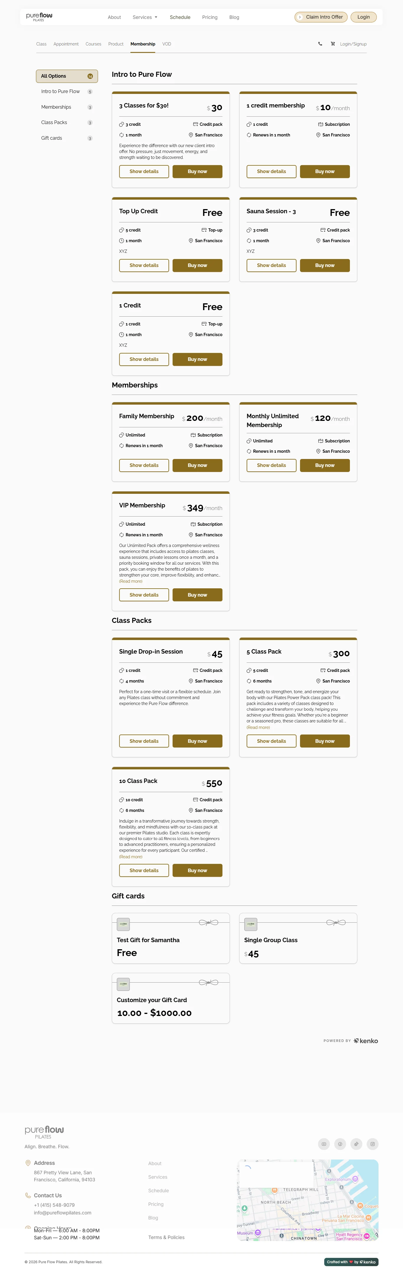
Pricing
Pricing was structured to help visitors move from curiosity to commitment without confusion.
The experience supports:
Intro offers
Class options
Memberships
Packages
Additional services
Rather than overwhelming the visitor with too many choices at once, pricing is grouped around the type of commitment someone is ready to make.
This makes the decision feel more manageable.
App Integration
The website also promotes the studio app, allowing clients to book classes, manage memberships, and stay connected to their Pilates routine from their phone.
I treated the app as an extension of the customer experience rather than a standalone promotion.
Once someone becomes a regular member, the app creates a faster repeat-booking experience and reduces dependence on returning to the website for every session.
FAQ Experience
The FAQ handles many of the practical concerns that can stop a first-time client from booking.
Questions include:
Can beginners join?
Is equipment provided?
How long are classes?
What should I wear?
Can I cancel or reschedule?
I used a simple accordion-style structure so the answers remain accessible without adding large amounts of text to the page.
Responsive Experience
Mobile usability was especially important because many fitness bookings happen from phones.
I optimized:
Navigation
Schedule access
Intro-offer CTAs
Service cards
Pricing sections
Reviews
Amenities
FAQs
Contact forms
Booking buttons
App messaging
The mobile design becomes a clean vertical journey while preserving the same premium visual tone.
5. Website Architecture
The architecture was kept simple enough for new visitors to understand immediately.
Homepage
Acts as the primary studio introduction and conversion experience.
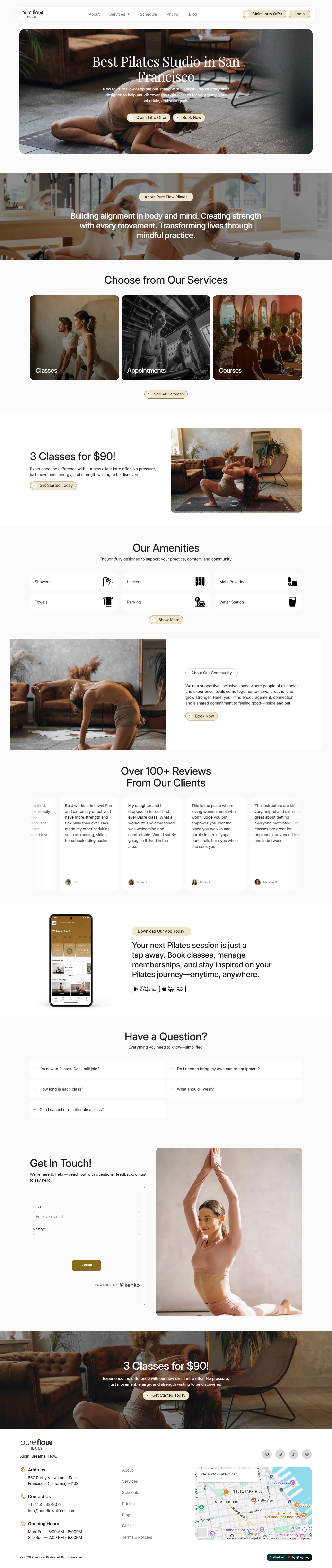
The journey includes:
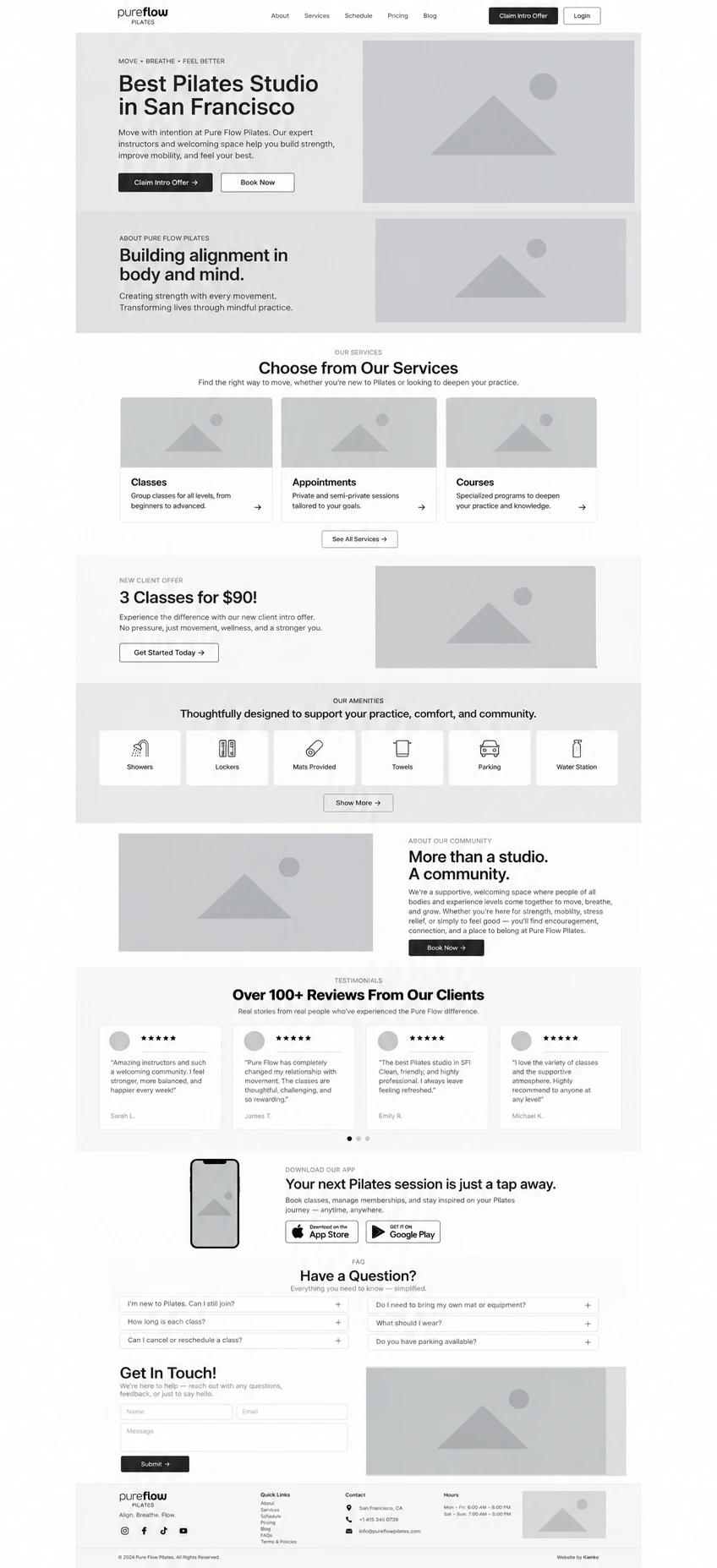
Hero → About → Services → Intro Offer → Amenities → Community → Reviews → App → FAQ → Contact
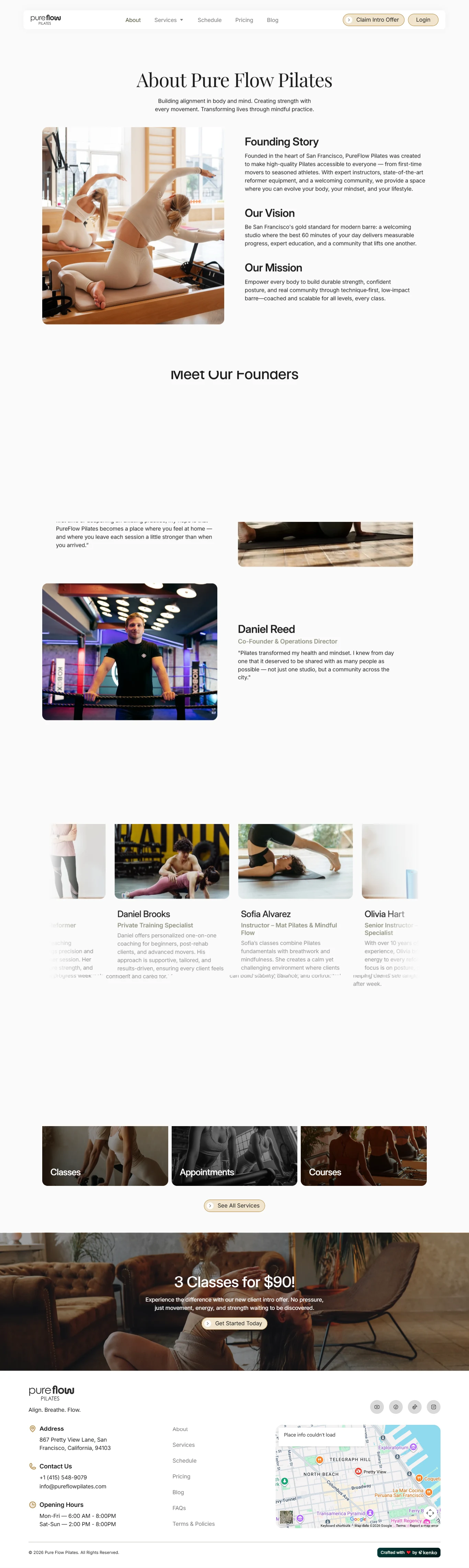
About
Provides deeper context around Pure Flow’s philosophy of alignment, strength, mindful movement, and community.
Services
Introduces the studio’s different service types:
Classes
Appointments
Courses
This gives visitors a clear starting point before exploring individual options.
Schedule
Provides the practical booking layer of the experience, helping users find sessions that fit their availability.
Pricing
Allows visitors to compare intro offers, packages, and membership options before booking.
Blog
The blog creates a content layer around:
Pilates education
Movement
Mobility
Wellness
Strength
Recovery
Studio guidance
This supports both customer education and organic search visibility.
FAQ
Provides deeper answers for new and returning clients.
Contact
Creates a direct communication pathway for questions that are not answered elsewhere.
The website also integrates the studio’s booking system so visitors can move directly into scheduling.
6. Webflow Development
Once the UX structure and visual direction were established, I translated the experience into a responsive Webflow build.
The development approach focused on maintaining the clean, premium aesthetic while supporting bookings, schedules, content, and future studio updates.
Key development work included:
Responsive Webflow development
Reusable content sections
Custom service cards
Pricing components
Intro-offer CTA sections
Studio amenity components
Testimonial sliders
FAQ interactions
Booking-system integration
Schedule integration
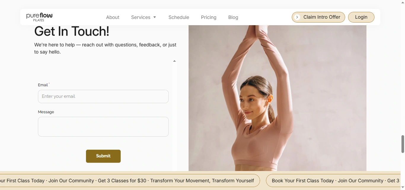
Contact forms
App-store pathways
CMS-powered blog
Responsive navigation
Custom hover states
Scroll interactions
Responsive imagery
Clean class structure
SEO-conscious heading hierarchy
Meta titles and descriptions
Accessibility-conscious interaction states
Image optimization
Performance optimization
Cross-browser testing
Cross-device testing
The component-based Webflow build also makes it easier to update offers, services, amenities, or studio content without redesigning entire pages.
7. Design & Development Process
Research → UX Structure → Wireframes → UI Design → Design System → Webflow Development → Booking Integration → Responsive Optimization → Testing → Launch
Research
I started by understanding the customer journey from someone discovering Pilates for the first time through becoming a regular studio member.
The main question was:
What does someone need to feel before they are comfortable booking their first class?
That led to four main answers:
Welcome → Confidence → Clarity → Convenience
UX Structure
I mapped the website around questions such as:
Is this studio for me? → What can I book? → What does the studio feel like? → What do existing members think? → How much does it cost? → When can I attend? → How do I book?
This became the foundation of the site structure.
Wireframes
The wireframing stage focused on:
Hero hierarchy
Intro offer placement
Service discovery
Amenities
Community
Testimonials
Pricing
Schedule access
FAQ
Booking CTAs
The goal was to create a simple journey before introducing detailed visual styling.
UI Design
The wireframes were transformed into a calm, premium wellness interface.
I avoided unnecessary visual noise and gave imagery, typography, and spacing room to communicate the feeling of the studio.
The result balances movement and energy with the control and mindfulness associated with Pilates.
Design System
Reusable rules were created for:
Typography
Buttons
Colors
Service cards
Pricing cards
Amenity icons
Review cards
Forms
FAQ elements
Navigation
CTA sections
Responsive spacing
This keeps the design consistent across the full experience.
Webflow Development
The approved layouts were translated into responsive Webflow components.
Particular attention was given to keeping the structure modular so new classes, offers, or content could be introduced without breaking the design system.
Booking Integration
The booking platform was integrated into the site so visitors could move naturally from learning about the studio into choosing and reserving sessions.
The goal was to minimize the gap between interest and action.
Responsive Optimization
Every important section was refined across desktop, tablet, and mobile.
Special attention was given to:
Large photography
Pricing
Service cards
Amenities
Booking CTAs
Reviews
FAQs
Navigation
This maintained the premium feel of the site even on smaller screens.
Testing
Before launch, I reviewed:
Navigation
Booking links
Schedule access
Intro offer
Pricing pathways
Forms
FAQ interactions
App links
Responsive layouts
Image behavior
Browser compatibility
Launch
The final stage focused on performance, accessibility, SEO foundations, responsive consistency, booking usability, and overall visual polish.
8. Key Features
Custom Webflow wellness website
Pilates studio positioning
New-client intro offer
Class booking experience
Schedule integration
Membership and pricing pathways
Classes, appointments, and courses
Studio amenities showcase
Community-focused storytelling
100+ client review presentation
Testimonial components
Beginner-friendly messaging
Mobile app promotion
Integrated booking platform
Interactive FAQs
Contact forms
CMS-powered blog
Reusable Webflow components
Responsive navigation
Custom interactions
SEO-conscious site structure
Accessibility considerations
Performance optimization
Mobile-first booking experience
9. Final Result
The final Pure Flow Pilates website turns the studio experience into a calm, welcoming, and conversion-focused digital journey.
New visitors can quickly understand what the studio offers, explore different services, see the facilities, hear directly from existing clients, check the schedule, compare pricing, and claim the introductory offer without feeling overwhelmed.
The design also helps remove some of the intimidation that can come with joining a new fitness studio.
Community messaging, beginner-friendly FAQs, supportive testimonials, and the low-friction introductory offer all work together to make the first class feel more approachable.
At the same time, the visual system keeps the studio positioned as a premium wellness experience through thoughtful photography, clean typography, generous spacing, and restrained interactions.
The Webflow implementation provides a flexible foundation for future classes, promotions, blog content, and studio updates, while the integrated booking experience gives visitors a clear path from discovery to attendance.
The result is a modern, responsive Pilates website that balances wellness branding with practical booking UX, helping Pure Flow turn first-time visitors into confident participants and long-term members.
Like this project
Posted Oct 12, 2026
A responsive website redesign for Pure Flow Pilates, focused on making class discovery, booking, and the overall member journey feel clear and easy to use. I handled the website design and Webflow development, shaping a polished digital experience around the studio’s services.