Skin Engineering Clinic Website Redesign

Victor Adebayo


Skin Engineering — Advanced Skin & Laser Clinic Website
Web Design · UX/UI Design · Webflow Development · Conversion Strategy
Project Type: Beauty / Aesthetics / Skin & Laser Clinic
Primary Objective: Build trust, simplify treatment discovery, communicate clinical expertise, and convert visitors into consultation bookings
Platform: Webflow
Role: Web Designer & Webflow Developer
Deliverables: UX/UI Design · Responsive Website Design · Webflow Development · Treatment Architecture · Booking Experience · Testimonials · FAQ · Custom Interactions · SEO & Performance Optimization
1. Project Overview
Skin Engineering is a specialist skin and laser clinic based in Marylebone, London.
The clinic offers advanced treatments including laser and IPL hair removal, Dermapen microneedling, pigmentation and vascular treatments, chemical peels, Endermologie, microdermabrasion, CACI microcurrent facials, semi-permanent eyebrows, and other specialist treatments.
The brand is built around a more considered approach to aesthetics, combining modern treatment technology with the biomedical-science background of founder and practitioner Ela Kwiecien, who has been working with clients for more than a decade.
The goal of this project was to create a Webflow website that felt premium and calming, but also credible enough for a treatment-led clinic.
Rather than designing another beauty website focused only on lifestyle imagery, I wanted the experience to answer the questions that matter before someone books:
What can you treat? → Which treatment is right for me? → Can I trust the practitioner? → What does it cost? → What happens during the process? → How do I book?
2. The Challenge
Aesthetic and skin-treatment websites need to balance two very different things.
They have to feel visually aspirational, but they also need to communicate enough information for people to make an informed decision.
Potential clients may arrive with concerns around:
Acne and acne scarring
Pigmentation
Uneven skin texture
Unwanted hair
Spider or thread veins
Signs of ageing
Cellulite
Facial toning
Eyebrow definition
General skin rejuvenation
At the same time, many visitors may not know which treatment is appropriate for their concern.
That meant the website needed to:
Establish professional credibility immediately
Make a large treatment offering easier to understand
Explain technologies without becoming overly technical
Connect skin concerns to relevant treatments
Present pricing clearly
Reduce anxiety around first appointments
Highlight the practitioner behind the clinic
Use reviews to reinforce trust
Explain the consultation process
Make booking simple
Work smoothly across desktop, tablet, and mobile
The main UX challenge was to make the clinic feel advanced without feeling intimidating.
3. Design Strategy
I structured the experience around four priorities:
Trust → Understand → Choose → Book
Lead With Expertise
The hero immediately establishes Skin Engineering as an advanced skin and laser clinic rather than a general beauty salon.
The messaging highlights both the range of treatments and the practitioner’s biomedical-science-led approach.
This helps create a stronger foundation of credibility before introducing individual services.
Organize Treatments Around Real Concerns
Instead of presenting every treatment as an isolated service, I focused on showing what each one is actually used for.
For example:
Dermapen Microneedling
Acne scarring · Skin texture · Rejuvenation
Ellipse Flex IPL
Pigmentation · Spider veins · Rejuvenation
Chemical Peels
Pigmentation · Acne · Texture
Microdermabrasion
Dull skin · Fine lines · Clogged pores
This makes the content easier to understand for people who may know their concern but not the treatment name.
Keep Consultation at the Center
Because treatments need to be matched to skin type, goals, and suitability, the website does not push visitors directly into choosing everything themselves.
The main conversion pathway is a skin consultation.
This creates a safer and more personalized user journey:
Explore → Learn → Ask → Receive Recommendation → Book Treatment
Balance Science With Warmth
The brand positioning needed to feel clinical enough to build trust but warm enough that visitors still feel comfortable booking.
I avoided making the website feel like a hospital or medical portal.
Instead, the interface combines:
Refined typography
Soft imagery
Clean layouts
Treatment-focused content
Practitioner storytelling
Client reviews
Clear pricing
Calm spacing
The result feels professional without losing the personal side of the business.
4. UX/UI Design
Hero Section
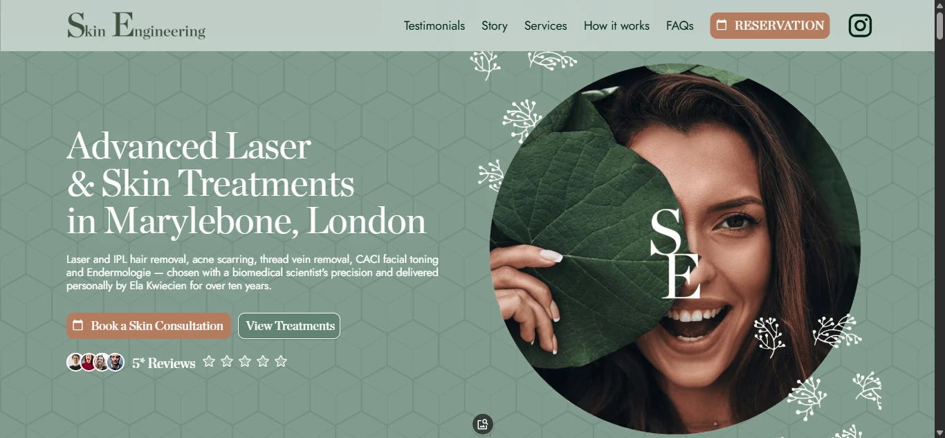
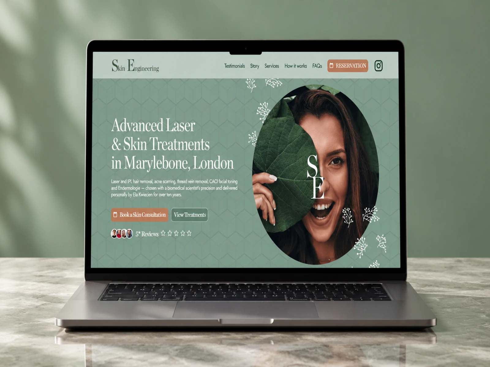
The hero establishes the service immediately:
Advanced Laser & Skin Treatments in Marylebone, London.
Supporting content introduces key treatment areas and reinforces the clinic’s practitioner-led approach.
The two primary actions are:
Book a Skin Consultation
and
View Treatments
This gives visitors a direct path whether they are ready to book or still researching.
Visual Direction
The visual identity was designed to feel calm, premium, and treatment-focused.
I used:
Editorial typography
Refined neutral backgrounds
High-quality treatment photography
Generous whitespace
Clean cards
Controlled accent colors
Minimal visual clutter
Strong CTA contrast
The design gives each treatment enough room to feel considered rather than presenting the clinic as a crowded service menu.
Typography System
The typography hierarchy was created to help visitors move quickly through information-heavy sections.
Styles were developed for:
Hero messaging
Treatment names
Skin concerns
Technology labels
Pricing
Supporting explanations
Practitioner content
FAQ questions
Calls-to-action
Larger headings establish the treatment category while smaller labels help users scan for concerns relevant to them.
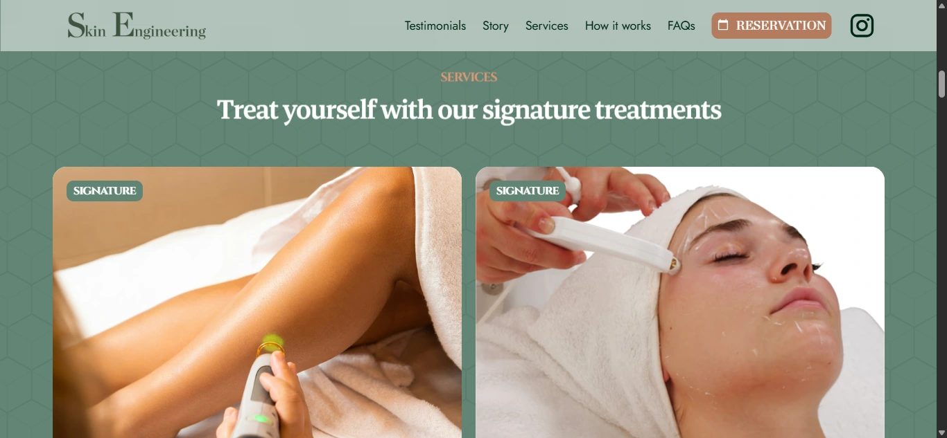
Signature Treatments
The primary treatment experience gives additional depth to core services.
Laser Hair Removal
The website presents both Ellipse Flex IPL and Q-Switched Nd:YAG as available technologies, allowing the clinic to communicate that treatment selection depends on the individual rather than relying on a one-size-fits-all approach.
Pricing is introduced directly alongside the service, with sessions beginning from £60.
Dermapen Microneedling
Microneedling is positioned around concerns such as acne scarring, skin texture, and rejuvenation.
The site explains that different goals may require different treatment approaches and that multiple sessions may sometimes be recommended. Pricing begins from £80 per session.
Giving these signature treatments more visual space helps visitors understand their purpose before reaching the wider service list.
Additional Treatments
The wider treatment section needed to communicate variety without becoming overwhelming.
Services include:
IPL for pigmentation and superficial vascular concerns
Chemical peels
Endermologie
Microdermabrasion
CACI microcurrent facial treatments
Semi-permanent eyebrows
Multi-Wave Oscillator sessions
Each service uses the same information structure:
Treatment → Main concerns → Short explanation → Good-to-know details
That consistency makes a large treatment offering much easier to scan.
Pricing Presentation
Pricing is an important trust factor in aesthetics.
Instead of hiding every price behind an enquiry, I introduced starting prices where appropriate.
This gives potential clients an early indication of commitment while still reinforcing that final treatment selection should follow consultation.
The balance helps avoid two common problems:
Too little information: visitors leave because they cannot estimate cost.
Too much rigidity: visitors assume one treatment or price applies to everyone.
How It Works
The booking journey is simplified into three steps:
01 — Book an Appointment
Choose a suitable time online or by phone.
02 — Consultation & Treatment
Discuss concerns, receive a tailored recommendation, and proceed with the appropriate treatment.
03 — Follow the Treatment Plan
Continue with the personalized recommendation and aftercare.
The live website similarly explains the journey through appointment booking, consultation and treatment, and the resulting treatment experience.
Turning this into a simple sequence reduces uncertainty for first-time clients.
Practitioner Story
One of the strongest trust assets is Ela herself.
Rather than presenting the clinic as a faceless aesthetics brand, I gave the practitioner a dedicated section that explains her philosophy and more than ten years of experience working with skin and wellness.
Her biomedical-science background is also reinforced in the FAQ, where the clinic explains that treatment decisions are informed by understanding skin biology rather than simply following trends.
This creates a more personal connection while supporting the clinic’s expert positioning.
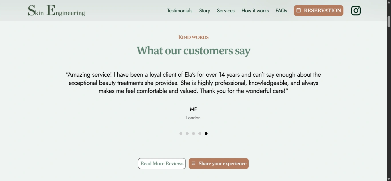
Testimonials
Client reviews appear early in the experience rather than being hidden near the footer.
The live site highlights Google reviews and client feedback around professionalism, knowledge, warmth, and skincare advice.
From a UX perspective, these reviews help answer a critical question:
What does it actually feel like to be treated here?
This is particularly important for first-time aesthetic clients.
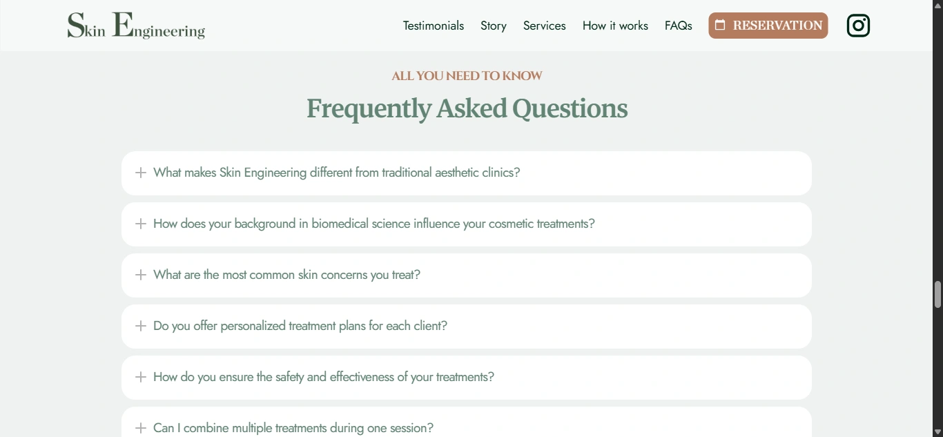
FAQ Experience
The FAQ handles deeper questions that would otherwise make the main pages too text-heavy.
Topics include:
What makes Skin Engineering different
How biomedical science influences treatment selection
Common skin concerns
Personalized plans
Safety and effectiveness
Combining treatments
What happens during a first consultation
I used an expandable structure so visitors can investigate only the questions relevant to them.
Product Partnership
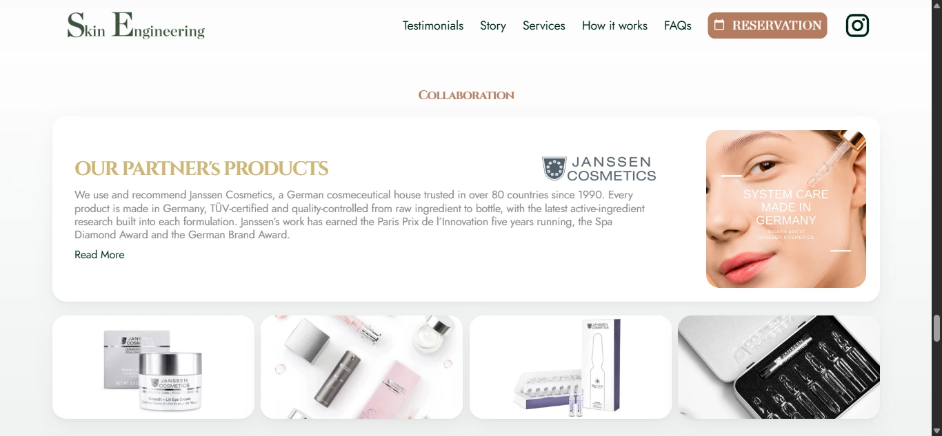
The website also introduces Janssen Cosmetics as a recommended skincare partner.
Rather than turning the website into a product store, the partnership is presented as supporting professional treatment and skincare recommendations.
This keeps the primary focus on treatments while reinforcing the broader skincare approach.
Booking Experience
The final conversion experience offers a free 15-minute online consultation, allowing potential clients to speak with Ela before committing to treatment.
Visitors who already know what they want can also contact the clinic directly.
The current site communicates:
Online consultation
Phone booking
Email booking
Treatment discussion
Clinic location
Weekend availability
This creates multiple conversion routes depending on how ready the visitor is.
Responsive Design
Mobile optimization was especially important because skincare discovery often happens through mobile search and social platforms.
I focused on:
Simplified navigation
Clear consultation buttons
Easy treatment scanning
Responsive pricing
Readable FAQs
Large touch targets
Clean vertical content flow
Practitioner imagery
Testimonials
Phone and email access
The mobile version keeps the premium aesthetic while making the path to consultation even more direct.
5. Website Architecture
The site architecture was intentionally kept focused.
A specialist clinic does not need unnecessary pages—it needs the right information at the right time.
Homepage

The homepage handles the full primary journey:
Positioning → Reviews → Signature Treatments → Additional Treatments → Process → Practitioner → FAQ → Products → Booking
About / Story
Provides more context around Ela, her philosophy, experience, and approach to skin health and aesthetics.
Treatments
The main treatment area organizes services around concerns and technology rather than forcing users to navigate an overly technical directory.
Relevant treatment categories include:
Laser & IPL Hair Removal
Microneedling
Pigmentation Treatments
Vascular Treatments
Chemical Peels
Endermologie
Microdermabrasion
Microcurrent Facial Toning
Semi-Permanent Brows
Consultation
Creates the primary entry point for new clients who are not sure which treatment is right for them.
FAQs
Answers deeper treatment, consultation, and safety questions.
Contact / Reservation
Provides booking information, clinic details, direct contact options, and consultation scheduling.
The clinic currently operates from 33 Weymouth Street in Marylebone, London.
6. Webflow Development
Once the UX structure and visual direction were established, I translated the design into a responsive Webflow build.
The development focused on keeping the website premium on the front end while making treatments and content easy to maintain.
Key development areas included:
Responsive Webflow development
Reusable treatment components
Treatment information blocks
Pricing components
Testimonial sections
Practitioner profile section
FAQ interactions
Online consultation integration
Contact pathways
Click-to-call functionality
Email links
Responsive navigation
Reusable CTA sections
Custom hover states
Subtle scroll interactions
Responsive imagery
Clean class structure
Semantic heading hierarchy
SEO-conscious page structure
Accessibility-conscious interaction states
Image optimization
Performance optimization
Cross-browser testing
Cross-device testing
Animations were kept subtle so the website maintained a refined clinic experience rather than feeling overly promotional.
7. Design & Development Process
Research → UX Structure → Wireframes → UI Design → Design System → Webflow Development → Booking Integration → Responsive Optimization → Testing → Launch
Research
I started by understanding the treatment offering, common skin concerns, target audience, practitioner positioning, pricing, and the information people need before trusting an aesthetics clinic.
The key question was:
What does someone need to see and understand before they feel confident booking a skin consultation?
UX Structure
I organized the customer journey around:
Can you help with my concern? → What treatment might work? → Who will treat me? → Can I trust the clinic? → What does it cost? → What happens next?
This became the foundation for the site hierarchy.
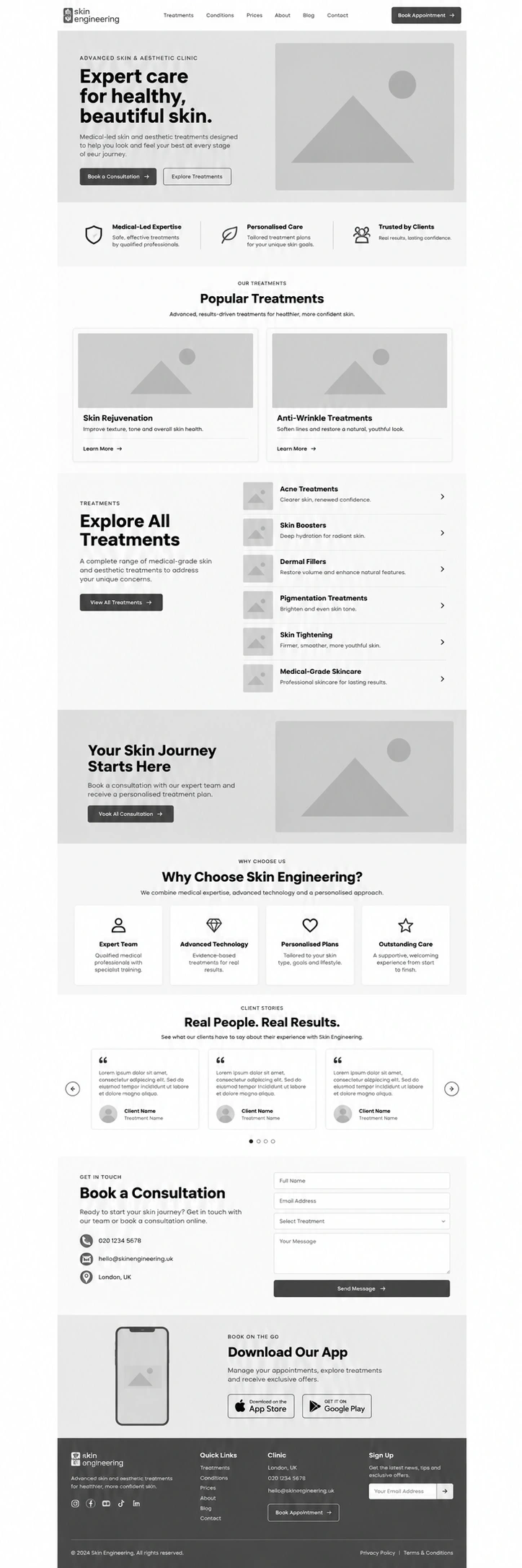
Wireframes
The wireframing stage established:
Hero
Trust signals
Signature services
Treatment grid
Pricing
Process
Practitioner profile
FAQ
Consultation CTA
The focus was on creating clarity before visual styling was introduced.
UI Design
The wireframes were transformed into a calm and premium aesthetics interface.
Rather than using overly decorative beauty visuals, I focused on a cleaner clinical-meets-luxury direction.
Large imagery, refined typography, balanced spacing, and clear information blocks allow the treatments to feel sophisticated without becoming difficult to understand.
Design System
Reusable styles were created for:
Typography
Buttons
Colors
Treatment cards
Pricing
Concern labels
Testimonials
Practitioner content
FAQs
Forms
Navigation
CTAs
Responsive spacing
This creates consistency across the full experience.
Webflow Development
The approved UI was translated into reusable Webflow components.
The site structure was kept modular so additional treatments, pricing, reviews, or clinic information could be added later without breaking the design system.
Booking Integration
The consultation journey was integrated directly into the website.
The main focus was reducing friction between researching a concern and speaking to the practitioner.
Free online consultations give lower-intent visitors an easier first step, while phone and email booking remain available for clients who already know the treatment they want.
Responsive Optimization
Each section was reviewed independently across desktop, tablet, and mobile.
Special attention was given to:
Treatment descriptions
Price presentation
Long FAQ content
Practitioner imagery
Booking CTAs
Navigation
Testimonials
The goal was to keep the same calm, premium experience regardless of screen size.
Testing
Before launch, I reviewed:
Navigation
Consultation links
Phone and email actions
Treatment CTAs
Pricing
FAQ interactions
Testimonials
Responsive layouts
Image behavior
Browser consistency
Launch
The final stage focused on usability, accessibility, page speed, responsive consistency, SEO foundations, and ensuring every major path ultimately led to a clear consultation or booking action.
8. Key Features
Custom Webflow aesthetics website
Skin and laser clinic positioning
Consultation-focused customer journey
Laser and IPL treatment presentation
Microneedling services
Pigmentation and vascular treatments
Chemical peels
Endermologie
Microdermabrasion
Microcurrent facial treatments
Semi-permanent brow treatment
Transparent starting prices
Treatment concern labels
Practitioner-led brand positioning
Biomedical-science credibility
Google review integration
Interactive FAQs
Free online consultation pathway
Direct phone and email booking
Skincare product partnership
Responsive navigation
Reusable Webflow components
Custom interactions
SEO-conscious architecture
Accessibility considerations
Performance optimization
Mobile-first booking experience
9. Final Result
The final Skin Engineering website turns a large range of specialist treatments into a clear, reassuring, and premium consultation experience.
Visitors can quickly understand what the clinic specializes in, identify treatments related to their concerns, see starting prices, learn about the practitioner, read client feedback, understand the treatment process, and book a consultation without having to navigate an overly complicated website.
The design also gives Skin Engineering a stronger point of difference.
Rather than feeling like another trend-driven beauty clinic, the experience emphasizes personalized treatment, practitioner expertise, scientific thinking, and long-term skin care.
At the same time, the visual system remains warm and aspirational enough to make the clinic feel welcoming.
The free consultation pathway reduces pressure for visitors who are still unsure which treatment is right for them, while more informed clients can move directly toward an appointment.
The result is a modern, trust-focused Webflow website that balances aesthetics with credibility, helping Skin Engineering turn treatment research into confident consultation bookings while giving the clinic a more distinctive and professional digital presence.
Like this project
Posted Oct 19, 2026
A premium Webflow site for a Marylebone skin & laser clinic, structured to turn treatment research into booked consultations.
Likes
5
Views
7
Timeline
Jun 5, 2026 - Jul 15, 2026