agere
João Loureiro
Winner of agere's identity contest — 2008
about.
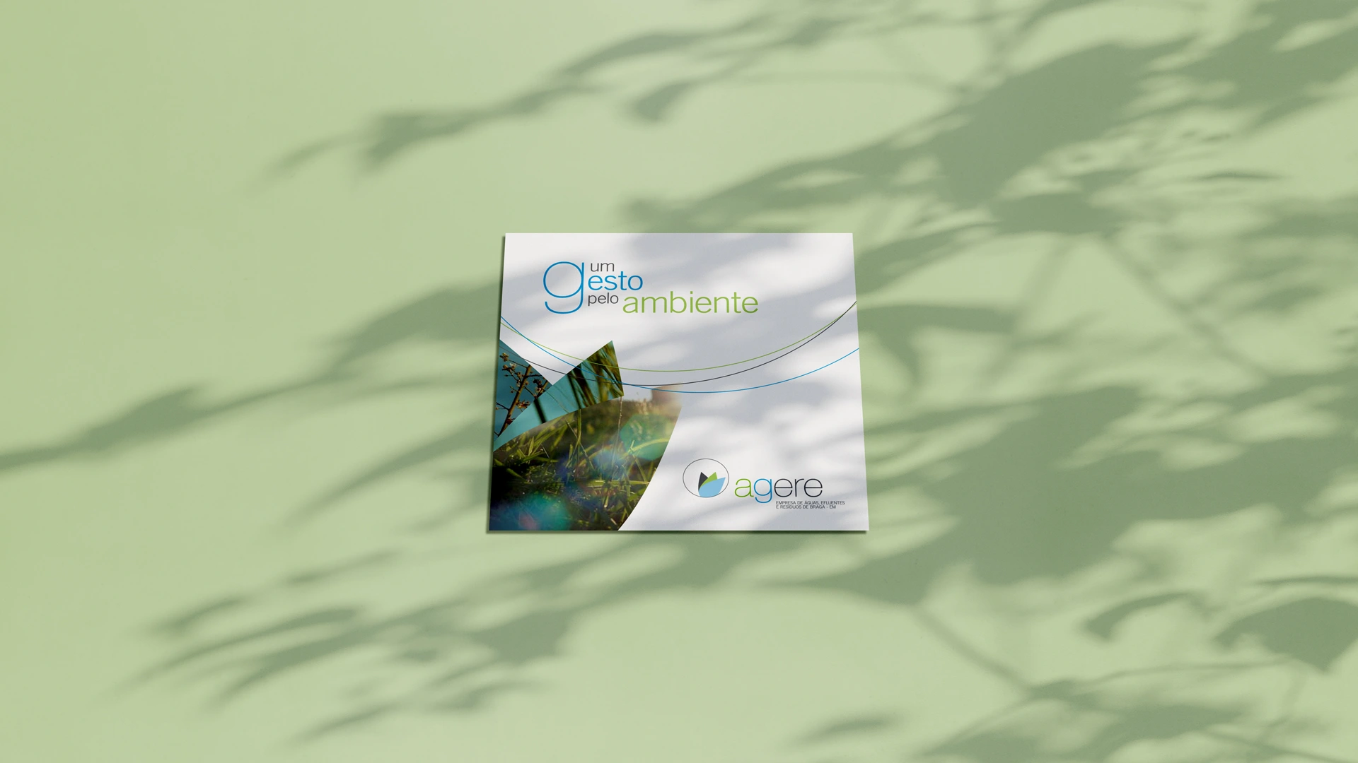
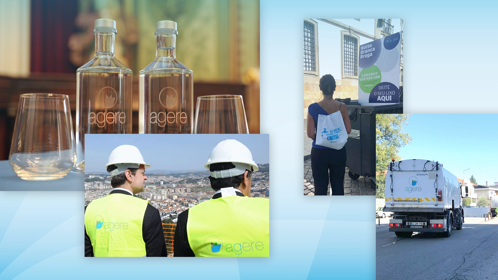
agere is the official local water supplier and waste treatment company from Braga, Portugal. In the past year 2008, while I was just a Design student, agere launched a national-wide identity contest and I was really tempted to apply. They wanted a new identity that reflects their new vision and environmental responsibility. I was the proud winner of their contest, winning amongst more than 100 participations and I can say that this was the work that changed my life forever.
brand concept.
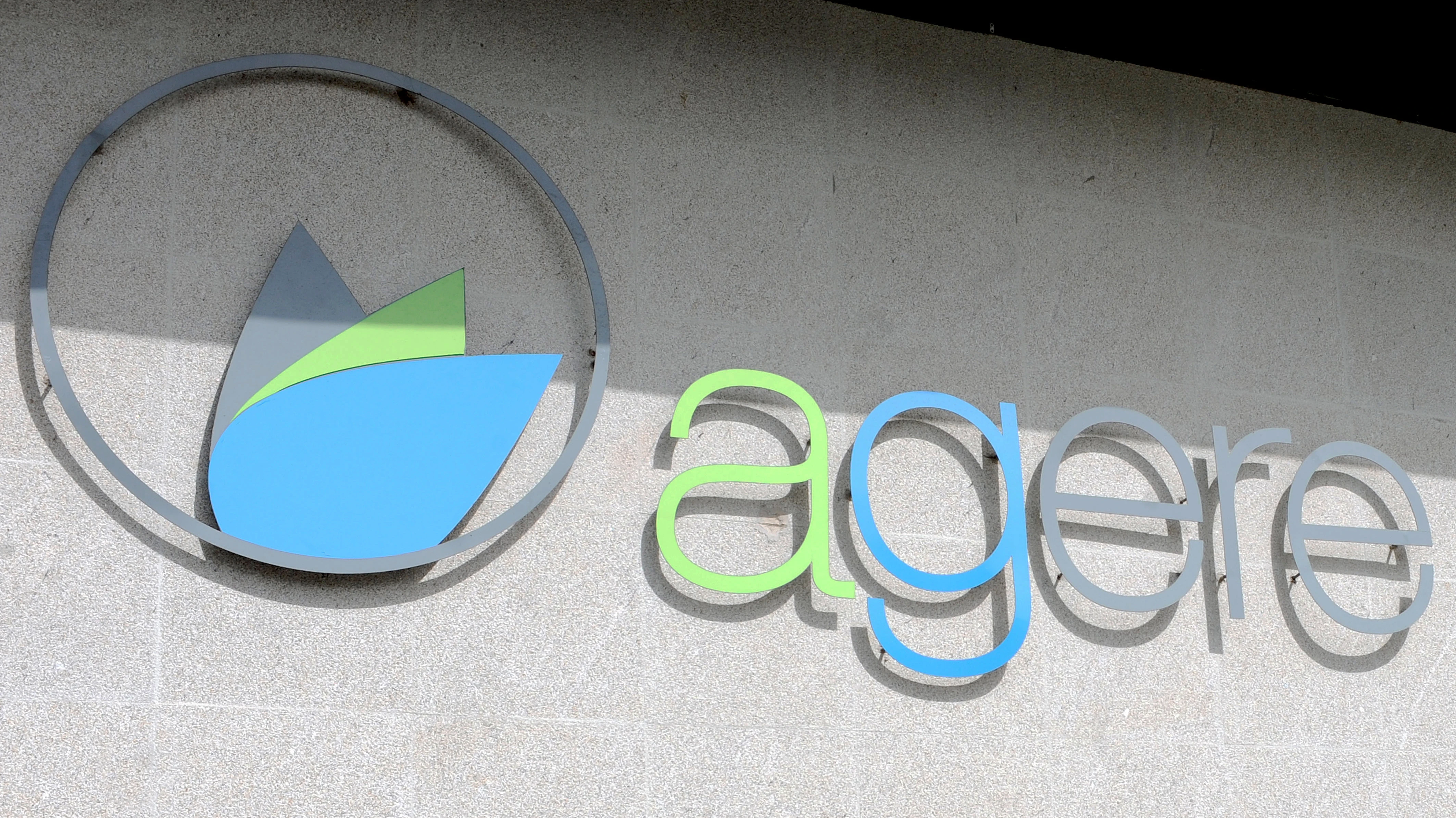
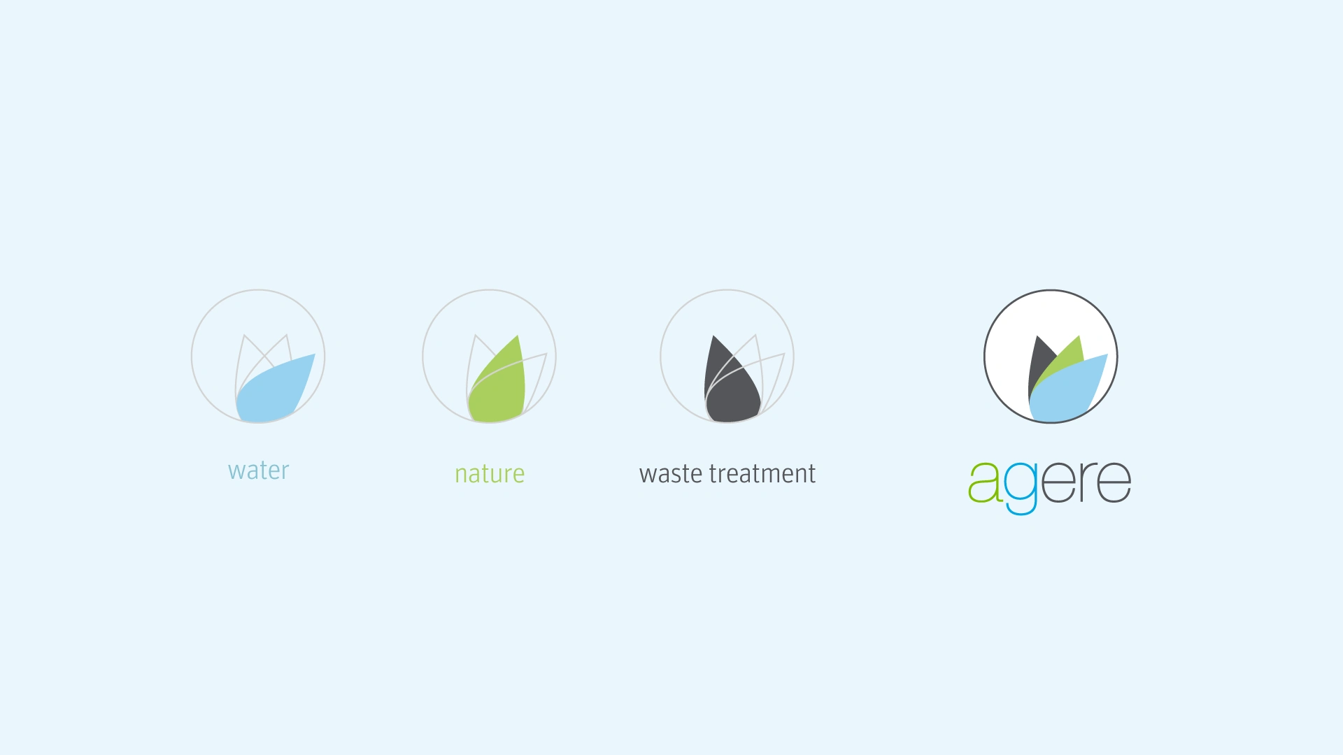
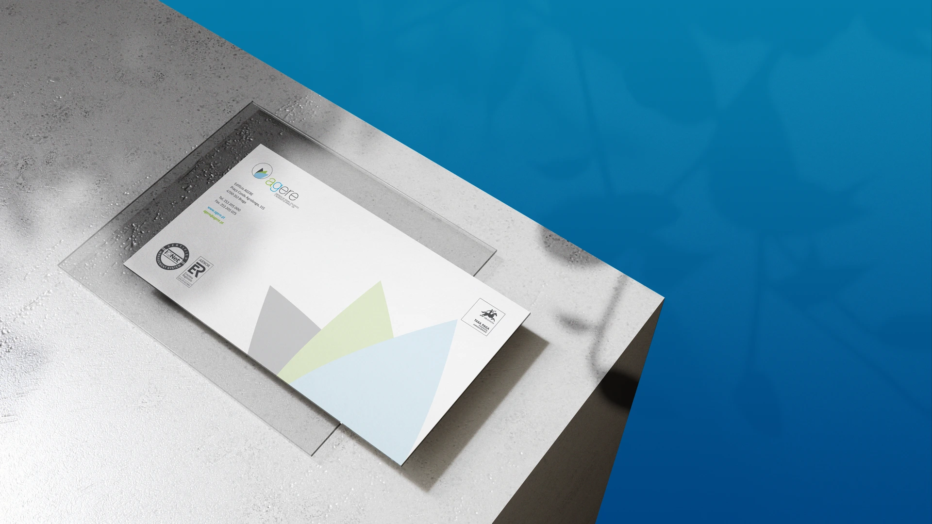
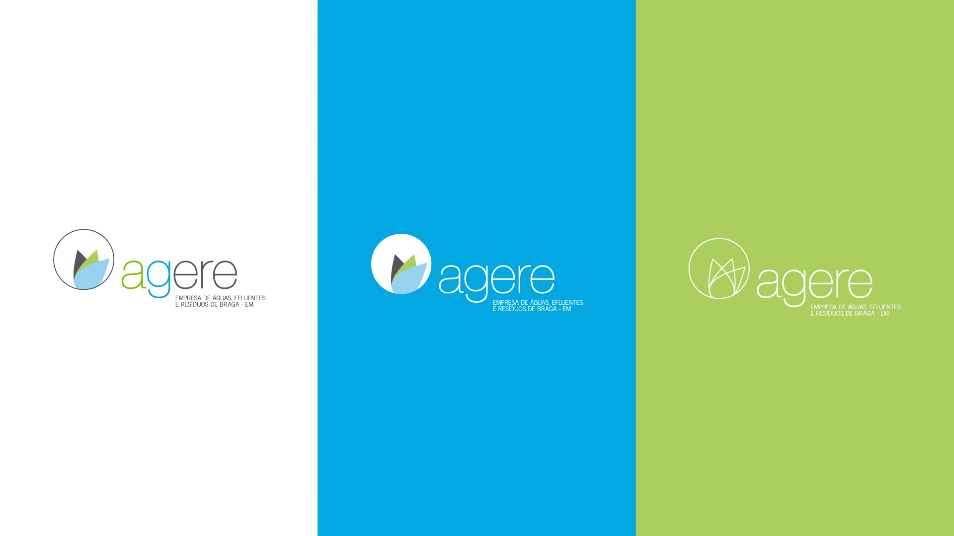
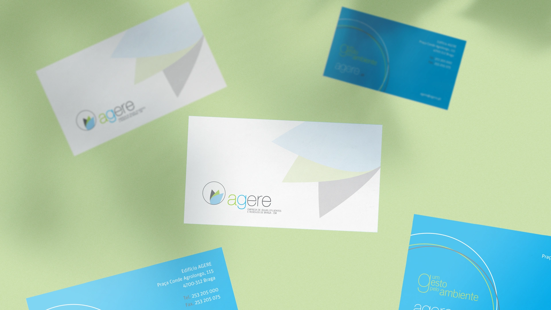
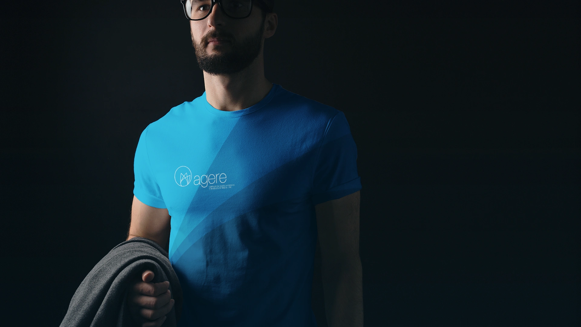
In this identity, I wanted to create a symbol that agglutinates all the brand core business and values. So, in order to do that, I created a symbol that is composed of a leaf / water drop element that represents each of the company services — Water + Nature + Waste Treatment. Each one of these are represented with a unique color (blue, green and dark grey). When combined all these elements they form a flower and the circle backward closes altogether, resulting in an elegant, modern and future-proof logo.
.logo variations
client: agere
year: 2008
design & art direction: João Loureiro
Like this project
Posted Jun 26, 2026
Award-winning branding project for agere, the local water supply from Braga, Portugal.
Likes
0
Views
0
Timeline
Jan 26, 2008 - Dec 26, 2009
Clients
AGERE