PhytaCeutics: Branding + Packaging
João Loureiro
About
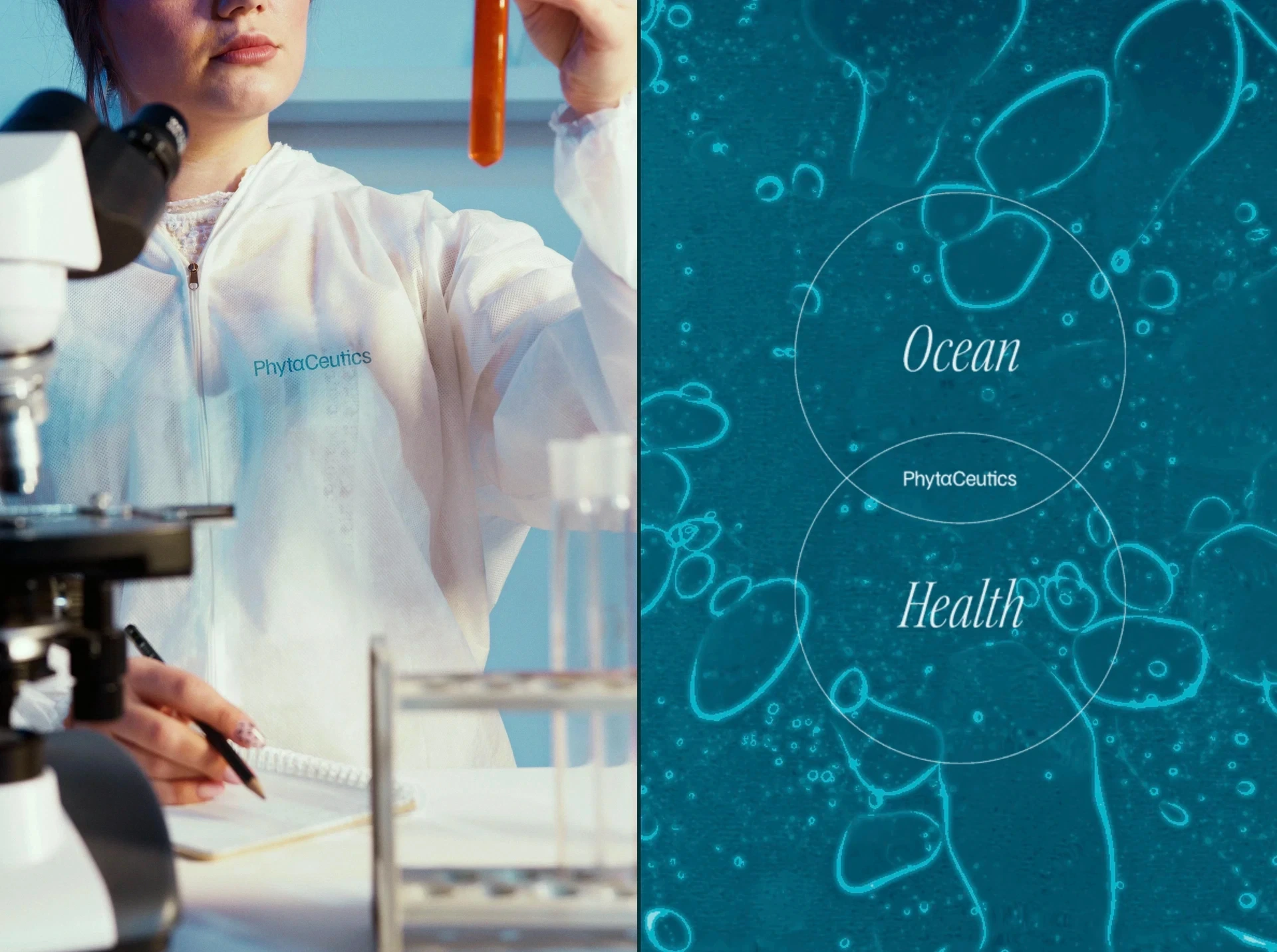
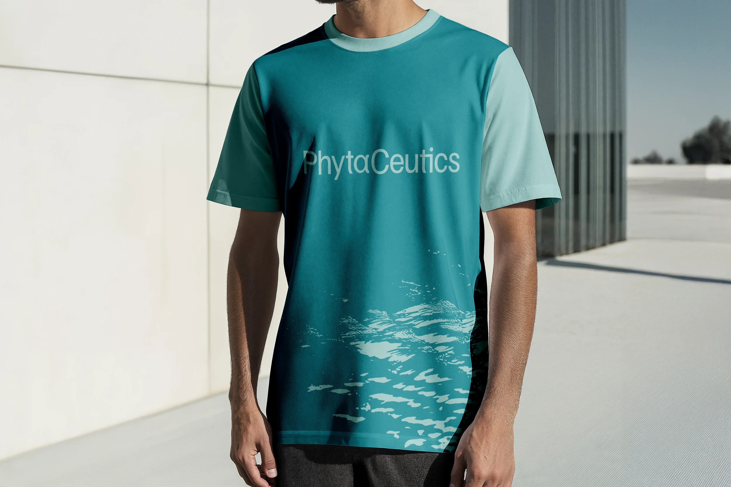
Sea4Us is a biotechnology company dedicated to discovering and developing new therapeutics based on marine-derived compounds, designed to address clinical conditions still lacking effective solutions. To separate pharmaceutical development from nutraceutical applications, embedded in the same scientific research, a new brand was needed - one able to house the differentiating products emerging from this innovation pipeline. This is how PhytaCeutics was born: a brand rooted in the ocean, powered by science, and shaped by nature’s untapped molecular potential.


Moodboard
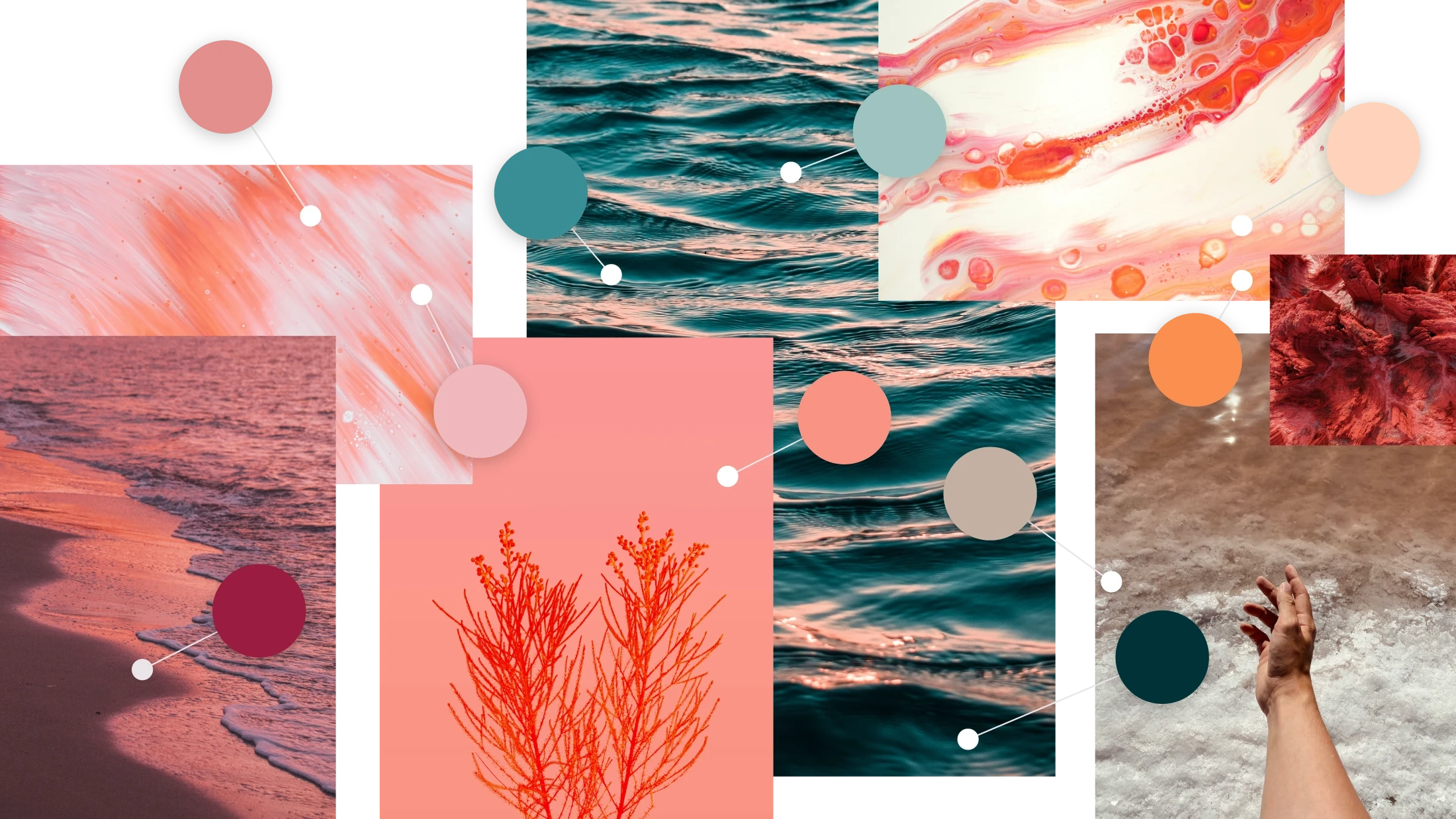
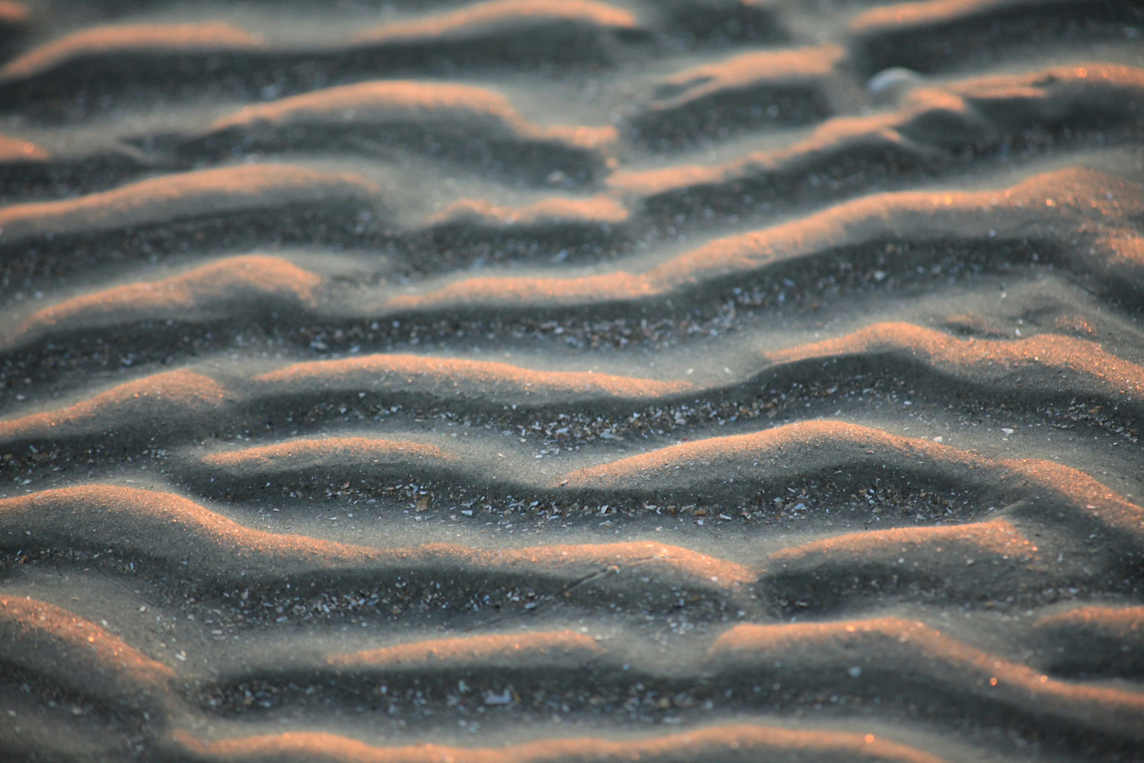
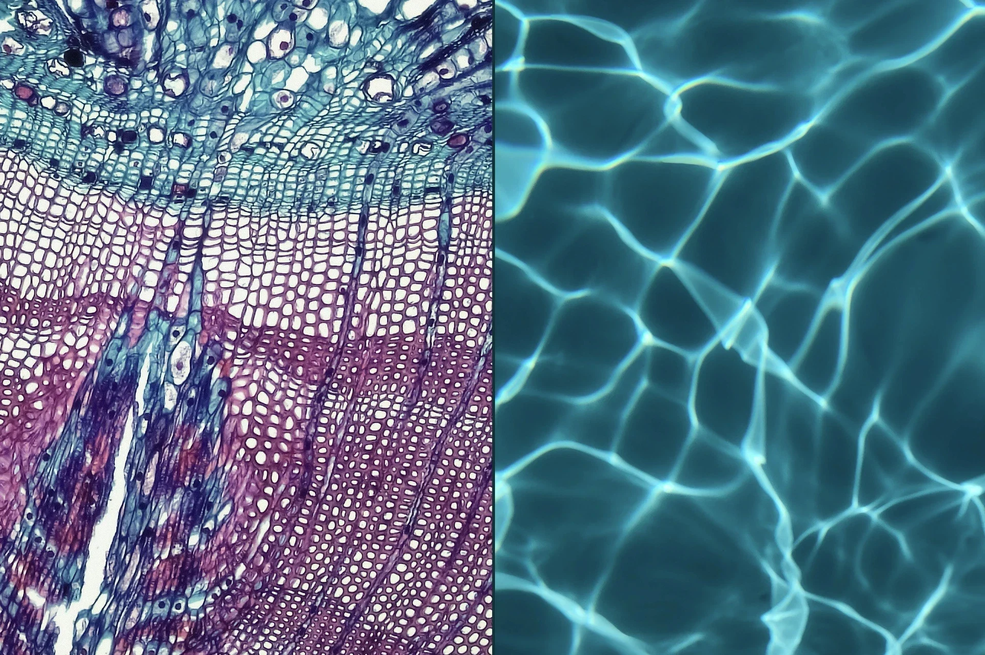
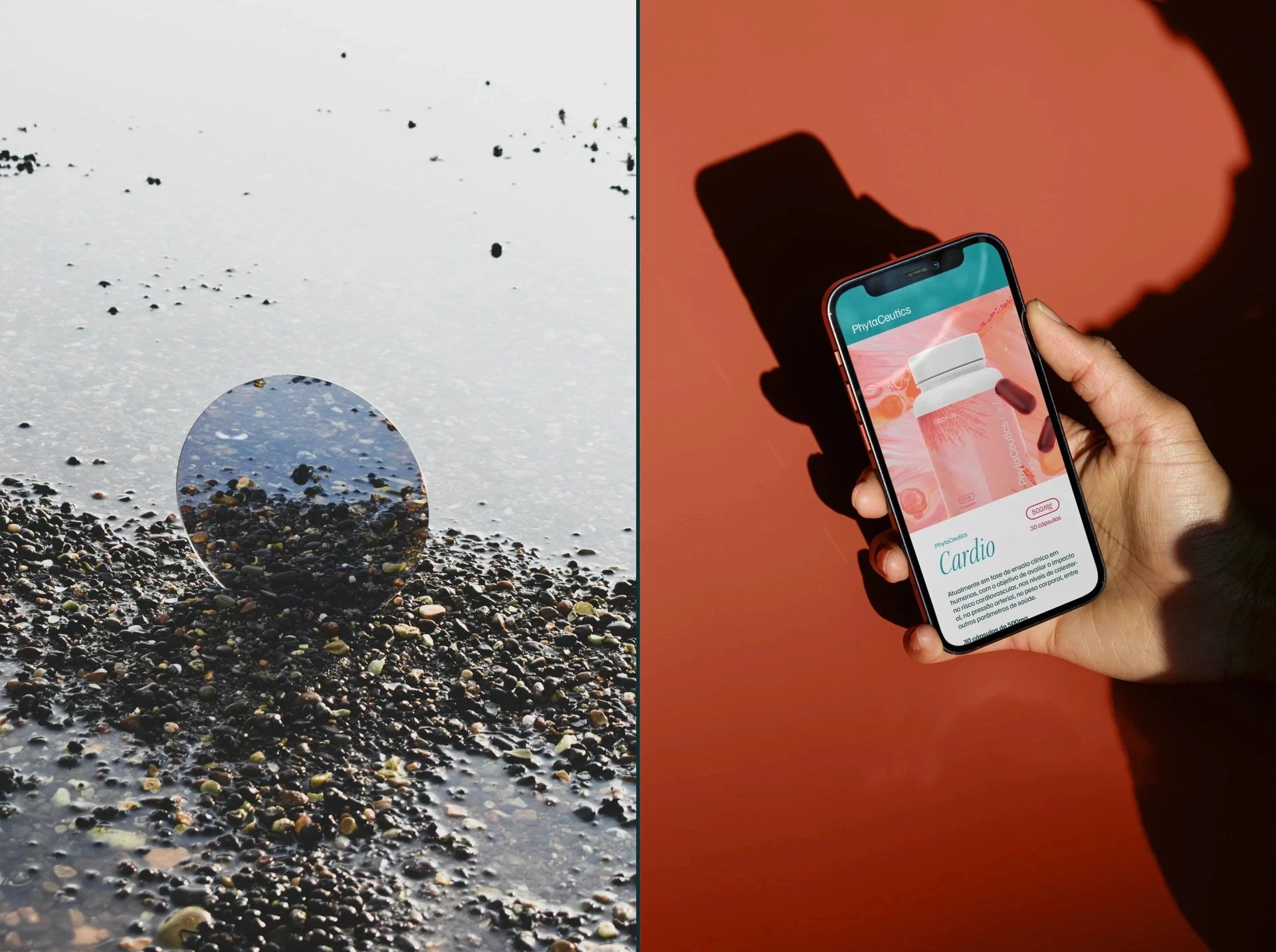
The colour palette was shaped by the ocean and by the bioactive core of the brand’s products. Inspired by the pigmentation of marine algae and subaquatic environments, it moves from deep blue to luminous turquoise, from marine density to clinical clarity. The brand lives alongside fluid textures and organic patterns that make the system unique and adaptable. No application is ever identical to the next, just like marine ecosystems in constant transformation.
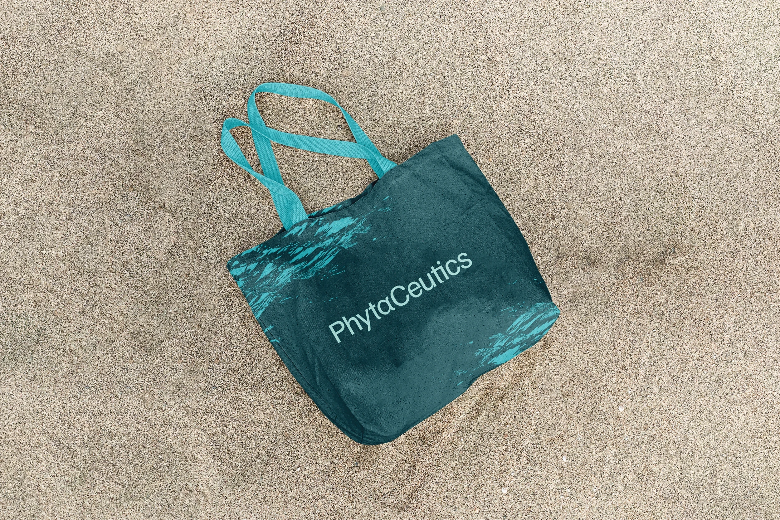
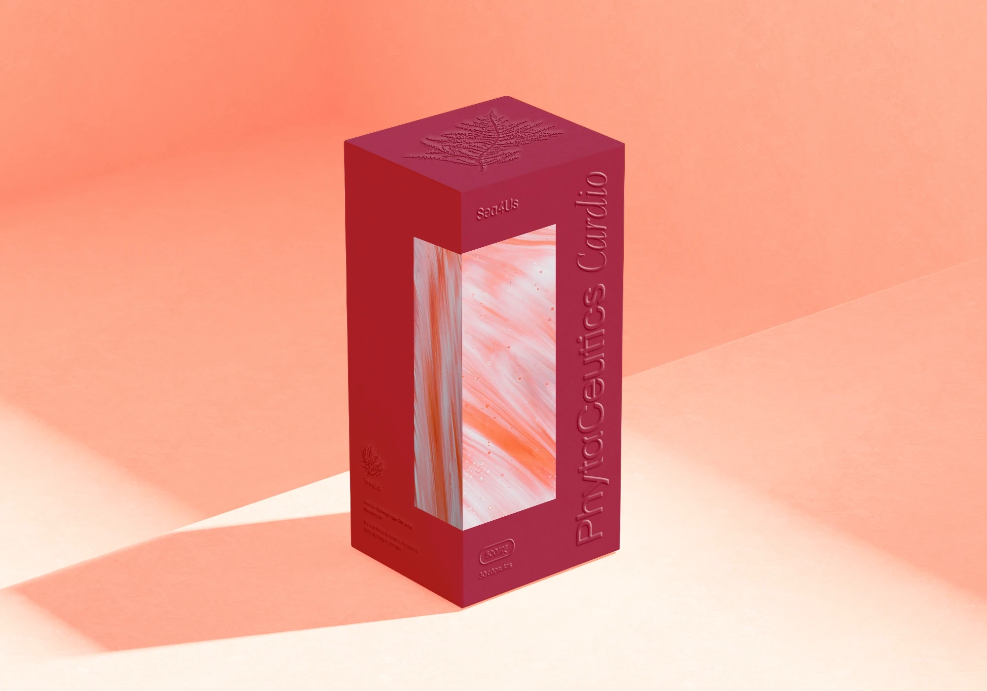
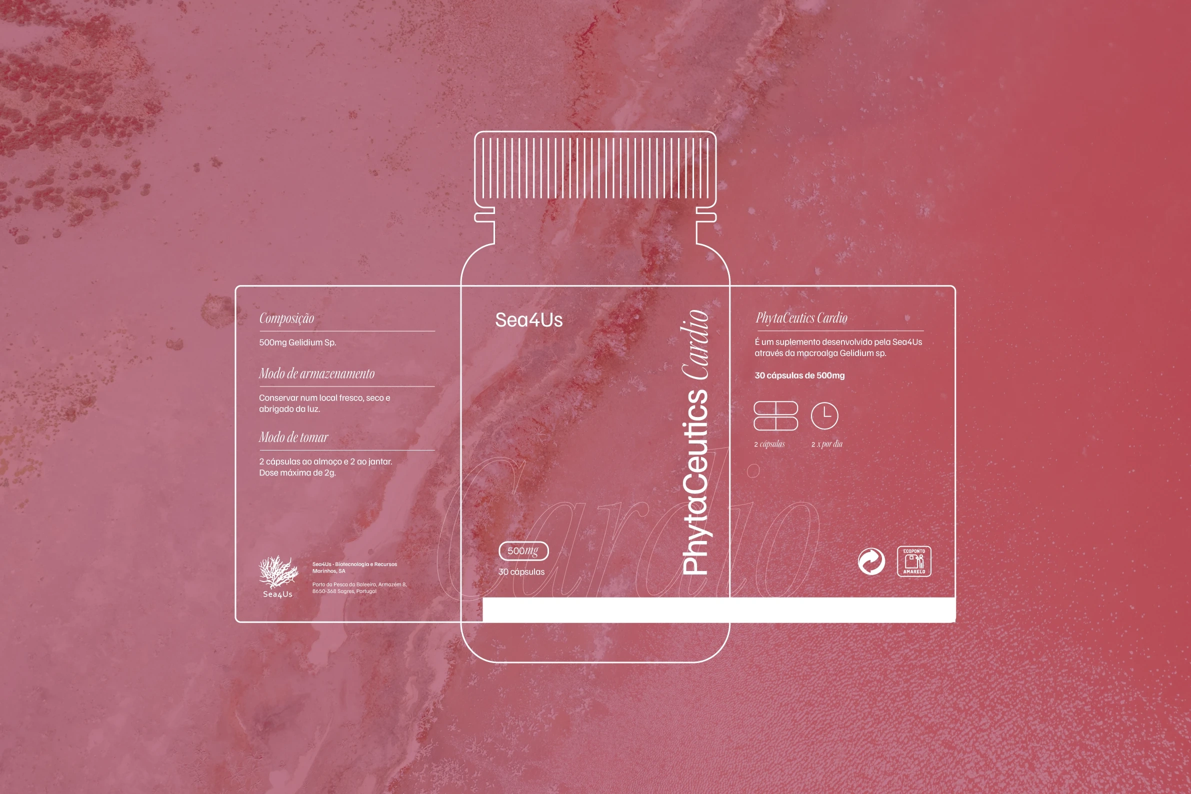
The Product
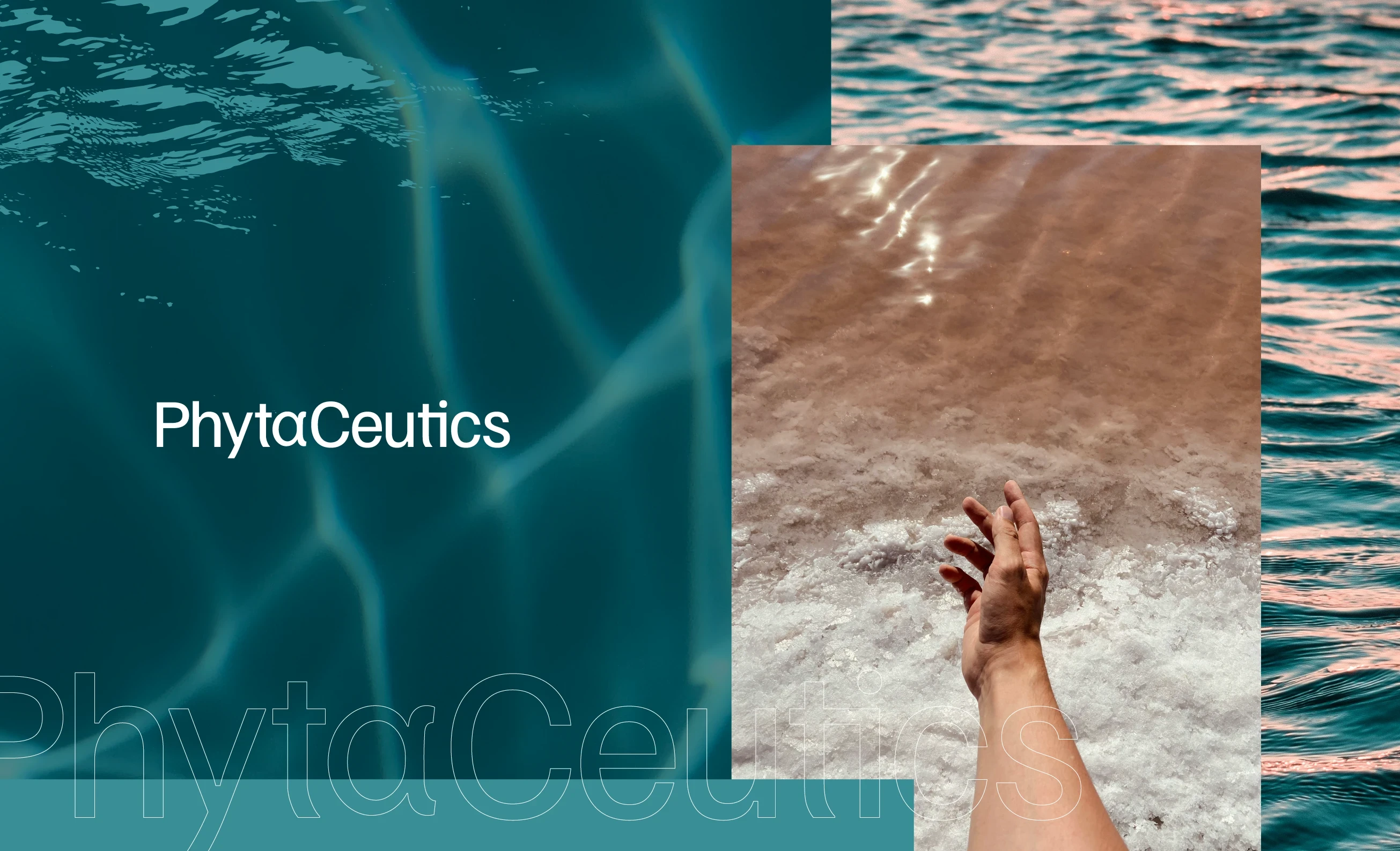
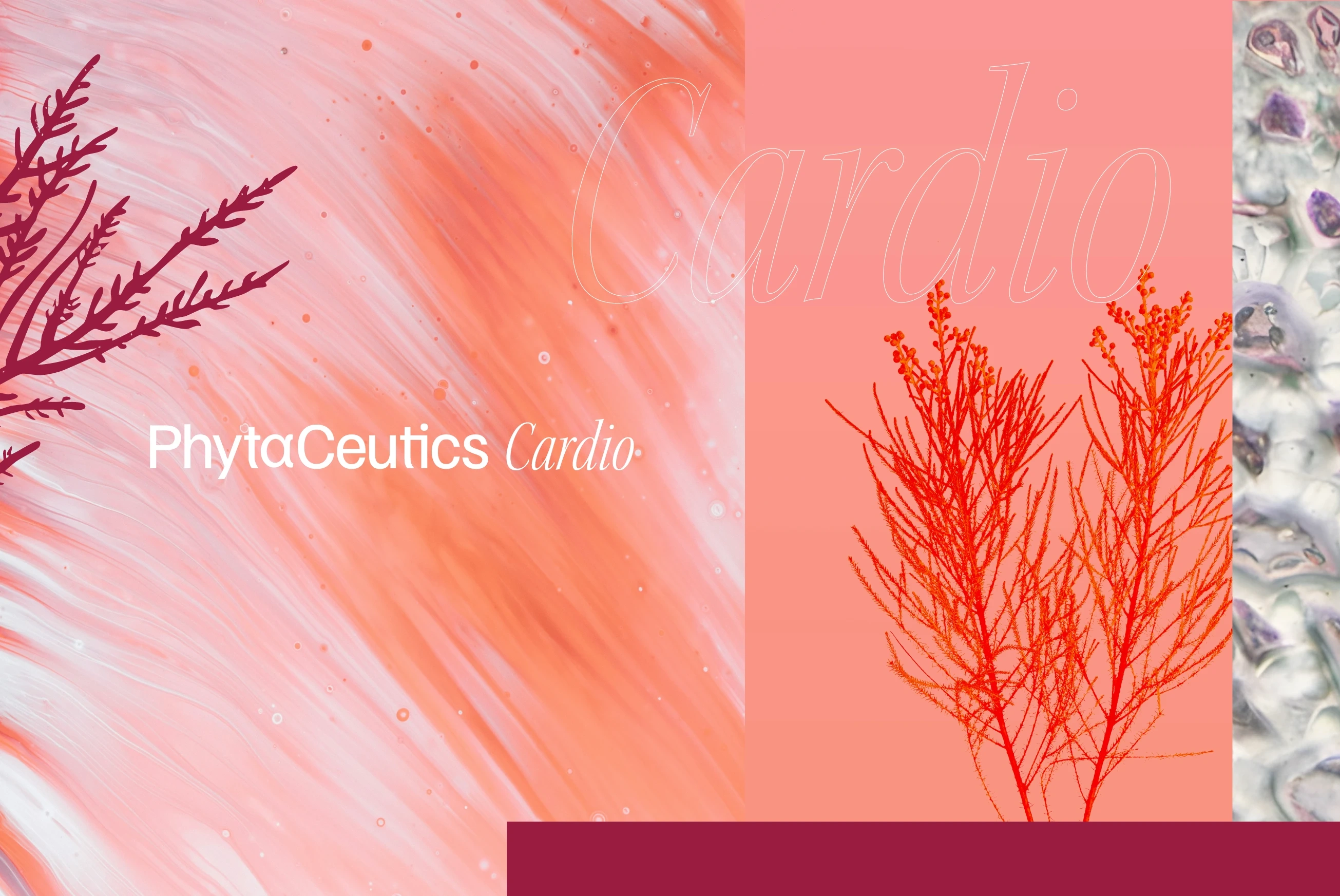
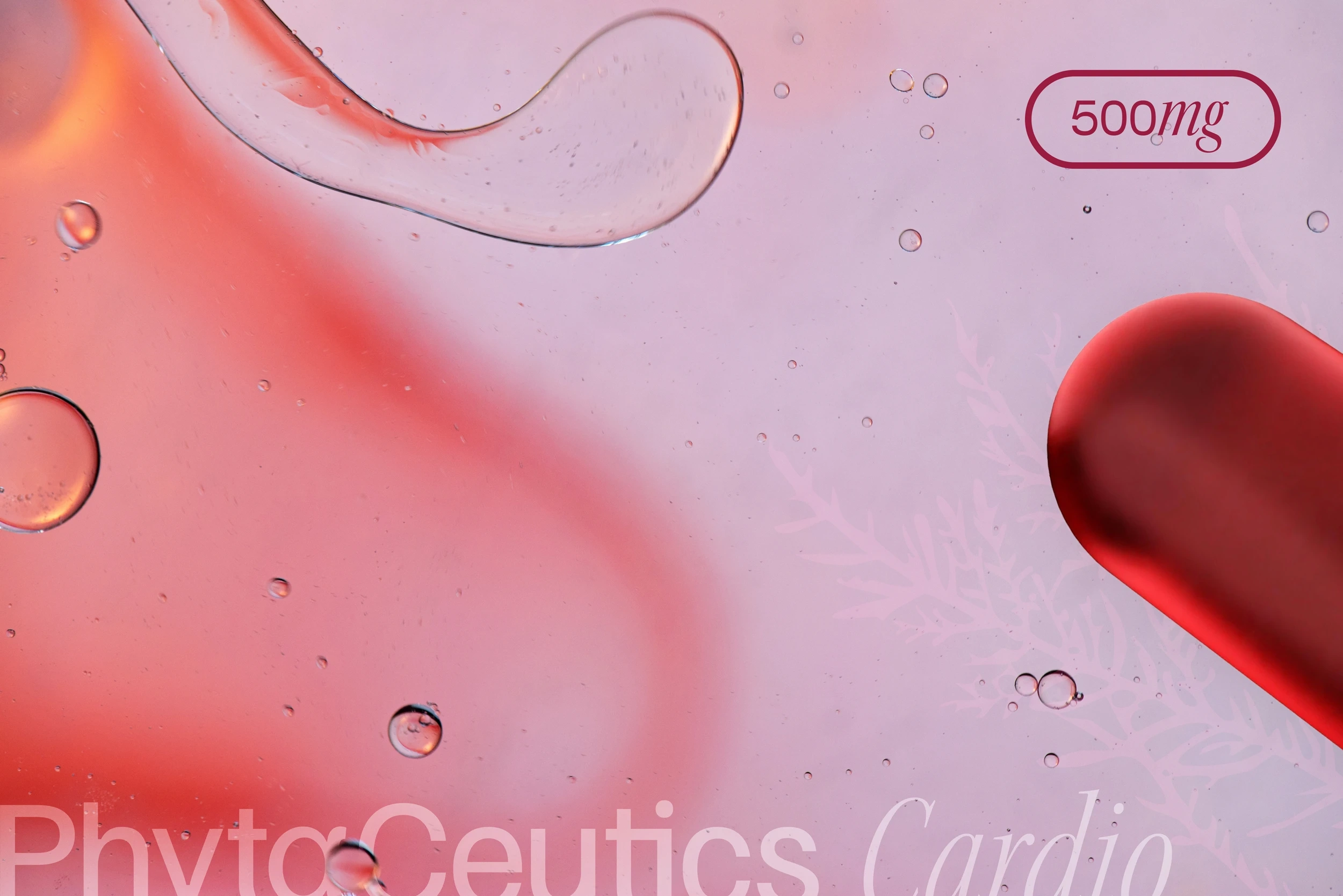
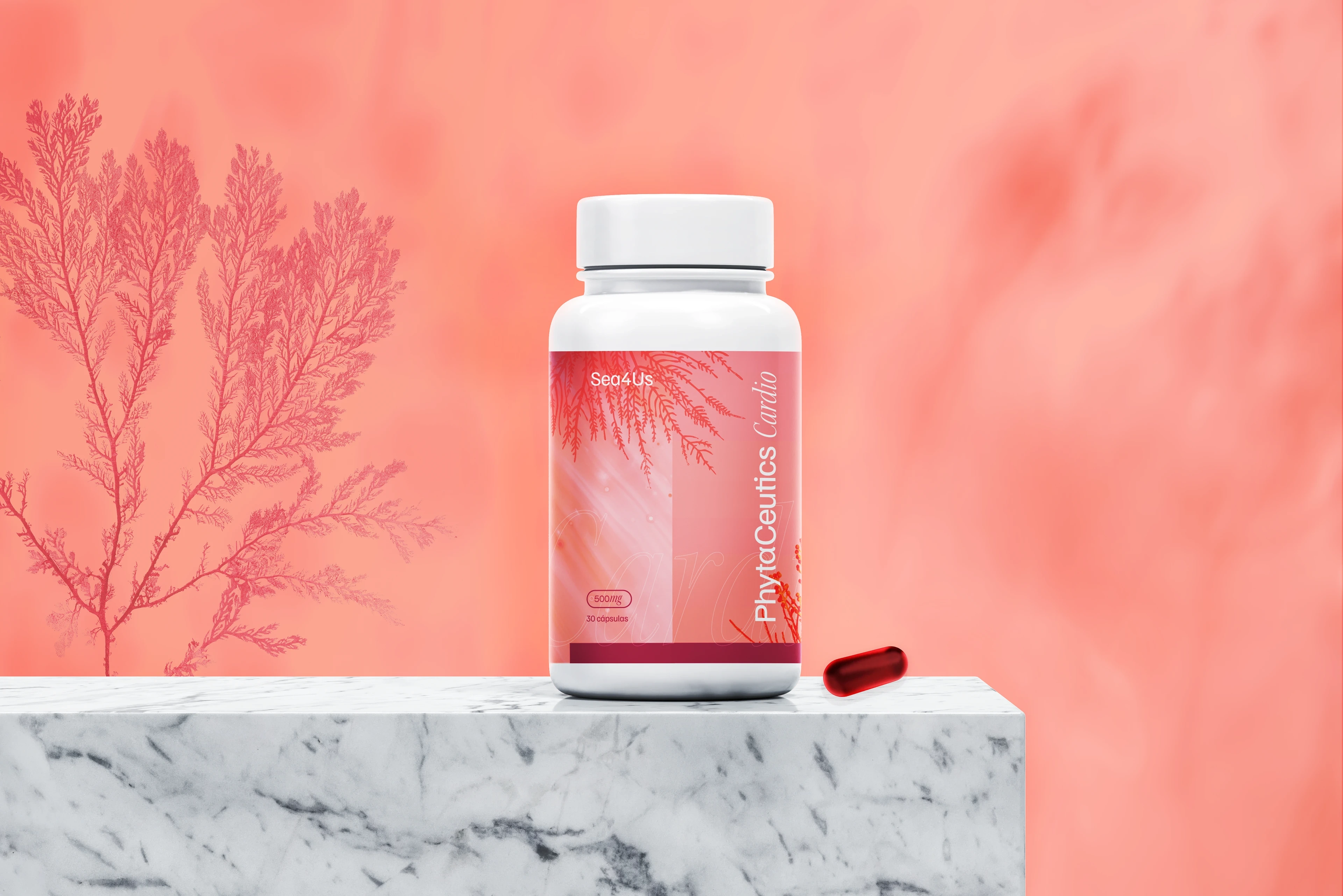
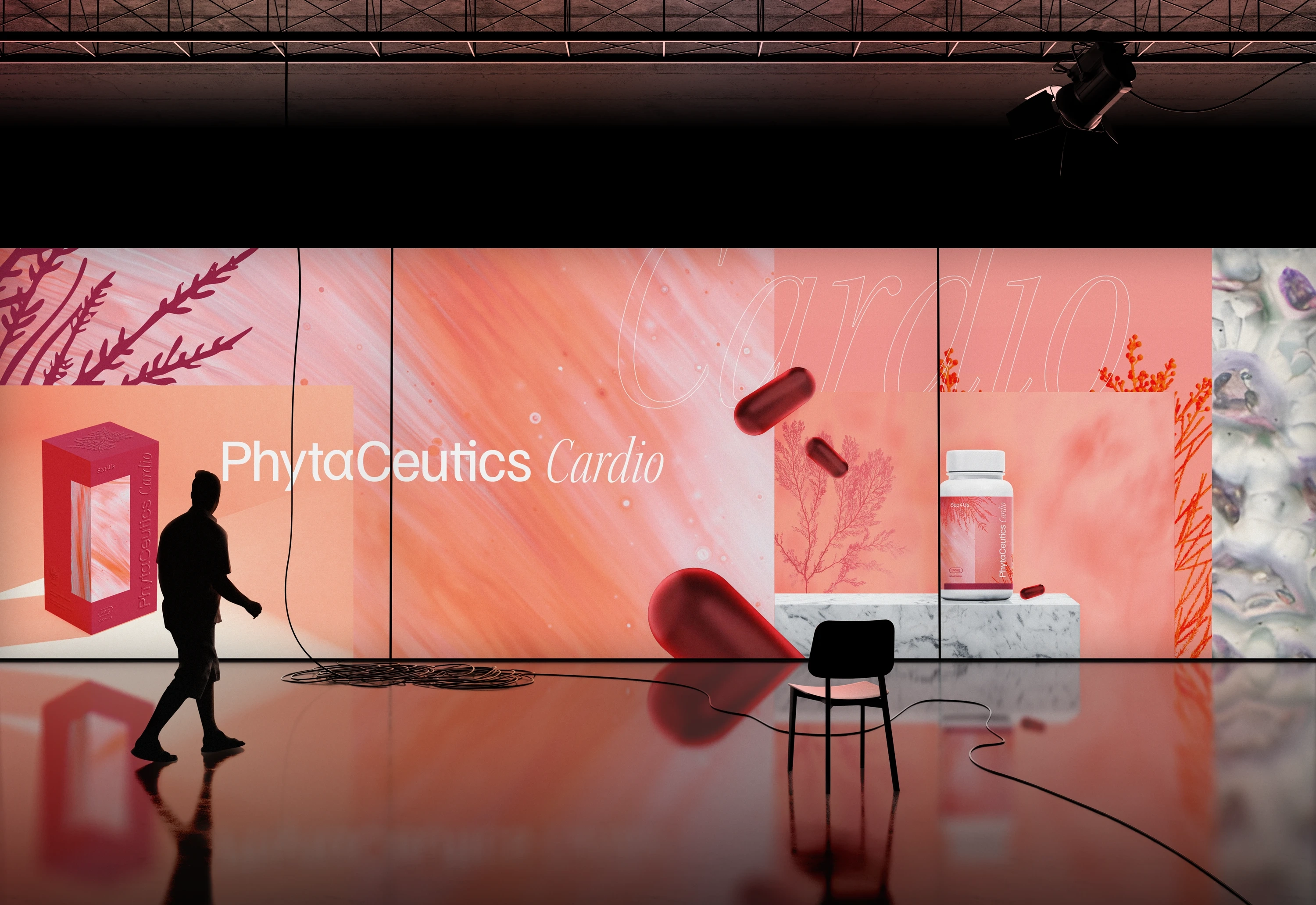
The brand identity is rooted in the imagery of the ocean, combining shades of blue and sand. For the Cardio product, these tones expand into nuances inspired by the macroalgae Gelidium sp., reinforcing the connection to the key ingredient. As the core element of the formula and the starting point of the creative process, this ingredient shaped the aesthetic of the brand’s first product, serving as the foundation of its visual identity.Since the benefits of this product are linked to the cardiovascular system, the visual narrative incorporates organic textures that evoke blood flow, adding depth and relevance to the design.

Thank you!
Client: Sea4Us
Year: 2025
Design & Art direction © João Loureiro
Like this project
Posted Jan 29, 2026
A visual identity inspired by the ocean, shaped through colour, texture and motion, and brought to life across branding, packaging and product launch.
Likes
1
Views
3
Clients
Sea4Us