Consigo Fisioterapia
João Loureiro

about
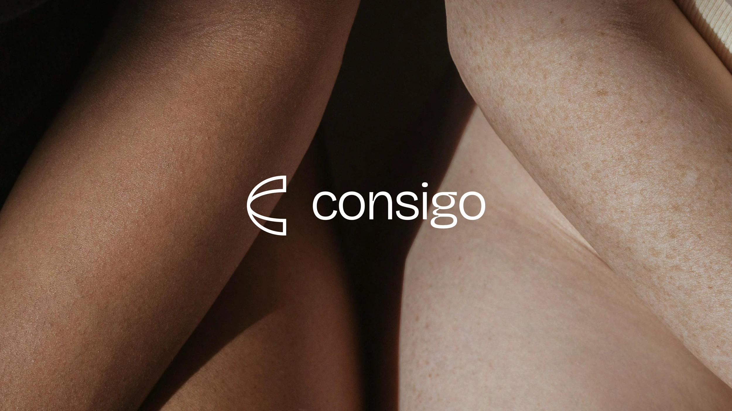
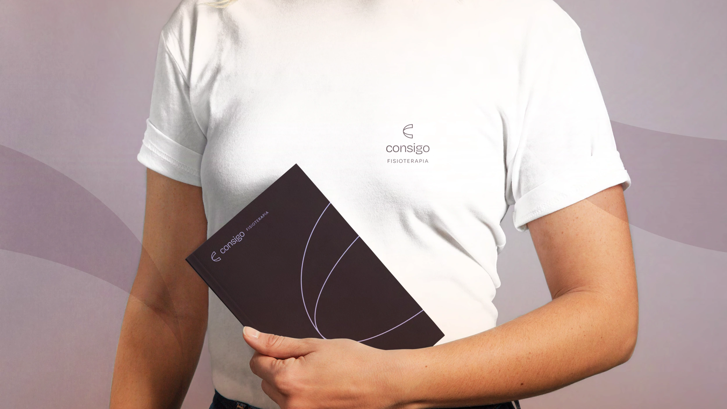
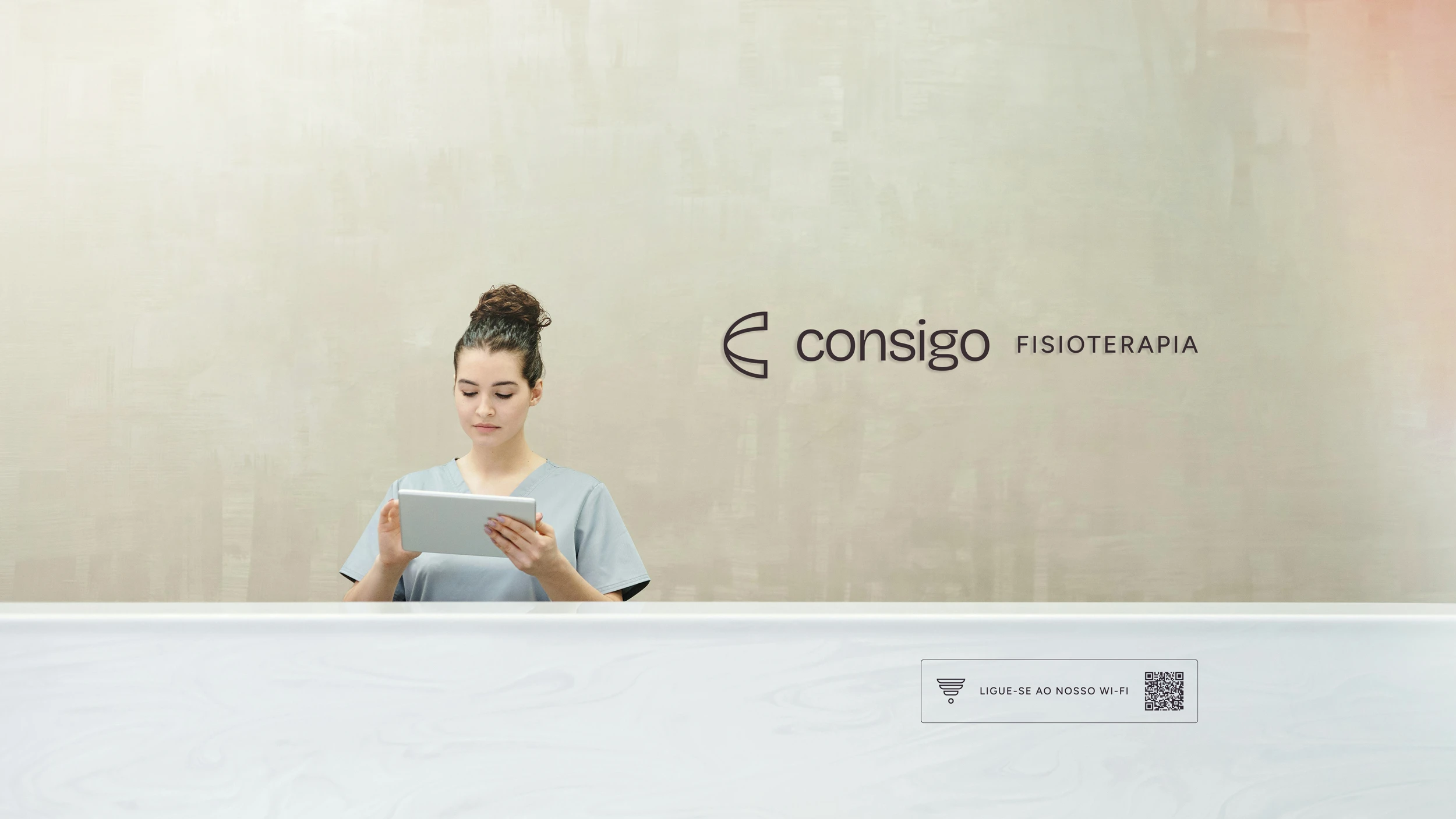
Consigo, located in Amadora, Portugal, is dedicated to recovery, prevention, and the promotion of physical well-being, with a personalized, patient-centered approach. With a team of experienced professionals, it employs advanced physiotherapy techniques to treat injuries, relieve pain, and improve the quality of life of its patients, always with a strong sense of closeness and care. After a decade of existence, the space underwent an internal restructuring, giving rise to a new identity, a new name, and a renewed strength – this is how Consigo was born! In Portuguese, "Consigo" means "with you," reinforcing the brand's commitment to a personalized and close-knit approach. To mark this important moment, I was invited to develop the new identity and all the communication for the space.
moodboard

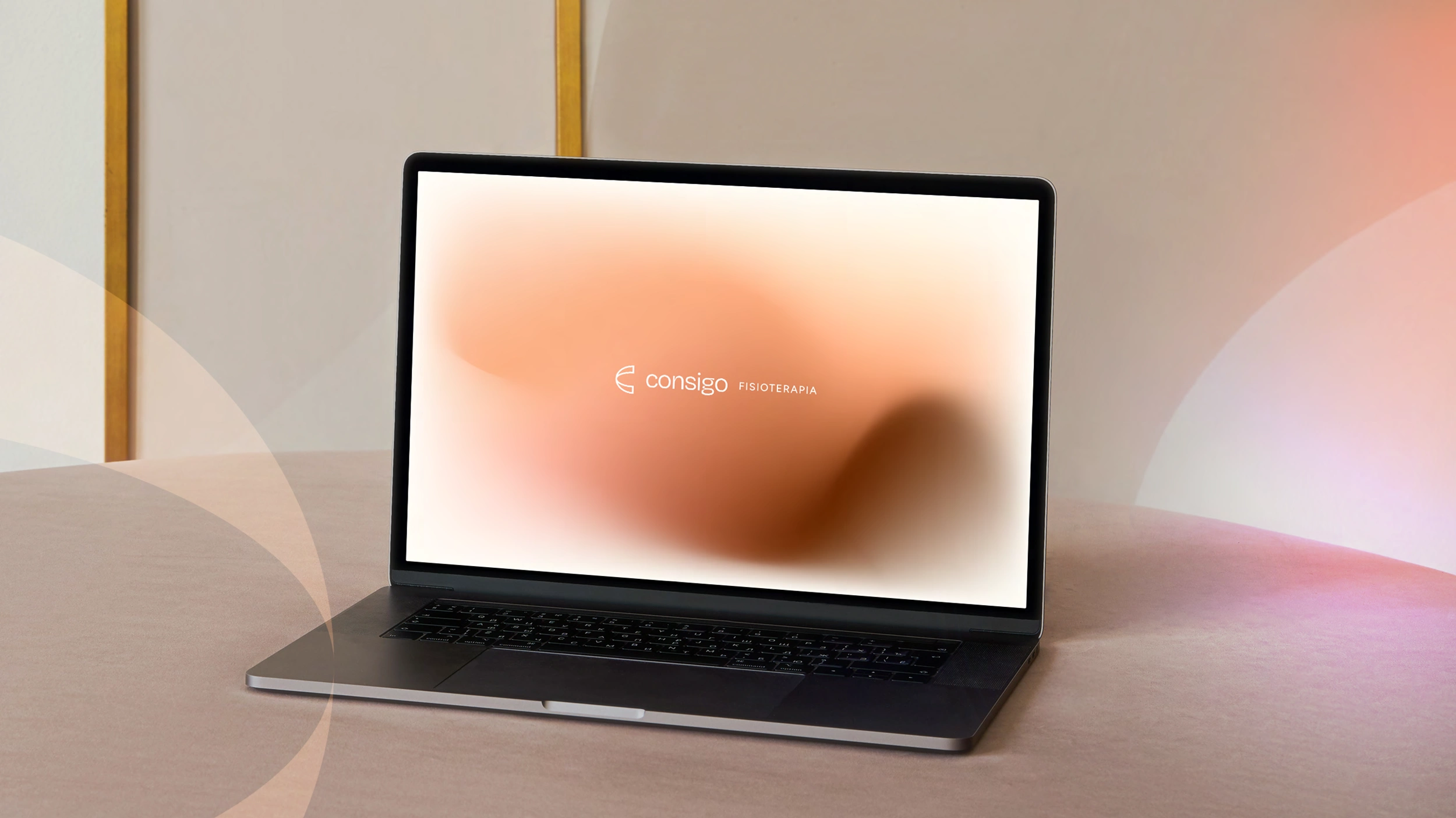
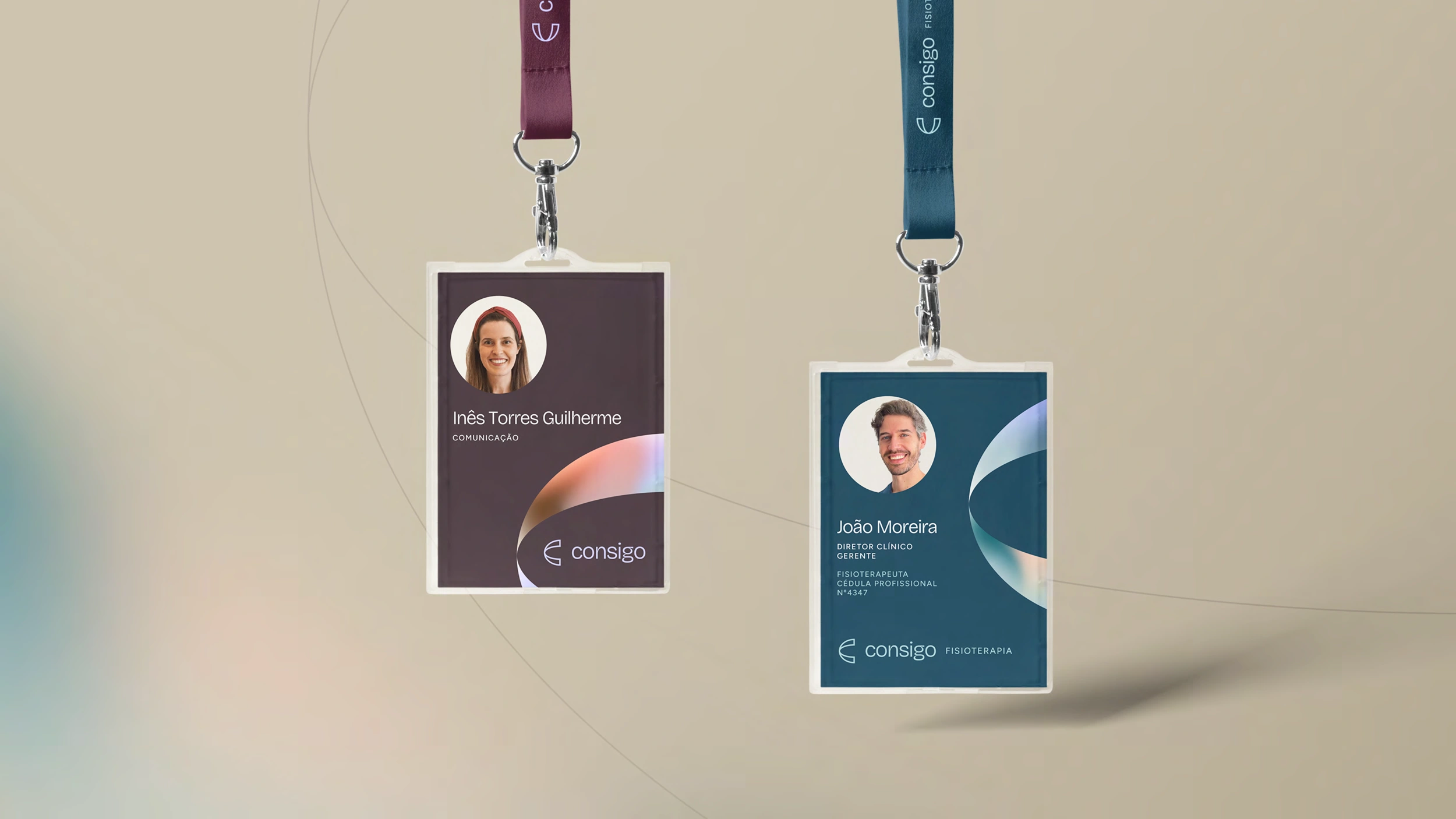
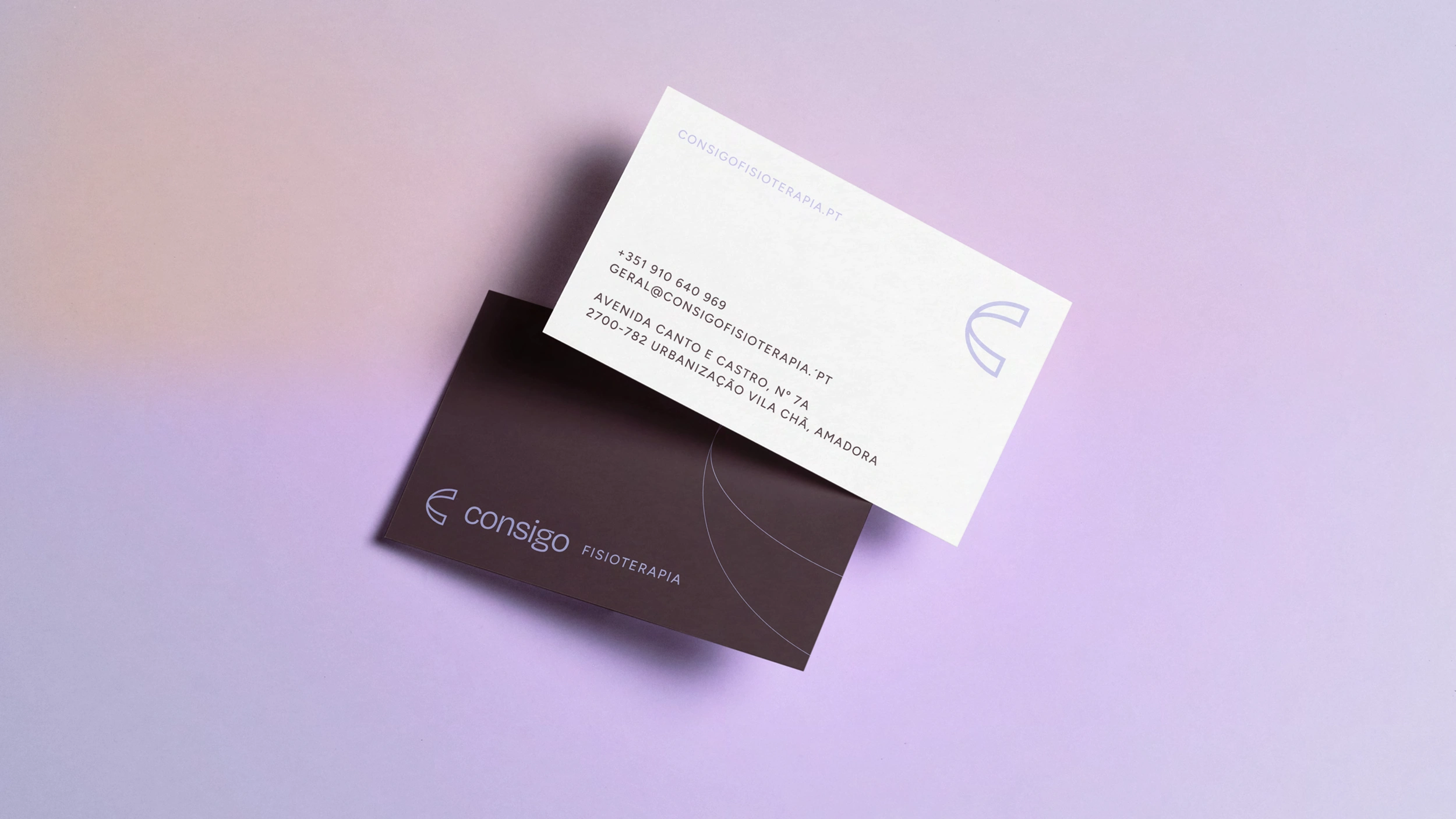
The new color palette was inspired by the diversity and closeness that the brand represents. I drew inspiration from skin tones, reflecting the multiculturalism of the area where Consigo is located and the diversity of its target audience. To complement this neutral and inclusive base, I added two warmer tones – plum and lilac, designed to create a closer connection with the female audience, which is the main target. In balance, I introduced two cooler tones, adding versatility to the communication, especially in content aimed at the male audience. Each color choice was made with the goal of creating a harmonious and flexible visual universe, while always ensuring brand consistency. The result is a welcoming, balanced palette that represents Consigo's mission.
concept
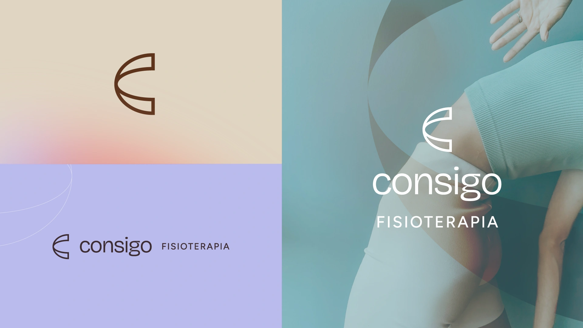
brand
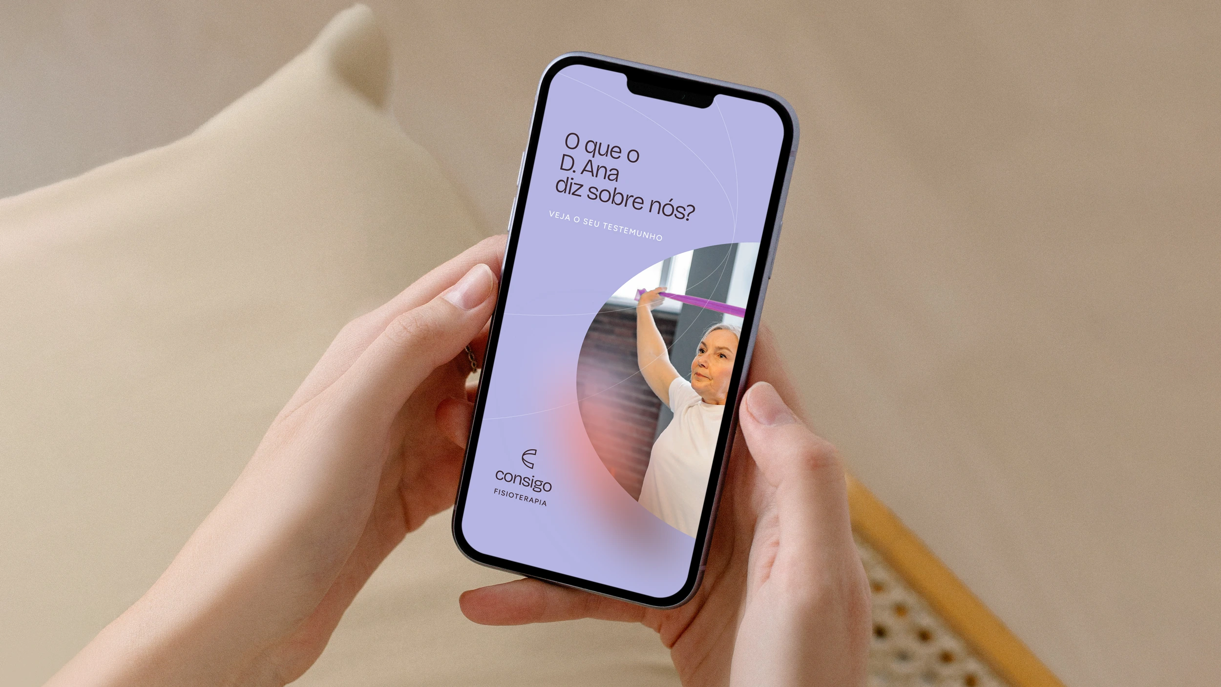
As a result, we have a modern, elegant, and highly dynamic brand that uniquely communicates the identity of Consigo to its target audience. The organic shapes, inspired by the body and the materials used in the therapies, facilitate easy recognition by the audience, allowing for a rich expansion. The chosen color palette strengthens the brand, making it unique and human, while communicating its values in an elegant and timeless manner.
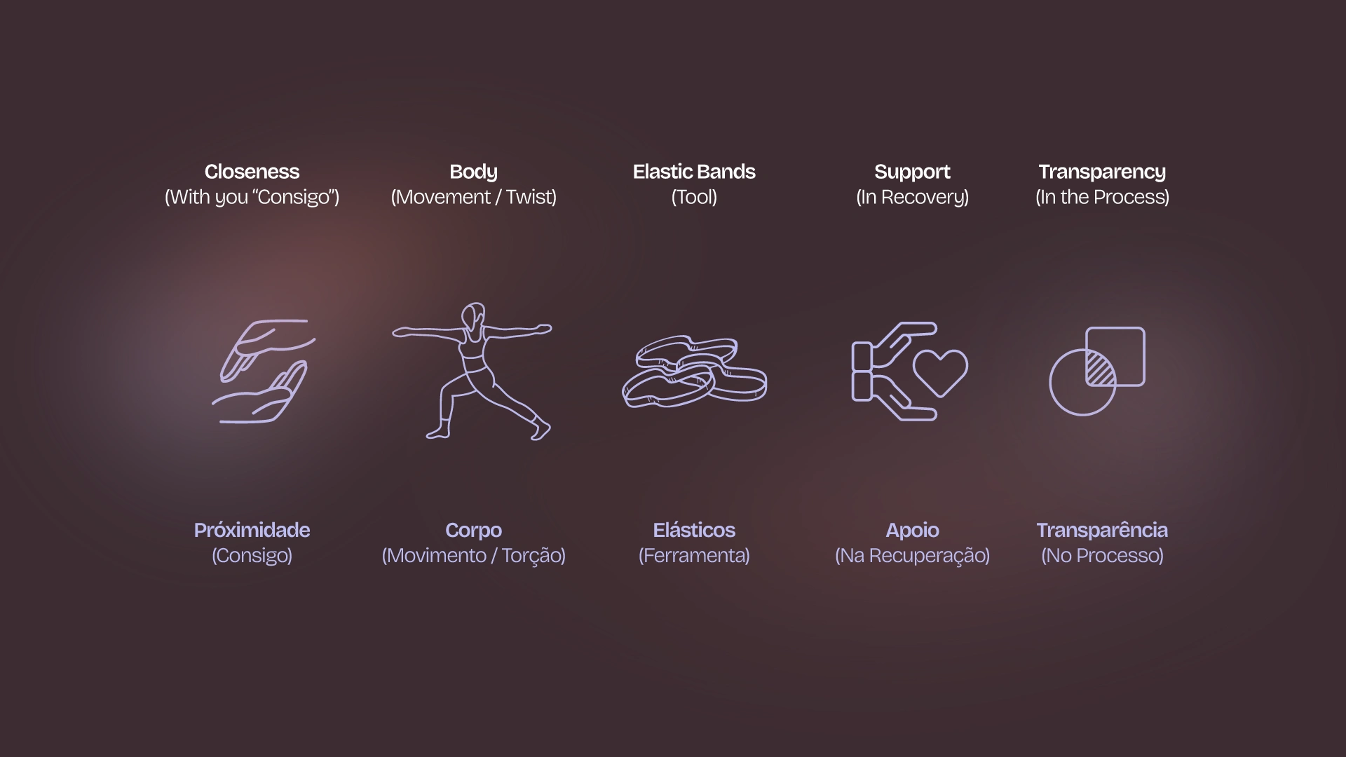
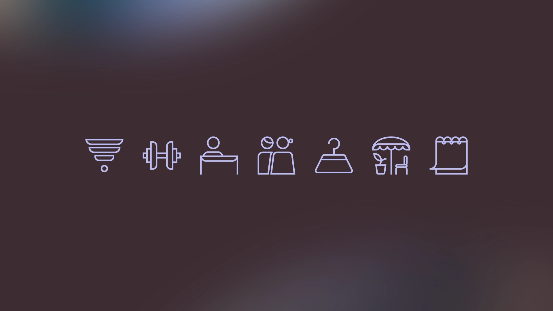
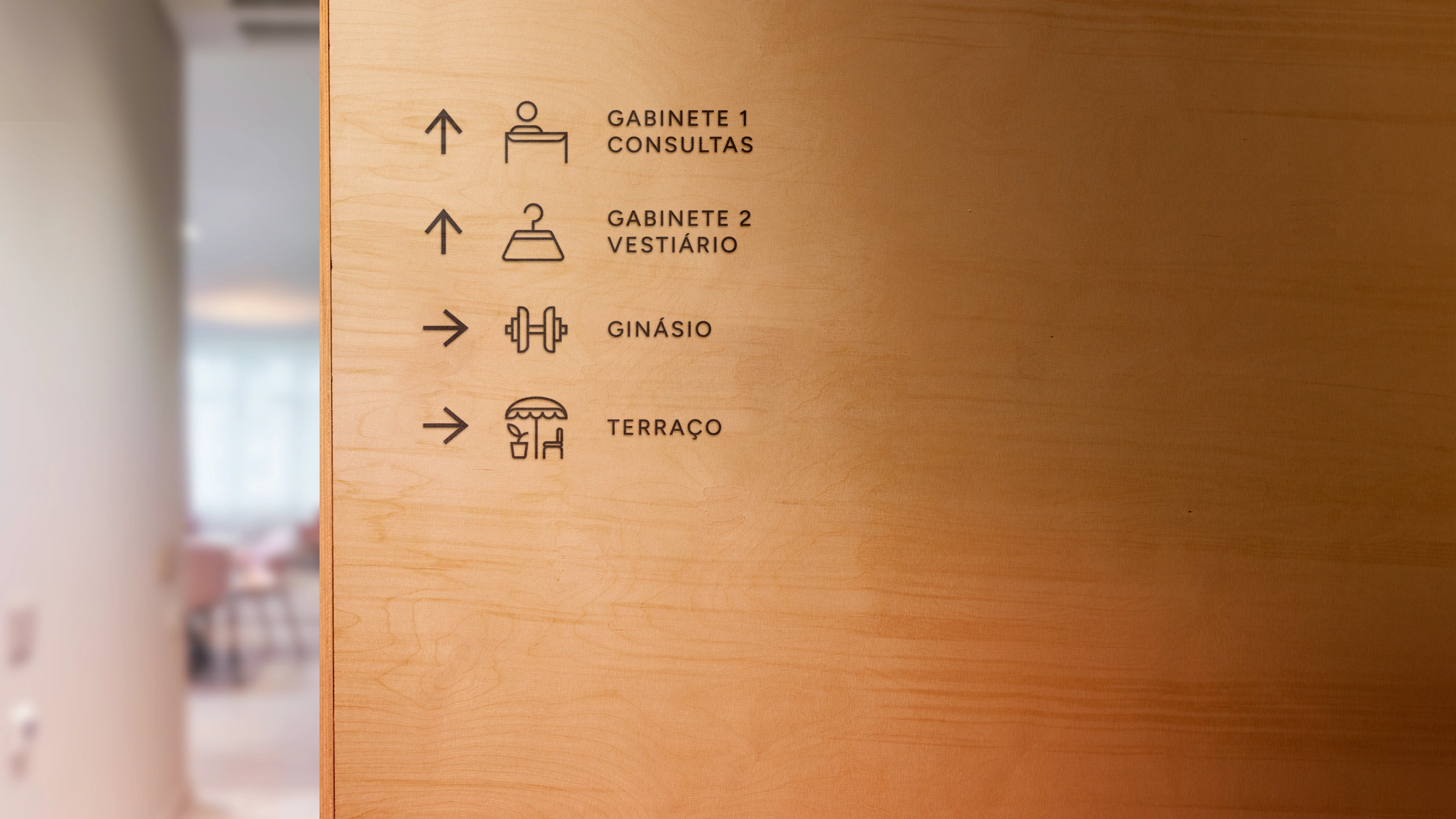
iconography & signage
The custom iconography I developed for Consigo was created based on a strict geometric grid, ensuring consistency and visual harmony across all communication pieces. Each icon was designed in line with the logo’s aesthetic, reinforcing the brand’s visual identity and promoting clear and effective communication. This unique and tailored work contributes to a cohesive visual experience, reflecting Consigo's careful and detailed approach in all its elements.
thank you.
client: Consigo Fisioterapia
year: 2024
design & art direction: João Loureiro
Like this project
Posted Jul 8, 2025
Dynamic visual identity that reflects the clinic’s mission of providing personalized care. The brand emphasizing warmth, human connection, and professionalism.
Likes
12
Views
122
Timeline
Jun 3, 2024 - Jul 1, 2025