MOXO
João Loureiro
____________
ABOUT
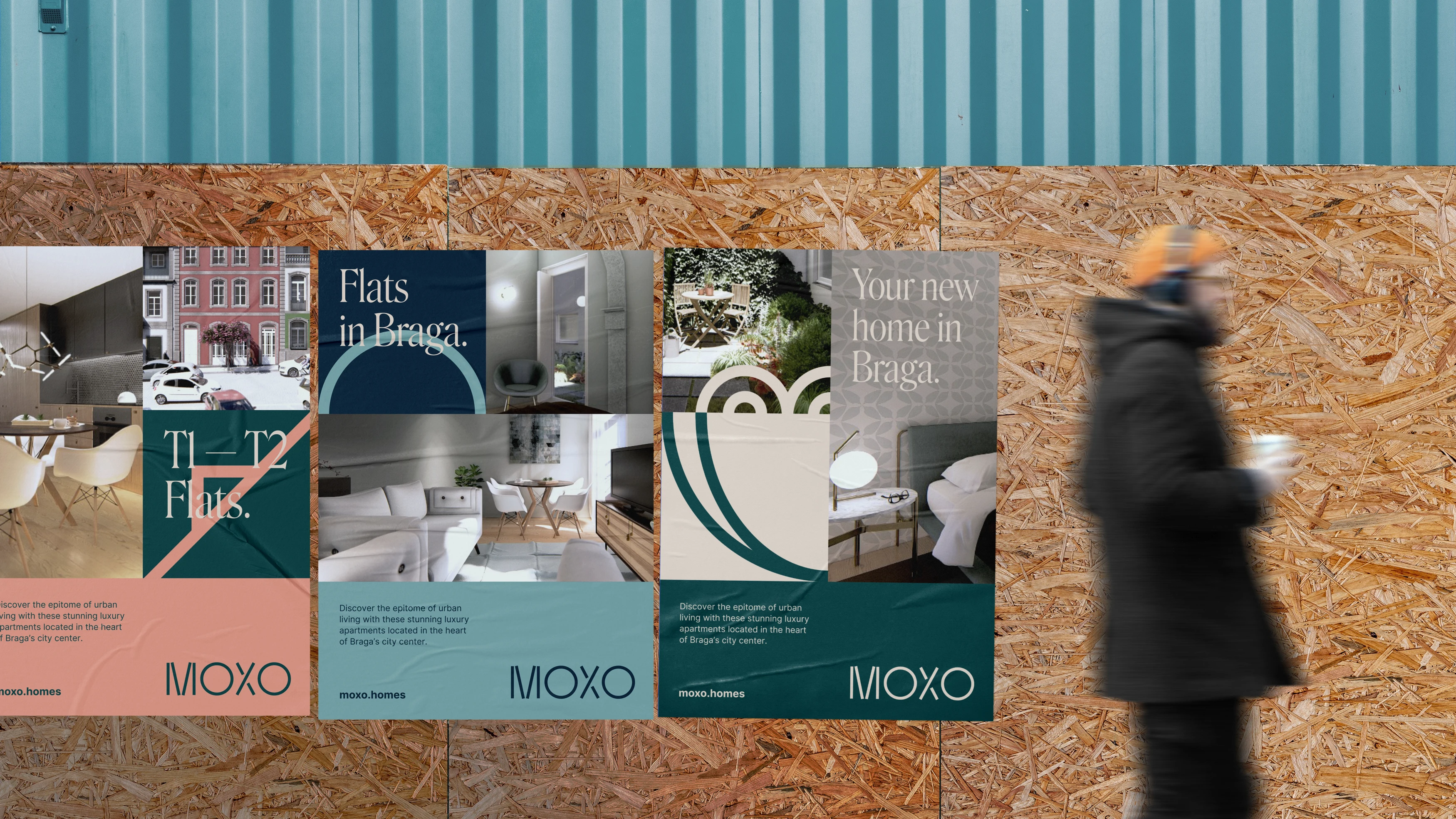
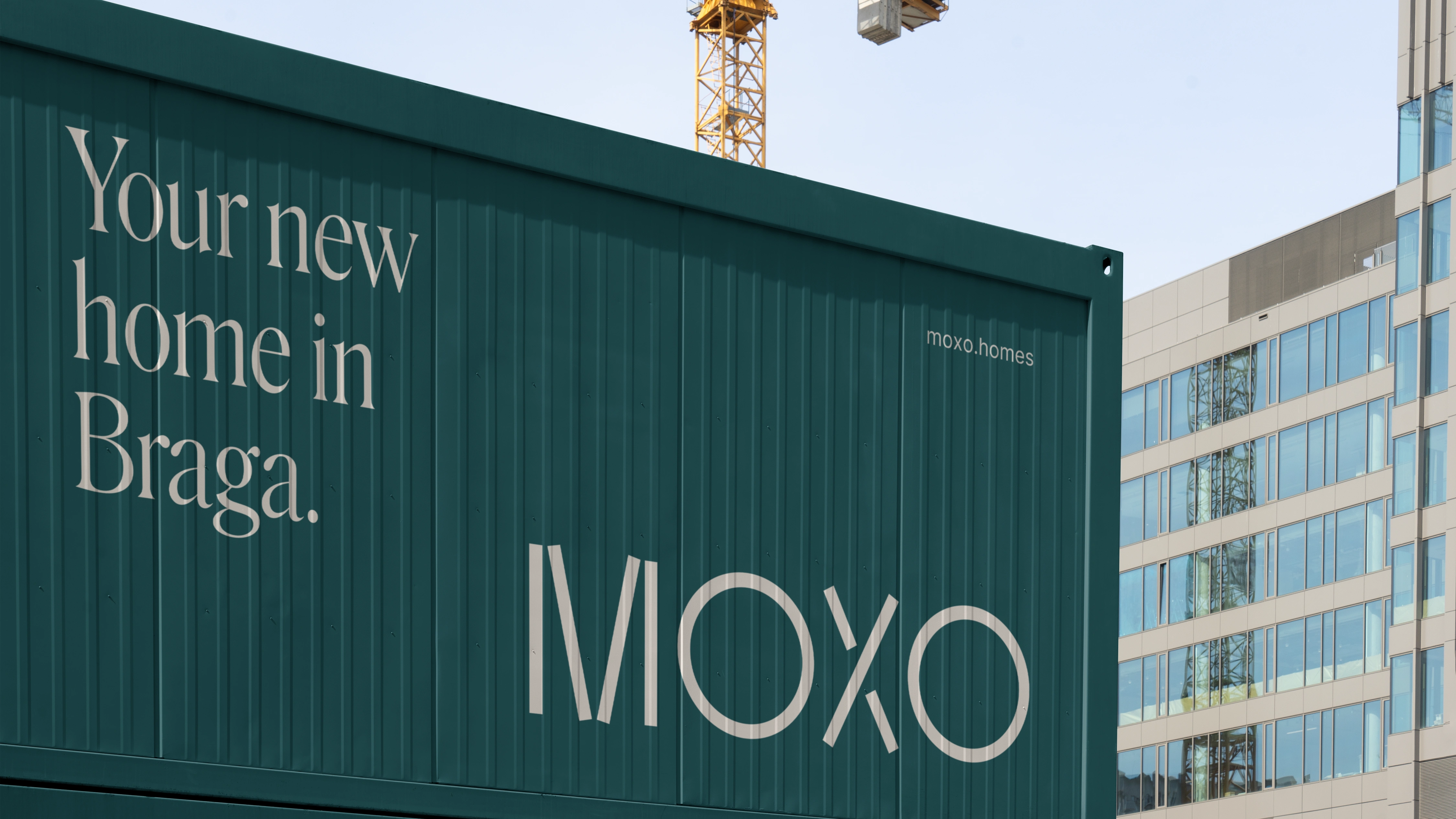
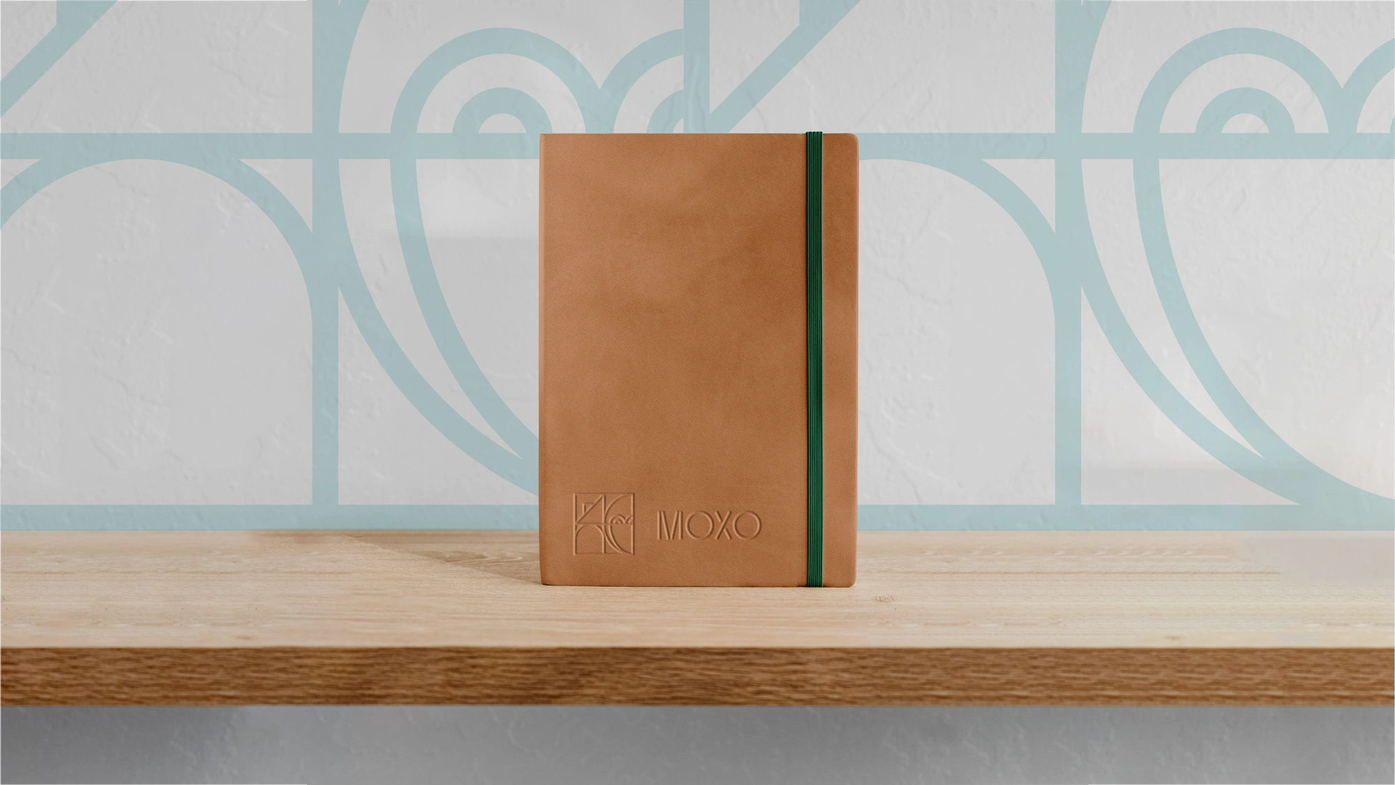
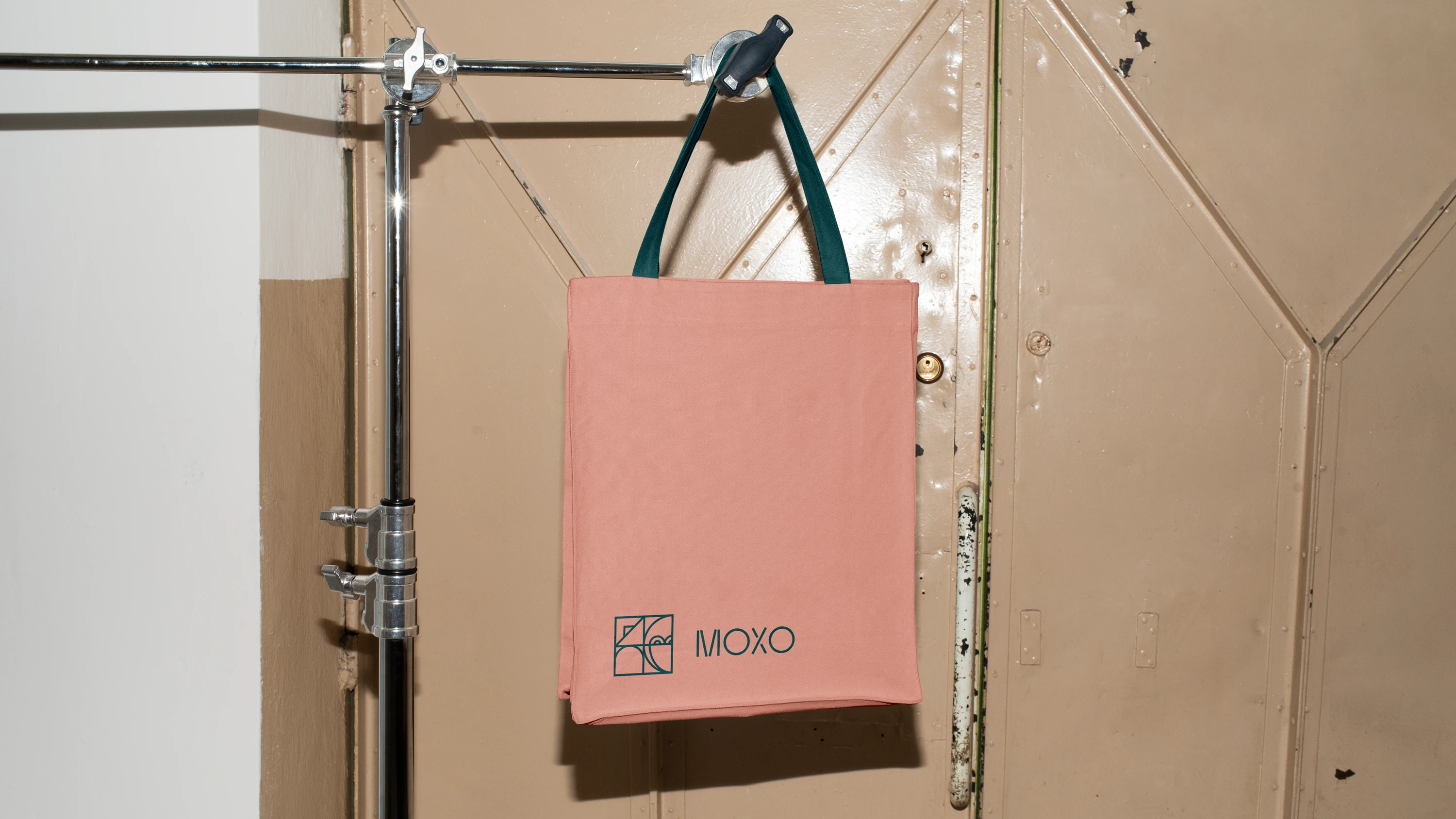
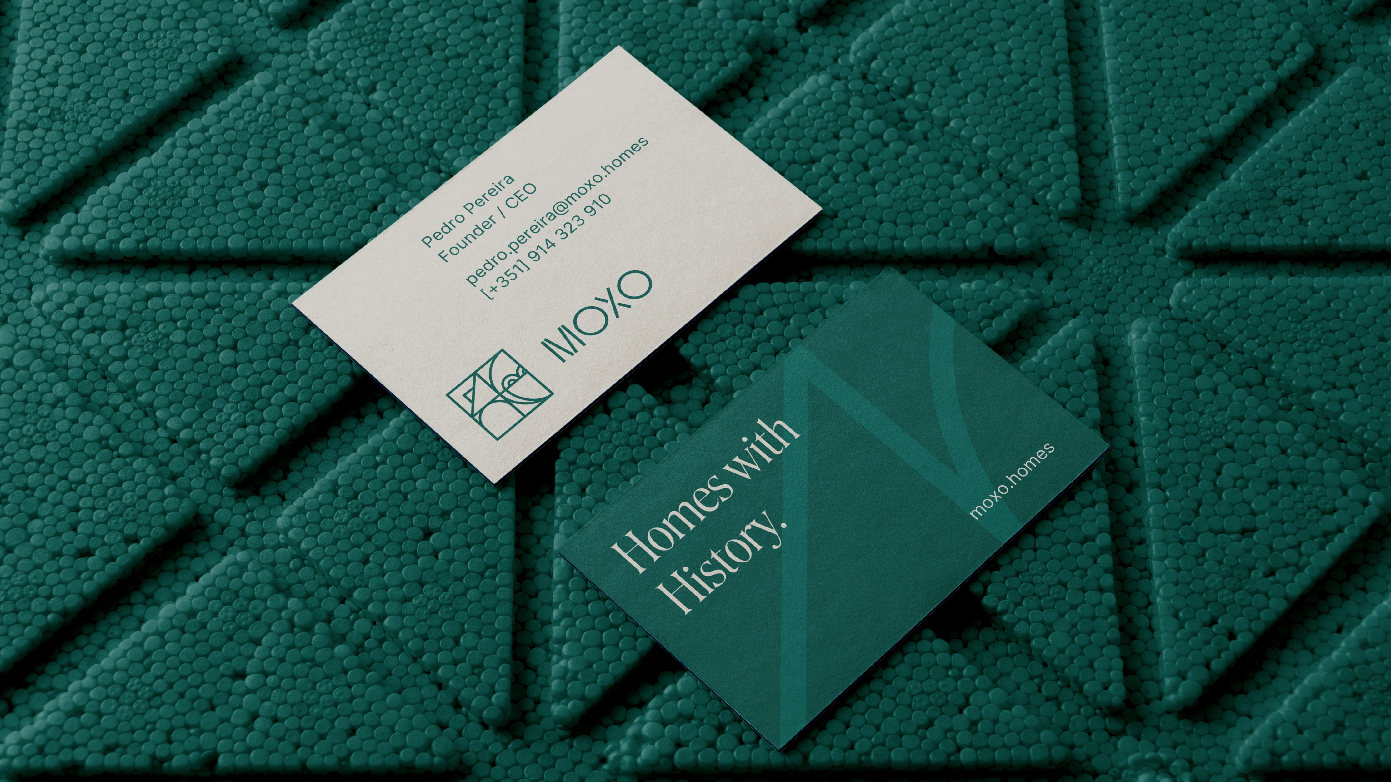
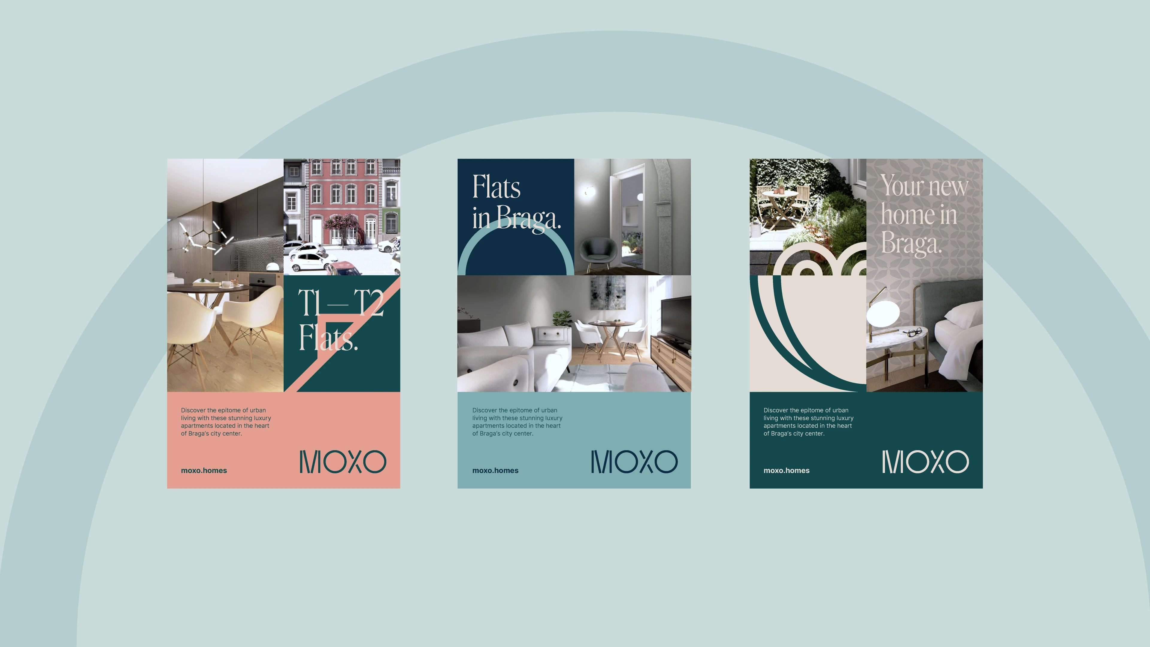
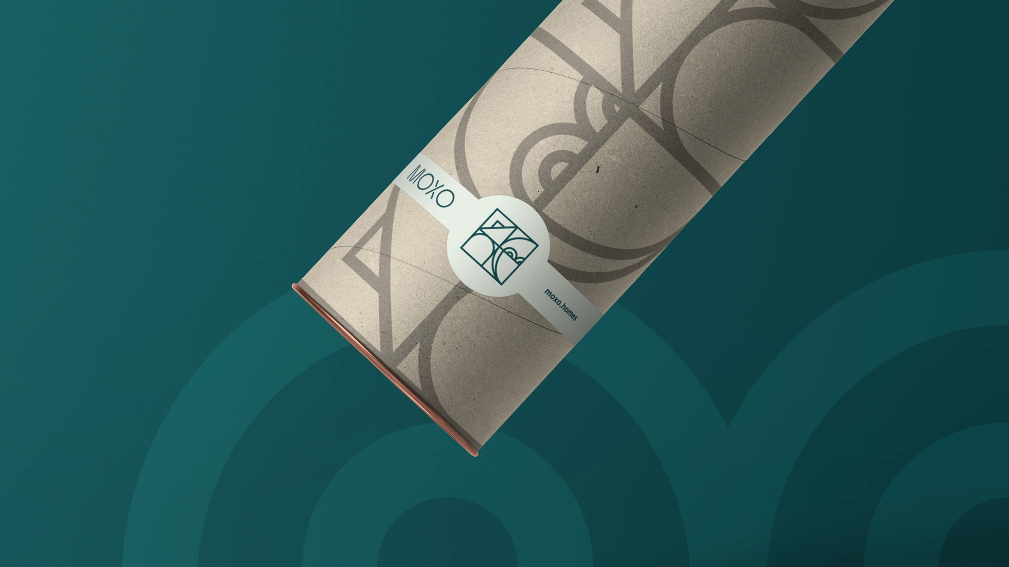
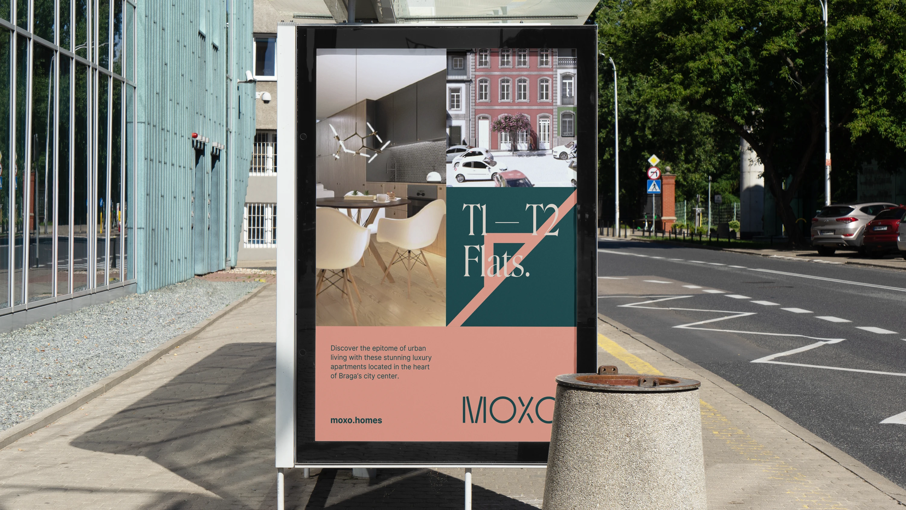
Embracing the challenge of creating an identity for a construction company with such well-crafted positioning and products, I decided to explore an elegant and modern visual concept, with a distinctly European touch, that faithfully represents its products and values. This way, the message would be effectively conveyed to the target audience. In the creative process, I chose to deconstruct a typical Portuguese element – the Tile – giving it a contemporary and unique twist. This approach represents the company and its field of activity, resulting in a dynamic and flexible brand in its various applications.
____________
MOODBOARD
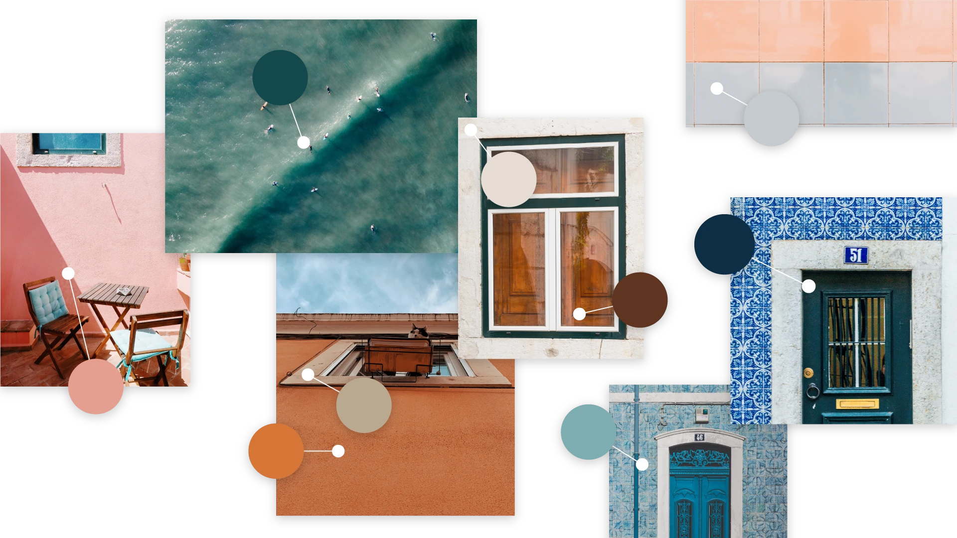
The brand's color palette is inspired by the Portuguese landscape, the postcards that depict its streets, and its rich cultural elements, widely recognized and appreciated by foreigners. This approach aims to foster empathy among the target audience and swiftly establish its position in the luxury real estate market. Additionally, the company name, "MOXO", which translates to "Owl" (the animal), was also considered in the creative brand-making process.
____________
CONCEPT
____________
LOGO
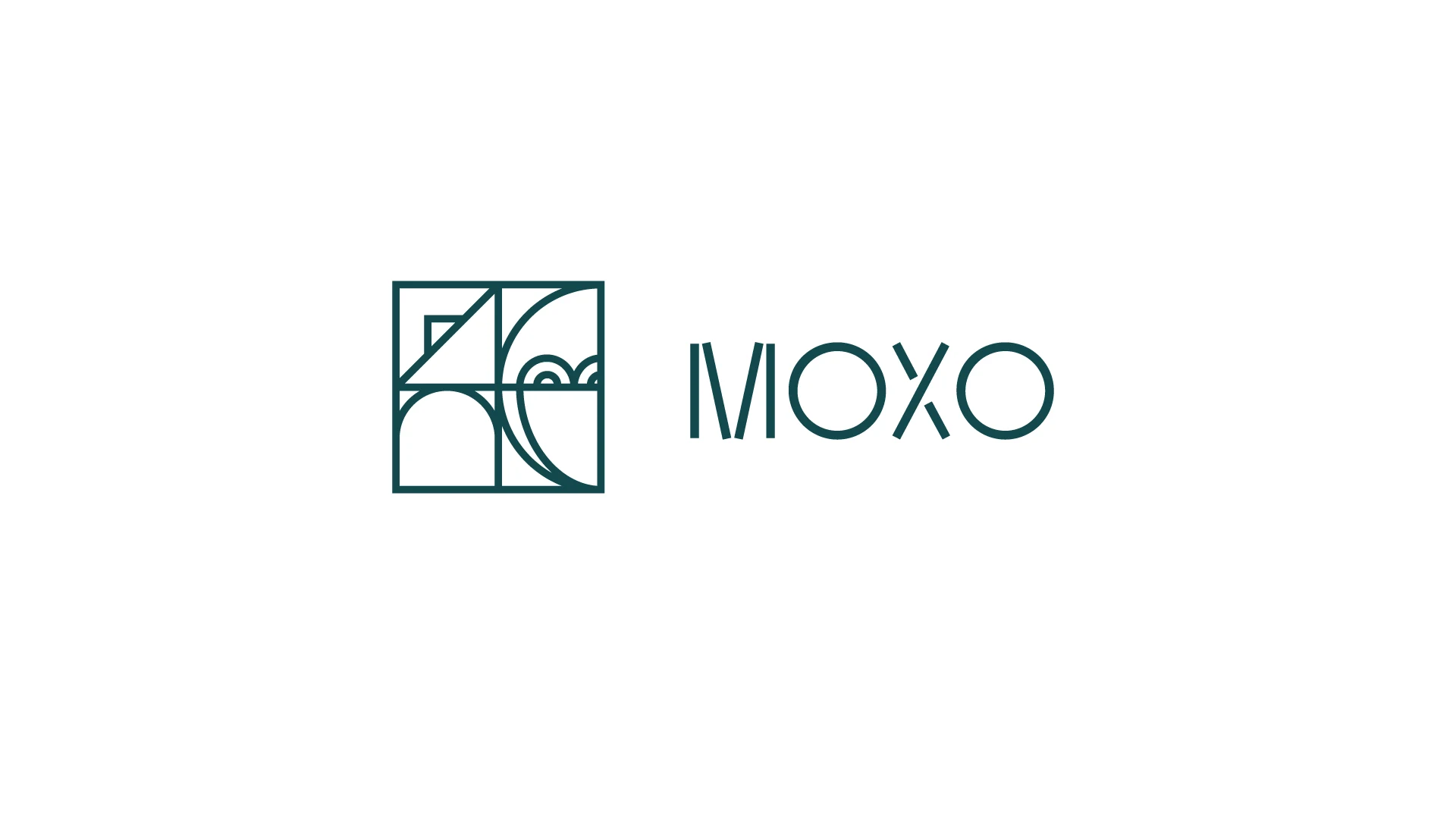
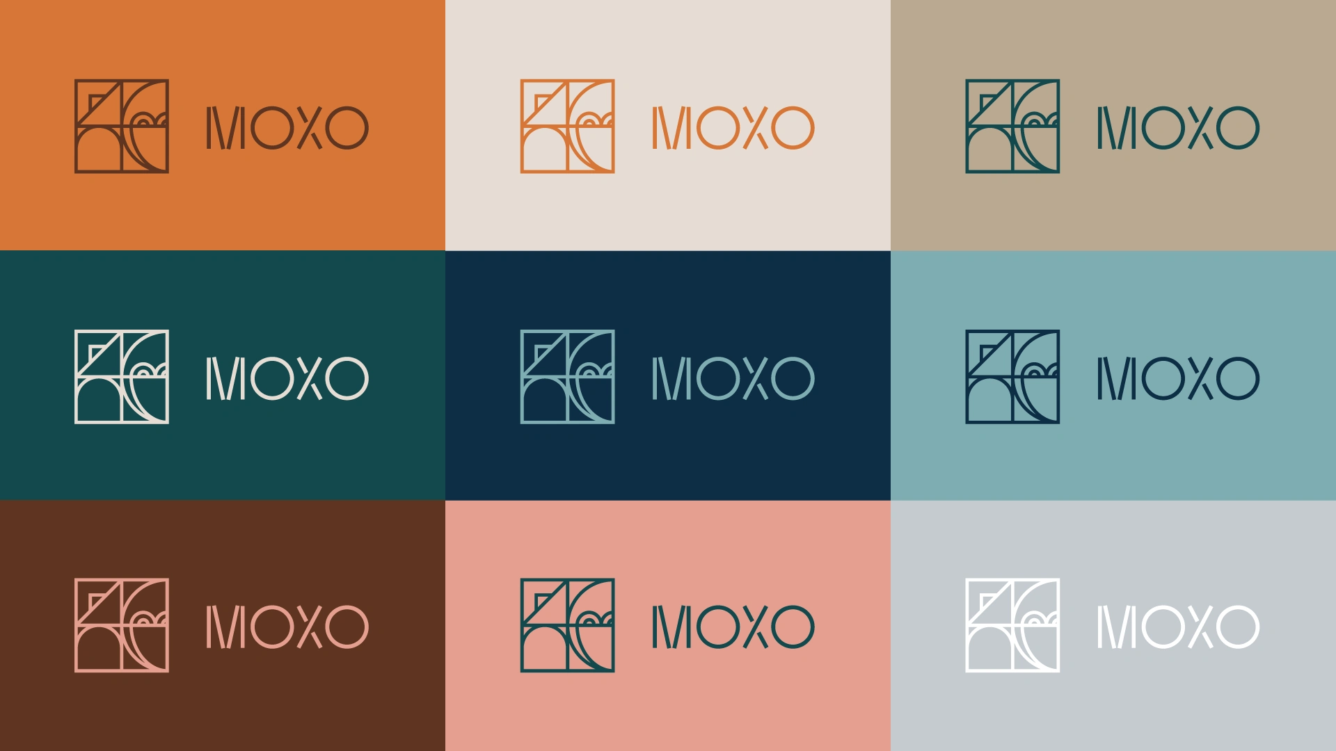
As a result, we have a modern, premium, and extremely dynamic brand that uniquely communicates the MOXO brand to its target audience. The geometric shapes inspired by architecture allow for a rich unfolding, as well the Owl (the animal), and the chosen color palette enables these shapes, when combined, to result in a selection of patterns and mosaics, allowing the brand to assert itself in a unique and timeless manner.
THANK YOU.
Client: MOXO
Year: 2021
Design & Art Direction: João Loureiro
Like this project
Posted Jul 8, 2025
A brand identity project for a Portuguese construction/real estate company called MOXO.